 Today on his social media, James Gunn announced the start of production for his Superman sequel, Man of Tomorrow. And he did it by revealing the logo for the film.
Now, it's been no secret that the big bad for the flick is Brainiac. A villain that could be very cool indeed if Gunn has cracked a way to make it interesting. And, let's face it, there's no reason to believe that he hasn't.
But anyway...
When I saw the logo my mind screamed "GAAAAAAAAAAHHH!"
Then I took a second look and my mind screamed "GAAAAAAAAAAHHH!" again.
First of all, here's Brainiac in several incarnations (including his ancestor, Brainiac 5)...
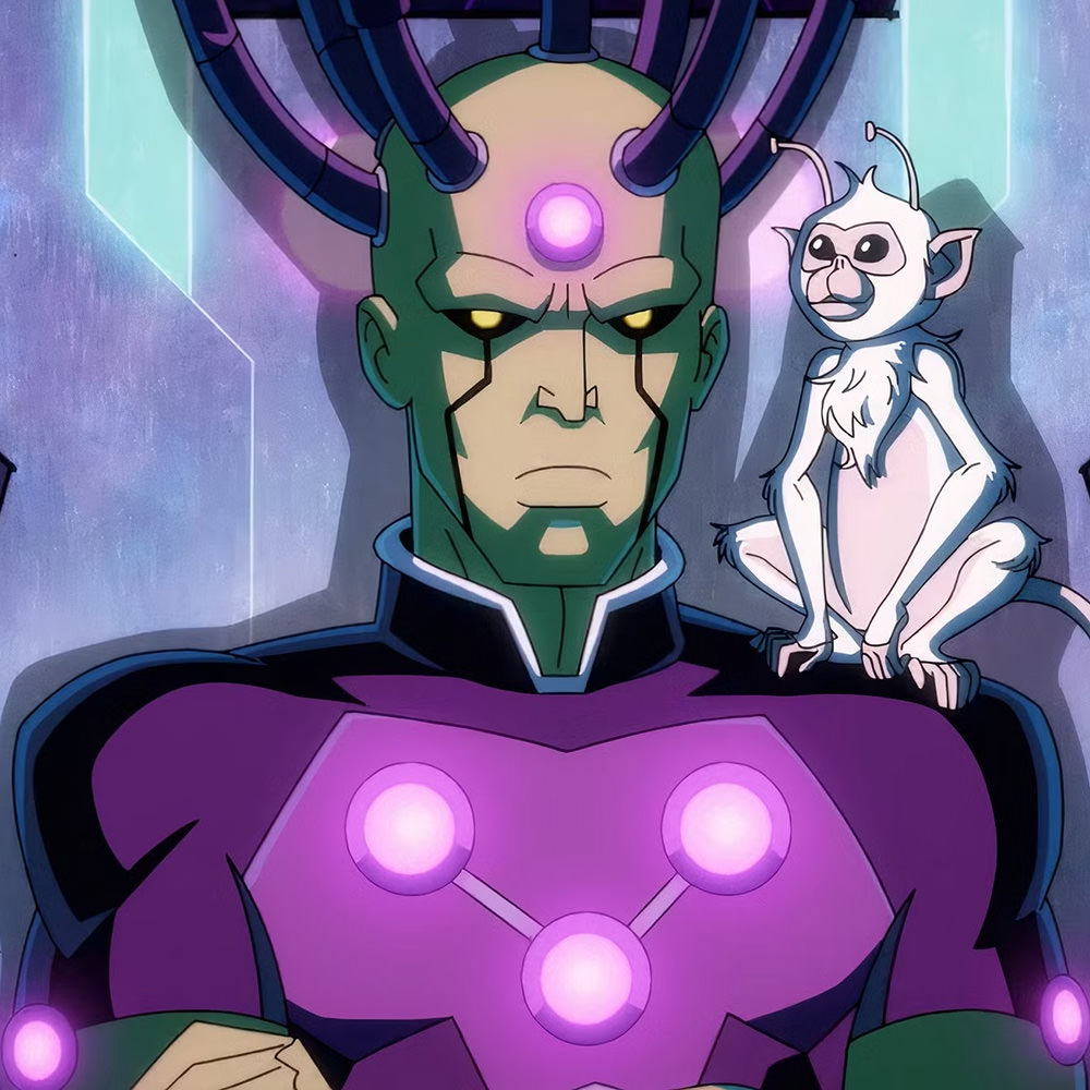
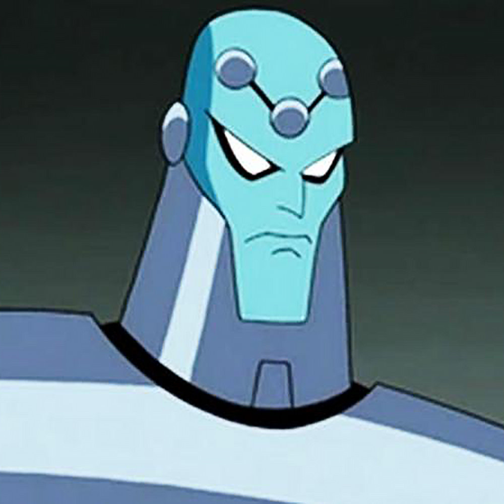

You'll notice a common element is his "logo," which is three connected circles.
But look at the logo for the movie... IT'S UP-SIDE DOWN!!!
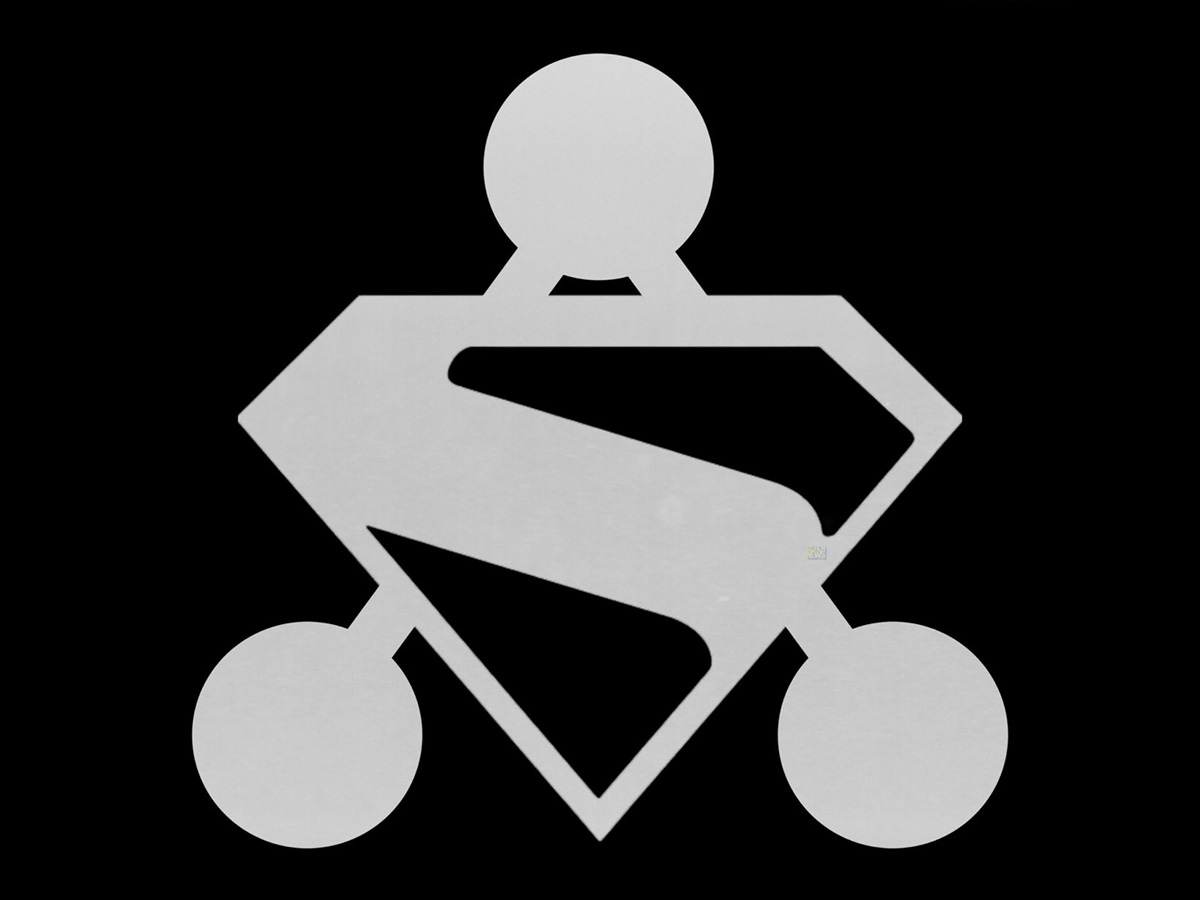
And just as I was telling my mind to calm down... that they likely did it up-side-down because it fit around Superman's logo better... I realized that the lines weren't lining up, which was when the designer in me nearly came unglued...

A good designer would have made the logos work without making one of them up-side-down. But a half-good designer would have known to have lined up the lines! I mean, holy shit, how hard was it to do something like this...
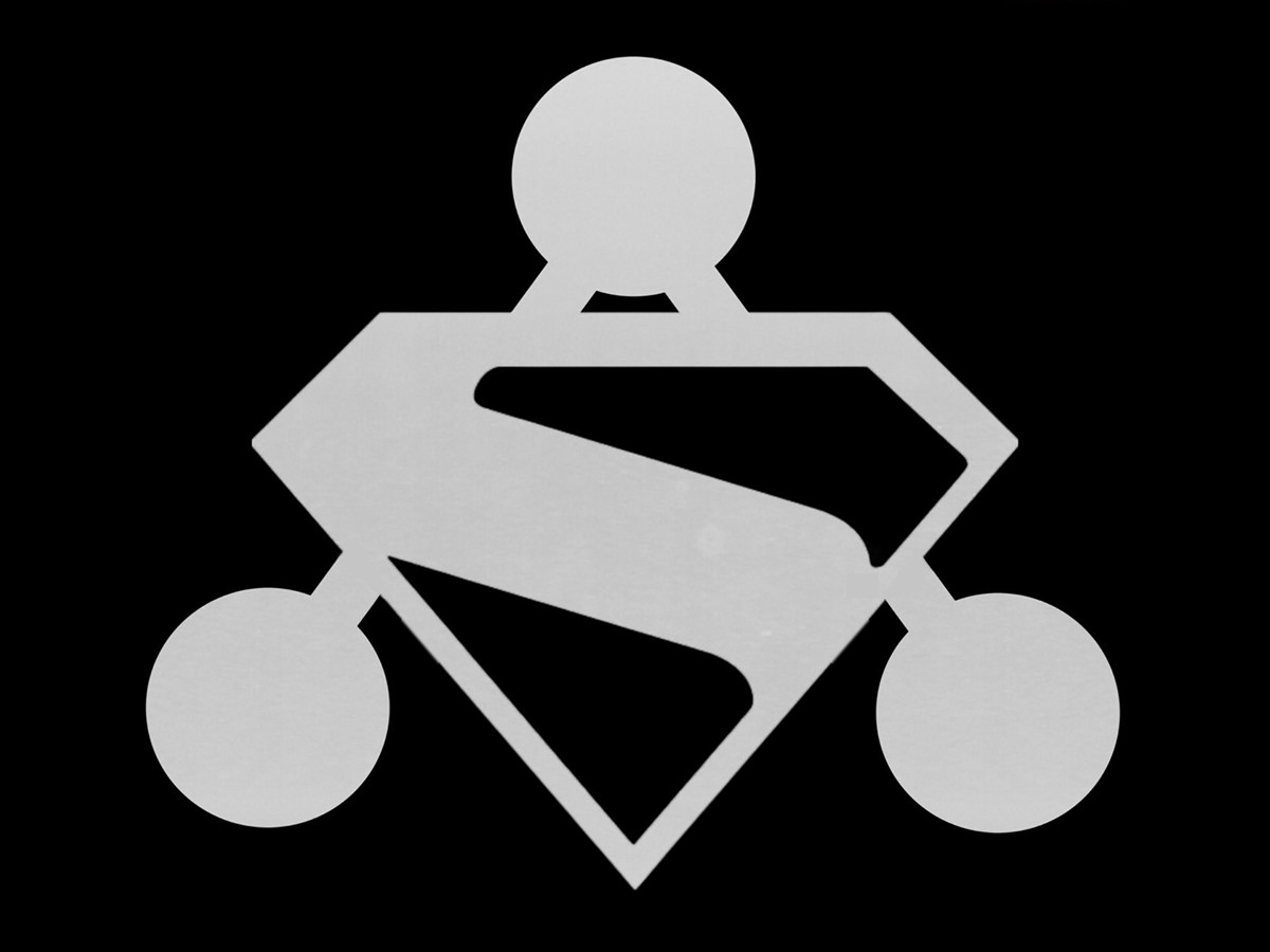
So, as you can clearly see, I hate this logo for two reasons (though there's a third I didn't mention: you should be able to see the Brainiac connecting lines through Superman's logo).
I sincerely hope this travesty isn't the final logo. And, if it is, I hope that the movie ends up being better than this would indicate.
 Thanks to the absolute madness that is Daylight Saving Time, I get a week of cat anger as they adapt to the time change, but I'm not in a panic yet... because an all new Bullet Sunday starts... now...
• NEWSFLASH: Lay’s Rebrands Because Customers Apparently Didn’t Know Chips Were Made With ‘Real Potatoes’. Because of course. They haven't had "Potato Chips" on the package since 2007... and I guess those potatoes on the package aren't a big enough clue. That being said, the Lay's rebrand is gorgeous. Kinda. The new logo typeface looks fresh while honoring what came before. The banner is so much better, looking like a design element instead of a weird merging with the sun(?) behind it. And, yep, it IS a sun, because now they have nice rays behind it. Perfect. And I love the wood table look of the background...
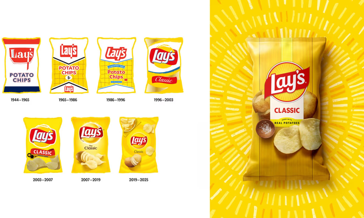
BUT THEN... they just take random photo elements and glop everything to the logo unit? What a mess...
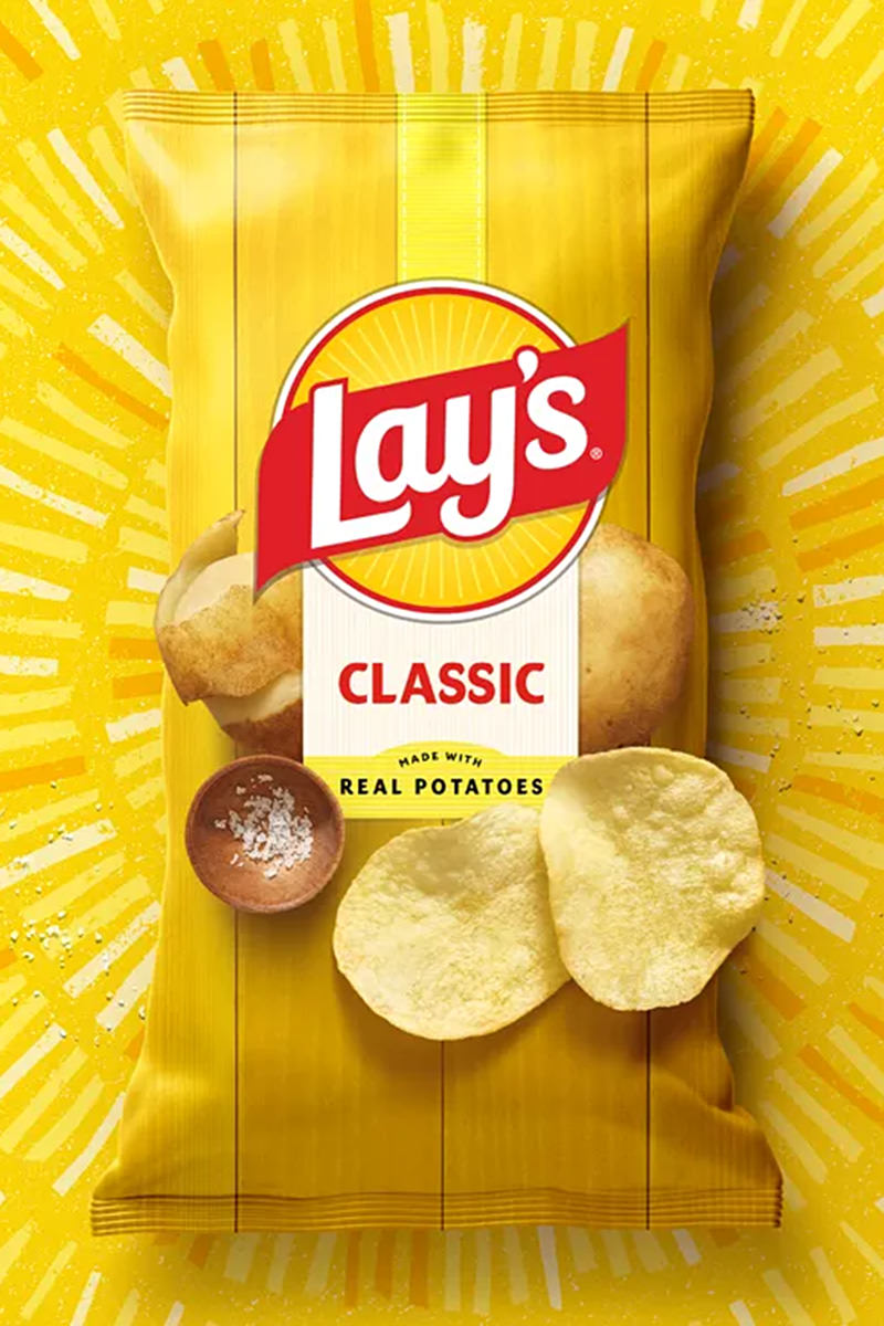
AND COULDN'T THEY HAVE STAGGERED THE POTATOES A LITTLE BIT??? OR RE-THINK THE PHOTO ELEMENTS COMPLETELY? WHAT DESIGNER JUST STICKS EVERYTHING TO THE LOGO LIKE IT'S A GAME OF KATAMARI DAMACY??? ACK! ACK! ACK!
Lay's created a gorgeous new logo then sabotaged it utterly. Those chips don't even look like chips (they look more like Pringles) and the potatoes are smaller than the chips they spawn? And because the taters are evenly placed, they look like a new design element which distracts the eye from the logo... they look like boobs on the bag or something? What were they thinking? This is a gorgeous treatment that is completely ruined by the photo elements being badly chosen and badly placed. Blergh. Such a missed opportunity.
• Property Brothers! BWAH HA HA HAAAAA. Things like this are when Saturday Night Live shines...
Biting satire that's funny because it's true. This is our reality.
• Precious Development?!? Parents are free to make decisions about their kid all they want. I mean, I draw the line when they are endangering the child but, for the most part, you do you when it comes to decisions about your own child. But this is abhorrent...
Fuck you and your Rainbow Bright face glitter shit. If you don't provide the teacher with alternative treats, what is the teacher supposed to do? Give everybody a treat EXCEPT your kid? How pissed off would you be then? It's entirely different if a kid has a peanut allergy and he was given peanuts. But a ring pop? To which she supplied no alternative? Like the teacher is supposed to go out and buy every alternative her class might require ON TOP OF the ring pops she already spent HER OWN MONEY on?!? Get fucked.
• Dear Deere! Another must watch video. "Why can't people repair the things they buy?" Because companies love money. iPhone broken? It can't be repaired by anybody but Apple or it gets bricked. McDonald's ice cream machine broken? Can't be repaired by anybody but the manufacturer or else you get sued (which is why they're always broken). Tractor broken? Can't get it repaired by anybody but John Deere because it's locked behind the software paywall. Spend a half-million dollars on a piece of John Deere equipment? You don't own it. They do. You're just paying for the right to license it. This is all kinds of fucked up, but corporations own the government, so they can do whatever the fuck they want to...
You don't own shit even if you pay for it. And lobbyists will keep spending billions to own politicians to keep it that way. God Bless 'Murica. But there is hope. "Right to Repair" laws are becoming a reality because politicians are being called out for their bullshit. More and more people need to speak out against this crap so that politicians will have no choice but to listen.
• Pepita Perfect! Last night I made one of my most favorite dishes: butternut squash ravioli in browned Kerrygold butter, crispy fried sage, toasted pepitas, and black peppercorns (which have been ground with a dash of nutmeg)...

I really need to buy a pasta roller so I can make my own though. Rana makes some good stuff, but I would prefer it without the orange color, as God intended, so it looks more appetizing instead of an orange blob. But anyway… a simple dish that’s also a bit complex in flavor.
• I HAVE TURBO PENIS! Yes, it happened to me! Lord how I love these debunk videos. Nobody does a takedown like Professor Dave. This should be mandatory viewing so that people understand how fucking stupid anti-vaxer "leaders" are...
The VAERS examination had me howling. How do people get duped by these idiots? It makes me crazy. We are losing herd immunity because people actually listen to these moronic douches.
• Men HATE This! GAG!!! I'm of the opinion that people should feel free to wear whatever the hell they want to wear. If you like it and it's comfortable and you can afford it... go for it. Nobody else has to approve. Nobody else's opinion matters. They aren't wearing it... you are. Which is why when I ran across this condescending gatekeeping asshole's YouTube channel, I couldn't roll my eyes hard enough. It's one thing to offer suggestions as to what people should consider wearing... it's quite another to pass judgement in the most immature and idiotic way possible. I mean, just look at these thumbnails...

She has very serious opinions as to what you're allowed to wear when you're over thirty. I'd argue that some could say that a woman over 35 shouldn't be wearing belly shirts as she's often seen doing... but I'm not a sanctimonious douche who spends my time gatekeeping clothing for views. Especially when you're acting like a fucking ten-year-old. An adult would realize that some people have to wear whatever they can afford... or whatever they're handed. So making fun of them or condemning them is a dick move. As it is when you make fun of people for wearing what they like.
• NEWSFLASH: RFK Jr. concedes administration lacks scientific evidence on Tylenol claims. OF COURSE THERE ISN'T ANY EVIDENCE, YOU STUPID FUCK! And yet you had the president announce to the world that Tylenol "causes autism." What kind of idiotic shit is running through your worm-riddled brain that you are so confident in spreading this crap misinformation? What kind of idiotic shit is running through President Trump's dementia-riddled brain that he believes your nonsense instead of ACTUAL FUCKING SCIENTIFIC RESEARCH?!? Christ, I hate living in the stupidest fucking timeline.
And now back to spending an extra hour of my Daylight Saving day.
I'm not exactly sure why I'm taking time to fire off some bullets given how much stuff I have to get done today, but here we are... because an all new Bullet Sunday starts... now...
• The Hawk! I had just finished rewatching Hawkeye, easily my favorite Disney+ Marvel Studios series, and was commenting how I wanted a second season so badly. Then this happened...
@high_performance Jeremy Renner reveals why Hawkeye Season 2 never happened... 👀🏹 Jeremy's episode with us is available now, exclusively on the High Performance App! 🙌 Jeremy Renner's 'My Next Breath' is available in all formats now, published by Simon & Schuster UK #avengers #jeremyrenner #hawkeye #hawkeyeseason2 #disneyplus ♬ original sound - High Performance
Well, shit. The guy was literally a part of billions of dollars in profit for Disney, and they want to pay him half of what he got for the first season? It's beyond shitty that this is how he was treated. Especially given how brilliant his series was.
• Unkerned! What is it with all these letter kerning crimes against humanity? This is atrocious. The Catholics couldn't get a designer for a tomb THIS important to them?
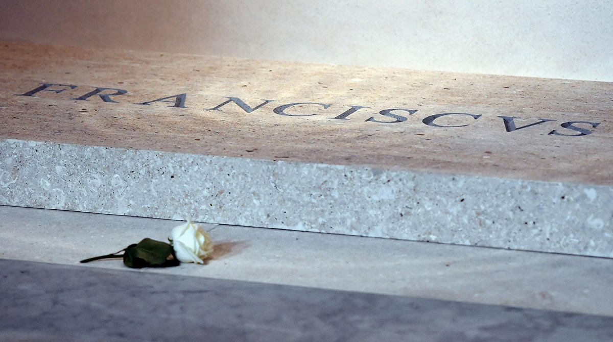
Literally "FR A NCISC VS" on that marker.
• Use The Force! Oh yeah, before I forget... May The 4th Be With You today!
Every once in a while I wonder what the world would be like if Star Wars never happened. It's honestly impossible to imagine. So much of sci-fi hinges on this one film. Sure there was the Star Trek TV series that came before it, but that was seen as a failure at the time (kept alive only by force of will from Lucille Ball and Desilu Studios). It was Star Wars that redefined what it means to be a blockbuster, and paved the way for so much of the science fiction we ended up getting. Sure, there might have been some other sci-fi movie that filled the void that the absence of Star Wars would have left... but I cannot even fathom what it might have looked like.
• Five Year Mission! And speaking of Star Trek... whenever I find an ad that I willingly want to watch, it makes me loathe bad ads even more. This ad is gold, and I love that the actors were game to do it...
Star Trek: Strange New Worlds is the show that basically sells itself with its genius (and I cannot wait for the upcoming season), but it's nice to know that when they have to sell it they're trying to be interesting about it.
• Construction! Oh man. If you like carpentry, watching an American-style house get built by a Japanese carpenter is your new bliss...
I'm not saying that the final result is the design direction I would have taken... but the artistry that was involved in creating this incredible structure can't be denied. What a cool video.
• Elevation! Here's what's possible when you don't hand over the bulk of your country's GDP to the industrial complex that supplies your war machine...
It's proposed that the 2026 Military budget will be increased to $1 TRILLION DOLLARS. It's so absurd how modern warfare has changed so radically when it comes to how battles are fought, yet we're still throwing money into building this vast military force like it's the 1980's. I don't get it. I really don't. A trillion dollars?!? And we've got $92 million going to go into a fucking military parade on the president's birthday? What the fuck?
I mean, when you think about it, this is hardly surprising. But we're cutting NPR and PBS funding for this senseless crap? Seriously? We're cutting childhood cancer research for this shit? THIS?!?
• NEWS: CDC reports 216 children died this flu season, the most in 15 years — Congratulations anti-vaxers... things are looking up for you! Just think of how successful your campaign will be now that RFK is championing your cause! Maybe you'll go from hundreds of child deaths in 2025 to thousands in 2026! I mean, that's what you want, isn't it? That's the goal?
Not exactly sure how to wrap this up after delving into childhood cancer and easily avoidable child deaths. So... see you next week. I guess?
 If you've read this blog for even a short amount of time, you know I love maps. Especially maps that present their information in a unique or clever way.
Simon shows you maps (which is an essential follow for map nerds) shared this incredible old map poster from Quantas Empire Airways, which puts their hub at Sydney in the center, then unfolds the world around it with mile-markers so you can know how far away they fly...
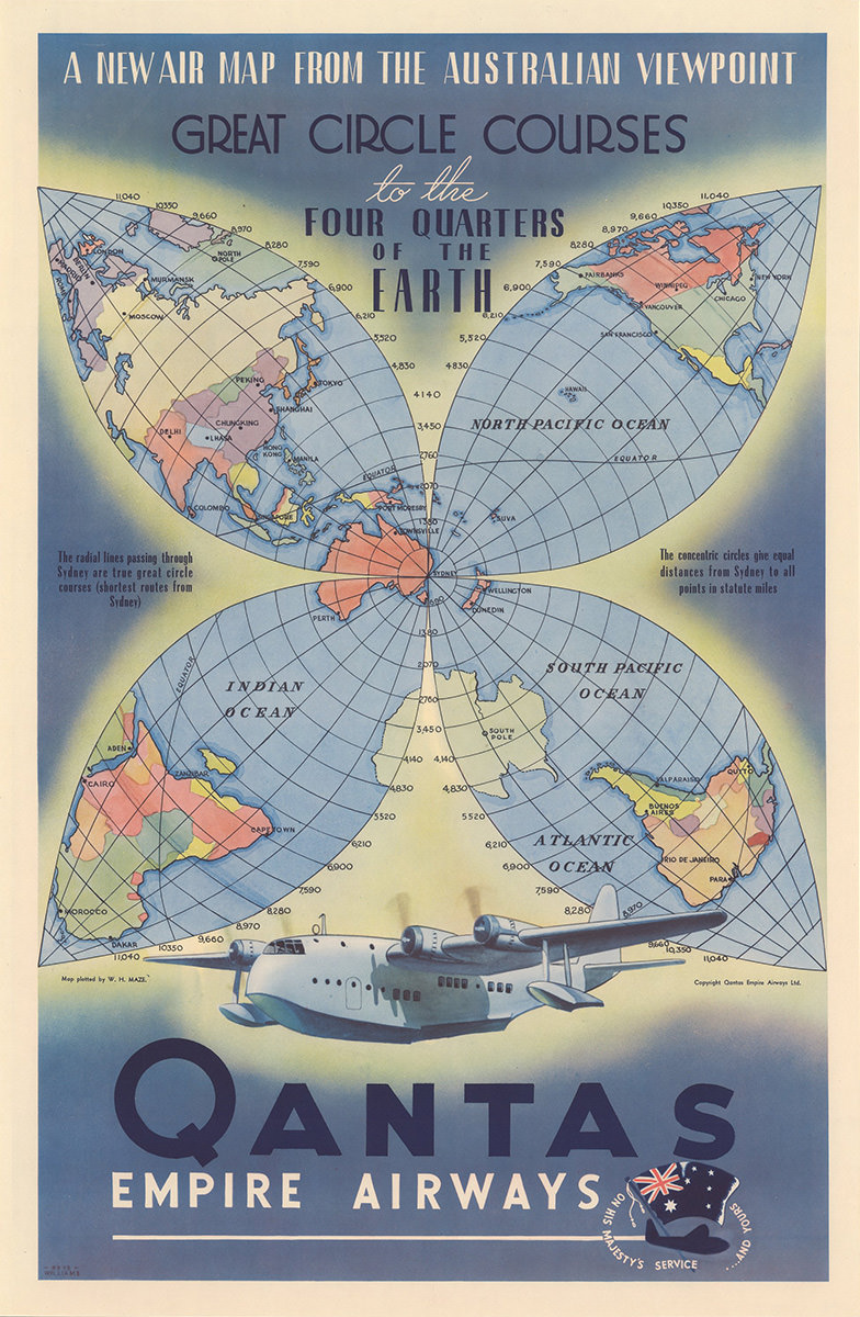
On top of being unique and clever... it's also gorgeous. Truly top-notch map-making and design.
If you want to see the poster in all its hi-res glory, you can go right here.
 For the LOVE OF GOD, Coca-Cola... could you please stop making it exponentially more confusing to buy your products?
I walk into the mini-mart to buy a Coke Zero. But instead I have to stand there for five minutes trying to figure out which bottle is just plain ol' original Coke Zero. You're flooding the market with a stupid number of variants that nobody gives a shit about which reduces the number of lanes available for the product everybody wants. then you keep changing the labels and hiring shitty fucking designers who let promo art TAKE PRECEDENCE OVER YOUR FUCKING PRODUCT NAME?!? I needed a pair of reading glasses to suss out what the hell I was holding, but I didn't have any so I had to take a picture with my phone so I could zoom in and see if this was actually Coke Zero...

At the BARE FUCKING MINIMUM you need to have an EFFECTIVE calm space behind the product name so that consumers older than 30 CAN ACTUALLY READ WHAT THE FUCK IT IS. And why are Coke and Coke Zero the same color? Make Coke signature red. Take Coke Zero back to black. That would eliminate 50% of the confusion right there.
Stupid marketing shit drives me insane. It drives me thermonuclear insane when companies with millions of dollars hire design firms who don't know how to market products correctly. Making sure the customer can quickly and easily understand and find your product is Design 101. Stop working with shitty design firms who don't know the ABSOLUTE BARE MINIMUM OF EFFECTIVE PRODUCT DESIGN.
I'd redesign their labels for free just so I could find the shit when I walk into a shop... but effective design isn't something Coke gives a shit about, apparently, so I guess I start taking reading glasses to the mini-mart.
 The SNL video below is making the rounds again. It's hilarious because it's based on reality. This was the talk in design circles for months, where we were all laughing our asses off that a movie with a massive budget that's grossing such huge bank had a logo making from fucking Papyrus. An overused bargain basement font that's installed on computers by default. And of course they didn't pull this same bullshit again with The Way of Water. Once was humiliating enough...
It surprises me greatly that this sketch ever made it to air. Only a small number of people who see it are going to "get it" fully... and I'm guessing roughly half of the people won't understand it at all.
Probably why it's one of the funniest things that SNL has ever done.
 This is part three of a three-part dive into the redesign of Thrice Fiction magazine on the occasion of releasing the first issue of Volume 2. If you missed it, you can read Part One right here and Part Two right here.
With all 27 FREE issues of Volume 1 of Thrice Fiction, I had the luxury of color. It was designed from the very beginning with color in mind. The focus of each issue, the stories, were (out of necessity) black and white for readability. I carried this theme to the contributor photos, which were also black and white. Everything else (i.e. the art) would be in color.
The problem with color is that it's expensive. Very expensive. But you can justify it when you have a small number of pages because the cost doesn't have a chance to accumulate that much. Since the format for Volume 2 was over a hundred pages, it wasn't an option. All interior pages would be black and white so we wouldn't have to charge $50 a copy.
All our artists were in a pandemic for 2020, so I decided to just do all the interior art myself after a few false starts in rounding up contributors. This actually turned out for the best, because I had no idea how our publisher (Lulu) would reproduce greyscale art. Since it's just me, I made a list of different styles to experiment with... line art... photo art... vector art... and so on.
And here's how that went.
Ann Bogle is a remarkable writer and it's always been a thrill to see her work in our pages. Needless to say that when RW informed me that she would be the "featured contributor" for our debut issue, I was thrilled. I read through all her stories a couple times looking for an idea... but I kept coming back to the second paragraph of her very first story, Credenza, where it was Abe Lincoln's 200th birthday. It's just too dang good an image to ignore. So I didn't...
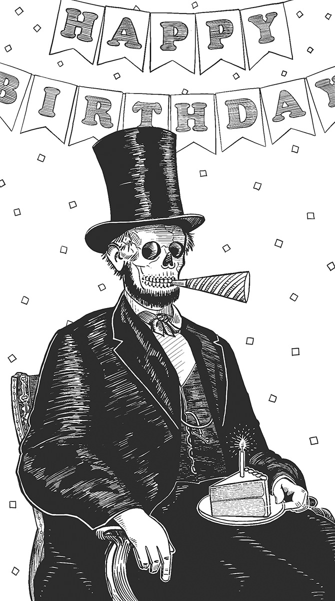
Originally there was no "happy birthday" banner in the background, as the idea was to put a party hat on top of Lincoln's famous stovepipe hat. It proved too clutzy, so I made the change. Also? Abraham Lincoln was originally drawn as a decomposing corpse, because that's the only way I could still have his beard on there. But that was pretty gruesome, so I went with a skeleton head, left the beard, and took all the rotting flesh off his hands. No, it doesn't make sense, but I actually think it's more humorous this way. This was knocked out on my iPad in ProCreate over a couple nights while watching Hallmark movies.
If you read yesterday's entry, you know that I was originally planning on the cover being a little boy looking up to the heavens as missiles stand ready to launch (for our relaunch, get it?). I thought this might be a little dark, but I liked the idea of the image so much that I decided to draw it up and slap it in the interior as a break-point...
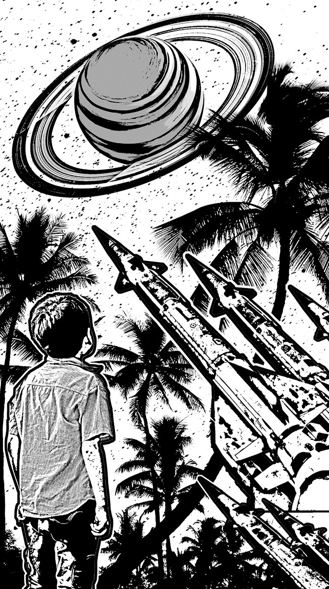
I thought this actually turned out better than what was in my head. I also think it probably works better as a block-cut than a color painting. The palms are extracted from a photo I took on the Big Island of Hawaii. The boy, Saturn, and the missiles are stock photos I cut out. It was all assembled in Photoshop, had extraction filters and edge filters run on it, then I imported it to ProCreate on my iPad so I could add texture and linework.
Amantine Brodur's work was a tough challenge to typeset because half of what makes it work is the formatting. Translating the formatting of The Anaphora House from a MS Word document to book pages took a long, long time of goofing around until I was satisfied that I had done the best job I could. Then a couple days later I would look at it again and decide to change half of it. =sigh= There was an abundance of riches to be had when it came time to figuring out what I wanted to do for the art. But once I got to the section titled Empires of Toast I just knew that was going to be where my piece came from...
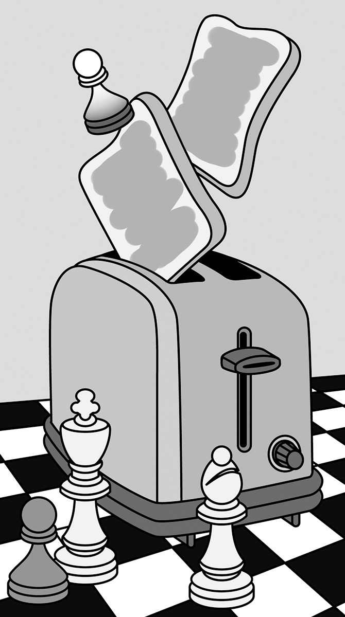
This is just pure symbolism, "empires" being represented by a chess set. I knew I wanted a toaster ejecting "toast" on the board, but I took it a bit further than that. The "theme" of our "Subject Paper" this issue was discussing "cultural appropriation." I drew a white pawn also ejecting from the toaster, the idea being that it wants to appear black, but couldn't take the heat that comes from being black. Deep, I know.
Eckhard Gerdes packs a lot in the slightly more than four pages of The Babble-Ons. I went from worrying that there wouldn't be enough visual ideas to draw from... to being completely overwhelmed by how much there was to choose from. I abandoned the idea of pulling literal passages and instead combined a rowboat and snails because I thought it would make for a fun image...
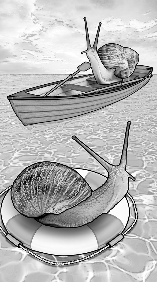
Don't ask me how that snail is rowing his boat. This is a half-dozen stock photos which have been reworked and combined into a single image in Adobe Photoshop... then outlined in Adobe Illustrator. I wanted to have an example for future artist contributors so they could see how photos reproduce at Lulu and how contrast has to be heightened to get something other than a mushy grey blob. It took a lot more effort than I was anticipating, and I'm pretty sure I put in just under three hours for an image that would have taken me 20 minutes if it were in color.
Art was never going to be the focus of Volume 2. It was always going to be the written word. But I still wanted some art in there to add breaks between sections and pieces. This was an idea I had years ago that I never did anything with, but kinda liked the thought of dusting it off and retooling it to be a collage overlaid by block-print. Something about the concept of aliens invading and not caring which god you worship reeeeeally stuck with me...
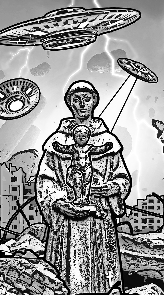
I cannot for the life of me remember where I took the photo of the monk with baby Jesus. I want to say Italy maybe? Columbia? I think it was in a courtyard somewhere. Could even be New Orleans. Since I pulled the photo out of my archives quite a long while ago, I can't remember. Everything else is composed of eight stock photos that I chopped up and combined. Before I started converting, painting, filtering, and drawing on top of it, this is what it looked like...
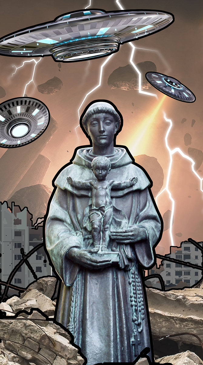
Had I done this in color, I would have painted over everything to make it "more my own" since all the pieces around the statue were created by somebody else. But it worked really well as a block-cut, so I spent considerable time massaging the pieces in Photoshop so it would work well. Minutes before publishing this issue, I went in and changed baby Jesus's eyes and the cross on the monk's robe to pure white and did a heavier outline around Jesus so they stood out better.
Originally I had created this art for the subject essay Who Do You Think You Are? by Franny Forsman which discusses cultural appropriation. This is a subject which hits at me personally from a number of different directions, and almost everybody has an opinion... from weak ("I don't care and don't see anything wrong with it because it doesn't affect me") to very strong ("This is pillaging my people and my culture and using it in inappropriate ways which I find deeply insulting"). Despite being 100% white boy with a "cultural heritage" that consists of a hodgepodge of other cultures (AKA "no culture to speak of"), I am in the latter category. And it stems from the simple idea of just being fucking decent and kind to people. If somebody tells you that their culture is not a costume and they are offended when people treat it that way... just pick a different Halloween costume. If somebody tells you that your football team has a shitty name and mascot because it is taken from a painful slur celebrating genocide against their people... just pick a different name. This is not rocket science, and you have to be kinda awful to not want to change when it's pointed out to you. And that's what I was trying to say with this piece depicting a butterfly seeing a poster advertising a movie about a butterfly... starring a cockroach...
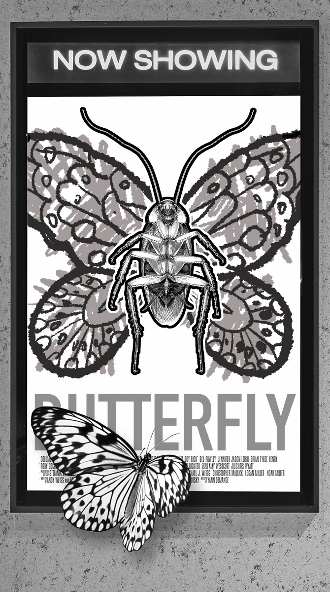
This is a composite of a bunch of stock photos that I cut into Photoshop (though I think the butterfly image is mine, taken from a butterfly sanctuary in Australia). The butterfly wings on the cockroach were drawn on in Procreate because I wanted them to look like they were badly colored with a crayon. The credits for my fake movie Butterfly are actually taken from the movie poster for White Boy Rick, which seemed appropriate. Ultimately I worried that any art put in front of such a serious subject would be distracting and inappropriate and decided to go with no art at all. But I kinda liked what Cheap Imitation was saying, so I stuck it at the back of the book.
And there you have it... all the art I came up with for the first issue of Volume 2! You can see it all in print by buying a copy with its glorious 128 pages for just $12 at the Lulu Book Shop. A bargain at half the price with some cool stuff to be had!
This is part two of a three-part dive into the redesign of Thrice Fiction magazine on the occasion of releasing the first issue of Volume 2. If you missed it, you can read Part One right here.
After the type had been selected and the logo had been designed, I moved to the cover. Our old magazine was graced with a variety of amazing artists contributing their talents but, just like with Volume One, I decided to do the first one myself.
I had many, many ideas.
For the longest time I had it in my head that since this was a relaunch, I was going to have a young boy on a tropical island looking up to the heavens... while a bunch of missiles were ready to launch nearby. I liked that it was implying even paradise can be meanacing. I ultimately abandoned this idea for being too dark but, never fear, I repurposed the idea for a piece on the interior.
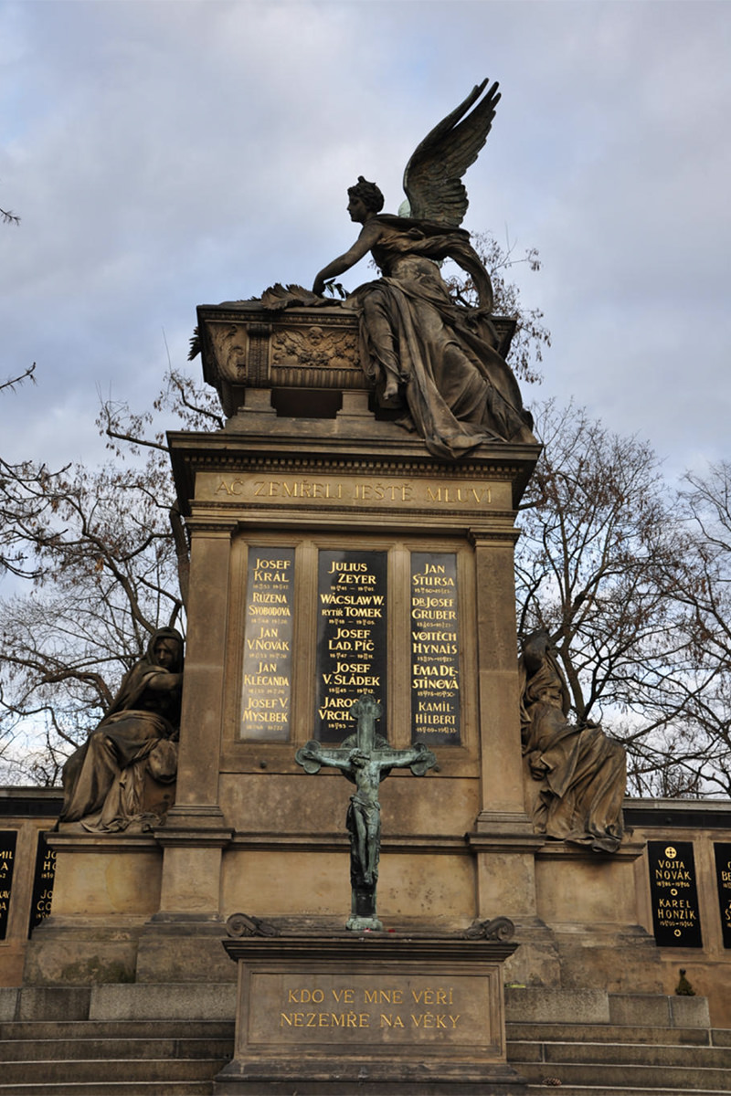
The next day I woke up and couldn't remember the name of my favorite restaurant in Prague (maybe I was dreaming about it?), so I went to my blog and searched for it (the name is Lehká Hlava, and it has my highest recommendation). Two images above where I was talking about the restaurant is one of my most favorite photos I've taken of all time...
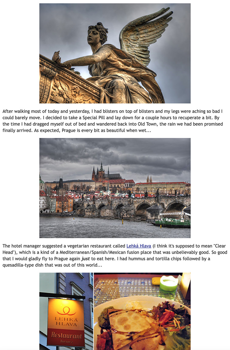
Now... you may be asking yourself... is that angel drowning a cupid baby angel in a bathtub? Or maybe a chicken? I honestly don't know, but it sure looks that way to me!
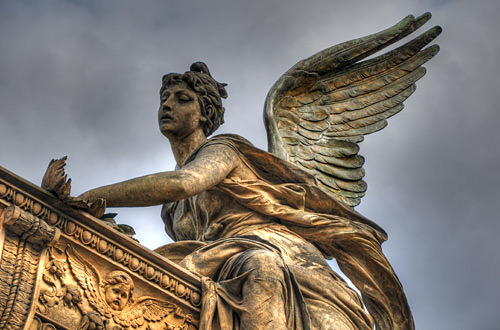
Despite the horror element, I always thought she was gorgeous. And the fact that I was blessed with those stormy skies just makes the photo that much more beautiful to me.
And that's when I had a thought... if Thrice Fiction is undergoing a rebirth, of sorts, we're essentially drowning Volume 1 in a bathtub (even though you can still read all 27 issues for FREE on our site). Maybe this is the image I'm going for?
Except this is going to be sold in book stores, and I thought the angsty, brooding, dark imagery has been done to death. Such a cover would fade into the rest of the books. Soooo... what if the angel was drowning the cupid in broad daylight... under bright blue skies? How disturbing would that be? Very. And so... I went through my photo archives to find the original image and see if it was something I could work with.
Bad news. It was cropped too tight and there wasn't enough in the original image to create a cover out of. Oh well. Back to the drawing board. Except... I had visited that cemetery on the day prior when it wasn't rainy and dark. Maybe with better weather I stuck around longer to take more photos? Turns out I did!
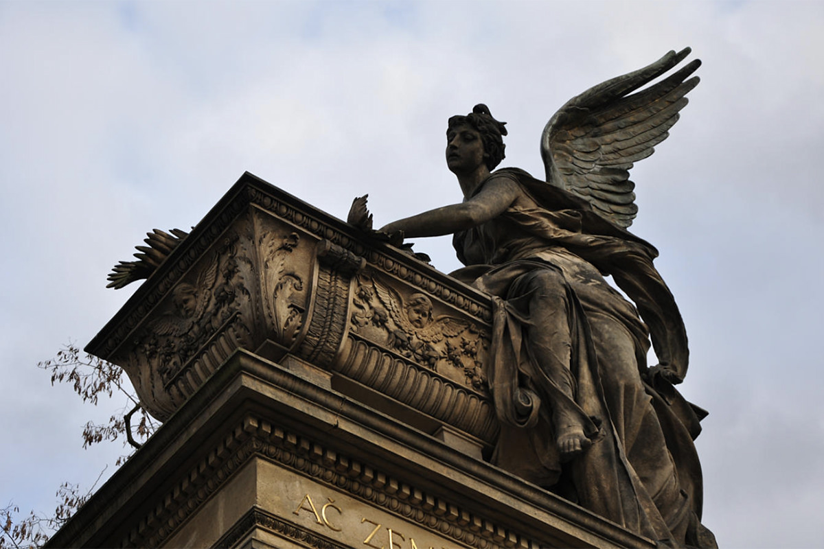
The second photo had the same angle I liked from the original photo, but it wasn't the cover I wanted. Too dark. Cropped too tight. It would never work.
Except... maybe it would if I put some work into it? Let's take a look, shall we?
Well, lightening it up a bit showed that there's enough pixel information in the shadows to work with... but how will I fill in the missing information at the bottom? Hmmm... remember that first photo that was kinda boring and flat? How about I cut out of that one and see if I can make use of it...

Oh yeah. That's perfect. I can easily warp it into a base for my murdering angel...
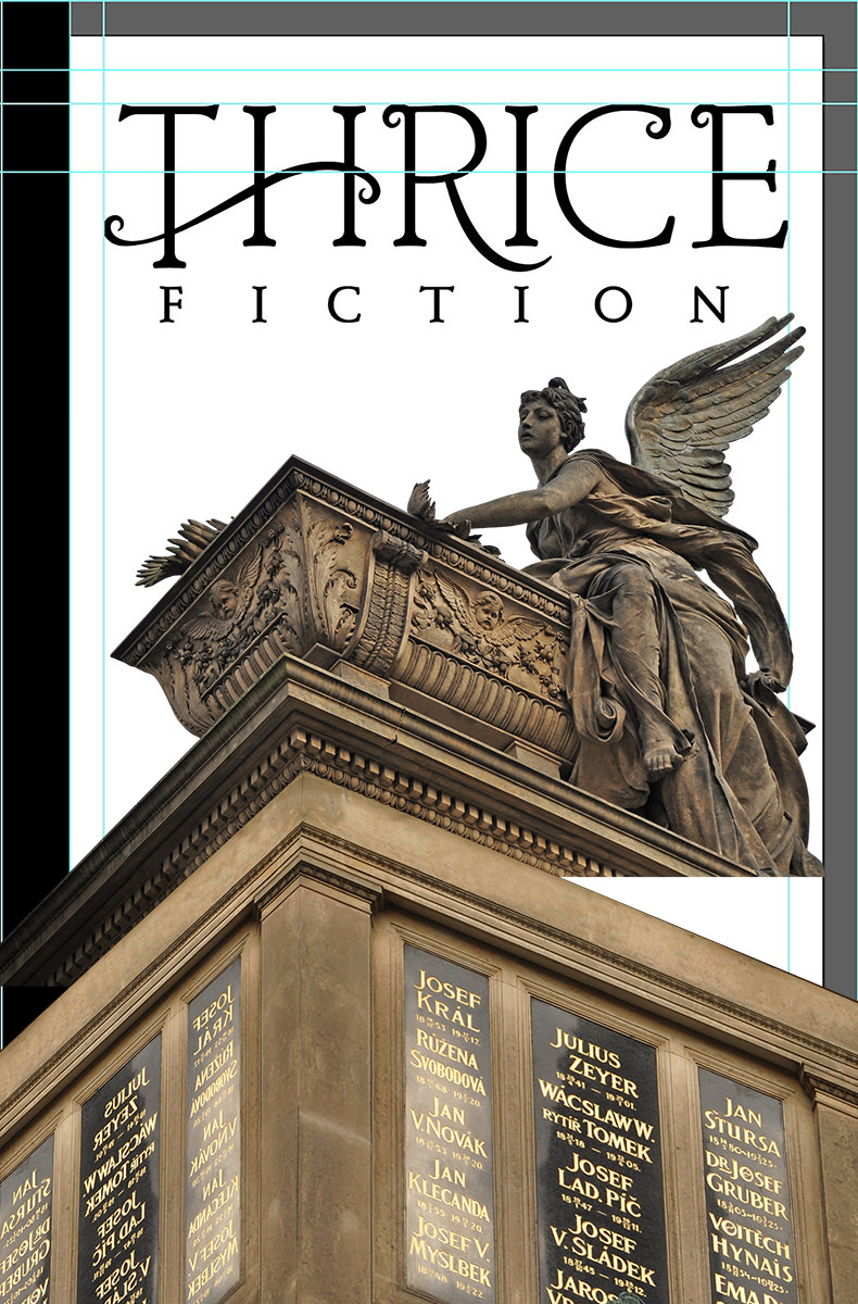
Cool. But there's still a long ways to go before this is the cover I've got in my head. First of all I have to paint in the missing bits and paint out the panels with stock photos so the names of our contributing authors can be easily read. It also needs to be much, much brighter. And maybe I could place a building back behind it to add a little visual interest? I've got tons of photos of Prague, so I could probably find one that works. And, say, what if instead of a bright blue sky I tried a brilliant orange sky in an attempt to tie everything together into a cohesive image?
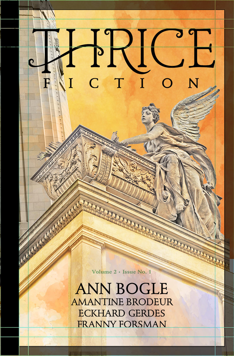
Blergh. That building is adding nothing but confusion. It needs to go. And while I like the idea of an orange sky, that's a color that doesn't reproduce well in CMYK printing, so I really think it needs to be blue like I originally envisioned...
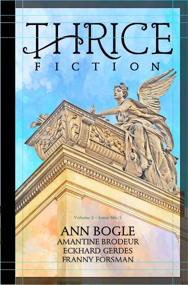
Now we're getting somewhere.
From here on out it's a lot of painting. There's a "watercolor" filter I use to speed up the process, but you can't just push a button and have all the work done for you. Well, actually you can do that, it's just that the results aren't that great. I go in and repaint features... do the watercolor filter... see what works and what needs to be worked on... undo the watercolor filter... then repeat. FOR HOURS! The face of the angel is practically untouched, and I went very light on the watercolor, because I wanted it to be easily "understood" by the reader. The further I got away from her face, the more radical the repainting becomes. I adjust contrast... add stock photo paint splotches for interest... simplify details to be more impressionistic for the watercolor filter... it's just refine... refine... refine...
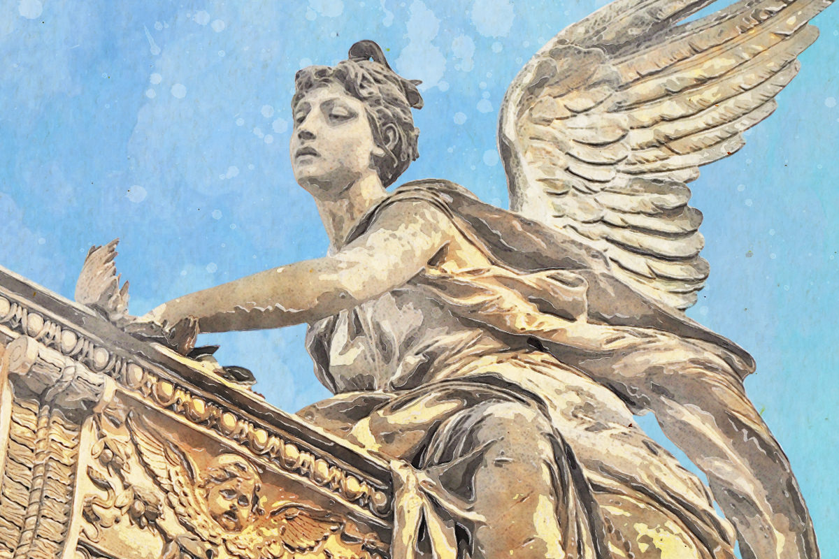
Eventually I get to a point where I've gone too far. So I step back to a previous version and I'm done. Thrice Fiction is reborn...
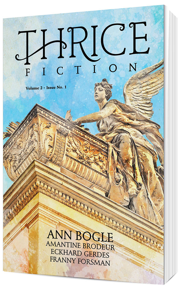
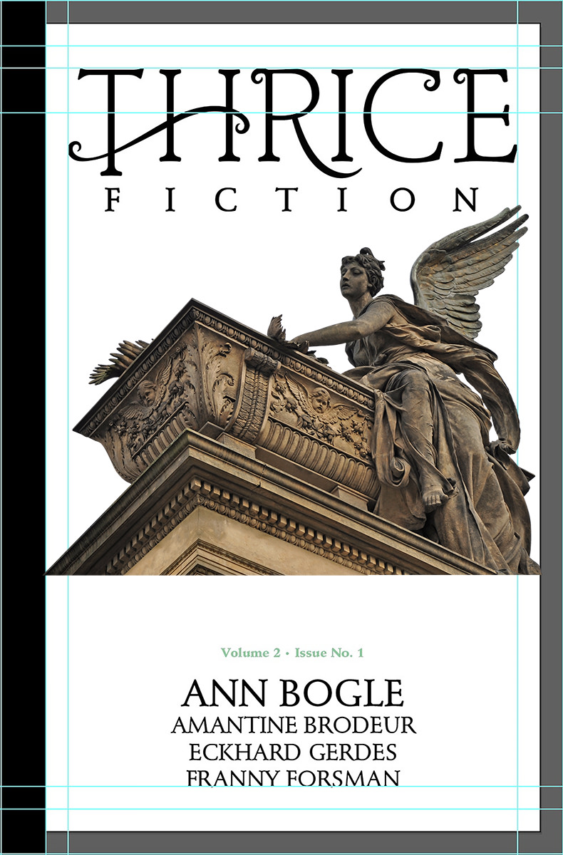
You'll note that the black strip on the left side (a carryover from the original magazine design) was abandoned. There's precious little horizontal space on the smaller book size, and I wanted to devote as much cover area as possible so our artists can fill it up. I also zoomed in on the angel quite a lot because I thought it was more impactful and prettier to look at this way.
Not exactly what I had in my head, but pretty close... murdered cupid and all. You can buy a copy with its glorious 128 pages for just $12 at the Lulu Book Shop.
Tomorrow I'll take a look at the interior of the book and go through all that drama for you. Sounds like fun, no?
After nine years, Thrice Fiction magazine (the amazing venue for short-form fiction that I created with RW Spryszak), came to an end with our December 2019 issue (You can still read all 27 issues absolutely FREE on our website).
But we're not dead yet.
RW and I just wanted to be freed from the thrice-yearly schedule that was becoming more and more difficult to keep. We don't get paid, we just do this for the love of it all, so the magazine always has to take a back-seat to Real Life. This kind of scenario is not conducive to a deadline.
And so we've relaunched with Volume 2, which no longer has a schedule. It's also no longer free, but it's as cheap as we can possibly make it (neither of us is getting rich here, we just need something to help cover our costs, which are more than you might think).
Here's our fist issue of the new Thrice Fiction...
You can buy a copy with its glorious 128 pages for just $12 at the Lulu Book Shop.
For the next two or three entries here at Blogography, I thought I'd go over the design process that went into it.
Starting with the new logo.
My goal with the original Thrice Fiction was to have the design fade away. Elements were intentionally stark, plain, and forgettable. The logo I came up with wasn't so much a "logo" as some of the plainest type I had available stacked up and centered...
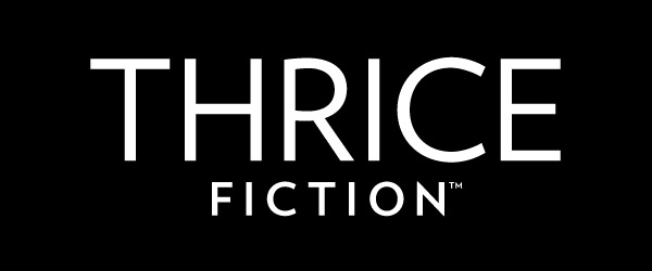
I actually had people comment about how "Thrice is pretty in execution, but plain in presentation." And I was like "Well, yeah, that's what it was designed to be!" We had some amazing artists contribute to our covers, and making sure a fancy logo didn't detract from their generously-donated work was all part of the plan.
But since Volume 2 was going to be sold in book stores and such, a different approach needed to be had. Slapping some plain type on it was not going to work, so I made a list of objectives...
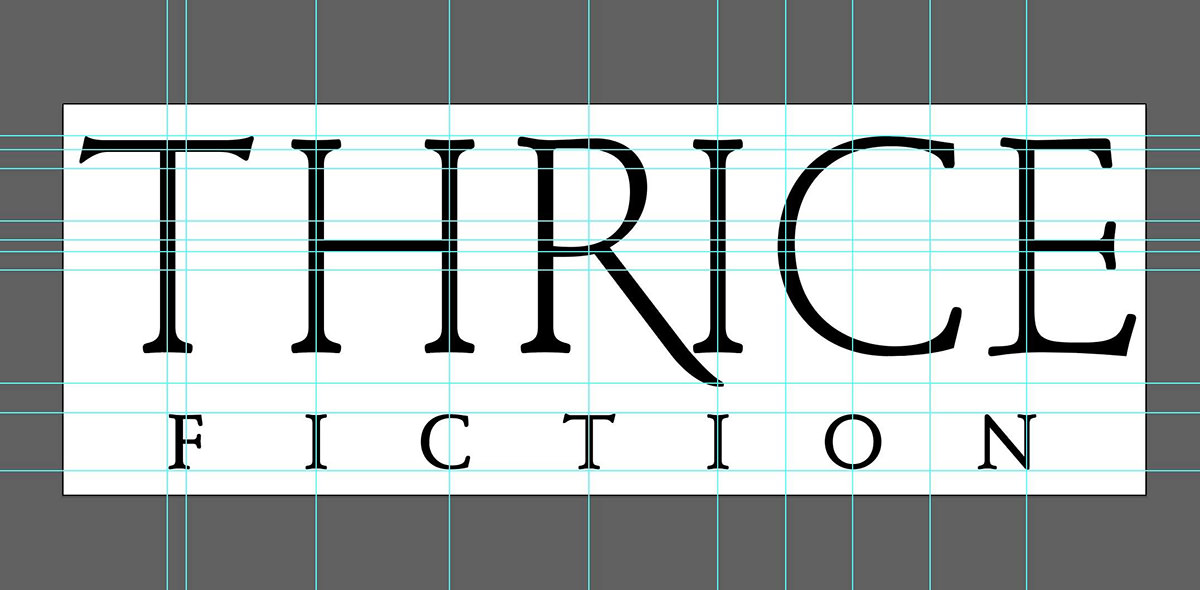
The last one, cheap was probably the biggest part of the puzzle. And so when I designed the interior I picked from typefaces which I already owned licenses for. The main typeface then became the base for the logo upon which I could build. The only "design" thing I did here was to rough in an extension for the leg of the "R" so I'd know to leave space for it...
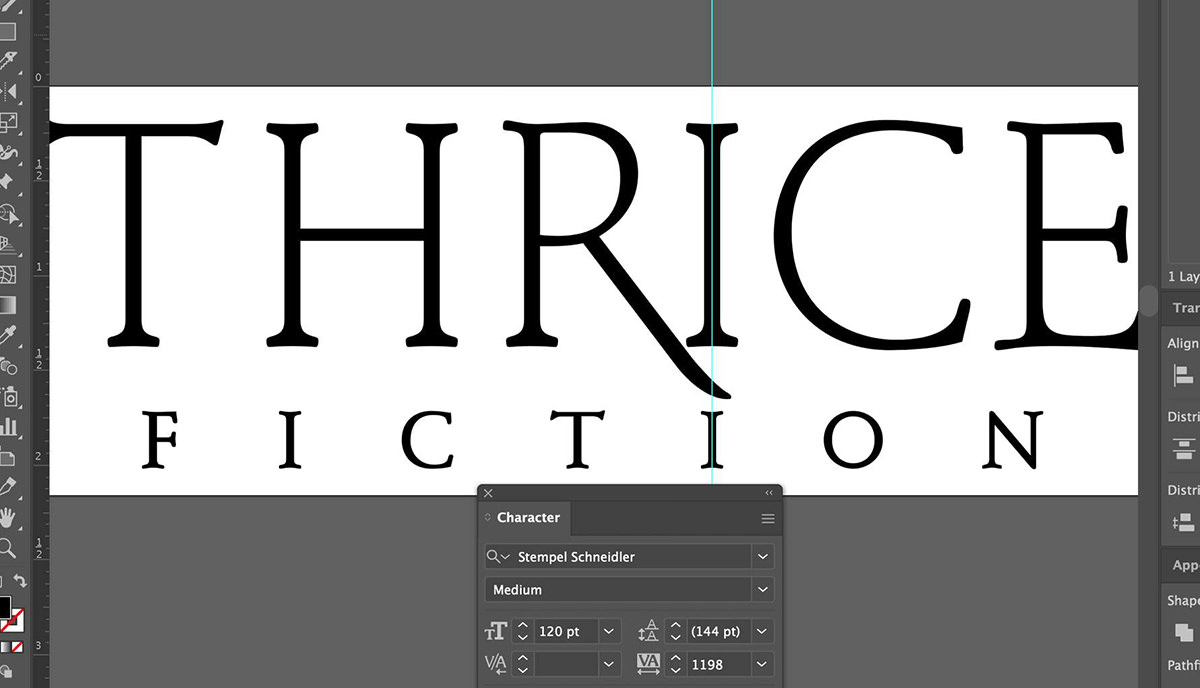
Now comes the part where my ADHD kicks in. I am obsessive about spacing consistency and working to make sure that elements are lined up as much as possible. It just makes for a cleaner logo that way. A lot of work goes into a project like this before I even get to a starting place...
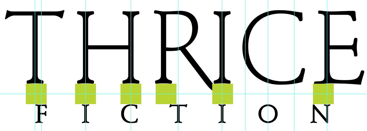
It's not uncommon for me to use dozens... or even hundreds of guides as I am figuring out the placement of all the pieces...
The "T" at the beginning of "Thrice" is problematic, because its width is defined at the very top by the crossbar. This leaves the "F" in "Fiction" looking off-center. I wanted to address this in case the logo ends up in a place where it would be helpful to look more balanced, so I roughed in a swash there so it would add visual width...
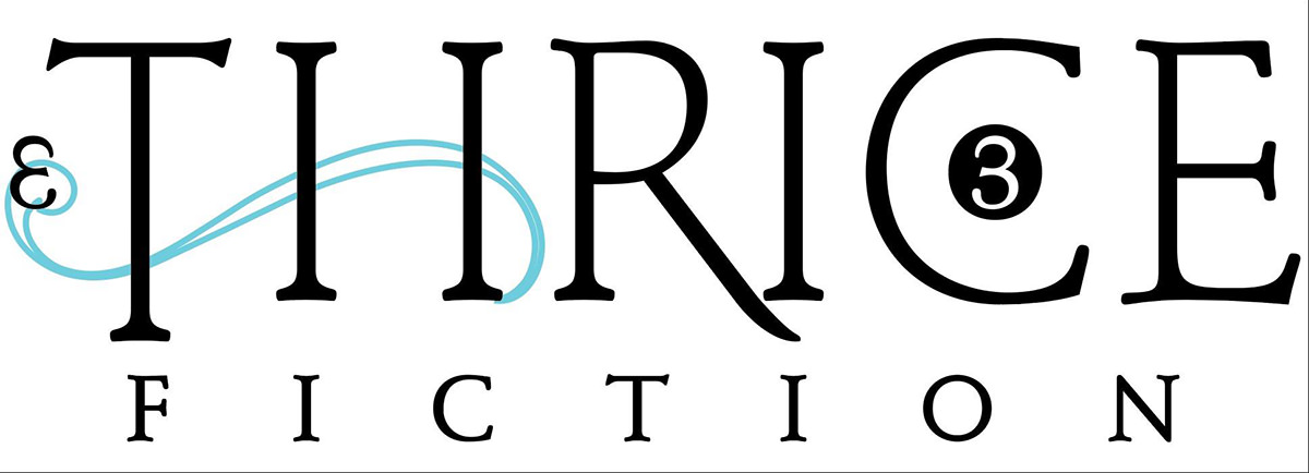
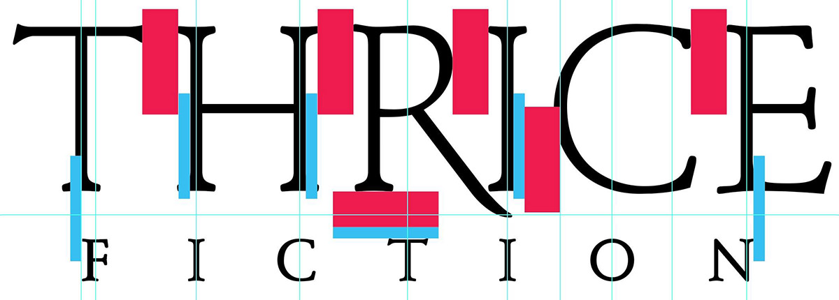
Note that at this point I planned on putting the "3" endmark (which signifies the end of each story of the interior) within the "C" because I thought it would look cool. It did look very cool. But it also added clutter and distraction, so it was dropped. Also note that I was planning on hiding a backwards "3" in the swash to be clever. This would also be dropped for clutter.
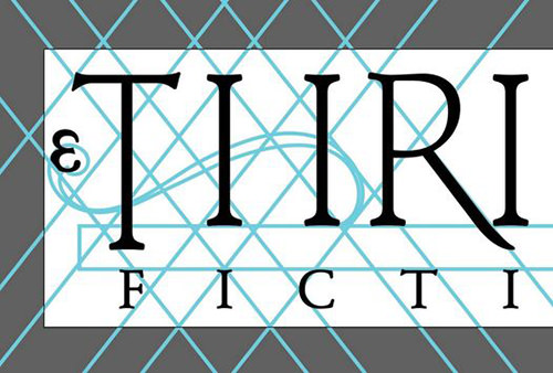
And here you can see me once again going crazy with the guides so I can line everything up in a mathematically-pleasing manner...
From there it's just endless futzing around.
Making the leg of the R be swoopy and pretty. Adding curls on the R, C, and E to tie them to the curls on the swash across the T and H. Cleaning up the letterforms by narrowing or widening the space they occupy to better line things up. That kind of thing...
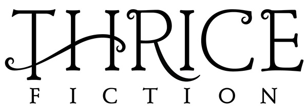
This is what I went to print with because I ran out of futzing time. There are still some minor tweaks I need to take care of until I'm happy with our new logo (starting with the swash going too narrow too quickly and looking jerky as it crosses the "T", which really, really bugs me). The work is never truly done until the deadline arrives, and even then it doesn't stop.
That's "design" in a nutshell.
Overall I'm quite happy with the logo because I think it fits my objectives well and looks nice on the shelf. So way to go, me!
If this kind of stuff interests you, tune in tomorrow when I discuss the cover art... then again on Wednesday when I discuss the interior art. Big fun awaits.
We may be at the beginning of a pandemic, but the bullets are still flying... because an all new Bullet Sunday starts... now...
• Hertz! Michael Hertz has passed away. He is largely responsible for one of the most beautiful and elegant map designs you'll find. It's the New York City subway map, which sought to simplify and clarify the depiction of the various lines by making them easier to understand...
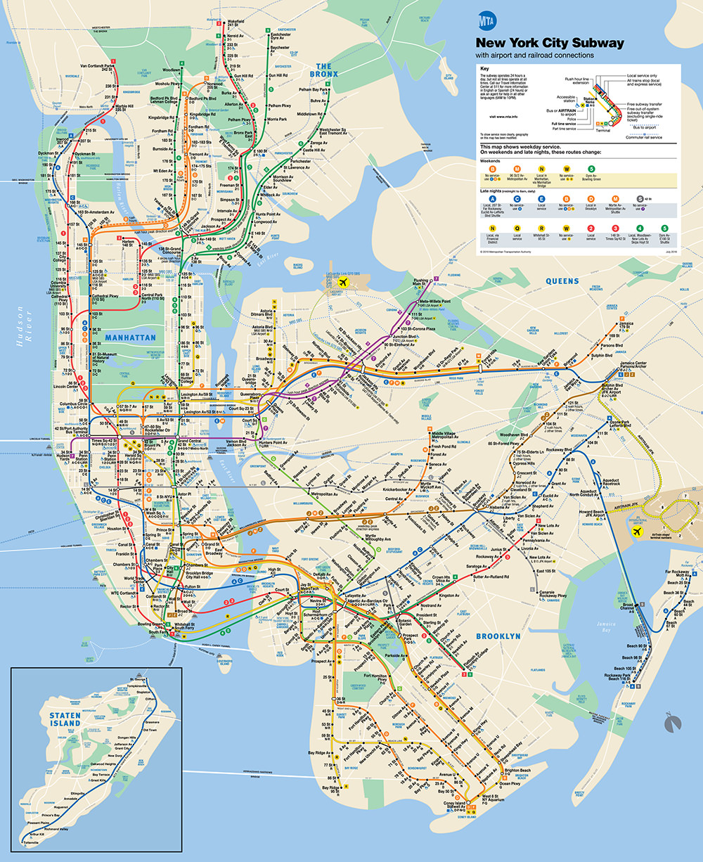
There were other versions of this map over the decades, but this modern version from 1978 is the one most people today are familiar with. It was proceeded by an equally beautiful (yet slightly more confusing) version by Massimo Vignelli...
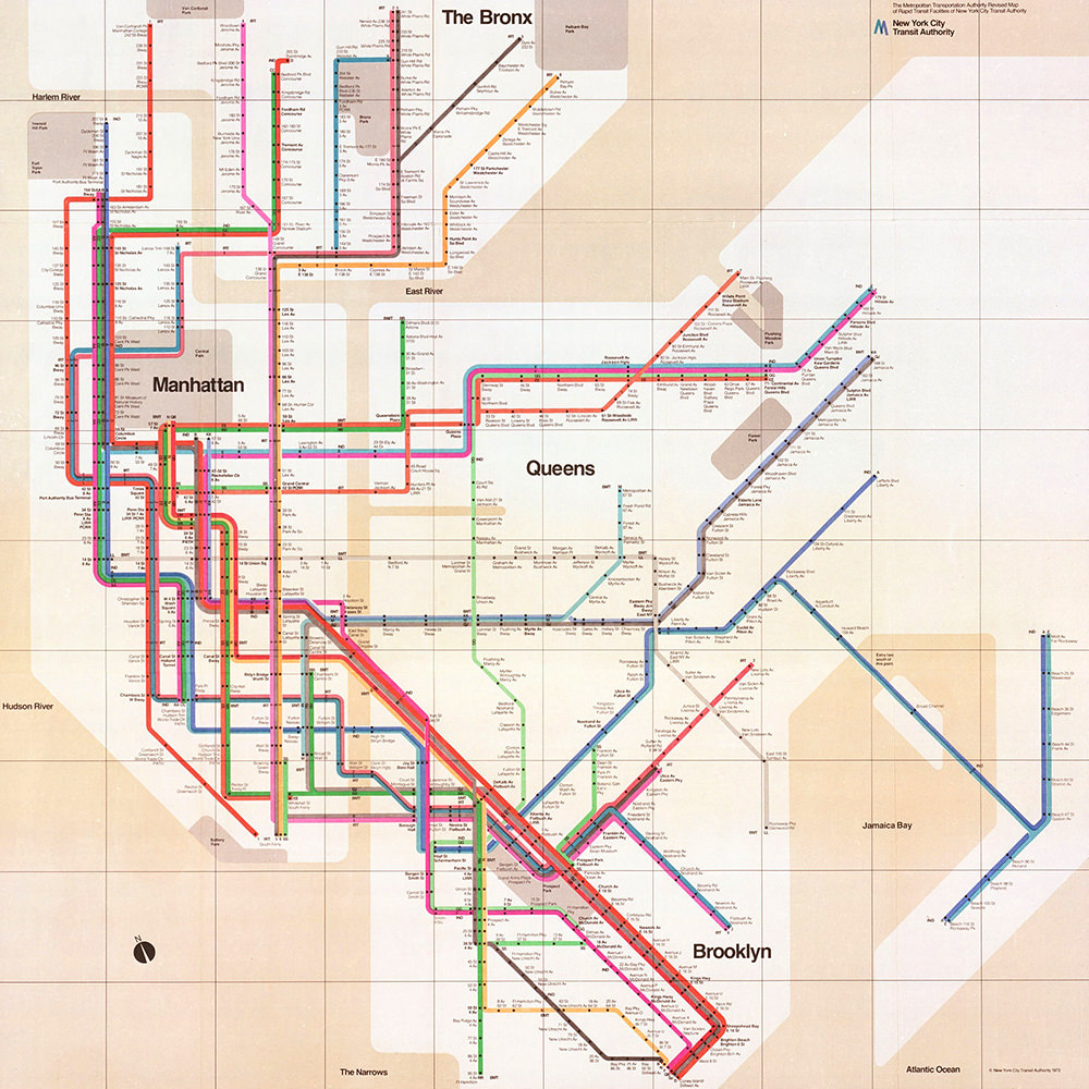
My first dozen times visiting New York City I ended up buying a new fold-out pocket subway map each time because I always forgot to bring an old one with me. Now, of course, I've just got the map on my iPhone. But I'll always have a place in my heart for the map I used for decades to get me around the city.
• Nygaard! Another designer who passed away that's definitely worth noting? Jens Nygaard, the guy who created the LEGO minifigs...
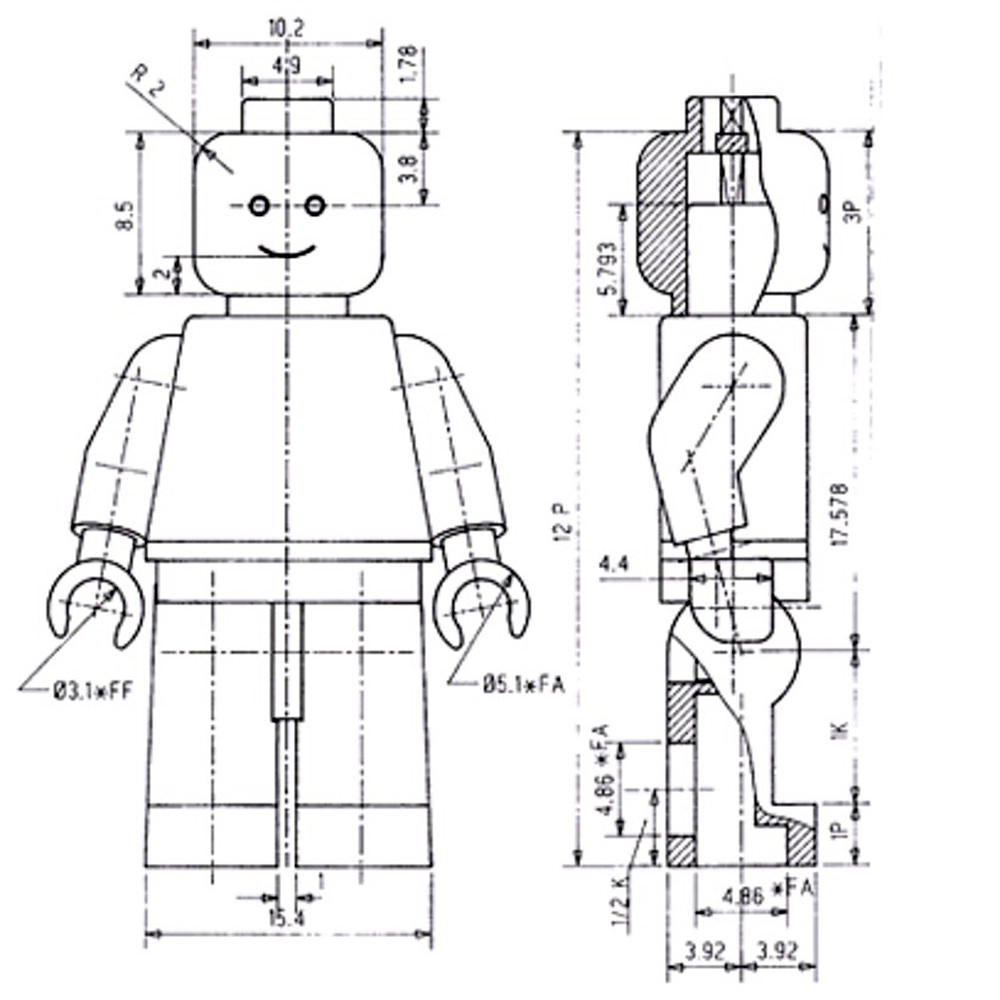
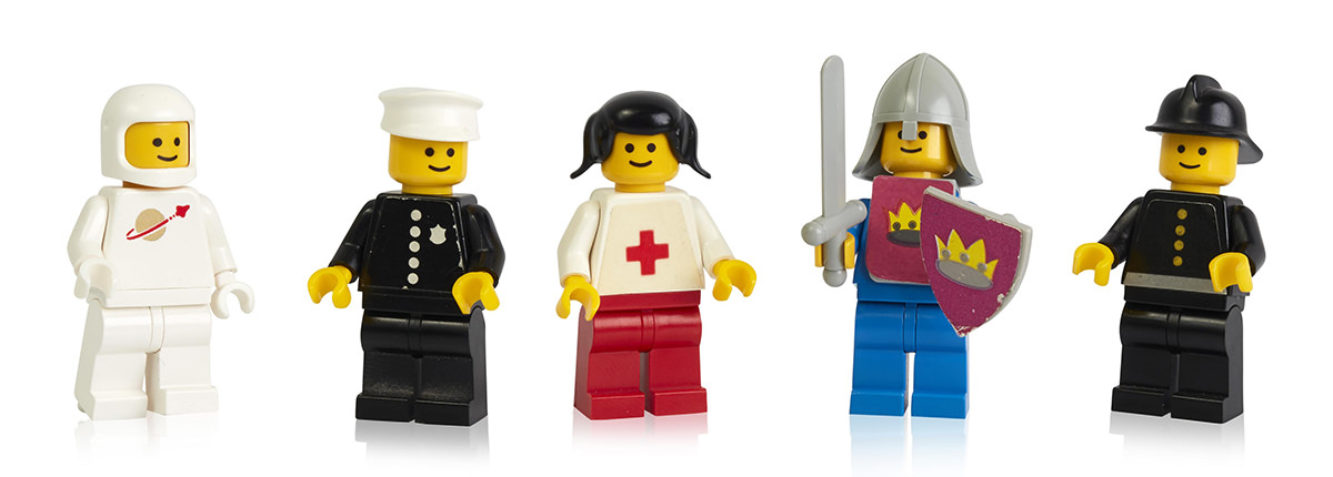
As somebody who started with LEGO before the minifig was introduced, this was absolutely a game changer. Prior to the minifies, which I believe I first got in the LEGO Space sets, we just drew a face on a stack of bricks. The "official" people of the LEGO Universe were a fantastic addition to the toy which took it in a fantastic direction that continues to this day.
• Dyson! Completing the trifecta of those who passed away this past week... Freeman Dyson. This brilliant mathematician, physicist, and astronomer (among other things) was such a huge influence on me that my pen-name, Maach Allon Dyson, was in honor of him. Because, seriously, just look at some of his accomplishments from his Wikipedia page. Though the thing that he's likely best known for... especially by me... is the Dyson sphere...
The idea is that a technologically advanced civilization would have the ability to maximize use of energy from their sun... by surrounding it with a sphere or a sphere of rings or a sphere of panels or something like that. It's a mind-blowing idea that would require mining materials from a huge number of celestial bodies (such as comets and asteroids) in order to construct. Pretty fantastic stuff.
• Apps on Parade! I ran across this video and had to laugh at just how frickin' brilliant it is at showing the sheer absurdity of Adobe's "Creative Cloud." I pay $57.34 per month to use exactly four of them... Photoshop, Illustrator, InDesign, and Acrobat. I also use Lightroom Classic to catalog my photos, but it's not something I need to have. Which means I essentially use less than 1/10th of the apps I have to pay for...
I would be willing to bet that this is the case for at least half of the people paying for Creative Cloud. Hardly getting our money's worth here, but that's what happens when you've got a lock on the industry. My only hope is that eventually another developer... most likely Affinity... will get to the point where Adobe will not be the only option for me. But until then? Blergh.
• Manga Mac! Apple released a clever new commercial which shows various times that Macs have appeared in Japanese manga animation. It's pretty great...
Just makes me want to rewatch the hundreds of manga that I've loved over the years.
• New Horizons! And speaking of ads in Japan... Nintendo really knows how to hit all the feels in their advertising...
The new version of Animal Crossing called Animal Crossing: New Horizons drops on March 20. It's one of those games that always starts out interesting, but I grow bored with fairly quickly. There's only so many fish and bugs you can catch before it gets old. Though maybe the online collaboration will keep it interesting for longer? I don't know that I want to spend $60 to find out.
And with that, bullets have come to a close this fine Sunday. Wash your hands!