
 This is part two of a three-part dive into the redesign of Thrice Fiction magazine on the occasion of releasing the first issue of Volume 2. If you missed it, you can read Part One right here.
After the type had been selected and the logo had been designed, I moved to the cover. Our old magazine was graced with a variety of amazing artists contributing their talents but, just like with Volume One, I decided to do the first one myself.
I had many, many ideas.
For the longest time I had it in my head that since this was a relaunch, I was going to have a young boy on a tropical island looking up to the heavens... while a bunch of missiles were ready to launch nearby. I liked that it was implying even paradise can be meanacing. I ultimately abandoned this idea for being too dark but, never fear, I repurposed the idea for a piece on the interior.
The next day I woke up and couldn't remember the name of my favorite restaurant in Prague (maybe I was dreaming about it?), so I went to my blog and searched for it (the name is Lehká Hlava, and it has my highest recommendation). Two images above where I was talking about the restaurant is one of my most favorite photos I've taken of all time...
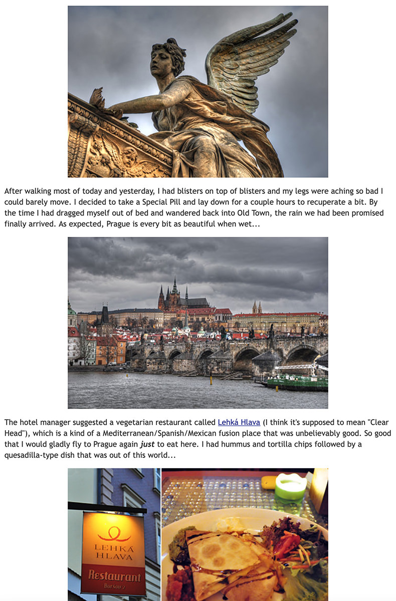
Now... you may be asking yourself... is that angel drowning a cupid baby angel in a bathtub? Or maybe a chicken? I honestly don't know, but it sure looks that way to me!
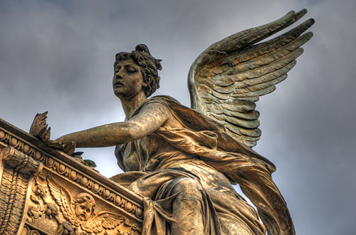
Despite the horror element, I always thought she was gorgeous. And the fact that I was blessed with those stormy skies just makes the photo that much more beautiful to me.
And that's when I had a thought... if Thrice Fiction is undergoing a rebirth, of sorts, we're essentially drowning Volume 1 in a bathtub (even though you can still read all 27 issues for FREE on our site). Maybe this is the image I'm going for?
Except this is going to be sold in book stores, and I thought the angsty, brooding, dark imagery has been done to death. Such a cover would fade into the rest of the books. Soooo... what if the angel was drowning the cupid in broad daylight... under bright blue skies? How disturbing would that be? Very. And so... I went through my photo archives to find the original image and see if it was something I could work with.
Bad news. It was cropped too tight and there wasn't enough in the original image to create a cover out of. Oh well. Back to the drawing board. Except... I had visited that cemetery on the day prior when it wasn't rainy and dark. Maybe with better weather I stuck around longer to take more photos? Turns out I did!
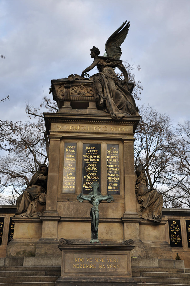
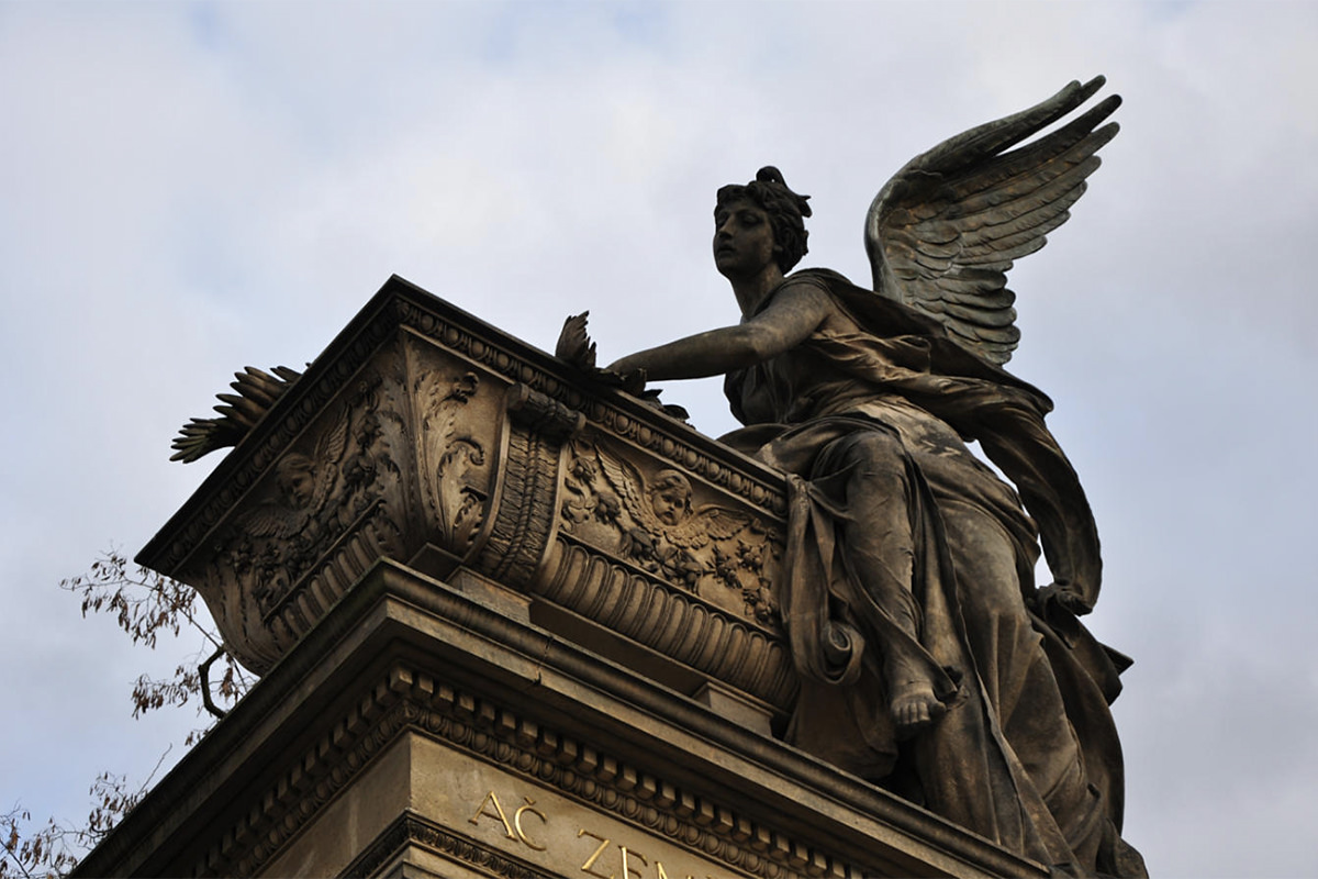
The second photo had the same angle I liked from the original photo, but it wasn't the cover I wanted. Too dark. Cropped too tight. It would never work.
Except... maybe it would if I put some work into it? Let's take a look, shall we?

Well, lightening it up a bit showed that there's enough pixel information in the shadows to work with... but how will I fill in the missing information at the bottom? Hmmm... remember that first photo that was kinda boring and flat? How about I cut out of that one and see if I can make use of it...
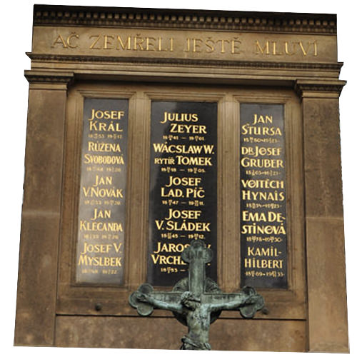
Oh yeah. That's perfect. I can easily warp it into a base for my murdering angel...
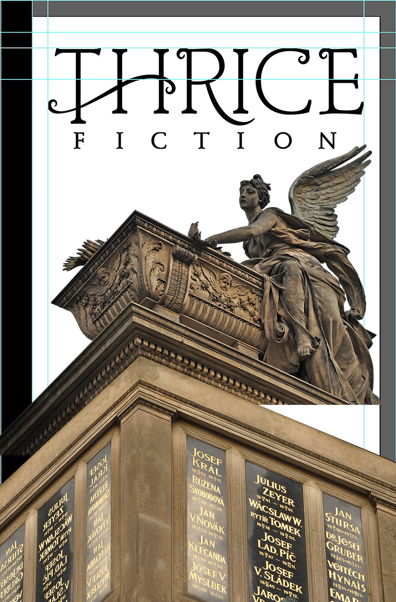
Cool. But there's still a long ways to go before this is the cover I've got in my head. First of all I have to paint in the missing bits and paint out the panels with stock photos so the names of our contributing authors can be easily read. It also needs to be much, much brighter. And maybe I could place a building back behind it to add a little visual interest? I've got tons of photos of Prague, so I could probably find one that works. And, say, what if instead of a bright blue sky I tried a brilliant orange sky in an attempt to tie everything together into a cohesive image?

Blergh. That building is adding nothing but confusion. It needs to go. And while I like the idea of an orange sky, that's a color that doesn't reproduce well in CMYK printing, so I really think it needs to be blue like I originally envisioned...

Now we're getting somewhere.
From here on out it's a lot of painting. There's a "watercolor" filter I use to speed up the process, but you can't just push a button and have all the work done for you. Well, actually you can do that, it's just that the results aren't that great. I go in and repaint features... do the watercolor filter... see what works and what needs to be worked on... undo the watercolor filter... then repeat. FOR HOURS! The face of the angel is practically untouched, and I went very light on the watercolor, because I wanted it to be easily "understood" by the reader. The further I got away from her face, the more radical the repainting becomes. I adjust contrast... add stock photo paint splotches for interest... simplify details to be more impressionistic for the watercolor filter... it's just refine... refine... refine...
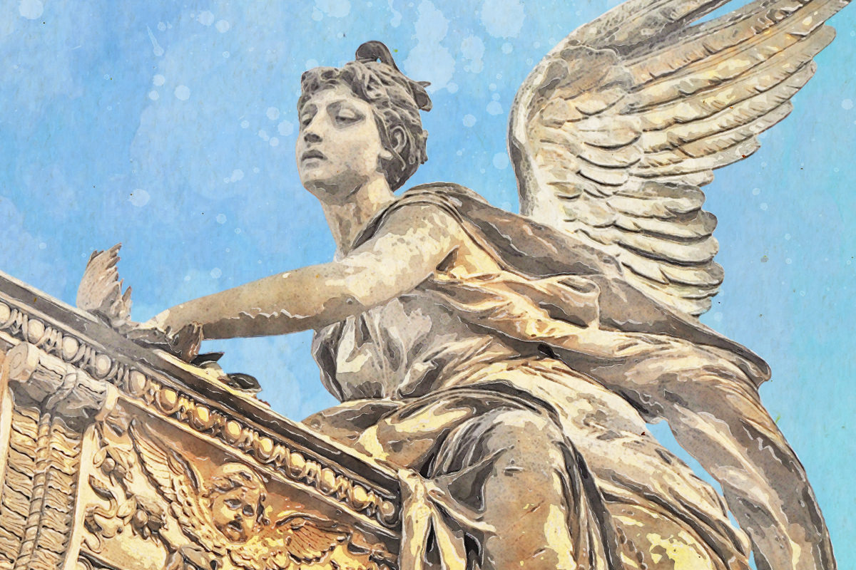
Eventually I get to a point where I've gone too far. So I step back to a previous version and I'm done. Thrice Fiction is reborn...

You'll note that the black strip on the left side (a carryover from the original magazine design) was abandoned. There's precious little horizontal space on the smaller book size, and I wanted to devote as much cover area as possible so our artists can fill it up. I also zoomed in on the angel quite a lot because I thought it was more impactful and prettier to look at this way.
Not exactly what I had in my head, but pretty close... murdered cupid and all. You can buy a copy with its glorious 128 pages for just $12 at the Lulu Book Shop.
Tomorrow I'll take a look at the interior of the book and go through all that drama for you. Sounds like fun, no?

I love comments! However, all comments are moderated, and won't appear until approved. Are you an abusive troll with nothing to contribute? Don't bother. Selling something? Don't bother. Spam linking? Don't bother.
PLEASE NOTE: My comment-spam protection requires JavaScript... if you have it turned off or are using a mobile device without JavaScript, commenting won't work. Sorry.

There's no comments here...