 After nine years, Thrice Fiction magazine (the amazing venue for short-form fiction that I created with RW Spryszak), came to an end with our December 2019 issue (You can still read all 27 issues absolutely FREE on our website).
But we're not dead yet.
RW and I just wanted to be freed from the thrice-yearly schedule that was becoming more and more difficult to keep. We don't get paid, we just do this for the love of it all, so the magazine always has to take a back-seat to Real Life. This kind of scenario is not conducive to a deadline.
And so we've relaunched with Volume 2, which no longer has a schedule. It's also no longer free, but it's as cheap as we can possibly make it (neither of us is getting rich here, we just need something to help cover our costs, which are more than you might think).
Here's our fist issue of the new Thrice Fiction...
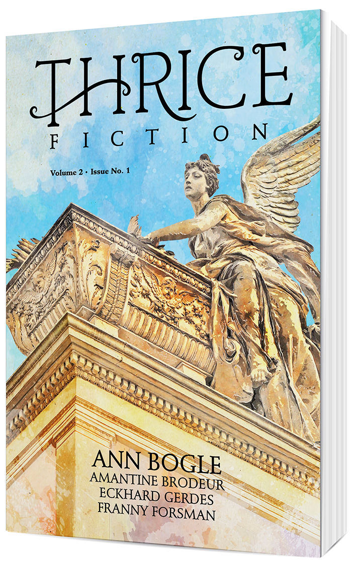
You can buy a copy with its glorious 128 pages for just $12 at the Lulu Book Shop.
For the next two or three entries here at Blogography, I thought I'd go over the design process that went into it.
Starting with the new logo.
My goal with the original Thrice Fiction was to have the design fade away. Elements were intentionally stark, plain, and forgettable. The logo I came up with wasn't so much a "logo" as some of the plainest type I had available stacked up and centered...
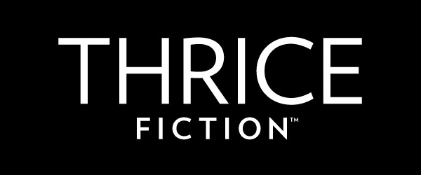
I actually had people comment about how "Thrice is pretty in execution, but plain in presentation." And I was like "Well, yeah, that's what it was designed to be!" We had some amazing artists contribute to our covers, and making sure a fancy logo didn't detract from their generously-donated work was all part of the plan.
But since Volume 2 was going to be sold in book stores and such, a different approach needed to be had. Slapping some plain type on it was not going to work, so I made a list of objectives...
The last one, cheap was probably the biggest part of the puzzle. And so when I designed the interior I picked from typefaces which I already owned licenses for. The main typeface then became the base for the logo upon which I could build. The only "design" thing I did here was to rough in an extension for the leg of the "R" so I'd know to leave space for it...
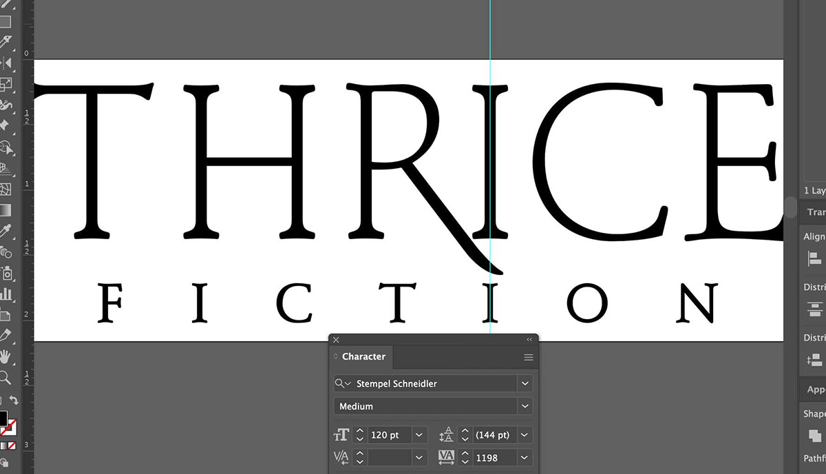
Now comes the part where my ADHD kicks in. I am obsessive about spacing consistency and working to make sure that elements are lined up as much as possible. It just makes for a cleaner logo that way. A lot of work goes into a project like this before I even get to a starting place...
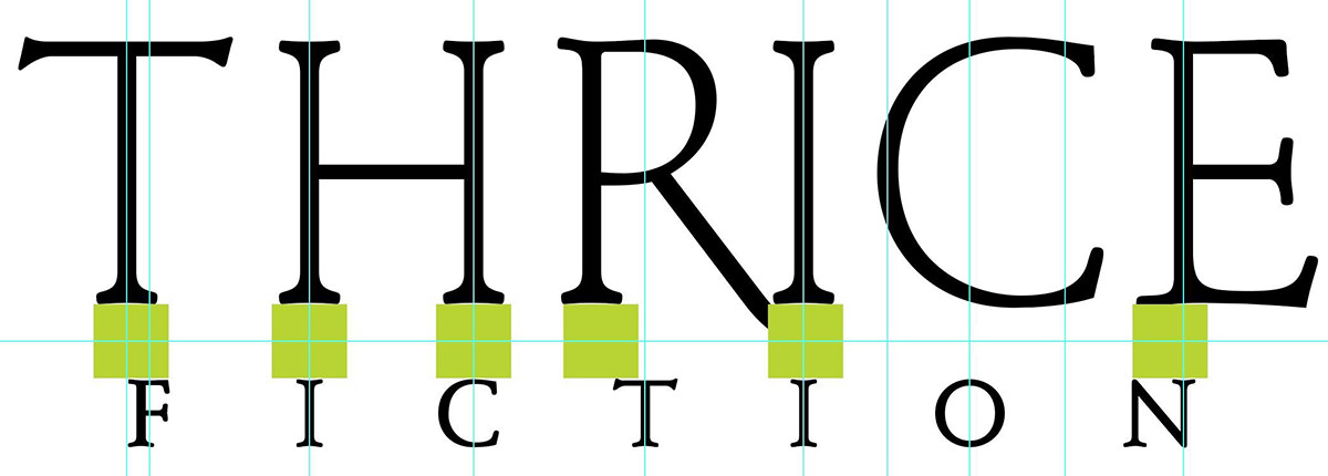
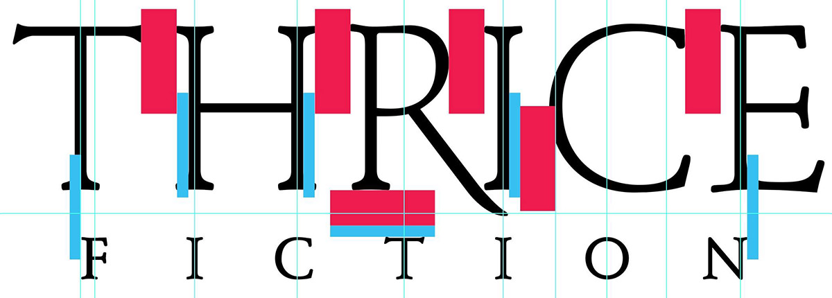
It's not uncommon for me to use dozens... or even hundreds of guides as I am figuring out the placement of all the pieces...
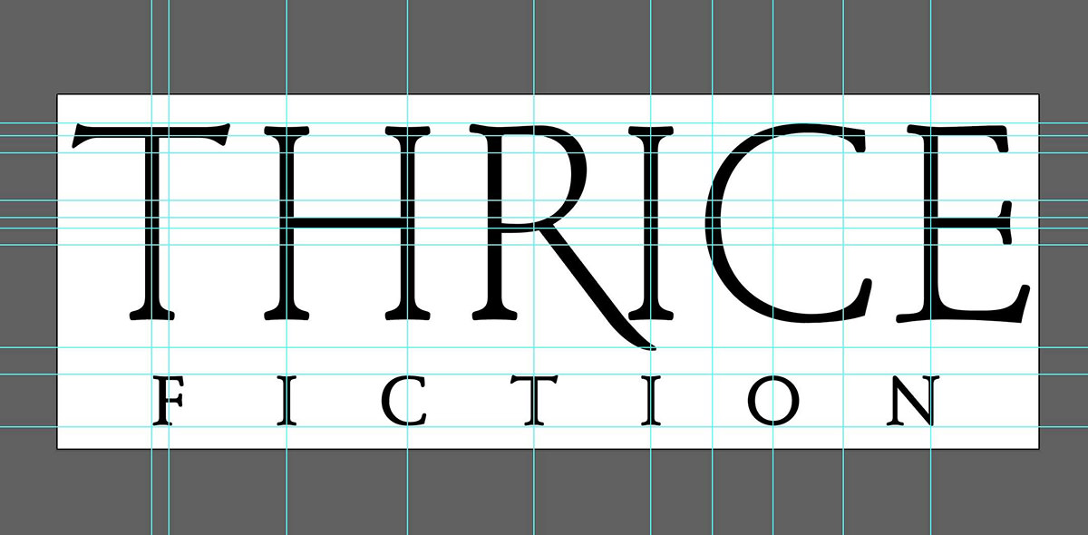
The "T" at the beginning of "Thrice" is problematic, because its width is defined at the very top by the crossbar. This leaves the "F" in "Fiction" looking off-center. I wanted to address this in case the logo ends up in a place where it would be helpful to look more balanced, so I roughed in a swash there so it would add visual width...
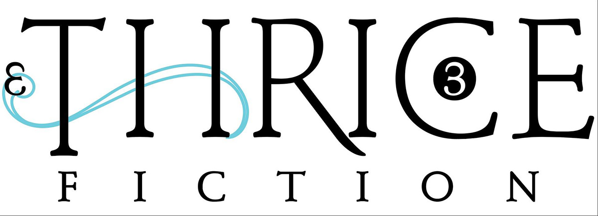
Note that at this point I planned on putting the "3" endmark (which signifies the end of each story of the interior) within the "C" because I thought it would look cool. It did look very cool. But it also added clutter and distraction, so it was dropped. Also note that I was planning on hiding a backwards "3" in the swash to be clever. This would also be dropped for clutter.
And here you can see me once again going crazy with the guides so I can line everything up in a mathematically-pleasing manner...
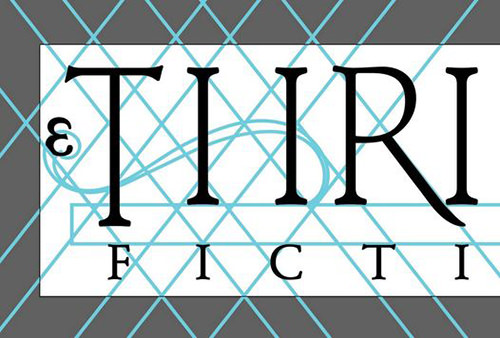
From there it's just endless futzing around.
Making the leg of the R be swoopy and pretty. Adding curls on the R, C, and E to tie them to the curls on the swash across the T and H. Cleaning up the letterforms by narrowing or widening the space they occupy to better line things up. That kind of thing...
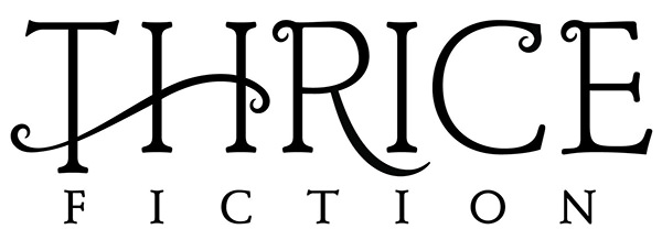
This is what I went to print with because I ran out of futzing time. There are still some minor tweaks I need to take care of until I'm happy with our new logo (starting with the swash going too narrow too quickly and looking jerky as it crosses the "T", which really, really bugs me). The work is never truly done until the deadline arrives, and even then it doesn't stop.
That's "design" in a nutshell.
Overall I'm quite happy with the logo because I think it fits my objectives well and looks nice on the shelf. So way to go, me!
If this kind of stuff interests you, tune in tomorrow when I discuss the cover art... then again on Wednesday when I discuss the interior art. Big fun awaits.

I love comments! However, all comments are moderated, and won't appear until approved. Are you an abusive troll with nothing to contribute? Don't bother. Selling something? Don't bother. Spam linking? Don't bother.
PLEASE NOTE: My comment-spam protection requires JavaScript... if you have it turned off or are using a mobile device without JavaScript, commenting won't work. Sorry.

There's no comments here...