
 You would think that when you pay for a movie in iTunes that the poster art would remain the same as when you bought it. But that's not the case. A while back Marvel started changing all the artwork in their store, which ended up changing the artwork on all the movies I bought.
And it all sucks.
Not that I'd be thrilled if it were better than the originals... I want the art that I recognize so I can recognize the movies I own. I want what I originally purchased.
Take for example the poster for Guardians of the Galaxy...
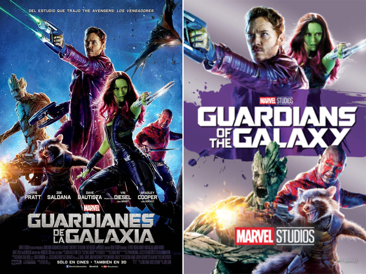
They hacked up pieces of the original poster, rearranged them, then slapped them on a boring-ass background. It looks worse than shitty, because there's no composition or context. Can you tell what in the hell Star-Lord is doing? Holding on to a handle? Who the hell knows?
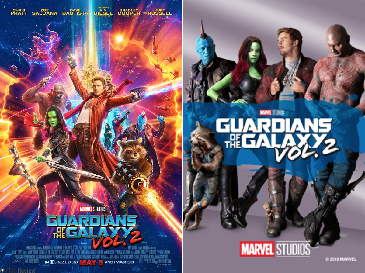
The sequel poster is even worse. The cool and colorful art with all kinds of cool movie imagery in the background. It's been replaced with something so boring as to be sedate by comparison...
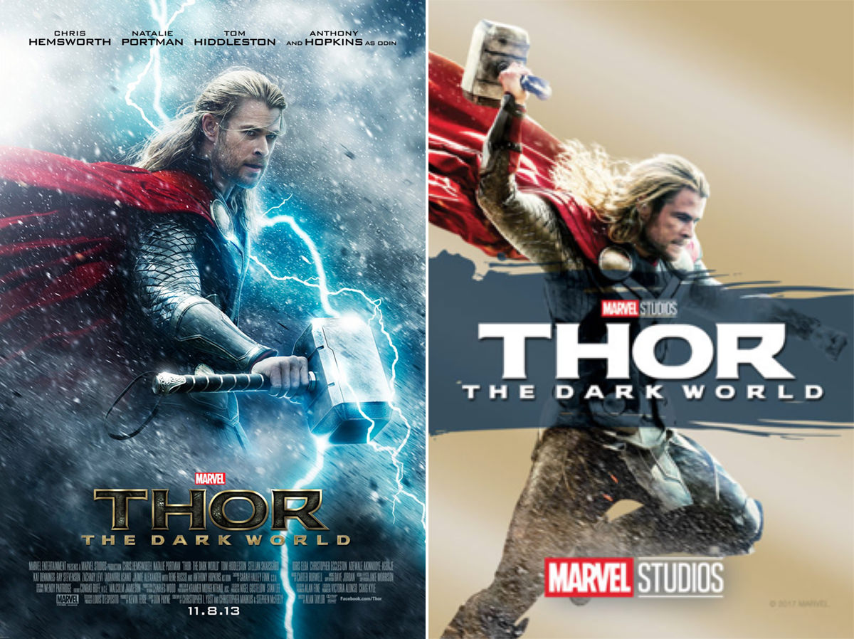
Thor: The Dark World is especially horrific in that he no longer looks like the god of thunder, but somebody in a red cape and bad hair...
Since most Marvel movies take place in New York City, Ant-Man was a breath of fresh air since it switched it up to the West Coast and San Francisco. To be sure there was no mistaking this, they put it right there on the poster...
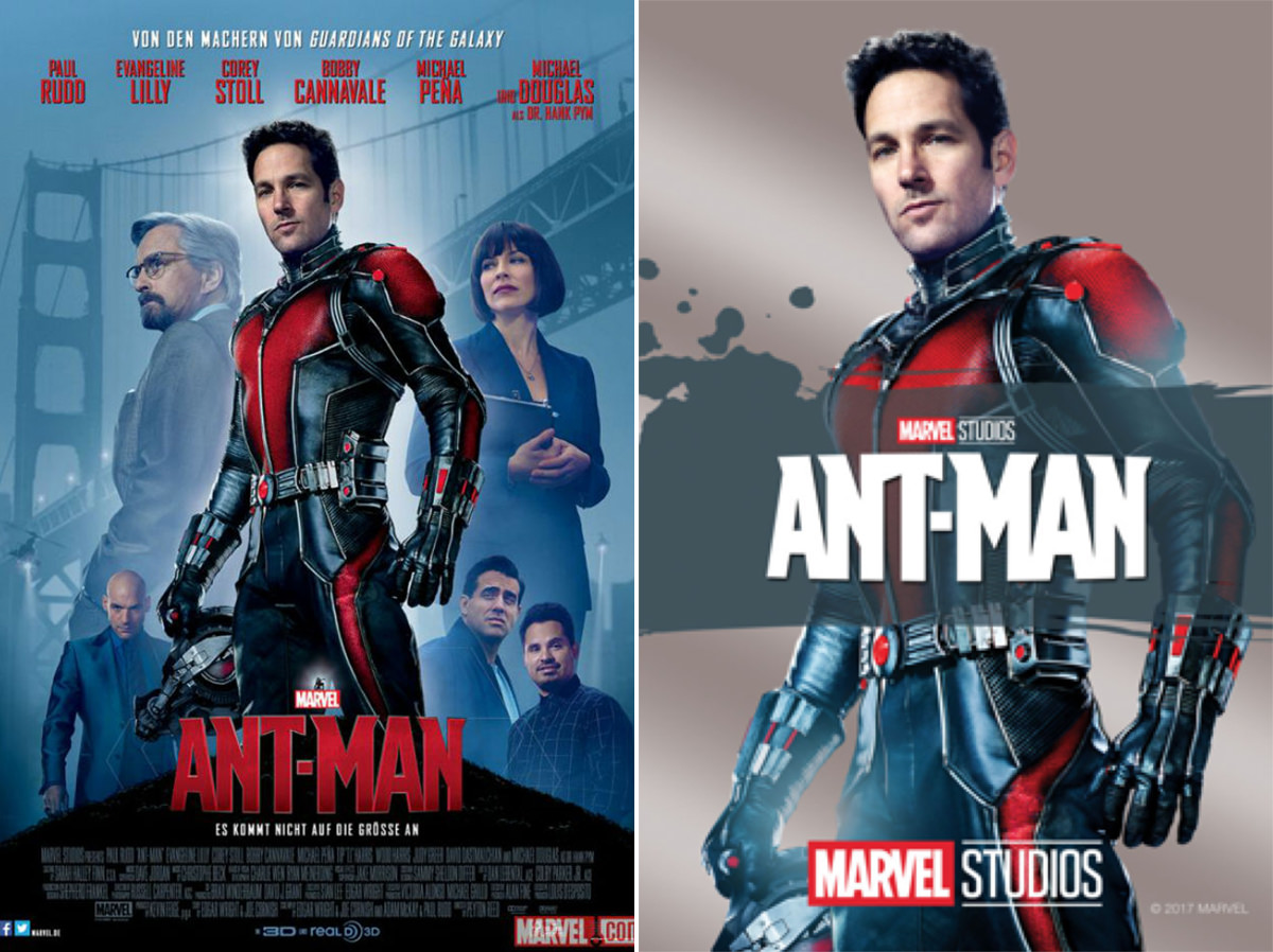
When they remade it, they simply stripped away all the cool supporting elements and slapped some ugly-ass faux-metallic effect. Lame.
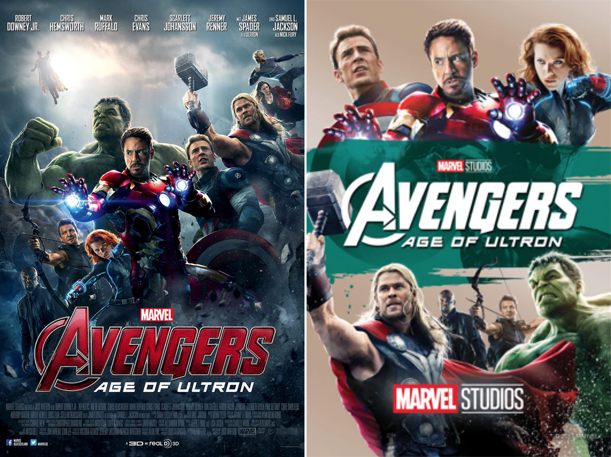
Group films like Avengers have posters that are carefully crafted to show the dynamic of the team. But now all we get is a grotesque cut-and-paste hack-job that has no interplay between characters and no dynamic. Somebody with a box of Colorforms could do the same damn thing... and probably better, since people wouldn't have their legs cut off and be suspended in air...
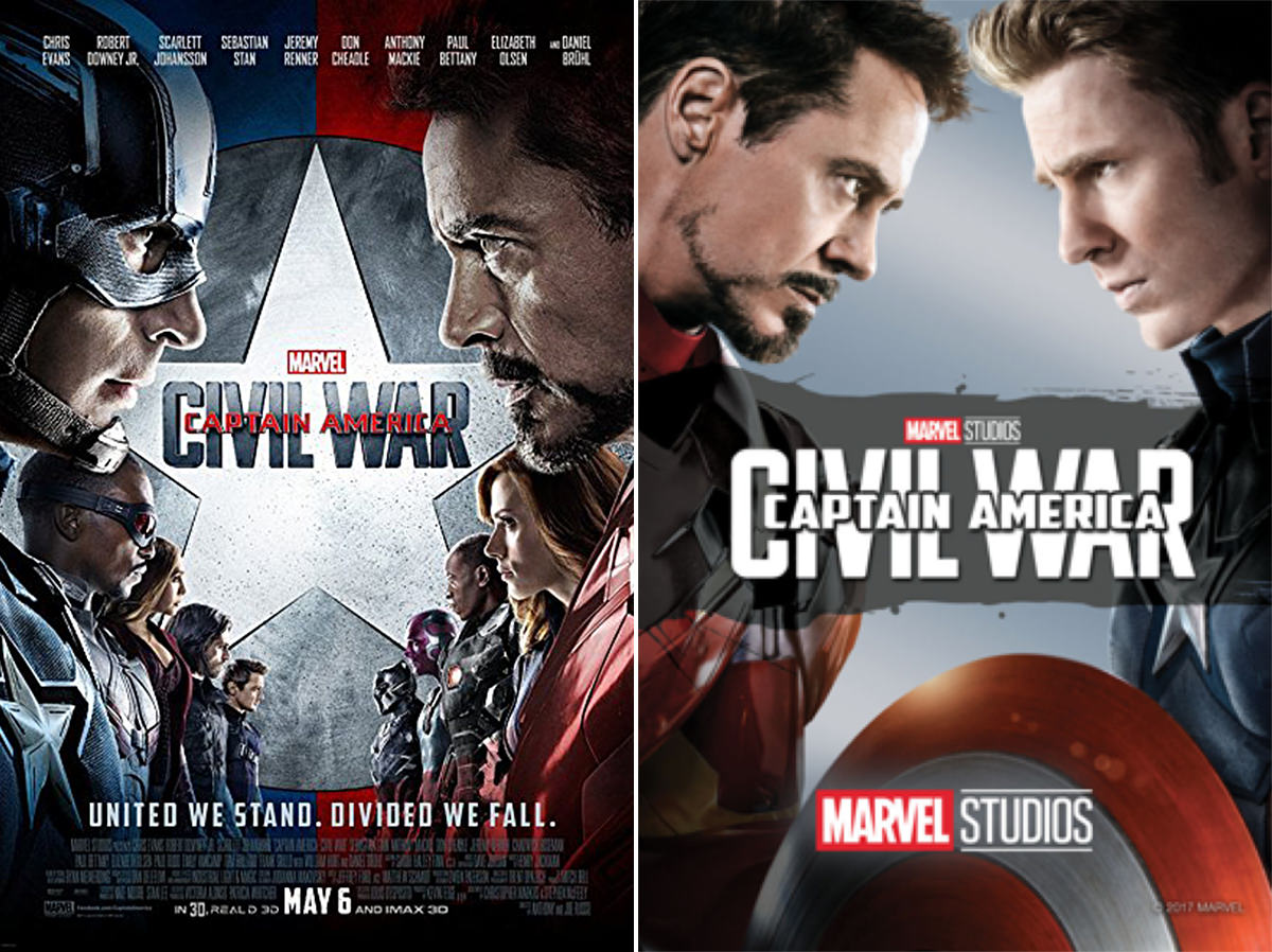
Another great example of this... Captain America: Civil War. What was the most incredible part of the film? The fact that there was a massive battle which pits hero against hero. But the new poster rips this away, completely confusing the story. For all we know from looking at the shitty art, this is a Captain America and Iron Man buddy picture. Or an Iron Man movie with a guest-spot by Cap, since the figures have been reversed and Stark is in the #1 spot...
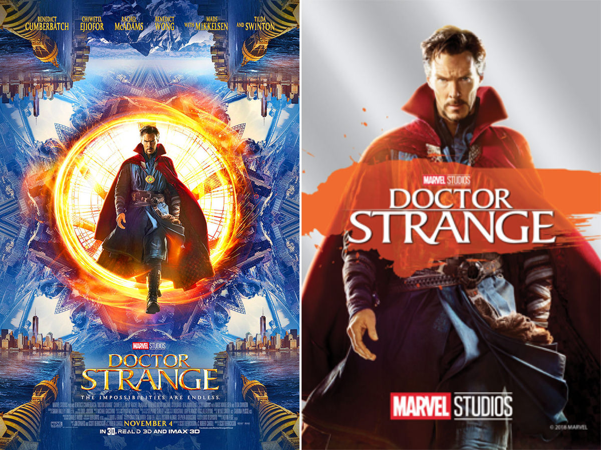
Doctor Strange is a mind-bending film which introduces magic and other dimensional planes to the Marvel Universe. But now? Some guy in a red cape with a tall collar? Shitty. Utterly shitty...
I think my most hated poster remake is for Iron Man 3...
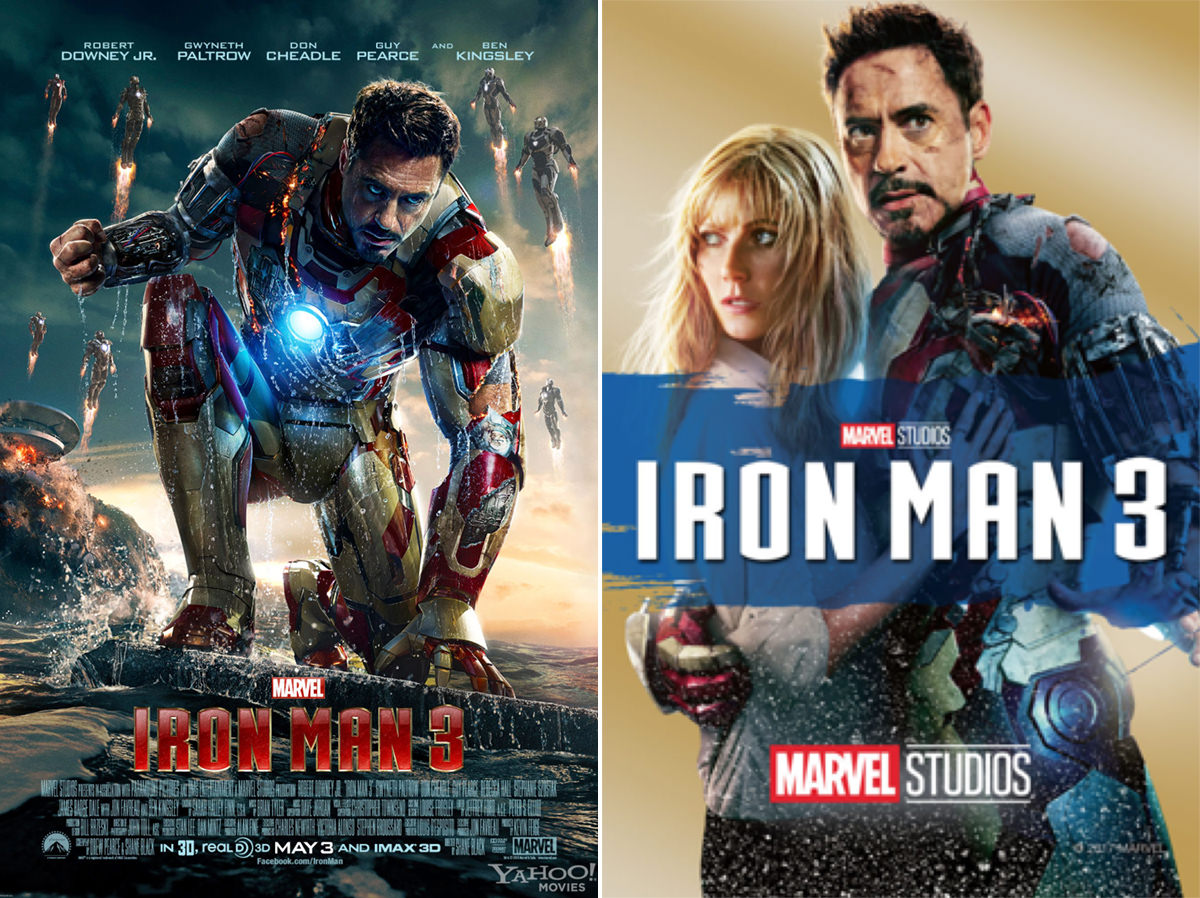
The original poster was SO cool. Foreboding atmosphere, Tony's house exploding, and The Iron Legion are all there... along with a ravaged but determined Iron Man. But the remake? You can barely even tell that's Iron Man. Looks like the cover to some kind of Harlequin Romance or a shitty, low-budget crapfest. And can somebody please explain why the characters are fading into a star-field?
I understand the thinking in redoing the posters. They are trying to create something that will be easily understood at the smaller thumbnail sizes that you'll find in iTunes or other movie streaming services. But when they come up with something this shitty, does it really matter if you more easily understand them? If anything, I'd argue that the original posters are more distinct and interesting... even if you can't fully tell what's going on when reduced to tiny sizes.
At the very least, they could leave it up to the buyer which poster to display in their iTunes library.
Because the new crop is more than just ugly and boring... they're offensively bad design.

I love comments! However, all comments are moderated, and won't appear until approved. Are you an abusive troll with nothing to contribute? Don't bother. Selling something? Don't bother. Spam linking? Don't bother.
PLEASE NOTE: My comment-spam protection requires JavaScript... if you have it turned off or are using a mobile device without JavaScript, commenting won't work. Sorry.

What’s worse is that, in Movies Anywhere, there is no consistency. Half of them have the old posters and half have the new posters. Actually, the GotG2 poster is neither of the ones you display above.