 This is part three of a three-part dive into the redesign of Thrice Fiction magazine on the occasion of releasing the first issue of Volume 2. If you missed it, you can read Part One right here and Part Two right here.
With all 27 FREE issues of Volume 1 of Thrice Fiction, I had the luxury of color. It was designed from the very beginning with color in mind. The focus of each issue, the stories, were (out of necessity) black and white for readability. I carried this theme to the contributor photos, which were also black and white. Everything else (i.e. the art) would be in color.
The problem with color is that it's expensive. Very expensive. But you can justify it when you have a small number of pages because the cost doesn't have a chance to accumulate that much. Since the format for Volume 2 was over a hundred pages, it wasn't an option. All interior pages would be black and white so we wouldn't have to charge $50 a copy.
All our artists were in a pandemic for 2020, so I decided to just do all the interior art myself after a few false starts in rounding up contributors. This actually turned out for the best, because I had no idea how our publisher (Lulu) would reproduce greyscale art. Since it's just me, I made a list of different styles to experiment with... line art... photo art... vector art... and so on.
And here's how that went.
Ann Bogle is a remarkable writer and it's always been a thrill to see her work in our pages. Needless to say that when RW informed me that she would be the "featured contributor" for our debut issue, I was thrilled. I read through all her stories a couple times looking for an idea... but I kept coming back to the second paragraph of her very first story, Credenza, where it was Abe Lincoln's 200th birthday. It's just too dang good an image to ignore. So I didn't...
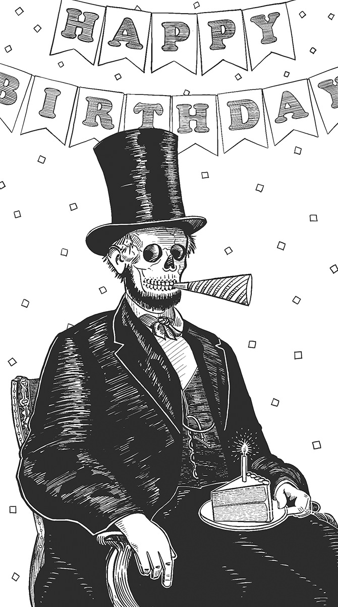
Originally there was no "happy birthday" banner in the background, as the idea was to put a party hat on top of Lincoln's famous stovepipe hat. It proved too clutzy, so I made the change. Also? Abraham Lincoln was originally drawn as a decomposing corpse, because that's the only way I could still have his beard on there. But that was pretty gruesome, so I went with a skeleton head, left the beard, and took all the rotting flesh off his hands. No, it doesn't make sense, but I actually think it's more humorous this way. This was knocked out on my iPad in ProCreate over a couple nights while watching Hallmark movies.
If you read yesterday's entry, you know that I was originally planning on the cover being a little boy looking up to the heavens as missiles stand ready to launch (for our relaunch, get it?). I thought this might be a little dark, but I liked the idea of the image so much that I decided to draw it up and slap it in the interior as a break-point...
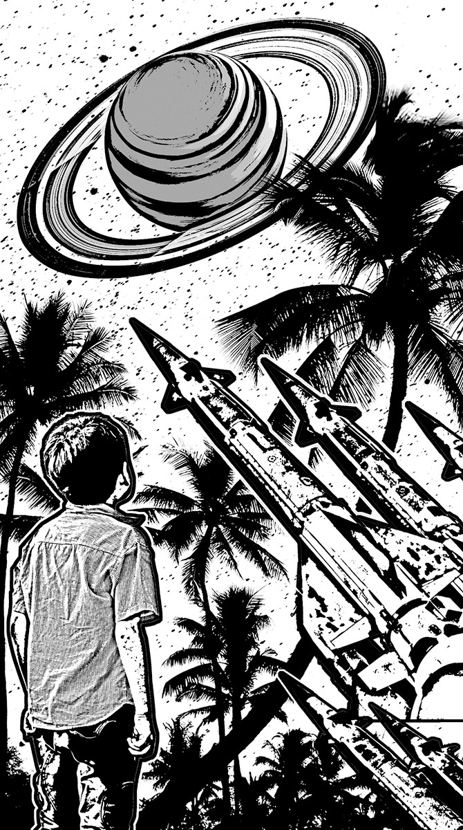
I thought this actually turned out better than what was in my head. I also think it probably works better as a block-cut than a color painting. The palms are extracted from a photo I took on the Big Island of Hawaii. The boy, Saturn, and the missiles are stock photos I cut out. It was all assembled in Photoshop, had extraction filters and edge filters run on it, then I imported it to ProCreate on my iPad so I could add texture and linework.
Amantine Brodur's work was a tough challenge to typeset because half of what makes it work is the formatting. Translating the formatting of The Anaphora House from a MS Word document to book pages took a long, long time of goofing around until I was satisfied that I had done the best job I could. Then a couple days later I would look at it again and decide to change half of it. =sigh= There was an abundance of riches to be had when it came time to figuring out what I wanted to do for the art. But once I got to the section titled Empires of Toast I just knew that was going to be where my piece came from...
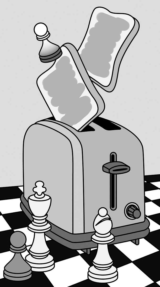
This is just pure symbolism, "empires" being represented by a chess set. I knew I wanted a toaster ejecting "toast" on the board, but I took it a bit further than that. The "theme" of our "Subject Paper" this issue was discussing "cultural appropriation." I drew a white pawn also ejecting from the toaster, the idea being that it wants to appear black, but couldn't take the heat that comes from being black. Deep, I know.
Eckhard Gerdes packs a lot in the slightly more than four pages of The Babble-Ons. I went from worrying that there wouldn't be enough visual ideas to draw from... to being completely overwhelmed by how much there was to choose from. I abandoned the idea of pulling literal passages and instead combined a rowboat and snails because I thought it would make for a fun image...
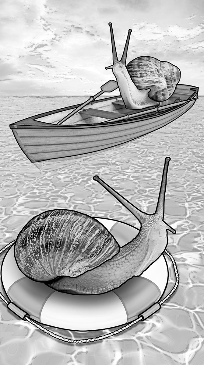
Don't ask me how that snail is rowing his boat. This is a half-dozen stock photos which have been reworked and combined into a single image in Adobe Photoshop... then outlined in Adobe Illustrator. I wanted to have an example for future artist contributors so they could see how photos reproduce at Lulu and how contrast has to be heightened to get something other than a mushy grey blob. It took a lot more effort than I was anticipating, and I'm pretty sure I put in just under three hours for an image that would have taken me 20 minutes if it were in color.
Art was never going to be the focus of Volume 2. It was always going to be the written word. But I still wanted some art in there to add breaks between sections and pieces. This was an idea I had years ago that I never did anything with, but kinda liked the thought of dusting it off and retooling it to be a collage overlaid by block-print. Something about the concept of aliens invading and not caring which god you worship reeeeeally stuck with me...
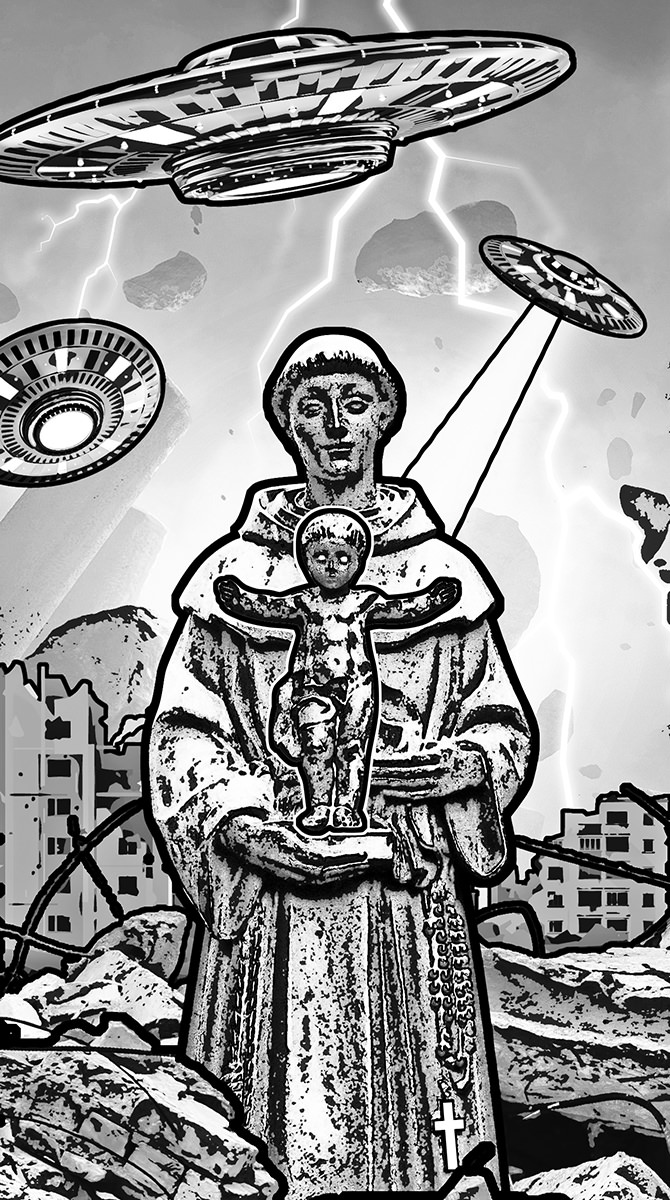
I cannot for the life of me remember where I took the photo of the monk with baby Jesus. I want to say Italy maybe? Columbia? I think it was in a courtyard somewhere. Could even be New Orleans. Since I pulled the photo out of my archives quite a long while ago, I can't remember. Everything else is composed of eight stock photos that I chopped up and combined. Before I started converting, painting, filtering, and drawing on top of it, this is what it looked like...
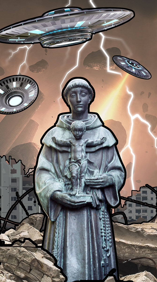
Had I done this in color, I would have painted over everything to make it "more my own" since all the pieces around the statue were created by somebody else. But it worked really well as a block-cut, so I spent considerable time massaging the pieces in Photoshop so it would work well. Minutes before publishing this issue, I went in and changed baby Jesus's eyes and the cross on the monk's robe to pure white and did a heavier outline around Jesus so they stood out better.
Originally I had created this art for the subject essay Who Do You Think You Are? by Franny Forsman which discusses cultural appropriation. This is a subject which hits at me personally from a number of different directions, and almost everybody has an opinion... from weak ("I don't care and don't see anything wrong with it because it doesn't affect me") to very strong ("This is pillaging my people and my culture and using it in inappropriate ways which I find deeply insulting"). Despite being 100% white boy with a "cultural heritage" that consists of a hodgepodge of other cultures (AKA "no culture to speak of"), I am in the latter category. And it stems from the simple idea of just being fucking decent and kind to people. If somebody tells you that their culture is not a costume and they are offended when people treat it that way... just pick a different Halloween costume. If somebody tells you that your football team has a shitty name and mascot because it is taken from a painful slur celebrating genocide against their people... just pick a different name. This is not rocket science, and you have to be kinda awful to not want to change when it's pointed out to you. And that's what I was trying to say with this piece depicting a butterfly seeing a poster advertising a movie about a butterfly... starring a cockroach...
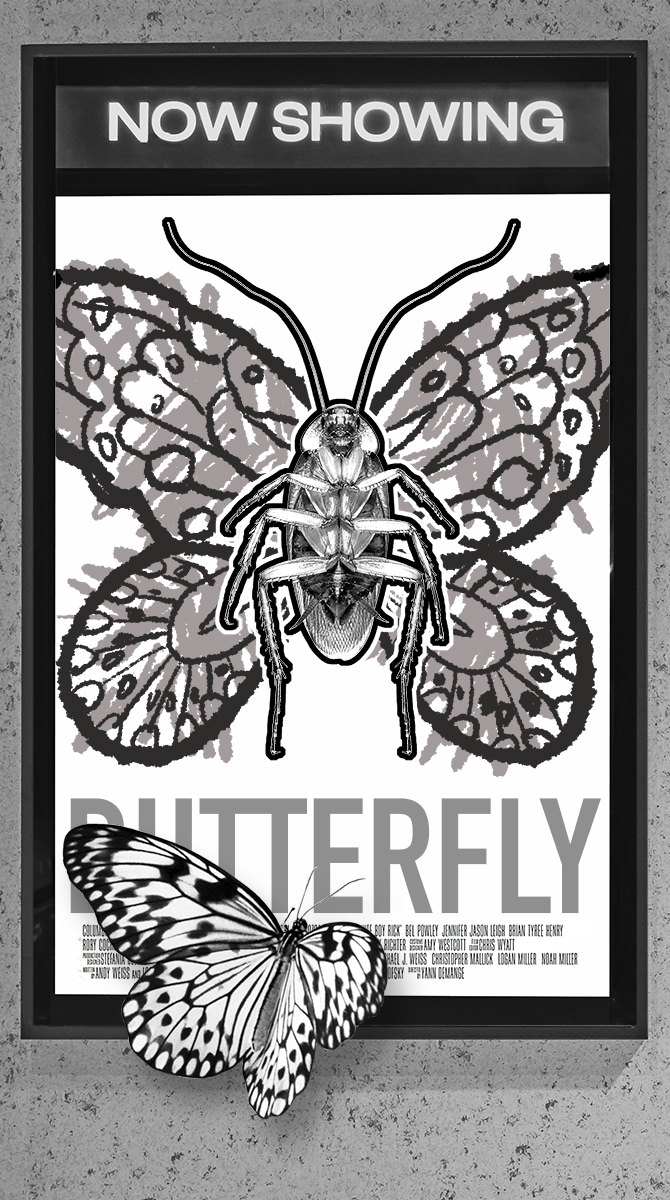
This is a composite of a bunch of stock photos that I cut into Photoshop (though I think the butterfly image is mine, taken from a butterfly sanctuary in Australia). The butterfly wings on the cockroach were drawn on in Procreate because I wanted them to look like they were badly colored with a crayon. The credits for my fake movie Butterfly are actually taken from the movie poster for White Boy Rick, which seemed appropriate. Ultimately I worried that any art put in front of such a serious subject would be distracting and inappropriate and decided to go with no art at all. But I kinda liked what Cheap Imitation was saying, so I stuck it at the back of the book.
And there you have it... all the art I came up with for the first issue of Volume 2! You can see it all in print by buying a copy with its glorious 128 pages for just $12 at the Lulu Book Shop. A bargain at half the price with some cool stuff to be had!
 This is part two of a three-part dive into the redesign of Thrice Fiction magazine on the occasion of releasing the first issue of Volume 2. If you missed it, you can read Part One right here.
After the type had been selected and the logo had been designed, I moved to the cover. Our old magazine was graced with a variety of amazing artists contributing their talents but, just like with Volume One, I decided to do the first one myself.
I had many, many ideas.
For the longest time I had it in my head that since this was a relaunch, I was going to have a young boy on a tropical island looking up to the heavens... while a bunch of missiles were ready to launch nearby. I liked that it was implying even paradise can be meanacing. I ultimately abandoned this idea for being too dark but, never fear, I repurposed the idea for a piece on the interior.
The next day I woke up and couldn't remember the name of my favorite restaurant in Prague (maybe I was dreaming about it?), so I went to my blog and searched for it (the name is Lehká Hlava, and it has my highest recommendation). Two images above where I was talking about the restaurant is one of my most favorite photos I've taken of all time...
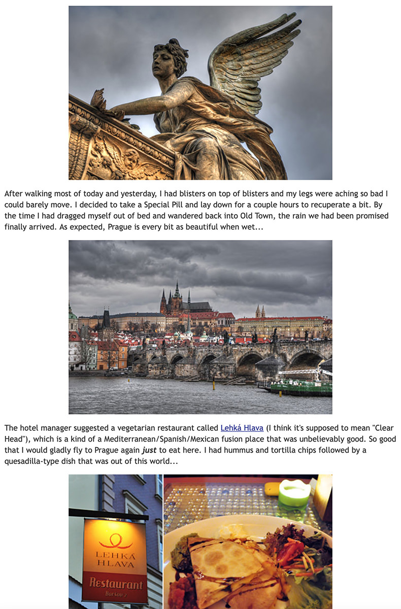
Now... you may be asking yourself... is that angel drowning a cupid baby angel in a bathtub? Or maybe a chicken? I honestly don't know, but it sure looks that way to me!
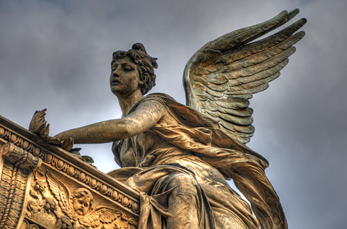
Despite the horror element, I always thought she was gorgeous. And the fact that I was blessed with those stormy skies just makes the photo that much more beautiful to me.
And that's when I had a thought... if Thrice Fiction is undergoing a rebirth, of sorts, we're essentially drowning Volume 1 in a bathtub (even though you can still read all 27 issues for FREE on our site). Maybe this is the image I'm going for?
Except this is going to be sold in book stores, and I thought the angsty, brooding, dark imagery has been done to death. Such a cover would fade into the rest of the books. Soooo... what if the angel was drowning the cupid in broad daylight... under bright blue skies? How disturbing would that be? Very. And so... I went through my photo archives to find the original image and see if it was something I could work with.
Bad news. It was cropped too tight and there wasn't enough in the original image to create a cover out of. Oh well. Back to the drawing board. Except... I had visited that cemetery on the day prior when it wasn't rainy and dark. Maybe with better weather I stuck around longer to take more photos? Turns out I did!
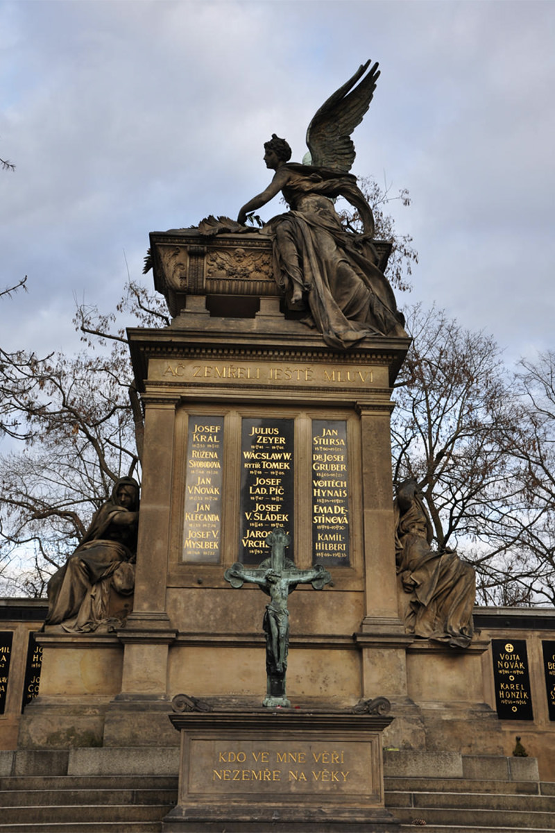
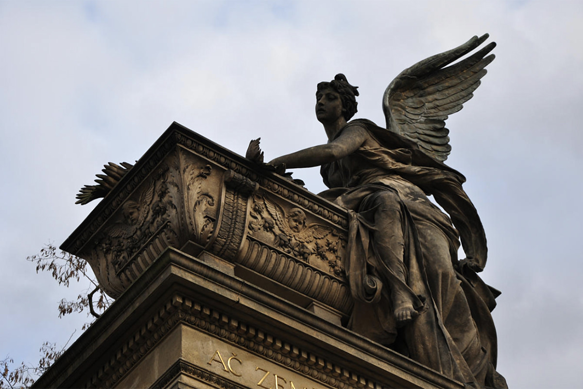
The second photo had the same angle I liked from the original photo, but it wasn't the cover I wanted. Too dark. Cropped too tight. It would never work.
Except... maybe it would if I put some work into it? Let's take a look, shall we?
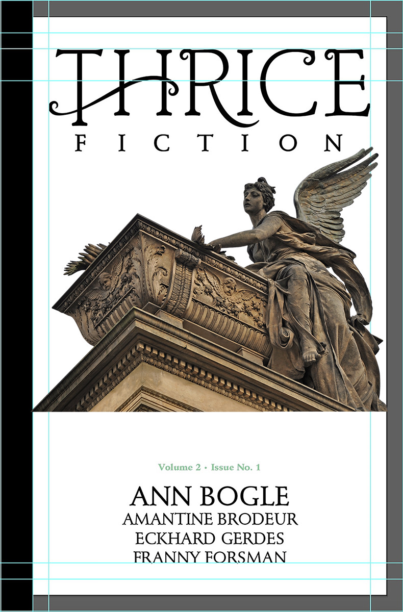
Well, lightening it up a bit showed that there's enough pixel information in the shadows to work with... but how will I fill in the missing information at the bottom? Hmmm... remember that first photo that was kinda boring and flat? How about I cut out of that one and see if I can make use of it...
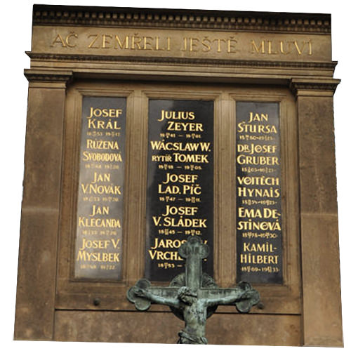
Oh yeah. That's perfect. I can easily warp it into a base for my murdering angel...
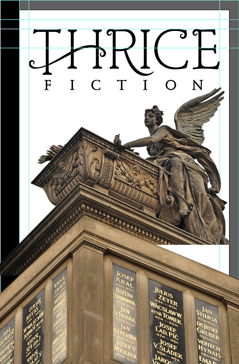
Cool. But there's still a long ways to go before this is the cover I've got in my head. First of all I have to paint in the missing bits and paint out the panels with stock photos so the names of our contributing authors can be easily read. It also needs to be much, much brighter. And maybe I could place a building back behind it to add a little visual interest? I've got tons of photos of Prague, so I could probably find one that works. And, say, what if instead of a bright blue sky I tried a brilliant orange sky in an attempt to tie everything together into a cohesive image?
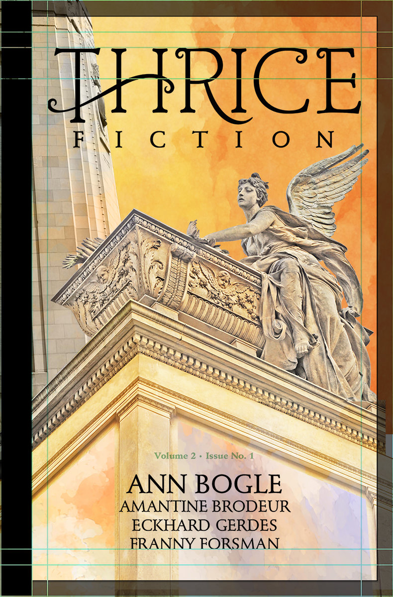
Blergh. That building is adding nothing but confusion. It needs to go. And while I like the idea of an orange sky, that's a color that doesn't reproduce well in CMYK printing, so I really think it needs to be blue like I originally envisioned...
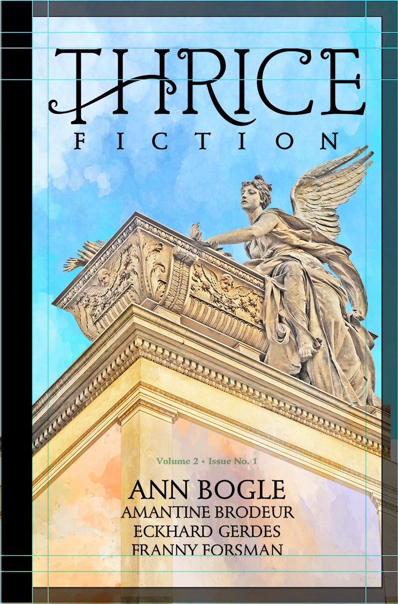
Now we're getting somewhere.
From here on out it's a lot of painting. There's a "watercolor" filter I use to speed up the process, but you can't just push a button and have all the work done for you. Well, actually you can do that, it's just that the results aren't that great. I go in and repaint features... do the watercolor filter... see what works and what needs to be worked on... undo the watercolor filter... then repeat. FOR HOURS! The face of the angel is practically untouched, and I went very light on the watercolor, because I wanted it to be easily "understood" by the reader. The further I got away from her face, the more radical the repainting becomes. I adjust contrast... add stock photo paint splotches for interest... simplify details to be more impressionistic for the watercolor filter... it's just refine... refine... refine...
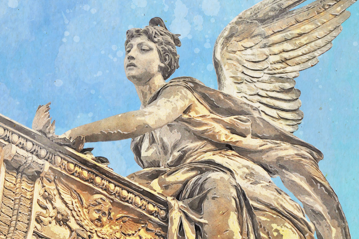
Eventually I get to a point where I've gone too far. So I step back to a previous version and I'm done. Thrice Fiction is reborn...
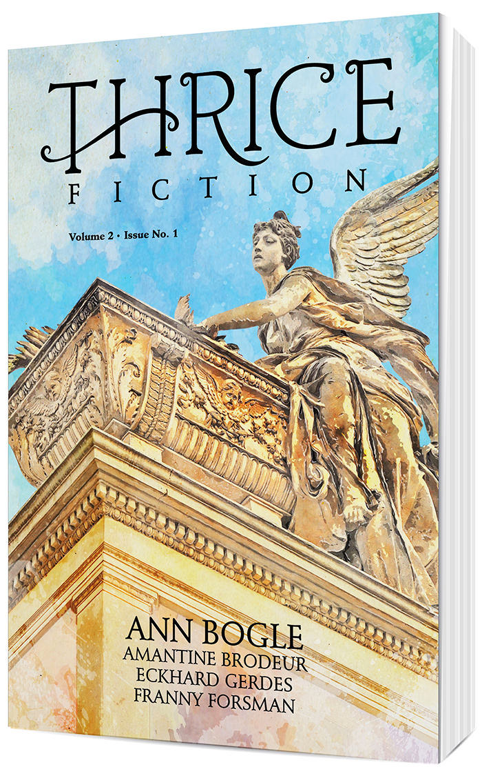
You'll note that the black strip on the left side (a carryover from the original magazine design) was abandoned. There's precious little horizontal space on the smaller book size, and I wanted to devote as much cover area as possible so our artists can fill it up. I also zoomed in on the angel quite a lot because I thought it was more impactful and prettier to look at this way.
Not exactly what I had in my head, but pretty close... murdered cupid and all. You can buy a copy with its glorious 128 pages for just $12 at the Lulu Book Shop.
Tomorrow I'll take a look at the interior of the book and go through all that drama for you. Sounds like fun, no?
 After nine years, Thrice Fiction magazine (the amazing venue for short-form fiction that I created with RW Spryszak), came to an end with our December 2019 issue (You can still read all 27 issues absolutely FREE on our website).
But we're not dead yet.
RW and I just wanted to be freed from the thrice-yearly schedule that was becoming more and more difficult to keep. We don't get paid, we just do this for the love of it all, so the magazine always has to take a back-seat to Real Life. This kind of scenario is not conducive to a deadline.
And so we've relaunched with Volume 2, which no longer has a schedule. It's also no longer free, but it's as cheap as we can possibly make it (neither of us is getting rich here, we just need something to help cover our costs, which are more than you might think).
Here's our fist issue of the new Thrice Fiction...

You can buy a copy with its glorious 128 pages for just $12 at the Lulu Book Shop.
For the next two or three entries here at Blogography, I thought I'd go over the design process that went into it.
Starting with the new logo.
My goal with the original Thrice Fiction was to have the design fade away. Elements were intentionally stark, plain, and forgettable. The logo I came up with wasn't so much a "logo" as some of the plainest type I had available stacked up and centered...
I actually had people comment about how "Thrice is pretty in execution, but plain in presentation." And I was like "Well, yeah, that's what it was designed to be!" We had some amazing artists contribute to our covers, and making sure a fancy logo didn't detract from their generously-donated work was all part of the plan.
But since Volume 2 was going to be sold in book stores and such, a different approach needed to be had. Slapping some plain type on it was not going to work, so I made a list of objectives...
The last one, cheap was probably the biggest part of the puzzle. And so when I designed the interior I picked from typefaces which I already owned licenses for. The main typeface then became the base for the logo upon which I could build. The only "design" thing I did here was to rough in an extension for the leg of the "R" so I'd know to leave space for it...
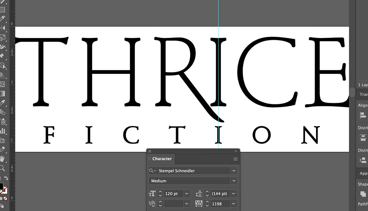
Now comes the part where my ADHD kicks in. I am obsessive about spacing consistency and working to make sure that elements are lined up as much as possible. It just makes for a cleaner logo that way. A lot of work goes into a project like this before I even get to a starting place...
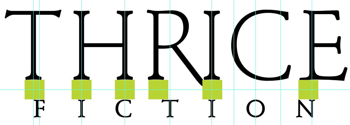
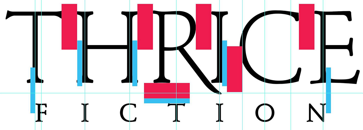
It's not uncommon for me to use dozens... or even hundreds of guides as I am figuring out the placement of all the pieces...
The "T" at the beginning of "Thrice" is problematic, because its width is defined at the very top by the crossbar. This leaves the "F" in "Fiction" looking off-center. I wanted to address this in case the logo ends up in a place where it would be helpful to look more balanced, so I roughed in a swash there so it would add visual width...

Note that at this point I planned on putting the "3" endmark (which signifies the end of each story of the interior) within the "C" because I thought it would look cool. It did look very cool. But it also added clutter and distraction, so it was dropped. Also note that I was planning on hiding a backwards "3" in the swash to be clever. This would also be dropped for clutter.
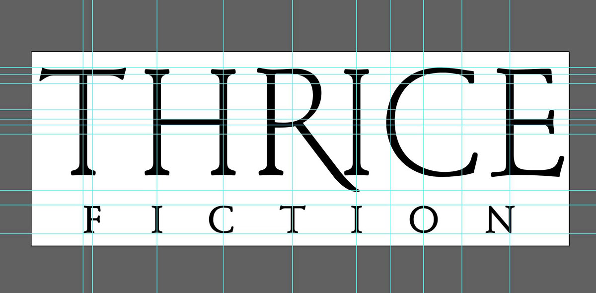
And here you can see me once again going crazy with the guides so I can line everything up in a mathematically-pleasing manner...

From there it's just endless futzing around.
Making the leg of the R be swoopy and pretty. Adding curls on the R, C, and E to tie them to the curls on the swash across the T and H. Cleaning up the letterforms by narrowing or widening the space they occupy to better line things up. That kind of thing...
This is what I went to print with because I ran out of futzing time. There are still some minor tweaks I need to take care of until I'm happy with our new logo (starting with the swash going too narrow too quickly and looking jerky as it crosses the "T", which really, really bugs me). The work is never truly done until the deadline arrives, and even then it doesn't stop.
That's "design" in a nutshell.
Overall I'm quite happy with the logo because I think it fits my objectives well and looks nice on the shelf. So way to go, me!
If this kind of stuff interests you, tune in tomorrow when I discuss the cover art... then again on Wednesday when I discuss the interior art. Big fun awaits.
 The penultimate issue of Thrice Fiction Magazine has just been released. You can check it out on our website absolutely FREE! Our next issue... No. 27, coming in December... will be our last.
I'll be talking about all that later though. Right now I want to talk about the current issue, which is pretty darn cool if we do say so ourselves!
The cover image is something I originally created for the story Ode to Oceans in the interior. I really liked the story, and the minute I read about a cat being "a gingery thing" and belonging to the ruler of the universe who lives by the sea I knew exactly what I wanted to do. Take one of my photos of water, flip it so the sea was the sky and the sky was the sea, then have Jenny sitting on the sky as if it were ground. Because the ruler of the universe can do that. Problem was... it didn't end up fitting the story well. So I took the cat out, put the image right-side up, then used that instead. It was better for the story and had really good impact.
But I couldn't let go of the original image. It was just so cool. Cool enough for the cover...
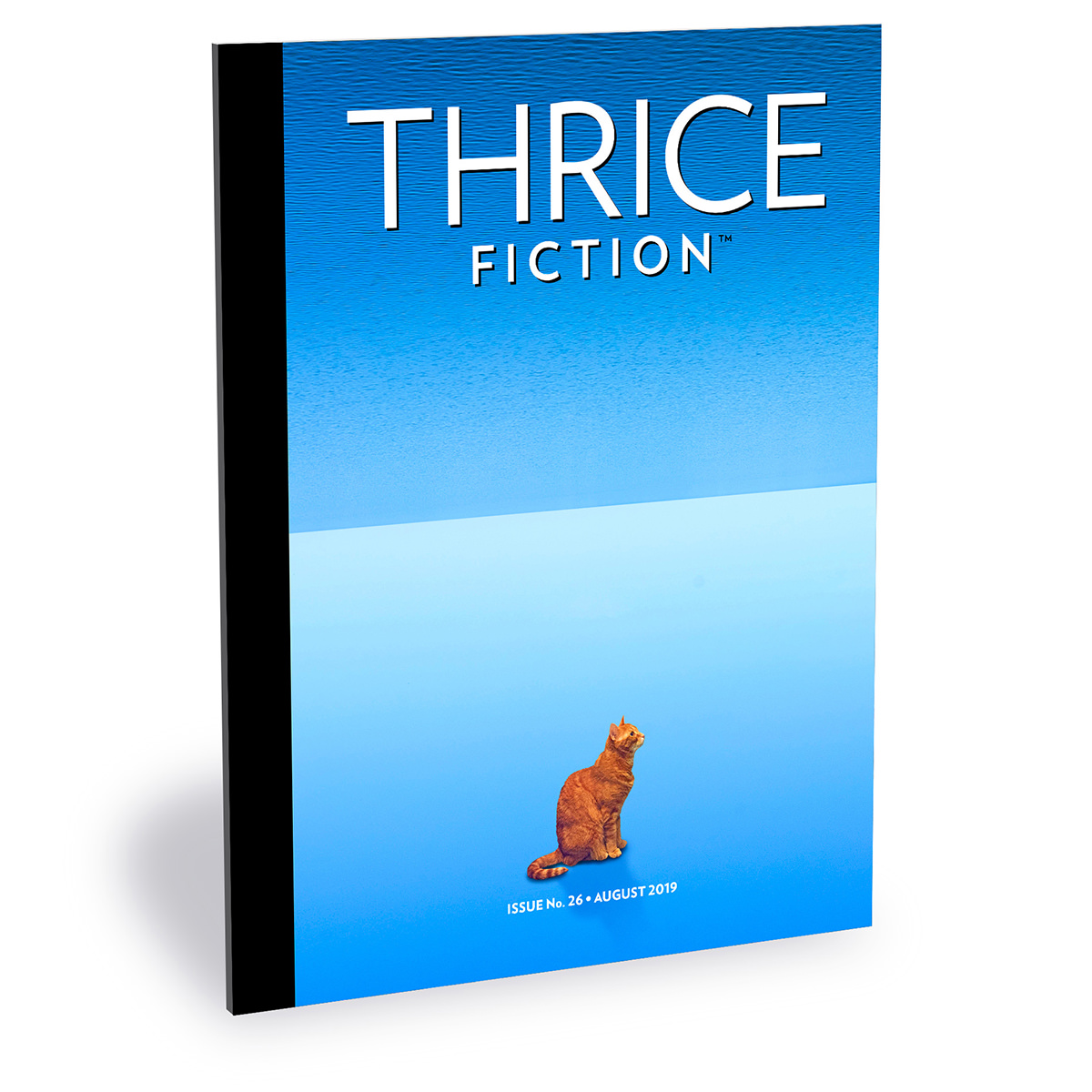
The cat is my sweet Jenny. So that means both my cats have now appeared in the magazine (Jake appeared in Issue No. 22). And here's the image for the story Ode to Oceans by Elena Botts...

That's a real photo I took. I just cut out the middle section which had a shore and some trees... then glued the sky and sea together to create a kind of weird mirror.
The next piece I created was for the story Way Cross, Georgia, 1937 by James Lloyd Davis...
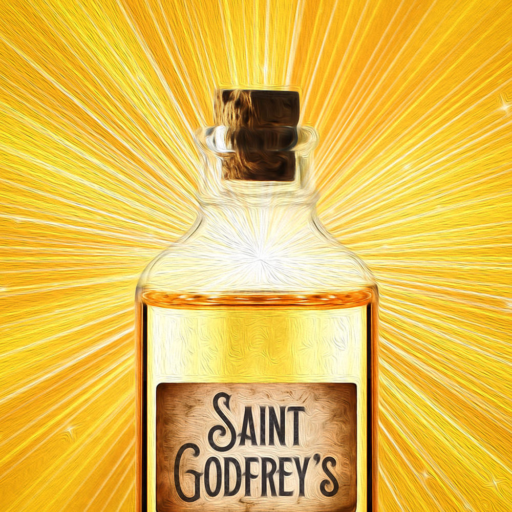
The story is one which has an emotional gut-punch and I wanted to have artwork to reflect that. But what I came up with originally didn't work for two reasons...
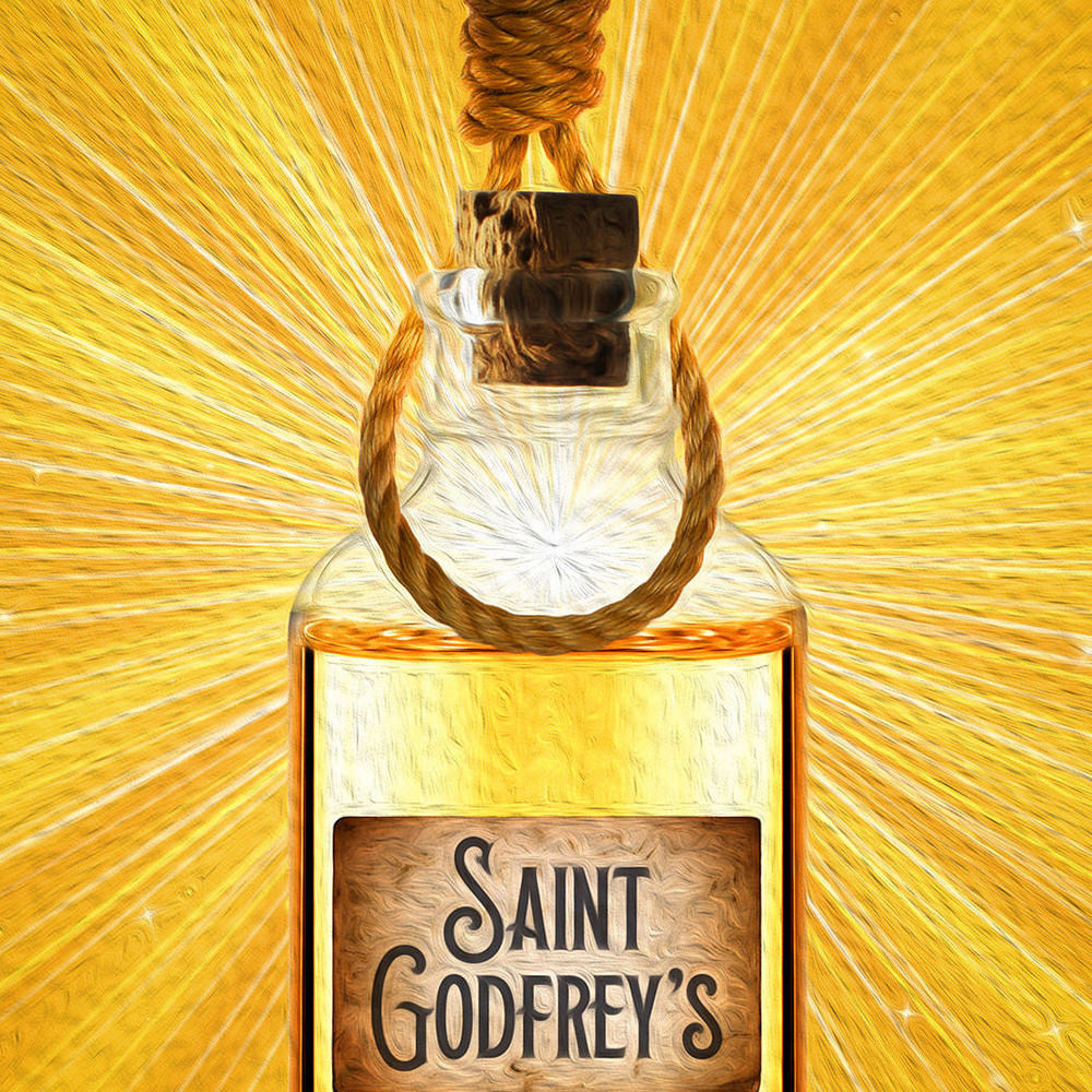
First of all... I had second thoughts on using a noose. It's a symbol of fear and hate and just seeing it can be hurtful to many people. I justified it because it's reflective of the story, yet I was still uneasy. But the reason I ultimately took the noose out was because it was a spoiler. The story has two distinct parts, and I was very careful to have a page break occur before the first section was over so the second part would be more impactful to the reader. But what good does that do if I give away the second part in the image?
And speaking of the image (a composite of four stock photos run through a paint filter)... the characters in the story are selling fake holy oil. I wanted to make it appear authentically holy by having a golden glow emanate from behind. It sure turned out pretty.
The last story I worked on was called Her Climb by George Hook...
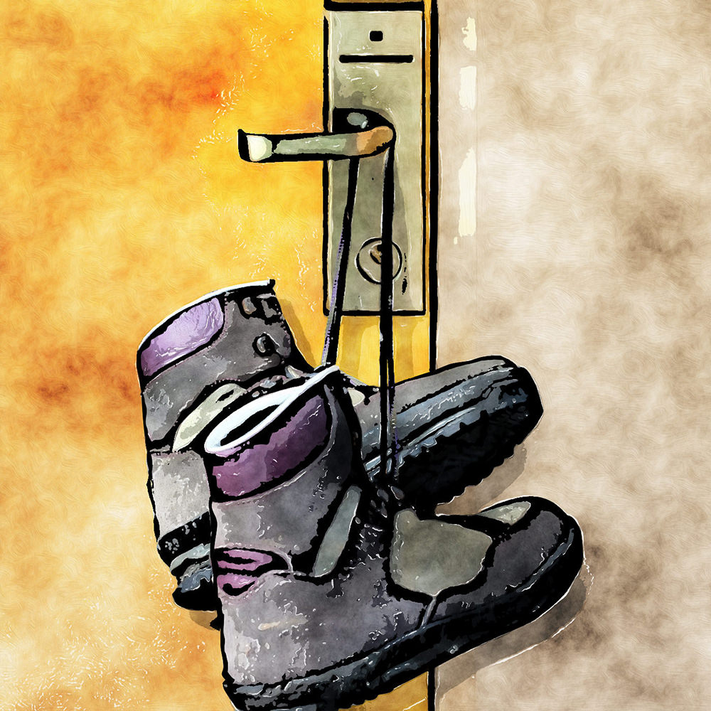
The story is the lament of a man pining after a Dutch girl who was climbing ahead of him. But, alas, the Dutch girl ended up with a French boy, and the man was left alone. He envisions the girl and boy from the climb in the room next to his being together (a climb of a different kind), which is even more painful to him.
I knew immediately what I wanted for the image. Since they were in the same building but different rooms, I imagined a hotel. And I imagined a pair of women's climbing boots handing off the door handle like a "Do Not Disturb" sign. My mom had a very nice pair of boots I bought her for our trip to Africa, but I couldn't find them to photograph them. I probably gave them to Goodwill or the Veteran's Exchange. So I ended up having to cut apart a bunch of stock images to create what I wanted... then drew around them with a heavy black outline. The resulting image was then run through a watercolor filter. I did several versions before I found one that would "read" for a small 2-1/4" square image.
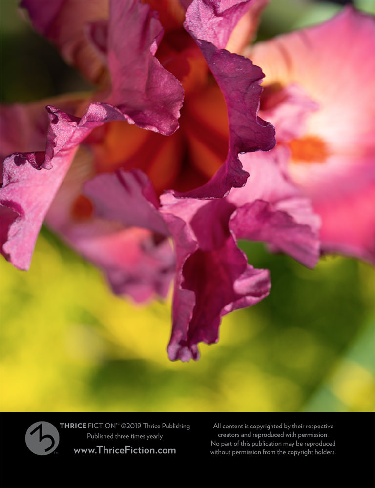
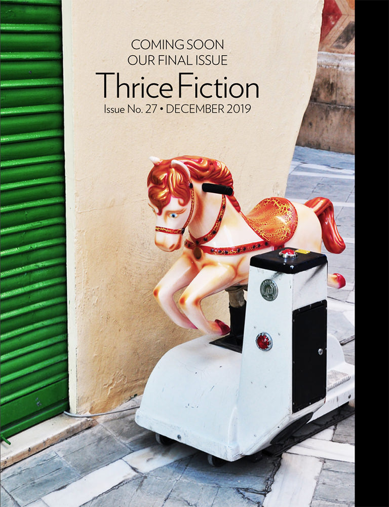
The final two images I created for the magazine were a flower from the side of my house on the inside-front cover... and a shot of a toy riding horse I photographed in Malaga, Spain...
And that was the end of that issue! One more to go...
 Hey!
Hey!
Have you heard?
The latest issue of Thrice Fiction has been released! And you can read it online (or download it as a PDF) absolutely FREE! To see a bunch cool stories and terrific art for the bargain price of free-fitty-free, just click here and enjoy!
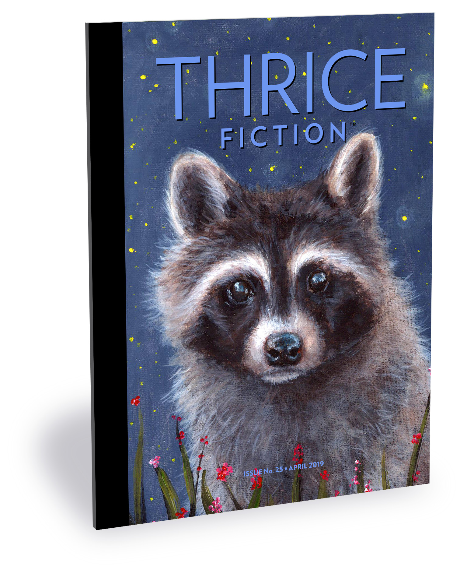
This issue's cover features our raccoon mascot and was lovingly painted by the ever-talented Kyra Wilson!
As always, I'm going to take a minute to talk about the art that I created for the issue. This may involve spoilers, so it's probably best that you read it before proceeding!
Alright?
Alright!
The first piece I created is for the story Convenience by Gregory Wolos. In the story a couple loses their dog "Bark" and all they have left is his collar. Since this happens almost immediately in the story, I didn't think it would be spoiling anything to use that in the image...
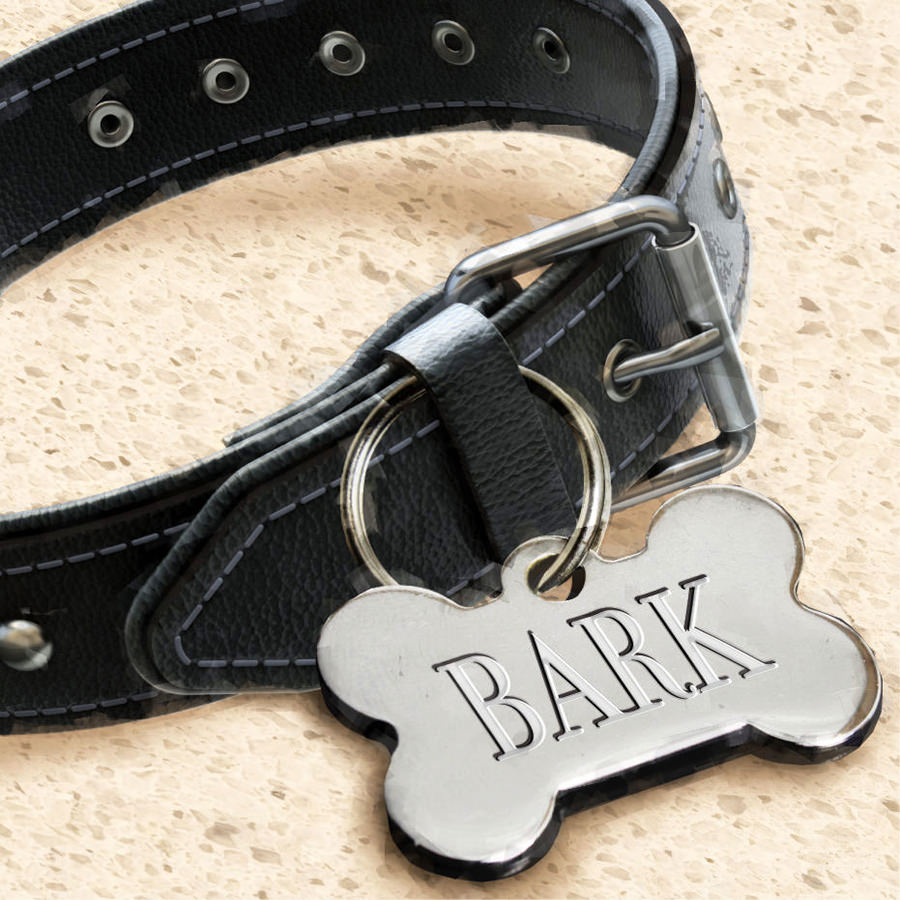
This is a stock photo of a collar that I combined with a stock photo of a name tag (which I had to erase then "engrave" myself) that I then Photoshopped on a formica countertop stock photo so I could add shadows. My goal was to have something look fairly realistic so that it reflected the very real stuff going on in the story.
This next piece for the story Last Wednesday by Djanaina Salamon was not something I felt that I should take on myself. It specifically speaks to experiences of a Black woman, and I felt if needed that voice for the accompanying artwork. I tracked down an artist that was a good fit, but it fell through. I tried to get a replacement, but that fell through. And so... the night before we went to press... I pulled out my laptop to paint something myself...
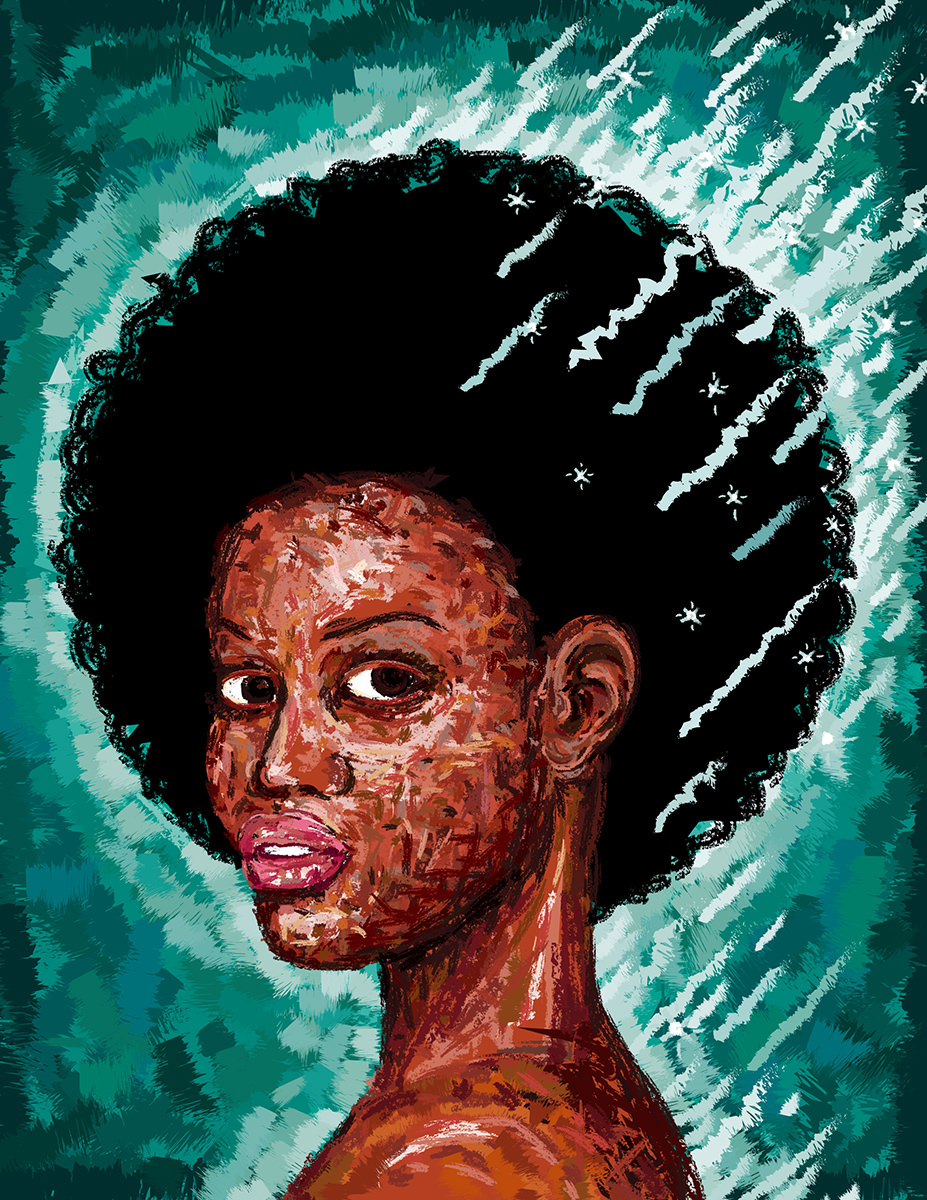
I used Adobe Illustrator and the brush pallet to "finger-paint" the image, which I wanted to look a bit raw and abstract... but still capture a sense of beauty. The idea here is that she's burning with righteous fury over the microaggressions and other daily injustices that would probably drive a white person insane if we experienced even a fraction of it. I didn't want the fire to be actual fire... that just reads as "anger" to me. I wanted it to appear "holy," in a sense, so that it could be interpreted as "righteous." So I decided to make it silver. I also decided to make it be more of a "glow" than wild flames, so it didn't seem like the woman was out of control. There had to be an internal strength there. Originally, her hair was much shorter... but then I got the idea to make an afro which was a perfect circle, like a halo around her head. In the end, I'm happy with the illustration... but I still struggle as to whether it was appropriate for a white guy to try and interpret something he will never have to experience. I really wish I could have found an artist better suited. But I was my only option if we wanted to make deadline. Such is the life of an art director.
For the story Away, Away by past Thrice Fiction contributor MaryAnne Kolton, I wanted to come up with something which illustrated what I perceived to be the essence of the story. It's the story of a woman thought of as weak and inconsequential by her abusive husband... a "dead fish" as he refers to her... who has to find the strength to do the unthinkable...
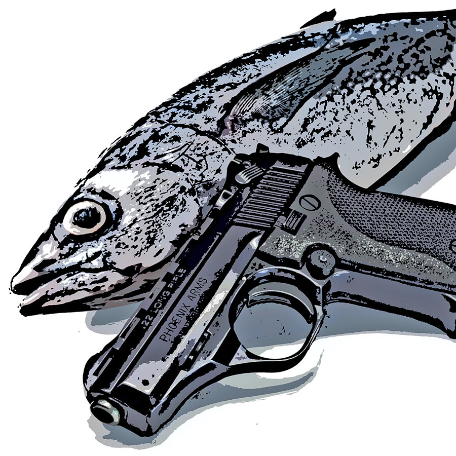
MaryAnne was specific as to the firearm used in the story... a Phoenix Arms Semi-Automatic Pistol... and I wanted to be accurate in my illustration. A stock photo of a dead fish was easy to find. But I couldn't find the right pistol at the right angle which could be used. So I called my brother, who works at a gun shop in Montana to see if he could help me out. He didn't have one. But a friend of his happened to walk in that did have one, so I had him prop it up against something of fish-height and send me a photo. I then composited them in Photoshop, painted over everything (being sure that "Phoenix Arms" was visible), adjusted the colors to be almost monotone and bleak, then ran it through some filters until I had what I was looking for.
Ali Azar's story A Drifted Sorrowful Soul was dense with imagery I could pull from... but I couldn't get the idea of a young Iranian boy being inundated with images from the television out of my head. At first I was just going to illustrate it like out of a children's book. But I bristled at the idea of taking such a serious subject and reducing it to a kiddie illustration, so I took my drawing and cut out textures as shapes that I could paste over it...
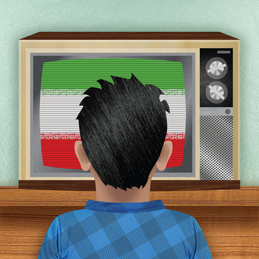
Every piece of the illustration is a texture except the Iranian flag, which is the real deal (but not really, because you can't see the center identifying mark). As you can imagine, this took a long, long time to construct. But the result is what I was looking for so I guess it's worth it. Kinda childlike... but "real" in the sense that the textures are all real.
For Paul Beckmans awesome bit of flash, it was critical to not give the ending away, which is what makes it so great. So I grabbed an image from the front-end of the story of a running dog and used that. In order to throw readers off balance and make it so they couldn't possibly guess what the story was about, yet be compelled to read it so they could understand what was going on in the picture, I intentionally drew something goofy and simplistic...
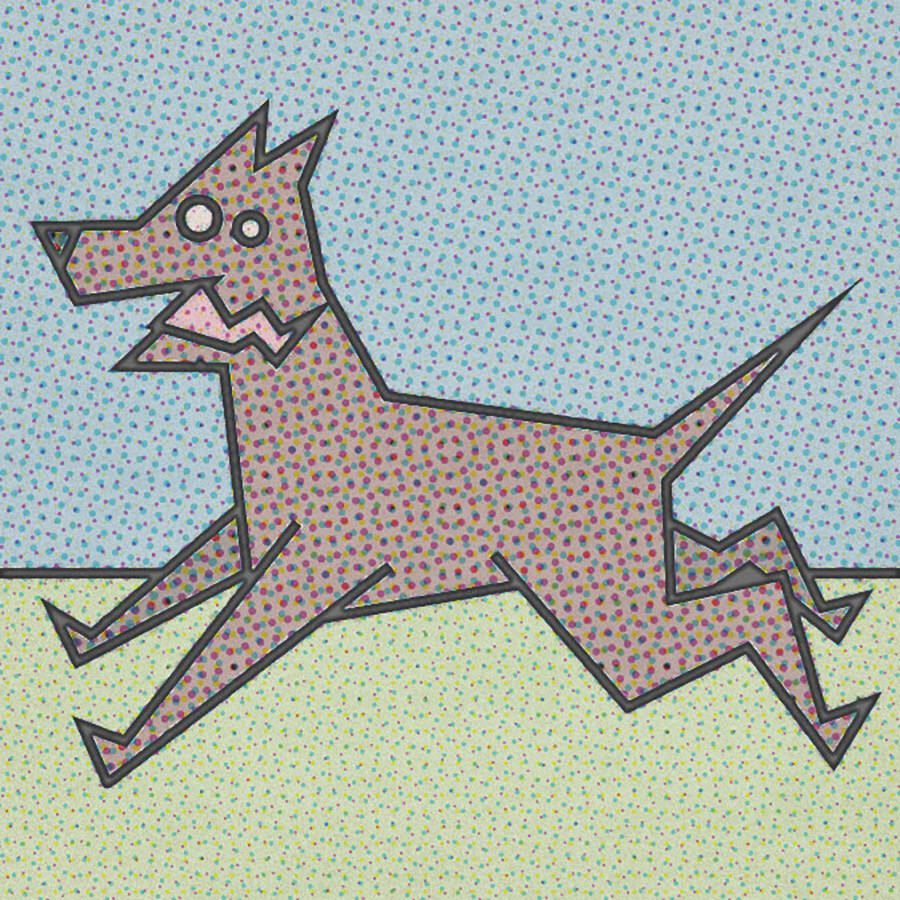
I then added old-fashioned halftone dots to the image to make it look like something out of a comic book. For no other reason than I love the story and the illustration I came up with amuses me, this is my favorite work in this issue.
For the cross-spread story of Larry, Said a Voice from Inside by Frank Candeloro, I knew exactly what I wanted to draw. The thing that sets everything in motion... a dying cellphone battery...
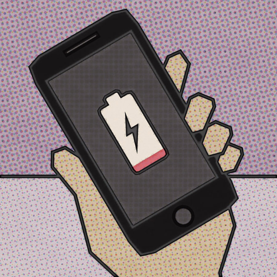
To match the previous page, I rendered it in the exact same style. Nothing round. All angles. Despite the simplicity, I love how it turned out.
And there you have my artistic contributions to Issue No. 25 of Thrice Fiction Magazine. If you haven't already, please do check it out... it's FREE, after all.
 Don't let smoke inhalation get you down, because an all new Bullet Sunday starts... now...
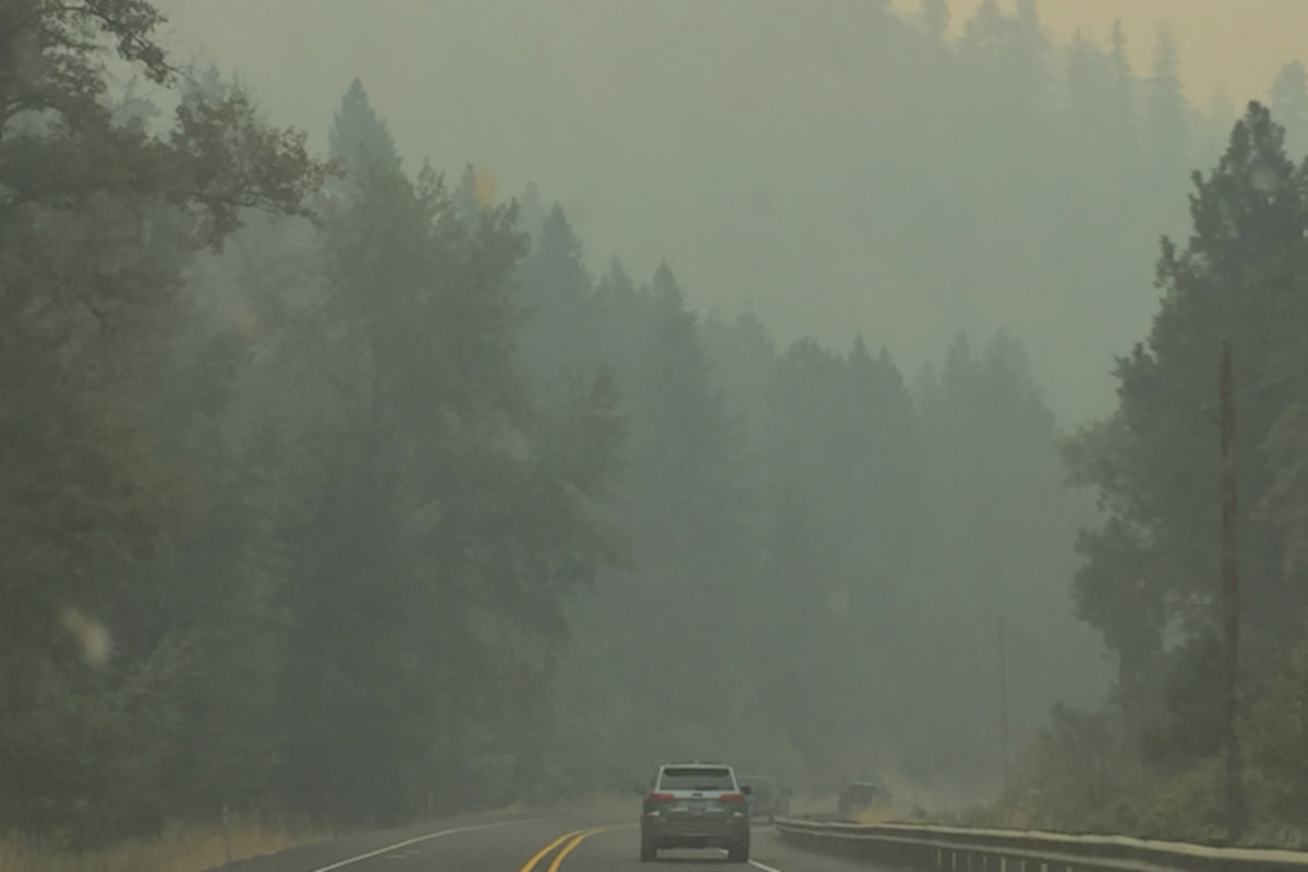
• FIRE! Once again it would seem that the Columbia Basin is on fire. This is the view I had on the drive over the mountains...
• Chase! My... My... My pants! Jake chases Jenny. Jenny chases Jake...
It's the circle of life up in my house.
• Tolerance! A short but bittersweet article that's worth a minute of your time: The Christians Making Atheists. The decline of Christianity in a nutshell. But, in reality, it could also hold true for other religions that attempt to hide their bigotry in the guise of religion.
• Fresh! This is what happens when you travel a lot and keep forgetting to pack deodorant...
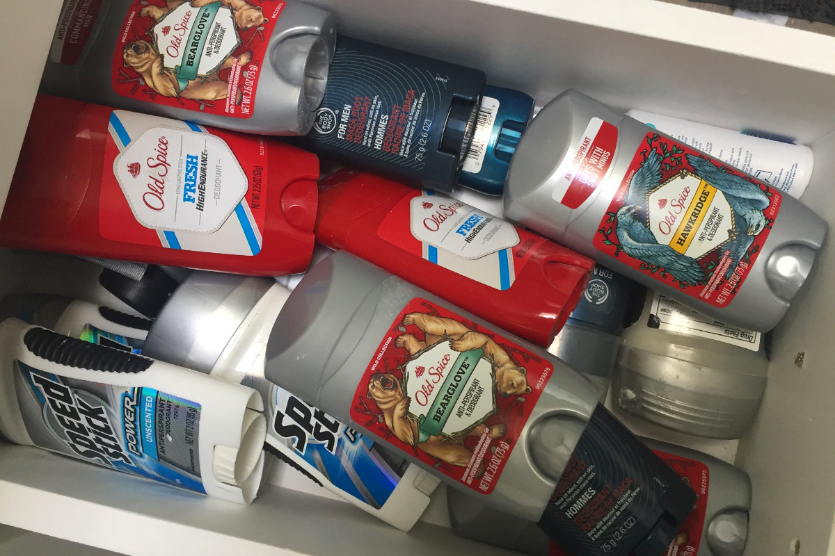
That's a lot of money tied up in antiperspirant products!
• Thrice! Hey! Did I happen to mention that the latest issue of Thrice Fiction has been released, and you can read it online or download it for FREE?!? Well, you totally can! Just visit the Thrice Fiction website!
If you like fiction and like to read... it's worth the price of admission. Which is FREE!
• All That We Share! Nice to know that while this country is tearing itself apart that other countries are making an effort to keep it together...
Viva la Denmark!
Have a good Labor Day weekend, everybody.
 Good news, everyone!
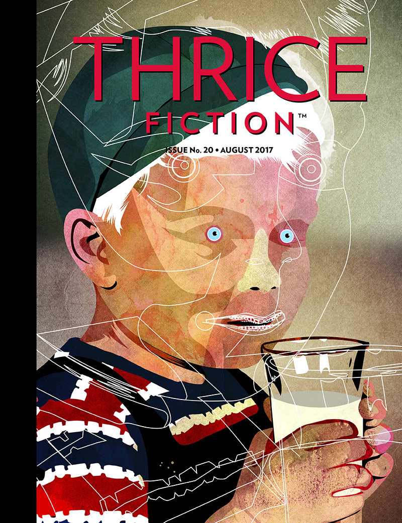
The twentieth issue of Thrice Fiction magazine has been released... just in the nick of time for the August cover date to still be in August! And you can read it online or download it for FREE at our website!
This time we are honored to feature a gorgeous cover illustration by Chilean artist Alvaro Tapia Hidalgo, who does work for The New Yorker, The Washington Post, Wired, Rolling Stone, New Republic, Forbes, Harper's Bazaar, and other fine publications. Many thanks for his kind generosity in allowing us to feature his artwork in this issue...
If you'd like to see more of Alvaro's stunning work, head over to his website and prepare to be blown away!
And now... what are you waiting for? Go take a look at the latest issue of the best fiction 'zine you're not reading: Thrice Fiction!
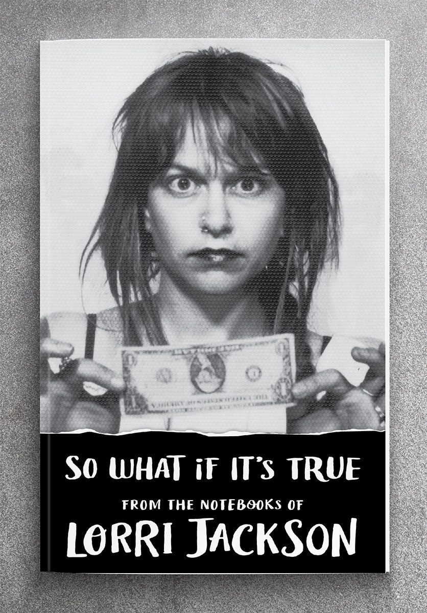
 I am very pleased to announce that Thrice Publishing (the Not For Profit company behind Thrice Fiction Magazine) has released their second book publication... So What If It's True.
This remarkable collection of poems, letters, and writings by the late Lorri Jackson is a lush snapshot of street culture in 1980's Chicago as edited by Thrice co-founder RW Spryszak and designed by Thrice co-founder David Simmer II (yours truly)...
You can read more about the book over at Thrice Publishing.
And if you'd like to order a copy, you can purchase it at Amazon with free 2-Day Prime shipping (for Prime members) or at the CreateSpace Store.
Thanks to everybody for your continued support!
 Hey! Yesterday was the last day of April!
It was also the last day RW and I had to get our "April" issue of Thrice Fiction released, which we did. It's our nineteenth installment of everybody's favorite lit-mag. A fact I bring up because I still remember being told not once... but many times... that we'd never last past our first year because most endeavors like this are doomed to failure.
But not us, baby.
You can take a look at it over at ThriceFiction.com and, in a first for us, you can also read it online! No special browser plug-in needed! In fact, all nineteen issues are available for reading or download absolutely FREE!
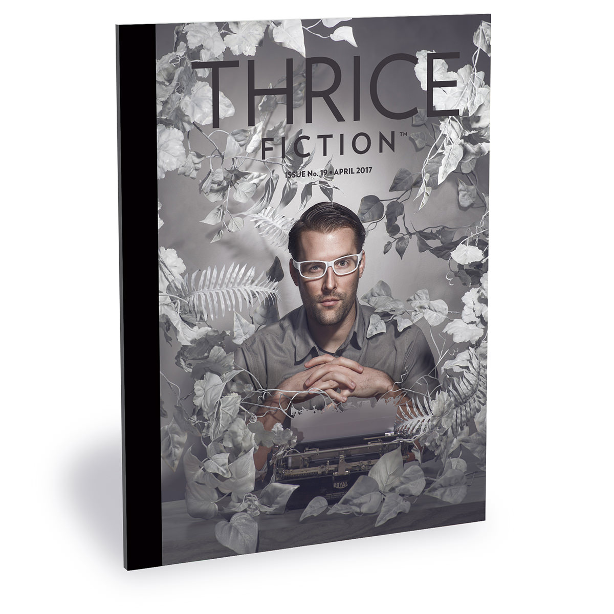
That amazing cover is courtesy of frequent Thrice Fiction contributor Katelin Kinney. Beautiful, isn't it?
The insides are equally wonderful... filled with great stories and terrific artwork from a bunch of talented people.
So what are you waiting for? Go get some!
 Did you know that yet another issue of Thrice Fiction Magazine will be debuting this month (hopefully)?
Well, it's true!
And while I don't want to give any of the awesome stories away, I thought I'd take a minute to share one of the art pieces I put together last night.
My favorite way of creating art to accompany a story is to draw, paint, or photograph something of my very own. But there are times that it's just not possible for what I'm trying to communicate. For one particular story in our next issue, I wanted to create a Bon Appetit magazine-style page. My vision was to have a kind of fried fish/prawn hybrid sitting on a plate in a Japanese restaurant... perhaps with a dollop of wasabi on the side. Being a vegetarian who hates seafood, the idea of putting fish parts in my deep-fat fryer filled me with horror, so I decided the best way to get what I wanted was to buy stock photos and assemble them into what I was envisioning.
And so I searched Adobe Stock for the pieces I needed...
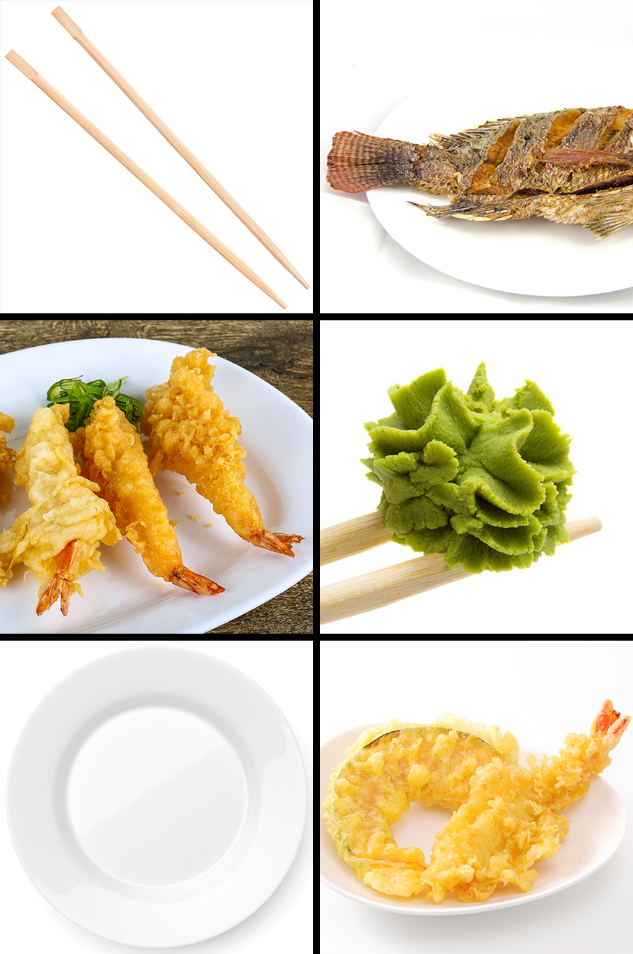
Then downloaded preview images into Photoshop so I could see if they would fit together well...
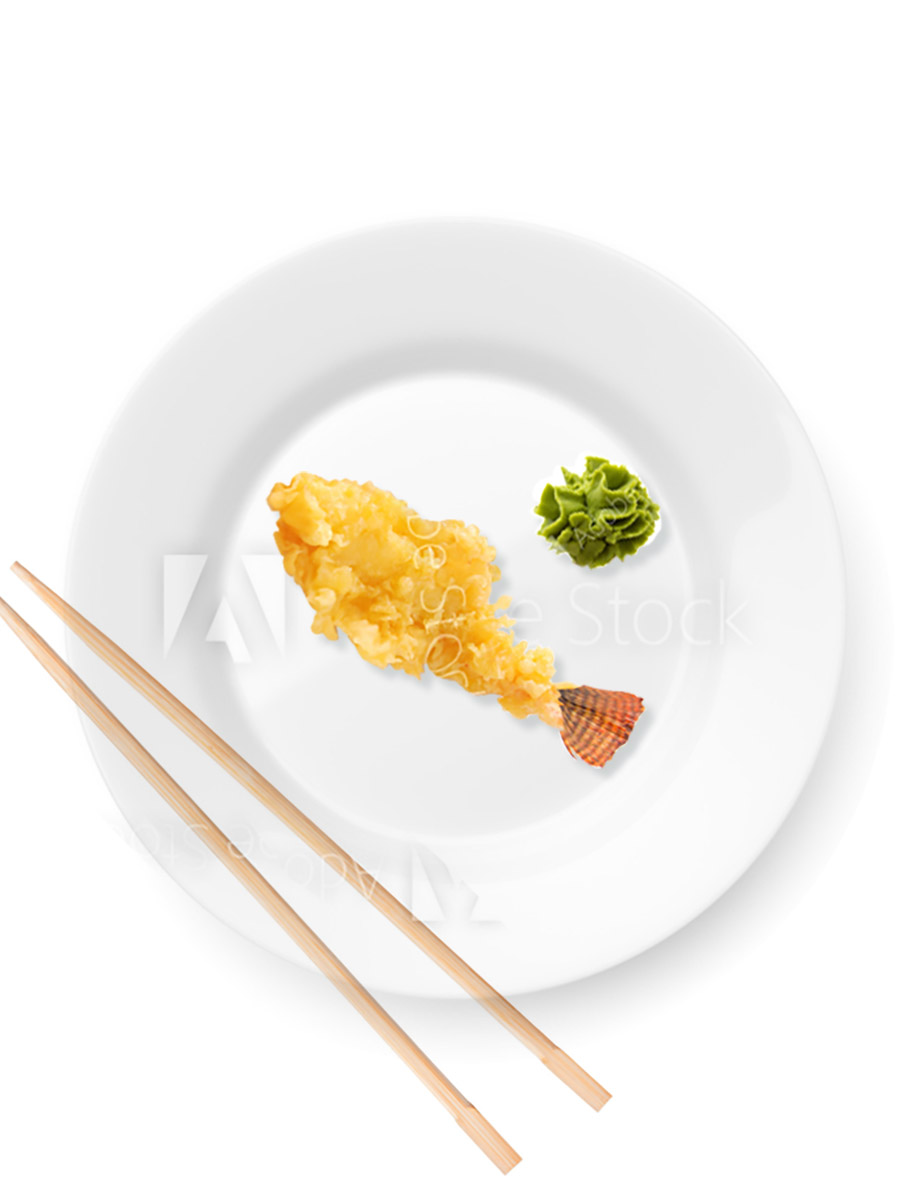
Then, once I was happy with all the parts and pieces I found, I'd purchase the full-res photos and get to work. I had to combine three pieces of fried fish/prawns into one... add it to a plate with some wasabi and chopsticks... then paint in shadows to bring it all together and make it look "real-ish"...

And voilà! A fish-prawn thing is served!
To find out why it's served... you'll have to download the April issue of Thrice Fiction, coming soon!
