 I don't sit around dreaming of having a ton of money. Would I like a ton of money? Of course. An awful lot of anxiety and worry would disappear if I was loaded.
But when I think of what having a lot of money would mean for me, this is what pops into my head...
Now, for those who are not familiar with Point Three, Assouline is a luxury book-maker whose products are beyond stunning. They're large, beautifully-crafted coffee table books which cost a fortune.
The company is best-known for their travel books (at $105 each)...
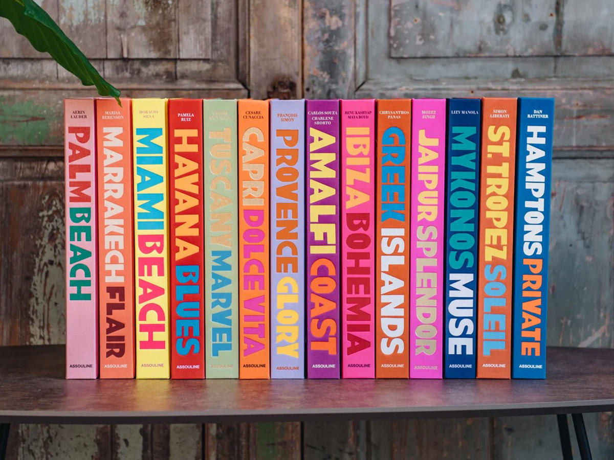
But they also have releases about many different subjects. Heck, they designed an entire book around Nutella.
But I'd probably start with Miami Beach.
 My mom was a huge murder-mystery fan. She devoured the Agatha Christie novels, loved TV shows like Columbo, Perry Mason, and Murder She Wrote. So when the novel Post-Mortem was getting huge buzz, she added her name to the list at the library so she could read it. This was, of course, the debut novel featuring medical examiner Kay Scarpetta by author Patricia Cornwell. And thus began my mom's longtime fandom of the series. I read some of them she thought I'd enjoy, and thought they were entertaining reads.
Due to the series' early successes, Demi Moore (who was riding high off of Ghost and probably A Few Good Men) was attached to star as Scarpetta in the film adaptation. As a huge fan of her work, I was looking forward to it. Except it never happened.
Fast forward to now, and Amazon Prime has come out with a series adapting both Post-Mortem and a much later book I never read. To have that make sense, there are two different sets of actors portraying each character in each time period. Most notably, Nicole Kidman and Jamie Lee Curtis as the older characters.
And despite the A-list talent and good source material, the Prime series is shit and I couldn't even get through the first episode.
First of all, the attempt at weaving together two storylines from two time periods is a failure. The connections don't really connect and the ping-pong narrative between past and present is a distracting mess. Maybe it evens out by the end, but I sincerely doubt it. I would have much rather them just adapt the complete book to let the story unfold more naturally. But the worst thing is the characterization of Scarpetta herself. Far from the analytical genius in the books, the adaptation is all about artificial drama that you'd be hard-pressed to give a crap about. Idiotic screaming fights are not what Scarpetta is about.
I never got far enough in the books to know that Lucy got married to a woman that eventually died, but I went running to the internet to find out if she created an AI of her dead wife in the books, because it seemed too randomly stupid for Patricia Cornwell to exploit. And, of course, it's not in the novels at all. Just another random attempt at padding out the source material that fails.
I know that Reacher is not 100% faithful to the books. But it still works because the character is faithful. So much so that it's almost impossible for me to read the books now without picturing Alan Ritchson in my head. The show-runners worked overtime to make sure that this was the case, which is why I love the adaptation so much. But with Scarpetta it's the exact opposite. The character is so divorced from the source material that I don't picture anybody from it in the books at all.
One of these days Hollywood is going to wake the fuck up and realize that the books they are adapting are popular for a reason. And deviating from them for whatever reason is a stupid mistake that rarely manages to improve on what people fell in love with in the first place.
But, as Scarpetta makes so vividly clear, that day is not now.
 This morning I woke up to the smell of burnt toast.
At first I was hoping it was a heart attack, but then I remembered that I attempted to make garlic toast to go with my pasta lunch yesterday and ended up burning it to a cinder. Because I forgot I had put it in the oven. Because my Whirlpool oven is so fucking stupid that you can't leave the door open when you're broiling something or else the oven turns off. Which means it's painfully easy to put something under the broiler and burn it because you can't keep an eye on it. I don't know if this is just my model or what. But never, ever buy a Whirpool oven when this is a possibility. Every time I have to broil something I'm like WHO THE FUCK DESIGNS AN OVEN LIKE THIS?!?
The butternut squash pasta with brown butter, crispy-fried sage, and pepitas was excellent though. Dang is that such an easy and delicious dish. And cooking it makes my home smell like a movie theater with lots of buttered popcorn. And, this time, burnt garlic toast.
But anyway...
I had mentioned some of the stuff hanging on my walls and got a question about it.
My favorite living comic book artist is Amanda Conner. She's phenomenal. The way she illustrates a story is so flawlessly suited to comic books. She has this incredible sense for crafting body and facial expressions to add to the story. And one of my favorite comic book characters is Vartox. He started as a wacky Zardoz imitation in a cool Superman story. But what he became in the pages of Power Girl is amazing. He's hilarious. So years and years ago when I saw three pages of original artwork by Amanda Conner from issue 12 featuring Vartox for sale? I jumped on them. Did I have the money? No. Did I care that I didn't have the money? No. I just bought them. Pages 13, 15, and 17 were mine.
To display them, I added printed scans from the comic for pages 11*, 14, and 16 (sorry I didn't straighten them out)...
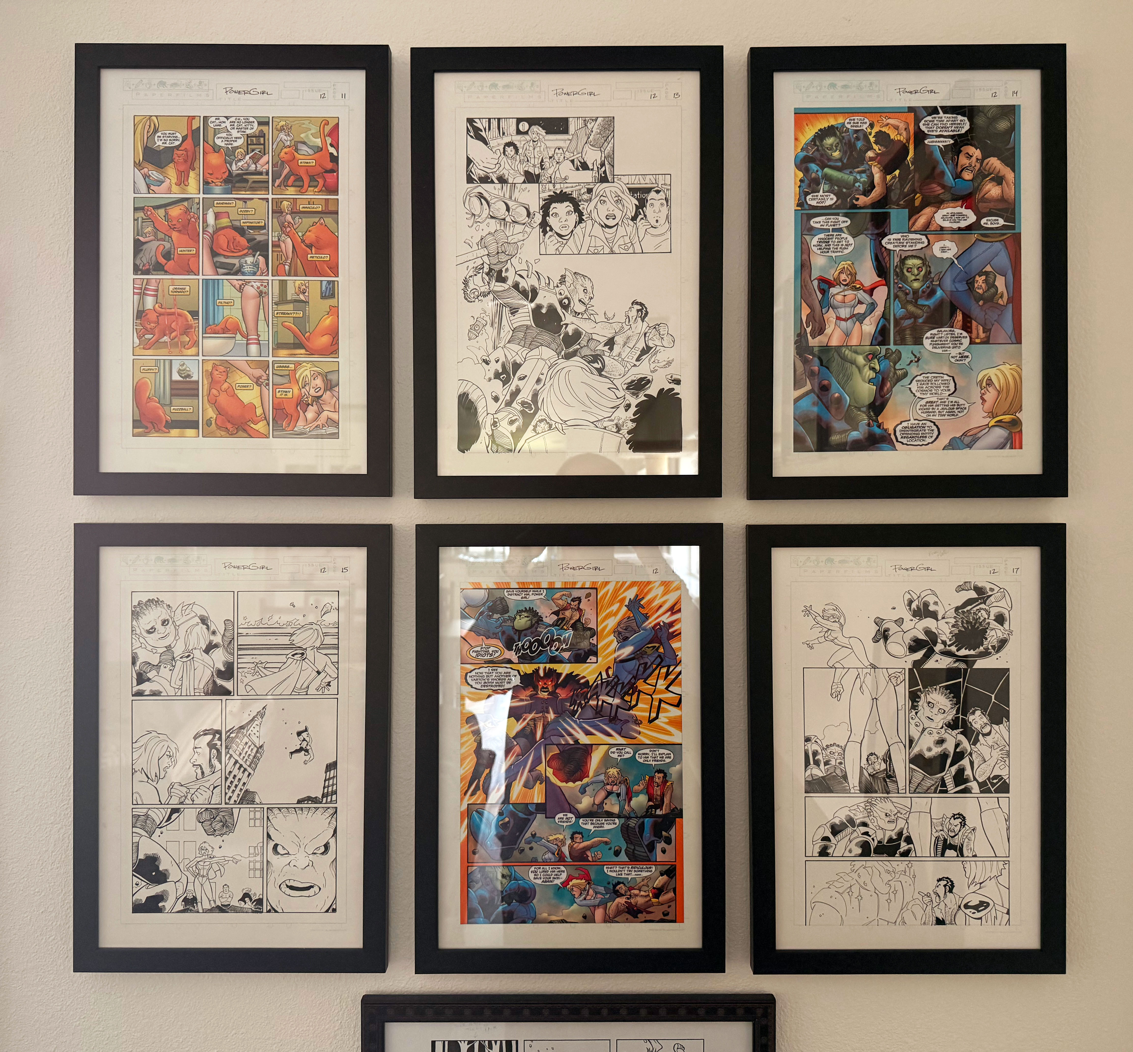
Click image to see the embiggened photo.
The art I bought was relatively cheap (the majority of each page are unpopular characters)... nothing compared to the cost of original Amanda Conner cover art... which is currently $4,000 to over $10,000 per page. So, yeah, profoundly grateful I was about to get what I got. Especially since it has Vartox in it. Conner doesn't do a lot of comic book art any more, so finding anything that's remotely affordable is nigh-impossible today.
Even though the art isn't particularly valuable, it means a lot to me. Which is why I nearly had a heart attack when it ended up lost after I moved house a decade ago. I had put it in a pile for me to take, but it got grabbed by the movers instead. Eventually I found that they had tucked it in-between some posters that got wrapped up. Posters that sat for almost a year before I unwrapped them. Talk about your happy surprises. I had long accepted that the pages got lost in the move!
When I started buying picture frames to start framing up all the stuff I had in storage, these were the first that I ordered. And I went all out... bought the UV-protective glass so they ink wouldn't fade. Then made sure I put them in a place which received no direct sunlight, just in case.
And now I can easily look at them whenever I want, which is often because they're some beautiful pages.
*I went with printing page 11 instead of 12 because I love that 11 featured her getting a cat!
Since I frickin' lost all the entries I had written for this week and am having to go back and remember what I must have been doing during this incredibly busy week.
Work, mostly.
And while I work? The many adaptations of Agatha Christie's fantastic murder mystery sleuth, Miss Marple. My mom was a huge Christie fan and I'd read the books she got from the library after she finished them. It was a natural progression from the Encyclopedia Brown books of my youth.
But anyway, back to adaptations...
My most favorite adaptation of Marple is the two TV movies starring Helen Hayes... A Caribbean Mystery and Murder with Mirrors. To this day I remain gutted that we didn't get another movie or six from her, because she added such a flawless and effortless air of mischief to the character.
Before Helen Hayes we got a different take on Marple by Angela Lansbury in The Mirror Crack'd. The movie was a good one, but Lansbury was much better suited to playing Jessica Fletcher in Murder, She Wrote (which my mom also loved). Alas, the movie didn't do well at the box office, killing a planned trilogy.
Joan Hickson is widely seen as the "definitive" Miss Marple by many, and her adaptations of the 12 novels are legend. What's bizarre is that Agatha Christie herself wanted Hickson to eventually play the character after seeing her in a play in the 1940's. It's bizarre because this series didn't start filming until 1984. Which means Christie was seeing the actor 40 years before she would play the role, and died before she saw Hickson realize her dream casting choice. Of all the adaptations made, this series is probably the most faithful (or, as faithful as it could be given that so much time had passed since the books were written).
And then we come to Marple... the adaptation which wasn't much of an adaptation which ran from 2004-2009. Granted, it's been so long since I read the books that I'm a bit fuzzy on details, but this series plopped Marple into stories she wasn't actually in and changed some major plot points of the books in which she did. As if that weren't enough, they invented details of Marple's life which don't remotely fit the character (she's always been a spinster, but this show gave her the back-story of having had an affair with a married man in the second episode?!?). Geraldine McEwan starred in the first three series and was fine... but the entire appeal of Marple is that she's a sweet old lady. Instead they wrote her as slightly more aggressive in this series, so the charm just wasn't there. When she retired and the role was taken by Julia Mckenzie, they kinda realized the error of their ways and reverted her personality back to the sweet old lady from the novels. Which is to say that I liked the final three series quite a bit more than the first three, and there were some excellent episodes. Even so, the Hickson series still manages to top anything we got here.
And now we're in 2025 where apparently we're getting new Miss Marple movie adaptations after the success of the Kenneth Branagh's Hercule Poirot films. I'll watch them, of course, but I didn't think any of the three modern Poirot adaptations were as good as what came before. Albert Finney (Murder on the Orient Express) and Peter Ustinov (Death on the Nile) were sublime in their respective film adaptations, and David Suchet's take on Hallowe'en Party (which became A Haunting in Venice) is also my preferred adaptation. But still... I'll hope for the best.
No matter what happens, the books still exist*
*Albeit with the racism, antisemitism, and other bits edited out for modern audiences.
 The Dog Days of Summer may be slowly fading, but the Bullets of Summer are still sticking around... because an all new Bullet Sunday starts... now...
• Yesterland! This video of Disneyland in 1956 is wild. Everybody dressed up for a day out at Disneyland... from dress shirts with long pants and full on suits... to sundresses or Capri pants... nobody was in jeans and a T-shirt (and where were short pants for the guys?)...
I remember for my first visit 20 years later it was the same. My brother and I were dressed up in matching green suits that my grandmother made. And the reason I remember them so clearly? Because the threads in my suit glowed when we were riding It's a Small World. I remember the suits right down to how the buttons looked (but don't ask me what I had for dinner last night). And, wow, were the attractions very different at the beginning! No E-ticket rides in 1956 because they didn't come until three years later. And of course this were back in the days where not much was politically correct. Something I didn't know is that Disneyland was never segregated. Walt Disney wanted everybody with the means to pay to visit the Happiest Place on Earth. That being said, there are precious few non-white people in this film (except for the "Indian Village" entertainment, of course). Interestingly enough, the boat skippers on The Jungle Cruise fired AT the hippos instead of in the air to "scare" them back in the day. Vicious.
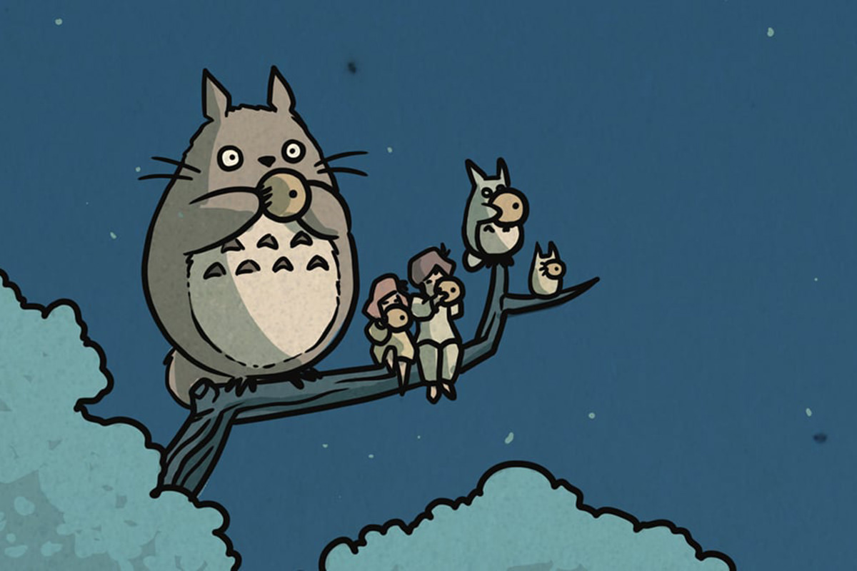
• I've Been Framed! Every payday I've been buying picture frames to hang up prints and art and maps and bits and pieces I've been collecting over the past 50 years. Last time, I bought some frames that arrived in a totally a different color than I ordered, so they refunded me 50% of the cost and I just spray-painted them. Score! Today they finally stopped smelling, so I hung them up. They're prints by Bill Mudron as a tribute to Hayao Miyazaki and his Studio Ghibli films (based on prints by Kawase Hasui). I love them. There were actually five I wanted, but two of them were sold out, so I got the these three, which are incredible. They're in the hall as I walk in the front door...
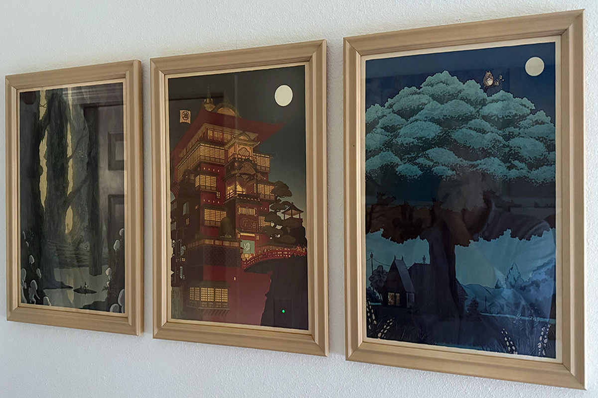
Dang. I wish I could afford glare-free museum glass (to get a closeup glare-free look at them, you can visit the artist's website here). What I really love is that the characters from the films are almost hard to spot in these prints because they're very small. In mine for Princess Mononoke and Spirited Away and My Neighbor Totoro, you have to look a minute...
I really wanted the prints for Kiki's Delivery Service and Ponyo as well...
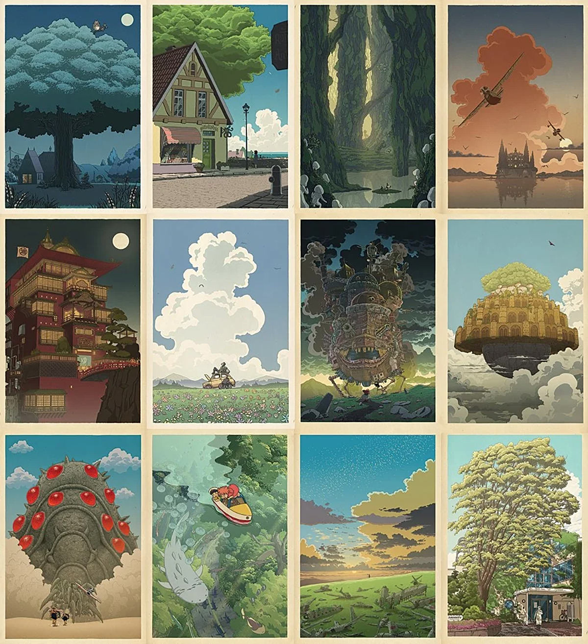
You can buy reproductions on Mudron's website, but you can't get them at the size of the original prints, dangit. I may buy a few smaller reproductions to hang somewhere else in my home, because they're so frickin' amazing.
• The Plot Thickens! If you've never seen Robots Draw, you're missing out. I knew about the account, but I didn't know that the guy behind it did a TedTalk...
Before I could afford a dot matrix printer, I had an Atari 1020 4-color pen plotter, which I'm reminded of every time I see a Robots Draw reel...
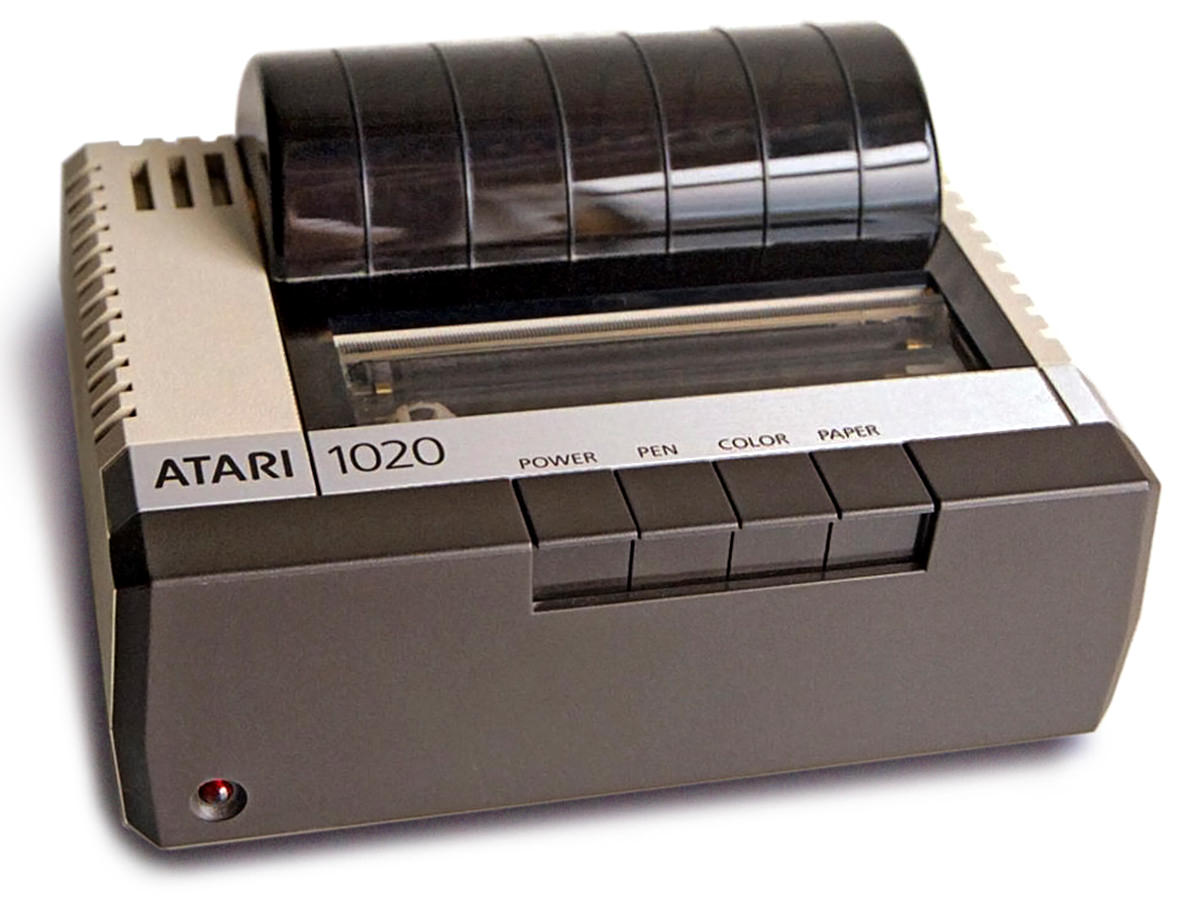
The printer was mostly for fun because the paper was only 4.5-inches wide, but it was better than nothing. Even if it took forever to print text because the letters had to be drawn one by one. Wikipedia has a short article on the unit here (which is where I got the photo).
• Gooey! I honesty don’t know how in the hell got to be THIS BAD at Apple after Steve Jobs’s died. Granted, I am using a public beta of the latest iOS, and this might be fixed... but... what the fuck does this last button do in Apple Music?

The first is shuffle. The second is repeat. The third is infinity auto-play. But that fourth button provides no feedback as to actually doing anything, so I have no idea. This odd set of buttons could very well be the worst GUI design I’ve ever seen. Coming from a company that used to care about GUI! Fortunately, long-time blogging friend LeSombre managed to remember an article about this very topic and was able to tell me it means "AutoMix" and Apple describes it as "Songs transition at the perfect moment, based on analysis of the key and tempo of the music." So I immediately turned it off, because I wondered why in the hell the end of a song was either sped up or slowed down in weird fucking ways as it faded to the next song via CarPlay. No thank you. And, on that note... APPLE, FOR THE LOVE OF GOD, PROVIDE SOME FEEDBACK FOR YOUR FUCKING BUTTONS SO PEOPLE KNOW WHAT THE FUCK THEY ACTUALLY DO!
• Only Connect! If you've ever been frustrated by The New York Times puzzle "Connections," you should know that it was inspired (or stolen) from a UK quiz show Only Connect. These puzzles always feel incredibly difficult, and I can't fathom having to solve them within a time limit. It usually takes me forever when I have forever!
In other news... "Father's Day" was invented at a YMCA in Washington State?!??
• Atmosphere! Alaska Airlines has rebranded their loyalty program as "Atmos" now that they've merged with Hawaiian Airlines. Which is fine, I guess, if not for the fact that Dolby Atmos home theater sound standard already exists. I'm guessing that there was no trademark danger since they are wildly different industries, but I still wonder why they'd go with this?

"Atmos" isn't a real word. At best it's an abbreviation for "atmosphere" (which is where Dolby got it, I'm sure, because they're creating an atmosphere of sound). Not sure where Alaska's head is at here, but I can't help but think they could have come up with something better.
• Winds of Waiting! I am clinging to the idea that the person asking this horrific question has challenges gauging social situations and perhaps didn't know that what they were asking is awful. Anything else just beats down my faith in humanity to new lows. I don't care how impatient you are for the next book, this is inhuman. And I have zero doubt that this question already haunts George RR Martin himself. So... why?
That. Being. Said. While undeserving of... whatever this was... Martin has kinda brought fan frustration on himself. He has been stringing everybody along for thirteen YEARS. All the promises and all the assurances of Winds of Winter being a "priority" falling by the wayside while he finds another TV show or movie or game or book or convention or talk show or whatever to do. Anything but actually getting the work done. Add to that the HBO adaption utterly destroying the ending of the A Game of Thrones adaptation and making fans even more anxious to know how everything "really" ends... and, well, it takes things to new levels. — No, he did not deserve this terrible question. But I have to wonder if George RR Martin wasn't constantly making promises he couldn't keep, would we have an environment where people feel entitled to ask a question like this in the first place? Something to ponder. Also something to ponder? BRANDON SANDERSON COMPLETING A SONG OF FIRE AND ICE?!? Good Lord. I'd rather have no ending than that. These authors in no conceivable way complement each other. Like... at all.
Now it's time to go pick tomatoes for my dinner.
I've been sick all weekend with a stomach bug, but have no fear about going bullet-free this Sunday... because an all new Bullet Sunday starts... now...
• Claws Out! I have a treasure trove of old memorabilia that I've been collecting over the decades. The most prized stuff I have is all the junk I saved from when I was ten years old during my first visit to Disneyland. And there's a lot of other Disney stuff collecting dust too. Prints and brochures and tickets... the list is endless. And then there's the travel stuff. And the comic book stuff. Boxes and boxes of it. And do you know why it hasn't been taken out and framed for display. Partly it's the cost. But mostly it's my scathing hatred of hanging stuff on the wall. It's way too difficult to even things up and get them to end up where you want. Enter CLAW drywall hangers by 3M...
And it really is that simple. The included positioning stickers make getting things where you want them pretty easy. Though I put the hook in the hanger, then put the positioning sticker under the hanger. That way when I position the frame on the wall and the sticker it set, I just put the hook above it... no pencil marks needed. And, yeah, I'm still not a fan of actually doing the hanging (nor the framing cost), but at least now I'm actually willing to do it.
• Heated! Preach, Elmo...
We're at the point where just taking out the garbage is a horrible ordeal where I live.
• Death After Life! It's no secret that Death: The High Cost of Living is one of my all-time favorite graphic novels. From the minute I saw Kirby Howell-Baptiste as Death in the first season of The Sandman, I was dying to see an adaptation of the story. Well... be careful what you wish for... because this adaptation was a complete waste. They took pieces of the story, but missed the entire point of what it was saying. I know that time was limited to an hour and they couldn't put in everything it, but surely they could have been more selective than this?
A few better choices here and there would have made a world of difference. Netflix failed utterly after the absolute perfection of everything that preceded it.
• De Niro's Still Waiting! Bananarama, one of the most celebrated "girl groups" on record, has continued to put out great music for decades after their big hits dropped. What I didn't know is that Sara Dallin and Keren Woodward rejoined with original bandmate Siobhan Fahey for a series of tours in 2017-2018. But I found out when this gem appeared in my YouTube feed...
And it turns out, yes, Robert De Niro knew of the song and took the band out for a drink when he met them after its release...
And, yes, Dallin and Woodward are still out there performing to crowds who still know every word to their songs...
If you're a fan, their YouTube Channel is worth a look. They take a look back at their old fashion, revisit old songs, and have their new music available for a listen.
• Morphin Time? Please, Lord. Please let this photo get back to the woman who was cosplaying Pink Ranger who didn't know she was standing next to the Pink Ranger...
I love stuff like this.
• Mourning in Cincinnati. And, lastly, I was just. talking about how all the people from my childhood are passing, and today got a gut punch when I learned Loni Anderson died. Her playing receptionist Jennifer on WKRP in Cincinnati was such a defining television memory for me...

But the thing that most impressed me when it came to her acting, was playing the title role in The Jayne Mansfield Story (opposite Arnold Schwarzenegger!), which is available in full on YouTube (for now)...
Rest in Peace.
And now it's time for more Pepto Bismol and a nap.
 My parents, education-forward that they were, bought not just one set of encyclopedias... they bought us two. They were different brands, but years apart, so I'm guessing they wanted to have books with the most current information while we were in school. No idea how my parents were able to afford such an extravagance... probably a monthly payment plan or some kind... but I was very glad to have them. Not just for the sheer convenience of having such a massive resource for doing school work at home (no trip to the library for me!), but also for entertainment.
I remember pulling volumes off the shelf and just reading them. Sometimes randomly flipping pages to learn something new. But most times starting on page one then working my way through it. I had an encyclopedia on my nightstand a lot as a kid.
Then came CD-ROMs. A media just begging for an encyclopedia set.
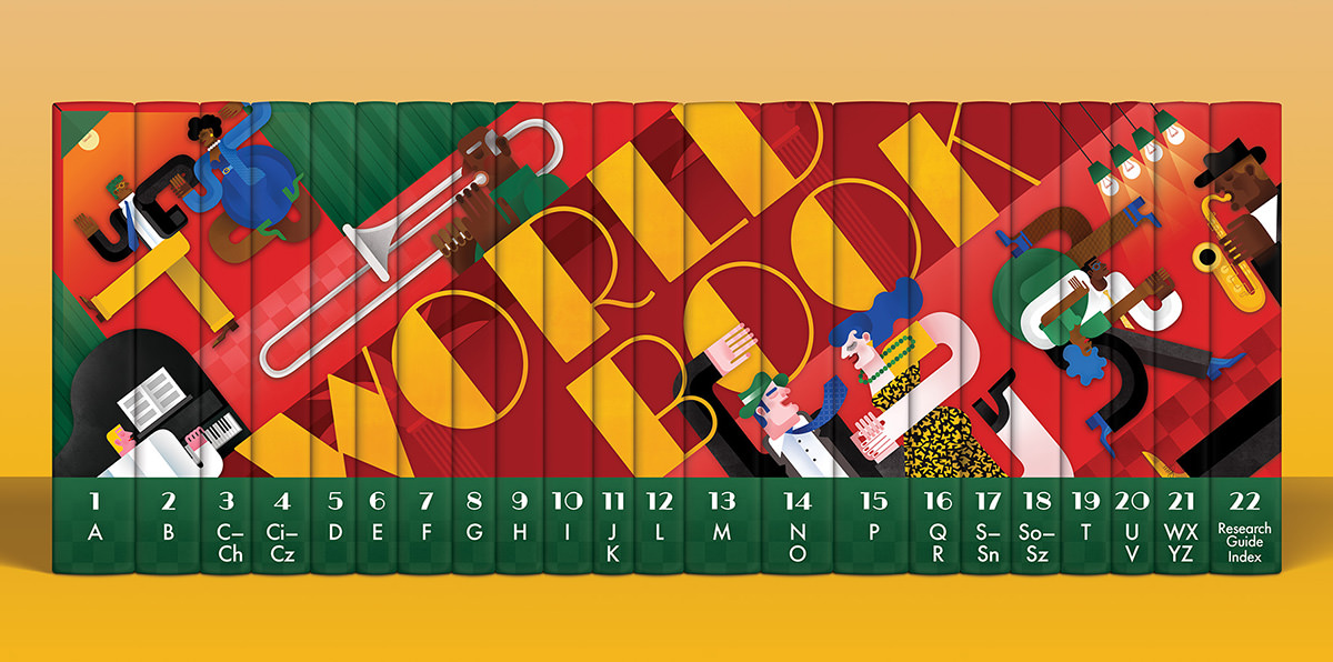
The big one being Microsoft Encarta, which I actually owned because it came with some bundle I got. But since I was on a Mac, I never used it. I had one of the alternatives, The World Book Encyclopedia. Which was handy, sure, but it was so slow and such a hassle that I didn't use it much. It was so much easier to grab a book off the shelf.
Except you couldn't, because the minute CD-ROM versions came out, the print versions were discontinued. Which I get because printing that many full-color pages were not cheap.
Which brings us to an interesting aside... apparently The World Book Encyclopedia is the only American encyclopedia still available in print. Sure it costs $1,175.00, but dang is it beautifully-designed...
World Book's owner Berkshire Hathaway's CEO Warren Buffett has committed to keeping the encyclopedias in print so long as a demand for them exists, which is darn cool.
But anyway...
The reason I fell down this encyclopedia rabbit hole is because I was wondering what happens when kids no longer know what an encyclopedia actually is. They'll likely be all Oh... you mean Wikipedia?" or something. And THAT got me wondering what happens to my childhood literary hero, Encyclopedia Brown? Perhaps the publisher will change his name to Wikipedia Brown? Or do they revert to using his real name... Leroy Brown.
They might as well, because it's not like kids now-a-days have ever heard of the Jim Croce song Bad, Bad Leroy Brown.
I may not be at home, but I'm still tossing bullets aplenty... because an all new Bullet Sunday starts... now...
• Cinematic Apathy! Simon Stålenhag is a brilliant, brilliant writer/artist who has crafted some of the most amazing books you'll ever see. The Electric State is a beautifully dark and haunting tale where every illustration looks like it belongs in a museum. The Russo Brothers, whose Avengers movies are genius, made a boring, safe adaptation that completely misses the point (on Netflix). It's awful, even though the source material is phenomenal still...
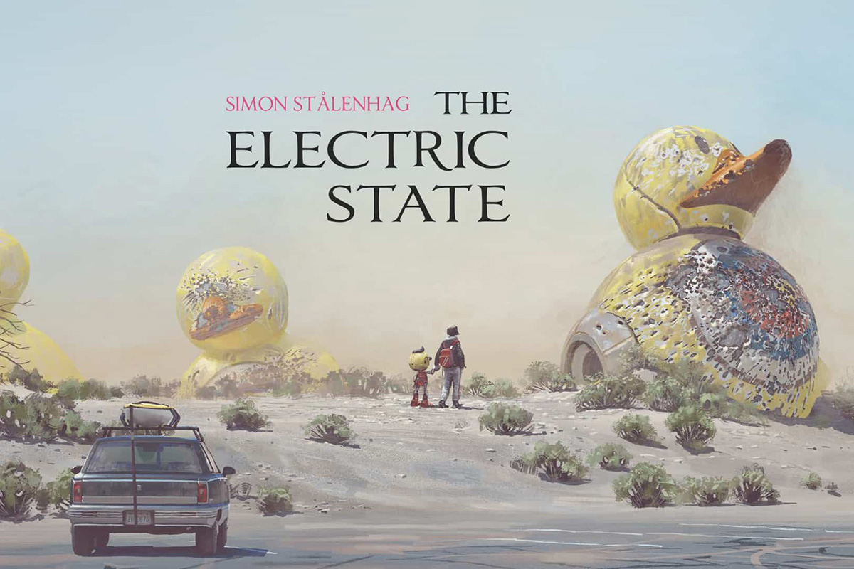

Even if it were a completely new movie that was an original work it would be awful.
• Qualls! This is easily one of the best Hollywood interviews I’ve ever seen...
What a fascinating guy.
• Port of Seattle! I’ve been saying for decades that SeaTac Airport (AKA Seattle-Tacoma Airport) is one of the shittiest airports in the world, even on the Federal level at Border Control. As you can see here. The airport is busted, nonsensical, inconvenient, and prioritizes space for businesses over space and comfort for passengers. I am filled with dread every time I fly out of the shithole. And I’m filled with embarrassment whenever visitors have to use it.
• Found On The Internet Part 7,365,411! I could use this award almost daily...
And so could you if you read this blog daily!
• Reagan?! I'll just put these videos here for no particular reason...
No reason at all.
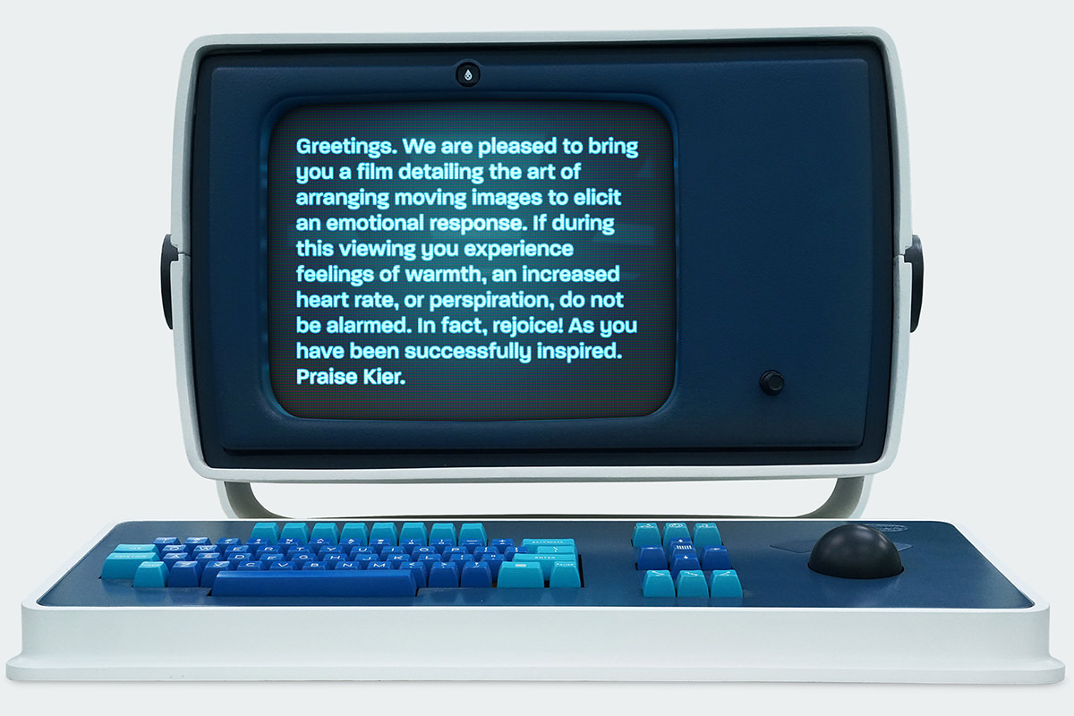
• Lumon Terminal Pro! BWAH HA HA HAAAA! If you're watching Severance on AppleTV+, then Apple's latest computer may interest you...
• Vaccinate! I feel bad that anybody suffers the consequences of science-denial... it's all programming and ignorance... but I feel even more terrible that their children have to suffer with them. Because Jesus Christ...
Your God gave us vaccines, but here you are... wanting your child to die instead of accepting a literal miracle that was handed to you.
See you on the other side of the mountains. One of these days.
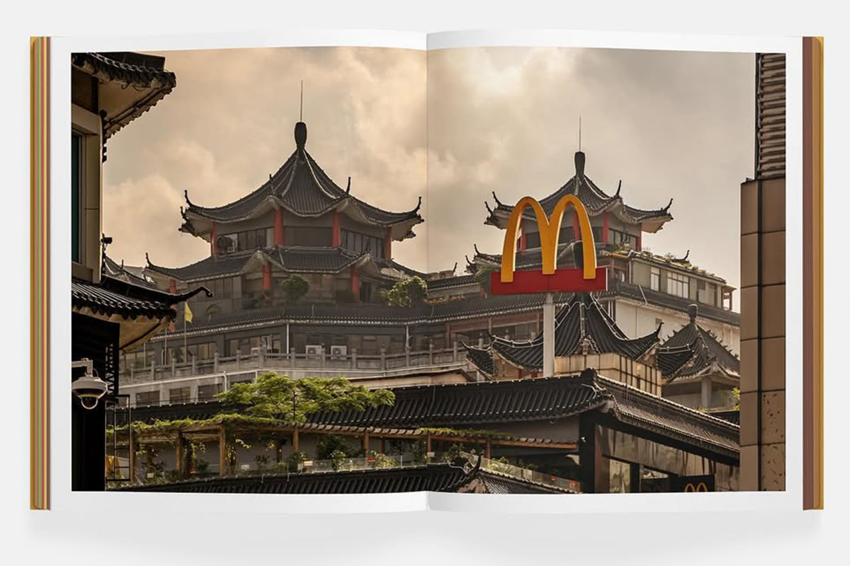
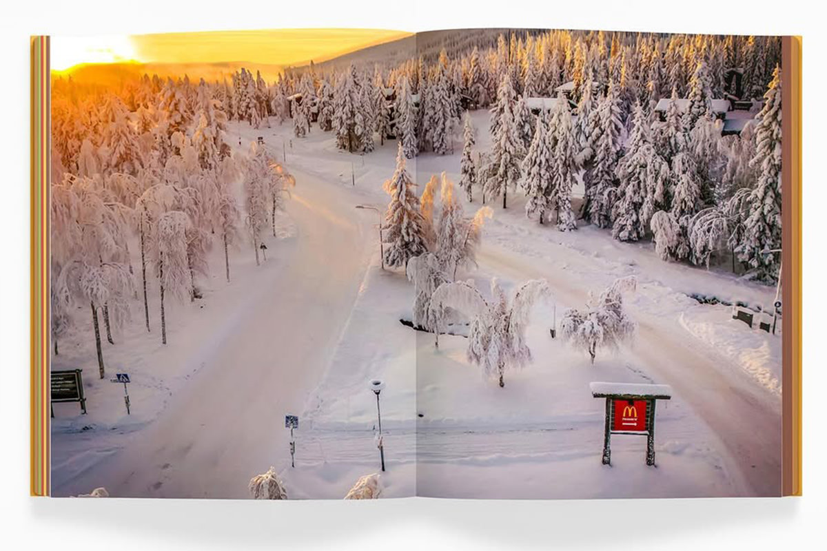
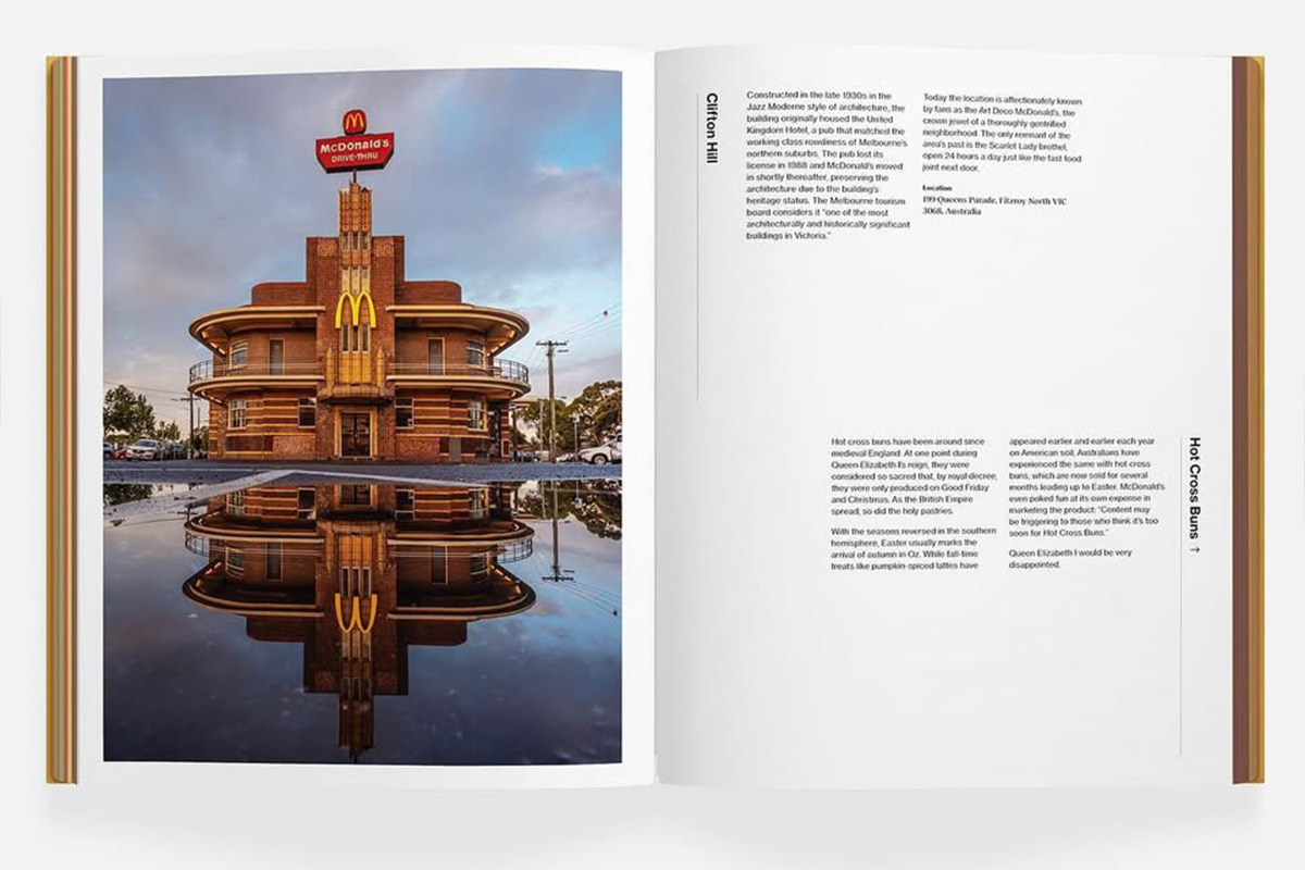
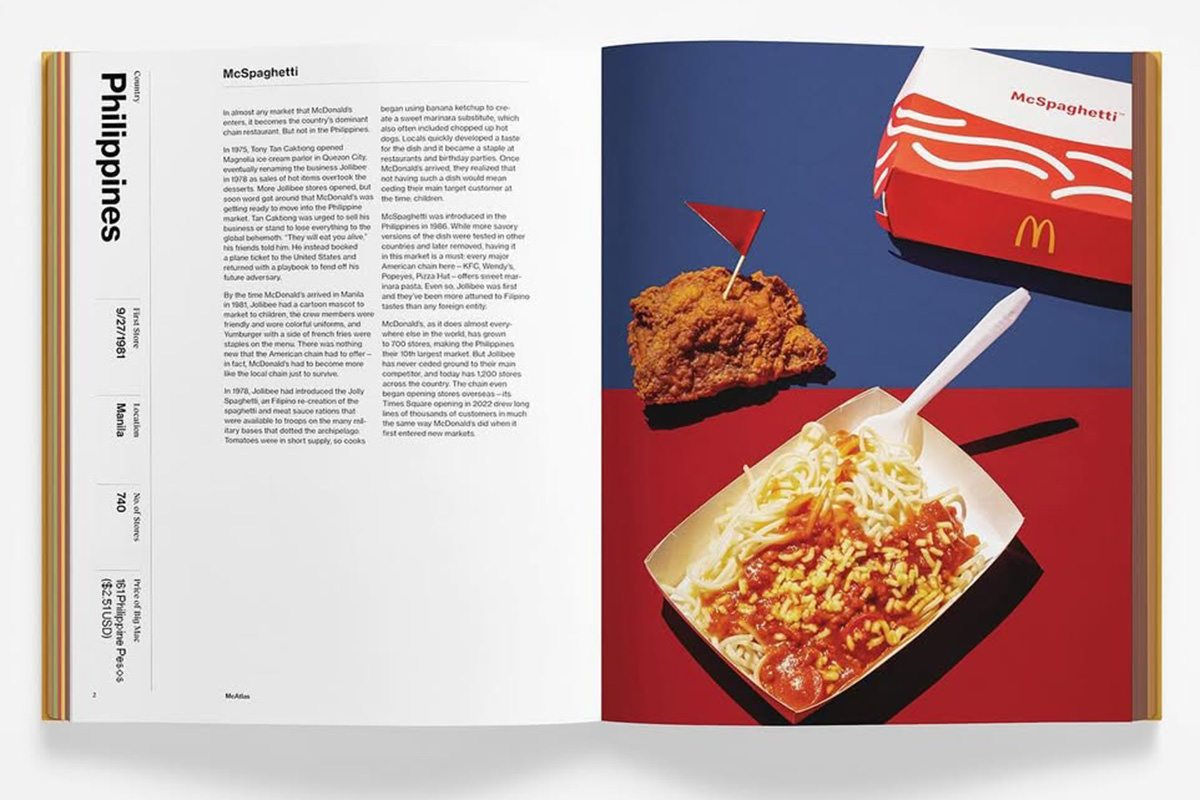
 I love map books and books on foreign cultures.
McAtlas has both.
It's a beautiful book (JUST LOOK AT HOW THE PAGE EDGES MAKE A HAMBURGER... COMPLETE WITH POPPY SEED BUN!)...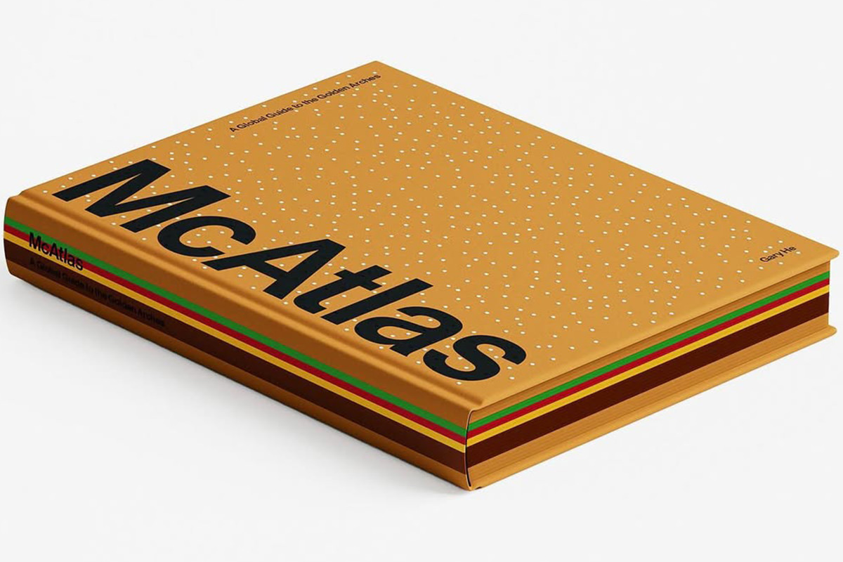
©2024 by Gary He and McAtlas
...which takes a fascinating look at some interesting McDonald's from around the world. In addition to gorgeous photos of some of the restaurants, there's also pages dedicated to unique food items that are available in other countries.
©2024 by Gary He and McAtlas
©2024 by Gary He and McAtlas
©2024 by Gary He and McAtlas
©2024 by Gary He and McAtlas
This will be a candidate for my favorite book purchase of 2025. I just got it yesterday and am already half-way through! I got it direct from the website, and they're currently offering free domestic shipping.
 Why does life have to be so incredibly messy?
Neil Gaiman is one of my favorite authors. I love his works. So when I heard that the amazing Colleen Doran was illustrating a graphic novel based on Neil and Terry Pratchett's Good Omens back in the Spring of 2023, I never backed a Kickstarter so fast.
Since then Doran has been diligently trying to complete the project... even working through cancer treatment to finish. Because of her health issues, the book is way overdue, but I didn't care because I love her art so much. Definitely worth the wait. BUT THEN there's all the horrific allegations of grooming and abuse by Neil Gaiman that came to light.
As a result, the Kickstarter has extended the refund window and stated that Neil will not receive any of the proceeds from the project... so now I'm stuck. Do I cancel because supporting Gaiman in any capacity is impossible for me given how awful he turned out to be? Usually I'd say yes. But Colleen has poured years of her life into this book... and had nothing to do with what Gaiman's done. The idea of not supporting her is really impossible for me.
Ultimately my desire to not punish Colleen Doran won out and I've decided to keep my Kickstarter pledge. But holy shit is this an awful place to be. How many people have to get their lives upended by this one asshole? Because on top of the people making the Good Omens graphic novel, there's the people working on adapting his other works for stage, screen (most notably the amazing Netflix adaptation of The Sandman), and other graphic novels.
This really blows. Sometimes I can manage to separate the artist from their art. This time around it's been really, really tough.