
 This is part three of a three-part dive into the redesign of Thrice Fiction magazine on the occasion of releasing the first issue of Volume 2. If you missed it, you can read Part One right here and Part Two right here.
With all 27 FREE issues of Volume 1 of Thrice Fiction, I had the luxury of color. It was designed from the very beginning with color in mind. The focus of each issue, the stories, were (out of necessity) black and white for readability. I carried this theme to the contributor photos, which were also black and white. Everything else (i.e. the art) would be in color.
The problem with color is that it's expensive. Very expensive. But you can justify it when you have a small number of pages because the cost doesn't have a chance to accumulate that much. Since the format for Volume 2 was over a hundred pages, it wasn't an option. All interior pages would be black and white so we wouldn't have to charge $50 a copy.
All our artists were in a pandemic for 2020, so I decided to just do all the interior art myself after a few false starts in rounding up contributors. This actually turned out for the best, because I had no idea how our publisher (Lulu) would reproduce greyscale art. Since it's just me, I made a list of different styles to experiment with... line art... photo art... vector art... and so on.
And here's how that went.
Ann Bogle is a remarkable writer and it's always been a thrill to see her work in our pages. Needless to say that when RW informed me that she would be the "featured contributor" for our debut issue, I was thrilled. I read through all her stories a couple times looking for an idea... but I kept coming back to the second paragraph of her very first story, Credenza, where it was Abe Lincoln's 200th birthday. It's just too dang good an image to ignore. So I didn't...
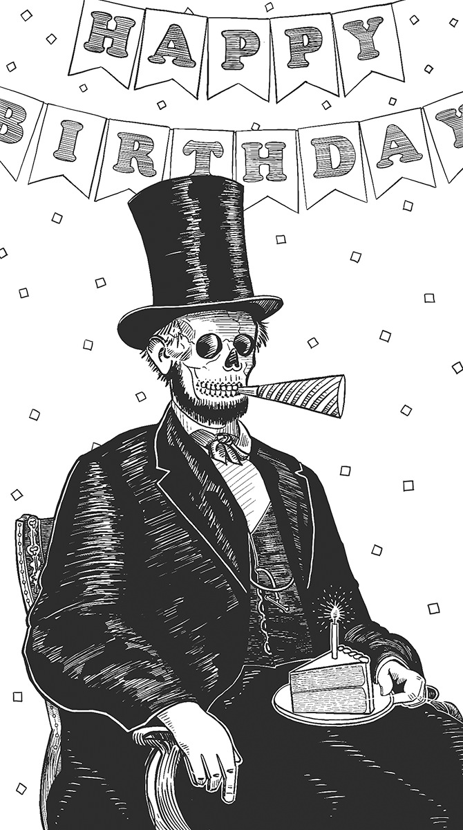
Originally there was no "happy birthday" banner in the background, as the idea was to put a party hat on top of Lincoln's famous stovepipe hat. It proved too clutzy, so I made the change. Also? Abraham Lincoln was originally drawn as a decomposing corpse, because that's the only way I could still have his beard on there. But that was pretty gruesome, so I went with a skeleton head, left the beard, and took all the rotting flesh off his hands. No, it doesn't make sense, but I actually think it's more humorous this way. This was knocked out on my iPad in ProCreate over a couple nights while watching Hallmark movies.
If you read yesterday's entry, you know that I was originally planning on the cover being a little boy looking up to the heavens as missiles stand ready to launch (for our relaunch, get it?). I thought this might be a little dark, but I liked the idea of the image so much that I decided to draw it up and slap it in the interior as a break-point...
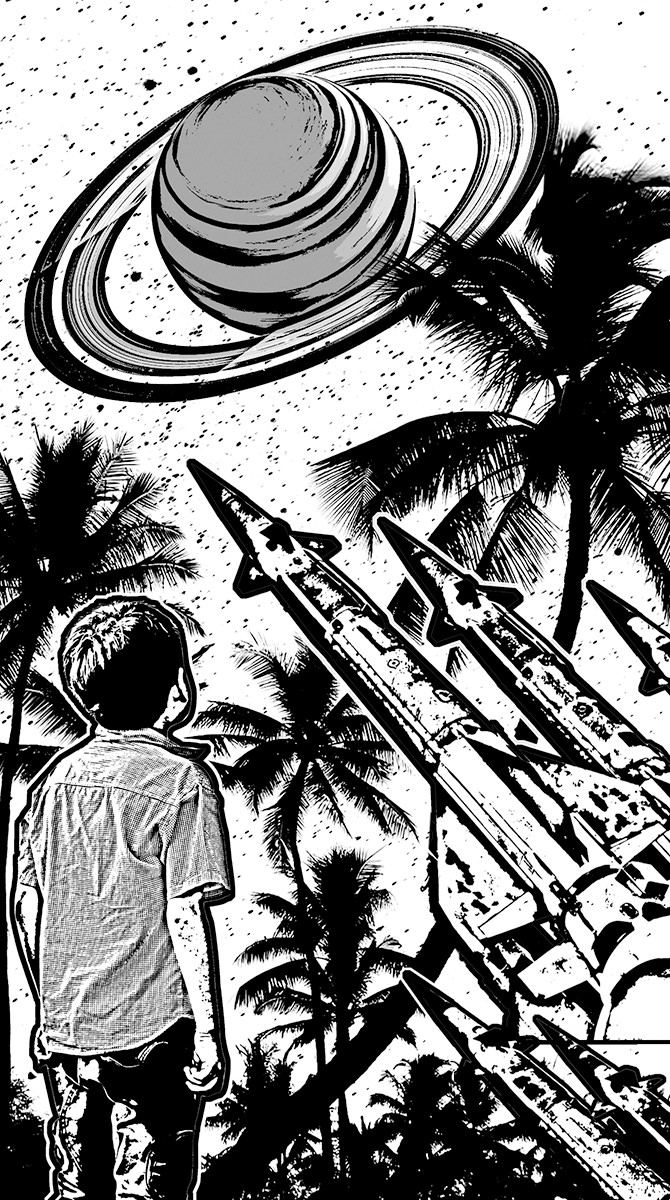
I thought this actually turned out better than what was in my head. I also think it probably works better as a block-cut than a color painting. The palms are extracted from a photo I took on the Big Island of Hawaii. The boy, Saturn, and the missiles are stock photos I cut out. It was all assembled in Photoshop, had extraction filters and edge filters run on it, then I imported it to ProCreate on my iPad so I could add texture and linework.
Amantine Brodur's work was a tough challenge to typeset because half of what makes it work is the formatting. Translating the formatting of The Anaphora House from a MS Word document to book pages took a long, long time of goofing around until I was satisfied that I had done the best job I could. Then a couple days later I would look at it again and decide to change half of it. =sigh= There was an abundance of riches to be had when it came time to figuring out what I wanted to do for the art. But once I got to the section titled Empires of Toast I just knew that was going to be where my piece came from...
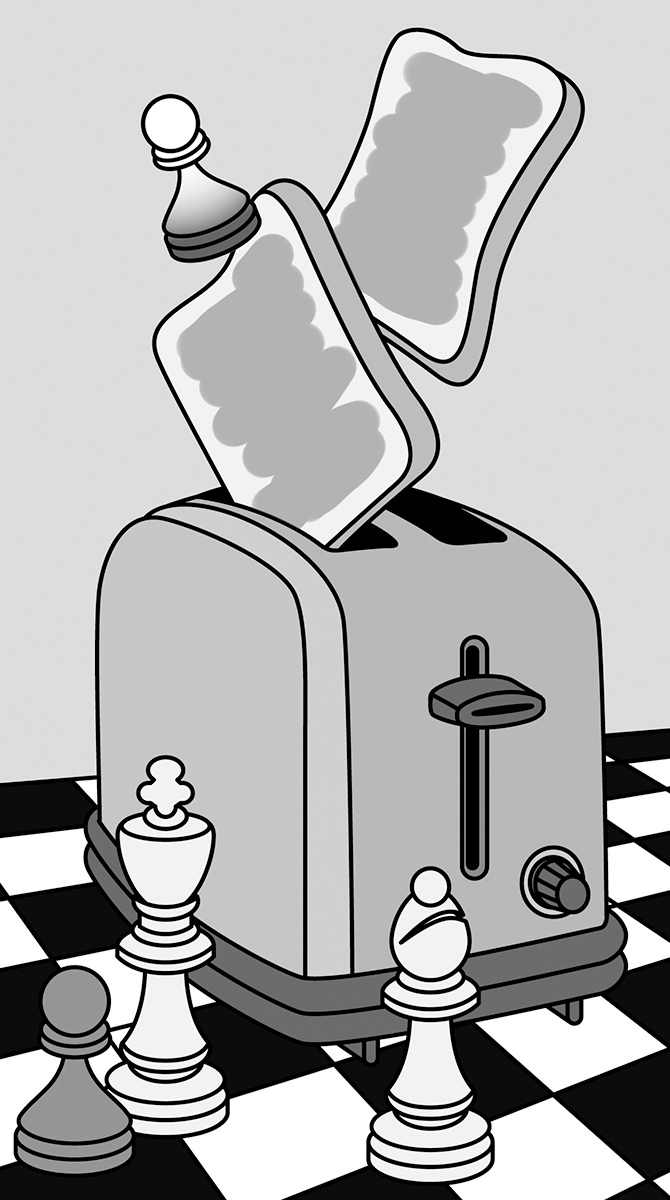
This is just pure symbolism, "empires" being represented by a chess set. I knew I wanted a toaster ejecting "toast" on the board, but I took it a bit further than that. The "theme" of our "Subject Paper" this issue was discussing "cultural appropriation." I drew a white pawn also ejecting from the toaster, the idea being that it wants to appear black, but couldn't take the heat that comes from being black. Deep, I know.
Eckhard Gerdes packs a lot in the slightly more than four pages of The Babble-Ons. I went from worrying that there wouldn't be enough visual ideas to draw from... to being completely overwhelmed by how much there was to choose from. I abandoned the idea of pulling literal passages and instead combined a rowboat and snails because I thought it would make for a fun image...
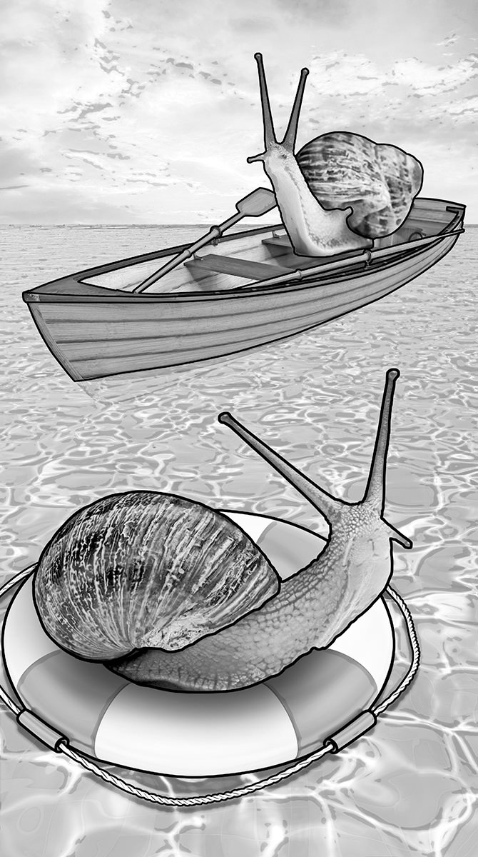
Don't ask me how that snail is rowing his boat. This is a half-dozen stock photos which have been reworked and combined into a single image in Adobe Photoshop... then outlined in Adobe Illustrator. I wanted to have an example for future artist contributors so they could see how photos reproduce at Lulu and how contrast has to be heightened to get something other than a mushy grey blob. It took a lot more effort than I was anticipating, and I'm pretty sure I put in just under three hours for an image that would have taken me 20 minutes if it were in color.
Art was never going to be the focus of Volume 2. It was always going to be the written word. But I still wanted some art in there to add breaks between sections and pieces. This was an idea I had years ago that I never did anything with, but kinda liked the thought of dusting it off and retooling it to be a collage overlaid by block-print. Something about the concept of aliens invading and not caring which god you worship reeeeeally stuck with me...
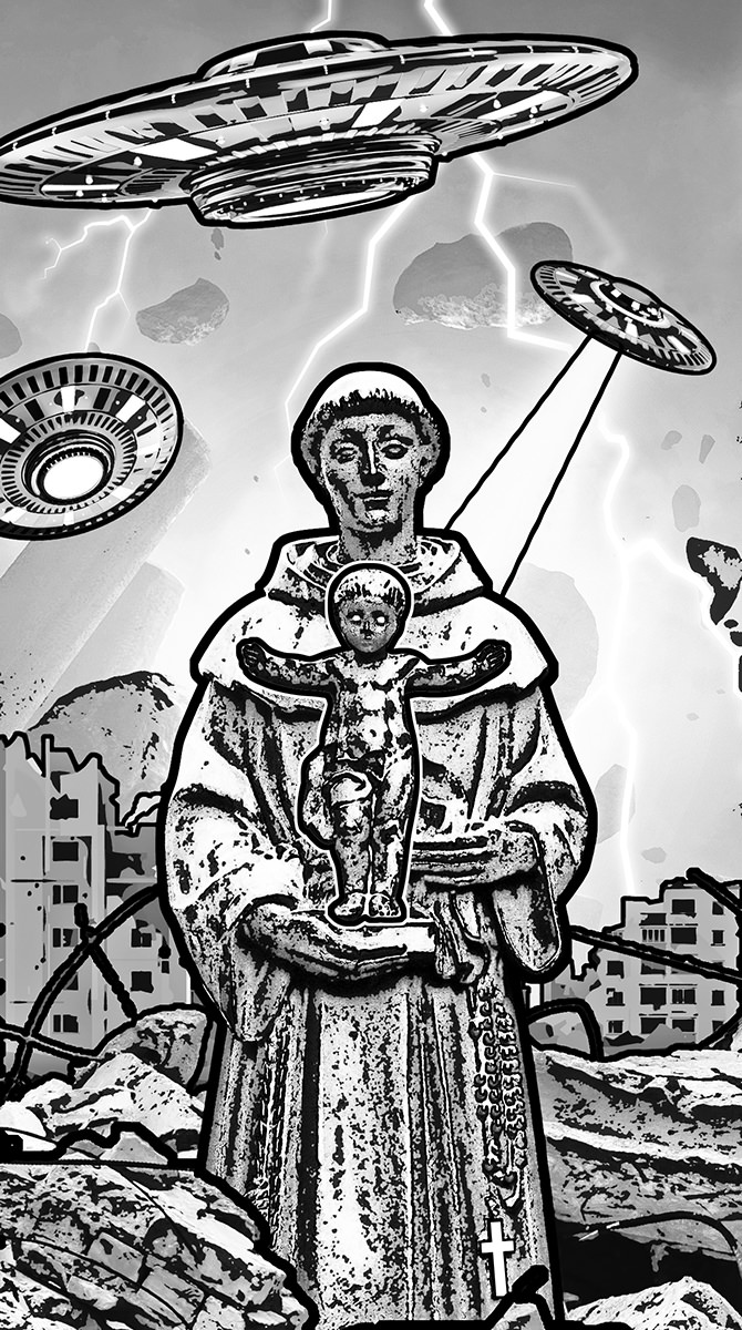
I cannot for the life of me remember where I took the photo of the monk with baby Jesus. I want to say Italy maybe? Columbia? I think it was in a courtyard somewhere. Could even be New Orleans. Since I pulled the photo out of my archives quite a long while ago, I can't remember. Everything else is composed of eight stock photos that I chopped up and combined. Before I started converting, painting, filtering, and drawing on top of it, this is what it looked like...
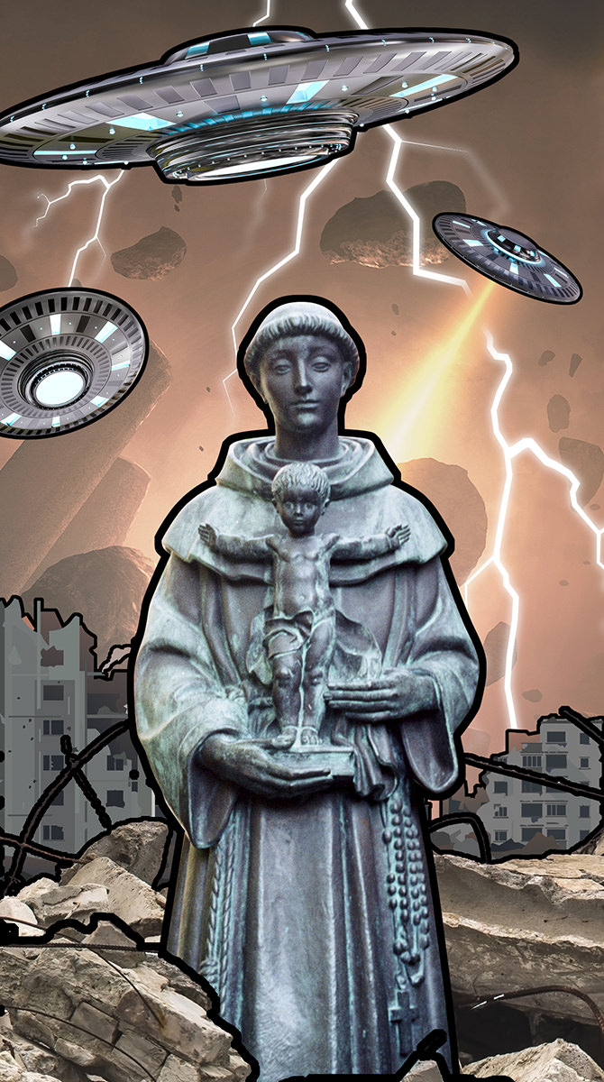
Had I done this in color, I would have painted over everything to make it "more my own" since all the pieces around the statue were created by somebody else. But it worked really well as a block-cut, so I spent considerable time massaging the pieces in Photoshop so it would work well. Minutes before publishing this issue, I went in and changed baby Jesus's eyes and the cross on the monk's robe to pure white and did a heavier outline around Jesus so they stood out better.
Originally I had created this art for the subject essay Who Do You Think You Are? by Franny Forsman which discusses cultural appropriation. This is a subject which hits at me personally from a number of different directions, and almost everybody has an opinion... from weak ("I don't care and don't see anything wrong with it because it doesn't affect me") to very strong ("This is pillaging my people and my culture and using it in inappropriate ways which I find deeply insulting"). Despite being 100% white boy with a "cultural heritage" that consists of a hodgepodge of other cultures (AKA "no culture to speak of"), I am in the latter category. And it stems from the simple idea of just being fucking decent and kind to people. If somebody tells you that their culture is not a costume and they are offended when people treat it that way... just pick a different Halloween costume. If somebody tells you that your football team has a shitty name and mascot because it is taken from a painful slur celebrating genocide against their people... just pick a different name. This is not rocket science, and you have to be kinda awful to not want to change when it's pointed out to you. And that's what I was trying to say with this piece depicting a butterfly seeing a poster advertising a movie about a butterfly... starring a cockroach...
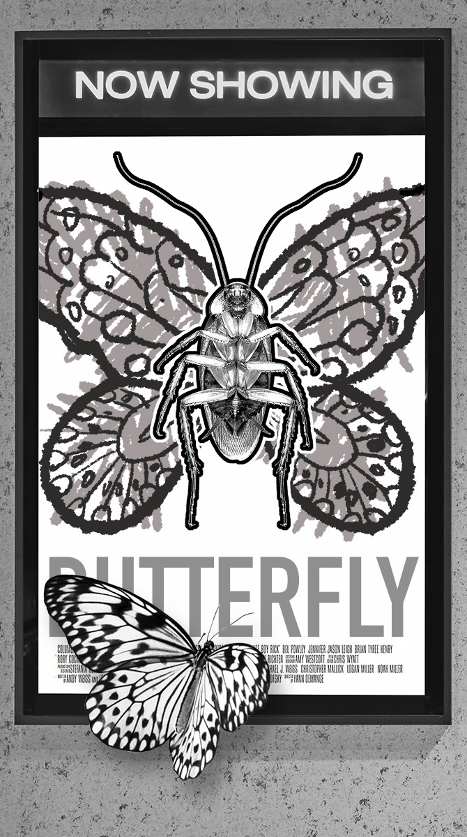
This is a composite of a bunch of stock photos that I cut into Photoshop (though I think the butterfly image is mine, taken from a butterfly sanctuary in Australia). The butterfly wings on the cockroach were drawn on in Procreate because I wanted them to look like they were badly colored with a crayon. The credits for my fake movie Butterfly are actually taken from the movie poster for White Boy Rick, which seemed appropriate. Ultimately I worried that any art put in front of such a serious subject would be distracting and inappropriate and decided to go with no art at all. But I kinda liked what Cheap Imitation was saying, so I stuck it at the back of the book.
And there you have it... all the art I came up with for the first issue of Volume 2! You can see it all in print by buying a copy with its glorious 128 pages for just $12 at the Lulu Book Shop. A bargain at half the price with some cool stuff to be had!

I love comments! However, all comments are moderated, and won't appear until approved. Are you an abusive troll with nothing to contribute? Don't bother. Selling something? Don't bother. Spam linking? Don't bother.
PLEASE NOTE: My comment-spam protection requires JavaScript... if you have it turned off or are using a mobile device without JavaScript, commenting won't work. Sorry.

There's no comments here...