
 Remember when taking pictures was a relatively complex ordeal where you had to load your camera with "film" and then send it off to be developed and printed? And THEN if you wanted to get those photos into your computer you had to have them scanned, touched-up, color-corrected, and burned to a CD? Hard times. Hard times.
Back in the early 1990's, Kodak came up with a system to cut down on the hassle called "Photo CD." This was a service where you could have your film developed, scanned, and a CD burned all at the same time. I loved it. The scan quality was pretty darn good if you went to a reputable lab, and the convenience was fantastic. It also saved a lot of money over paying somebody to scan them for you or buying the equipment to do it yourself.
Unfortunately, Photo CD never really went anywhere for a number of reasons. Eventually Kodak abandoned their proprietary format, and that was the end of that. Soon after, digital photography caught hold, and film died a long, agonizing death. With that in mind, it's not like PhotoCD had much of a chance had Kodak hung in there. Still, for somebody stuck in the film era, it was good while it lasted.
Flash forward to today, and there are a lot of Photo CDs still floating around out there.
Tonight I ran across a pile of them while tossing out some old computer junk.
Needless to say, you can't just pop a Photo CD in your iMac and look at all the pretty pictures. Modern computers have no frickin' clue how to read (let alone display) any of the images in that dead format. Lucky for me, people have reverse-engineered the proprietary Kodak file scheme and there are decoders out there (assuming you're tech-savvy enough to hunt them down and figure out how to use them). Or, if you have an antiquated computer laying around with old software installed, you might be able to read Photo CDs (Photoshop v5 anyone?)... which is probably the easiest way to do it. Eventually, I might get around to converting them to JPEGs (or whatever) but for now they're just sitting in a pile on my desk.
And it gets you thinking.
Photo CD died less than 20 years ago and it's quickly becoming impossible to read them.
And it's just a drop in the bucket. Think of all the dead formats out there... ZIP disks, JAZ drives, SyQuest cartridges, floppy disks, VHS, LaserDisc, digital video cassettes... the list goes on and on. And can CDs and DVDs far behind? Does Apple even sell computers that have CD/DVD drives any more? How long before they're just two more dead formats on the pile?
If you've got any media sitting around that has stuff which is important to you... I wouldn't wait too long to get it transferred.
In twenty years, you might not be able to. At least not easily.
 Now there's a full year of Bullet Sundays ... because a Very Special THREE HUNDRED AND SIXTY-FIFTH edition of Bullet Sunday starts... now...
• Mac! Happy 30th Birthday to the Macintosh. It's easy to overlook the importance of something when you use it every single day, but I love my Mac more now than I ever have...
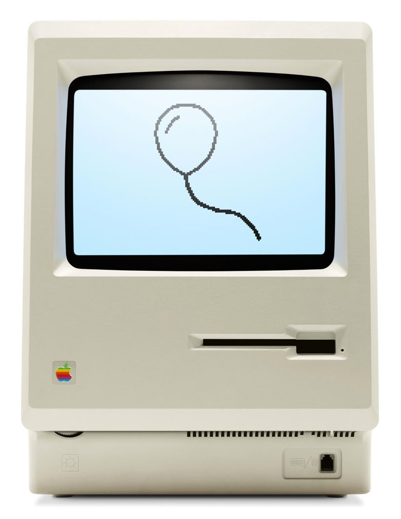
If you haven't seen Apple's look back at Mac innovations, it's well worth exploring If I were forced to pick that one year of Macintosh history that was the biggest for me, it would have to be the release of the Titanium PowerBook G4 in 2001. Not only was it sexy as hell, but it was also the first time I felt I could do everything on a portable that I could do on my desktop Mac.
Here's to 30 more years of kicking ass.
• Truth! The greatest concert I ever saw was Depeche Mode's Music for the Masses tour back in 1988. A close second would be P!nk's Truth About Love tour from last year. Absolutely spectacular. If you didn't get to see it... or just want to see it again... it's been released on video and is for sale at the iTunes Music Store for just $15 and it's worth every penny...
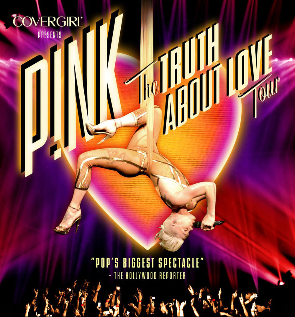
Just an FYI... the tour is actually still ongoing, with three more dates remaining for Anaheim, Fresno, and Las Vegas. If you've got loads of money sitting around, it's worth tracking down tickets for this sold-out show.
• Bernice! Looks like I need to start watching South Beach Tow! Because, BERNICE! How awesome is she?!?
Holy shit! I hope her ObamaCare has kicked in by now... she's got a rough job!
• Unintelligent! I have been recording the new show Intelligence on my DVR, stacking them up in the hopes of discovering another Black List. No joy. This is easily one of the stupidest shows ever to air on television. It's yet another one of those shitty series where the writers are constantly pulling some kind of random techno-bullshit out of their asses not because it makes sense for the story... but because they're too fucking lazy to come up with something... intelligent... for lack of a better word. "HOW ARE WE GOING TO STOP HER? SHE HAS A COMPUTER CHIP IN HER HEAD?" — "I KNOW! LET'S PRESS A BUNCH OF RANDOM BUTTONS AND EXPLOIT SOME HERE-UNTO NON-EXISTENT FLAW IN THE CHIP SO WE CAN HACK HER HEAD AND SAVE THE DAY!" — YEAH! WHO GIVES A SHIT IF WE ARE THE VERY DEFINITION OF DEUS EX MACHINA! IT BEATS HAVING TO USE LOGIC FOR A LIVING! Seriously, I don't understand how this crap-fest ever made it to air.
• LEGO! Just when I think that I couldn't possibly be more excited about the upcoming LEGO movie, this comes along...
"Epic" isn't an epic enough word to describe the epicness of just how epic this movie is gonna be.
And there it is... a year's worth of 365 Bullet Sundays in the can. And you said it wouldn't last. Shame on you!
 Stop digging out that old bomb shelter... because Bullet Sunday starts... now...
• Cold? "Russia is the only country in the world that is realistically capable of turning the United States into radioactive ash." — Kremlin-backed television presenter Dmitry Kiselyov, host of a weekly current affairs show in Russia. Behind him was a backdrop of a mushroom cloud following a nuclear blast. (from Reuters)
You wanna know what bothers me more than the thought of being turned into radioactive ash? I really, really, want to visit Russia. I always have. Ever since I first saw a photo of Saint Basil's Cathedral in Red Square. For most of my life, the idea of it has been an impossibility. But then the Soviet Union collapses, the cold war thaws, relations normalize, tourism becomes more and more common, and suddenly... but not really suddenly... the impossible becomes possible...

And now I'm asking myself... Are current tensions going to blow over? Are current tensions going to escalate? What happens if they do escalate? Have I waited too long? Am I too late?
Last year I ultimately decided to visit Vietnam, Laos, and Cambodia. But also in the running? A river cruise through the Ukraine, including a couple stops in Crimea...

I guess that ship has sailed... for a while. Or forever. You just never know. How shitty is it that we can't all just get along?
• Flash! The first two comic books I ever bought were Green Lantern/Green Arrow #121 and The Flash #277. Not coincidentally, they became my favorite super-heroes for quite a while...
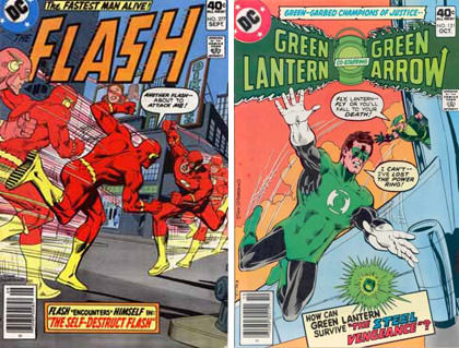
At least until I discovered The Legion of Super-Heroes. And Batman, of course. But even so, I've always had a soft spot in my heart for those first heroes. Green Lantern finally made it to the big screen with a fucking horrendously shitty movie that I hated. Then Green Arrow got a very good television show I'm currently enjoying called Arrow. Next up? The Flash!
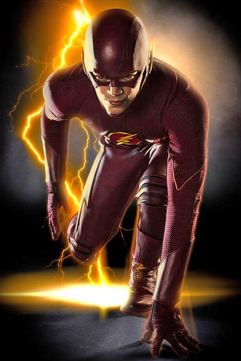
It's a spin-off from Arrow, so my hopes are high. The costume is certainly a step in the right direction.
This isn't the first iteration of The Flash on TV. The first was a show starring John Wesley Shipp back in 1990. It was surprisingly good, but limited by the technology of the day. To say I'm anxious to see what we'll be getting in the year 2014 is an understatement. The pilot is filming now. I'm assuming we'll be seeing it this Fall. Assuming the show is picked up. That's a lot of assuming.
• Drop. Apple has a terrific bit of tech called "AirDrop" that allows you to share iPhone/iPad photos, contacts, files, and whatnot pretty much effortlessly. Open what you want to share, activate AirDrop, and you can beam stuff to other AirDrop users...
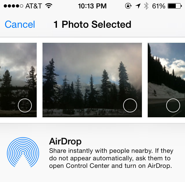
Cool!
Apple has a terrific bit of tech called "AirDrop" that allows you to share Macintosh photos, contacts, files, and whatnot pretty much effortlessly. Locate the file you want to share in the Finder, activate AirDrop, and you can beam stuff to other AirDrop users...
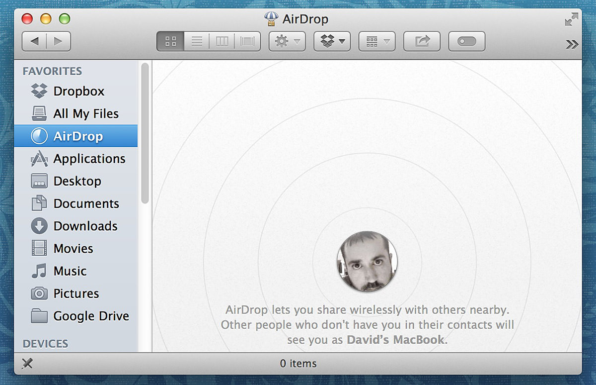
Cool!
BUT YOU WANT TO KNOW WHAT'S NOT COOL?!? EVEN THOUGH THEY ARE BOTH CALLED "AIRDROP," THE iPHONE AND MAC TECHNOLOGIES ARE NOT FUCKING COMPATIBLE! This is outrageously stupid and, for the life of me, I just don't get it. I keep thinking "It's coming any day now, I'm sure!" But then it doesn't, and I get pissed off all over again. Why bother naming them both "AirDrop" if they are so different that they can't even talk to each other? How is it that Apple can be so smart in so many ways but so stupid in others?
• Stick! I promised myself that I wouldn't start in on the new video game, SOUTH PARK: THE STICK OF TRUTH, until I finished LEGO MARVEL SUPER-HEROES, but I just couldn't resist any longer. I'm a massively huge South Park fan, and the trailer looked amazing (warning, NOT safe for work)...
And you know what? It IS amazing! It looks exactly like you're "playing" an episode of the TV series. As if that weren't enough, it is frickin' hilarious. As in laugh-out-loud-funny. Not only because it's South Park, but because they've managed to create a fully-realized RPG game that's actually a parody of RPG games... with humor built into practically everything you see and do. I'll want to play it a bit more when I get back from vacation before I write a review... but, if you're a South Park and video game fan, it's pretty much a no-brainer. You simply must own this.
• Mars 2. The Veronica Mars movie (which I reviewed here) has only been out for three days, and already the sequel talk has started. Here's creator Rob Thomas Himself..
“With the first movie, because it was crowd-funded, it was a love letter to the fans,” he explains. “I put every character they loved back into the movie. There are a lot of inside jokes. With a second movie, I would build it from the case out. In the first movie, I feel like I did just the opposite. I put all the dessert, all the frosting on there, and then put a detective case in the middle. On the next one, I would want the detective case to be the driving force of the movie.”
It's as if he read my blog post and is answering my prayers!
Needless to say, I would be positively thrilled to get a sequel. Especially if we get a fantastic Veronica-Mars-style mystery on-par with what we saw in the first and second seasons of the show. NOW SHUT UP AND TAKE MY MONEY!
Annnnnd... the end.
 For the longest time I've been dismissive of those who say that Apple has gone downhill since Steve Jobs left us (praise be unto His name). As a Certified Apple Whore, I pretty much have to, right? And besides, as great as His Steveness was, Apple has always been more than just one man. Steve Jobs didn't do it all alone, and the people who helped to make Apple into such a remarkable company are still around. So, yeah, Apple isn't going to be the same... but it couldn't possibly be the horrific disaster that all the nay-sayers keep insisting: "APPLE IS OVER!" "APPLE CAN'T SURVIVE!" "POST-JOBS APPLE IS DOOMED!" What nonsense!
Except...
As time goes on and the user experience with Apple products degenerates to complete and total shit, my opinion has been changing.
Don't get me wrong... I firmly believe nobody is doing it better... but the detail-oriented Apple that made me commit my eternal servitude over the past decade simply doesn't exist any more.
Let's walk through an example, shall we?
I perfectly understand the need to prevent random people from walking up to my computer and charging a bunch of crap to my Apple ID. Really I do. But having to enter my password four times? What kind of sadistic fucking asshole made that happen? And how badly would Steve Jobs explode over what a shitty user experience that is? I'd rather just buy a physical book at Amazon with their One-Click shopping.
This problem goes much deeper than just inconveniencing customers to enter their password over and over and over and over again... it encourages people to pick simple, short, easy-to-remember, passwords. Which is pretty much the opposite of what you want, because those are the passwords that are easiest to crack. What you want is people using heinously complicated passwords that are very difficult to crack. But to get this to work, you have to make it so the password only has to be entered rarely. The password should be remembered by the system and auto-populate whenever you want to buy something. Of course you have to secure the system with a password... otherwise you're back to square one. But THAT is the kind of stuff Apple figures out so well. Like the fingerprint scanner on the iPhone, for example.
So where is it?
And since one example doesn't build a compelling case, here are a few more things off the top of my head that have been bugging the shit out of me with Apple's "User Experience"...
Holy crap... and that was just the stuff off the top of my head. Had I put some actual thought into this list, it would be ten times as long, I'm sure.
And there's my problem with Apple. In the past, I would expect that insane shit ruining the Apple experience would eventually be fixed. Now? I honestly don't know. There's obviously people in charge of these problem areas. But is Tim Cook obsessing over making sure these people are getting things to work exceptionally well like Steve Jobs was? Or is he being distracted by shiny things to buy with Apple's massive bank account? Early after his take-over, I was willing to give him the benefit of doubt. But now? We're going on three years and I'm starting to worry.
I want... need... Apple to be insanely great.
Anything less isn't Apple.
 Because my entire day yesterday was spent catching up on work, I had the Apple Worldwide Developers Conference keynote running... but couldn't pay very close attention to it.
And so... today's the day I get to channel my inner Mac Whore and talk about new happings at everyone's favorite fruit-named tech company. If the thought of that bores you, here's your chance to escape! But don't come back until the day after tomorrow, because that'll be Part Two.
OS X YOSEMITE
The successor to OS X Mavericks, OS X Yosemite, was presented by Craig Federighi, the Senior VP of Software Engineering at Apple...
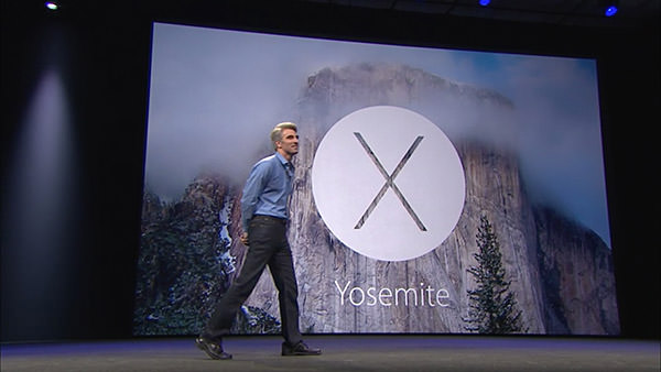
The guy is incredibly charismatic and engaging... reaching to near Steve Jobsian heights with his presentation skills. He's also darn funny, injecting wit and humor into his speech at a breakneck pace.
The look of Yosemite is very much a continuation of iOS7. All aspects of the OS from the controls to the icons have been simplified, saturated, and flattened. In addition, transparency effects have been liberally sprinkled all over the interface elements. Which is something I'm not thrilled about because I find it unnecessarily distracting. Hopefully users will have the ability to disable the transparency like they currently can with the menu bar.
Federighi seemed especially proud of the new look for Yosemite's trashcan...
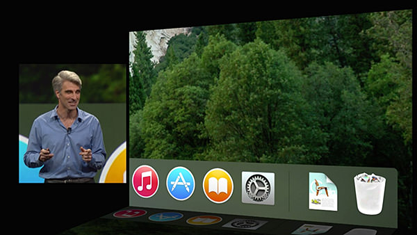
Personally, I don't give a shit what the trashcan looks like... I only care that it works. Which it currently does not in Mavericks. It will show as "empty" even when there's files inside. Hopefully somebody bothered to fix this incredibly basic and incomprehensibly ignored bug.
After talking trash, we moved on to the system font, which is no longer Lucida Grande. I don't know what the new typeface is called, but it's very pretty and easy to read. And as exciting as that improvement is, the next improvement is something I've been begging for... DARK MODE... where the menu bars and menus are darkened so they don't distract from what you're working on...
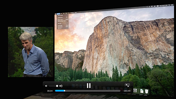
The window model for Yosemite continues to add functionality for title bars and devote more space to content, which is nice. Apple has also changed the way window controls work... with the green button now taking the window full-screen. Something I could get behind if they WOULD ONLY HAVE AN OPTION TO KEEP THE MENU BAR VISIBLE! I frickin' hate going full-screen because fighting the disappearing menu bar drives me insane. I need to be able to see my clock... my battery level... the date... all that important stuff that's so handy to have available... at a glance.
Notification Center is getting the ability to add widgets, which will finally make it useful to me.
Spotlight, Apple's search system for OS X, is getting an upgrade... and this time it looks more than just cosmetic. All I care about is that it's not a flaky pile of shit like the interface is now (How many times do you end up launching the unintended result? For me, it's practically daily). The addition of Sherlock-esque internet data for searching is a welcome throwback.
Next up, Apple puts the smack-down on DropBox by releasing an online storage option of their own called iCloud Drive. I don't know how it will be an improvement over DropBox, which makes cloud storage so drop-dead easy, but I'll definitely be taking a look.
Federighi then took a look at Yosemite's update for OS X Mail... currently the most-hated app I use every day. It is a buggy, slow, and overall shitty email client that looks downright embarrassing when compared to what Microsoft has going on with Outlook. He promises that they have worked very hard to make improvements with the basic functionality, which would be very nice. A new feature for Mail is "Mail Drop," which allows the seamless sending of files up to 5 gigs via iCloud Drive.
Safari is a world-class browser, but Apple's not resting on their laurels. They've added a number of new features for convenience, speed, and improved battery life... but the standout for me is being able to spawn separate windows for Private Browsing instead of it being an "all or nothing" game.
And then came the first surprise of the day... something Apple is calling "Continuity"... which works towards providing a seamless experience between MacOS X and iOS. The crowd erupted in applause when Federighi announced that FINALLY you can "Air Drop" between MacOS X and iOS. This omission has been categorically absurd and, if I had been in the audience, I would have been screaming "IT'S ABOUT FUCKING TIME!"...
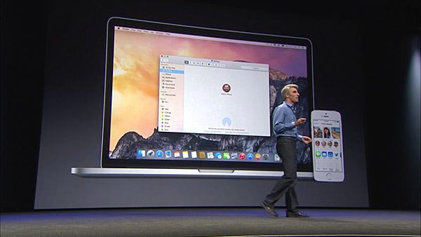
But Apple didn't stop there, because next came a new feature called "Hand-Off." This nifty bit of tech means your Mac and your iPhone (or other iOS device) now has proximity awareness of each other. You can start composing an email on your Mac, then hand it off to your iPhone so you can keep composing as you walk out the door. Additional features, like being able to answer an incoming call from your iPhone on your Mac or use your Mac to make calls through your iPhone is dead-sexy. That Federighi demoed this by calling a "new employee" — Dr. Dre — was just the icing on the cake.
And there's where Apple wrapped up their look at just some of the new features that will be available with the new MacOS X.
The beta for Yosemite has been released to developers already. Non-developers can join the beta program later this Summer. Then everybody will be able to grab a free copy come Fall.
Tune in tomorrow when I unleash my commentary on Part Two of the keynote... with iOS 8.
 "Android fragmentation is turning devices into a toxic hellstew of vulnerabilities."
— Adrian Kingsley-Hughes, ZDNet
This is the second half of my notes on Apple's Worldwide Developers Conference keynote, this time focusing on what's coming down the pipe in iOS 8. And something else entirely, which was an unexpected surprise.
To start things off, Apple CEO Tim Cook was back on stage to drop some rather startling statistics on iOS update adoption vs. Android update adoption...
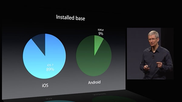
89% of iPhone users are on the latest version of iOS. A mere 9% of Android users are using the latest version of that mobile OS. For developers, this is a pretty big deal. If you are counting on new OS features for the functionality of your app, you have to be assured that your users have a version of the OS which has those features. From the looks of things, Android developers are going to be very slow to implement new stuff in their apps, because the vast majority of their users are on some older version where they are unsupported. Add to that the heinous fragmentation of the Android OEM variants, and Apple has made a very good case for developers to choose iOS as their platform of choice.
After Tim Cook's intro, Craig Federighi comes back to show everybody what end-user features and improvements we can expect with the next update.
One area where iOS has always been pretty horrible is dealing with interruptions. Get an alert, and you have to dump out of whatever you're doing to deal with it. iOS 8 takes a big leap forward by allowing you to handle common interruptions (like text messages and calendar alerts) without leaving the app you're in...
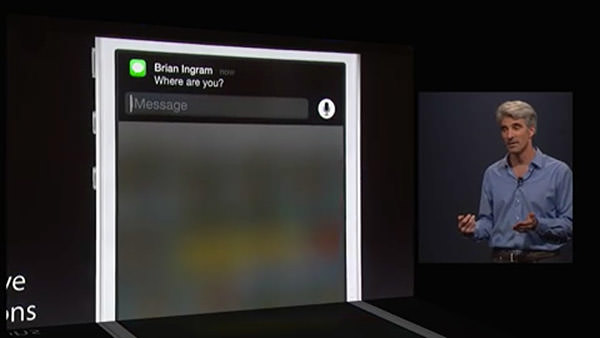
This is very cool, but it would be pretty useless if it were restricted to Apple-only interrupts. Fortunately, interactive notifications are available to 3rd-party apps, which is fantastic for people like me who communicate primarily through Facebook Messenger or other non-Apple services. What remains to be seen is how far the interactivity goes. Can developers customize the controls available to best fit their apps? Or does Apple limit interactivity to internal iOS buttons and text fields? Time will tell.
Taking a page from Windows Phone 8, iOS 8 now has some people-centric additions... like being able to access frequent and recent contacts on the app-switcher page. A terrific use of some wasted space...
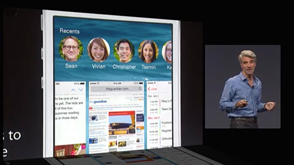
Unfortunately, the usefulness of this feature is hampered by Apple deciding how you can interact with these people. Right now you can text, call, or Facetime with them... but there's no option for Facebook messaging or a slew of other 3rd-party apps that people use to keep in touch with the people in their lives. So, ultimately, a step in the right direction... but not a very big one.
Next up was a beautiful new grouped tabs interface for Safari on the iPad...
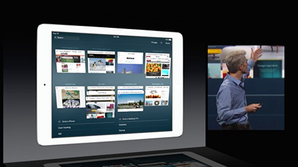
I do three things on my iPad... 1) Watch movies when I travel... 2) Read comic books... and 3) Surf the internet. The area in most need of improvement is Safari for web browsing, and it's nice to know that Apple is at least trying to make it a better experience.
One of the most exciting pieces of news at the keynote was Apple's announcement of an improved keyboard... now with predictive text. As you type, words appear above the keyboard where iOS is trying to guess what you're typing. Kind of like what happens now as words appear above your input cursor while you type... except now you get more than just one word, which should be a lot more productive. iOS doesn't stop there though... it also tries to predict words you'll use in response to emails based on the content and whom the email is from! The keyboard learns context, and tries to be smart about how it assists you...
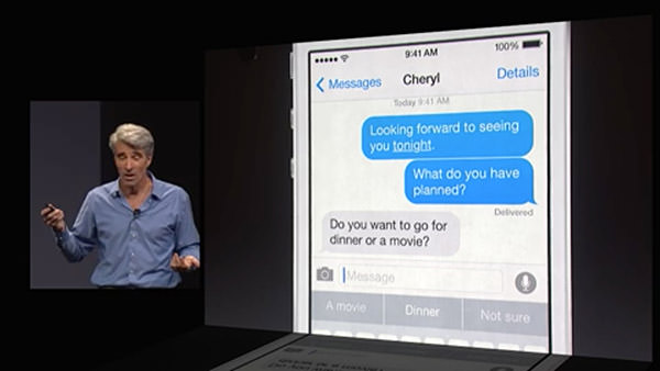
As if all that weren't enough... Apple is now going to allow you to install alternative keyboards! This means terrific technology like Swype, which allows you to slide your finger from letter to letter in a word... and Fleksy which has an amazing word-guessing algorithm and cool gesture controls... can be installed and used system-wide. This is fantastic news, because now users can test keyboards and find the one that will allow them to type the fastest.
And then, AT LONG LAST, Apple has finally given some love to their texting app, "Messages." I don't know what the heck took so long, but now we can finally manage users on group messages... and even dump out of a conversation if you want. If that's too extreme, you can put a thread on "do not disturb" so it won't keep buzzing your phone. Even better, iOS 8 has even more ways to communicate... allowing you to share your location, and even add voice memos and quick videos...
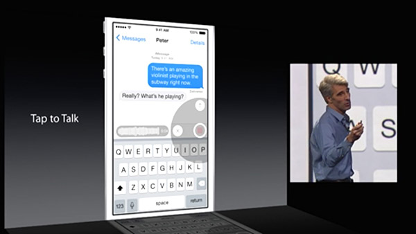
Now if Apple would only get off their ass and give the same attention to VOICE CALLS. I mean, come on... PC call center software has been around for decades which allows you to do simple things like record custom voicemail messages and selectively route callers... why in the hell is iPhone so far behind in this? It IS, after all, primarily a PHONE, isn't it? Oh well, I suppose I should be thrilled that we at least get to block a caller from calling again... how long did we have to wait for that?
And then we have HealthKit... Apple's portal to managing all your health apps...
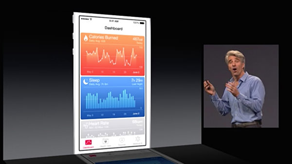
The ultimate promise of the idea is that one day you will be able to monitor various aspects of your health (like blood pressure and the like) which can automatically be transmitted and monitored by your automated analysis software and you doctor. If there's a problem detected, your doctor's office can then contact you to get it sorted out. It's a fantastic idea. In theory. In reality, I wonder how many doctor's offices are going to implement this stuff any time soon. I also wonder when we're going to get Apple's "iWatch" which will have health monitoring and syncing that makes HealthKit actually useful. Who knows.
From there we moved on to photo storage (in iCloud, of course) and the idea of Apple's "Smart Adjustment" technology which gives you the ability to perform comprehensive edits that are smart enough to do a lot of "behind the scenes" work to give you much better photos with little effort...
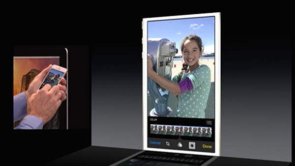
It will be bundled with iOS 8 and be added to Yosemite in 2015. Which is great and all... but I have to wonder where this leaves Aperture, Apple's high-end photo editing and storage software. How will it be able to handle edits made in iPhoto on iPhones, iPads, and Macs? Will they integrate, or be a separate set? Will flattened edits in Aperture be saved out so that devices reading from your iCloud Photos can actually view them? All of this is up in the air. And since Apple won't comment on future software (natch) it's tough to tell if Aperture is even going to be around in 2015. This is very, very frustrating... but so typically Apple. I honestly don't expect them to tip their hand and tell people what's happening with Aperture... but it would at least be nice to know that it's still going to be around.
A surprise to no one, Siri is being updated...
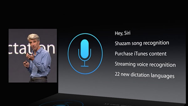
I use Siri all the time, so naturally I am thrilled to have improvements to his/her functionality. What bums me out is how far behind the Mac version is to the iOS version, and no mention has been made as to whether or not any love is going to be spent improving the Macintosh side of things. I would hope so, because the crappy dictation functionality on the Mac is pathetic. Why Apple can't keep up with the iOS side of things is a complete mystery. Why can't you ask Siri questions on a Mac like you can on an iPhone? It makes -zero- sense. And yet here we are.
And here's where things start to get interesting.
Very interesting, if you're a developer.
First of all, Apple is going to finally allow permission-based data sharing between apps. Something that is long overdue and will makes for some incredible extended functionality possibilities. Sure, the functionality will be limited so as to keep data safe... but this is such a massive leap in the right direction that I find it hard to not get excited at the prospect.
Game developers will get up to a massive 10x speed bump in their apps thanks to a new technology called "Metal" which allows them to get closer to the raw power of the iPhone/iPad processor than ever before.
And, lastly, something that took everybody by surprise... a new development language called Swift that takes the best parts of past programming languages and marries them to modern programming concepts while leaving all the antiquated baggage behind...
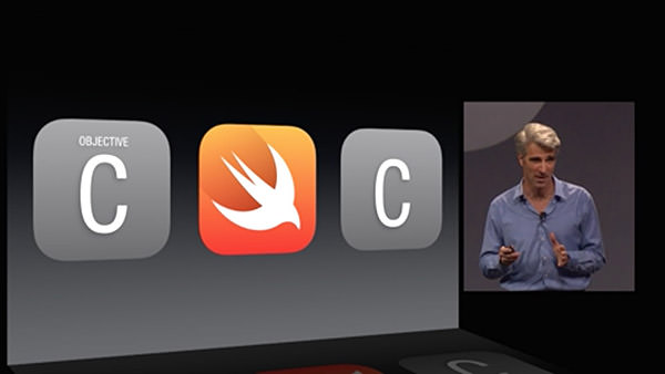
Without being able to see it and play with it, there's no way I can really comment on how useful Swift might end up being. But it certainly sounds promising. And powerful. And easier to use. And smart. I can't wait to take a look.
And that was that.
No new hardware. No new AppleTV. No new iWatch.
Just some interesting new features and a promising new future for Mac developers. Which is what I guess we should expect from a Developer's conference.
So I guess I'll try not to be disappointed with the lack of new toys.
 So Apple has stopped development on Aperture, their professional-grade photography organizer and editor.
As somebody who has invested an incredible amount of time and money in Aperture, I am understandably pissed off. But not the least bit surprised.
This is par for the course with Apple and their professional software. They build something incredible, eventually lose interest, then either dump it... or downgrade it to the point that so-called "professionals" are left behind. I've been through the whole thing before with Final Cut Pro and DVD Studio Pro.
You'd think I'd have learned my lesson by now, but nope!
I've stuck by Aperture despite the fact that Apple hasn't released a significant update in four years. I've stuck by Aperture despite the fact that Adobe's competitor, Lightroom, has been getting continuous upgrades and improvements all that time. I've stuck by Aperture despite the fact that Apple has such a profoundly shitty track record with the "Pro" apps.
No, I have no idea why.
I also have no idea what, exactly, Apple is thinking by discontinuing their Pro photography app (Aperture) and their Consumer photography app (iPhoto) in favor of something new (Photos). I'm guessing their new baby is going to land somewhere in-between, in which case it's going to be too much bloat for the consumer and too little capability for professionals.
So what's the play here?
What's Apple up to?
Where's the hook?
Well... the hook is that Photos will be iCloud-based and able in integrate with Photos running on iPhones and iPads. All your photos are syncing all the time. As are your edits. If that weren't enough, apparently Photos will be smart enough to catalog proxies based on your device's capacity. The bulk of the data is kept on iCloud... including RAW originals... and the pricing looks excellent.
That's quite a hook.
Assuming it works. And when it comes to iCloud, you can never really tell.
The full feature list of Photos isn't going to be known for a while yet. Will it be "professional" enough to be a worthy successor to Aperture? Who the hell knows?
So, in the meanwhile, I'll just carry on being pissed at Apple.
I'm starting to get used to it.
 To mourn the passage of Apple's Aperture photography cataloging and editing software, there was a discussion thread where people are posting the first photo they ever imported into the program.
Aperture was released in 2005, but the first photos I imported were those I took after having gone 100% digital in 2000. Up until that point, I always took a film camera with me on my travels because I wanted to make sure I had a reliable fallback in case the digital photos turned out horrible (which they often did back then).
But then the Sony Cyber-Shot DSC-D700 camera was released. Suddenly I had an unbelievable 2.8 megapixel sensor that could produce dazzling
And here's the first photo from that batch to be imported into Aperture...

That's a picture of Akihabara Denki Gai ("Akihabara Electric Town") in Tokyo, Japan.
Today I shoot in RAW format and take three bracketed exposures for every image. That eats up a hefty chunk of memory but, with 32GB and 64GB SD cards so common (and getting cheaper every day), it's not a big deal. Back in 2000, however, I was constantly switching between Medium Quality (
As for Aperture?
Now that it's been discontinued, I've resigned myself to the fact that my last import into the program will be my upcoming trip to Salt Lake City. After that I'll be switching to Adobe Lightroom.
If I'm feeling nostalgic, maybe I'll be sure that the first image I import into Lightroom will be the same first image I imported into Aperture.
 I've had more that a couple people ask me if I've joined the Apple Mac OS X Yosemite Beta program. Of course I have, which always leads to the question "Well? What do you think?
The answer is not so easy to pin down... mostly because the beta is very much work in progress. And a lot of the more compelling features, such as all the nifty new iPhone integration, can't be tested because I don't have iOS 8 installed on any of my devices. So about all there is for me to comment on is A) How it runs with my existing stuff, and B) What it looks like. Those answers are as follows...
A) Seems to run fine, though I've noticed there is some lag when typing with a few apps.
B) I think it looks like shit. Garish, dated, and inexplicably messy on anything less than a Retina Display... which is a lot of people still have.
First of all, the new "flat" icon aesthetic isn't bad... it's the ugly day-glow color pallet that makes it appear that way. Even worse, the "flatness" is applied inconsistently. The icon for Mail, for example, isn't truly "flat" at all. It's got a lot of photo detail on it plus a watermark, which looks inconsistent next to all the other Apple icons that are so minimalistic...
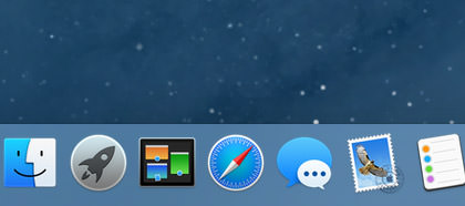
The Mail icon is new, so I'm guessing that's pretty much what it will look like when Yosemite is released. Unfortunate.
Even putting the garish app icons aside, there's an even bigger problem with folders. No longer a subtle element that recedes into the background so you can focus on what you need to, folders are now about as subtle as a slap in the face. They're like a plague of distraction...
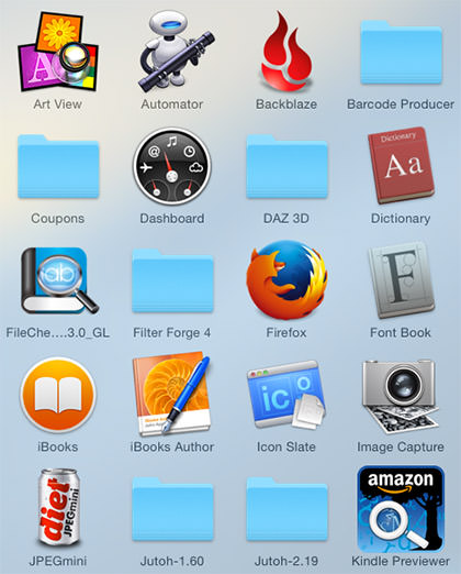
Get a grouping of them and it's almost worse...
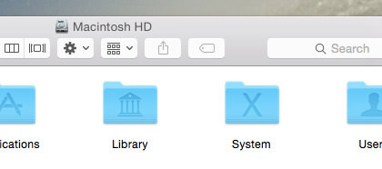
Compare and contrast to the much classier presentation of the older folders...
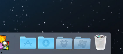
Also note the trash can, which no longer looks like an actual trash can... but instead like a frosted shot-glass filled with cigarette butts. Far more Windows-like than Mac-like in my opinion.
And it doesn't stop there... every single control element has been flooded in 80's day-glow colors which looks almost manic in it's distraction...
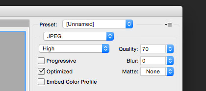
YES! WE FUCKING GET IT! WE CAN CLICK ON THOSE CONTROLS!! Praise be to Jobs that you can tone it down by switching the appearance controls to "Graphite"...
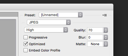
Unfortunately, there's no way to do that with the folders and icons. And, this being Apple, it's not like they're going to offer any skinning options so you can replace their shitty 1980's color scheme with something more sensible.
I haven't played much with the Apple apps that come with the system. Notepad and Contacts have been updated, but not noticeably so. The Calendar app looks a little different, but is still the same flaming pile of shit when it comes to usability. The only difference is that they've moved the laughably absurd and confusing month labels from the right to the left...
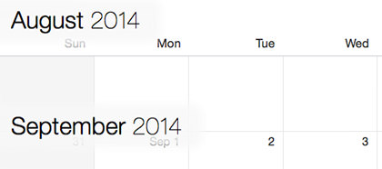
For the life of me, I don't understand Apple's new design mantra. It used to be that design was functional first... then that functionality was made beautiful. Now it's apparently design over function... which is made a hundred times worse because it's shitty design that's being painted over shitty functionality. Exactly the opposite of what Apple is supposed to be about. At least it's consistently shitty, which means they're still ahead of Microsoft. But for how long?
I was pleasantly surprised to find that the gimmicky transparency crap they've injected everywhere is much more subtle than I feared it would be. I still think it's entirely unnecessary, but at least it's not distracting me from getting things done. Even so...
John Hammond: I don't think you're giving us our due credit. Our scientists have done things which nobody's ever done before...
Dr. Ian Malcolm: Yeah, yeah, but your scientists were so preoccupied with whether or not they could that they didn't stop to think if they should.
That classic quote from Jurassic Park pretty much sums up my feelings about how Apple is operating now. Yes... yes... it's cool that the QuickDraw engine of Mac OS X allows effortless transparency to be added to any element... but just because you can do a thing doesn't mean you should do a thing.
One thing I rather like about Yosemite is iCloud Drive. It's basically DropBox integrated into the operating system. I am hoping... hoping with all my might... that this will make data sharing with iPhone have some semblance of sanity. If not, then DropBox it is. DropBox is not only dead-simple to configure and use... they just upped everybody who pays for their pro service to a whopping 1 terabyte at no extra charge. That's probably cheaper than what Apple will offer, which means the iPhone quackery you have to put up with is suddenly not the deal breaker it once was.
More random things to like...
And that's about all I have to say, really. Everything else is pretty much as it's being reported on every Mac website in existence.
While I think Yosemite has some interesting things going for it, ultimately it feels as if Mac OS X is taking a step backwards in functionality and design. Whether these things will be fine-tuned and improved before release is anybody's guess. I certainly hope so.
 And so Apple released their long-rumored watch and long-leaked iPhone 6 today.
We'll get to that next entry. I've got bigger fish to fry first.
As you may have already heard, several celebrities... including Jennifer Lawrence, Kate Upton, and Kirsten Dunst... had their personal (and often revealing) photos stolen and posted publicly without their consent or knowledge. Despite what the assholes at FOX "News" say, victim blaming is not the way to respond to this. You should be able to take whatever the hell photos you want and not have to worry about some criminal violating your privacy by stealing and posting them. And while it's nice to think that these criminals can be tracked down and made to pay for their crimes, the global reach of the internet makes this unlikely or impractical. The criminal would have to be located here in the US for US law to really be of any use. Even then, cyber crimes are persecuted so wildly that there's no guarantee a criminal will get a suitable punishment.
So what to do? Let's see...
In a press release Apple says "Hey, don't blame us" because the theft wasn't caused by a breach of their network. Instead, it was a targeted attack on specific accounts where the criminal broke in by guessing passwords (probably with the help of brute-force hacking software). At the end of the release, apple closes with this...
To protect against this type of attack, we advise all users to always use a strong password and enable two-step verification. Both of these are addressed on our website at http://support.apple.com/kb/ht4232.
To which I say... bullshit.
Not because it's bad advice, but because Apple itself makes taking their advice far too difficult.
My Macintosh and my iPhone and my iPad are password protected. In order to get to any information on them, you have to get past the login screen first. I use a rather strong password that's a pain in the ass to type, but protecting my information makes it worthwhile. But here's the thing... once you've unlocked your device, Apple continues to pester you for passwords all the goddamn time. And, yes, I've checked "remember my password." It doesn't do any good. I am FOREVER having to enter my password. Just this morning I opened iTunes so I could listen to some tracks by The 1975. For reasons unknown, all my iTunes Match songs stored in the cloud were inaccessible. In order to play them, Apple wants my password...
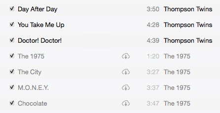
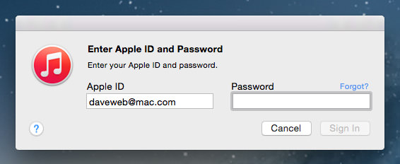
Now, I've already typed a password to unlock my machine, so having to type the password AGAIN makes no damn sense. But at least with my Mac I have a physical keyboard available. What about my iPhone? That damn thing asks for my password several times a day. Want to buy an app? Even a FREE app? Type your damn password. Then type it again. And again. And again. And again. And here's where having that strong password that Apple recommends falls apart. Who wants to type "&7pbik9jbkQos$HB" on the shitty, incomplete, tiny keyboard that's on your iPhone over and over? Anybody? No? That's what I thought.
Which is why people tend to create simple, easily-hackable passwords.
So when Apple says "It's your fault, Jennifer Lawrence, you should have had a stronger password!" I want to say "Bullshit, Apple, it's all YOUR fault for making stronger passwords too difficult to use by making people type them too many damn times!"
Apple's answer to that would probably be "You should buy a new iPhone that has Touch ID... then you don't have to type a password, you can just use your fingerprint!" Well, okay. But that's no help for the millions of people who can't afford to upgrade their phones every damn time Apple comes up with a new technology.
So, Apple, please... seriously please... stop being so clueless when it comes to security. It's one thing to offer the advice of using strong passwords... it's another thing entirely to make strong passwords practical to use. Which you absolutely do not. You need to allow the user an option to NOT require passwords once a device has been unlocked. Then, instead of forcing users to create easy-to-type/easy-to-hack passwords they have to enter constantly, you can instead get a strong, worthwhile password they only have to type once...
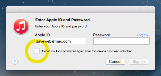
Today Tim Cook said that Apple excels at solving problems like this.
Time to prove it, because your current "solution" isn't working.
 Three big announcements from Apple yesterday. All of which would have been surprising if it all hadn't been leaked to the internet weeks ago. If you haven't seen the keynote video, it's over at Apple's site for your viewing pleasure.
• iPhone 6... And so the inevitable happened... iPhone got bigger. But the user interface didn't get bigger with it. Meaning it's not any easier for people to navigate if they have poor eyesight (me), or older eyes (me), or vision problems (me). Nope... the tiny icons and text have just been moved further apart on the bigger screens of the iPhone 6 and iPhone 6 Plus...
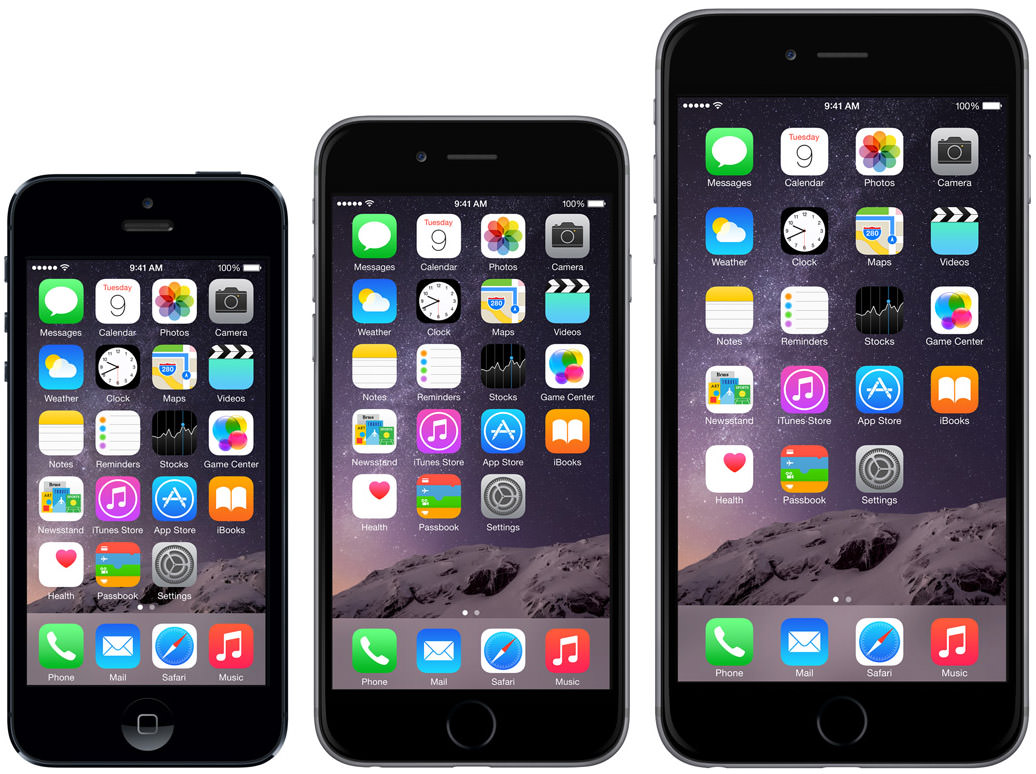
Except... Apple mentioned something called "Display Zoom" which sounds interesting. The iPhone 6 can apparently render the text and icons larger than previous models on command...
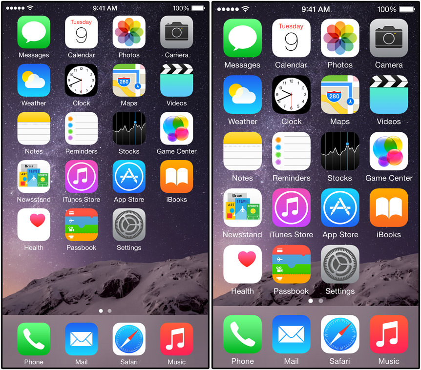
Huzzah! But... I can't find much detail as to how this works. Can you leave "Display Zoom" on all the time, or is it a temporary thing? Does it work everywhere, or only with apps that support it? However it works, it looks to be a step in the right direction for people like me who need an easier time of it when trying to use their phone. My fear is that this only works on the home screen, but I guess that's better than nothing.
Anyway...
The new seamless, ergonomic design of the iPhone 6 is just beautiful. Apple's mobile aesthetic has been looking dated for a while now compared to what the competition is doing, so this is a welcome sight...

A pity that you have to slap a case on that sexy design in order to keep it from smashing to bits if you happen to drop it. With this in mind, Apple is introducing both a leather and a silicone case to protect your investment. Hopefully this time they'll be available at launch so your iPhone is made safer from day one.
Screen resolutions are getting to be ridiculous... with some newer phones having pixels that are smaller than the eye can detect. Which means wasting precious battery life to power something that you probably won't even notice. Apple increased the density on their "Retina Display" screens, but didn't go too crazy (326 ppi on the 6 and 401 ppi on the 6 Plus). This should strike a good balance between getting a beautiful display while still being battery efficient.
Not surprisingly, Apple is using a new 64-bit A8 chip for the brains of their latest and greatest. If you watched the game demo during the keynote, you've seen what this kind of power is bringing to the table. But power, of course, comes at a price. Lucky for us Apple has made advances with the iPhone power cell as well, so you can still get decent battery life with the faster processor.
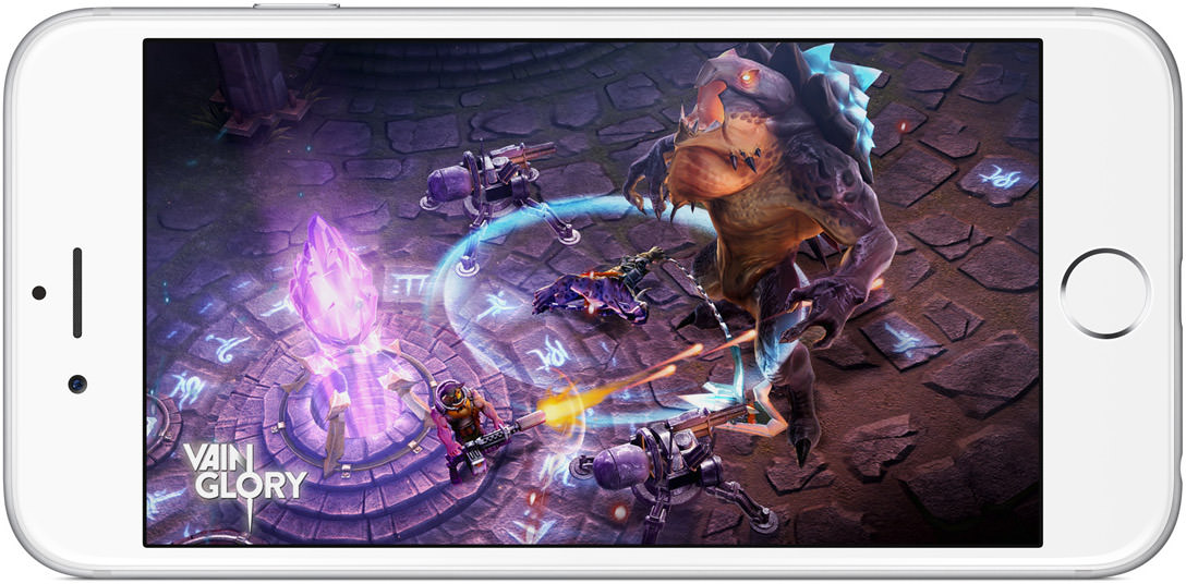
But what about the feature I use most on my iPhone? What about the camera? And I'm not talking about all the bells and whistles like "face detection" and "burst mode" and "HDR"... I'm talking about the actual camera element. The specs say that iPhone 6 is still stuck at 8 megapixels, which is a bit surprising. I mean sure, megapixels aren't the sole determining factor in getting great photos... but higher pixel counts do allow for more detail. So if not the megapixels, what has been improved?
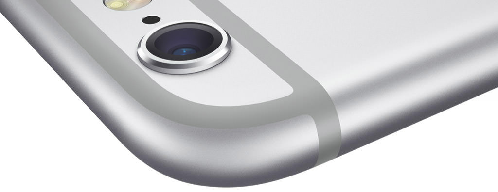
Well, the lens has been bumped up to an f/2.2 aperture, which is a bit brighter than before. That's a good thing. Exposure control should make getting shots with wildly disparate lighting conditions a bit easier. Also a good thing. And Apple has come up with "auto stabilization" to reduce motion blur and shake. That's a very good thing. BUT, if you've been waiting for actual OPTICAL stabilization, you can get it at long last... but ONLY on the iPhone 6 Plus. That's a not-so-good thing for me, because I don't want to have to start carrying a purse so I have a place to put my iPhone.
The only bad thing I've noticed is that the camera lens now protrudes from the shell. Seems like that's an invitation for damage if you're not using a case on your iPhone... but superior camera features are going to have a trade-off, and this is what you have to pay...
If you shoot video, there's a slew of improvements on that front. Automated time-lapse. 240 frames per second slo-mo at 720p. And while there's no 4K option, you do get beautiful 1080p HD video running at 60 frames per second... all with cinematic video stabilization. Sold!
Of course Apple included Touch ID on the iPhone 6 models... which nicely addresses my bitching from yesterday about the shitty password security Apple is using on pre-Touch ID models. AND it dovetails nicely into another big announcement today...
• Apple Pay... And heeeeeere's Apple's new "digital wallet" functionality! Many others have tried to bring us this golden carrot of the modern age... but they've all failed. This October, we'll see if Apple has the muscle to get their version accepted by merchants around the globe. Something tells me they can. But... what about security? Well, it would seem that Apple has put some real thought into Apple Pay, because its security features are pretty well-rounded. First of all, you no longer have to disclose your credit card number, name, and security code like you do when you hand over your credit card. Instead, Apple Pay creates a Device Account Number that is stored on a new Security Element chip on your phone... not on Apple's servers... to conduct the transaction. Furthermore, Apple is actually adding privacy to the transaction by keeping them private. No details will be stored or transmitted, so your purchases can't be tracked back to you. Well, through the payment anyway. And since Apple Pay also has an online component, this should make it easy for Conservative lawmakers to get their gay porn fix anonymously.
I'm in love with the idea of not having credit cards bulk up my wallet. But that day isn't coming any time soon. So long as one retailer you deal with doesn't accept Apple Pay, you're going to have to hold on to your plastic. And while it's nice that you won't have to dig them out as often as this technology get adopted, it's not like using a physical credit card is such a huge burden that it's going to matter all that much in the end.
Verdict? Cautiously optimistic.
• Apple Watch... Praise be to Jobs that we seem to have escaped from the "i" branding that's dominated Apple for the past several years. By naming their wearable "Apple Watch" instead of "iWatch" I will be able to purchase one without screaming.
And, yes, you read that right... I am buying one.
The minute I saw this image hit the screen, the decision was made...
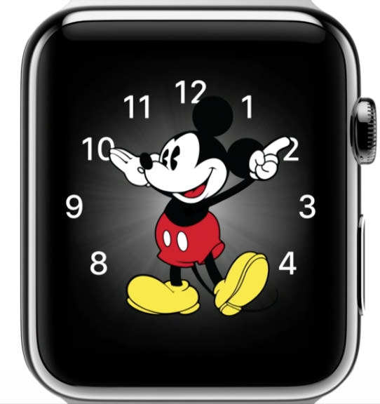
Everything else is gravy, because I'd buy the watch if all it did was display the time using an animated Mickey Mouse (he taps his foot with the time!).
And about that gravy...
The health crap is nice, but probably not something I'm going to make use of. The whole "send your heartbeat" "tap a friend" and "send a sketch" stuff isn't very compelling to me. Heck, a lot of the features being touted aren't compelling to me. Yes, it will be nice to not have to go fishing for my iPhone every time I've got an alert or a message or whatever, but the defining feature to me? We're one step closer to Dick Tracy, baby...
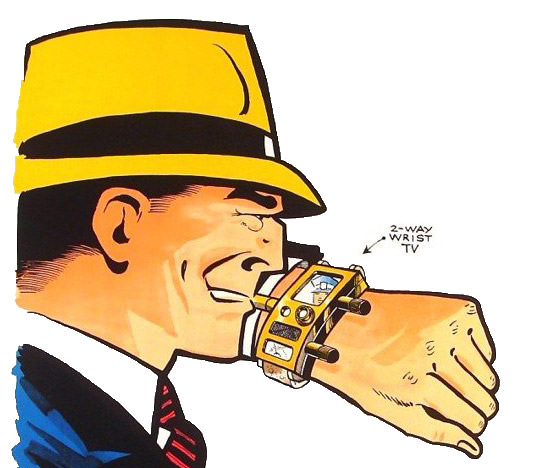
The day I can hold a FaceTime conversation on my Apple Watch will be one of the greatest days of my life.
In the meanwhile, I'll just have to settle for the dozens of things that Apple Watch can do right now.
All of which wouldn't mean shit if Apple Watch wasn't something I wanted to wear. Fortunately, that was never really a concern. I knew Apple would come up with something good-looking and wearable... and they did...
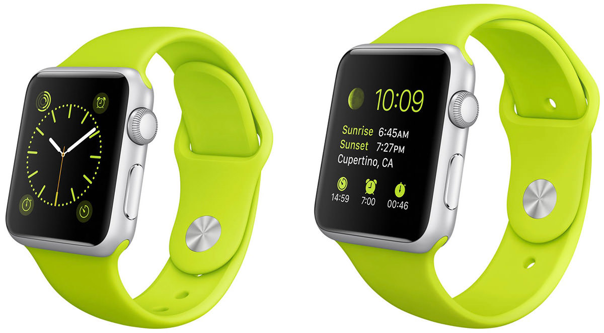
...IN TWO FRICKIN' SIZES!!!
Which means that if the larger one is like a brick on my bony arm, I have another option available. Sadly, it doesn't look like it gets any thinner, which has always been the problem with so-called "smart watches." I mean, just look at this boat anchor...

To be honest, I really thought Apple's watch would be thinner than this. I thought they'd find a way to put the battery in the band... or make it run on nuclear fusion... or something to make it not be so obvious...

Maybe they're saving that for Apple Watch 2.0.
The one thing that did turn out as expected was the interface. Apple being Apple, they weren't content to force a Phone interface on their watch. That's what other companies do. No no... they started from scratch and came up with something more appropriate to the smaller size of the device. Using the "crown" for interactivity so it doesn't obscure the screen is genius. Using "deep presses" for touch selection is genius. Having the watch tap you for attention instead of jolting you with a buzz is genius. The MagSafe contact charger is genius. The customization options are genius. Everything about the Apple Watch is genius...
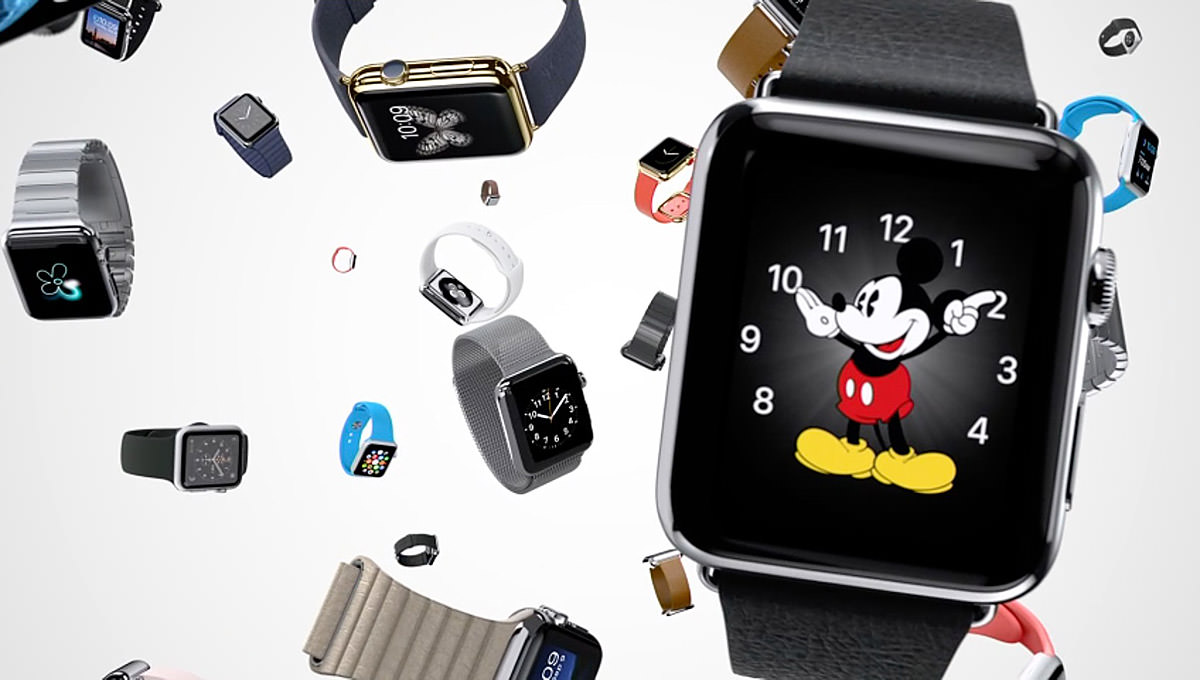
Battery life? Memory size? Durability? Water resistance? Who knows? Who cares?
Well, except the wait. "Early 2015" is pretty non-specific, and could mean as late as May.
Another sticking point could be the price. "Starting at $349" leaves a lot of latitude. The style/band you want could run much, much higher.
Not that it matters. If I have to sell a kidney to get my digital Mickey Mouse... that's definitely on the table.
So... a banner day for Apple and Apple Whores alike!
I guess.
It's hard to know for sure until I find out if I'm going to be down a kidney or not.
 Don't let Summer's imminent demise get you down... because Bullet Sunday starts... now...
• New? You know that feeling when a new toy you ordered from Amazon shows up? Suddenly it's Christmas and your Birthday all rolled into one and it doesn't matter that you had to pay for it because it's something you really want and are just so thrilled to have it in your hot little hands at long last after an agonizing wait even though you just ordered it only yesterday. Great, isn't it?
You know what's not great? Getting your new toy then discovering that it's not "new" after all. Not only has the box been opened previously... but all the packages inside have been opened. As if that weren't bad enough... THERE IS DIRT ON YOUR "NEW" TOY! ... DIRT!!!!
Obviously, I received returned merchandise. Obviously, I won't be keeping it. Obviously, I have to return it and wait AGAIN for my NEW toy to arrive.
Life can be so hard.
Well, relatively speaking, of course.
• Palin! Last month Sarah Palin started her own online channel. And more amusing than the fact that there are people out there willing to pay $9.95 a month to listen to her bullshit is that Saturday Night Live predicted it...
But it wasn't until news of a drunken brawl involving The Palins broke out that I realized what serious entertainment potential "The Sarah Palin Channel" has. Reality is far better than anything Saturday Night Live could ever dream up. And while I seriously doubt Sarah will be airing footage from what really goes on in her life that's not been carefully orchestrated for public consumption... I am praying that somebody captured footage of Palin yelling "DO YOU KNOW WHO I AM?!? while mixing it up with the locals. I would gladly pay $9.95 to see that.
• Fake! As somebody who has been accused of "faking" my travels on more than one occasion, I was intrigued by the story of a Dutch girl who actually did fake a trip to Southeast Asia. At first I was thinking "How lame could you be?"... but then I read the story...
Interesting. And yet another wake-up call to not trust everything you read on the internet.
• Mom! This is beyond sweet...
So very Japanese... but in a way I think anybody can relate to.
• Phone 6! I placed my pre-order early enough that I'll be getting my iPhone 6 on launch day. Except I'll be half-way around the world on vacation when it arrives, so actually I won't be getting it on launch day. I am both happy and sad about that.
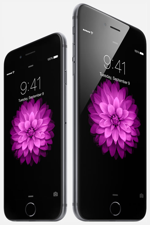
ZOMG! JUST LOOK AT IT! I really need to start planning my vacations better.
• Phone 8! I would never give up my Apple iPhone for a Google Android Phone. I don't care for Android... at all... and would consider such a move to be a significant downgrade. But then there's Windows Phone 8. I wouldn't trade down to that platform either... but, if Apple closed up shop today, that would be the phone I'd buy. For one thing, Windows Phone 8 is the only OS with an interface that seems "new." Whereas Android is a shittier version of what Apple's already done, Windows 8 is a beautiful departure. It feels modern. It looks great. Some real thought went into it. I like most everything about it... once I got used to the "flippy tiles" interface, which gets annoying after a while...
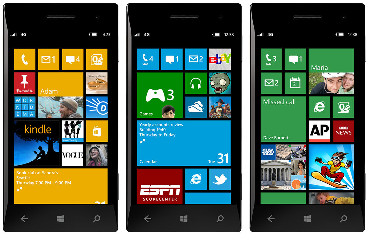
But there's a couple of serious problem for Microsoft: market share and apps available. Market share is probably the biggest problem because they don't have any. It's hovering just below 3% and dropping fast. And because of that, developers aren't writing apps for their dying platform. Including the three companies I work with. Two never even started... the third stopped all WinPhone development last Friday.
And so Microsoft is in catch-22 situation. Their market share won't grow if customers don't have a ton of compelling apps. Developers won't create a ton of compelling apps until there is significant market share. And I don't care how many billions of dollars that Microsoft throws at the problem, it's not going away any time soon. Which means Windows Phone 8 is probably not long for this earth. Eventually Microsoft is going to have to face the fact that they will never be able to compete with Apple and Google when it comes to smart phones. Their only chance now is to fork Android to create their own version of the OS so they can still do what they want to do while having access to the gazillions of apps available. Whether Microsoft decides to do the obvious or waste billions upon billions of dollars to no avail remains to be seen. As a fan of their UI, I hope they do something before WinPhone is forced to close shop permanently.
And, on that happy note... time to finish packing.
 Everything's coming up picture perfect... because a very special Bullet Sunday on Tuesday FOUR HUNDREDTH ANNIVERSARY "WHAT'S IN YOUR CAMERA BAG" EDITION starts... now...
• Sony NEX-6 Camera. This is my main shooter, which I reviewed here back in May, 2013. Because it's a mirrorless camera, it is small, light, and perfect for travel... yet maintains the photo quality of a bigger, heavier DSLR. The one big caveat is that it doesn't have a full-frame sensor, so there's a crop factor for any full-frame lenses you attach. This actually ended up being a benefit on my recent trip to Africa, because my 70-200mm FE lens becomes a 105-300mm lens, making it much easier to zoom in on animals in the bush...

There's not much I don't like about the NEX-6... except the start-up time, which is kinda slow and did cost me a shot or two. Otherwise? A wonderful camera that is capable of delivering great photos. Will probably trade it in for a full-frame sensor camera before my next big trip (hopefully the successor to the Sony A7r.
16.1MP • ISO 100-25600 • $748 (discontinuted) • ★★★★☆
• Sony A7s Camera. I bought the latest Sony mirrorless camera specifically for night-shooting on my Africa trip. I knew there would be game drives in the evening, and wanted every possible advantage in getting clean shots. The A7s is made for this kind of shooting with its high ISO full-frame sensor, and gave me images I would have had a very hard time getting with any other camera. This post-sunset shot, for example, was taken in near-darkness. It was so dark that I could barely see, and didn't know what I had captured until after I looked at the camera's display...

Yes, things get a bit grainy when shooting at those monster ISO levels, but at least you get a shot...

For red-light safari drives in total darkness the A7s really shines, giving me shots that my NEX-6 couldn't hope to touch...

The A7s loves low light and, quite by accident one night, I discovered what this would mean if I shot the night sky...
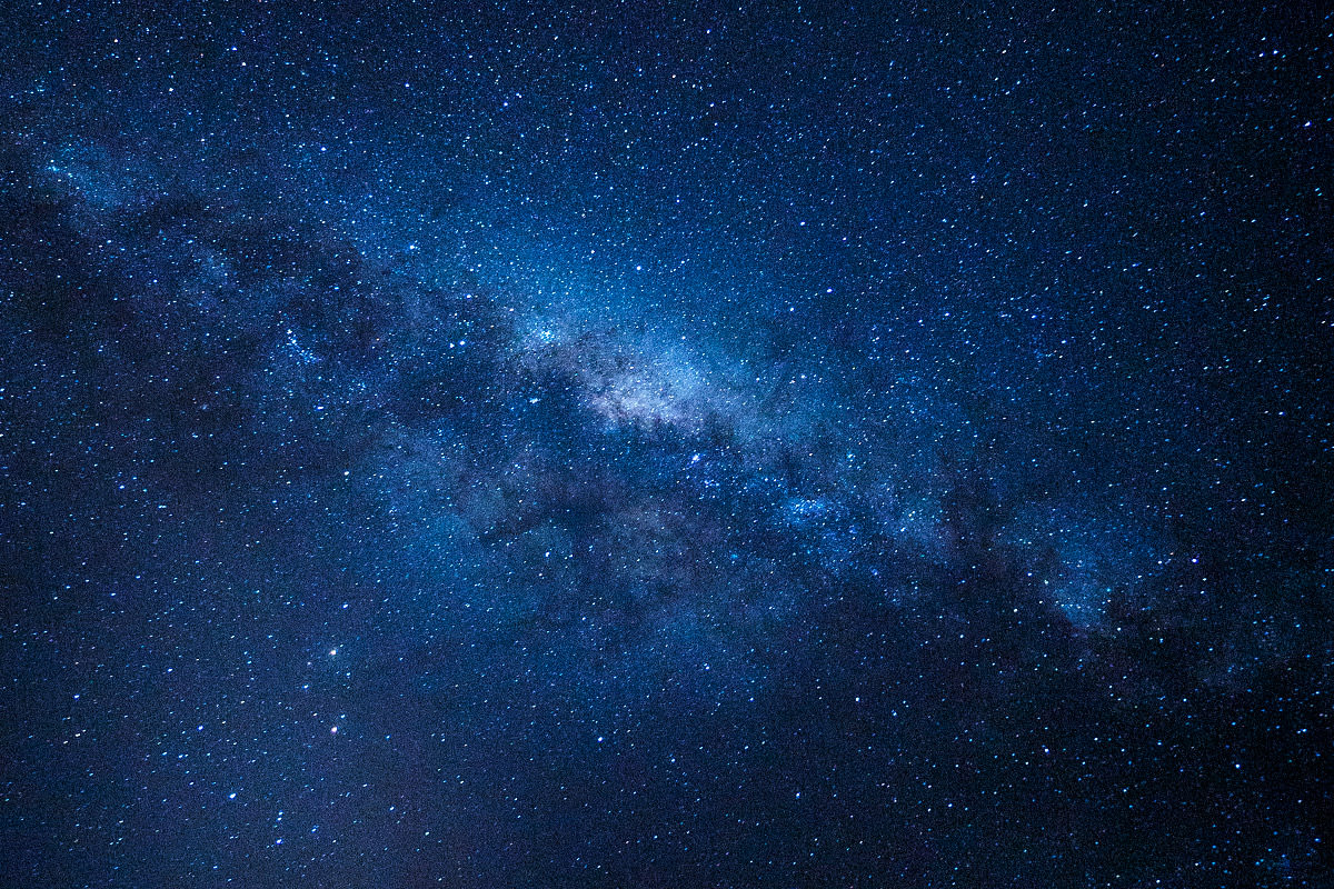
The ability to shoot in near-blackout conditions comes at a price, however. The sensor resolution is a meager 12.2 megapixels. This will turn off a lot of photographers who equate megapixels with photo quality, as a 4240 x 2832 image seems weak compared to the 7360 x 4912 you'll get out of other cameras in this price range. But all the pixels in the world can't save a shot if your camera records a big black blob, so it was a trade-off I was happy to make. And after looking at the amazing photos I managed to get, I have zero regrets. The A7s has terrific video capabilities, but I'm not a video shooter, so I'm taking Sony's word for it.
12.2MP • ISO 100-102400 • $2,499 • ★★★★★
• Sony DSC-HX50V. As a backup-backup (hey, how many times will I get to go on safari in Africa?) I needed a camera with some reach to it, and started shopping for ultra-zooms. The field has gotten really competitive, and finding the right camera was tough. Ultimately size was the deciding factor for me, and Sony's pocketable HX50V fit the bill perfectly. Sure, I would sacrifice some zoom (it's 30x when others in this arena are at 50x), and not being able to shoot RAW was disappointing, but it's a camera I could slip in my pocket and have with me at all times that I'd barely notice.
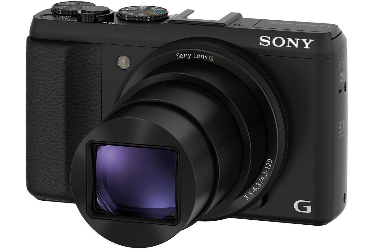
Turns out the image quality is quite nice (for JPEG) so long as you don't zoom too much, and the HX50V is a capable little shooter that I was happy to have on me for those times my camera bag was back at my tent. But ultimately I regretted my purchase for one big reason... no eyepiece viewfinder. The only way to compose a shot was to use the display on the back, which is completely obliterated in bright light! Under the African sun this camera was rendered totally useless. I couldn't see a damn thing to compose a shot, and was shooting blind any time I was out of the shade (even when setting the screen to max brightness). If you buy this camera, I hope you'll only be shooting indoors or in overcast conditions, because that's all its good for. Still, it DOES have a GPS... which is more than I can say for the much more expensive Sony's listed above. I took an occasional shot with this camera just so I could use the GPS info to geotag my other photos, and it worked pretty great for that... meriting an extra star.
20.4MP • 30x • ISO 80-3200 • f/3.5(W)-f/6.3(T) • $325 • ★★☆☆☆
• Sony FE 70-200 f/4 OSS E-Mount Lens. Go with a cheap zoom lens to get the reach you need... or go with a quality zoom lens and crop the reach you want? It's a question that every photographer has to grapple with at some time in their lives. In the past I've just gone for the cheapest zooms I could find because I don't use them very often. But for my Africa trip, I decided to invest heavily in a good zoom because the quality of the image was what's important to me... even if I wasn't as close as I'd like to be. And since Sony only makes one E-mount zoom with any reach to it, the FE 70-200mm, my decision was made for me. I reviewed the lens back in August, and have only one thing to add to this remarkable addition to my camera arsenal... WHY IN THE HELL DOESN'T SONY HAVE A SWITCH-LOCK ON THE IMAGE STABILIZATION SWITCH?!? Every time I slid this lens into my camera bag, image stabilization would slide off. So the next time I'd go to shoot a lion (or whatever) I'd end up with blurry camera shaken images until I'd remember to turn it back on. This is categorically stupid. At no time... none did I ever want the "Optical Steady Shot" turned off, yet there was no way to lock it in the "on" position. Very, vey frustrating. But, once I remembered to switch OSS on, I was getting some fantastic shots from this lens...


Sure it's big and at almost 2 pounds it's a bit heavy too... but you can't argue with the results. Crisp images, beautiful bokeh, fast auto-focus... I was very, very happy to have this full-frame wonder with me on safari, and was much relieved that I spent the money to have a quality telephoto in my camera bag. 90% of my photos were shot with it. Minus a star for the lack of an image stabilization switch lock... and for not having a bit better aperture (it's locked at a consistent f/4 though, which is nice)... but if you're an E-mount shooter, this is the zoom to get.
70-200mm (full-frame), 105-300mm (cropped) • f/4 • $1,499 • ★★★★☆
• Sony FE 35mm F/2.8 Carl Zeiss Sonnar T* E-Mount Lens. I skipped the kit lens for my A7s full-frame sensor camera because I wanted some glass that would really let it shine. Unfortunately, my choices were limited, because Sony doesn't have many options when it comes to FE prime lenses. Ideally, I wanted a 35mm with image stabilization and a maximum aperture of f/1.4... but it doesn't exist. A 35mm with NO image stabilization and a pokey f/2.8 aperture is as close as I can get. And, to make matters worse, Sony is charging a whopping $800 for it. In all honesty, I don't think the Zeiss name justifies such a heinous price tag, but what choice do I have? None at all. Yet despite the absurd cost, this lens has a lot going for it. It's small and light. It focuses blazingly fast. It's super-sharp. Color is very good. And I got some really nice shots with it...


Night sky images were mind-bogglingly great...

The slow aperture was never a problem on my NEX-6 in the sunlight nor on my A7s with its amazing low-light capabilities, but I still find it disappointing... f/2.8 on a 35mm? Who does that any more? This, along with the crazy-stupid price tag drops two stars from my rating, even though the FE 35mm is a darn fine lens once all is said and done. And yet... I keep coming back to the cost. EIGHT HUNDRED DOLLARS?!? For THESE specs? Holy crap I hope Sony gets their heads out of their asses and starts producing affordable FE lenses soon.
35mm (full-frame), 50mm (cropped) • f/2.8 • $799 • ★★★☆☆
• Sony 10-18mm f/4 OSS E-Mount Lens. I shoot a lot of wide angle, so this lens was purchased alongside my NEX-6 on day one. I absolutely love it. Small and light for a wide angle. Really sharp. Great color. Quick to focus. Image stabilized. And all at a reasonable cost! As if that weren't enough... even though it was designed for the cropped sensor on Sony's NEX cameras, it works amazingly well on my full-frame A7s if you limit the focal range! Amazing! This lens fulfills the promise of mirrorless cameras, and proves Sony doesn't need Zeiss (or Zeiss' absurd price tag) to give their customers a great lens. And though I didn't get much use out of it in Africa, it's the one lens that's always in my camera bag...


If you've got an E-mount camera, this is the lens to own. Fantastic for landscapes, yes... but I use it all the time for just about everything (the wide angle distortion is very easy to correct in Photoshop). Thank you, Sony.
10-18mm (cropped) • f/4-f/22 • $849 • ★★★★★
• Apple 11-inch MacBook Air. I'm using an iPad more and more for things like email and web browsing, but when it comes to photography, there's simply no substitute for Photoshop on a Mac. My MacBook Pro excels at running Photoshop, but is way too big and heavy to tuck in a camera bag. Fortunately, Apple has a diminutive solution that tucks easily in my bag, and it runs Photoshop just fine thanks to the 8GB memory option...

Until Microsoft manages to come up with a "Surface" tablet/PC hybrid that's worth a crap... or Apple comes up with a MacBook Air that has a retina display touchscreen I can give five stars... this will certainly do.
1.7GHz i7 • 8GB RAM • 256GB SSD • $1,250 • ★★★★☆
• Transcend Information USB 3.0 Card Reader. Unfortunately, there wasn't enough room in the MacBook Air 11-inch model to fit a card reader, so you need to buy an external one. This Transcend model takes advantage of the USB 3 speed of my MacBook and accepts SDHC, SDXC, microSD, microSDHC, and microSDXC cards. Cheap, compact, and does the job. If they could remove the micro card compatibility (that I'll never use) to shrink it even further, I'd give it five stars.
$7 • ★★★★☆
• B+W Kaesemann XS-Pro Circular Polarizer. I have UV haze filters on all my lenses to protect the optics, but I stopped using "creative" filters ages ago. Between in-camera functions and Photoshop, I just don't need them. But every once in a while, it's handy to have a circular polarizer in your bag. B+W makes my favorite filters... pricey, but high-quality, so all I had to decide was whether or not I would go with the Kaesemann variant or not. Ultimately I went with Kaesemann, despite the added cost, because they don't "gray things up" like a traditional polarizer can. The only time I ended up using the thing in Africa was when I was shooting through a helicopter window...

It helped take the glare of the sun off the water, which was nice, but the shake of the copter coupled with the lack of image stabilization on my lens kinda sabotaged my efforts to get great shots. Oh well.
Kaesemann XS-Pro, MRC Nano Filter • $89 • ★★★★★
• VisibleDust Hurricane Blower. Dust and moisture are the enemy of photographers who rely on clean, dry optics to get the best image quality. Having a blower on-hand is essential, and I was using it several times a day while in Africa. At home I have a Giottos Rocket Blaster, but I wanted something a bit smaller to take with me, so the VisibleDust Hurricane got the job. Works great.
$14 • ★★★★★
• LensPen Lens Cleaner. The only lens cleaner I use. Has a good quality brush on one end and a concave lens swab coated with a carbon compound (from the lid) on the other. Works perfectly every time.
$10 • ★★★★★
• SanDisk 32GB Extreme Plus UHS-1 SDHC Class 10 Memory Cards. It took me a while to settle on a memory card manufacturer I like best, but once I got my hands on the SanDisk Extreme Plus line my camera storage of choice was found. They're tough, reliable, and blazingly fast... yet don't break the bank. Which is good, because I've stopped re-using memory cards. They're small size makes them all too easy to slip into a safe deposit box, thus providing the perfect backup of your precious memories. Sure you can save money by going with a cheaper card, but is it worth taking the chance something will go wrong and you'll lose all your photos? Not to me. There's higher-capacity versions of the Extreme Plus, but 32GB stores more photos than I can manage as it is, so I don't want to go bigger.
$38 • ★★★★★
• Oben TT-100 Table-Top Tripod. This tiny tripod slips easily into my camera bag, but still manages to secure my camera perfectly. Unlike some smaller tripods, the Oben has a ball head which made it really handy to get the perfect angle for a shot. A great product... I just wish it was a bit easier to tighten and manipulate.
$35 • ★★★★☆
Add some extra camera batteries, a couple of battery chargers, a ballpoint pen, a Sharpie marker, and some unscented wipes to keep everything clean, and I'm done!
As for what camera bag I use? That's another story...
 While I was half-a-world away, my new iPhone 6 was delivered. Now that I'm back, I've had a little time to play with it. And since I have a blog, I'm obligated to tell everybody what I think.
So here it is.
Aesthetically? The iPhone 6 is a beautiful phone. I love the way the glass marries to the case. It feels really good in the hand. It looks sexy in a way most phones can only dream of (including my previous favorite, the HTC One). Too bad it has to go in a case to cover that up.
I'm not a fan of the larger size in my hand and would have preferred a phone the size of my smaller iPhone 5. That being said, the "display zoom" feature which makes everything bigger on the 6 is wonderful. So much easier on my eyes and far easier to use. Except... things do not seem as sharp as they have been on previous models, even when display zoom is off. Would a higher pixel density help with the lack of sharpness?
Apple's "reachability" feature which drops the top-half of the screen down with a light-double-tap of the home button (so you can reach it one-handed) is a nifty feature. I can't seem to get in the habit of using it, but appreciate that Apple at least tried to compensate for the biggest inconvenience that a bigger phone saddles you with.
I am not liking the on/off button being moved to the side. It was more intuitive on the top.
Yes, the phone is very thin. I would have gladly endured a bit more thickness if it would have meant a bit better battery life but... still, the battery life isn't terrible.
Performance is stellar, and it's the snappiest, smoothest phone I've ever used.
I'm disappointed that the sound hasn't been improved much over previous models. It's 2014. Is stereo too much to ask for? Especially on a phone this big?
The camera is fantastic, but it would have been nice to have had the optical image stabilization of the 6+ over the less capable digital stabilization in the 6. Also? While the image the camera produces are nicer overall, the contrast seems weak and inconsistent. Physically having the camera protrude from the back of the phone is a bit of a design flaw (though most people will eliminate this problem by putting their phone in a case).
And, speaking of cases...
I went with the Speck CandyShell Grip...
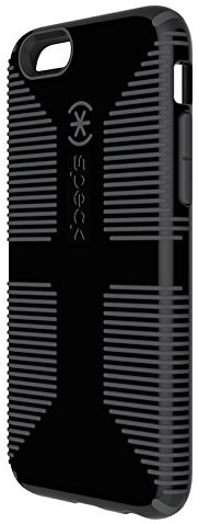
It's a nice enough case and the rubberized grip is very good. But I really, really hate two things about it... 1) Why in the hell do manufacturers insist on plastering their name all over your frickin' phone? Nobody cares and it's just lame and stupid. And 2) the photo of the product looks like the case is a matte color, but it's not. It's insanely glossy which looks absolutely terrible once fingerprints and smears get plastered all over it. If Speck were to take their damn name off and use a matte plastic, this would be a killer case. As it is? I'm not digging it. At all.
Overall, I'm happy with the iPhone 6.
No, it's not a critical leap over the previous generation, but call quality seems a bit improved in low-signal areas over iPhone 5, so I'll definitely take it.
Ultimately it's a phone, after all.
 The drive home from Seattle-side was uneventful. Mostly.
There was that time the car ahead of me ran off the road while texting or eating or whatever the hell it is that people do while they're supposed to be paying attention to the road. At first I thought maybe they had a heart attack or something, so I pulled over and started getting out of my car to help... but by the time I got one foot on the ground, they had already recovered and blown past me.
You're welcome!
When I got home, I was positively unshocked to find out that I had no internet. If I had a nickel for all the times it goes down, I'd probably have enough to pay my internet bill.
After work I was entirely too tired to troubleshoot my internet, so I decided to go through all the photos I took on my trip and delete all the crap I don't need. As I was culling photos to keep, I ran across this one...
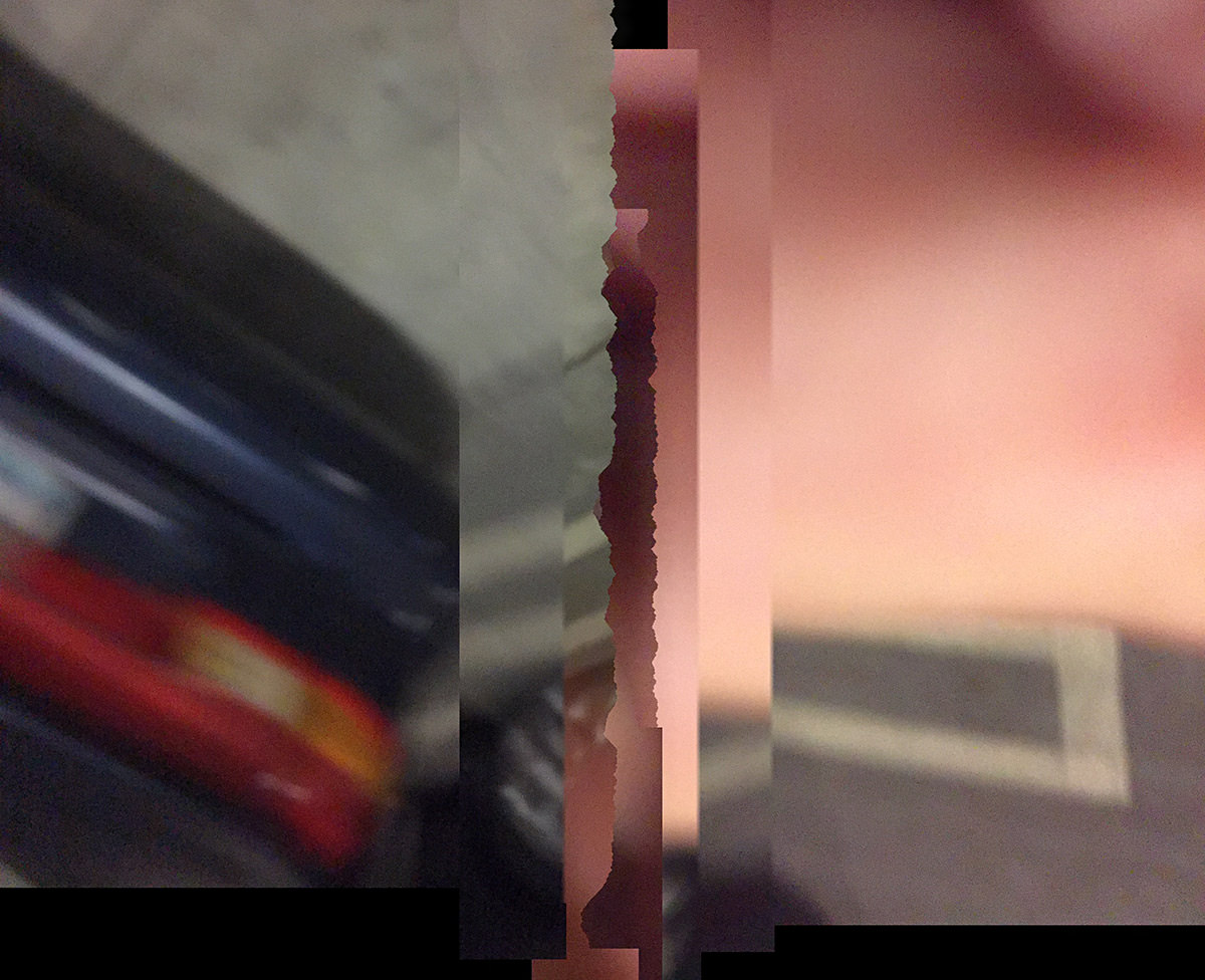
That's the back of my car on the left... I have no idea what's going on there on the right. I don't recall taking this photo, nor do I know if it's a combination of two images... or (more likely) something that got shot while rapid movement was going on.
Regardless, it's actually pretty cool. Add some filters and you've got instant art!
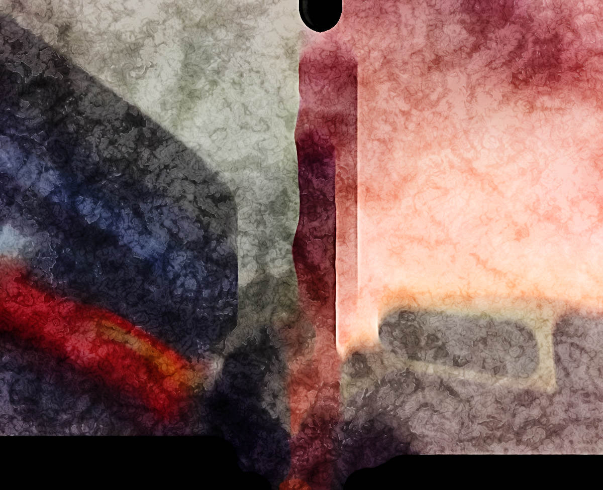
Guess I need to experiment with my iPhone and try and create something like this on purpose.
Maybe I could do it while driving. Apparently that's all the rage now.
 Another Apple event?
Apparently this is for all the crap they didn't want mucking up their big iPhone 6 slash Apple Watch event last month.
So what's on-deck this time around? Let's take a look, shall we? Needless to say, there will be spoilers for those who haven't seen the broadcast.
• iPhone 6 Launch! Before Tim Cook takes the stage, we get to look at the hysteria surrounding the launch of the iPhone 6 from around the world. Holy crap. As big of an Apple Whore as I like to think I am, even I felt this was way, way over the top and embarrassing. It's not a cure for cancer, people... it's a frickin' PHONE. Albeit a pretty phone. That's too big. I want the same size iPhone I used to have. Not surprisingly, it's the biggest iPhone launch ever, because aren't they all?
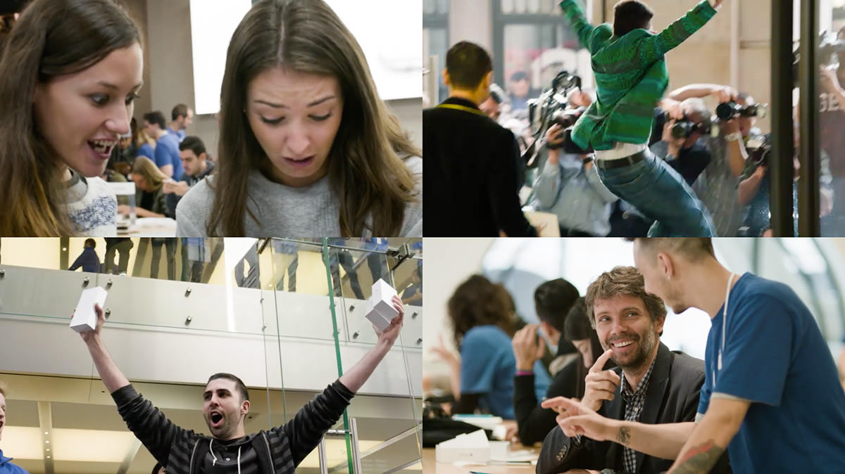
1. ZOMFG, WHITNEY, IT'S A PHONE! ZOMFG, BRITTANY, THIS IS THE BEST DAY OF MY LIFE!
2. There may be genocide in Syria... BUT iPHONE, MUTHAFUCKER!!!
3. SECOND MARKET VICTORY IS MINE! SEE YOU ON eBAY, BITCHES!
4. YOU, SIR, ARE A FUCKING iGENIUS! I'd like to book some one-on-one training!
As if that weren't enough hype, Apple dusts off Walt Mossberg for one of his idiotic quotes designed to make people think that Walt Mossberg is still relevant to tech journalism when all it does is reaffirm that Walt Mossberg will continue to say anything he has to in order to keep Walt Mossberg firmly implanted up the collective asses of giant tech companies so as to give the illusion that Walt Mossberg is relevant to tech journalism.
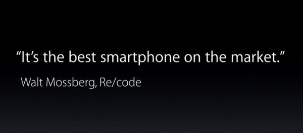
WALT MOSSBERG!!!
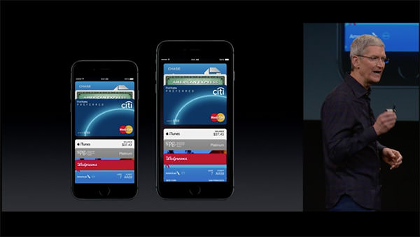
• Apple Pay! Heaven help me, I'm actually excited about being able to pay for things with my iPhone and not have to lug around a crap-ton of antiquated credit cards, debit cards, reward cards, and the like...
• Apple Watch! For the first time in a long time, Apple has announced a product that I'm not immediately wanting to buy. Sure, Apple Watch looks great, and it seems a handy thing to have (assuming you own an iPhone)... but until I see one in person, the idea of having a giant klutzy bangle strapped to my write holds little appeal...
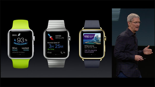
Naturally, it's better-looking than anything else on the market... but I was hoping Apple would figure out a way to make a thinner profile... put the battery in the band or something... to make it not be such a boat anchor. Oh well. Maybe Apple Watch 2.0.
• iOS 8.1! In addition to iPay, Monday's update will also include a beta for iCloud Photo Library. WHEEE! THAT TOTALLY MAKES UP FOR KILLING OFF APERTURE!
NOT!
But if they finally... FUCKING FINALLY... allow you to AirDrop files between OS X and iOS devices... I'll be happy.
• MacOS X Yosemite! I've been using the beta. I'm not too impressed. Yes, there are some nifty features (I am really loving being able to use my Mac as a speaker phone... and being able to send an SMS from your Mac through your iPhone is fantastic)... but it's just so damn ugly. Hideous day-glow colors I thought had been abolished in the 80's permeate absolutely everything. Tacky, distracting, and just inexplicably bad GUI. Perhaps I'll get used to it. But I doubt it.
• Continuity! The ability to seamlessly transition from your iPhone to your iPad to your Mac is a pretty killer feature. The problem being that it doesn't always work the way you'd expect it to. Much like the early days of iSync, it would seem that Continuity has a ways to go before it actually becomes the user nirvana it claims to be. Bonus points to Apple for getting Stephen Colbert onboard for his Supreme Commander of Security bit though.
• iPad Air 2! Not a lot of new features and improvements here. Certainly not enough to get your average iPad Air user to buy the latest model. And yet... LOOK HOW THIN IT IS! IT'S THINNER THAN A PENCIL! TWO iPAD AIR 2's ARE THINNER THAN THE ORIGINAL iPAD! THEY'RE SO THINNNNNNN!
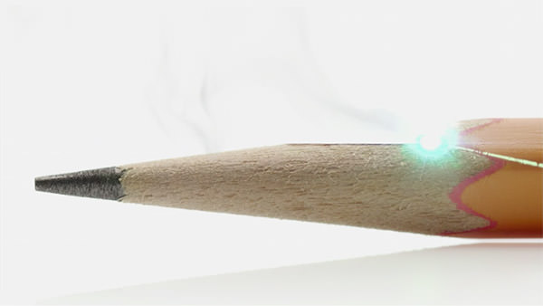
The bonded, glare-resistant display sounds nice. Wish they'd update all their other shit to have less glare on them. A speedier processor is great if you're playing a lot of games and such. Using an iPad as a camera is weird to me, but a lot of people do it, so I suppose they'll appreciate the camera upgrade. Adding Touch ID is a no brainer, as iPad Air 2 can be used for Apple Pay.
The ridiculous thing here is that, like with the iPhone 6 before it, Apple doesn't start the base model with 32GB. $499 for 16GB? Absurd. And then it jumps all the way to 64GB... WTF?
• iMac Retina 5K! Okay... this... THIS... is frickin' incredible. Phil Schiller's presentation pretty much said it all... for the entry price of $2,500 you get a mind-bogglingly beautiful 5K display that's cheaper than most 4K displays... and a computer thrown in for free...
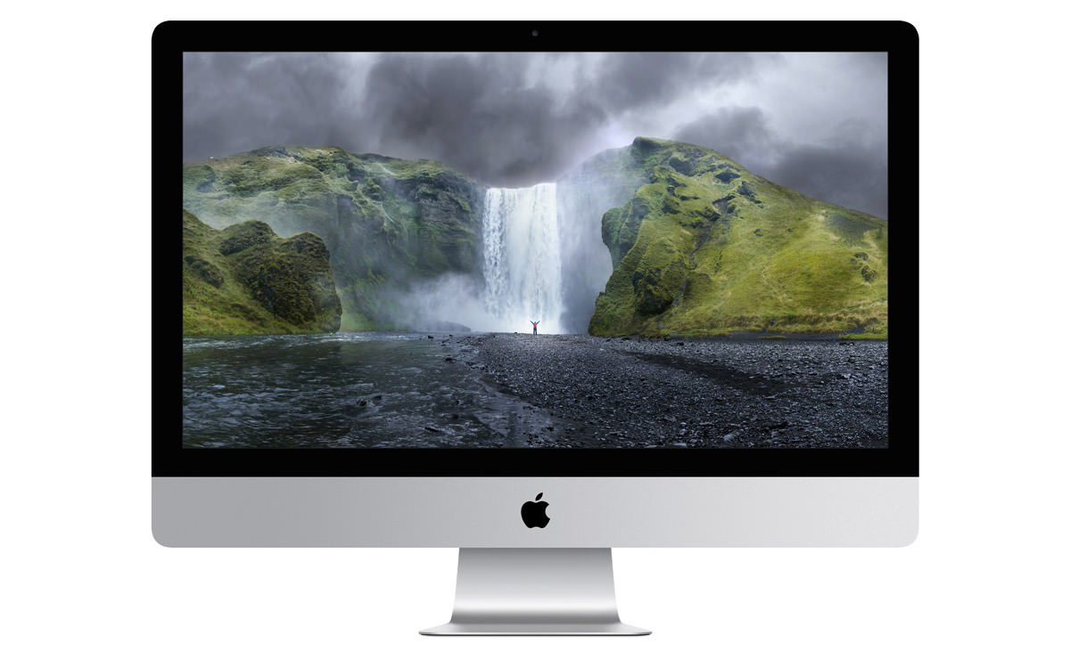
Forget the Mac Pro... THIS is a photographer and graphic designer's wet dream...
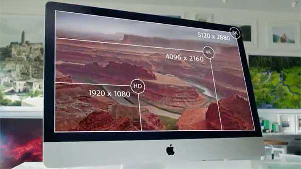
Once I got used to the Retina Display on my MacBook Pro, it's almost painful to use a machine that doesn't have a Retina Display. Assuming I can ever afford to buy this, I won't have to.
WANT!
WANT SO BAD!
• Mac mini! Kind of a wacky product to still have around. I mean, sure, when you were trying to get Windows users to switch, it made sense to have a cheap Mac that could use your existing monitor, keyboard, and mouse... but now? Well... I suppose there's still an audience out there given that Mac mini is half the price of an iMac... but it's really not the best way to experience a Mac, and I'm surprised Apple is still dredging the bottom of a dying computer market.
Then again... market share is market share, and Apple is about the only computer manufacturer out there still able to be in it at a profit, so what do I know?
UPDATE! The internet is having a field day over the fact that the new Mac mini no longer allows user-upgradable RAM. A valid concern, to be sure... and I really hate what this says about the disposability of computer equipment that can't be upgraded... but, again, this is the bottom-feeder Mac of a dying PC market. Can't really blame Apple for cutting every possible corner they can to keep prices at a point that the audience for this item expects?
Annnnd... that's a wrap...
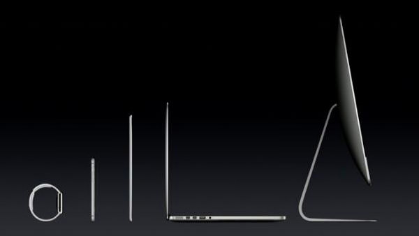
Kind of a lackluster event, so far as Apple is concerned, but it does solidify the ideal that Apple has their shit together when it comes to creating a complete line of products that will integrate into every aspect of your life. They're not just a computer company... or even a tech company, really... Apple is a lifestyle company.
Now if they'd just come out with their own television and DVR service for my lifestyle, I'd be really happy.
 After Apple discontinued their Aperture photo software, Adobe promised to deliver a plugin for their competing "Lightroom" product that would allow you to import your Aperture library into Lightroom.
Thanks, Adobe!
Yesterday the plugin was finally released.
Thanks, Adobe!
Today I spent just over five hours performing the import. Only to find that -zero- photos had actually been imported.
Thanks, Adobe!
 I'M UPGRADING MY iPHONE! NO TIME TO BLOG, MR. JONES!
CHECK BACK TOMORROW, NEVERMIND!
 As a Certified Apple Whore I'm probably more critical of Apple than their harshest detractors. I don't know why that is, except I'm so used to things being awesome when it comes to Apple products that I'm pretty upset when things go wrong.
And it seems as though things go wrong more often than not lately.
As an example... I'm positively outraged that I still can't stream my iTunes movie and television purchases to my laptop or iPad/iPhone. Unlike every other media content provider on the planet, Apple doesn't allow streaming (except to their Apple TV device) and forces you to download video content in order to watch it. This is stupid as hell, makes no damn sense, and means iTunes is grossly inferior to alternatives like Amazon, Google, and Ultraviolet by a huge margin... but Apple simply doesn't give a shit. You do it their way or not at all.
You would think that past idiocy like this would prepare me for any new failures that Apple racks up, but I assure you it does not.
This was only confirmed today when I flew into an apoplectic rage when the two new features I've been waiting, waiting, waiting for in the just-released iOS 8.1 update don't actually work as advertised...
APPLE PAY
The idea is an intriguing one. Instead of using a credit card to pay for purchases, you use the credit card information stored on your iPhone 6. Why bother? Well, there's three very good reasons, actually...
Great, huh?
Well... kinda...
Adding a credit card to Apple Pay is pretty easy. You type in the card info (or take a photo of the card to enter it automatically), then confirm the added card via email, text, or phone call. When it works, it's pretty painless. My Chase Bank Disney Visa even brings up a photo of my physical card design so I recognize which card I'm using...
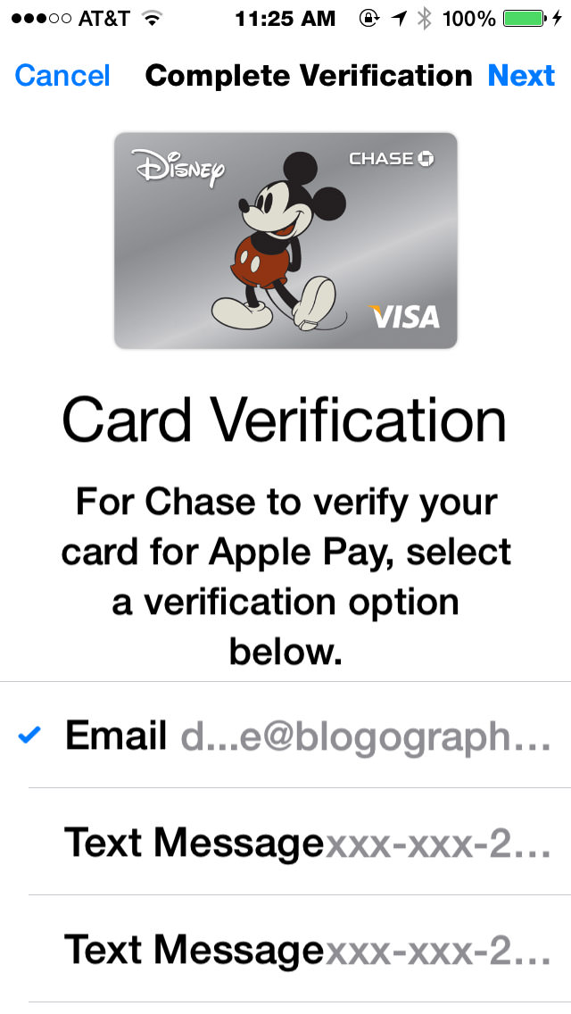
Once added, credit cards appear on PassBook along with everything else...
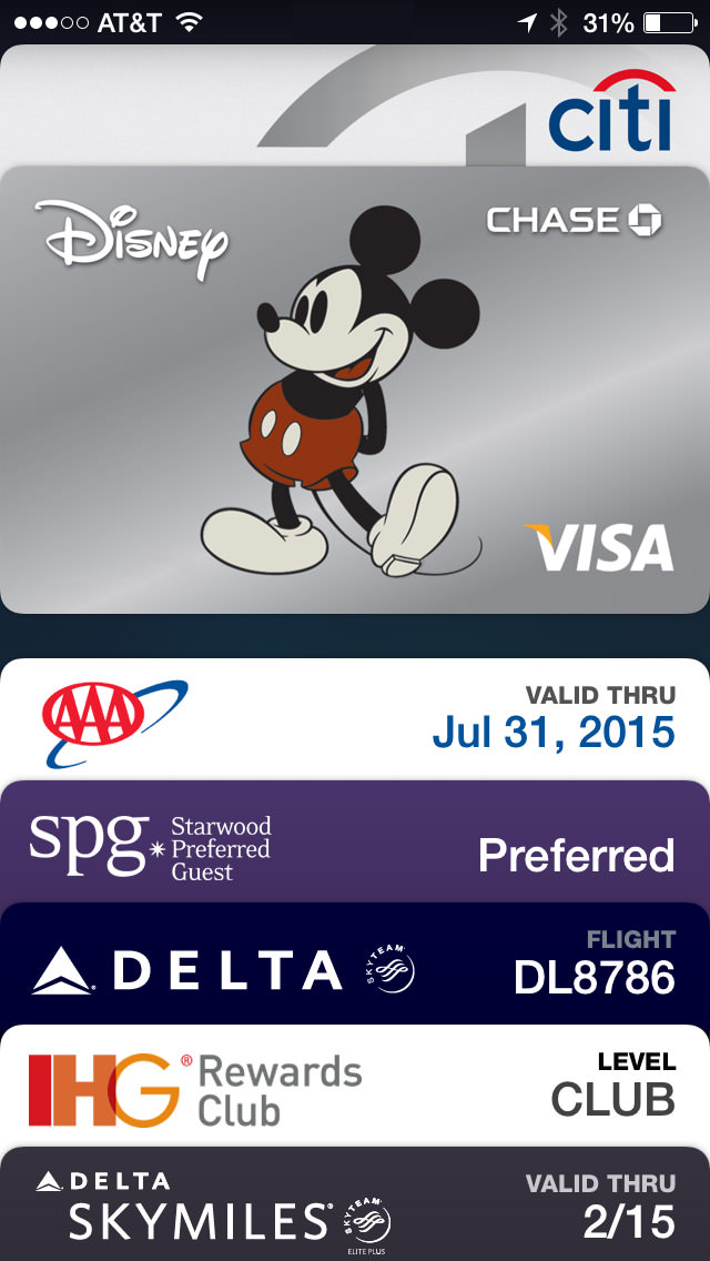
Except... it's not a flawless process by any means. For reasons unknown, my Citi card added just fine, but all subsequent attempts to verify it have failed. I've been trying for two days now...
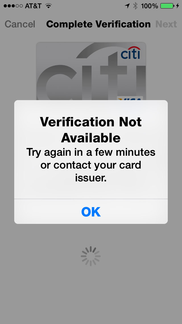
Needless to say, unverified cards are unusable, even though they show up in PassBook just the same. I don't know if this is an Apple problem or a CitiBank problem, but it doesn't matter... in the end it's an Apple problem because they obviously didn't test this crap as thoroughly as they should have.
UPDATE: Eventually I just deleted the card and started over. This time, the only option I had for verification was to call a toll-free number and tell a computer the name of my favorite teacher. Alrighty then...
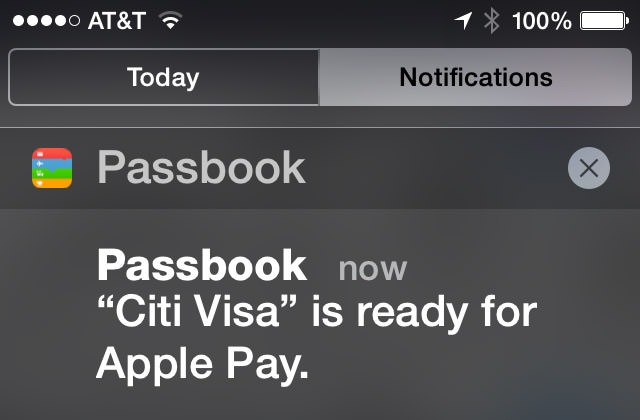
And then, of course, there's those credit cards that aren't supported, like my US Bank FlexPerks account...
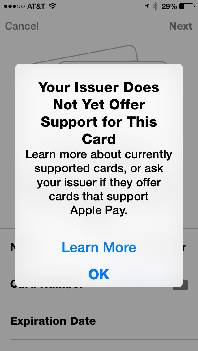
Now, I'm assuming this is not Apple's fault. I'm assuming that they presented Apple Pay to USBank along with all the other major credit card issuing banks, and USBank decided not to make it a priority.
Which is insane.
A major, major player like Apple comes up with a new method of making payment that DOESN'T cut credit card companies out of the picture... and US Bank is not onboard for launch? Like I said, insane. But hardly surprising. Do you know how long it took USBank to add chips to their cards? Years. Years of waiting for them to get off their asses and add a chip so I could use my card in Europe. Here's hoping that Apple completely removes credit card companies from Apple Pay within five years. Like record labels, they will NOT be missed, and technology will proceed much better without them.
Moving on...
According to Apple's FAQ, if a merchant requires you to give them your credit card number, you are to instead give them your "Device Account Number." Problem is, if you have "Display Zoom" turned on, you can't see the number and can't swipe to get at it. Most times when this happens, I am able to copy the information and paste it somewhere to look at it. Not with Apple Pay. I guess the only way to get my "Device Account Number" is to turn off Display Zoom first...
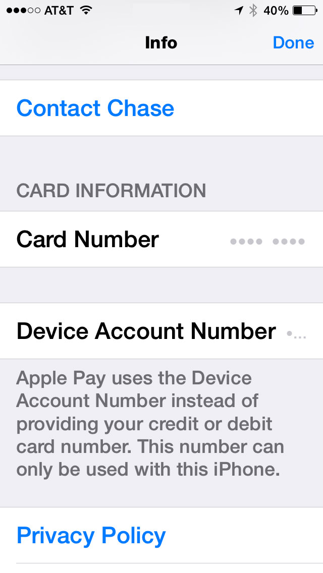
Now, I gotta ask... who the hell is beta-testing this shit? ANYBODY?!? Because every damn time Apple releases something, I find a half-dozen bugs within a day or two. Every. Damn. Time. Surely Apple can't be this inept, so the only conclusion I can draw is that they know about most of the bugs they ship, and just figure they'll get to them when they damn well feel like it. In the meanwhile, their customers have to put up with this bullshit. But anyway...
Once set up, how is it to actually use Apple Pay? Easy. Just hold your phone next to the NFC (Near Field Communication) terminal and your iPhone 6 will automatically come alive and ask you to approve the transaction with TouchID (and allow you to change to a different card than your default, if you wish). You then get a confirmation that the payment was made and a confirmation of the transaction on your card's "info" panel...
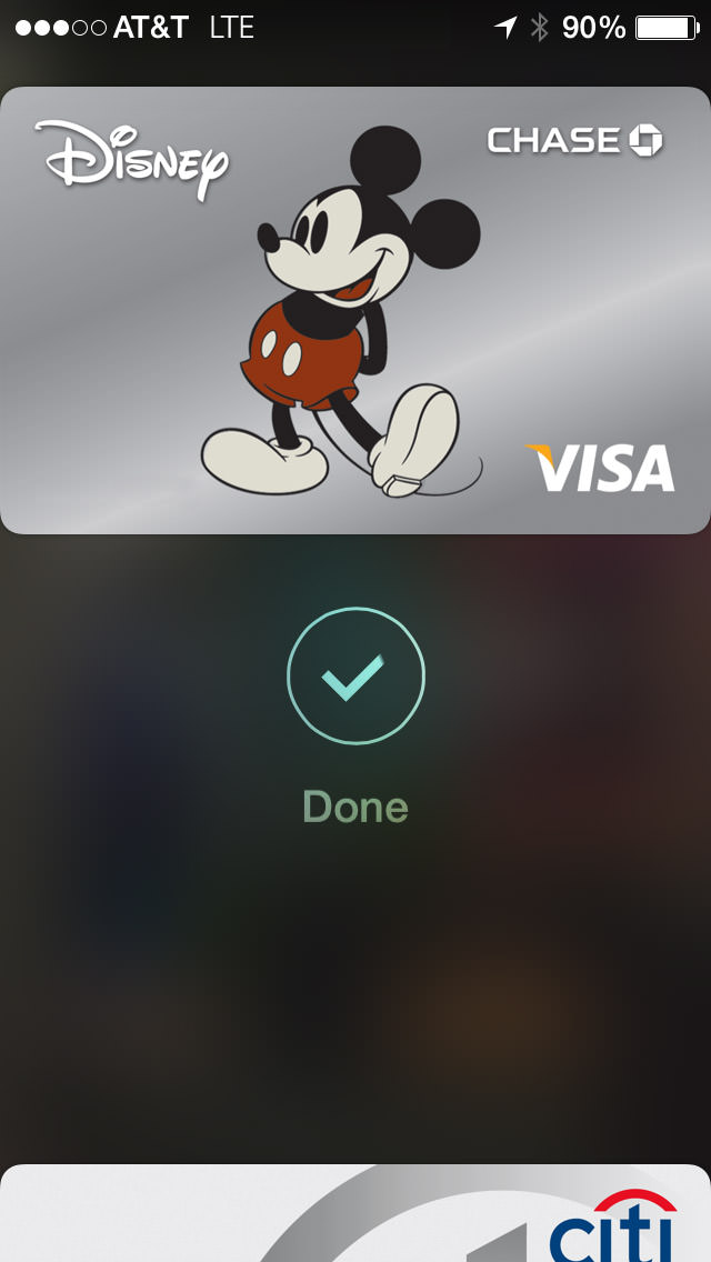
All of this is, of course, is entirely dependent on whether the merchant in question A) Has Apple Pay. B) Know what it is and how to process it. and C) Has it up and running. I tried four locations that were listed as Apple's "partners" and the result was a mixed bag...
So... 50/50 with only one of the two successful transactions working exactly as intended. Not bad for second day after launch, I guess. The one thing I didn't do was attempt to return something to the store, which is supposed to be a real mess. I can imagine that may take a while for stores to train their employees how to handle.
UPDATE: One interesting thing... as I mentioned above, my Device Account Number doesn't show up because I have Display Zoom enabled. But on both my Walgreen's and McDonald's receipt, it says "VISA ACCT" followed by four digits that are not from my credit card. I'm guessing this must be my DAN, so I've made note of it.
Ultimately, Apple Pay has amazing potential. If every transaction could be as utterly painless, seamless, and blazingly fast as my experience at Walgreen's was, I would never pay with any other method ever again. Which, of course, can't happen until all the bugs are worked out and every merchant gets off their ass and implements a NFC processing system... so we're a ways away on that. But still, the future of payment is here, it's really great, and it's Apple Pay.
AIRDROP & HANDOFF/CONTINUITY
For quite a while now, Apple has had a technology called "AirDrop" on their Mac OS and iOS devices. This wonderful feature allows you to transfer files between machines with very little effort. Except... not really. Despite being named the same, AirDrop on Mac OS was an entirely different system than AirDrop on iOS, and they were completely incompatible. This was stupid with a capital D, and Apple should have waited until they got Mac OS/iOS interoperability before unleashing unfinished shit. Well, that day has finally come with Mac OS Yosemite and iOS 8.1. Except not really.
I'm just going to set aside that since my iMac doesn't have Bluetooth LE, it is incapable of connecting in any way with my iOS devices...
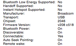
I can, however connect with other, newer Macs, but this involves entering an "Old Mac Compatibility Mode" on a more recent Mac to work. And once you are in that mode, you have to dump out in order to use the current AirDrop with "iOS devices and newer Macs" again...
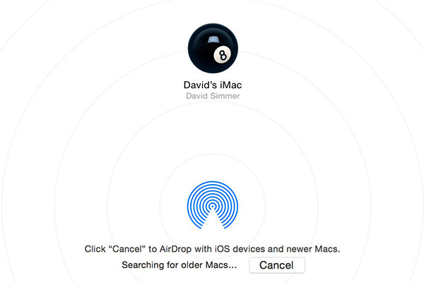
About as elegant as buttering a slice of toast with a hammer, but I'm assuming there's some kind of technical reason for it. But, hey, at least there's an option here. When it comes to getting files from an iOS device, I'm back to emails and DropBox.
But what about those Macs which have Bluetooth LE and are compatible with AirDrop 2.0? Well... I have good news and bad news.
The good news is that it works. Except... not really.
Connecting my MacBook Pro (mid-2012) with my MacBook Air (Early 2014) and iPhone 6 works nicely. Though there was some confusion at first as to what I was AirDropping with because all it shows is the device's owner. In order to know which device you've got a connection to, you have to connect to two or more devices at the same time, then the information pops up...
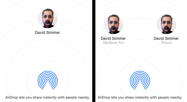
No. I have not one damn clue as to why Apple doesn't help you out with that info when there's only one device connected. Maybe it's aesthetically displeasing to the spirit of Steve Jobs or some crazy shit like that. With Apple, you can never tell. But anyway...
Going Mac OS to Mac OS works perfectly. Going Mac OS to iOS works as expected. But going from iOS to Mac OS? No joy...
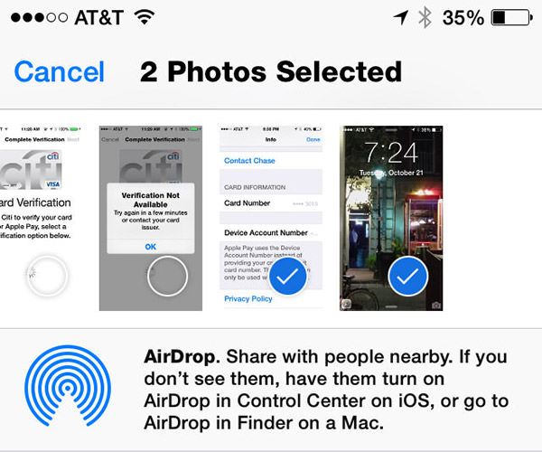
AirDrop is clearly connected... I can verify that on the Mac side in two places. But iOS simply will not acknowledge that it's part of an AirDrop network no matter what I do. I've rebooted my phone. I've disconnected and reconnected various devices in every order I can think of. I can send files TO my iPhone... but can't send a damn thing FROM my iPhone. At least to a Mac. To another iPhone 6 it works fine. I have verified in Apple's support forums that I am not the only one having problems. A lot of people are having problems. To which I have to say (again) who the hell is beta-testing this shit? ANYBODY?!?
Oddly enough, "Handoff" or "Continuity" (or whatever the hell Apple is calling their iPhone to Mac to iPhone to Mac app transfer service) only works in the opposite direction... I can hand off composing an email or looking at a web page from my Mac to my iPhone with no problem at all. A little icon of my current Mac activity shows up on the lock screen of my iPhone 6 (opposite the camera icon), I swipe up on it, login with Touch ID, and I'm picking up exactly where my Mac left off, as advertised...
But the opposite direction? No joy. No matter what I do, nothing will ever handoff from my iPhone to my Mac. To which I have to say (again) who the hell is... well, you get the picture.
So Handoff, like Apple Pay, has some problems that need to be ironed out. Why Apple doesn't test thoroughly enough to iron them out before release is a complete mystery to me, but here we are. You'd have thought that Apple would have learned their lesson after the utter disaster that was iSync, but... well... apparently not.
The frustrating thing here is that Apple is developing these awesome technologies that are actually useful. Apple Pay, Air Drop, Handoff... all terrific, terrific stuff. On paper. In order for me to be impressed, Apple needs to make this shit work in reality. Apple Pay is close. AirDrop/Handoff isn't even in the ballpark.
I'm confident that one day things will get hammered into place. Apple has too much to lose if it doesn't. The only question is... how soon?
I want the future now.
 So...
So...
According to Apple, my fingerprint is acceptable proof of my identity. With my fingerprint and Apple Pay, I can purchase thousands of dollars worth of merchandise at a wide variety of stores. Apple Pay's entire existence is predicated on the concept of my fingerprint being secure, immutable, infallible validation of somebody who is authorized to make charges to my credit card.
And yet...
If I have to restart my phone, suddenly my fingerprint isn't good enough to make a $2.99 purchase from Apple's own App Store?
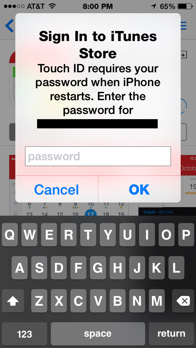
In all seriousness here, Apple... go fuck yourself.
This stupid shit has got to stop.
By continuously asking people for their damn password for no good reason, you encourage people to choose easy to remember, easy to type, easy to hack passwords. You force people to ignore good security practices. And when people have their accounts hacked and their personal, private photos "leaked" onto the internet... you have the balls to say it's not your fault... that people need to choose stronger passwords... which you make entirely too difficult for them to do.
If my fingerprint is good enough to buy $1000 worth of shit at Foot Locker, it's damn well good enough for me to buy a three-dollar app in your own app store... even after restarting my frickin' phone.
Or is there something inherently risky about fingerprint security that you're needing to tell us now that Apple Pay has launched?
 I hate to sound like a broken Apple-bashing record here but, in all seriousness, things have gotten so overwhelmingly bad that I'm feeling as frustrated with Mac OS and iOS as I ever was with Windows.
First of all, quality control is total fucking bullshit. I am running into bugs within minutes of installing updates... MINUTES! And these are not esoteric one-in-a-million-users bugs, but problems so basic and ordinary that I cannot fathom how they get missed when Apple is testing their shit (they DO test their shit, don't they?). So far as I know, my set-up on my iPhone, iPad, and Macs are fairly typical. I am not running any hack software of any kind. I am not on a custom network or using a VPN. I am not using terminal tweaks or altering the system software at all. I'm just trying to get through my damn day without a crash or running into some idiocy that makes my life difficult. But that's almost impossible now-a-days with even the simplest of tasks.
Like using email.
I have four email accounts. One personal IMAP account. One work IMAP account. One charity work IMAP account. One ThriceFiction IMAP account. All four are synced using Apple's iCloud. Except they're not. If I make changes to an account... or add an account on one of my devices... or delete an account... or change any account information... it's supposed to sync up and make changes on all my devices. But it doesn't, and I have no fucking clue why. Not that Apple makes it easy to figure out what you're doing with your accounts anyway. In what has to be one of the most inexplicably stupid-ass design flaws ever, there is no single place to go to manage your accounts. There are THREE. The first two can be found in the Mail menu...
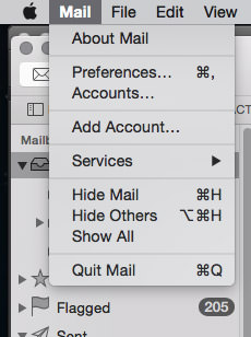
There's the "Accounts..." option, which opens up a panel from the System Preferences.
There's also an "Add Account..." option, which opens up a sheet on your main mail window. This is ten flavors of stupid, because you'd think that if you wanted to add an account, you'd click on the "Accounts..." menu option and just add it there (which you certainly can). But Apple has it as a separate menu item, duplicating functionality for no reason that I can tell.
And then things get really strange.
Click on "Preferences..." and you now how account management options in a third place...

WHAT THE BLOODY FUCK?!??
Seriously, what in the hell is going on here?
Does Mail have its own set of accounts separate from the system preferences accounts? Or are they pulling from the same place? If they're the same... GOOD LORD, WHY ARE THEY IN TWO PLACES? If they are separate, are they all syncing with each other? Which ones are synced to iCloud? How do I control what goes where? Does the "Add Account..." option in the Mail menu add to the system prefs or to Mail? Or both? This is absolute madness. To duplicate shit in multiple places, each with different interface, is utterly confusing and just bad design. This is the type of stupid shit I have historically expected from Microsoft... but Apple?!?
And the idiocy doesn't stop there.
Apple is known for creating wonderfully handy and useful ways of doing things which are so great that people switch platforms just to take advantage of how well thought-out a computer experience can be. One of my hands-down favorites is the ability to switch SMTP email servers within a Mail message from email to email. As somebody who travels often, this is an absolute godsend, because some servers I use don't work remotely. Elegant, simple, and infinitely useful...
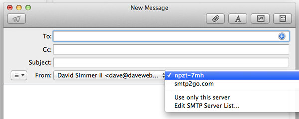
So guess what Apple eliminated in Mail for their latest OS, Yosemite?
Yes. The ability to switch the SMTP server on the fly is now gone. If you have multiple servers associated with an account, Mail will just keep trying all of them until it finds one that works. The problem there is that my default server WILL LOCK ME OUT if they get too many network errors. This means that I now have to remember to go into email preferences and change the default SMTP server before I compose an email when I am on the road. Which I often forget to do, which means that I get locked out of my work connection over and over and over again.
This is just fucking insane.
Why?
Why did Apple remove such an astoundingly handy feature?
Did it clutter up Mail's composition window too much? Did they think it was too confusing even though it didn't even show up unless you allowed more than one SMTP server to be used? Was it simply forgotten when they were re-coding the app for Yosemite? Who the fuck knows? And it's not like there's any way you can call up Apple and ask them. At the very least you'd think that Apple would put this as an app preference instead of deleting it entirely, but I've come up empty looking for it.
And don't even get me started on the hideous mess of trying to get SMTP servers assigned in iOS. Just look at this bullshit...
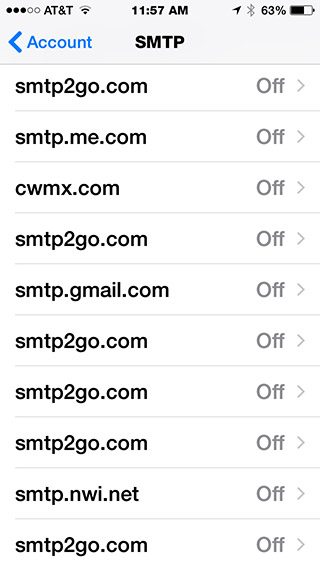
Any idea why servers are showing up multiple times? If there are different settings between the duplicates, any idea how to tell what's different between them? Not even an Apple Genius could figure that one out.
I am so frustrated dealing with Apple idiocy like this every single day that I'm about ready to fucking burn all my Apple crap and become a luddite.
Not that they'd give two shits. Apple knows what's best for you, even if they don't, and if you don't want to accept that you can piss off because they've got billions of dollars and don't have to care.
Which makes two of us.
 After a month (plus) with my iPhone 6 (not plus) I don't have much to say.
Do I like it? Oh yes. In fact, there are many things I love about it. Starting with Apple Pay, which is pretty much the bomb (when and where you can use it, that is).
There are, of course, things I'm not thrilled about as well. Mostly minor stuff that's not worth mentioning.
And one big thing that is. Which would be that it's too dang big!
The size of the 5s was perfect. It fit really well in my hand. It was super easy to operate one-handed. Typing on it was a joy.
The size of the 6 is oafish, clutzy, and difficult to mange... even with two hands... even with Apple's "Reachability" feature (double-touching the home button will drop the screen down in reach of your thumb). I can't even fathom how much worse the 6+ would be.
Apparently nobody else can either. The 6 is outselling the 6+ three-to-one. Or perhaps six-to-one, depending on who you want to believe.
I just hope this means Apple will give us an option to go down a size with the iPhone 7.
 Virtual desktops have been around for a very long time. But it wasn't until Apple unleashed their version of the virtual desktops in 2007 (called "Spaces") that it became a seamless experience on Macintosh computers.
And essential. At least to me.
By creating multiple desktops using Apple's "Mission Control," you get clutter-free workspaces that you can switch between with a flick of the mouse or trackpad...
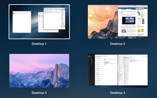
Being able to give each of your Spaces a different background image so you can tell which desktop you're looking at is pretty cool. But the killer feature that makes Spaces so compelling is being able to anchor different apps to a specific desktop...
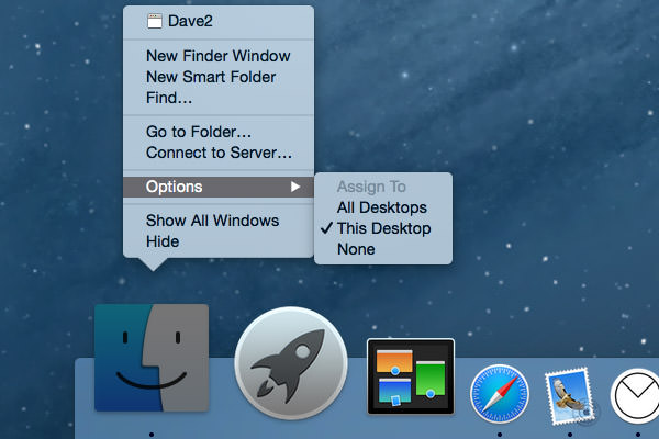
So now when you click on an app icon in the dock, you are sent to the associate desktop automatically without having to keep sliding between all your Spaces. Nice. I've become so accustomed to using Apple's "Spaces" desktops that I don't even think about it anymore... it just The Way Things Are.
Until this morning when they stopped functioning for some reason.
I tried working without virtual desktops, but was quickly driven insane. Instead of effortlessly switching between Spaces I was having to hide and unhide apps... sort through piles of windows... constantly resize app panes... it was a nightmare of inefficiency and trauma. So much so that I wasted precious time Googling a solution (had to kill some prefs) so I could get back to work.
And now I'm a little paranoid... wondering which technology I take for granted every day is going to be the one that gives out next. We've let tech take over our lives bit by bit, and now it has become so integrated into how we function that we don't even notice it.
Until it's gone.
Holy crap don't let Angry Birds be next.
