
 Happy WWDC to all who celebrate!
And lo did Apple descend from the heavens to bestow upon all of us the glory that is World Wide Developer Conference 2024! As usual, I will be jotting down my thoughts as the keynote progresses.
UPDATE: Somebody compiled Craig being Craig and it's perfect. Except they didn't show the part with his Daily Hair Journal...
And here we go. The thing that everybody has been waiting for...
So... out of my Top Five Most Needed Things to Come Out of WWDC 2024, Apple managed to check one of them. My #2 ask. Oh well. That's so very Apple that I wouldn't imagine it having gone any other way.
Overall I'm excited to see how AI being integrated to seamlessly into our lives is going to change the world. For better? For worse? Time will tell. At which point it will be too late to do anything about it one way or the other.
UPDATE: There's buzz out of WWDC that we will finally be able to specify which device we want to use as a "Home Hub." Color me fucking shocked. Of course I'm going to specify my hardwired via Ethernet AppleTV that's connected to my main television. Since Apple's shitty fucking software can't figure out that's the best bet on its own. So damn embarrassing. So, yeah, I guess I'm giving Apple a half-point for that (doesn't seem like there's any other much-needed improvements happening, but maybe?).
 Apple's release of their new iPads got me to wondering about how much the Adobe apps have approved over the past three years. I had bought a 2020 iPad Pro because I heard that useable versions of Illustrator and Photoshop were out for iPad (or coming soon to iPad... I can't remember). But then found out that they weren't really in a state that I could use them to do actual work. They were but a shadow of the full program. It was a bummer, but I had something fun to play with during pandemic lockdowns, so it was all good.
Turns out that the apps have improved dramatically. Not only can I open and edit full-on Illustrator and Photoshop files, the feature set is rich enough that I can do real work on it. So that's nice. But it's not the most impressive thing I've discovered after ignoring my iPad for years.
That would be an app called "Adobe Fresco" which is around 4 years old now.
Meant to compete head-to-head with "Procreate," it's a drawing and painting program that's darn good. It has a different approach in some areas, and is a vast improvement in others (particularly with their animation tools and "live brushes"). It's matured a lot in the past few years...
And so... looks like I'll be taking a closer look at that this holiday weekend.
Though, call me old fashioned, but I will always prefer physical media over digital drawing tools. There's just something about getting your hands dirty that makes art seem more "real" to me.
 I'm building build building this weekend, but I haven't forgot about you, dear reader... because an all new Bullet Sunday starts... now...
• DestructiPad! Apple introduced their amazing new iPads in the worst way possible. To illustrate how this miracle device is capable of a huge number of creative endeavors, from music to art to research, they released a commercial where a massive hydraulic press squishes musical instruments, art supplies, and other physical tools into nothingness. And they let you see the destruction in excruciating, closeup detail...
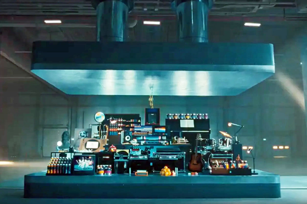
Now, I get what they were trying to do... but holy shit. Who thought this ad which celebrates the death of physical creativity would be a good idea? The first thing I thought was "Do they not speak with foreign culture consultants before releasing their ads?" Because the first thing I thought of was... there are cultures where creative tools are revered, and destroying them like this is an unforgivable act. And, sure enough, the outrage was immediate. Particularly from Japan, where something like this is unforgivable. But it should anger anybody who thinks this kind of waste is senseless. Apple ultimately apologized, but it is crazy to me that they were so stupid as to do this in the first place. They could have animated it... or used cardboard cut-out representations... or anything where the actual objects weren't destroyed.
• MaxiPad! Tone-deaf commercial aside, the new iPads are incredble. The display, the power, the larger size, the new stylus... it's a digital creator's dram come true. I don't use my iPad enough to justify buying a new one (I have a 2020 iPad Pro), but was curious to know how much my ideal iPad configuration with accessories would cost. It's $2000... not including AppleCare. But no worries... Apple will give me $65 to trade in my old iPad Pro! Yikes. I'll just wait for the MacBook Pro M4, thanks.
• Exit! Okay. Dang. Sometimes short films have more impact per second than a multi-million dollar flick...
This brilliantly illustrates how a film doesn't necessarily have to take its time and build up characters into fully-realized people in order to be entertaining. Sure traditional long-form movies are my preferred way to experience a story, but running into something like this shows that it's not the only way to tell a story. If you haven't seen it yet, be sure to check out my last short film pick, Two Strangers Meet Five Times.
• THERE IT IS! And... scene...
Here's the thing: I have never had a desire to wear nail polish. It's never been my thing, even when I was into cultures where it was a part. But seeing all these snowflakes getting so triggered by FUCKING NAIL POLISH makes me actually want to start wearing it. The idea that guys can't accessorize their appearance without being trashed by the toxic masculinity brigade is absurd. Why the fuck are people so invested in what other people are doing with their appearance? Let them do them and you do you. It's not that hard to ignore shit that makes others happy that you wouldn't do for yourself.
• EXIT SLOW! Ah yes. The Union Street exit in Seattle. I have taken it many times. And have seen people nearly lose control many times. Never seen a crash... but I believe they happen often because of how it's designed. Some guy set up a camera to catch accidents of cars taking the exit too fast, and they do indeed happen often...
You'd think that people driving in an area that they are unfmiliar with would be following all suggested speed signs rather than ignoring them. Odds are, there's a reason that they tell you to slow way down.
• More Runner! One of my most favorite films of all time is Blade Runner 2049. It shocks me to this day that it wasn't a massive blockbuster success. This is the film that genius-director Denis Villeneuve made before his celebrated Dune films, and it's equally phenomenal. This week it was annonced that Amazon Prime Video is making a sequel series... WITH MICHELLE FUCKING YEOH!!! I gotta tell you, I have no idea when Blade Runner 2099 is going to happen, but I am already looking forward to seeing it. If it's even half as good as 2049, it will be well worth the wait.
• NEWSFLASH: Ted Cruz Called Automatic Airline Refunds a ‘Dumb Idea.’ Senators Disagreed. Do you think that if Ted Cruz blows enough airline executives he can take his next Cancún vacation for free? The refund is not immediate-immediate. It's only if your flight has been significantly delayed and you don't rebook another flight to replace it. The only thing this changes is that you don't have to fill out a bunch of paperwork and let the airline string your along forever... or issue you some stupid credit that you'll never use before it expires. Where the fuck does this boot-licker asshole come up with this outrageous shit? Do people even believe his ridiculous crap anymore? Ted Cruz is a fucking embarrassment, and the fact that he still has a job shocks the shit out of me. Republicans don't think that they deserve to get their money back with a minimum of inconvenience when they get fucked over by over-bookings or maintenance failures or whatever? Get real.
And now back to hammering...
 It's that time of year when Six Colors has released their annual report card on all things Apple.
Their report card is calculated by talking to a lot of people. Mine is calculated based only on my own experience. In many ways I agree with their assessment. In others I disagree strongly (they gave HomeKit a D+, which I thought was incredibly generous given the shitshow it is).
But anyway... here we go...
Mac: A-
Apple must be doing something right, because their latest round of MacBook Pros were sweet enough to convince me to upgrade after only one year (thanks to their trade-in problem, which is not great, but so easy and better than nothing). For most things... like email and web browsing and the like... there is virtually no difference with the new M2 MAX chip. But for the actual work I do? 15% to 20% faster is absolutely worth it. Less time waiting on renders and stuff gives me more time to do other stuff. I was a bit surprised that the iMac is still stuck at 24" and the M1 chip... and there's still no MacPro, which is getting increasingly embarrassing... but I am fairly certain all that is forthcoming with the advent of Apple's new 3nm chips, coming soon to a computer near you. Though it's kinda a bizarre flex for a desktop machine when the true miracle of dropping to 3nm is the power savings, so I'm guessing it must have one heck of a performance bump. 2022 was pretty much a stop-gap year to the Next Big Thing, and how 2023 pans out will largely depend on just how big that Next Big Thing ends up being.
iPhone: B
If I wasn't on the Apple iPhone Upgrade Program track, I would have likely skipped the iPhone 14 Pro. It just wasn't much more significant than the 13 Pro it replaced. All the improvements were mediocre and far from sexy, which is a real head-scratcher. Maybe now that we're in 2023 Apple has something more spectacular planned... a better camera would be a great start... but I have to wonder if there's nothing but low-hanging fruit from here out. I'd like to think that the "Dynamic Island" isn't the pinnacle of iPhone innovation, but it's really starting to feel that way. If I were still with my iPhone 12 Pro, I'd likely be none-the-wiser, and that's a very bad sign for Apple. Still, their phones are really nice (and still my favorite), so grading them lower than a B seems criminal.
iPad: C
I love my iPad Pro, but there has been zero reason to upgrade it after three years. There's nothing going on with iPad, which is a shame, but it's still the best tablet on the market by a country mile. And, as Apple-savvy as I am, I have no fucking clue which accessories work with which model, which is an absolute disaster for a company that bills itself as the easiest and most user-friendly option.
Apple Watch: B
Another product that just doesn't seem to be going anwhere... no revolutionary new features or ideas here. At least with the base model. A very notable exception is the Apple Watch Ultra, which is amazing on every level and bumps my grade from a C to a B. Problem is that it's very narrow in focus, as big as a Buick, and has a limited audience. And yet for those who need it, the thing is a game-changer. I am still waiting for a blood glucose monitor before I upgrade again. My 3-year-old Apple Watch is just fine. Even then, my "ancient" tech is still far more appealing to me than the newest of the new when it comes to other brands.
AppleTV: D
Holy shit. What the fuck is it going to take before Apple gives us a user interface that's worth a shit? I just raged about this fairly recently, and if I start in again I may not be able to stop. Just about every other TV interface on the market that I've seen is better than this crap, and the fact that Apple does nothing about it just means I'm not investing in any more of their bullshit. I don't care how good the remote is.
Services: C
I am so meh on everything Apple is doing in the Services arena that I am finding it difficult to even comment. It's all still too expensive for what you get. The plans don't have enough options so that people can get exactly what they need, so they are either paying for more or less than what they would otherwise like. Apple TV+ is okay, but I don't watch enough on it to really care (until Ted Lasso returns). I don't give a crap about the fitness stuff. I switched to Apple Music when I dumped Amazon Prime, but it's not that different and costs more than what I was paying, so I honestly don't care. I don't have time to play their games. I know Apple is making a metric shit-ton of money off Services... I wish I could say they earned it. Right now their bundles aren't worth it to me, so I am paying for iCloud Drive, AppleTV, Apple Music, and iTunes Match all separately. In order to get an Apple One bundle, I'd still have to purchase an iCloud Drive upgrade because what comes with it isn't enough. Let me build my own bundle with a calculated discount and I'd likely upgrade my score to a B. That's for flexibility, not value.
HomeKit: F-
I jumped to HomeKit when Insteon folded the first time. This involved a lot of expense on my part, as most all my switches and devices had to be changed out. And what did I get for my money? A horrendously fucked up system that barely works. And it just keeps getting worse. All of a sudden half my shit will just up and stop working. HomePods will refuse to issue commands. I've woken up to find that my garage door mysteriously opened at 2am for no reason. And despite everything running on the super-speedy Thread technology now, Automations are slow as shit... when they bother to work at all! At the rate that I've had to unplug and plug back in my HomePod minis in an attempt to get things working again, you'd sure as hell think that Apple would make a plug on the mini itself so I don't have to go moving the fucking furniture every time I need to unplug to reset my network. HomeKit is HomeShit more than ever, and there's no end in sight. Just more "architecture upgrades" to slap lipstick on a pig. Fortunately most of my devices are Matter compatible, so I'll be looking into going that route. Hopefully it will allow me to use Siri since Apple is in with Matter, but things will actually work once I transfer.
Hardware Reliability: A-
Software issues and OS stupidity aside, the hardware is always on-point. Although I am dropping them from an A to A- because of the afore-mentioned wired plug on the HomePod mini. Now that the MacBook Pros offer an SD card slot and an HDMI port instead of forcing me to use dongles, I'm thrilled (a
Software Quality C+
Even with HomeKit removed from the equation, I still have numerous problems with the way Apple software functions (or doesn't function as the case may be). Apple Mail is a fucking travesty and one of the biggest piece of shit apps I have ever used. And Apple doesn't give a fuck. Features I use are stripped out of their software for no reason other than they want it that way. Bugs are rampant and pop up in the strangest places. It's almost as if nobody at Apple is using their own apps, because the same bugs never seem to go away. One day maybe Apple will start giving a shit. Until then? Still the best option, faults and all.
Developer Relations N/A
As I am not currently in the Apple Developer Program, I don't really have room to comment. Except to say that the World Wide Developer Conference always seems like a fantastic step in keeping things right with those developers on their platform. As a consumer, however, I can say that their App Store is a pile of shit. Which is a mystery because they get a cut of every sale. You'd think they would want it to be a top-tier experience. But instead apps you are looking for are hard to find, update options are weird, AND THERE'S NO FUCKING WAY TO FIND ONLY GAMES THAT DON'T REQUIRE IN-APP PURCHASES! And speaking of in-app purchases... maybe they wouldn't be as annoying if they weren't so damn expensive, but since Apple takes such a huge, huge cut of the money, expensive they will remain. This is such a problem that it's entirely likely Apple will be forced to allow customers to "side-load" apps and bypass the App Store. This would be a disaster because affordable apps wouldn't come with protections. And it's all on Apple and their greed.
Societal and Society Impact B
They are one of the most accessible platforms in existence, and trying to make sure that anybody can use them regardless of any physical or mental challenges is pretty incredible. Where they fail is with their employees. And it's some pretty heinous failures. They need to do better.
Customer Service B+
This is a category I added on my own after my heinous experience with the iPhone Upgrade Program (I returned my old iPhone at an Apple Store... Apple said I never returned it... and I spent TWO MONTHS trying to get it straightened out). I have to say... exchanging my iPhone in the mail? Flawless. The trade-in experience with my MacBook Pros? Flawless. Actually getting support? Not so flawless. Apple makes it incredibly difficult to get the help you need, instead letting you use Google for support (see: HomeKit). That being said, they did exchange my faulty keyboard with hardly any trouble, so hardware is not the issue it used to be, so there's that.
Overall, Apple is still doing more right than wrong. It's why I'm so loyal, because other brands are pretty awful. And yet there's always room for improvement, and Apple has more than a few things that need improving, so here's hoping.

Monday was the annual World Wide Developer Conference, and here's my thoughts on what came from that.
PASSKEYS
I'm putting this first because it's something that took me completely by surprise in the best possible way. Having to keep track of dipshit passwords in the year 2022 is absurdly stupid, and it's been more than a little shocking that nobody has thought to do anything about it. Sure Apple has made things better by having TouchID and FaceID auto-fill your passwords for you, but it's still stupid. For one thing, there's still a password floating around out there that can be compromised by a company with lax security. Apple wants to ditch passwords in favor of biometric handshaking. Finally. And because they want to get this up-and-running quickly, they're working with Google and Microsoft to make it happen. Can't happen soon enough.
CARPLAY
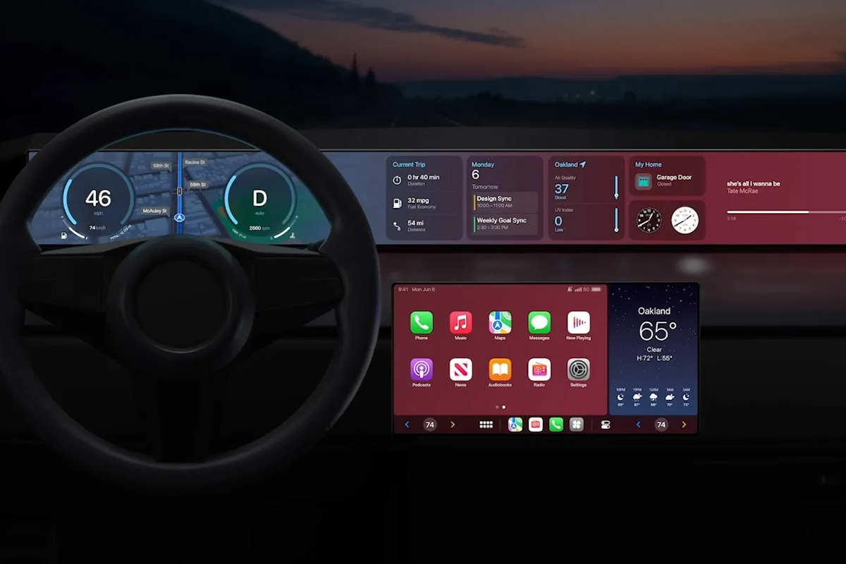
Up until now, CarPlay has been a curious diversion to me. It doesn't really do anything beyond what my iPhone can do when slapped on my car vent holder. Certainly nothing that makes me want to run out and buy a CarPlay stereo or a CarPlay-enabled car. But now? Apple has gone and made CarPlay take over the entire dash, and it's just phenomenally cool...
HOMEKIT HOMESHIT
My complete and total loathing of Apple's Smart Home standard, HomeKit, has not abated since it debuted in 2014 and was actually viable in 2016. It's the most absurdly stupid thing which works with nothing and what it does work with... works badly. I tried to get started with it twice and ended up hating it more after each go. Apple has now started over from scratch, which is about the best thing they could do. The new HomeKit will be built upon the new Matter standard, which is backed by everybody who's anybody in tech, which means that even if Apple shits the bed AGAIN, there will be other options so you're not trapped. I am 1000% looking forward to Matter, which means that I will be a part of HomeKit and not care.
MACBOOK AIR M2
This thing is sexy as hell with its four color options and beautiful design. But that's not even the best part... it's got Apple's shiny new M2 chip inside! If you don't need the power and ports of a MacBook Pro, this is a no-brainer ($1,000 for an M1 chip model, $1,200 for an M2 chip model).
MACBOOK PRO 13 M2
I am beyond confused by this machine. It's $100 more than the Air, has the same chip, a slightly smaller screen... and the only difference I can see is that the screen is OLED on the Pro. Not that it makes any difference to me... I need a 16" model, which this is not.
iOS 16
This update feels mostly cosmetic, allowing you to create custom lock-screens and switch between them like faces on an Apple Watch. The only part of this upgrade which excites me is that you can have "Live Activities" which update on your lock screen in real time, so you don't have to unlock your phone and navigate to the app to track progress on something. Also in this update is improvements to the Photos app (mostly to do with sharing) and the Messages app (you can edit and delete messages, which seems nice on the surface, but could be a nightmare for those being bullied or stalked via text who need evidence) and the Mail app (better search and the ability to undo a send, when supported by the recipient). There's also better dictation abilities (you can use the keyboard while dictating something by voice!) and some intriguing tech which allows hearing-impaired persons to have voices transcribed for them in real-time, which is all kinds of cool (the fact that iOS 16 is finally compatible with Nintendo Switch controllers after waiting for this for years is just icing on the cake).
macOS VENTURE
A lot of what the desktop is getting is the same stuff as what's happening in iOS. But there are a few perks that are unique here. First of all, you can now use handoff with FaceTime calls. So if I've started a FaceTime on my iPhone I can sit down at my Mac and transfer the call there with a click. That's very slick and useful. Likewise, you can use the superior camera on your iPhone as the webcam for your Mac and be able to use it as a Center Stage camera if your monitor doesn't have that ability (see above). And there are MagSafe adapters on the way to affix your iPhone to your Mac, which is a nice touch. Even nicer? An attempt has been made to make managing large numbers of Finder windows easier and for task switching not suck. Something called "Desk View" which allows you to use your iPhone camera to look down at your desk while still having a separate view on your face. This will be incredibly useful to me... it looks like Zoom will adopt the ability, which I truly hope happens since that's where most of my video calls happen. In addition to this stuff... games are faster... there's a lot of minor improvements all over the place, and there's now a shareable online whiteboard for collaboration called Freeform which is cool... but I don't know if it is cross-platform with Windows users? I missed it if this is possible.
iPad OS 16
Ever since iPad broke away from iOS, I keep waiting for this quantum leap change that's going to make it all worthwhile. A pretty big change was multi-tasking for using multiple apps at the same time... but then things kinda just... stalled. Of course iPads are getting all the new stuff from iOS (and the nice app-switcher from macOS Ventura), but all the coolest new stuff is only available for iPads with an M1 chip, which leaves me out. Of course, the thing that I most want from an iPad is a model with a much larger screen for drawing, which hasn't materialized yet.
And that was it. Since none of the OS stuff will be officially released until September (unless you like the idea of playing with the public betas which drop next month).
Until then... I guess I'm good.
 AND LO DID TIM COOK DESCEND FROM THE HEAVENS TO BESTOW UPON THE WORLD NEW APPLE PRODUCTS, AND IT WAS GOOD!
Or not. I haven't quite decided. But there was indeed an Apple Event™ today, and Tim Cook did indeed drop a bunch of stuff on an undeserving world. As usual, I just can't seem to shut my mouth about it, so here we go. If you want to watch the actual Apple Event™ before reading my commentary (or watch as you read) then here you go...
AppleTV+
Some of the forthcoming movies and shows look interesting to me. The addition of Friday Night Baseball is an intriguing idea, but the only way I would want to watch it would be if they're showing a Red Sox game, so who knows how useful this will be to me. I'm not quite understanding where Apple is going with all this. Television series (like my beloved Ted Lasso) and movies (like the wonderful CODA) make sense. But baseball? I don't get it. This is not a big missing piece that is filling a hole in Apple's lineup to attract subscribers.
iPhone 13
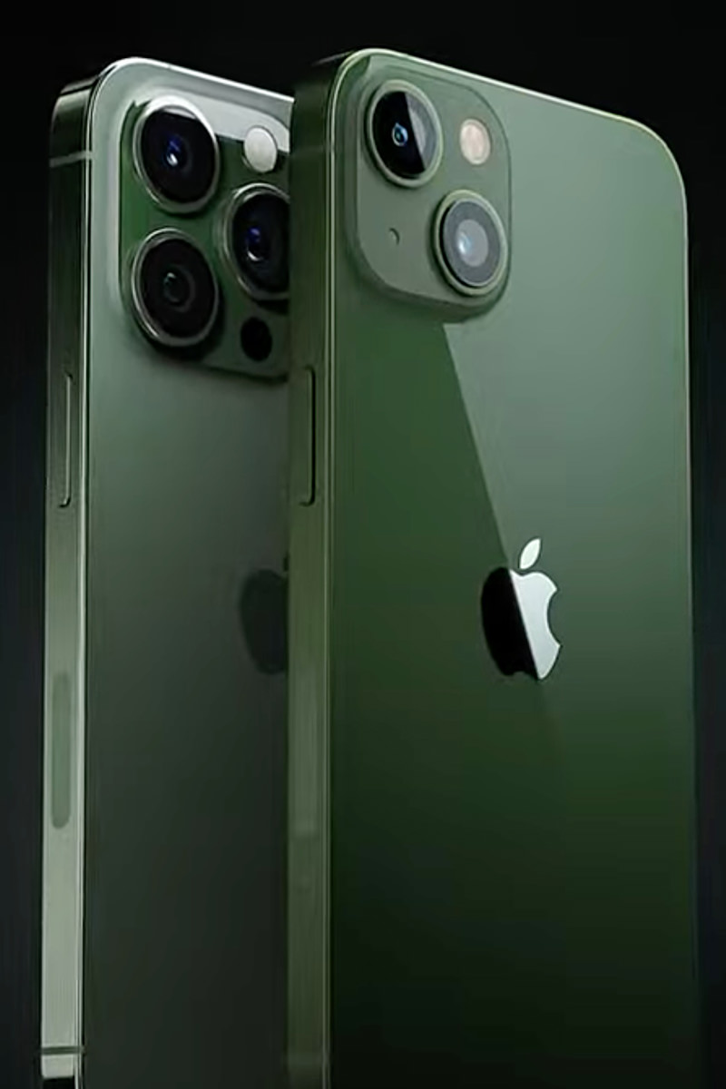
Whoop-dee-doo. A new green shade for iPhone 13 and iPhone 13 Pro. It kinda makes me upset that A) Apple adds colors after you've already bought the latest model... and B) the Pro models always get "sophisticated" (i.e. boring) colors. Let me know what I can have when a product is released. And, for the love of God, give the Pro users cool bright colors like the non-Pro models get. I want my (PRODUCT)RED iPhone Pro, dammit.
iPhone 13 SE
This is the "budget" model iPhone that's not exactly "budget." But it is a more affordable option for people wanting a newer, faster iPhone with a better camera and 5G. What's surprising is that the SE is actually more bang for your buck than what you get with a standard model iPhone 13. Because with the exception of FaceID (which I love) this is a pretty sweet feature-packed mobile phone for $430.
iPad Air 2022
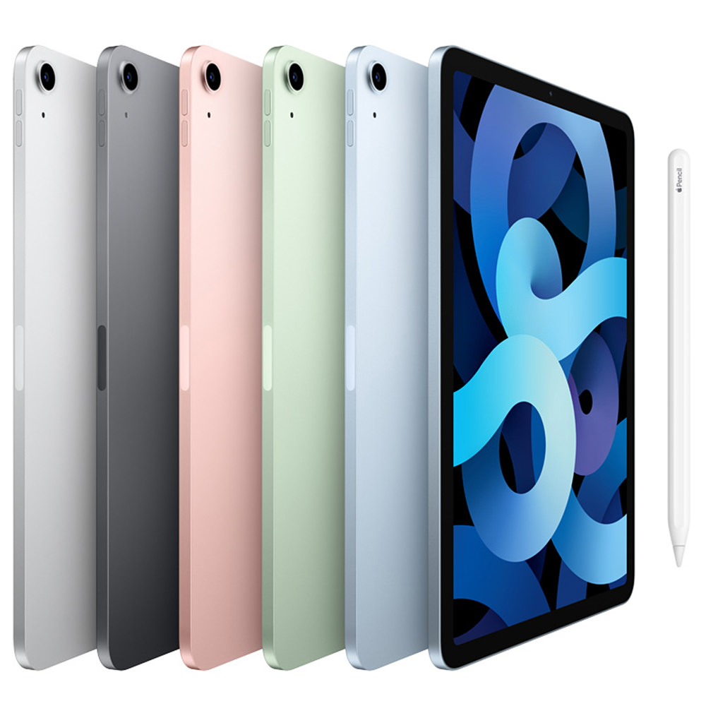
Yada yada yada... better, faster, stronger than the last model. This means nothing to me, because what I want is a 17-inch iPad Pro. That's all I want. Until they offer one that's sized for graphic artists, there's no need for me to upgrade from my iPad Pro 12.9-inch model. But for somebody wanting an iPad that slays? This is for you. This is the model I would have bought for my mom. In purple. At $600 it ain't cheap, but there's a lot of bang for your buck in that price tag. Inexplicably, by adding the M1 chip, Apple pushes this into "Pro" territory, which makes me wonder why they have "Pro" models at all. Unless there's new "Pro" models around the corner which will leapfrog this new Air? M2 perhaps?
Mac Studio
Studio Display
And here we go. Pro users want to upgrade their machines faster than the average iMac user. But it's always a waste because the 27-inch display on the iMac Pro is integrated with computer, so getting rid of one means you're getting rid of both. And the trade-in value ain't that great. So separating the computer from the display makes a lot of sense. Unfortunately, doing so means that you have to pay more to get what you need (even though upgrading will be cheaper because you can hang on to the monitor (and this monitor is really sweet, featuring 5K, great sound, and a very good camera)...
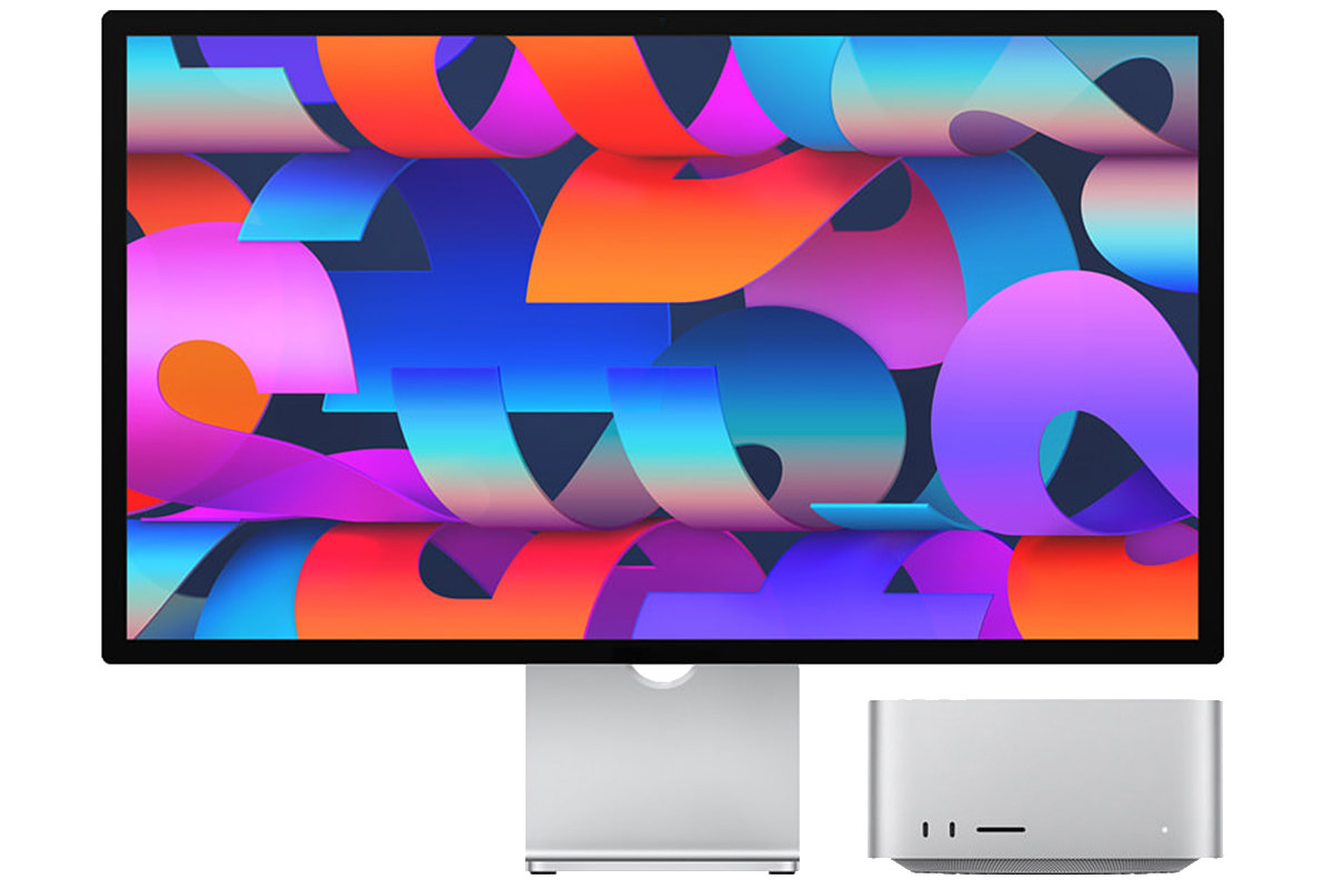
My MacBook Pro with M1 Max is the ideal laptop because it redefines power computing on the go... all while getting sublime battery life. I couldn't be happier with it. Finally an actual Pro laptop! The new Mac Studio allows you to choose between this very capable chip... or the shiny new M1 Ultra. This beast of a processor is essentially "ultra-fusing" two M1 Max chips together into a single processing unit that's more powerful and efficient than using two separate chips that are soldered to the motherboard. Plus the system sees it as a single chip, so developers don't have to do anything special to take advantage of its power. Naturally, I covet a computer using one of these chips... but, even with the intensive work I do, it's likely overkill. Hopefully my office will spring for one of the cheaper models for me, because my 8 year old iMac is dying and takes forever to do simple tasks.
The $2,000 and $4,000 price tag is a lot of cash. But when compared to equivalent high-end PCs it's actually a pretty fair price. And compared to the iMac Pro it's replacing (at $5000) it's a hot bargain. Then there's the Mac Pro, which is still for sale on Apple's website and still using Intel chips. They start at $6000. I'd rather max out a Mac Studio for that kind of money. At least until Apple upgrades the Mac Studio to whatever ungodly powerful chips they're developing.
And that was all she wrote.
And speaking of "she"... interesting to note that all the developers interviewed when talking about the M1 Ultra were women. Appropriate as we celebrate "International Women's Day," I guess. Hopefully all these women are getting equal pay for their work... because that would be something to really celebrate.
But anyway...
Here's the Apple product matrix as it currently stands...
| ENTRY | MID-RANGE | PRO | |
|---|---|---|---|
| iPhone | |||
| iPad | |||
| iMac | |||
| Mac | |||
| MacBook | |||
| Watch |
So... inconsistent and all over the map then. Steve Jobs must be turning over in his grave.
Though Steve was innovating in a different, simpler age. Tim Cook seems to be more interested in filling needs than filling boxes, which is probably how it should be. No, it's not simpler than having a neat matrix with clearly-defined labels... but it does make sure that people will get devices that are a good fit for what they are wanting to do with it and how much money they have to spend. And that's probably a better approach.
I dunno.
All I do know is that I wish money was not an option, because I would just buy the biggest, baddest, most expensive model of everything Apple makes every time they release it.
Fantasyland is so much nicer than Reality.
 And here's an Apple Event on this fine Spring day.
Billed as "Spring Loaded," Apple was their usual cryptic self with what was being discussed and announced. The only thing that everybody was betting on was the long-delayed "AirTags" tracking devices. A new iPad Pro was also anticipated. Both of them arrived. And then some. As always, I'm posting the thoughts that went through my head as I watched.

And here we go...
Apple Card I ain't gonna lie. I love the way the Apple Card credit card works. It (along with ApplePay) is how these things should work. The app they built around it is genius. It has features that makes controlling your charges a piece of cake. It works hard to show you the consequences of your payments on interest charges so you can better control your finances...
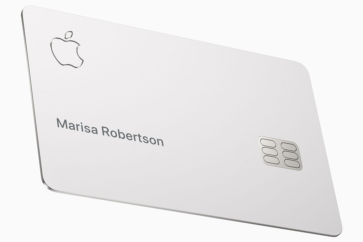
Everything about it is classy. EXCEPT the meager cash-back perk and the fact that it's issued by controversy-embroiled Goldman Sachs. Apple kicked off the event by talking about changes they're making so that cards are more fair. They were hit hard by accusations of unfair, sexist practices, so now they are allowing married persons and domestic partners to use a combined credit history when determining rates and limits. It's about time, and I hope this is just the start in addressing credit inequity in this country, because right now your entire financial future is being determined by something completely out of your control.
Podcasts I don't listen to a lot of Podcasts, but the app for doing so are pretty shitty. Apple is updating things to run better and help people discover content. It's about time.
iPhone 12 Now available in purple! And it is beautiful...
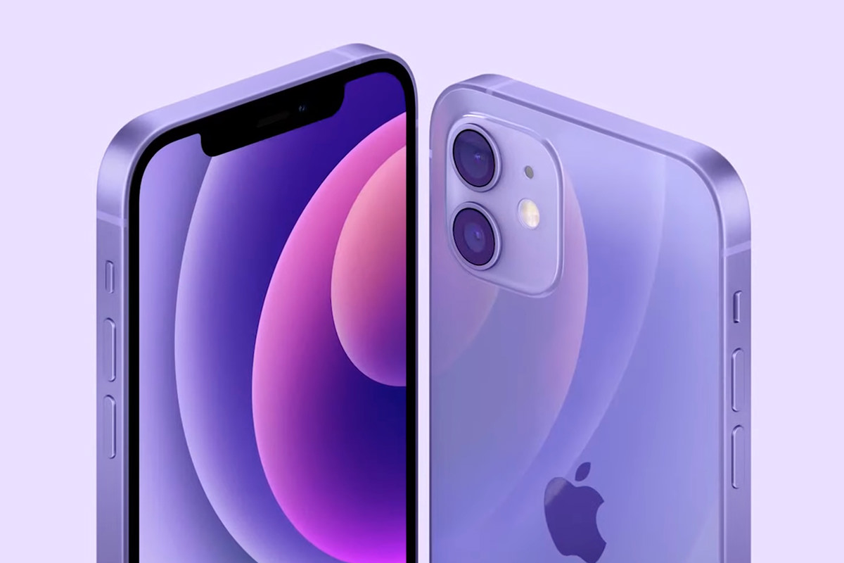
This is the iPhone Prince would have! And released the day before the fifth anniversary of his death.
Find My & Air Tags I am embarrassed at how often I have to use location tracking to find my phone, keys, and wallet. Currently I am using Tile, but it's less than an ideal solution even though it works just fine. Now Apple has finally released their long-rumored "Air Tags" which takes location tracking to the next level. It's far, far superior to just playing a sound, which can be vague... it actually guides you to the location...The only thing not great is the price. $30.00! Or a 4-Pack for $99. Yikes. And while there are cheaper $13 accessories for putting AirTags on keyrings and such, get a load of the Hermès accessories!

BWAH HA HA HA HAAAA! But, hey... if you've got more money than you know what to do with, Apple has definitely got you covered.
TED LASSO! The best television show I have ever seen is coming back for a second season in July!
Now that's something to look forward to!
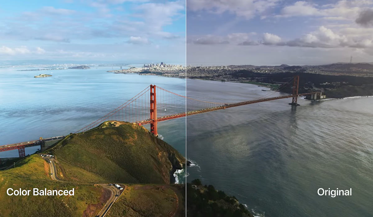
Apple TV AppleTV is shit. The OS is flakey. The apps are garbage. The remote is the fucking WORST. And yet... it's what I use as my primary streaming device because it's the most convenient. Now Apple is finally addressing some of the offenses with their new AppleTV 4K. Starting with color fidelity, which can be adjusted within AppleTV instead of trying to get your television calibrated. Sweet...
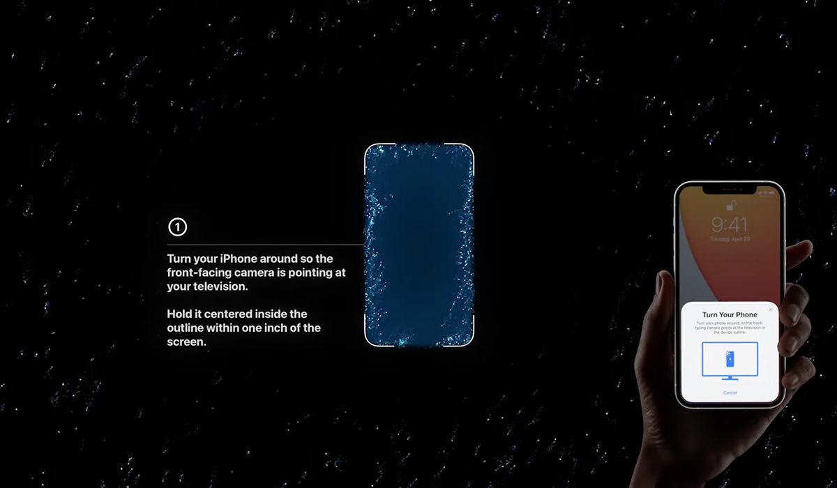
And then there's improvements to the SHITTY FUCKING REMOTE...
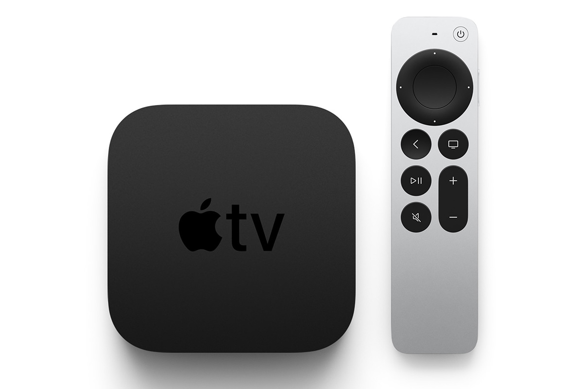
It looks better, looks easier to handle, and I like the touch wheel buttons replacing the heinous fucking "touchpad" in the old one. Now if only they'd do something about the shitty AppleTV app, which is absolute garbage. Just TRY to get to the movie you want when you have hundreds. No way to quickly navigate... you have to scroll and scroll and scroll and scroll. Apple has always had a phenomenal GUI team, but now they are falling behind. Badly. The fact that they won't put a little effort into updating it from the ground up tells you all you need to know about Apple's dedication to AppleTV. But holy cats the price. $179 and $199?!? In an arena where you can get streaming devices for cheap, the fact that Apple is pushing TWO HUNDRED DOLLARS is sheer lunacy. AND THE REMOTE DOESN'T EVEN HAVE A BUILT-IN AIRTAG, WHICH SEEMS LIKE A NO-BRAINER OF THE HIGHEST MAGNITUDE!
iMac M1 In colors! And they are GORGEOUS. Well, they're gorgeous FROM THE BACK. On the front they use a muted shade of the color. So if you love red and buy a red iMac, you're staring at PINK all day. Ugh. It's like Pepto Bismol mixed with milk. That being the case I guess I'd go with blue or yellow or something...
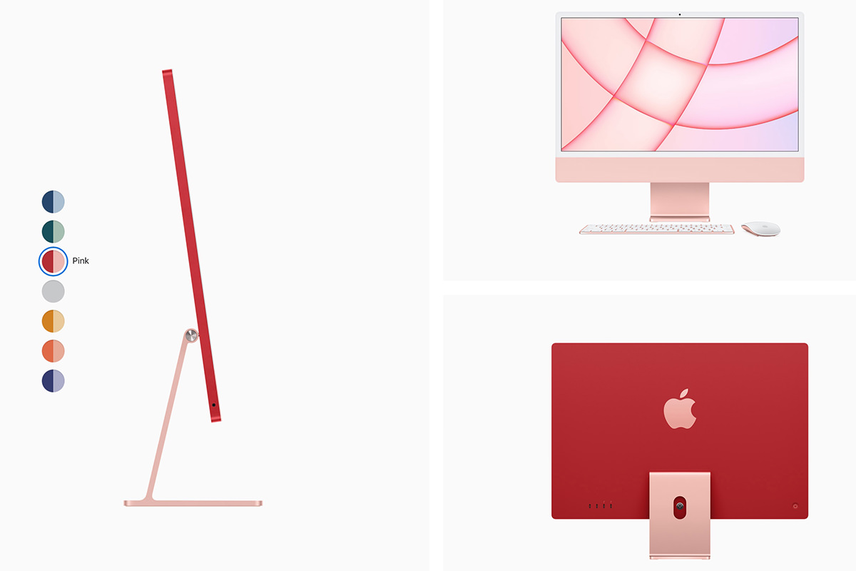
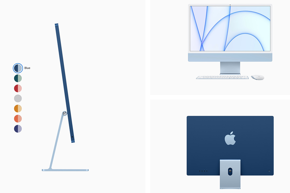
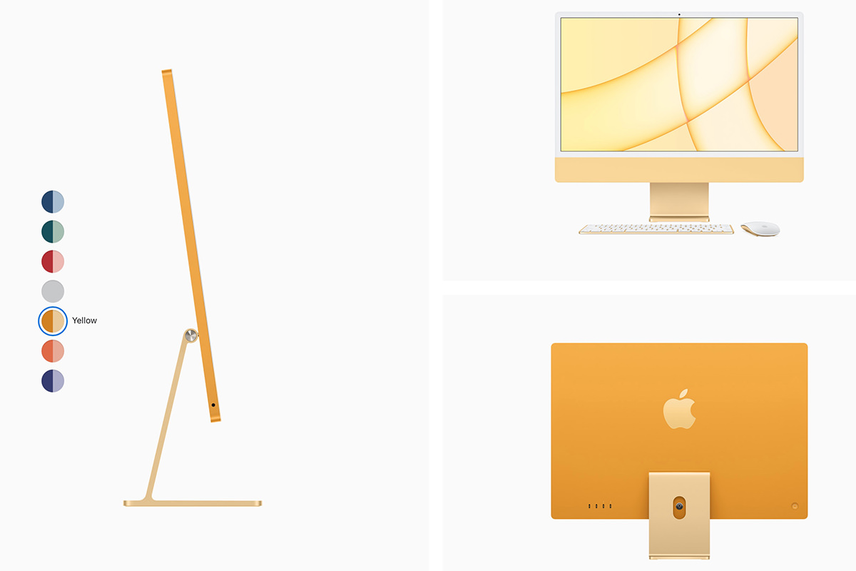
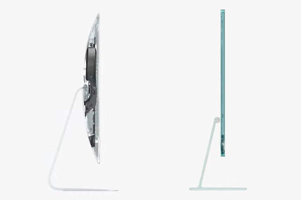
The design on these things is absolutely fantastic. Apple moving to their own custom silicone is the gift that keeps on giving, because it allows them to do amazing stuff. Just look at the profile improvement...
And it looks like Apple is FINALLY realizing that video-conferencing is a critical feature to have (especially now), and is taking a look at their less-than-stellar current camera system to do something better with 1080p and realtime image processing to present the best stream possible...

Apple has brought TouchID to a new color-matched keyboard, which is pretty cool. I love this feature on my MacBook Pro. Though I'd prefer the FaceID that my iPhone has...
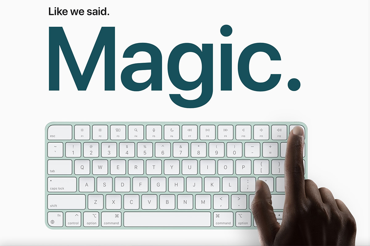
And it starts at $1299 and $1499, which seems about right for all you get. It's nice that Apple is still investing in the Mac... heaven only knows that the iPhone and iPad profits make them the focus of the company, so anything moving the Mac forward is a good thing.
M1 iPad Pro Welp. This was the shock of the day for me... iPad Pro now runs on the M1 chip! The iPad has never been "just a bigger iPhone," but now any doubts can be pushed aside. It's a tablet with a desktop class processor...
The addition of a Thunderbolt port opens up mind-boggling array of new applications now that you can attach high-volume storage and large displays...
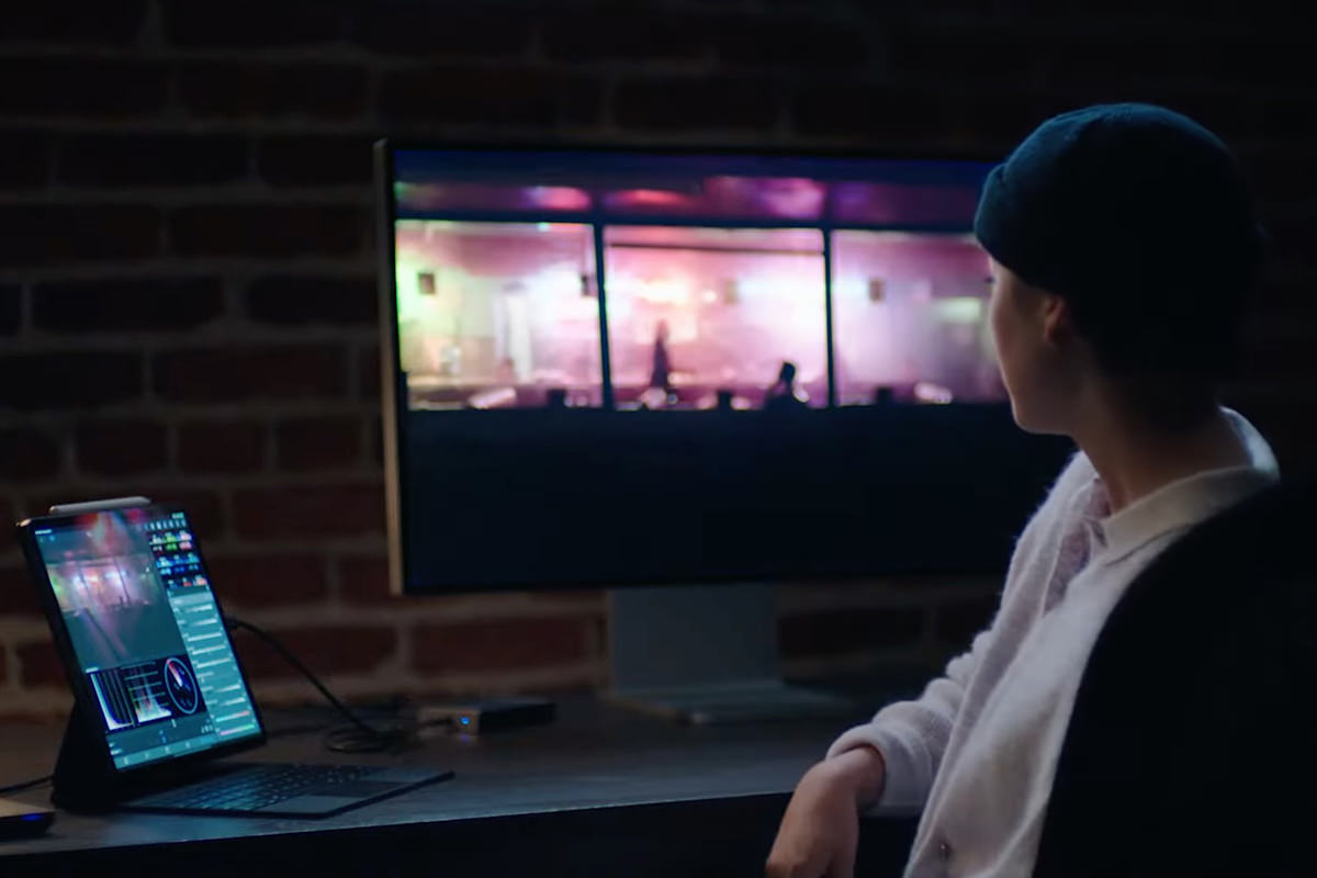
Apple has customarily put a crap front-facing camera in their products. The new iPad Pro fixes this by going 12MP with a wide-angle lens that allows really cool features, like "Center Stage" which pans the feed to keep you centered in the view even if you're moving around...

But here's the thing. I want a bigger iPad. 12.9-inches is not big enough for somebody who draws and paints on it. I need to see more of what I'm working on to be the most efficient at what I do. I have the current 12.9-inch iPad Pro, and it's fine. But until Apple goes at least 17-inches, I'm good, thanks.
And that was the end of that. I have to say... the iMac update and iPad Pro revision are pretty exciting stuff. I don't need either of them, but it's encouraging to see where Apple is headed. It's more clear now than ever before that iOS and MacOS platforms will be merging one day
 Here we go with yet another post-Apple-World-Wide-Developer-Conference keynote. This year's was really long, so I am only writing about things when I have a comment to make instead of summarizing every little thing that was presented. If you want to watch the keynote yourself, just head over to Apple.com and have a look!
• But First... Kudos to Apple for prefacing their WWDC Keynote with a statement on racism, equality, and injustice... and what they are doing to address racism in their industry and our communities. Not only that, but Tim Cook called out the "senseless killing of George Floyd," which is not as strong as calling it what it is... but at least they didn't diminish it by merely calling is "the death of George Floyd." This is not just lip service. Apple is putting their money where their mouth is too. Apple is investing $100 million to help in demanding equality in our communities. That's a drop in the bucket compared to the massive fortune they're sitting on, but it's a heck of a lot more than what other big companies are doing. Apple is also creating programs for Black developers and finding new ways to encourage involvement by POC in the developer community. As a step forward, all the developer videos from WWDC are completely free for anybody to look at this year. Good on them.
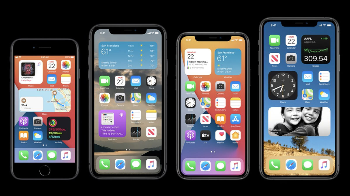
• iOS: Widgets. One of the things that I loved so much from MacOS X was the widget screen. So many incredibly useful tools are just a swipe away. Then Apple eliminated them and I was bigly sad. And yet... here they are in iOS?!? Does this mean we will see a return of widgets in MacOS? I am holding my breath. I have said many, many times how my favorite mobile phone to work on was Windows Phone. Yeah, I never gave up my iPhone for it but, upon release, Windows Phone OS had new ideas with fresh ways of doing things. By contrast, Android was just a poor iPhone copy. One of the best features of Windows Phone was "Live Tiles," and that's almost exactly what iOS widgets are looking to be like.
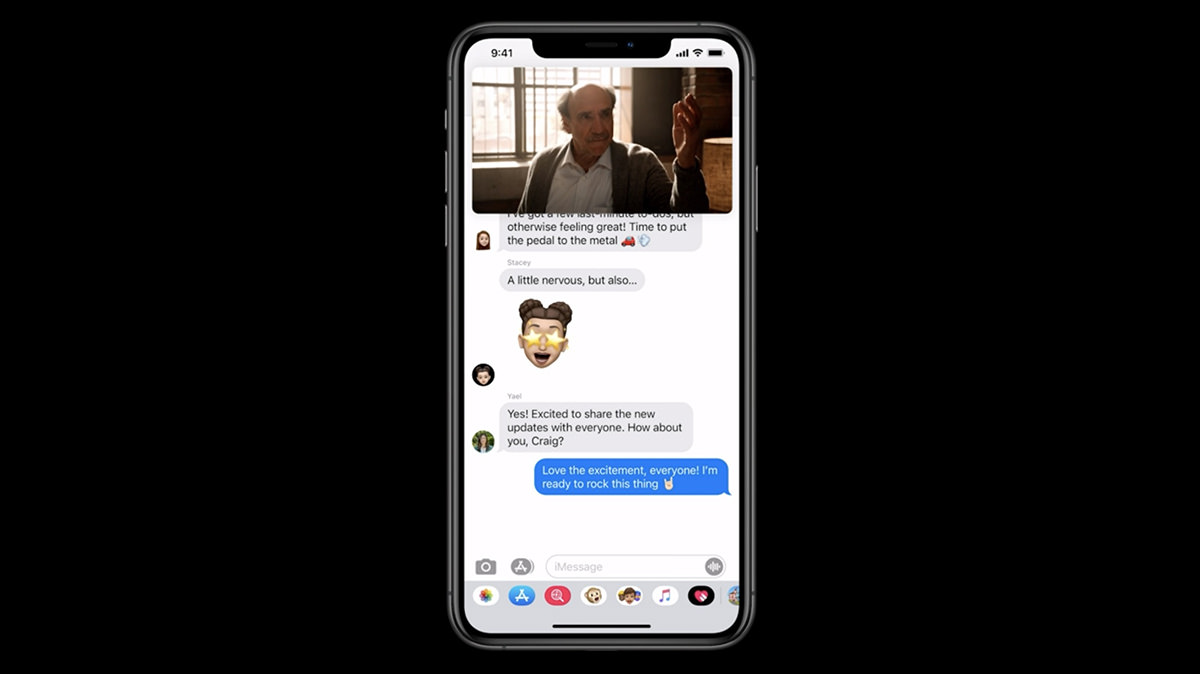
• iOS Picture in Picture Video. Before iOS 14, you had to stop watching a video if you needed to access your apps for some reason. Now Apple has made it so you can keep watching (and listening) while you use your apps. Given how many times a day I get a distraction, being able to keep watching while I'm glued to my phone while traveling is a serious big deal.
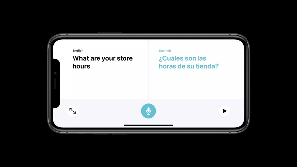
• iOS Translate. Holy shit. Offline machine learning translation with conversation mode? Sign me up! As translation gets better and better, this is going to open up the world in new ways. I cannot tell you how many times this would have come in handy with my work. Very exciting stuff.
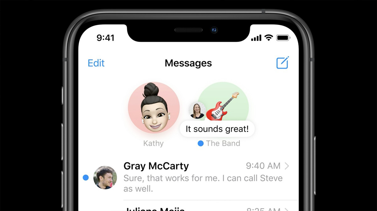
• iOS Messages. I hate phone calls. All my friends and co-workers know this. I will put off returning a phone call for as long as possible. But a text message? I will hop on that immediately. And yet... I still kinda detest text messages because it's such a messy way to communicate. Apple has started addressing this by adding new features. The one that's most important to me? Groups. Group texts have been vastly improved, which is a huge step towards organizing the madness that can ensue.
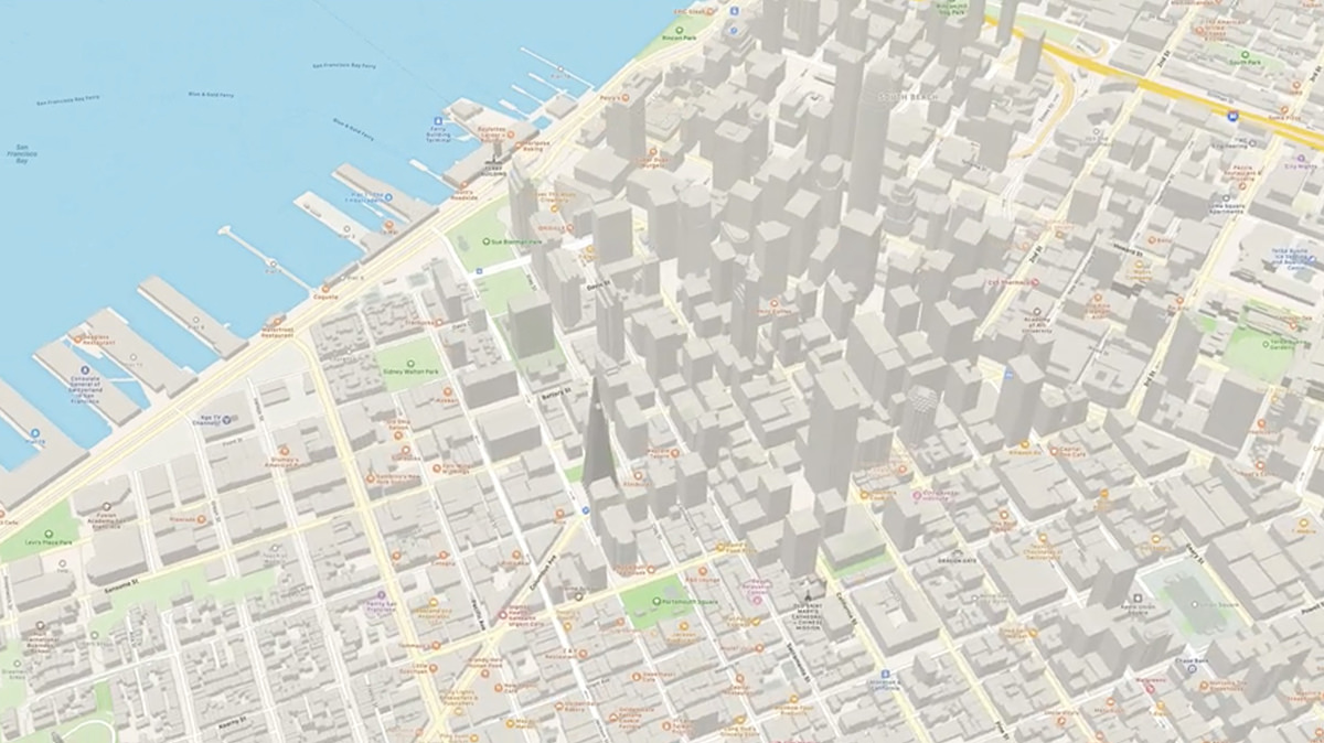
• iOS Maps. I never use Apple Maps for actual navigation because I'm addicted to Waze. I only use it for the cool 3-D views of cities and to have access to their "Walk-Around" feature, which is a greatly upgraded version of Google Maps' "Street View." But that may change. Sounds like they are upgrading their directions (which have been pretty awful). All they need now is automated traffic redirection like Waze has and they could be a contender.
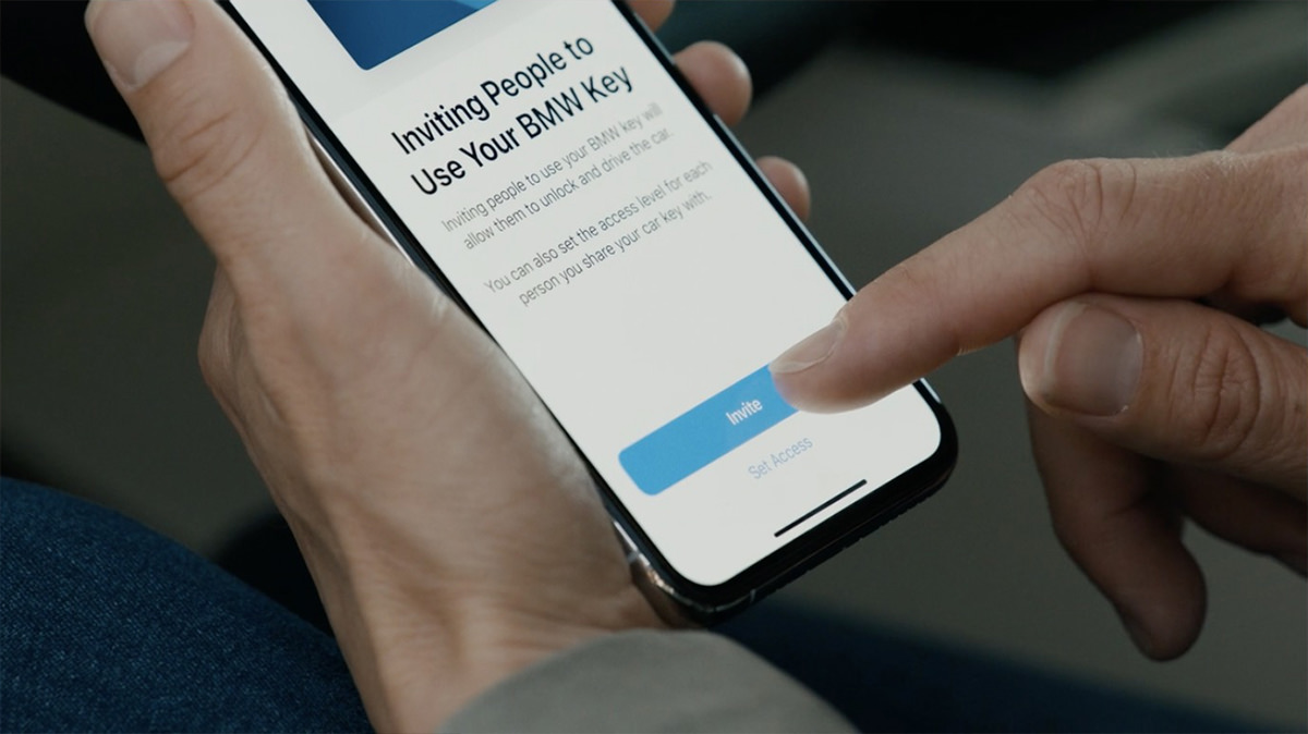
• iOS Digital Car Key. Being able to have my home unlock when I arrive is so cool. Apple is extending the idea further with digital car keys. Now not only can you use your phone to unlock your car, you can also message a digital key to somebody so they can drive or move your car if needed... no matter where you are in the world. Of course I would need to buy a new BMW in order to use it... BWAH HA HA HA... but a boy can dream, can't he?
• iOS Apps. No mention from Craig about the recent controversy of Apple being wishy-washy about which apps owe them a cut of their revenue, but I didn't expect there to be. Craig can likely get away with this because he's got almost offensively good-looking hair.
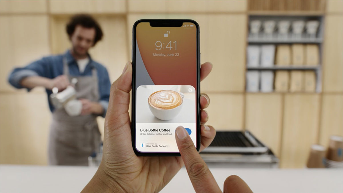
• iOS App Clips. Having to download a new app for some little task is frustrating. App Clips are tiny pieces of apps that handle simple tasks you need to get through your day. They load immediately and will streamline tasks because they integrate ApplePay and "Log-In With Apple" features. And if you want the full app after using the App Clip, you can easily download it. Simple!
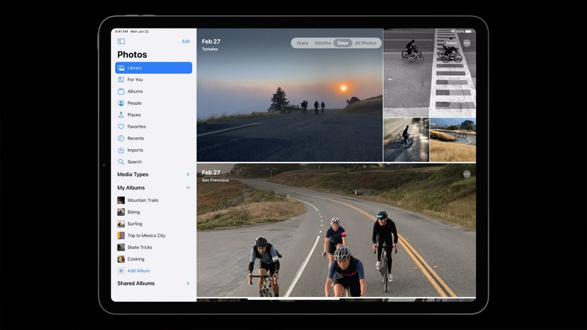
• iPadOS. I only use my iPad for two things... creating art and Zoom calls. That's it. Everything else happens on my iPhone or Mac. Apple is working hard to change my thinking on this by continuously upgrading the iPad experience. They started off with something that goes a long way towards addressing multitasking issues and app navigation... SideBar. This seems a no-brainer given the small screen of the iPad compared to a desktop Mac, but this is the first I've seen it. Smart stuff.
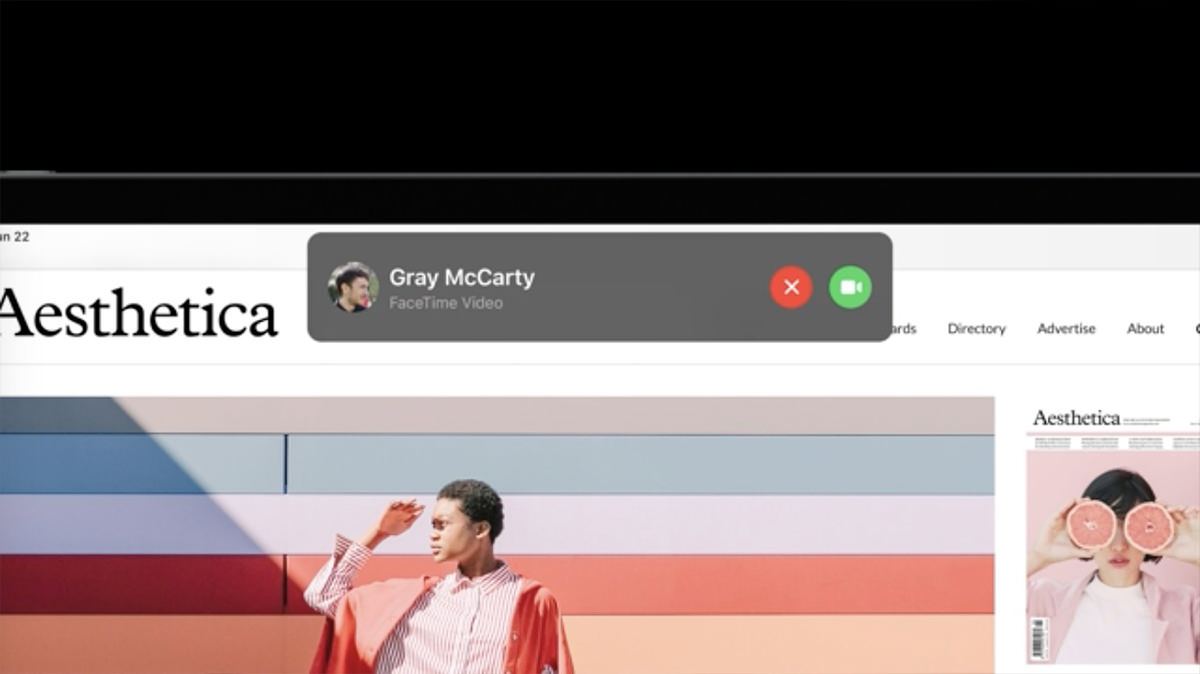
• iPadOS Phone Notification. The way iPad handles calls is kinda stupid. You are dropped out of your app in order to deal with it. Not any more. You can accept or dismiss calls or FaceTime or Skype requests with a popup. Much better.
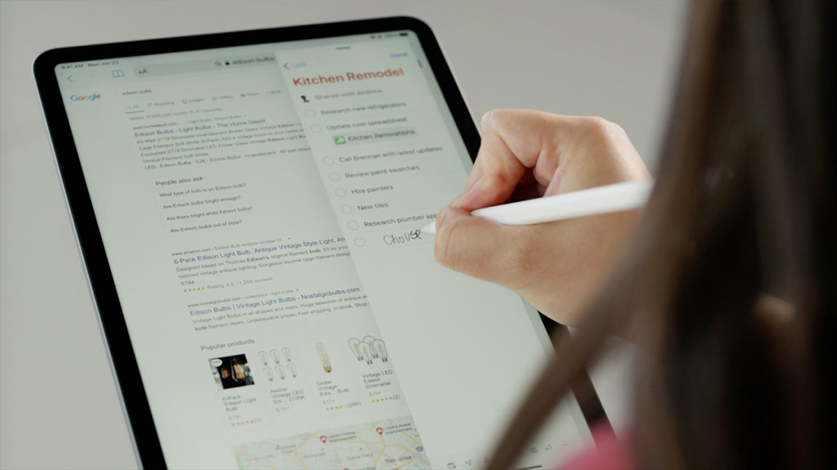
• iPadOS Pencil. iPad is now attempting to treat your handwriting like actual text. You can select it and move it easily. Or have it converted on-the-fly when you paste. iPad is essentially now full-on an Apple Newton with "Scribble" which instantly converts handwriting to text.
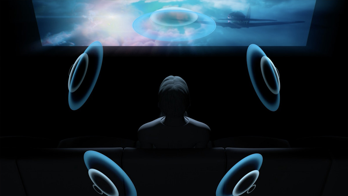
• AirPods. Auto-switching between devices? Magical. But the spatial audio feature being added to AirPods Pro is what has me really excited. If it actually works as advertised, this is Dolby Atmos Audio for one, and well worth investing in a new set of AirPods for me. The way the spatial audio ADJUSTS ON THE FLY when you move your head is incredible.
• WatchOS. I am fairly certain I will be buying into the Apple Watch ecosystem soon. I avoided it for the longest time because I find them so uncomfortable to wear. But after using Waze Band for a while now, I seem to have adjusted. My change of heart has everything to do with the Apple Health benefits which come with WatchOS. As I get older, I am more and more interested in taking advantage of the monitoring and active involvement of staying healthy. I will not, however, use the new "Dance" feature, which would probably result in injuries. Maybe if they add "pole dancing" I will reconsider?

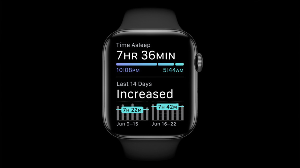
• WatchOS Sleep. The Waze Band ventures a little bit into sleep monitoring, but I don't have a lot of confidence in accuracy and there's no tools to help you get better sleep. Apple Watch seems like there's a lot more going on, making sleep features far more useful.
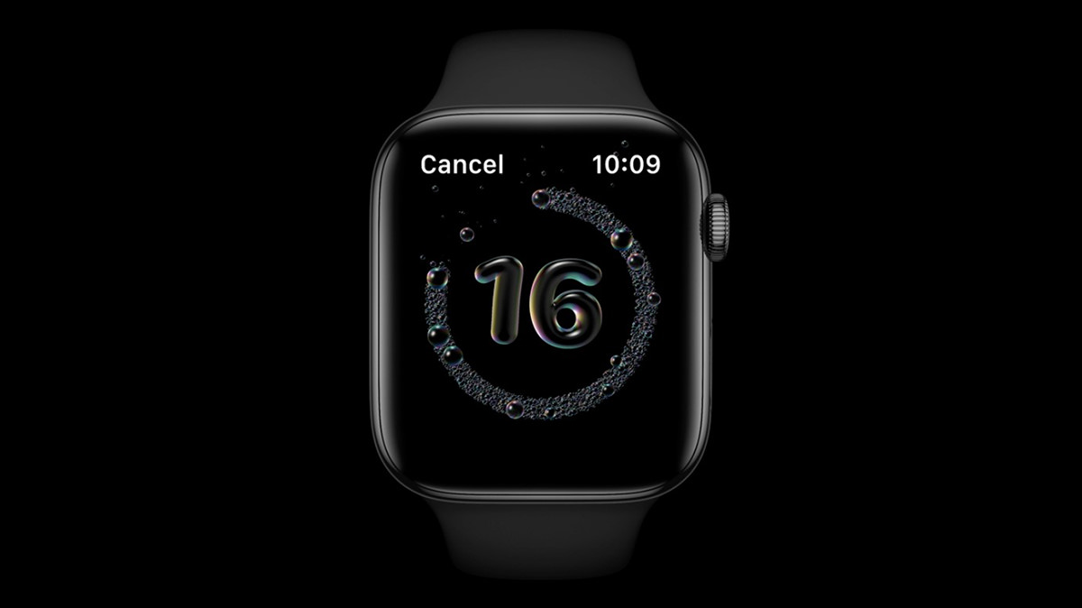
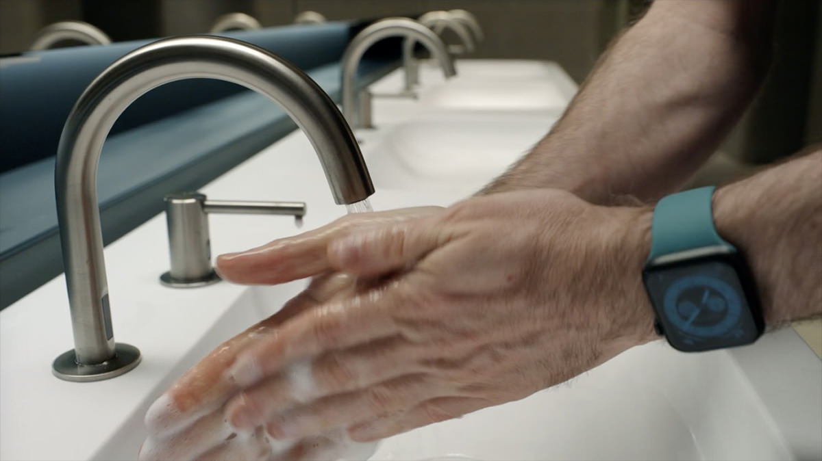
• WatchOS Wash. Talk about timely features... Apple has added a hand washing monitor which makes sure you are washing long enough to destroy the lipid layer of things like COVID-19 so the virus will die.
Note that Kevin seems to have thinner wrists like me, so he's wearing his watch quite a bit lower than you usually wear a watch because it's uncomfortable on the wrist bone for us. This is encouraging. If this guy is in charge of stuff with WatchOS, and he has to wear a watch like I do, that means all the hardware monitoring features will likely work for me because he's obviously going to be testing them. Sweet!
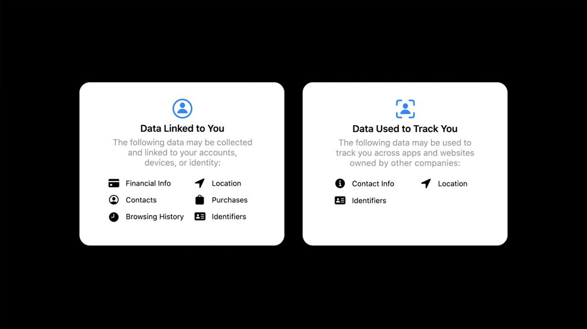
• Privacy. Apple seems to put a lot more thought into privacy than other companies. They are constantly providing more tools to protect us and keep moving data analysis locally so that it doesn't have to go out onto the internet. I don't have much to say about this except Good job, Apple! Our own government doesn't seem to be interested in guarding our privacy, so it's nice that somebody is stepping up.
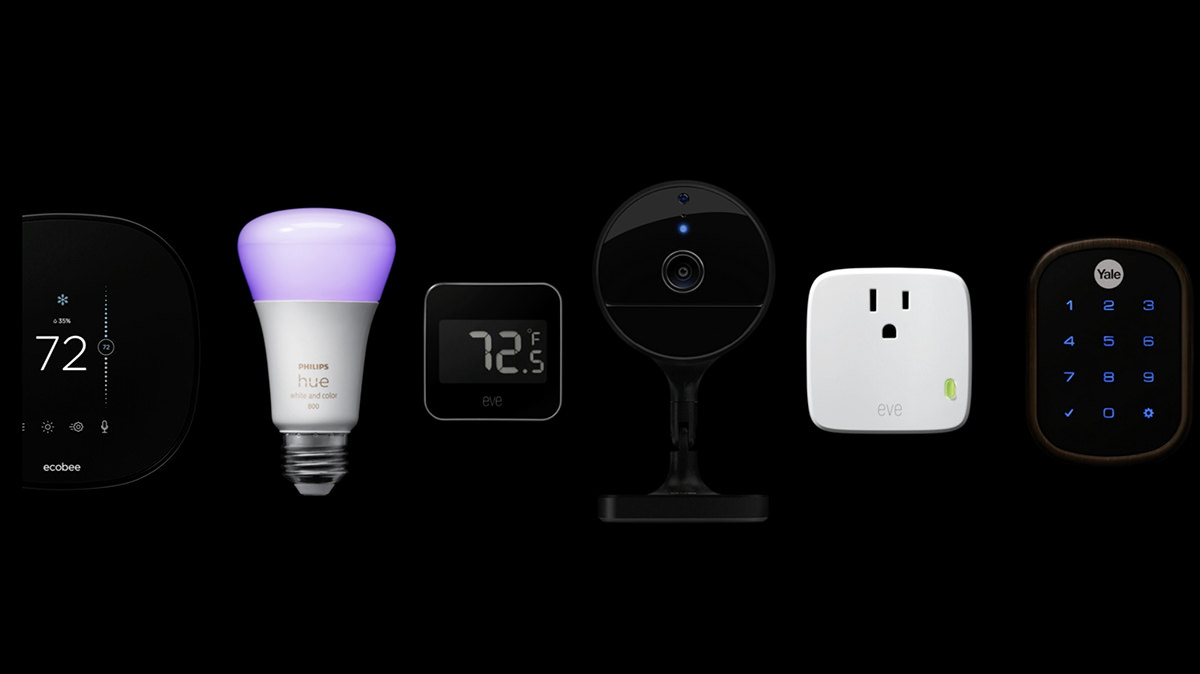
• HomeShit Kit. I detest HomeKit. I avoid it whenever possible because it's just an awful, awful system. Expensive, limited, and it barely works for me. Despite having multiple AppleTVs in my home to fully blanket everything with plenty of signal, sometimes I get an error which says that HomeKit can't communicate with my devices. Ugh. Apple has been steadily improving HomeKit with features and such, so maybe I will check it out again one day. But given my horrible past experience, I'm in no hurry. And yet... there's some compelling integration with iOS that has me wondering if I should be investigating it sooner. The one thing I am very interested in is Apple joining a new home automation consortium with Google. Does this mean my Nest cameras will integrate with HomeKit? Interesting to think about.
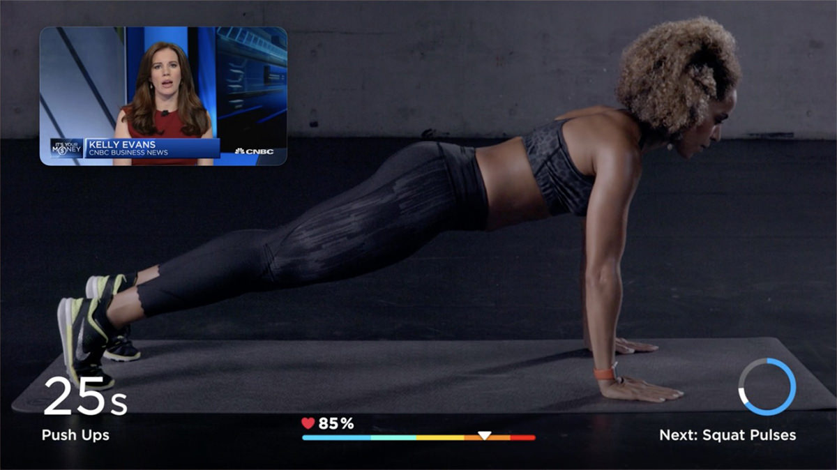
• AppleTV. My experience with AppleTV has been less than stellar. Sometimes it's downright bad. It apparently has very little RAM for streaming because there are times I get shitty, stuttering video. But the biggest problem is with Apple media itself. Even when other streaming services are working flawlessly on my AppleTV, the stuff I bought from iTunes will fail to load or not display properly. Until they address this, all the other bells and whistles (like new picture-in-picture for apps) don't mean much to me.
• AppleTV+. One of my favorite works of science fiction is the original Foundation trilogy by Isaac Asimov. Apple bought up the rights and teased the result...
No idea how this will play out, but I'm certainly excited to see what they've done with it.
• MacOS Big Sur. "Drug-fueled, mini-bus-driving, vision-quest?" — Okay, Craig. Settle down! If you believe the hype, this will be the biggest change to the visual interface of the Mac since the switch to OS X. I don't know if that's the case... these changes seem a more "evolutionary" than "revolutionary"... BUT THAT BEING SAID... I absolutely love what I'm seeing. WIDGETS ARE BACK? FUCK YEAH!!! Discontinuing them was a bigly stupid move, and adding them into Notification Center is okay by me.
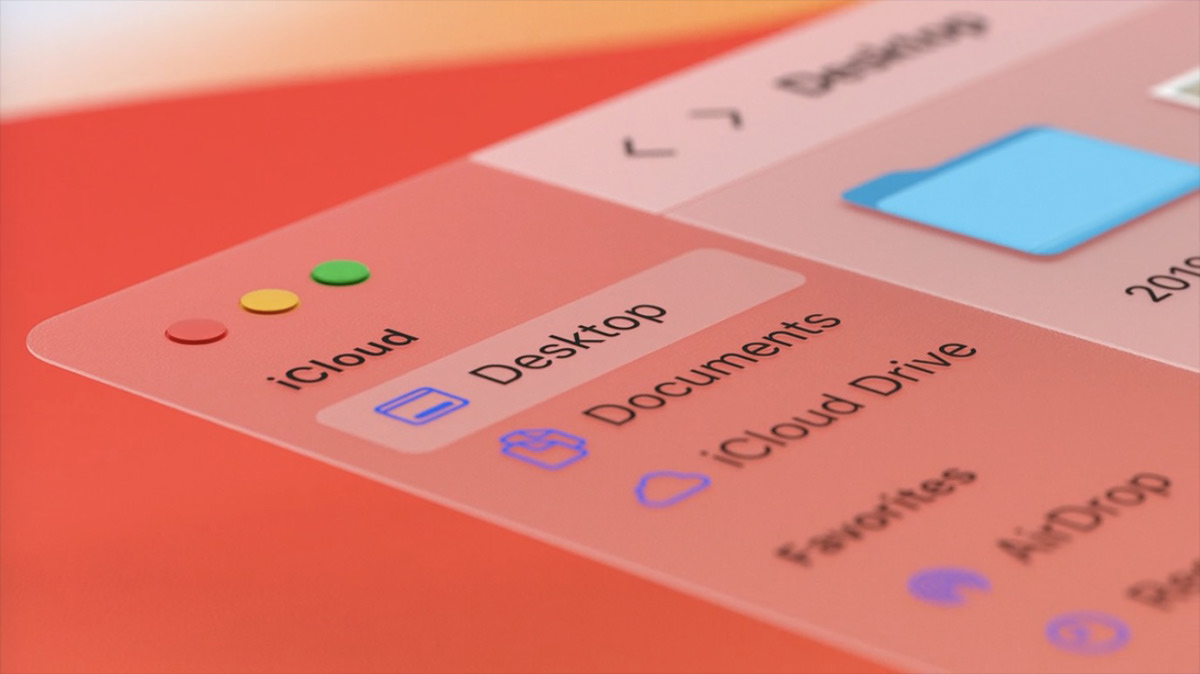
• MacOS Icons. MacOS has redesigned icons! Whee! What pisses me off is that Apple STILL hasn't allowed icons to be manually generated and "baked" into data files. Used to be when you saved a photo from Photoshop, the app would generate a tiny icon to attach to the file so you could see what image you've got. MacOS X eliminated this. Now data file icons are generated by the Finder. Which is so fucking stupid. No longer can you just scroll through all your images and see what they look like... you have to scroll and wait... scroll and wait... scroll and wait... it's infuriating.
![]()
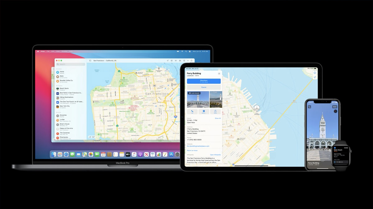
• MacOS Maps. And... MacOS is no longer the red-headed step-child of Apple's hardware when it comes to maps. Apparently they are adding more iOS Maps features that have been missing since Maps appeared on MacOS.
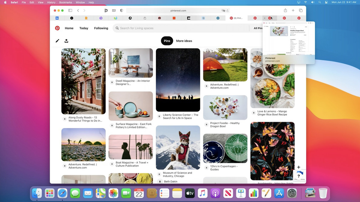
• MacOS Safari. Even though I remain unconvinced that Safari is the best browser out there, it's my default browser just the same. Apple wants to be sure that this remains the case, because they keep making it more responsive and faster with each new release. On top of that, they are constantly improving security and privacy features. By far the most exciting is that they will now notify you if your passwords have been compromised when a data breach is reported. How amazing is that? THESE are the features that are important to me. And, oh yeah, they made Safari more customizable and pretty as well. Whee. And what about those new tabs? NICE...
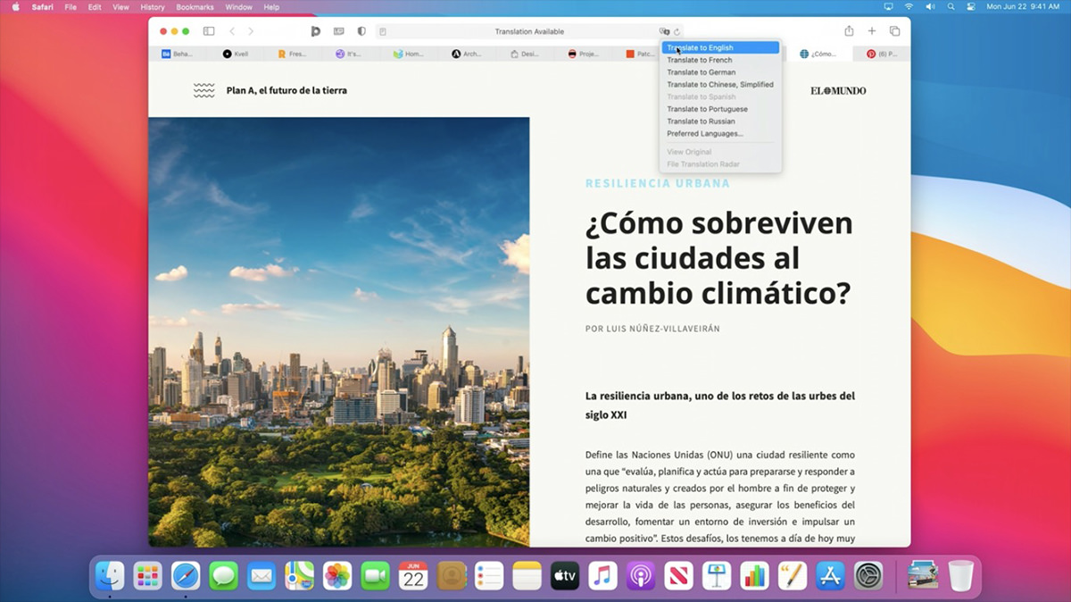
Plus... inline translation when the language of the site is different than your selected language. Looks like you have to click a button. I wish I had an option for pages to translate to English automatically for me... and just let me know with an icon indicator or something so I can switch back if needed.
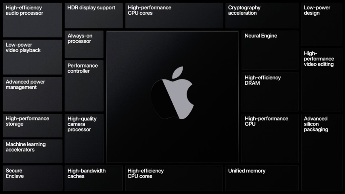
• Mac on ARM. First it was a switch from 8086 to PowerPC. Then it was a switch from PowerPC to Intel. Now Apple is reeeeeally moving forward by developing their own silicon chips for Macs, just like they already do for iPhones and iPads. This is incredibly smart. By having MacOS work hand-in-hand with custom chips that they design and control, Macs will get faster, smarter, and have better battery life. They can tailor every aspect of the "brain" of their computers to do exactly what they want with no wasted processes or energy. Everybody knew this was coming. I honestly thought it was going to be years off yet. I'm happy to see that it's happening sooner rather than later. My only worry? That eventually Macs will just become big iPads. Because right now there are things that Macs can do which are clumsy or impossible on an iPad. But who knows what the future will bring?
It looks like anything written in Apple's Xcode app development system will just have to be recompiled. Perhaps with minor tweaks. Simple. Microsoft and Adobe are already there for all their apps, and these are some really huge and complicated apps! What will be interesting is how these big companies use the custom hardware to add features to their products. This reminds me of the switch from PowerPC to Intel. All the apps would compile to work on both products via Universal Binary packages, and the user experience was seamless. But for those apps which weren't compiled to run on Intel silicon, they had a translation environment called "Rosetta." Now they've brought that idea back with Rosetta 2," so it looks like the transition is going to be just as seamless to Apple silicon, which is exactly what you want. Performance seems to be very good as well, so what's not to love?
![]()
• iOS on MacOS. A brilliant side effect of Apple making their own chips is that they can make it so iOS and iPadOS apps run natively on the new Macs. That's pretty great.
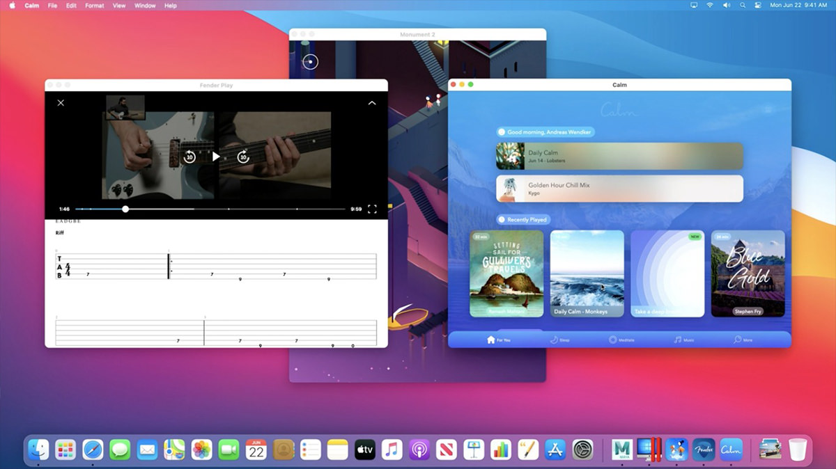
And that's a wrap. There's a lot of stuff to really appreciate here, but it's all vaporware until it ships and end-users have access, so I guess we'll see.
 Continuing on from my new iPad 2020 post from yesterday...
I had no intention of buying a Magic Keyboard for my new iPad Pro. I bought the thing for drawing and painting. I don't need a keyboard for that, and adding one essentially turns an iPad into a laptop. I've already got a laptop. And then there's the $350(!) price tag for the thing. Add that to a 12.9-inch iPad Pro ($1,000) with an Apple Pencil ($130), and your total jumps to a whopping $1,480! A MacBook Pro 13-inch is $1300! So why?
But then...
In anticipation of my new iPad arriving, I started taking a look at all the new apps and app updates that have been released since I set up my existing iPad back in 2016. Because once I installed Procreate (the painting/drawing program I use) and the essential stuff I had on my iPhone, I never really looked at anything else. I made an exception for Photoshop for iPad when it was released because, well, it's Photoshop and I was really looking forward to what it might be like on iPad... but that ended in disappointment. Nope. With the exception of trying to blog on my iPad every once in a while, I've used it solely for Procreate and nothing else.
But then...
After looking at all the things I could be doing with my iPad, I decided to take another look at my keyboard options because there's entirely too many apps for which is would be a very handy thing to have. My current iPad has a "Smart Keyboard" which I actually like quite a lot. The keys aren't really keys... they're bubbles that click on the fabric surface, but it's perfectly useable. I could type better on this than I ever could Apple's horrific "butterfly keyboard." The problem is that you can't really type on your lap with it. There's no solid "base" on which to rest it on an uneven surface and it just flops over when you attempt it.
The new "floating" Magic Keyboard is different...
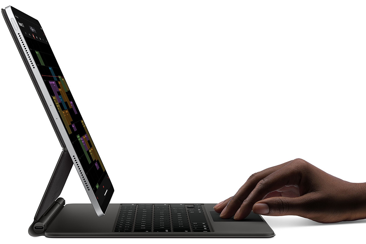
On the plus-side it is very sturdy, has a solid base, can be used on irregular surfaces (like your lap), and types like a dream. Plus... a trackpad! Something that is weirdly (but brilliantly) integrated into what is supposed to be a touch-based device.
On the down-side there's no way to fold the keyboard back and out of your way. In order to use the tablet like a tablet, you have to pop it off the keyboard completely. At which point your iPad is 100% unprotected. This scary and, quite frankly, dangerous prospect has me more than a little worried. It's way too easy to drop a $1000 device and end up with some serious damage if there's no protection on it whatsoever. I don't know if Apple will release some kind of hard case to protect the iPad which can still be used with the Magic Keyboard, but somehow I doubt it.
So let's get into this, shall we?
Given that I blew through all the Apple Cash I had been saving up for the past year to get this (and still had to come up with $60 on top of that!), the biggest question I have for myself is whether or not Magic Keyboard is worth the $350(!) price tag.
The answer is a resounding no.
As high-quality as it feels... as capable as it is... as well as it works... as beautiful as it looks... it's just not worth THREE HUNDRED AND FIFTY DOLLARS(!). I mean, holy crap... that's THREE HUNDRED AND FIFTY DOLLARS(!)... FOR A KEYBOARD!!! I can see it being worth $200 tops. Which is likely what the competitors will be selling for when they get around to it. They may not be as top-of-the-line as an Apple model, but give me a break.
The way it works is to magnetically attach to your iPad. And those magnets are strong. My initial worries about my pricey new tool falling off the keyboard and crashing to the floor were wiped away the minute I attached it. And the Magic Keyboard is heavy. I mean really heavy. It makes my 12.9-inch iPad feel three times as weighty. That's great for making sure that it stays on the table without falling over... but it's terrible for portability. A primary selling-point for iPad is how much lighter and smaller it is than a computer. Well... with this keyboard on it, Apple might as well have added a touchscreen to a MacBook Air and been done with it.
Opening the Magic Keyboard folio is terrible. Because the hinges are all so tight and the Apple Pencil gets in the way, I have ended up accidentally lifting the magnetic cover off the iPad instead of opening it a couple times now. It's easier to open if you take the Apple Pencil off, but should that really be required? And speaking of Apple Pencil, it's kinda stupid that there's no security strap to help keep it attached while charging. The magnets which attach it are strong, but brush the iPad up against something and Pencil still going to come off. This is an inexplicable move, and I wish that there was a model which had SOMETHING to help keep the Pencil in place so I don't lose my $130 stylus. I'm trying to get in the habit of lifting the iPad up and cracking it open like a book when opening it. This is far easier, but way less intuitive.
The "floating" aspect of the design is a mixed bag. Push the iPad to a flatter more normal viewing angle and the bottom of it floats right up next to the number keys, which is kinda a bummer (and also explains why Apple didn't bother to put function keys on this? Talk about a bummer!). And, as I mentioned, you can't flop the keyboard back behind the iPad so it's out of the way. You're either using it like a laptop with your iPad attached or you're not using it at all because your iPad is detached. There is no "best of both worlds" to be had. As mentioned above, the hinges which keep the Magic Keyboard closed and the hinges which allow angle adjustment for the iPad angle are very stiff. Almost too stiff to be comfortable. It makes me wonder if they loosen over time, and Apple made them too stiff so that their pricey keyboard attachment wouldn't be floppy within a year? Something I'm guessing is still a possibility. iPads are light, but they ain't that light. Eventually the hinges have to succumb to the weight, don't they?
Unlike the "Smart Keyboard" on my old iPad, the Magic Keyboard works just fine on my lap when sitting... or propped against my knees in bed. I don't know that it's worth the trade-off of not being able to flop the keyboard around to the back so it's out of the way though.
As for the keyboard itself, the keys are certainly nice enough to type on. Far better than the old fabric-bubble "Smart Keyboard" I was using, which I actually liked just fine, so I'm quite happy typing on it. The keys are backlit so you can more easily type in dark places (which holds true even if you are a good touch-typist because you have to find those keys first!). Sure I would like a bit more "travel" to be really comfortable, but it's not a big deal.
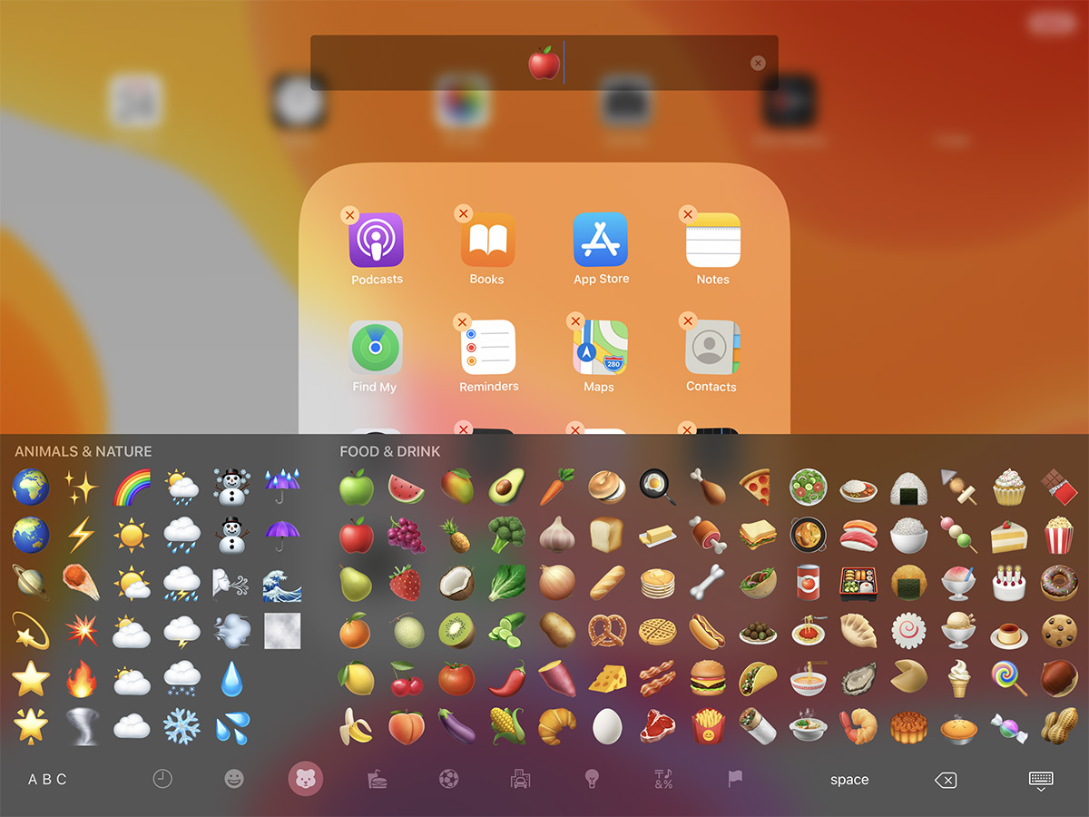
There may be no "Escape" key... no function keys... but there is a "Global" key which summons the on-screen emoji keyboard. This is so much more useful than the crappy little "TouchBar" on my Mac which takes forever to navigate emoji with. I wish they would give us this in
The trackpad confuses me. In the best possible way. What I find confusing is why I would ever need to use it since I have a massive touch display floating in front of me. Wouldn't it be better to just tap on the screen instead of the trackpad? Well, not always, as it turns out. First of all, your hand doesn't get in the way of viewing the display when you use the touchpad. Second of all, the way the "mouse pointer" works when you use the trackpad is really beautiful. It doesn't just stay an arrow (or, in this case a big dot)... it morphs, changes, and sticks like a magnet as you move it over elements like buttons and text and such (not everywhere and not always, alas, but when it does it's magic). So very elegant and useful. Which is to say it's so very Apple. I dearly love the way the trackpad works with iOS and can't help but wonder if this kind of thing would translate well to
On the functionality side... the entire trackpad surface is a button you can press but, unlike on my MacBook which fakes a "click" by providing force feedback when you press down, this trackpad actually physically clicks. I'm guessing this is due to the smaller size making physical clicks more feasible than on the massive trackpad on Apple's laptops. It feels good. Not just for clicking but for tracking and dragging. I wish it had a bit more "tooth" to provide physical sensation for your fingertip, however, because it's really slick. Of course the trackpad supports gestures (like multi-finger swiping) and click-dragging, which work much like my MacBook Pro... though they are a bit more difficult to use on the smaller surface.
The Magic Keyboard comes with a
When it comes to actually protecting your iPad, I'm going to say that the Magic Keyboard doesn't do much there at all. There's essentially no cushioning or protection for the sides and corners. Indeed, the only thing you get extending past the iPad structure is part of the weak seam where the Magic Keyboard parts are heat-sealed together! This is shockingly lame, and one of the main reasons I'm so mortified that I paid $350(!) for it. I'd have hoped for some protection, but got practically nothing. The screen is protected and that's it.
One final note that I find kinda silly... there's a cutout for the camera bump on the back. So if you want to take a photo with your iPad, you can lift up the entire iPad/Magic Keyboard assembly and snap a picture... even though the angle of the iPad on the Magic keyboard is really silly for this. Anybody wanting to snap a photo will most likely just pop the iPad off the Magic Keyboard to do it. But, hey, I guess they had to do something to accommodate the camera bump back there, so why not?
And so...
Am I keeping it? Am I willing to just eat the $350(!) cost despite my not thinking it's anywhere near worth that much?
As I understand it, Apple has extended their return window, and so I have some time to decide. But, odds are, I will probably hang onto it. Despite value-for-the-money not being there, it is a really nice keyboard. And given how iPads are so very quickly getting to the point where I will be able to do actual work on them (in addition to the drawing and painting work I do now) I'll be needing a nice keyboard for extended typing tasks.
But THREE HUNDRED AND FIFTY DOLLARS(!) FOR A KEYBOARD? Damn, Apple, that seems absurd... even for you.
UPDATE: The soft-touch vinyl(?) cover is already showing scuff marks, which is rage-inducing. THREE HUNDRED AND FIFTY DOLLARS(!) and you can damage it with your fingernail? Seriously? For that kind of money, couldn't Apple have made it with a tough fabric cover that will hold up to even the most minimal abuse? What a shitty, shitty design decision. Used to be with Apple you paid more because the quality was better. Not so much with this Magic Keyboard embarrassment.
 The last iPad I bought was the 1st generation 9.7-inch iPad Pro four years ago in 2016. It was my second iPad and, at the time I purchased it, the intent was to use it as a laptop replacement for travel. That didn't work out at all. It just wasn't capable enough for me to do real work on it. Any time I traveled with my iPad, I had to have my MacBook with me as well. Still, it was good for watching movies on the plane.
What the iPad did do for me was revolutionize the way I draw and paint digitally. Thanks to its blazing speed, virtually non-existent parallax, and low latency (with the right app)... plus the fantastic responsiveness of the Apple Pencil stylus... everything changed. I found it to be a better experience for creating art than an expensive Wacom Cintiq tablet paired with a high-end computer! If there was a flaw, it was that the 9.7-inch size was too small for me to work comfortably, and I regretted quite badly that I didn't spend the money to buy the 12.9-inch size.
In November 2018 Apple released their 3rd generation model iPad. It was compelling enough an upgrade from my older model that I started saving $50 a month until I could afford one.
A month ago Apple released their 4th generation model iPad Pro. It was definitely time to upgrade now, but I had only saved up $700 of the $1000 price tag. Then quarantine started dragging on so I figured I might as well blow through some of the vacation money I had been saving since I won't be using it any time soon... and went to order me a new 12.9-inch iPad!
Much to my horror, the specs stated that my 1st generation Apple Pencil wouldn't work with the new model and I would have to spend an additional $130 to buy an upgraded one of those as well. It would be another month until I could get the money together for that, so my plans were put on hold.
Eventually I managed to scrape the money together and order... then today it finally arrived!
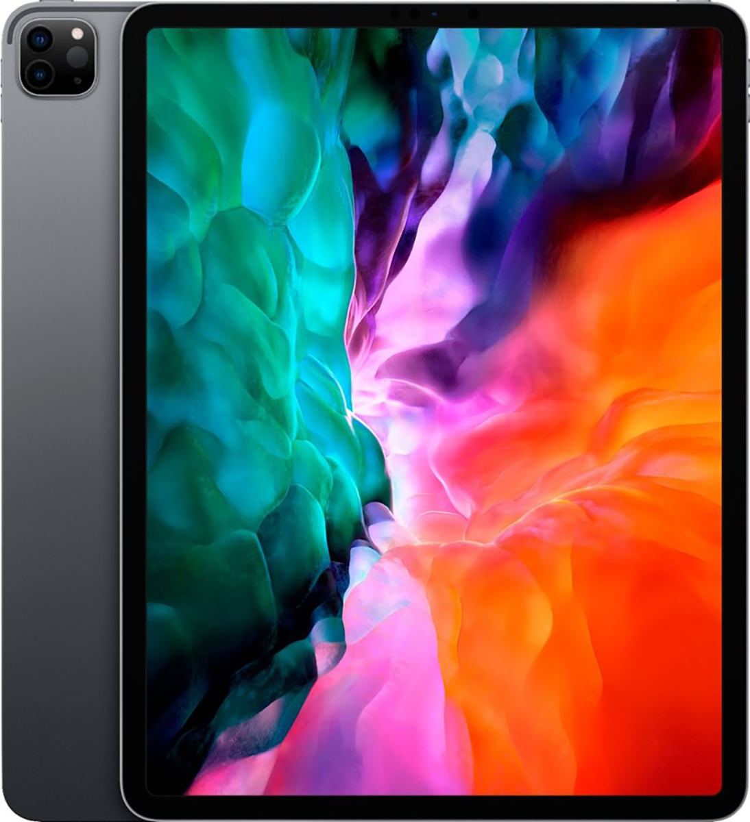
And now for my thoughts...
Holy cow is this thing beautiful. And so impossibly thin! It's like a thick sheet of glass with metal on the back. I honestly don't know how they manage it, and thinking of how far technology has come in my lifetime makes my head hurt.
My old iPad was pretty darn fast, even when running modern apps. But this thing is ridiculously speedy. Everything happens instantaneously. There's no delay for anything. It's kinda how like you dream your computer would work... except it's reality. What I don't understand is why Apple put in an A12Z chip instead of the newer, faster, better A13 chip that's in my iPhone. The A12Z has an additional core compared to the A12X from the previous iPad (8 cores instead of 7) which aids in some areas, but it's a minor upgrade at best. If you're going to use a new chip, why not go with the best you already have instead of spending the money to retool an older one with minimal effect?
The "new and improved" $130 Apple Pencil drawing stylus is actually "new and improved." It has a matte surface instead of a glossy one so it also has a more natural texture when you grip it. I also like the thinner diameter (which I know some people do not). But the absolute best part? You don't have to plug it in to charge it! It magnetically attaches to the iPad and charges wirelessly in either direction (nice for lefties and righties)... but only on the right "long-side" of the iPad (when held vertically... it's the top when held horizontally). As a side benefit, the flat "charging" side of the Pencil means it won't roll off the table. Where the Apple Pencil is just frickin' brain dead is that it's not reversible. Most styluses can be flipped to erase something (mimicking a real-life pencil eraser). STILL NO ERASER ON A $130 STYLUS IS UNFORGIVABLE. They do have a tap sensor on the pencil, however. In Procreate a double tap switches to the eraser. Another double tap goes back to your pen. This is a really nice way of working, but I still don't understand why a stylus costing a fraction of what Apple's charging has an eraser end when Apple's doesn't. Even so, I like this stylus 1000% better than Apple's old one. If I have a complaint, it's that I don't understand how it costs $30 more than the previous model.

Back to the iPad itself... the larger size of the 12.9-inch model is far, far better for drawing and painting. Not as comfortable to hold, of course, but much easier than a tablet hooked up to a computer. EXCEPT... thanks to a feature called "Sidecar" you actually can hook your iPad up to your computer if you want to (assuming it's a new enough model to support it)...
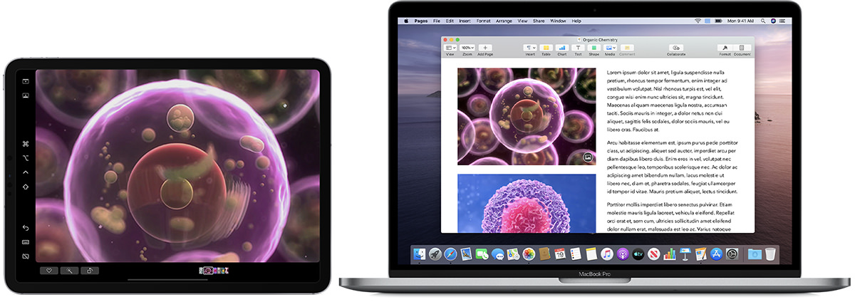
But it gets better... MacOS X apps which support pressure sensitivity can inherit this data from the iPad! Below is not a screenshot of my computer screen, it's Photoshop on my iPad in Sidecar mode. I drew a mustache on Jake to show how the pressure sensitivity on brushes allows you to get thicker lines as you press harder...

Not as flawlessly responsive as when using an iPad-native app like Procreate, but still perfectly useable! This is next-level-amazing, because now I won't have to save up $1,200 to get that Wacom Cintiq Pro 16 display tablet I've been dreaming of. My new 12.9" iPad is able to sit in for a 15.6" tablet, and still be useable as an iPad on its own! Disconnect the Cintiq from your computer and it doesn't do anything. iPad truly is the best of both worlds.
Not that I wouldn't love to have an even bigger screen than 12.9-inches but, finances considered, it's absolutely big enough. Still, can you imagine if Apple were to unleash a 16-inch iPad? A 20-inch iPad? As display technology gets more amazing and cheaper, it's gonna happen. The pro creative market pretty much demands it. Apple could match Wacom Cintiq models size-for-size and price-to-price and corner the market with display tablets that are also fully iPad-functional.
The display on this thing is brilliant. I mean really brilliant... as in bright and beautiful. I don't even need to turn the display brightness to maximum like I usually do! Colors are lush and saturated. The refresh rate is a mind-boggling 120Hz and buttery smooth when dragging shapes I've drawn. Just like my older iPad, it's still too slick for me to draw comfortably. To help with this I've ordered a
I don't think I've ever used the camera on either of my past iPads. My iPhone is better and more capable for taking photos (not to mention handier since it's always in my pocket). Never-the-less, the new iPad Pro has gone dual-lens with a wide and ultra-wide lens if I ever need them. The big technology here is the brand new LiDAR (Light Detection and Ranging) Scanner which can accurately map out your surroundings for things like Augmented Reality. I haven't had a chance to play with this much, and I don't know that it's something I will ever use regularly, but it does give us a hint as to how big Apple is betting on AR for the future.
Something else I haven't used in previous iPads was the front-facing "selfie" camera. But in the age of social distancing when video-conferencing has become the norm, I've found myself actually using it. And Apple's camera works fine... when the iPad is held vertically. But since I use my iPad horizontally the vast majority of the time, it's just bizarre. People can see me fine, but I'm looking off to the side and I got a comment that it's a bit disorienting. You may be thinking "All video conferencing cameras are like that!" and you're right. But it's very noticeable in horizontal mode because the camera is on the side of your screen instead of on top of it. And there's another problem there too... when held in portrait orientation, there's a good chance your thumb will cover the camera needed for FaceID unlock. Apple really, really needs to rethink this and put a camera for both vertical and horizontal orientations. Transmitted sound is really good, and I'm told it's not as "tinny" as my old one when I asked about it during video chat. Likely because Apple says they are using five "studio-quality" microphones.
There's no headphone jack, of course. I have AirPods so this isn't a problem, but I sure wish I could use my high-priced headphones from 1994 with the iPad and not have to use an adapter. Right now, my MacBook Pro is the only thing left which has a headphone jack. That being said, the sound quality coming from the built-in speakers floors me. Just as with my iPhone before this, I cannot comprehend how such good sound can come from speakers so thin! And, unlike the cameras, Apple has made darn sure that your stereo experience is good whether you hold it vertically or horizontally (though horizontal seems to give better dimension to the sound because the speakers are further apart). There are four speakers, two on the top and two on the bottom, and they seem to adjust automatically depending on the orientation of the iPad. So nice!
Given how stubborn Apple can be about cables and connectors, I was pleasantly surprised to see that the 2020 iPad has USB-C instead of Apple's proprietary Lightning connector. Granted, before USB-C was invented Apple had to do something to get away from the "this-side-up" idiocy of older, larger, slower USB connectors... but given how USB-C is on everything else Apple makes and working great, it seems silly to hold out on the iPhone. Hopefully that will be remedied soon.
And then there's the iOS that's running everything...
=sigh=
Having the greatest tablet hardware in the world means very little when the software isn't up to the task. And iOS is mostly there. But not completely. The gesture-based multitasking is just plain bad. It's confusing, complicated, unintuitive, and sometimes I can't even get it to work correctly (and never understand why). Sadly, this makes an otherwise amazing product feel half-baked. Given Apple's long history of sublime user experiences and interfaces, this is baffling to me. There are a number of "proof of concept" videos out there showing better alternatives to how Apple is doing things, yet Apple themselves just sits on their hands? Why? I can only imagine it goes back to their preposterous stubbornness (which was responsible for their laptops having shitty keyboards for years). Well, get off it, Apple. You can do better than this. You need to do better than this. The power users you're courting to break free of the "home and hobby" mindset of a tablet not being a "real" computer isn't going to change until you do.
And so...
In all the ways that matter, the 2020 iPad Pro is not that different from 2018 iPad Pro. It has one more core in the CPU and a LiDAR sensor that's of limited use, and that's pretty much it. But when compared to my 2016 iPad? It's a pretty big upgrade. And not just because I went from a 9.7-inch screen to a 12.9-inch screen... it's faster, smarter, and more capable in every way. And when you couple that with the fact that I can use it as a display tablet when hooked up to my desktop Mac? It's a phenomenal value... even with the $1,000 price tag (or, if you include the $130 Apple Pencil stylus I had to buy, the $1,130 price tag).
We are rapidly getting to the point where computers and tablets are converging. This is more apparent when you look at Microsoft Surface and the slew of touch-screen PCs being released, but things seem more kludgy on the Windows side than with Apple's more purposeful iOS/MacOS convergence. Next year Apple is said to be switching from Intel chips to their custom ARM chips in their Macintosh computers. The next step will be to have an iOS layer on MacOS to run iPad apps natively. Then, once all the apps have gone to iOS for the Mac, the MacOS is no more. As technology gets smaller and faster, it's pretty much inevitable. I have to wonder if it will be less than 10 years before you can get an iOS desktop? I dunno. More likely, it will just be iPad. And if Apple gets off their asses and stops being so stubborn, this might not be a bad thing.
To be honest, I would have rather spent my vacation money on an actual vacation. But, I am quite happy with my new iPad and am grateful to have gotten it ahead of schedule. Hopefully it will unleash my creativity and be worth the price.
