
 Apple had their "Mac Week" this week. Except it was more like "Mac Part-Week" because they stopped announcing new stuff after three days. I was fully expecting updates across the entire Mac line... iMac, Mac mini, MacBook, Mac Studio, and Mac Pro (or possibly some new Mac-based HomeKit device or wildcard tech).
Instead we got iMac, Mac mini, and MacBook.
Which ain't nuthin', but still.
iMAC
I bought the first Apple Silicon iMac with the M1 chip back in 2021. The only thing I didn't like about it was the color. The original yellow model I got was too light and the yellow aluminum looked like urine. It was so bad that I exchanged it for blue because the photo looked nothing like what Apple showed on their website. The new models have deeper, more vibrant colors, so my one complaint was addressed...
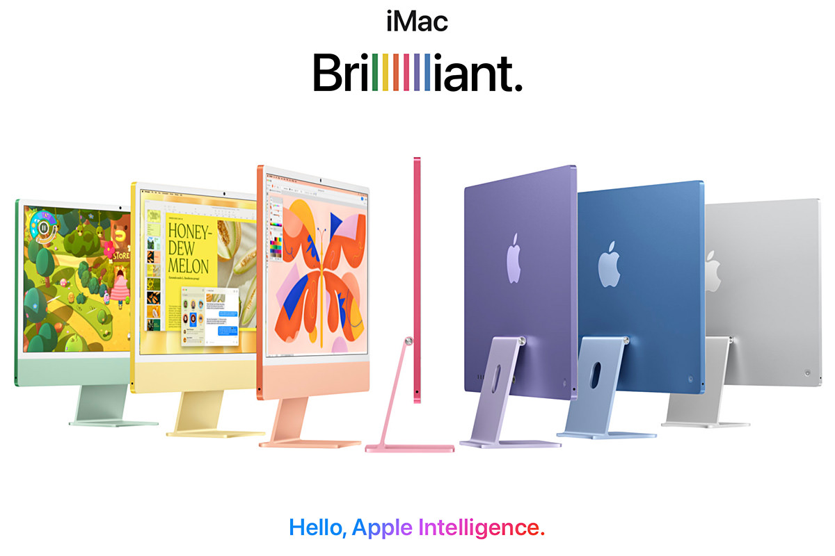
My iMac is mostly used for video conferencing. It's exceptional for that. I do work on it too, and the M1 chip is plenty good for the basic stuff I do on it. I won't be upgrading.
MAC MINI
The new mini is more mini than ever before. I want one, but not because I need it for anything. I just want one because it's so darn adorable...
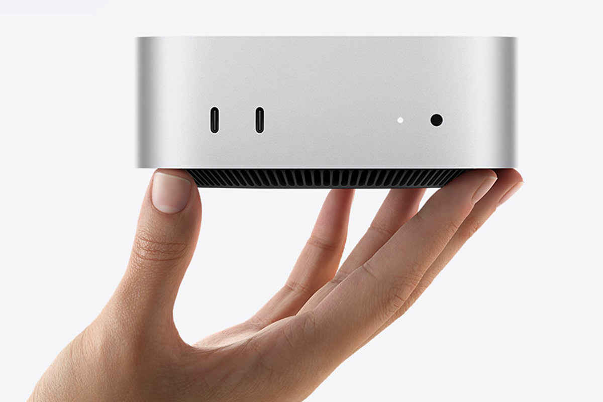
The price is pretty good for the power you get. If I didn't have a NAS already, I'd buy one to hook up to a RAID and use it to serve files at home. NAS drives are usually so embarrassingly underpowered with last-gen chips and barely enough memory. With Mac mini I could build a better, faster, more-powerful NAS for the money. But, I don't have a bunch of cash laying around, so I'll just be sticking with what I got. It's fine.
MACBOOK
And here we are. The one temptation which might be too good for me to pass up. I skipped last year's M3 Max upgrade because it wasn't a hefty enough upgrade to my M2 Max (which was an upgrade from the year before). But the leap from M2 Max to M4 Max? Well. That's another matter entirely. I use my MacBook for serious work. The most demanding of which is 3D rendering. It takes a lot of power to do that quickly...
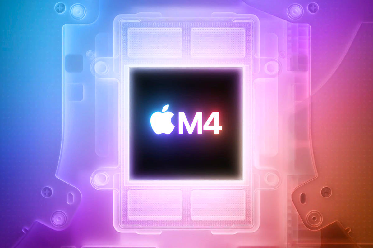
The M4 Max is 3.5× faster than M1 Max. So it stands to reason that it's around 2.5× faster than the M2 Max. Or thereabouts. Even if it's just twice as fast, that's a game-changer for me. To finish a render in half the time? I dunno, man. That's a lot of time saved. That might be worth it. And so... I'll be waiting to see the benchmarks. If there's a significant leap, like two times or two-and-half times, then I may not be able to stop myself from upgrading. Dangit anyway. That'll be a good chunk of money I can't afford, even with trade-in. Though the matte display option is kinda the icing on the cake.
 A while back I introduced everybody to Lemon, my yellow iMac.
Except the yellow that was advertised on Apple's website was absolutely not the yellow I got. What I got was a gold iMac. It's colored shades of gold and urine-stained aluminum. At first I was just going to live with it... despite being more than a little upset that I spent $200 extra just to get yellow in the first place. But... it's not yellow...
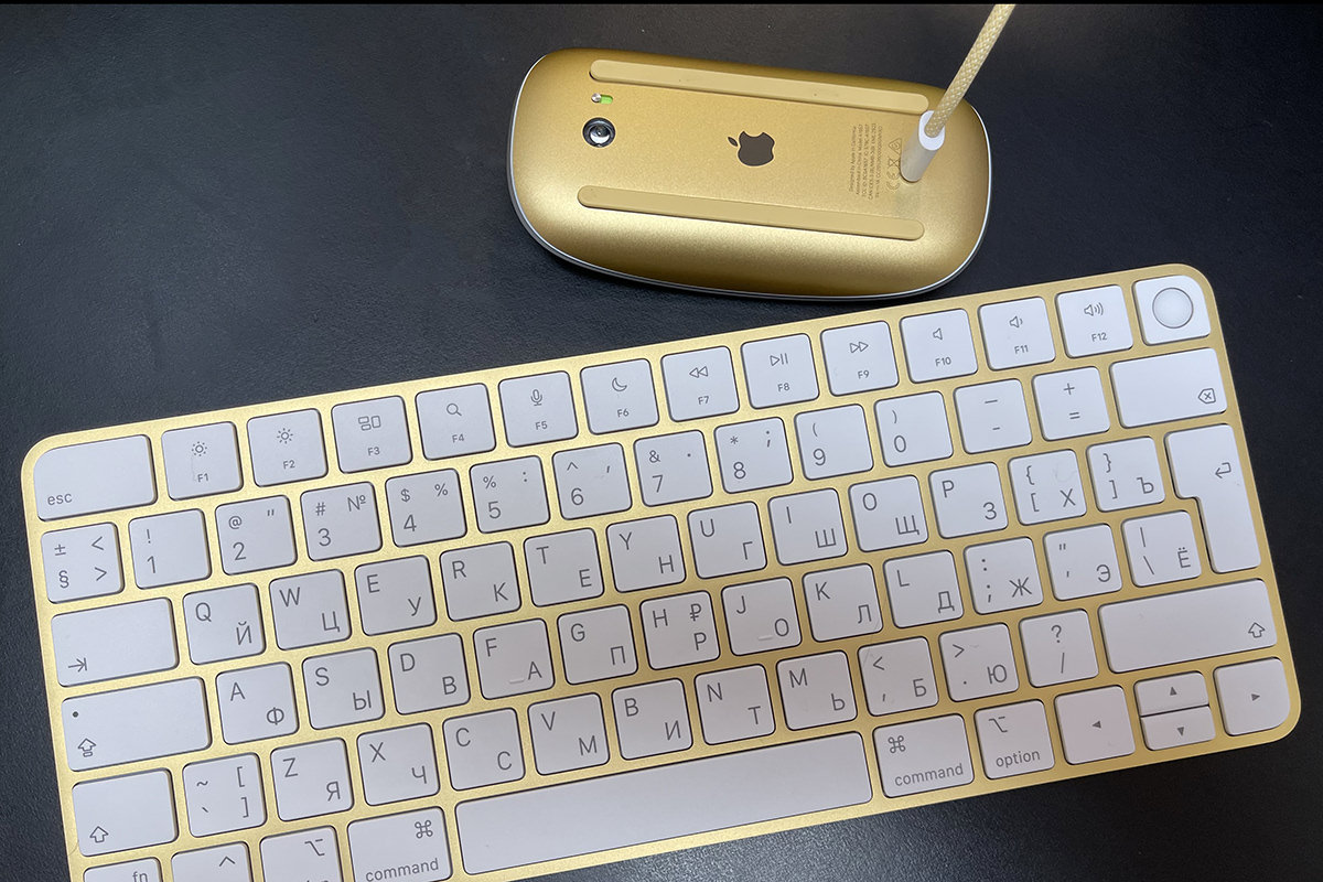
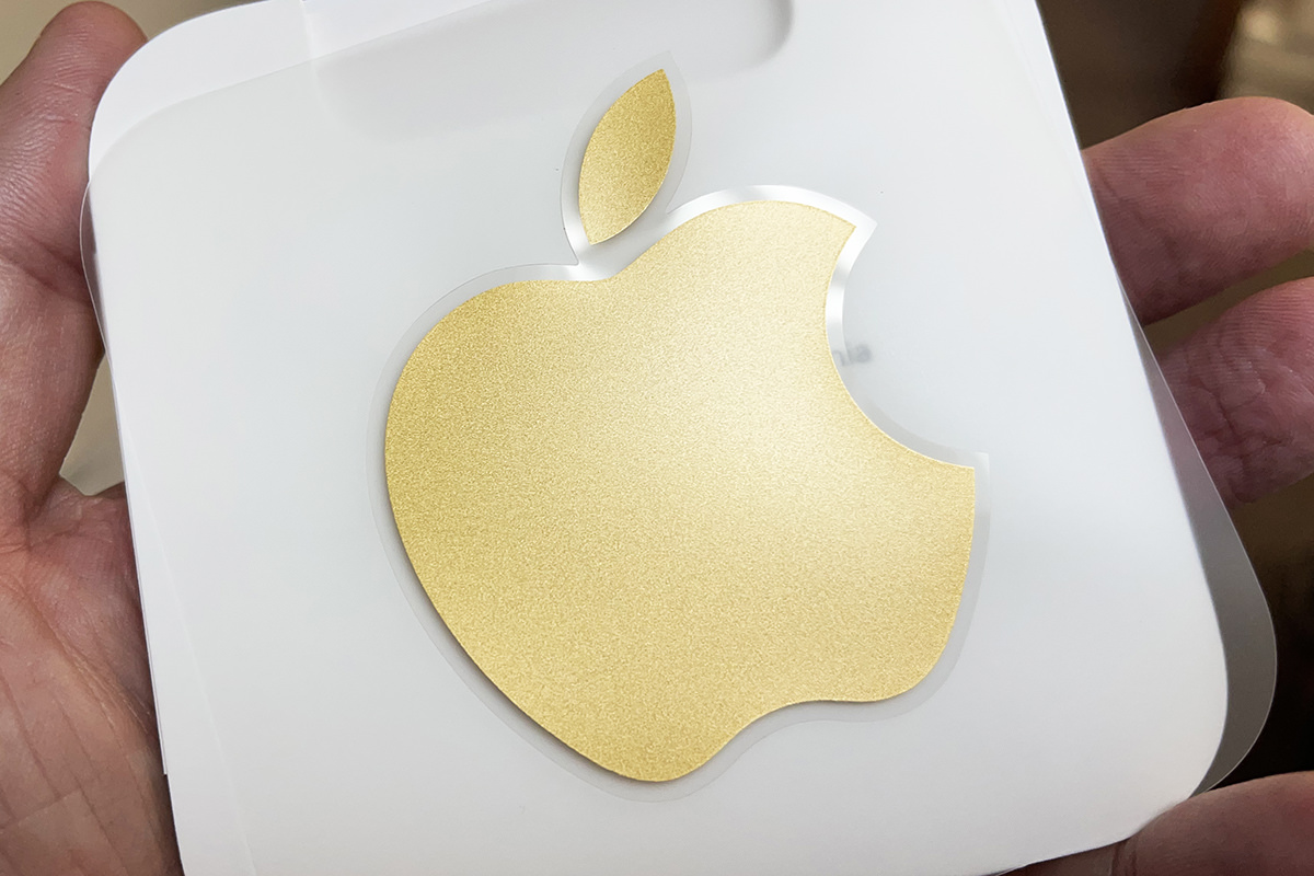
Heck, even the sticker that comes with the thing is very clearly GOLD...
But then...
With each passing day that I sat down at my computer, all I could think about was having a tacky gold and urine-stained abomination in my house, which was disturbing.
And I wasn't the only one who noticed it. Many people reviewing the "yellow" iMac commented that it was actually gold...
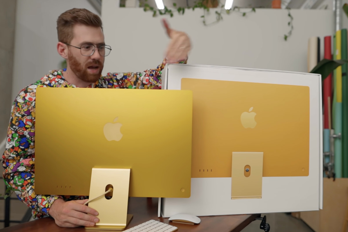
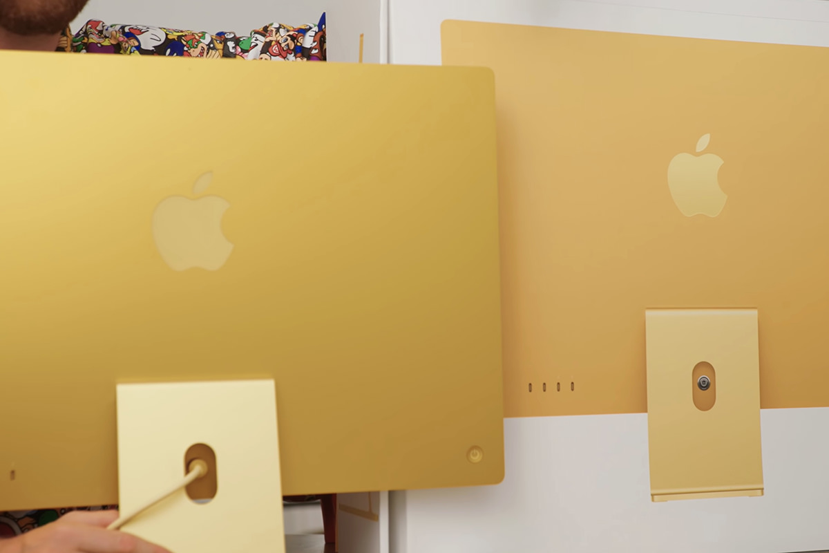
Taken from Tyler Stalman's unboxing and review.
Now, some people may love the gold, and more power to them. But since I don't live in the Trump Tower penthouse, I called Apple to voice my dissatisfaction.
Their solution? "Oh. We'll just exchange it for a different color. What color do you want?"
Apparently when Apple says "Free Shipping & Free Returns," they actually mean it. So... good on them, I guess. But just think how all of this could have been avoided if Apple would use actual photos on their website instead of Photoshopped color-adjusted photos. Because, seriously, the only way I could replicate Apple's "yellow" image is via Photoshop.
This is really dishonest on Apple's part, in my humble opinion.
At least they made it right at no charge to me though.
But anyway...
I replaced Lemon with the same iMac, but in blue. The only difference was that this time I got a matching blue Magic Keyboard with TouchID in American English and ordered an add-on Magic Keyboard in Russian. This way I can have an easier time typing in English... which I do 98% of the time... and just grab the silver Russian keyboard when I need to type in Cyrillic. The upshot being that Apple ended up making an additional $100 of me in the exchange because of it.
The blue iMac is closer to what you see on Apple's website. The lighter blue on the iMac stand (along with the mouse and the keyboard) is a nice steel-blue metallic aluminum color... the back is a gorgeous deep blue color. And the "chin" on the front is not a bright baby blue as I was fearing. It's more of a flat sky blue that has a little grey in it so things don't look ridiculous. So, all in all, it's a far better fit for me than the heinous gold thing was...
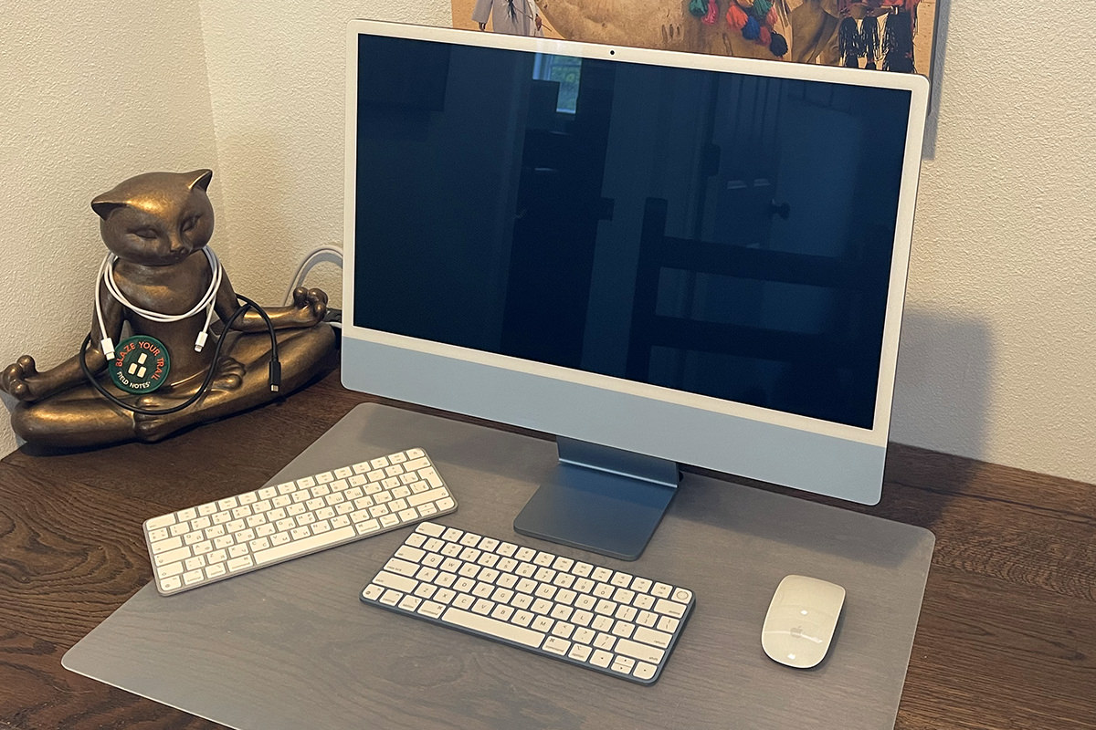
They must have been out of blue mouse charging cables, because mine is for the silver iMac... but it looks fine.
My guess is that some crafty companies will make cling-skins for the "chin" which you can pop on in a variety of designs. I will likely be cashing in on one of those if I can find a design I like. I'd be happy with just plain dark blue to match the back, to be honest.
Setup was a piece of cake because I just used a Time Machine backup to copy everything over from the gold iMac. Once I rebooted it, everything was just as I left it. All that was left to do was wipe the old iMac's hard rive, put it back in the box, then call FedEx.
And there you have it. My all-new NEW iMac.
I am still calling him "Lemon" though, even though he is blue. I'm too attached to the name after using it for the past couple weeks to want to change it.
 Before I get to my latest frustrations with Apple...
One of my favorite movie franchises is Kingsman. It's James Bond films for a new age and the first one was sublimely good. Smart, funny, thrilling... it had it all. The second movie faltered quite a lot, but was still good entertainment. Now there's a prequel called The King's Man which, despite the shitty kerning on the title logo, looks very good indeed. And now a trailer has landed...
I talked about the logo here... but this is what's so horrific to design-minded people...

But anyway...
Apple has built a business around making computers easier and more seamless to use than other computer manufacturers. "It just works" is the mantra that they bash you over the head with over and over again. And that's a pretty compelling reason to get a Mac, and a very cool perk which comes from owning one.
Until it isn't.
That's when it makes you want to hop a flight to Cupertino and start throat-punching people.
My photo cataloging software is Adobe Lightroom. The full-resolution original photos themselves are stored on my NAS file server, but Lightroom keeps a catalog of thumbnails on your local drive to speed things up. It's a pretty great system which allows me to have terabytes of photos... but only have to keep around 100MB on my local hard drive.
Last night I decided to install Lightroom on Lemon (my new iMac). I was originally just going to AirDrop my catalog files from my MacBook Pro to Lemon. But since the MacBook Pro doesn't have WiFi 6, it was going to take nearly an hour to copy. No thanks. Instead I grabbed the USB-C power cable off my MacBook Pro charger and thought I'd just put the laptop into "Target Disk Mode" which turns it into a big hard drive.
Easy, right?
Not really. I fired up the MacBook Pro in "Target Disk Mode" and it wouldn't mount. For whatever reason, Lemon couldn't see it.
What the hell?
A quick Google search reveals that Macs can, in fact, do "Target Disk Mode" over USB-C... but only if you use a special designated Firewire cable.
And the cable Apple includes with their pricey charging brick... isn't.
This meant I had to dig through a big box of cables until I found a USB-C that was Firewire compatible. Which is tough because manufacturers other than Apple don't seem to mark their cables with a little thunderbolt logo. Eventually I found one in an old hard drive box that had a Firewire logo on the tag that tied it together. I plugged it into my MacBook Pro in "Target Disk Mode" and the hard drive came up.
Eventually.
It took several moments. It started working just as I was going to unplug the thing.
So surely it should be easy now, right?
Lord, no.
Using the MacOS Finder to copy the Lightroom catalog files took frickin' forever because it was stuck on "Preparing to Copy"...
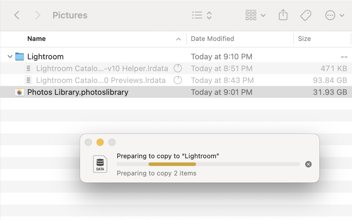
Time to install ChronoSync to see if my backup software would go any faster.
The answer is yes and no.
Yes it was faster to initiate the copy... but the copy itself? It never went over 70MB/second. Even though the Firewire 3 port on my MacBook Pro and Thunderbolt 4 port on Lemon can (theoretically) transfer 40GB/second. Yes, you read that right... I'm getting less than 70 MEGAbytes a second when I should be getting 40 GIGAbytes a second.
I mean, yeah it was faster over cable... 20 minutes instead of an hour via WiFi... but still, this is really shitty. Factoring in the 30 minutes it took for me to get "Target Disk Mode" working, and I ended up saving a whopping 10 minutes over just AirDropping the stupid thing over WiFi.
So... uh huh... somebody at 1 Infinite Loop needs a throat punch. Bad.
I'm not ruling out that it was the cable that was the limiting factor, but a hardwire transfer of any kind that can only sustain 70MB/second transfer is pathetic and embarrassing.
But oh well. Despite the monumental waste of time, Adobe Lightroom is functioning flawlessly... and it positively flies on the M1 chip in my iMac thanks to Adobe investing the time to make it run natively on the hardware. It really is astounding to contrast and compare using the software on my MacBook Pro vs. my decidedly non-Pro, consumer-model iMac.
There's good news though. It only took Lemon 6 minutes to backup the new data to the attached Time Machine Thunderbolt 3 SSD backup drive. Much more inline with my expectations of how long it should have taken to get the data to be transferred to Lemon in the first place.
 First I talked about deciding what specs to order for my new iMac. Then I talked about the design of the thing yesterday. And now I suppose I should talk about actually using Lemon (which is what I named my shiny new yellow... er... gold computer).
When it comes to my iPhone, I am a part of Apple's iPhone Upgrade Program. I make a monthly payment for the iPhone, AppleCare, and Theft+Loss... and, in exchange, Apple lets me upgrade to the latest model iPhone every year. It's a pretty sweet deal, because I can't afford to pay $1000 for a new iPhone model every year. The down-side is that I don't own my phones. I have to return them to Apple when I upgrade. The only way I get to own my phone is if I skip an upgrade and make payments for two full years. I never do this. I'd rather have the latest iPhone than an old phone that loses value with each passing minute if I were to pay it off.
But there is no "Mac Upgrade Program."
So when it comes to my Macs, I use them until they fall apart, or can't run my software, or die (as in the case of my last iMac).
As you can imagine, it's always quite a shock getting a speedy new Mac after using nothing but old hardware for years and years (my iMac was 12 years old when it finally died, and my iMac at work is 7 years old). My MacBook Pro is my newest Mac (purchased 2019) and the fastest Mac I own, despite being the cheapest model available at the time (hey, I was on a budget!).
My new iMac 24" positively smokes all of them.
I am not kidding. This thing with it's new M1 chip is unbelievably zippy.
But before we get into it all, it's important to bring up the elephant in the room... to get the best performance out of your Mac, you need to be running native apps for the M1 processor. Anything that's not native (i.e. written for old Intel Macs) has to be run under an emulation layer that Apple calls Rosetta 2 (the first Rosetta was from 2006 when Apple made the relatively seamless switch from PowerPC chips to Intel chips).
You would expect that any Intel apps that have to use Rosetta 2 emulation would run much slower than on actual Intel-based Macs. And they probably do. But when comparing my 2-year-old MacBook Pro with emulated apps on my new iMac via Rosetta, the performance is very close. Meaning that I don't actually lose anything by running non-native apps on Lemon.
Native apps are called "Universal" (because it runs native on the M1 and will also run on Intel), which you can see in the Get Info box...
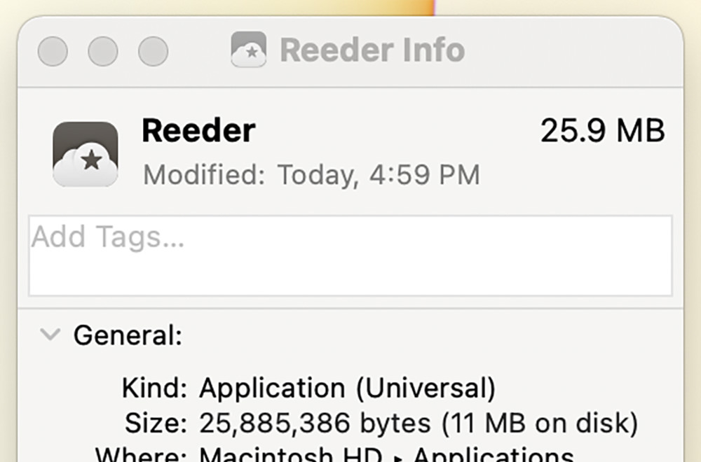
Whereas Intel apps are called "Intel" in the Get Info box...
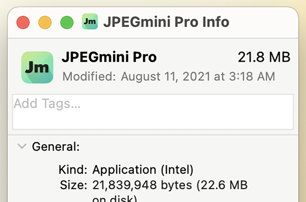
Fortunately, a lot of the apps I use have been compiled to run M1 native. This includes Adobe Photoshop, Adobe Illustrator, Adobe InDesign, and Adobe Premier. There are a few things in these apps that aren't working yet (so if you need them you'll need to run them in Rosetta 2 mode) but those features are things I don't use anyway.
And let me tell you, the M1 native apps absolutely fly.
Working on large files in Photoshop and big documents in InDesign is positively dreamy. Everything is so snappy and so smooth. Something that would be impossible with just 16GB on an Intel Mac. InDesign is a particularly crappy app to use because just scrolling through pages with lots of images is a jerky mess that will have you screaming at your computer. But on my new iMac? Butter.
Kinda.
As I mentioned in part one, I put the $200 upgrade I had into 16GB of memory. I do not regret this choice, because the work I do benefits from having extra room to do the processor-intensive stuff I do. I didn't want to put that $200 into getting extra storage because all my files are stored on a NAS network file server. Why invest in storage that I won't use?
The answer is that on-chip storage makes loading my big documents much, much faster. Which means I can start work quicker and get more done. Loading files from my NAS over WiFi is pretty good speed-wise because the iMac has WiFi 6, yet far slower than from internal storage. Once my iMac has the file loaded everything is super-speedy though, so it's all good.
But when I transfer the files to Lemon's internal storage and load them from there? Good Lord. It's almost instantaneous! Not even enough time to take a sip of Coke Zero! The files are just... there! It's computer Nirvana.
Which makes me wish that I had the extra cash to have purchased more storage. The iMac tops out at 2TB of storage. But I didn't have $800 to make that happen, so I went with the base 256GB.
If I ever need to use Lemon for serious work, I'd probably end up moving my NAS from downstairs to upstairs so I can plug it in directly. That would speed up file-loads a bit (but not huge because the iMac is limited to a pokey 1GB ethernet port instead of the 10GB that my NAS can dish out).
So, yeah, I'm positively thrilled with the performance of the 2021 iMac 24".
And this is a consumer machine! Can you imagine what the Pro models will be like?
Well, my work iMac is going to die eventually, so I guess we'll see sometime in the future.
Because the future of the Mac is clearly on Apple silicone like the M1.
 I have a deep love of finding beauty in every day objects.
Many a time I have spent more for something because it looks nicer than the competition. My kitchen utensils, for example. The basic corn peeler you can buy is functional and cheap. But the OXO Good Grips corn peeler looks nicer. It's pretty black and yellow. Probably works the same, but I like the look of it. So I pay extra to get the OXO Good Grips version and am happy to do it.
It will come as no surprise that I'm a Certified Apple Whote.
Apple has built an entire industry over making their products look better than the competition... sometimes at the expense of features and functionality. Yet the trade-off doesn't matter to me. The specs for Apple devices are always enough for me to work within, so I am always all-in on their products. Always have been. Sure there are a few products they made that weren't the best (that stupid-as-shit "sunflower" iMac G4 was a grotesque insult to design, and I remain baffled that Steve Jobs ever let it go into production with it's ugly-ass bulb base and heinous neck joint... GOOD LORD!).
Some of Apple's products I purchased knowing that they were shit specs because I just loved how beautiful they were. Take for example the Power Mac G4 Cube. Oh how I loved that thing! It was grossly overpriced for the features you got, but just look! LOOK AT IT! BASK IN ITS GLORY!...
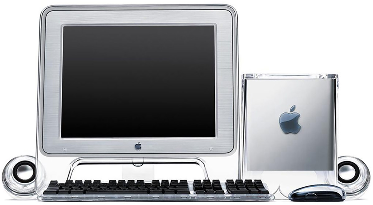
I have thought about buying an iMac mini and upgrading the guts of my G4 Cube many, many times. Then I could buy a better-looking monitor to match it and have one sick-looking showpiece of computing to display in my home!
But it's kinda senseless to go to the expense and effort when I can just buy an all-in-one iMac that looks beautiful in its own way. If I want the Mac Cube to be on display, I can just set it next to the iMac and leave it at that.
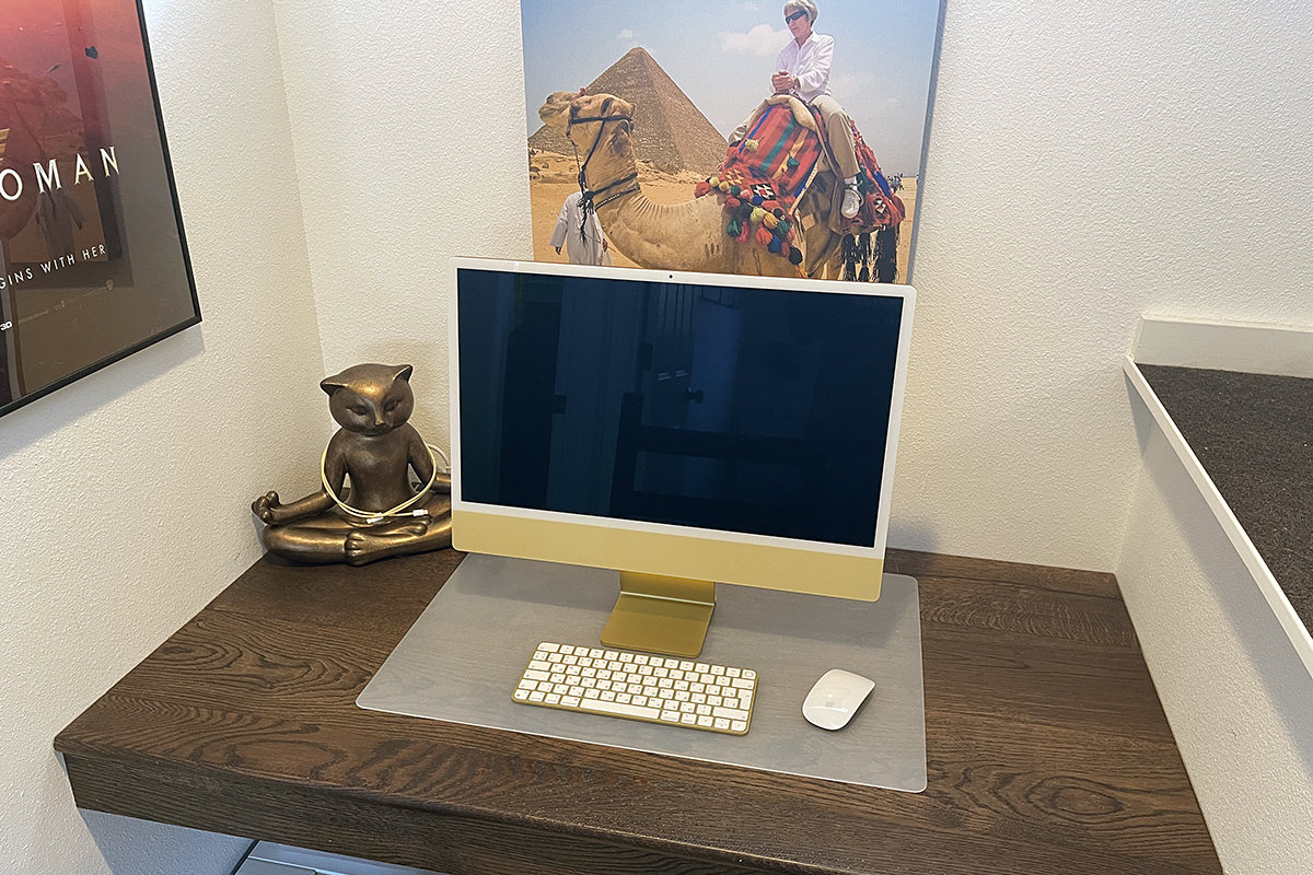
As I mentioned Tuesday, when my ancient iMac finally died for good, I took it as a Sign from Above that I should replace it with one of Apple's pretty new iMacs. More specifically? The pretty new yellow iMac, which you can see here on my built-in-computer desk (a necessity since my cats took over the room I was using as my office)...
THE COMPUTER
When it comes to the design of the iMac itself, the thing is beautifully and impossibly thin. 11.5mm to be exact. And the computer itself (thanks to the all-in-one M1 processor chip that sits in the iMac's "chin") doesn't really exist that you can see it...

Pictures seriously don't do it justice. You need to see it in person to comprehend just how thin this thing is. And the fact that there's just a single cord coming off of it in so many cases (most everything is wireless now-a-days) the thing literally looks like it's made of magic.
So... no complaints about the industrial... but the actual look? Yikes.
THE CHASSIS COLOR
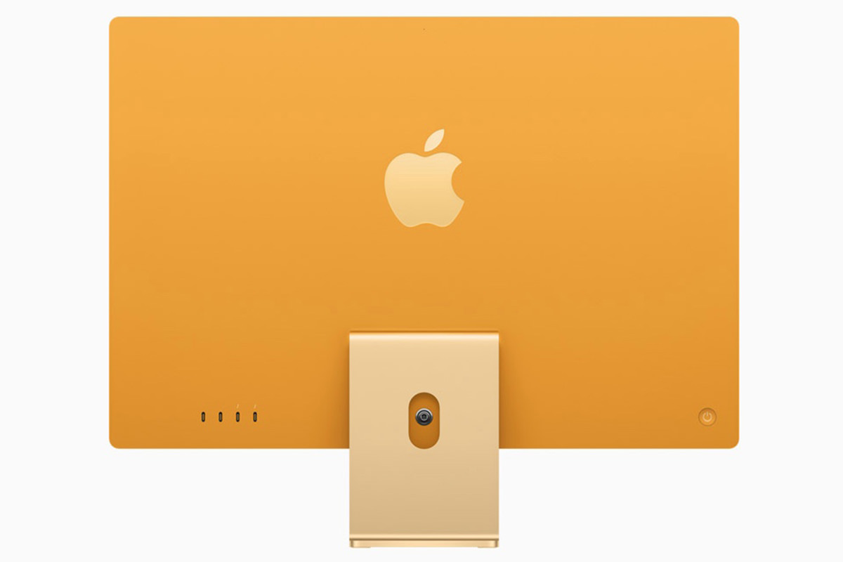
Something I wanted to separate out here is the actual color of your computer. The color on the front is printed on plastic, so it's literally light yellow (as shown in the Apple photos). But since the rest of the computer color is printed on metal, it's not a flat, brilliant yellow like what's shown on Apple's website...

Not even close!
On the metal parts, my computer looks far more "gold" than "yellow." It's actually quite pretty on the back... which I'll never see because my computer is against a wall...
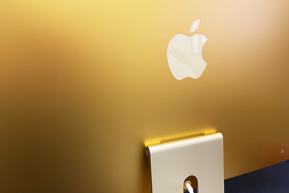
But the metal part I do see on the stand... well... looks like it's... ummm... urine-stained aluminum? It's nice enough when well-lit (as you can see above), but in the shadow that the iMac display casts over it? Looks like urine-stained aluminum to me...
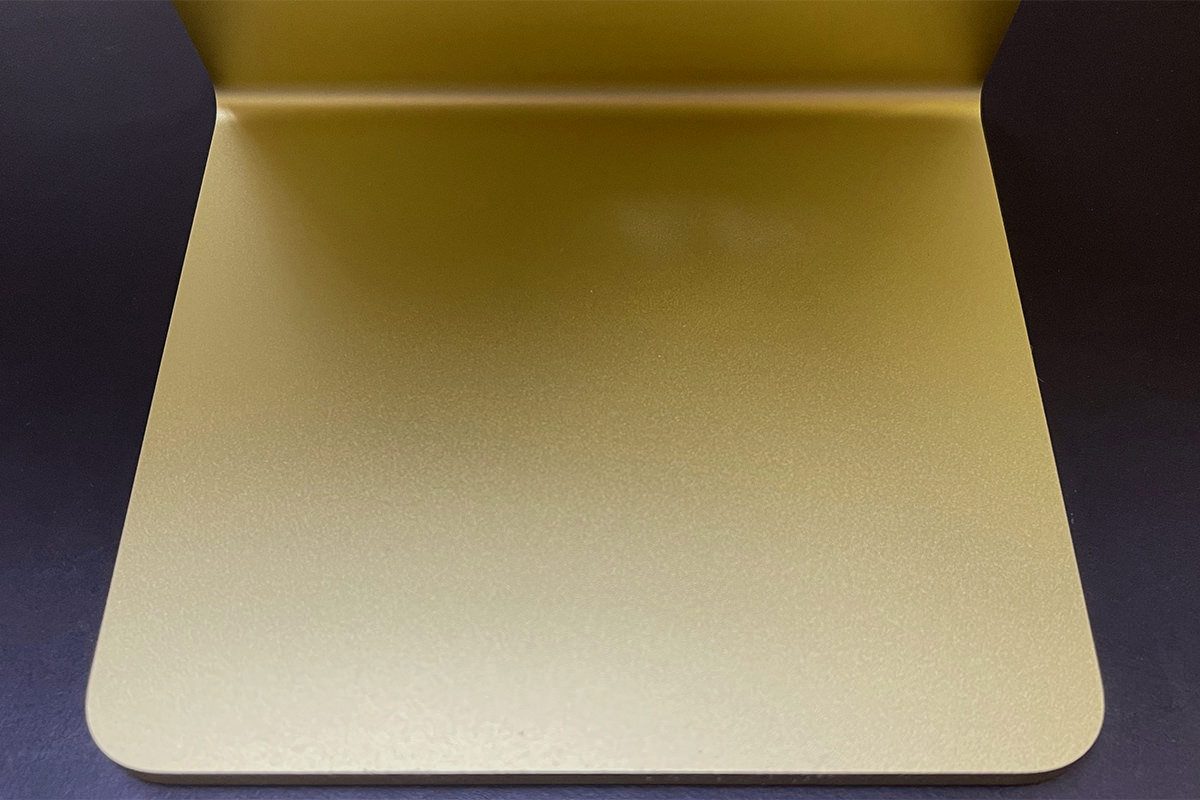
Overall, I think Apple's design aesthetic for the new iMacs is gross and shitty. Three different shades of yellow that don't match, don't harmonize, and look bad together. Maybe it's better on the other colors? I wouldn't know. There's not an Apple Store around her for me to see them. In the end, this is amateur hour bullshit. I definitely regret spending $200 extra to get the yellow color. If it were the same color as on Apple's website, I would have been thrilled. But this is a botched look that is just plain bad and Apple obviously had to Photoshop it so that people would order something that doesn't exist. Oh well. It's not distractingly bad, so it's easy enough to ignore... I just wish that I hadn't trusted Apple and spent the extra $200 for a pretty computer that I didn't get. If you're in the market for one of these things, I highly recommend seeing them in person before you purchase.
THE DISPLAY
The display is a 24" Retina Display that looks as incredible as you'd expect. Since it's bigger than my MacBook Pro and smaller than my 27" iMac at work, I'd describe the size as "cozy." The work I do demands a large screen for efficiency, but this is plenty big to get actual work done (especially since my old iMac was only 20"). Colors are vibrant. Brightness is better than good (actually too bright at maximum brightness!). Contrast is amazing. And since it's Retina, that means the pixels just disappear to make the screen look like a photograph. The glass is, oddly enough, somehow not as reflective as my other iMacs. It feels smooth, so the anti-glare coating must be under the glass. Whatever is happening, the display looks a touch soft. Not as crisp as my other Macs. This is not terrible, but it has taken some time for me to get used to.
The issue that many people have with the display is that it's surrounded by a white border instead of a black one. But, honestly? It doesn't look white when I'm working on it... it looks grey. And kinda blends into the wall that's behind it. It will only look white when you are shining a light directly on it, which you would never do because then you'd be fighting glare off the display. So settle down, yo. The color on the thing is superb. Just look at this...
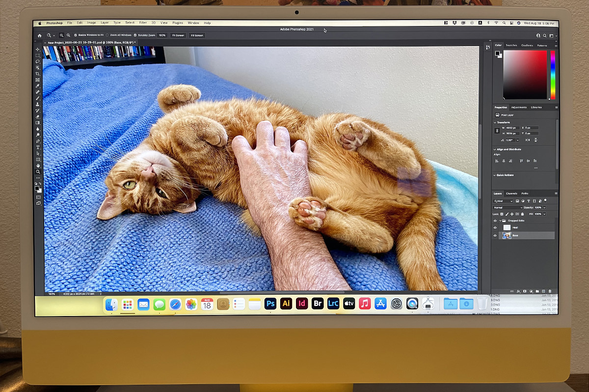
And that photo doesn't even really do it justice.
I have zero problem with the "white" border and don't understand what the fuss is about. The display for my Mac G4 Cube that I showed above didn't have a black border and I was fine with it... just like I am with the "white" border around the new iMac display. It's a complete non-issue, and helps to complete the aesthetic that Apple was going for (which, as I said above, is pretty fucking bad, alas).
THE SOUND
Despite Apple's hyperbolic claim that my new computer would have "The best sound ever put into a Mac," I was dubious. How could it possibly have better sound than my old iMac and my work iMac which have considerably more thickness to them for speakers? Well... I dispute Apple's claim. The sound is good... very good even... but I don't think it's quite as good as my
THE CAMERA
For whatever reason, Apple has consistently put shitty self-facing cameras on their hardware. No clue as to why. But if there's one thing that these COVID times made very clear, Mac users have gotten the short end of the stick when it comes to remote meetings. I Zoom with a colleague and they look great... while my image looks like shit because I'm on a Mac. Thankfully, Apple has finally gotten off of their ass and done something about this. Well, two things, actually. First, the new iMac's camera is 1080p, as it should have been for years now. Second of all, the M1 chip is so speedy that the camera image can be optimized in real time to give a better picture. Something I verified this morning on a Zoom call. Even if the person you're speaking to doesn't have internet speeds that can handle 1080p, the image still looks better thanks to the post-processing that the M1 does. Score. And score. I just find it pathetic that it took a frickin' pandemic to get Apple to do something.
THE ACCESSORIES
Regardless of the color you choose, I hope you really love that color... because Apple uses it everywhere! My keyboard is yellow (gold). The sides of my mouse are yellow (gold). The cable to charge my keyboard and mouse is yellow. The MagSafe power cable is yellow. The desktop background defaults to yellow. It's yellow-palooza up in here! The keyboard/mouse is the same metal as the stand. But since they aren't in shadow like the stand, they look like pretty gold instead of urine-stained. The cables are closer to the color on the front of my computer, but don't match exactly... adding a fourth yellow to the mix that doesn't harmonize with any of the other yellows. What in the hell was Apple thinking here? It would have been better to not match stuff color-wise if it's not actually going to match!

I am studying Russian at the moment, so I got a Russian keyboard. Interestingly enough, the iMac knows what language your keyboard is in when you connect to it over Bluetooth. So when I selected "English" as my preferred language, Russian was added as a keyboard input method automatically. Very cool. Very Apple. The keyboard itself is okay, for the most part. Keys have very little "travel" which is not great, but typing is not overly-difficult. I do wish that it was angled a bit more like my keyboard at work... it's like typing on a laptop instead of a desktop... but I think I can get used to it. INTERESTING TO NOTE: When not typing in Cyrillic (Russian), I would prefer to use an American English keyboard. I thought I might pick one up, but Apple doesn't let you order one in yellow... only silver. Had I known this, I would have ordered my keyboard in English and bought the add-on keyboard in Russian since I type in English much, much more often. But oh well. Eventually I'll get used to the shorter left-hand shift key and the super-skinny return key. I hope.
The mouse is Apple's Magic Mouse and just as crap a design as it's always been. Run out of battery? Sorry... you lose! The plug to recharge your mouse is on the bottom for some absurd reason, so you're without a mouse until you've charged it up. Is it really that damn difficult to design a mouse with the charging port coming out of the top like a corded mouse so you can plug it in and use it when the battery dies? Apparently.
I ordered the next-level-up from the base model so I could get my iMac in yellow (gold), which means Lemon included a gigabyte ethernet jack. But since an ethernet plug is deeper than the iMac, they couldn't put the port on the iMac itself. Instead they put it on the power brick. This is actually fine by me. If I ever get ambitious enough to run ethernet up to my desk, it will work just fine...
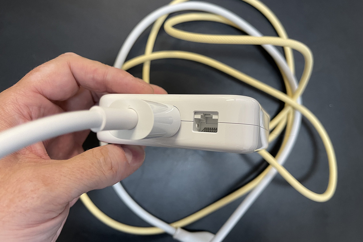
As an aside here, why is Apple using a 1GB port when everybody else in the known universe puts in 10GB ports? Not that it matters to me. My heinously expensive Amplifi Alien router doesn't have a 10GB port anyway. SO SICK OF THESE COMPANIES CHARGING A PREMIUM PRICE FOR NON-PREMIUM SPECS! Though that's par for the course for Apple, so why am I not surprised?
And that... plus a keyboard and mouse charging cable... is all you get in the box. As this is Apple, you don't even get an instruction booklet! Not that you need one. You plug it in and the iMac says "Hello" and tells you what you need to do to get started.
THE PORTS
As I mentioned on Tuesday, the base model comes with two USB 4 ports (that accept USB-C plugs). The next-step-up model that I got also includes an additional two USB 3 ports (that accept USB-C plugs). What I forgot to mention on Tuesday is that there's also a headphone jack! It's easy to miss because it's on the side of the iMac chassis (the plug is deeper than the computer, so they couldn't put it on the back!). This is kinda weird considering that Apple is obliterating the headphone jack everywhere else... but yay? I dunno. I've switched over to wireless for everything and don't even think I own a pair of wired headphones any more.
DESIGN CONCLUSION
How Apple managed to craft something this amazing only to make it look this shitty boggles my mind. I ordered a yellow iMac. Instead I got a gold/urine/yellow/pale yellow iMac where none of the "yellows" match... at all. A part of me wants to return this and get a blue one or something that might not look as shitty, but I don't think I care enough to go through the trouble. Which is something Apple is undoubtedly counting on. What's infuriating is that they very clearly Photoshopped the images on their website. I mean it's blatantly obvious that they Photoshopped the images, and that's some bait-and-switch-bullshit. What you see is not what you get. Because when you go to Apple.com, the yellow computer is very clearly yellow in every shot they show you. But as you can see from my actual and unretouched photos, it's clearly gold.
Anyway...
Tomorrow I'll do a dive into actually using the thing. Does the M1 live up to the hype? Or is it just another pack of lies from Apple?
 It used to be that companies would have to guess how many units they would sell, then instruct manufacturing (usually in Asia) what to build. This is almost always a disaster. If your product is less popular than you projected, you end up with a heinous amount of money tied up in inventory that you can't get rid of. If your product is more popular than you projected, then you can't fulfill customer orders and lose money that way too.
Either way, you're likely playing a losing game.
Thanks to our global economy and the way shipping works now-a-days, companies have another option... Just In Time Manufacturing.
This is how Apple does almost everything now-a-days. The flexibility of making something only when it's needed to fulfill an order is pretty mesermizing. First of all... no inventory problems. Second of all... you can offer multiple configurations with very little risk. Which explains why the new iMacs can be offered in multiple colors and multiple configuration options.
My iMac, for example, is yellow and has an M1 chip with an extra 8GB of memory.
So when I made my order at Apple.com, it was sent to China for manufacturing. There somebody grabbed a yellow chassis... an M1 16GB chip motherboard... slapped it together with some yellow accessories... then packed it all up in a yellow box.
Then handed it to FedEx for shipping.
And this is where it gets interesting.
I was anticipating quite a wait. Because even if Apple is paying for air freight, surely it's going to take time to work their way to my order, asemble it, box it up, accumulate enough freight for a shipment, then get it to the US and make its way to me here in Washington State. Right?
Actually... not so much!
I ordered on August 10th and received an email confirmation that said 2 to 3 weeks production time. Then I got an email Sunday telling me it was prepared for shipment... after just three days?
And I got it today! The computer shipped from China to Japan on Monday. From Japan to Memphis on Tuesday. From Memphis to me on Wednesday. I essentially got my computer in a week.
Incredible...
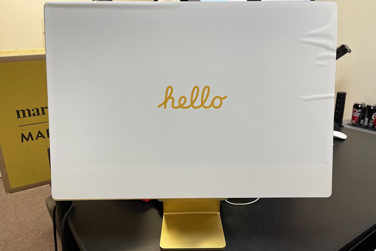
I have quite a lot to say about it, but we can begin all that tomorrow.
 The iMac I use at home had a good run.
I bought it in the Spring of 2009, which means the thing is over 12 years old. Positively ancient, in technology terms. Sure it's slow. Sure it can't run the latest operating system. And sure it's had to be repaired twice (once when a memory DIMM failed, and again when the hard drive failed). But it was still usable for attending Zoom meetings, reviewing documents, researching on the internet, ripping my DVD collection, and numerous other tasks which have ensured that it's been in near constant use. And I do mean constant. Even when I was using my much newer and much faster MacBook Pro, ye ol' iMac was still a part of my workflow because it spools my home printer jobs and backs up all the stuff on my file server to the cloud.
But then? Tragedy struck.
I went to print a document and my iMac wasn't there.
I couldn't turn it on so I ended up taking it apart (again) to see if I could figure out what was wrong (again). But then, as mysteriously as it died, it sprang back to life (again). For three days. Then it died a death that it couldn't be brought back from.
At first I was going to just get along without it. I have a MacBook Pro and an iPad Pro... do I really need an iMac as well?
Turns out I do. It's just too darn useful to have a desktop computer at home for certain tasks. The problem is that Apple stuff is expensive, so I needed to figure out how much I would be spending to see if I could afford it. The answer? Not really. I would have to go into credit card debt, something I'm unwilling to do. But then... I see that Apple has zero-interest monthly financing. Which means the new iMacs released back in April that I thought were pretty but I would never end up buying?
I did that...
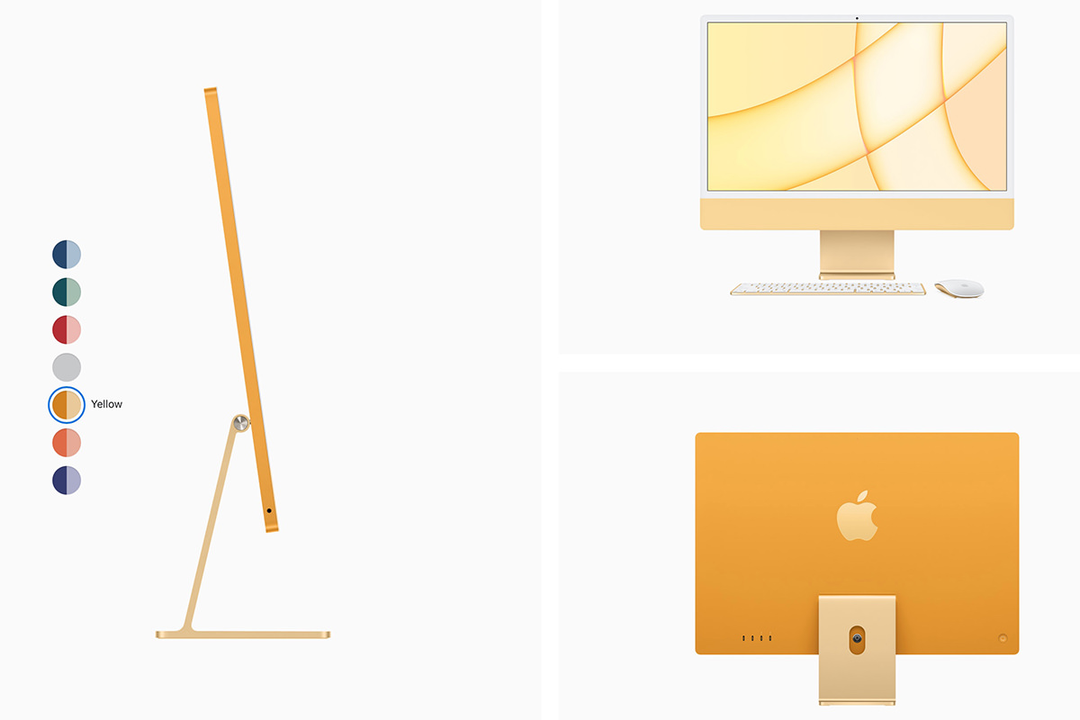
As I mentioned when I first saw them, ordinarily I would have picked a red one. Blue is my favorite color, but red is what I like to have around my home (such as my pot-holders and iPhone case). Except the new iMacs are only actually colored red on the sides and the back. All you see on the front is a sickly pink color which I hated. My second choice, blue, was gorgeous on the back... but a weird baby blue on the front. Eventually I went with yellow because it was still yellow on the front (albeit a pastel shade of yellow). Why in the hell Apple couldn't continue the same beautiful colors on the back to the front is a complete mystery to me. PEOPLE USE COMPUTERS FROM THE FRONT... SO YOU AREN'T SELLING RED COMPUTERS, YOU'RE SELLING PINK COMPUTERS! More than a little infuriating.
At first I was going to go with the cheapest model. Since it's replacing a 13-year-old computer that was fine for my needs, that was more than enough.
Except the base model isn't available in yellow!
I was this close to just going with silver and being done with colors... but the difference between the base model and the yellow model was $200, which meant my monthly payment was only $17 more... so what the heck? Might as well. The yellow iMac has 8 GPU cores instead of 7 GPU cores (that I won't much use) plus two extra ports (that I definitely won't use), and a better keyboard (that I very much want, but don't need), so I essentially shelled out $200 just so I could get the color I wanted?
How very Apple!
The yellow iMac comes with 256GB of storage, which is plenty considering nothing much is stored on it... all the files in my house are on my NAS. It also comes with 8GB of memory. Which was probably going to be enough? But, unlike older iMac models, there is no way of adding more memory if you find out what you bought isn't enough. The memory is embeded on the M1 chip along with everything else. The only way to have more memory is to buy the M1 chip with more memory on it. And so... I ended up spending ANOTHER $200 to max out the memory to 16GB.
Yes, you read that right, the maximum memory you can have in a new iMac is 16GB.
Now... this is worrisome. If I ever end up needing to use my iMac for anything serious, 32GB is pretty much minimum for the work I do. The idea of trying to work on a graphics file that 20GB in size within a 16GB limit seems absurd in 2021.
Except...
Apparently the memory you have doesn't matter so much with the new M1 processor. Since everything is unified on a single chip... the CPU, the GPU, the memory, and the storage... it doesn't really matter. The M1 processor doesn't swap things in-and-out of memory over a circuit board bottleneck... it's using all of its resources all the time and allocates them out as needed. What this means is that Adobe Photoshop will load what's needed into the memory available then dynamically swap the pieces it's not using to storage. Instantly.
Which is why articles I read suggested that the average user with $200 to blow should double the storage instead of the memory since you're getting more usable memory for your money. Which makes sense, given the unified memory architecture of the M1 chip.
The problem is that I'm not the average user. The apps I use... Photoshop, Illustrator, Premiere, InDesign, etc... are more efficient when they have more memory. Regardless of how fast the on-chip storage is. So, assuming I ever have to use my desktop Mac for those applications, the fact that precisely zero of my files will be stored on the iMac means that my best bet would be to shift the $200 for double the memory. I'll still have 256GB for apps and overflow, which should be plenty.
If I was made of money, I'd just max out the memory to 16GB and the storage to 1TB. But since I'm not, paying $200 for yellow and $200 for memory is way more than I want to spend already.
In the not-so-distant-future, I think we won't ever have to decide whether to choose memory over storage or storage over memory. There's just going to be "memory" that's used for whatever the computer needs. How cool will that be?
As I mentioned above, the only thing hooked up to my iMac will be an old laser printer. From time to time I also drag out an old scanner. Neither of which plugs into the USB-C ports on my new iMac! They're both the original USB-A plugs. Which really sucks because I'll have to use a dongle to plug anything in. The base model only has two USB 4 ports (USB-C plugs). The yellow model gets two additional USB 3 ports (USB-C plugs) and an ethernet port (which is on the power brick because the iMac is thinner than an ethernet plug!).
As I also mentioned above, the yellow model iMac comes with an upgraded keyboard. What makes it better is that it has TouchID. This is something I scoffed at when I first got my MacBook Pro that came with it. But it's surprising how much I came to love just touching my computer with my finger to unlock everything and get to work instead of having to type a stupid password. I don't even think about it now. When I sit down to use my computer, my finger automatically goes to the upper-left corner of the keyboard. — So until FaceID comes to the iMac, this is the next-best thing.
EXCEPT...
I have an Apple Watch. The beauty of buying into the Apple ecosystem is that everything works together. When my Apple Watch is on and unlocked (which I do each day after charging), I don't even have to use TouchID! I smash the space bar to wake up my Mac and it's automatically unlocked from my Apple Watch. Nice!
Right now you may be wondering... "If Dave has an Apple Watch which unlocks his computer, why did he say he very much wanted a keyboard with TouchID?"
And the answer is this: BECAUSE APPLE IS FUCKING RANDOM AS TO WHEN APPLE WATCH CAN ACTUALLY BE USED TO UNLOCK SHIT! Sometimes I'll do something like need to unlock my passwords in Safari. To do this I can just double-click the button on my Apple Watch to unlock. Simple! Better than a password! But then the next time I want to unlock my passwords in Safari, my computer will suddenly develop amnesia and forget I have an Apple Watch. Nope. It wants my password. — But TouchID seems to work every time (and comes in especially handy when buying stuff via Apple Pay), so I think it's a great feature to have.
My keyboard and mouse are also yellow to match my iMac, but we'll talk about the design of the thing more in Part Three after my new iMac (hopefully) arrives tomorrow!
Oh... I've named him "Lemon," by the way.
 And here's an Apple Event on this fine Spring day.
Billed as "Spring Loaded," Apple was their usual cryptic self with what was being discussed and announced. The only thing that everybody was betting on was the long-delayed "AirTags" tracking devices. A new iPad Pro was also anticipated. Both of them arrived. And then some. As always, I'm posting the thoughts that went through my head as I watched.

And here we go...
Apple Card I ain't gonna lie. I love the way the Apple Card credit card works. It (along with ApplePay) is how these things should work. The app they built around it is genius. It has features that makes controlling your charges a piece of cake. It works hard to show you the consequences of your payments on interest charges so you can better control your finances...
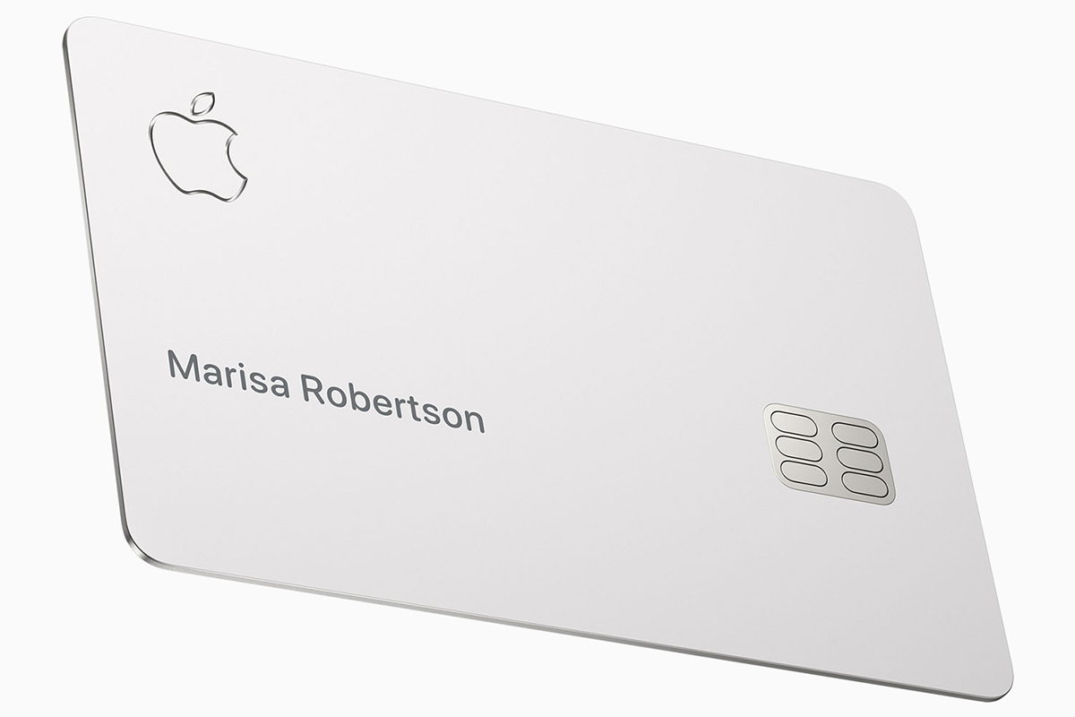
Everything about it is classy. EXCEPT the meager cash-back perk and the fact that it's issued by controversy-embroiled Goldman Sachs. Apple kicked off the event by talking about changes they're making so that cards are more fair. They were hit hard by accusations of unfair, sexist practices, so now they are allowing married persons and domestic partners to use a combined credit history when determining rates and limits. It's about time, and I hope this is just the start in addressing credit inequity in this country, because right now your entire financial future is being determined by something completely out of your control.
Podcasts I don't listen to a lot of Podcasts, but the app for doing so are pretty shitty. Apple is updating things to run better and help people discover content. It's about time.
iPhone 12 Now available in purple! And it is beautiful...
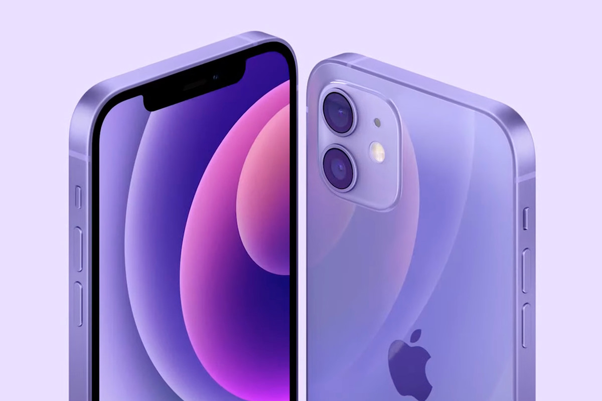
This is the iPhone Prince would have! And released the day before the fifth anniversary of his death.
Find My & Air Tags I am embarrassed at how often I have to use location tracking to find my phone, keys, and wallet. Currently I am using Tile, but it's less than an ideal solution even though it works just fine. Now Apple has finally released their long-rumored "Air Tags" which takes location tracking to the next level. It's far, far superior to just playing a sound, which can be vague... it actually guides you to the location...The only thing not great is the price. $30.00! Or a 4-Pack for $99. Yikes. And while there are cheaper $13 accessories for putting AirTags on keyrings and such, get a load of the Hermès accessories!

BWAH HA HA HA HAAAA! But, hey... if you've got more money than you know what to do with, Apple has definitely got you covered.
TED LASSO! The best television show I have ever seen is coming back for a second season in July!
Now that's something to look forward to!
Apple TV AppleTV is shit. The OS is flakey. The apps are garbage. The remote is the fucking WORST. And yet... it's what I use as my primary streaming device because it's the most convenient. Now Apple is finally addressing some of the offenses with their new AppleTV 4K. Starting with color fidelity, which can be adjusted within AppleTV instead of trying to get your television calibrated. Sweet...
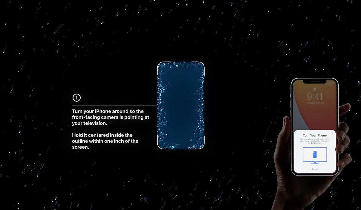
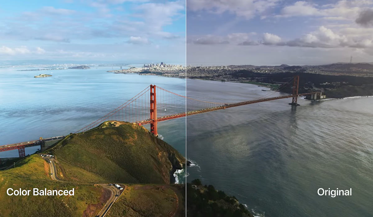
And then there's improvements to the SHITTY FUCKING REMOTE...
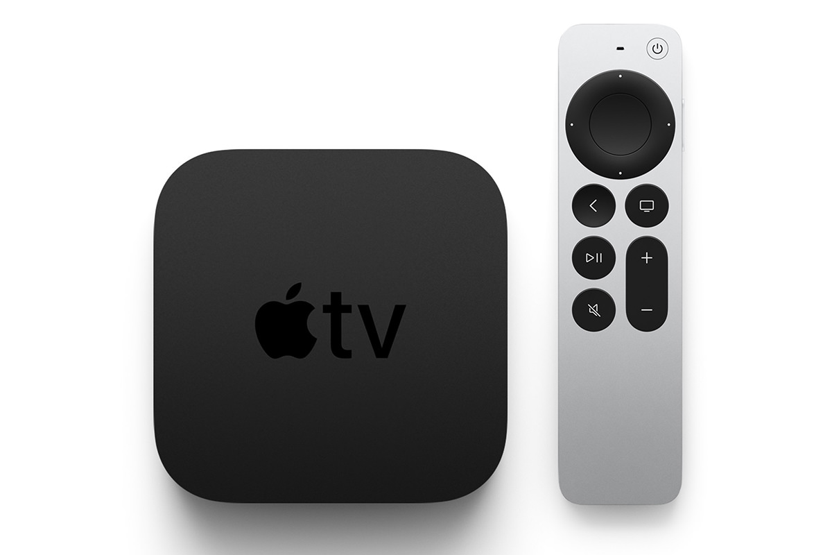
It looks better, looks easier to handle, and I like the touch wheel buttons replacing the heinous fucking "touchpad" in the old one. Now if only they'd do something about the shitty AppleTV app, which is absolute garbage. Just TRY to get to the movie you want when you have hundreds. No way to quickly navigate... you have to scroll and scroll and scroll and scroll. Apple has always had a phenomenal GUI team, but now they are falling behind. Badly. The fact that they won't put a little effort into updating it from the ground up tells you all you need to know about Apple's dedication to AppleTV. But holy cats the price. $179 and $199?!? In an arena where you can get streaming devices for cheap, the fact that Apple is pushing TWO HUNDRED DOLLARS is sheer lunacy. AND THE REMOTE DOESN'T EVEN HAVE A BUILT-IN AIRTAG, WHICH SEEMS LIKE A NO-BRAINER OF THE HIGHEST MAGNITUDE!
iMac M1 In colors! And they are GORGEOUS. Well, they're gorgeous FROM THE BACK. On the front they use a muted shade of the color. So if you love red and buy a red iMac, you're staring at PINK all day. Ugh. It's like Pepto Bismol mixed with milk. That being the case I guess I'd go with blue or yellow or something...
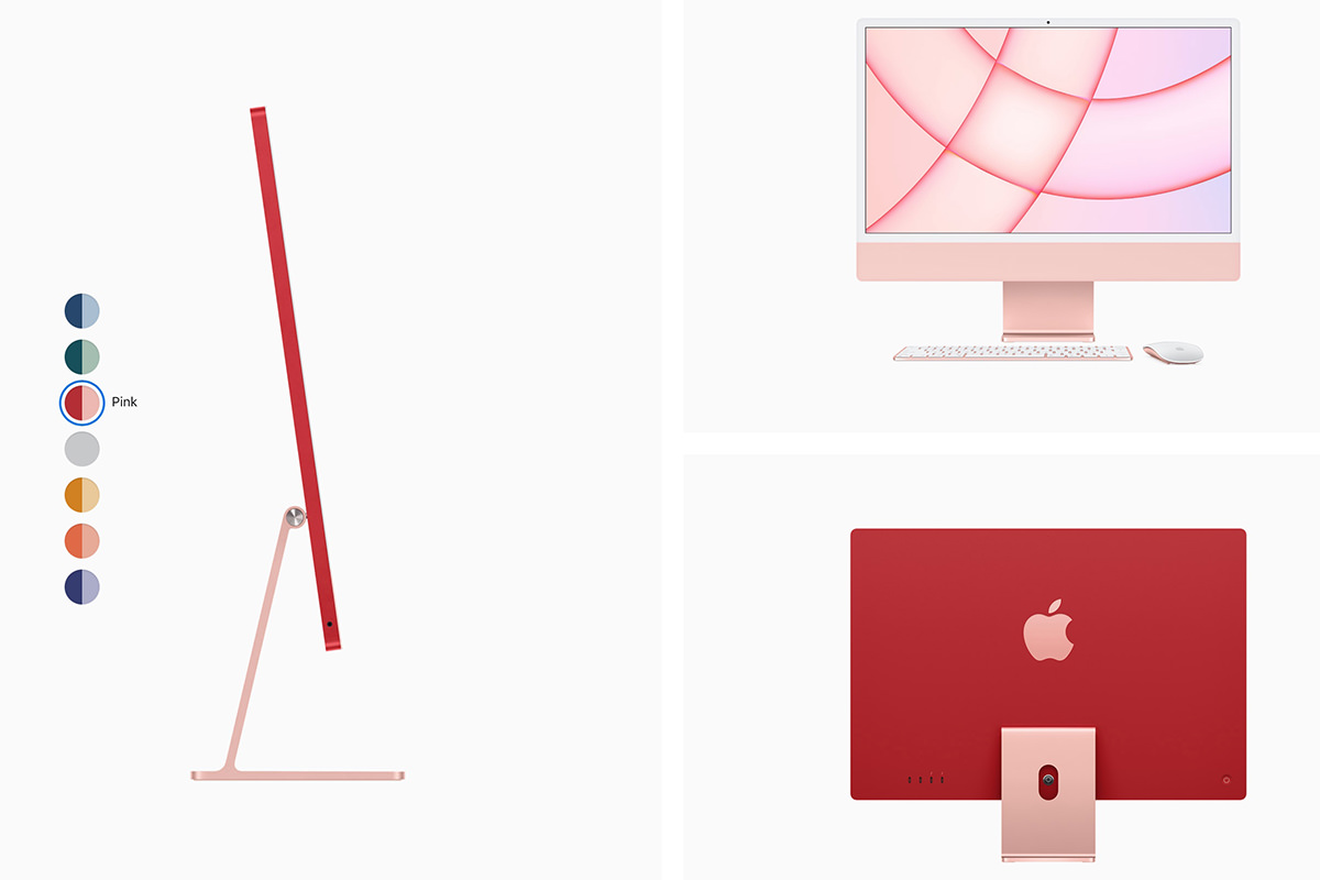
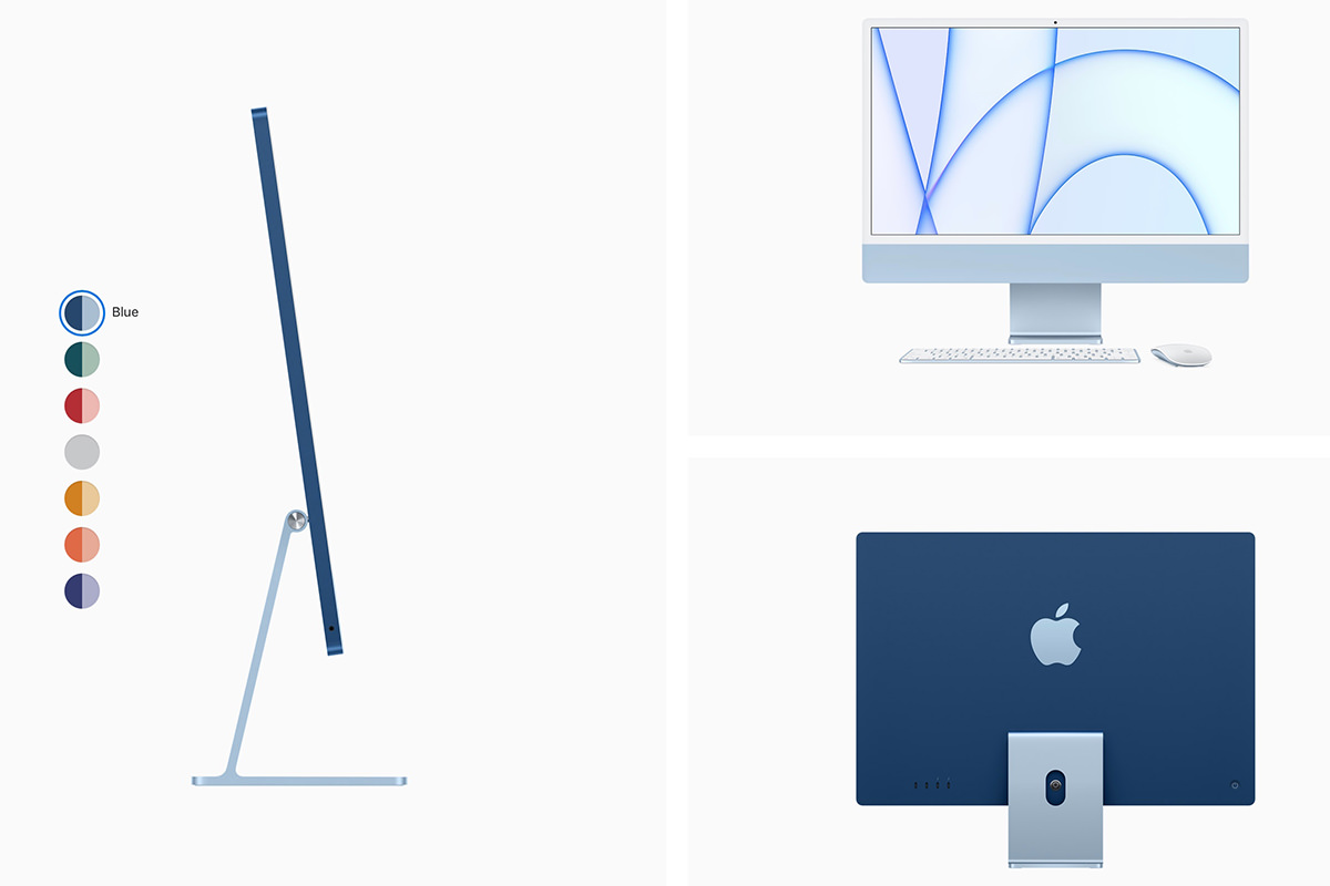

The design on these things is absolutely fantastic. Apple moving to their own custom silicone is the gift that keeps on giving, because it allows them to do amazing stuff. Just look at the profile improvement...
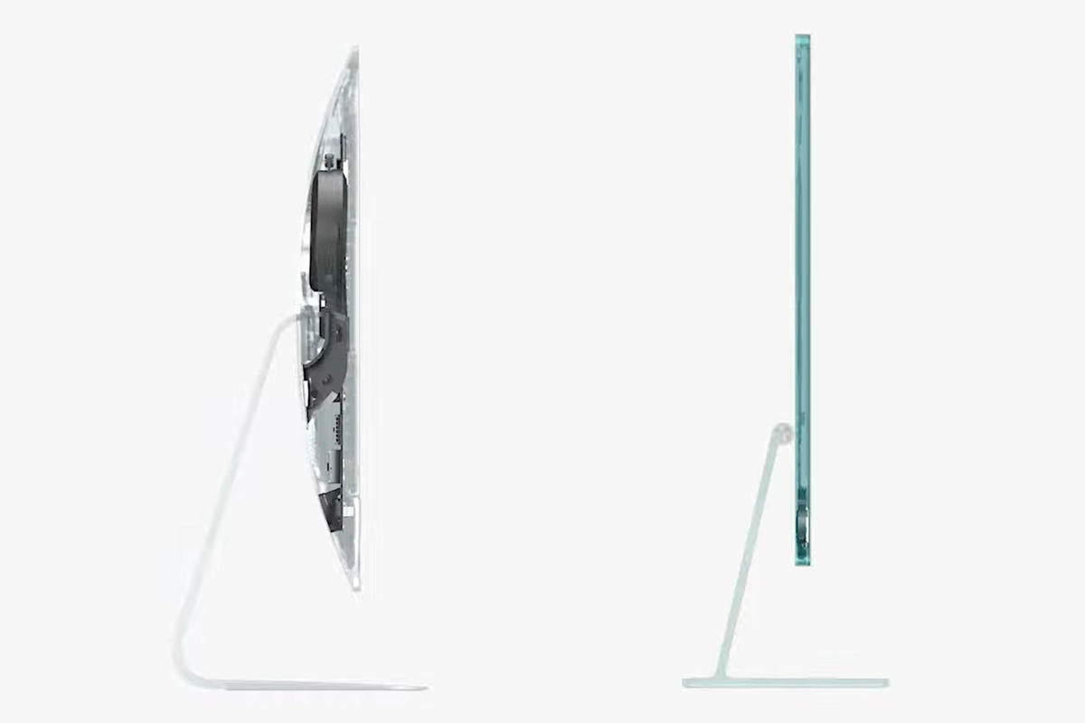
And it looks like Apple is FINALLY realizing that video-conferencing is a critical feature to have (especially now), and is taking a look at their less-than-stellar current camera system to do something better with 1080p and realtime image processing to present the best stream possible...

Apple has brought TouchID to a new color-matched keyboard, which is pretty cool. I love this feature on my MacBook Pro. Though I'd prefer the FaceID that my iPhone has...
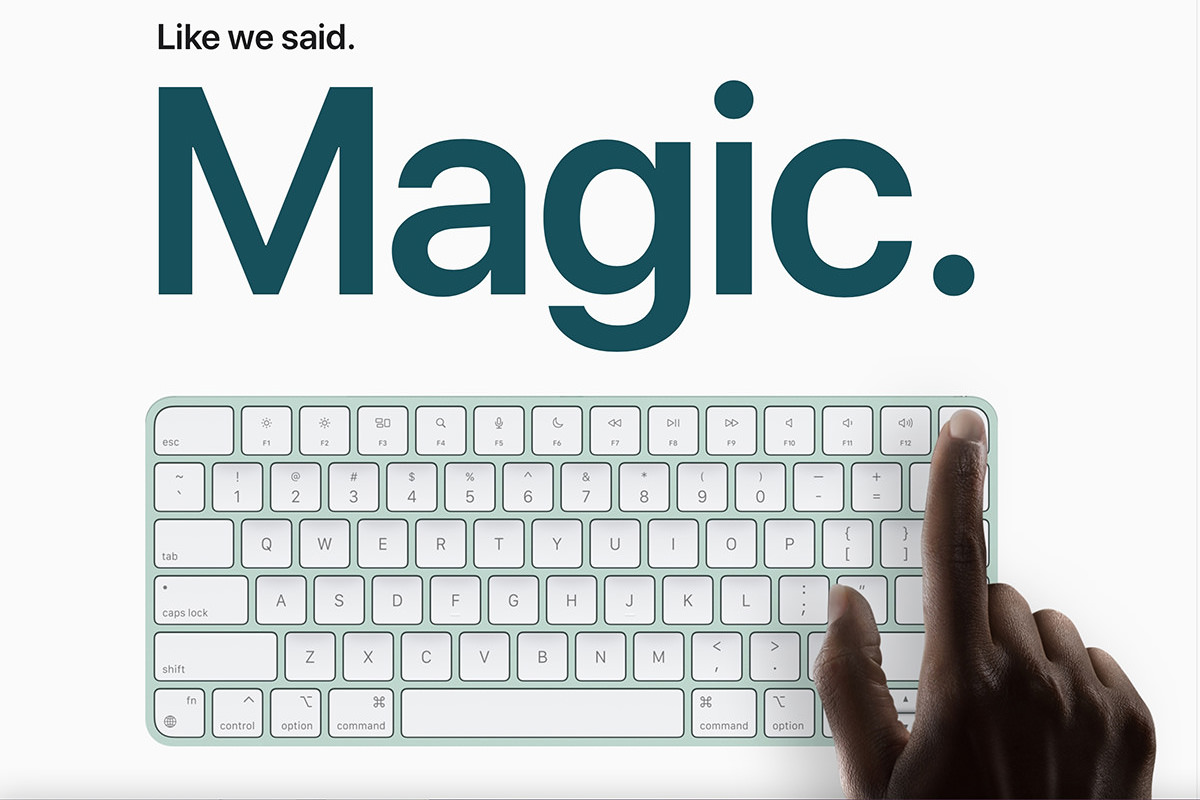
And it starts at $1299 and $1499, which seems about right for all you get. It's nice that Apple is still investing in the Mac... heaven only knows that the iPhone and iPad profits make them the focus of the company, so anything moving the Mac forward is a good thing.
M1 iPad Pro Welp. This was the shock of the day for me... iPad Pro now runs on the M1 chip! The iPad has never been "just a bigger iPhone," but now any doubts can be pushed aside. It's a tablet with a desktop class processor...
The addition of a Thunderbolt port opens up mind-boggling array of new applications now that you can attach high-volume storage and large displays...
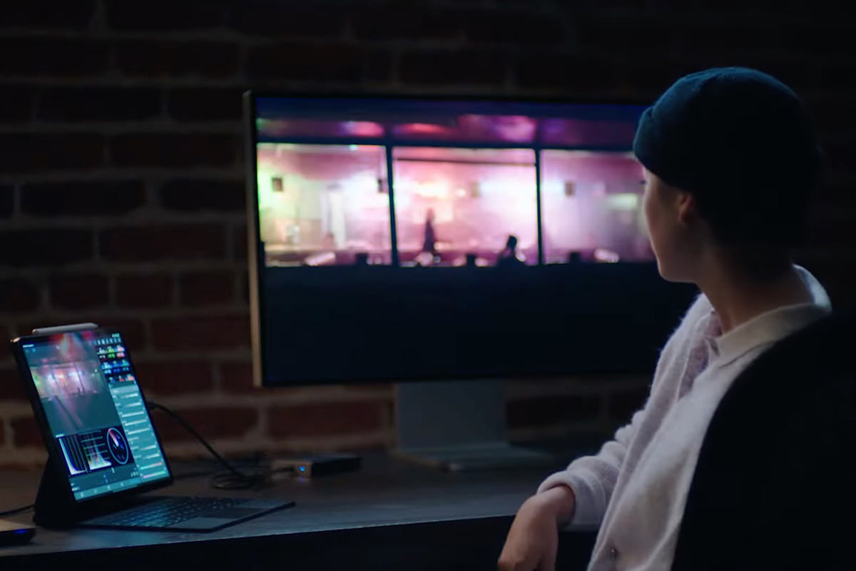
Apple has customarily put a crap front-facing camera in their products. The new iPad Pro fixes this by going 12MP with a wide-angle lens that allows really cool features, like "Center Stage" which pans the feed to keep you centered in the view even if you're moving around...

But here's the thing. I want a bigger iPad. 12.9-inches is not big enough for somebody who draws and paints on it. I need to see more of what I'm working on to be the most efficient at what I do. I have the current 12.9-inch iPad Pro, and it's fine. But until Apple goes at least 17-inches, I'm good, thanks.
And that was the end of that. I have to say... the iMac update and iPad Pro revision are pretty exciting stuff. I don't need either of them, but it's encouraging to see where Apple is headed. It's more clear now than ever before that iOS and MacOS platforms will be merging one day
 And so it's time once again to tune into the Apple World Wide Developer Conference keynote to find out what everybody's favorite fruit-based tech company has up their sleeves for second quarter 2017.
I have to admit, I no longer get ramped up for these Apple things like I used to. In the past, I would take a frickin' vacation day when the WWDC keynote was unspooling just so I could unpack all the Apple goodness that had been unleashed. I'd pour over every minute and blog epic breakdowns of everything that was announced.
Now?
Well, I'm still excited over Apple's stuff... they're an exciting company. But the way they keep screwing up has me less enthused than I once was. I bought into their HomeKit home automation tech, only to find out that it is a total load of crap. They keep making "pro" equipment that isn't for "pros." The reliability of their products is in the toilet, and the way they address their lack in quality is bullshit. Meanwhile Microsoft is killing it with their Surface line, easily picking up the pro design market that Apple is abandoning.
But I digress.
Rather than have to watch hours of keynote like I did, here's a 19 minute recap that tells you everything you need to know (assuming you haven't seen it already)...
And here are my reactions...
All in all... some nice upgrades in the OS and software departments, but more of the same bullshit for pro design users. A market Apple used to own, but is throwing away with gleeful abandon. Leaving me to wonder if my next computer will be running Windows. My license for Adobe's Creative Cloud Suite works for Mac or Windows, and they function the same on both systems. Food for thought.
 Much to my shock and dismay, my faithful iMac died a horrible death for no apparent reason after a mere four(!) years. My guess is that the video card crapped out but, as you would expect from an all-in-one unit, it's not like I can rip into it and effect repairs. So I am now using a shiny new iMac with 5K Retina Display at work.
Since I have a Retina Display on my MacBook, which is admittedly very nice, I didn't think going full-Retina on my desktop would be a big deal.
I was so wrong. This display is the most glorious thing I've ever seen in my life.
The Sistine Chapel? Utter shit by comparison.
I don't want to look at anything else ever again unless it is displayed in this iMac...
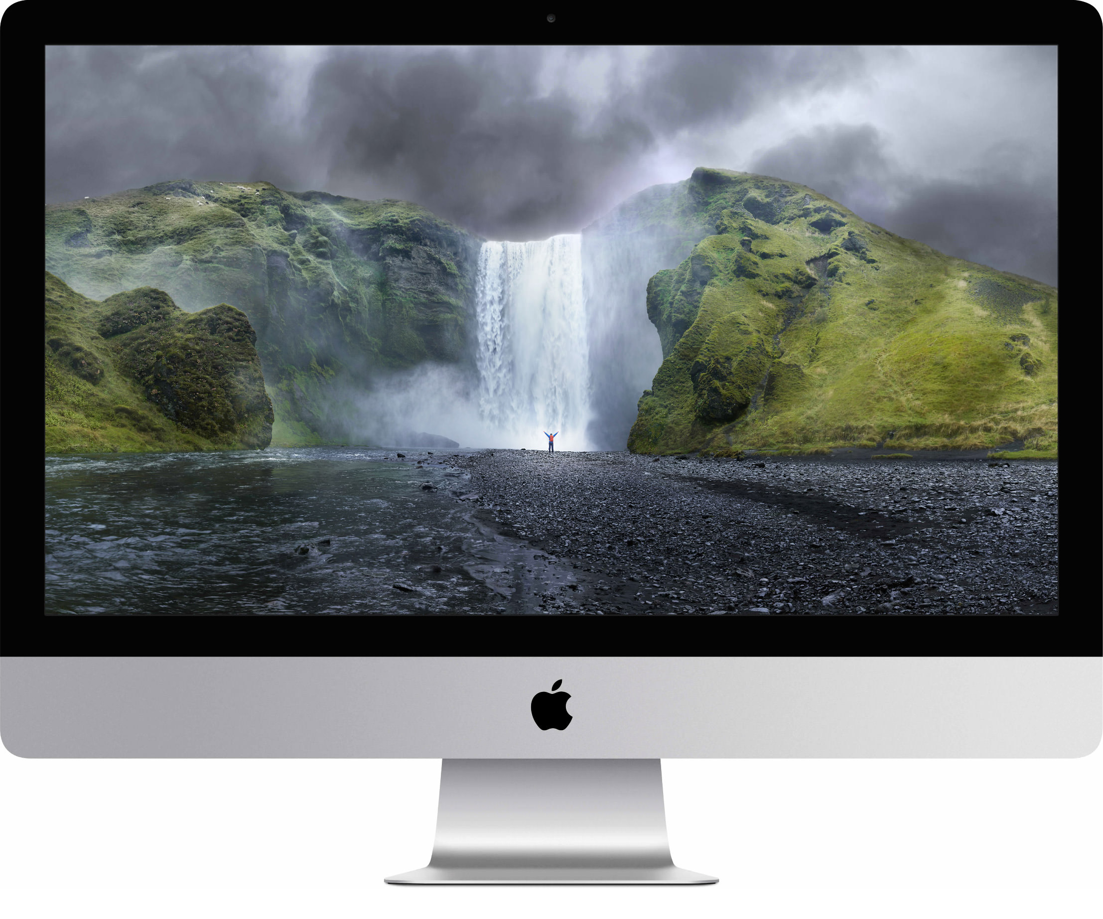
I'm not sure how I managed to avoid sneaking into an Apple Store and taking a look at this jaw-dropping piece of Apple hotness over the past five months since release, but I'm kinda glad I didn't. Because firing up a 5K display and seeing just how amazing it looks is something you can only do once, and having it be on your own machine is priceless...
What's even more amazing than how it looks is what it costs. Or, more accurately, what it doesn't cost. To purchase a 5K display alone will cost you around $2,500. The iMac with Retina 5K Display starts at... wait for it... $2,500. And you can bet your ass that Apple's display is probably superior quality to boot. Which means the best 5K display on the market essentially comes with a pretty decent Mac attached for free.
To power such a massively beautiful display requires all kinds of technological advancements that Apple goes over in detail here. Sure it all sounds very impressive and everything... but there's simply no substitute for sitting in front of the machine and looking at some great quality photographs. Or reading small text. Or just looking at the icons in your Apps folder. Everything is so incredibly sharp... so mind-bogglingly vibrant... so orgasmically beautiful... that you have a hard time believing you're looking at a computer display. It's higher res than HD. It looks better than the best quality print you've ever seen. There's just no comparing it to, well, anything, really. The future is here, and it's stunning...
But what about that Mac part?
The computer itself tapers to a surprisingly thin 5mm on the edges and looks fantastic. I'm guessing there are fans in there but, if they ever turn on, I've not heard them. Overall its a gorgeous Mac that makes previous implementations look clunky and archaic by comparison.
I opted for the pricier 4GHz Quad-Core Intel Core i7 chip, which is a pretty good performer. Sadly, it looks like this i7 is using the older "Haswell" architecture instead of the newer "Broadwell" chips that Intel has unleashed, but I don't know that the newer CPU would give me a terribly huge real-world advantage. Guess we'll just have to wait for the benchmarks when Apple catches up. In any event, it's plenty fast for the rather intensive applications I run, so there's no complaint there.
I also chose to upgrade the standard AMD Radeon R9 M290X 2GB GDDR5 to a full 4GB. I have no idea if the $250 price tag was a worthwhile investment, but I figured I'd rather be safe than sorry in case Photoshop needs the extra room when I have to work on massive-sized files.
Storage was a tough call for me. I have long-since given up on "regular" hard drives as boot drives, because once you've experienced the terrifying speeds of a Solid State Drive (SSD) you will never go back. But Apple has a technology called "Fusion Drive" which marries a 128GB SSD with a 1TB hard drive in a single volume. The system then optimizes your experience for fastest results by keeping commonly-used files (like the operating system) on the SSD and transferring seldom-used files to the HD. Probably because I haven't filled up my SSD section yet, but the disk access feels as fast as it ever was when using the SSD-only unit on my old Mac, so I'm happy.
Physical expansion is pretty much what you'd expect from a modern Mac... four USB-3 ports, a couple of Thunderbolt 2 ports, GB Ethernet, a headphone jack, and an SDXC card slot. No USB-C connector like on the brand new MacBook Pro, but that's no big deal for me, as I plan on sticking with Thunderbolt peripherals for the foreseeable future.
Everything else is pretty much current implementations of modern standards... including 802.11ac WiFi and Bluetooth 4.0. This allows full AirDrop and Continuity support, which is much appreciated.
About the only thing you don't get is a CD SuperDrive, which is to be expected now-a-days. I can't tell you the last time I had to read or burn a CD, but it was knowing that I could do so if I needed to that added a bit of comfort to my previous iMac purchase. Oh well. Something tells me I won't be missing it.
And that's a wrap!
It's easy to recommend a Mac where the display alone is worth the cost of admission (both literally and figuratively)... even when that cost is $2,500. One look and you'll know it's worth every penny.
So don't look unless you have $2,500 burning a hole in your pocket.
