
 MacOS Sonoma has released. The bad news is that it hasn't done jack-shit to solve my biggest problems (like fixing fucking AirDrop, which never works at work and is unreliable everywhere else). But anyway... let's get on with it...
Caps Lock indicator. I have no idea why this hasn't been done before, because it's frickin' fantastic. A little indicator pops up under your cursor where you'll actually see it. Nice.
Screen Sharing. Apple's screen sharing "solution" has always been pretty basic and unworthy. It's clutzy and janky and feels very much like an afterthought. So much so that I have been using a third party app for years. Well... Sonoma changes that. Their high-speed connect mode is very, very good (and available only on Macs with Apple Silicon). You can literally watch high-res video at full speed with only an occasional rare stutter. I love it. I haven't tried using it over the internet yet... but the "standard mode" is probably capable. I'm just not sure if I want to risk it.
Screensavers & Desktops. There's some beautiful new screensavers that have cool motion to them... much in the vein of the AppleTV screensavers... then when you pop into your computer, the screensaver freezes and becomes your desktop photo. There's this new feature where when you click on your desktop to send all your windows flying and you can see whatever's on your desktop, but I don't know if I'm keeping it or turning it off yet. It's both handy and annoying in equal measure. UPDATE: Yeah, I turned it off. It's far more annoying than helpful.
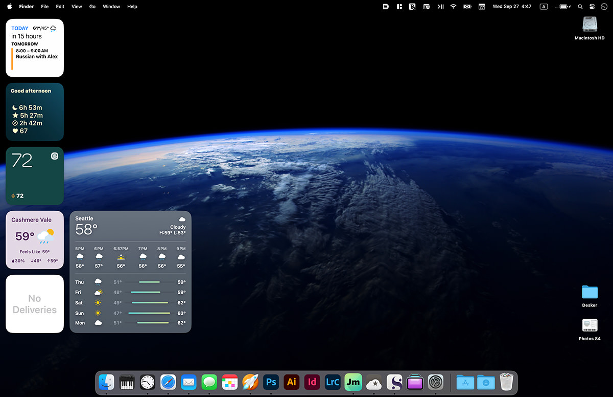
Widgets. There was a time that Apple gifted us widgets... then took them away. And now they're back. For a while, I'm guessing. You can post widgets to your desktop... whether they be from your Mac apps or your iPhone/iPad apps (if supported). I've got my Fantastical widget with my upcoming events, my Autosleep widget to remind me of how little sleep I'm getting, my Ecobee thermostat app so I can see what the settings/status is, my Tempest widget to let me know what my weather station is reading, my Weather forecast widget, and my Parcel widget with any deliveries I've got coming up. All handy.
Spotlight Search. When it works, I'm a huge fan of Apple's internal search tool that works for finding just about anything on your Mac... or even across the web. The problem is that every once in a while my various Macs cannot search through my files. No idea why. It seems to happen at random and come back at random. And sometimes it will return results... but when you click on the file to open it, some other entirely different file will open! Hopefully this has been cleared up, but who knows? In any event, it's apparently supposed to be better now.
Predictive Text. Mac now suggests words as you type. It's a feature which is most welcome on a phone screen, but it's kinda bonkers on a machine with a physical keyboard. Maybe if you're a really slow typist it would be helpful... but most times I can out-type the suggestions, which is to say that by the time it's registered that I could have just hit return to finish typing a word, I've already finished typing it. So, yeah. Not a great feature for me.
Web Apps. When the iPhone first debuted, there were no apps. Everything was done with "web apps" that were pretty much shit. Well, now you can bring those shitty web apps of yesteryear to your Mac! And put them into your dock! Except they actually are kinda useful in that you can have frequently-used websites that are essentially their own apps anyway within easy reach. I've got a few I'm trying... like YouTube... which I'm kinda digging.
Lockdown Mode. If you're browsing the dark web (or whatever) and need added protections, you can slap all your Apple devices into Lockdown Mode and be far more secure. It offers a host of safeguards that are pretty strong and severely limit your normal operations, but if you need it... you need it.
No idea what's going on... but today I lost over three hours work when all of a sudden the files just evaporated. They were still showing in my "recent files" but any attempt to load them would give "File Not Found." Fortunately my computer is constantly backing itself up, so I was able to recover most everything and only spent 10 minutes making updates that were lost. No clue what went wrong. But this is a scary-ass thing to have happen. It's like the system just trashed them or lost them for no reason. One minute they were there... the next they didn't exist! I hope this isn't a regular occurrance, because yikes.
Email Search That's Worth a Shit. Ever search for a word within a long, long email chain, then get disgusted because, unlike Safari, you can't jump between those highlighted words or phrases but instead have to scroll endlessly and pore over everything until you find what you're looking for... AND THEN DO IT OVER AND OVER BECAUSE YOU KEEP MISSING IT? This is just next-level idiotic and I cannot believe that Apple hasn't done shit to fix it.
AirDrop. As I said... nothing has been fixed. Still a fucking pile of shit. This is enraging because Apple keeps promoting it. Meanwhile I can't send a photo from my iPhone to my work Mac unless I text it to myself.
Photos. Lord. It's like... give us a fucking manual sync already. It's maddening because you know that the files have been uploaded to iCloud for an hour, but you still can't sync them because there's no way to force it.
Printing. I know that Apple is embracing the digital future now, but there are times we still need to fucking print shit. It would be nice if ANY EFFORT AT ALL would be put into making this happen. But instead I am still clicking on an ignore button because every fucking time I print to 12×18-inch paper I am told that sorting is not supported. No way to permanently dismiss because Apple don't give a fuck.
Preferences Mayhem. Last time around, Apple did a radical reimagining of the System Preferences pane. And it's absolute and total shit. Alas, they're clinging to it like a boat anchor, and we're still stuck with this idiotic shit that makes it difficult to find absolutely anything. Despite it having a search box.
Icon Arrangement. You can never fucking get your icons to sit where you want them to when "Snap to Grid" is enabled. Well, you can, but that one time you can't drives me so fucking crazy that I fantasize about burning my fucking Mac to the ground. If a grid square is open, THEN FUCKING LET THE ICON SIT THERE AND DON'T FLOAT IT ACROSS THE SCREEN FOR NO FUCKING REASON.
Hard Drive Alive. Since the wide adoption of Solid State Drives throughout Apple's offerings, they've removed the ability to keep older hard drives spinning. Instead they power up and down and up and down and up and down. Which is terrible. I thought that turning off the power-down in Energy Saver settings would work, but nope. So I use a third party app called "Amphetamine" but it doesn't automatically start at login even when I add it to login items. I wish Apple would just let you go back to how it used to work.
Meh.
 And lo did Apple release another Mac OS X update.
Right off the bat, Stage Manager (the feature I was most looking forward to) is a pile of shit. It's supposed to make it easy to focus on the task at hand by shoving the apps you're not using to the left-hand side of the screen. But nothing acts in an intuitive manner and trying to figure out what will actually happen when you interact with something is an impossibility because there's no sense to it. I spent five minutes trying to access my Finder windows so I could drag files to an app only to give up in frustration and turn off the entire shit-show. Maybe I'm using it wrong, but if something acts this badly and you have to get training to understand how to interact with it, then it's a big ol' fail, isn't it? So back to "Spaces," once again, I suppose. One can only hope that Apple gets this figured out, because it's an intriguing idea.
Safari is a web browser that's both great and incredibly frustrating. Great because it's fast and capable... frustrating because there are sites which break on it. Facebook, for example, is horribly frustrating because stuff randomly won't work on Safari. Take, for example, not being able to click on story links and have them open (currently you have to control-click and tell Safari to open the link in a new tab or window). It would be nice if you could use Safari without having to worry about crap like this, but it is what it is. You'd just think that Apple would put the effort in to make sure that popular sites are compatible... because you know that Facebook doesn't give a fuck. Their solution is going to be "use Chrome."
Apple Mail is a shit program that keeps getting more and more shitty because Apple takes features away and never fixes the things that needs fixing. Take, for example, being able to select the outgoing server. You used to be able to change it right from message composer. But then Apple took it away for unknown reasons. The didn't even give the user the ability to hide it or show it depending on if they need it... they just took it away. This time around Apple is improving things (like actually having search work worth a shit) and adding things (like "schedule an email" so it will send at a later date... and "undo send" to retract an email you sent), but Mail is still trash. The only reason I keep suffering through it is because there are things that are much easier due to the Apple ecosystem integration. I'd probably be a lot more forgiving if the program would quit in a timely manner... I am sick to death of "Shutdown was canceled by Apple Mail" popping up all the damn time.
In happier news... ZOMG! MacOS X has a Clock app! Works about the same as the iPhone version. What the hell took them so long? Can a calculator for iPad be coming next?
Back in the olden days, you had to purchase a separate font manager to deal with activating and deactivating the tons of fonts that designers need to use (I was a fan of Suitcase then FontBaseFont). But eventually I just went with MacOS Font Book because it's built in and worked okay. The Ventura version isn't better or worse... it's just different. All the typefaces are displayed in tiles which now gives you a hint as to what the font looks like (it's just an "Aa" shown in the typeface). This is nice, but it sure would be helpful if you could view more characters in a secondary pane or something. As it is, you have to waste time double clicking every time you want to see the full character set... or you can switch to a "Quick brown fox..." Sample view which requires a lot of scrolling if you have a lot of fonts loaded. Overall I think this is an improvement, but it would be nice if they would keep working on it, because it sure could be better.
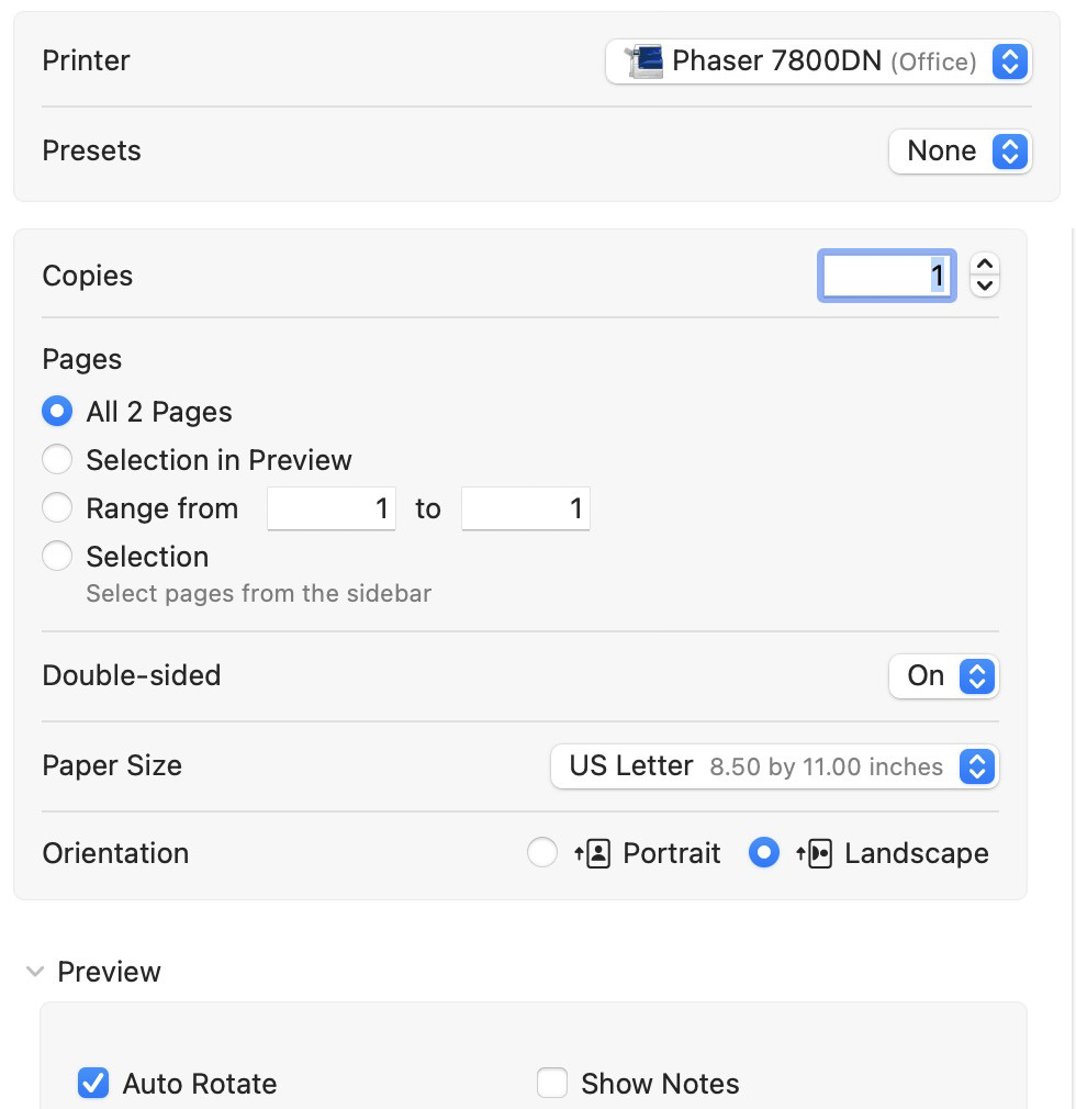
One of the bigger shocks in Ventura is the new "Print" dialogue box. The old one has been busted for years, and now it's how it should have been from the very start. No longer is the "two-sided" option on the "simple" page and all the other options on the "more..." page, there's just one page...
Photos has always been a kinda half-baked app. It really needs a way to switch to an "expert" mode where it acts more like Aperture than something so basic. That being said, there's some new toys that make the latest version an improvement. For one thing, your photos are now text searchable in Spotlight...
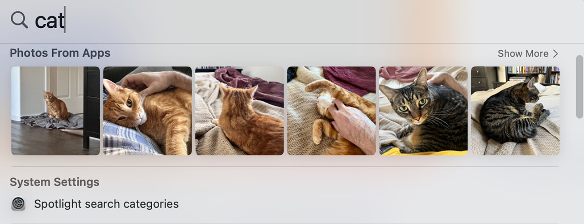
You can even search for a text string in your images if you've photographed a sign or something. Also available is automatic detection of duplicate photos which can be easily merged, and you can share custom photo libraries more easily.
Continuity Camera allows you to use the far-superior camera on you iPhone as a webcam instead of relying on the customarily mediocre-to-bad camera in Apple's displays. When I tested it, people couldn't really tell the difference. Where this feature shines is when it uses the wide-angle lens to look down at your desktop, changed the distortion, and pipe that to your video stream. It's very cool. But also kind of wonky, because the distortion correction gets weird when something comes up off the desktop. Even so, this is an awesome idea.
You can choose to edit or unsend text messages in Messages now. I haven't taken the time to find out if this is apparent on the other end... but I sure hope that it is. The idea that abusers and harassers could change the narrative of events when you have to seek help is a dangerous game to be playing. If somebody is in that position, switching to SMS is essential, so worth checking out if you need it.
When it comes to System Settings... they are just... gone. Replaced, but not really. I have no fucking clue where anything is and have to search for what I'm wanting to adjust in the hopes I'll know what to do when I get there. This is a bizarre change, but I suppose that they are trying to unify how to change system settings across all platforms.
And lastly there's "Passkeys." This is Apple's admirable effort to abolish passwords. You have a public key that's on the website which gets matched to your private key on your Mac (via TouchID) or iPhone (via FaceID). You don't have to type out anything... you just get logged in after verifying on your device. It's a nice idea. So nice that other companies like Google are signing onboard. The problem is getting apps and websites to adapt it. Until they do, Passkey isn't going to help. I had read that PayPal, eBay, and Google were using Passkey, but couldn't find anywhere to turn it on, so that's not good. If there's one technology that I want to really take off, it's Matter SmartHome (a universal protocol for smart devices). If there's two technologies that I want to really take off, the second would be Passkey. So fingers crossed.
All-in-all Ventura is okay. I wouldn't consider it a game-changer or an essential upgrade though. But since it doesn't cost anything, maybe that's okay. Since all three of my Macs are running Apple Silicon now, I have a feeling that there are a bunch of little optimizations going on behind the scenes that I can't really notice to appreciate, but am grateful are there just the same.
If there's a takeaway to be had from the more recent OS X versions, it's that the big feature-busting releases are a thing of the past. From here on out it's all optimization with an occasional cool new thing thrown in so Apple's marketing department has something to sell.
You'll have to forgive me that I still keep hoping for something revolutionary to come along.
 As usual when I return from a trip, my cats have been taking turns glomming all over me. Poor Jake acts like I've been gone for years, and will sleep on my bed for two or three nights before things get back to whatever passes for "normal" in my house.
Though at some point in the middle of the night, he left me long enough to go downstairs and grab Mufasa and Moose the Mule and bring them upstairs. I went to take a photo of them when I woke up this morning and was surprised that iPhone decided to use the flash instead of Night Mode. The flash washes everything out, so I turned it off and Night Mode kicked in, giving much better results. Apple needs to work on this. Maybe the camera should know how to cut back on flash and create some kind of “Half Night Mode” for cases like this? Just a little flash on top of Night Mode would have cut down on grain, but preserved color fidelity and detail. Oh well. Until that day, I’ll just keep the flash turned off. It just seems to ruin things...

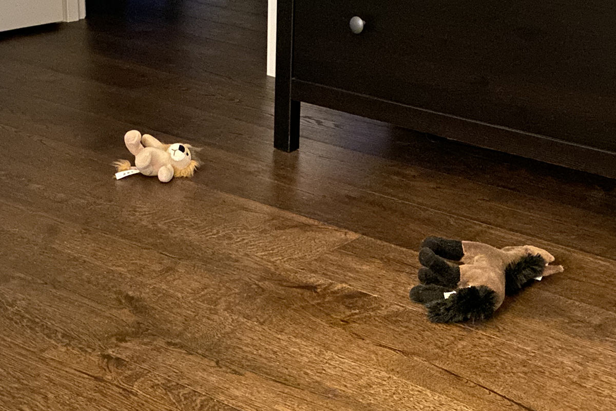
I don't know what's going on with my cats and their toys. When I got home from work yesterday, I walked in the door to this...
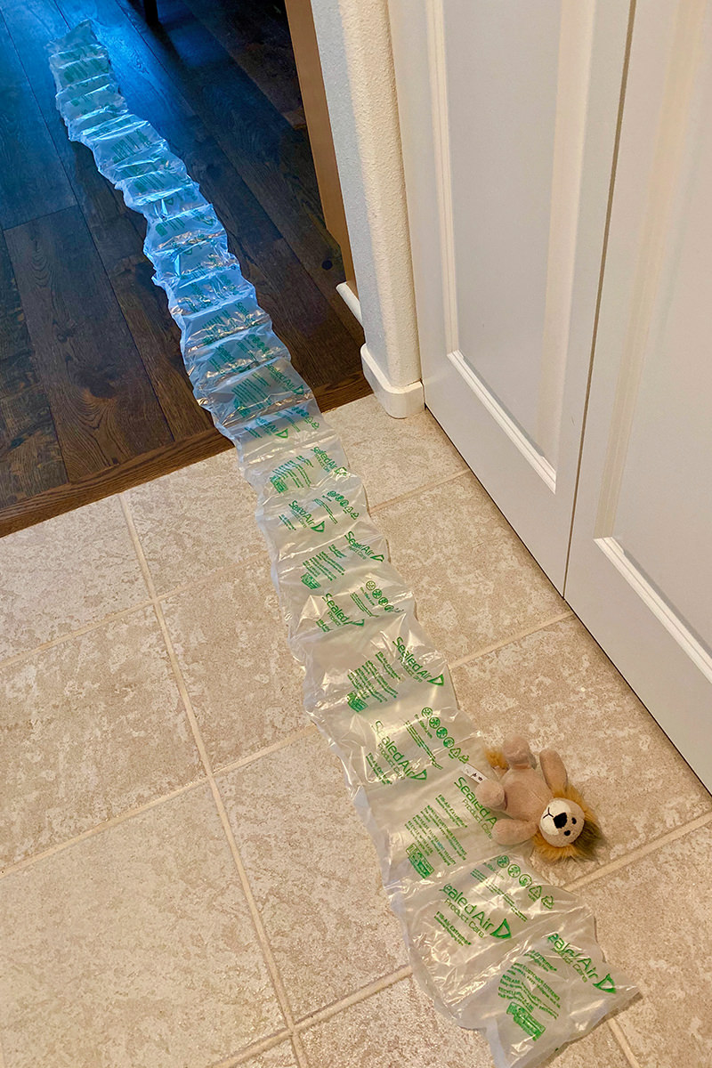
I don't know what chain of events led up to it. Maybe Jake did Jenny wrong, so she took Mufasa away from him and was going to ship him back to Africa? Silly cats.
Yesterday I made potato salad (again) and it was the first thing I thought of for breakfast when the cats' feeding alarm went off...

As I was taking my tater salad back to bed so I could go through my email and get some work done, I noticed that my thermostat was glaring at me. Apparently it's time to turn on the whole-home humidifier...
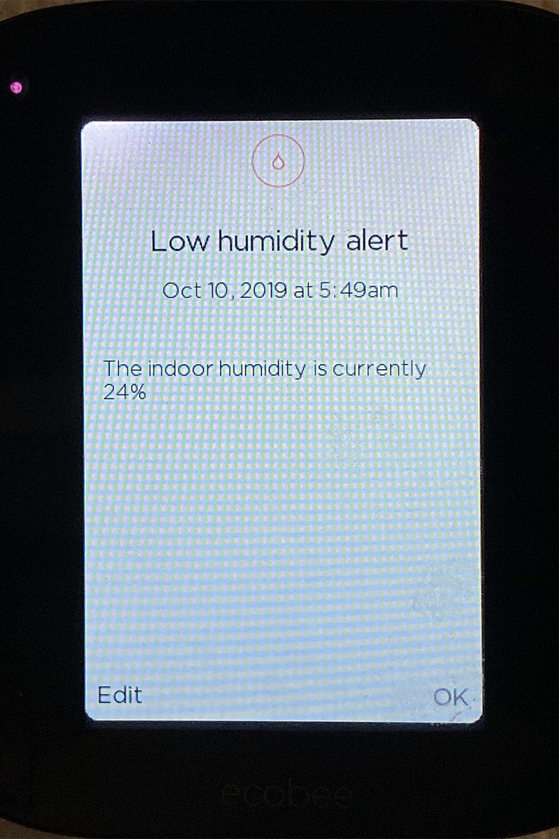
I would have turned it on right then, but all my woodworking tools are piled in front of it, so I guess that will have to wait until the weekend.
When I managed to get back up to my work, my laptop let me know that the final version of MacOS X "Catalina" dropped while I was in New Orleans (I've been running the betas since they were first released)...
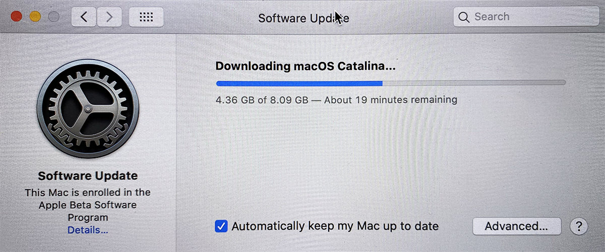
There goes my morning productivity. Fortunately Jenny came up after her breakfast and kept me company while I waited...
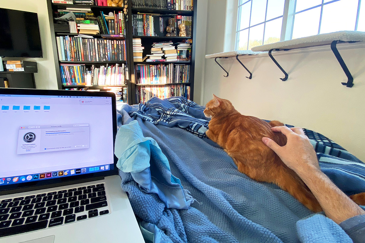
As usual with Apple, first there's a time to download screen... followed with a time to install screen... followed with a time to update screen. Which not only made it so I couldn't get any work done, it make it so I was late to the office. Yay.
Just another Thursday morning.
 And lo did Apple descend from the heavens to reveal unto The Faithful a public beta of the next version of MacOS X, Catalina (which is version v10.15, if you're keeping count). And since I know everybody in Blogography Land is just dying to know what I think of this fairly uneventful release, here you go...
INSTALATION
It was a piece of cake. I logged in to the Public Beta program, registered my Mac, then clicked to install. I keep all my documents in Dropbox, so I didn't need to back up anything. If the install screwed up, all I'd have to do is scrub my machine and install my apps fresh. If you do keep data on your machine, be sure and back it up before installing any major OS release... beta or otherwise. Apple is better than most, but can still royally screw up from time to time (as I've found out the hard way).
FINDER
Apparently services like DropBox are now "more integrated" into the Finder, but I'm not exactly understanding how. Maybe it's something the services have to update their software to support? Though DropBox has gone far beyond just storing files in the cloud, and is now trying to compete with collaboration and project management services like Slack and Basecamp, which is just stupid because that's not what I use DropBox for... so I'm probably dumping it anyway. If there are other changes, I haven't noticed them yet.
DASHBOARD
Gone. Vanished. This is shitty because I actually use Dashboard widgets several times every day. It's just so dang handy to be able to swipe over to a calculator... dictionary/thesaurus... measure conversion... and what-have-you. But no more. I cannot for the life of me understand why something so incredibly useful is being dropped. I don't even know how you can replace the widgets. I'm guessing with a menu bar app, but that's just nuts when my menu bar is already packed full.
APPLE TV
Apple interface design is complete and total shit. And getting worse by the day. I have hundreds of movies. Do you know how insane it is to have to scroll through hundreds of movies to find what you want? Even simple fixes... like being able to press the R key to go to the movies starting with "R"... doesn't even occur to Apple's developers, which is both sad and embarrassing. But, even worse, Apple still has their idiotic and flawed security bullshit fucking up their apps. Any time I set up a new computer (or do a major OS upgrade) I end up having to retype my credentials over and over and over and over and over AND OVER AND FUCKING OVER AGAIN. This time? SIX FUCKING TIMES IN A ROW before it stopped asking...
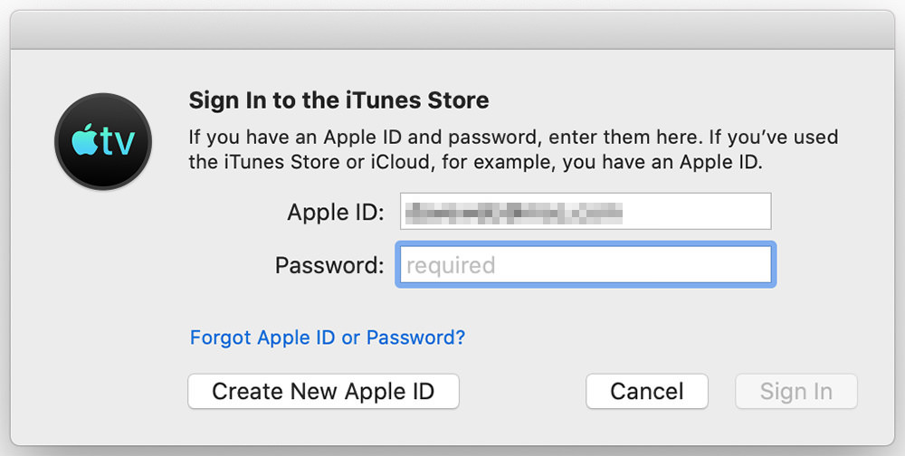
All of Apple's "concerns" about helping people maintain better security is nothing but bullshit posturing when they have idiotic crap like this happening. Who wants to create passwords that are complex and secure when you'll have to type them so many damn times? Nobody. People are just going to keep creating the same easy-to-type-and-remember, easy-to-hack passwords they always have. So congratulations, Apple. In addition to making life with your computers increasingly more irritating and difficult, you're making them less secure.
MUSIC
The (main) replacement for iTunes is Music which, as the name implies, organizes and plays all your music. Except... not really well... it's mainly designed as a gateway and access point for Apple's streaming service, "Apple Music." Since I don't subscribe to Apple Music and prefer Amazon Prime's "Music Unlimited," that means the primary purpose of the app is lost on me. But... it does organize and play all my "iTunes in the cloud" music, so I guess no harm no foul. It's just a shame that Apple didn't innovate past what I already had in iTunes. The new Music is practically the same.
PODCASTS
I don't listen to a lot of podcasts, but there are a few I do enjoy from time to time. The new "Podcasts" app seems perfectly serviceable (if a little bland), which is nice. Except... when browsing the available podcasts, I found a dumbass racist pile of shit staring at me. WITH NO WAY TO HIDE HIS DISGUSTING FUCKING FACE FROM AVAILABLE PODCASTS...

Seems like hiding podcasts you don't want to see would be a good feature to have.
PHOTOS
I use Photoshop for photo editing, so the new editing tools aren't going to be used very often (if at all). But it is nice to know that they are available. Everything looks similar to the tools on iPhone Photos, so if you are familiar with that, using the Mac Photos is the same. They added some extras for such things as retouching brush, red-eye fixing, noise reduction, and selective color adjustments (which, I'm guessing, are being added to the new iPhone version as well)...
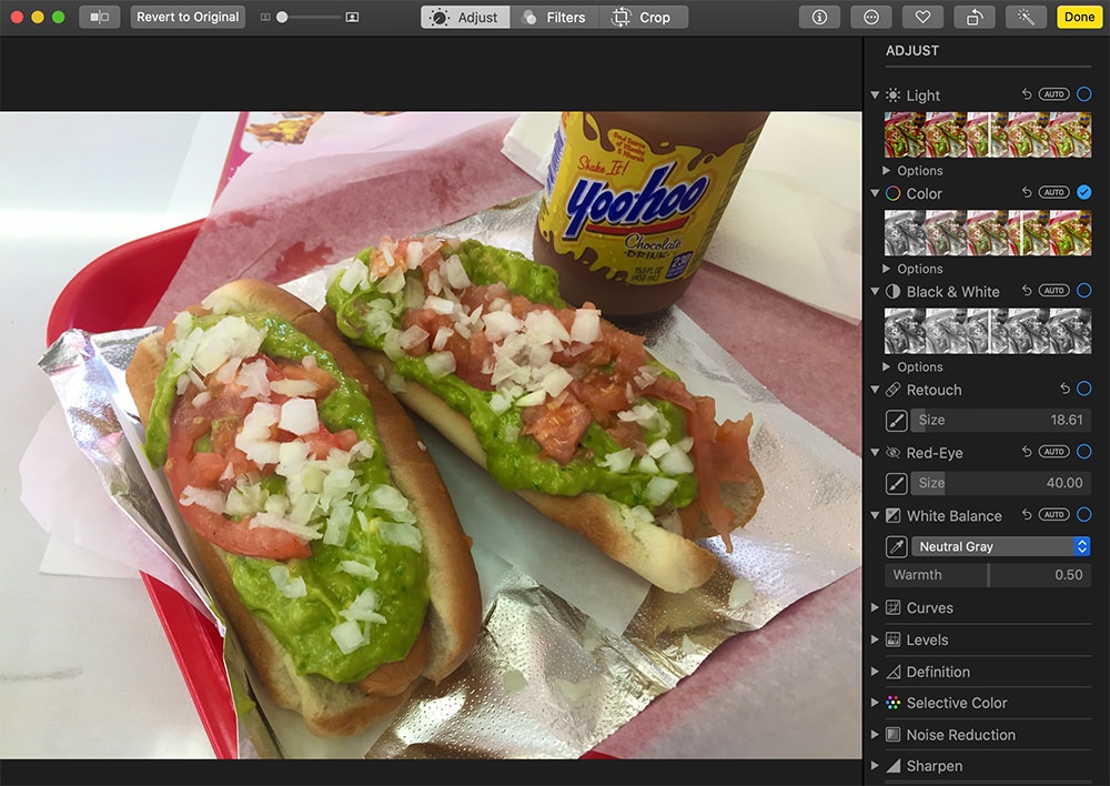
Other than that, they just made things prettier... so to speak. Videos move in preview. The "Day" view tries to logically group and display photos... that kind of thing. Apparently they are using their "machine learning" routines to group photos into events, which is handy for those times you shoot a hundred photos all the same. Photos will now group them...
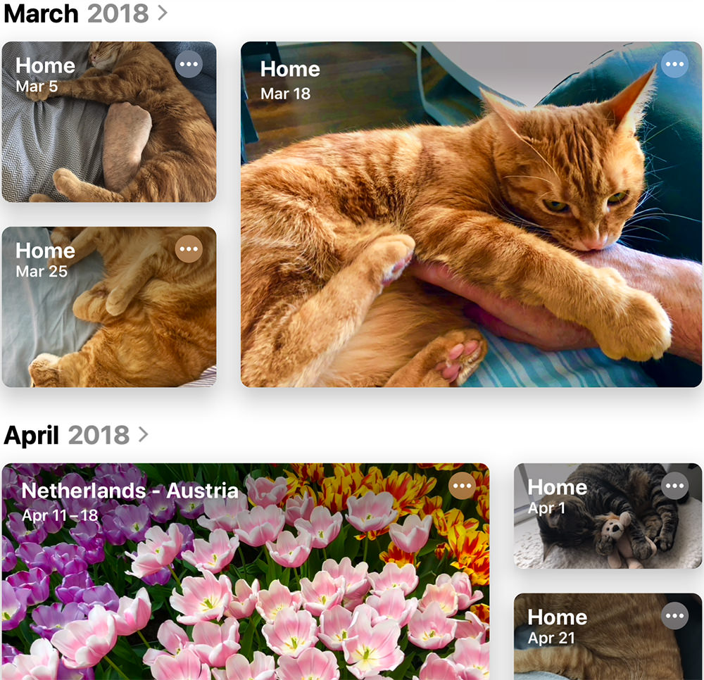
Except I don't like the way that rectangular photos are sometimes cropped as squares to do this, however, so I'll probably end up in "All Photos" mode, which preserves the original photo's aspect ratio. Another way Apple claims to be using "machine learning" is to better recognize people in your photos. I'm not seeing much of a difference from how it worked previously, however.
SAFARI
Cosmetic upgrades on the start page, which is no less annoying than it's always been. Can't find anything else that's new.
MAIL
Looks to be mainly cosmetic (It does look a little different). But Apple says there are new features to be found. They must be subtle, because I ain't feeling it.
CALENDAR
Seems the exact same. Which is to say it's an underwhelming app that lacks any of the tools required for professional use. If you're just keeping track of birthdays and setting reminders for lunch appointments, you're good. But if you need more functionality, you'll be looking elsewhere.
REMINDERS
Looks prettier, has more functionality, seems smarter. I use a different system entirely, so this is not something I'll make use of.
NOTES
Looks a little different because of the inclusion of a useless "Gallery View" (too small to read anything, can't be enlarged)... but operates basically the same.
SIDECAR
Because I didn't want to buy a new MacBook with Apple's shitty, shitty keyboards... and instead paid good money to have my old 2012 MacBook Pro Retina display repaired when it broke, my Mac is too old to test this feature (which allows you to use an iPad as a second screen). It seems odd that such a simple trick would be forbidden when my MacBook is perfectly capable of driving an external second monitor, but okay. I've read that you can hack old Macs to force them to support Sidecar, but since it's unsupported, glitchy, and slow... I'll just take a pass.
FIND MY
Apple's new "tracking tech" is mostly applicable to devices like iPhone which are mobile, easy to leave behind, and have a GPS. The fact that Apple is delving into creating a global mesh of "lost and found" is a remarkable thing with some pretty great privacy securities baked in. I suppose it's only a matter of time before Apple releases tracking "tags" to put Tile out of business. On a Mac, Find My is just combining "Find My Friends" and "Find My iPhone" into a single app.
SCREEN TIME
I already know that I spend every waking moment in front of a computer. Having Apple tell me this is not helping. Fortunately, you have the option of turning it off.
ACCESSIBILITY
Apple has made great strides in making their devices easier to use with enhanced voice control and other cool stuff. Bravo.
And that's about it. Like I said... pretty uneventful. When the biggest change is that you broke a single app into three separate apps, well, it's hard to see the point. But I guess it serves to let people know you haven't forgotten about the computer-side of the business, so I guess it's all good. I just wish Apple was interested in finding something new and exciting to push MacOS X into new territory.
 And so it's time once again to tune into the Apple World Wide Developer Conference keynote to find out what everybody's favorite fruit-based tech company has up their sleeves for second quarter 2017.
I have to admit, I no longer get ramped up for these Apple things like I used to. In the past, I would take a frickin' vacation day when the WWDC keynote was unspooling just so I could unpack all the Apple goodness that had been unleashed. I'd pour over every minute and blog epic breakdowns of everything that was announced.
Now?
Well, I'm still excited over Apple's stuff... they're an exciting company. But the way they keep screwing up has me less enthused than I once was. I bought into their HomeKit home automation tech, only to find out that it is a total load of crap. They keep making "pro" equipment that isn't for "pros." The reliability of their products is in the toilet, and the way they address their lack in quality is bullshit. Meanwhile Microsoft is killing it with their Surface line, easily picking up the pro design market that Apple is abandoning.
But I digress.
Rather than have to watch hours of keynote like I did, here's a 19 minute recap that tells you everything you need to know (assuming you haven't seen it already)...
And here are my reactions...
All in all... some nice upgrades in the OS and software departments, but more of the same bullshit for pro design users. A market Apple used to own, but is throwing away with gleeful abandon. Leaving me to wonder if my next computer will be running Windows. My license for Adobe's Creative Cloud Suite works for Mac or Windows, and they function the same on both systems. Food for thought.
 And so, after months of waiting to upgrade my MacBook, Apple unleashed their latest and greatest pro laptops at a special media event yesterday.
Except they're not. Not really.
They're not the latest or greatest. They're woefully underpowered. Embarrassingly underpowered compared to the cutting edge releases in Windows World laptops. The CPU is a marginal improvement in power and speed over previous models... but who gives a shit about "marginal" in a "pro" machine? The Radeon GPU is borderline ridiculous compared to Nvidia's more powerful mobile chips, so why is Apple using them in a "pro" anything? And memory is still maxing out at 16 gigs, not 32? Seriously? In 2016? I regularly work on files larger than 16 gigs! The idea that these are "pro" laptops is laughable to a humiliating degree for Apple. Remember when a MacBook was the absolute king of laptops? So badass that even Windows developers were buying them? Well, those days are over.
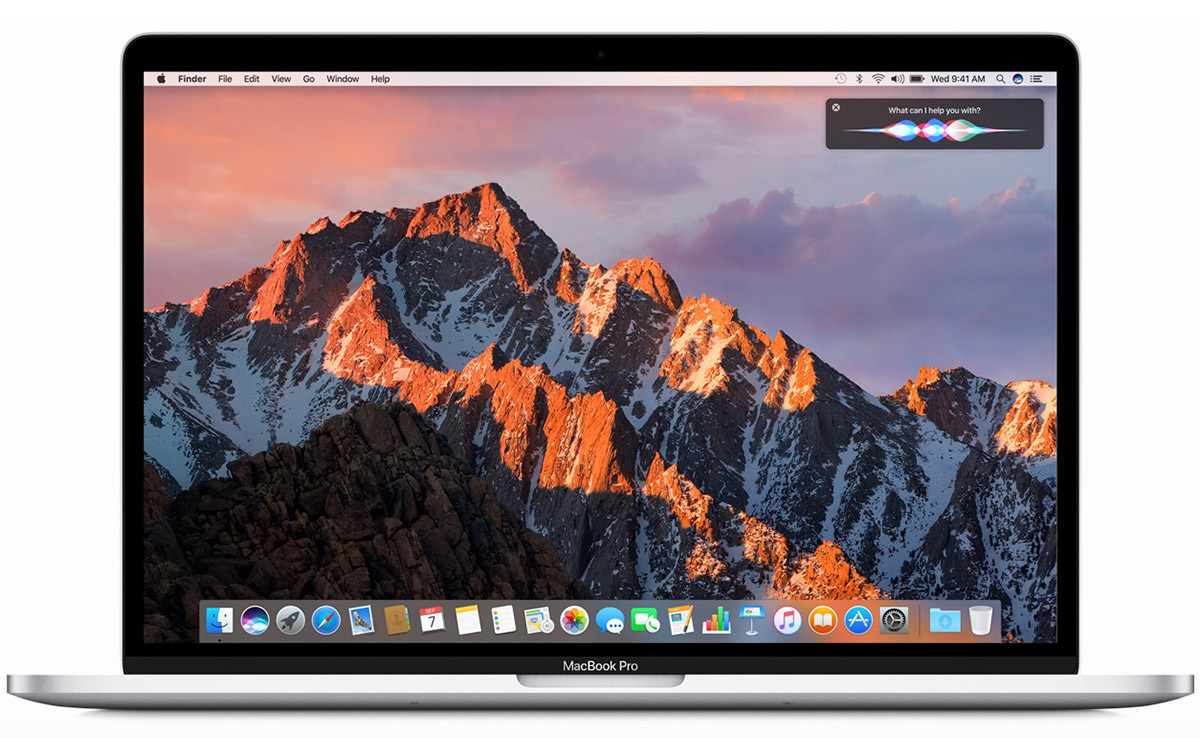
But, ooh... you get a "TouchBar" at the top of the keyboard! And, ooh... it's really thin!
Two things I could give a flying fuck about. I need... NEED... a beast of a portable machine that will allow me to work at peak performance with spec-crushing apps like Photoshop.
And while it would be nice to have an array of ports to handle all my peripherals without another fucking dongle... or, hell... even being able plug in my fucking iPhone without another fucking dongle... that's not a deal-breaker for me. And while it would be nice to have Apple's MagSafe power port that has saved my laptop from taking a header more than once when I tripped over the power cord... that's not a deal-breaker either.
I NEED A FUCKING MACBOOK PRO LAPTOP!
And giving me this "pro" machine that hasn't got cutting-edge performance IS a deal-breaker.
There is no reason whatsoever for me to trade in my 2012 MacBook Pro Retina for the new machine. Certainly not at the premium price tag Apple has slapped on the high-end 15-inch model (my preferred configuration runs $3099). And certainly not with a bezel on the display that is not even all the way around the screen... what an OCD nightmare.
Which leads to a question for Tim Cook, Jonathan Ive, and everybody else in charge at Apple... What in the fuck am I supposed to do now?
Switch to Windows so I can actually buy the tool I need to get my work done?
The MacBook Pro IS Macintosh. It has been for a while. So does Apple even give a shit that they are essentially killing off the Mac with what has to be the stupidest fucking move they could have made for the pro users who actually buy their OS X shit? I just don't understand. Did nobody working at Apple stop for two fucking seconds to think about what they were doing, then turn to Tim Cook and say "This is not what our pro users are needing"... nobody?
Apparently that's the case, and it speaks volumes as to just how badly Apple has lost their way. From all appearances, they haven't the slightest fucking clue what they're doing with OS X anymore. While this was somewhat apparent when they released their bizarre Mac Pro "tubes" that aren't really built for pro needs... it's deathly apparent with the release of their latest "pro" laptops.
When Steve Jobs died, I was never one of those people saying "Apple is doomed! They will never survive without Steve!" But more and more I'm thinking that I was wrong. Everybody at Apple seems to be obsessed with making things thinner and lighter with no regard whatsoever as to what that actually means to the end-user. Pro power requires a bigger, heavier form-factor to accommodate the chips, ports, and battery required. What good is a super-thin, super-light "pro" laptop if it's not powerful enough to do the job? Does Apple even give a fuck? Or is thin and light truly all they care about, even though it's not the top priority for their customers?
I am one of the biggest Apple Whores you will ever meet. I live and die by their products. A good chunk of my life is defined by their products... the Mac, in particular. Nobody wants to see Apple knock one out of the park more than I do. Nobody wants to spend money to buy the latest Apple laptop more than I do. Nobody loves the Mac more than I do.
And that's the problem.
I love the Mac more than Apple does.
Look where that's gotten us.
 Something pretty great is going on in my life right now, but I can't talk about it.
Which is kinda frustrating because I don't really have anything else to blog about.
Oh... except to say that I just spent an hour figuring out what went wrong with my blog, so I can actually post all the stuff that I've been sitting on all week.
I guess that's something.
Now, if you'll excuse me, I'm going to try and figure out what Apple has done with the "Secure Empty Trash" command in the MacOS X El Capitan beta...
 And so... I've been using Mac OS X "El Capitan" Public Beta for a full day now.
Not terribly impressed. Some things I've observed in the past 16 hours...
A lot of things I'd liked fixed/changed, to be sure. But the biggest is my laptop fan going off and on all day long. It just sucks to have to listen to it all the time when I rarely had to with previous OS X versions. If this is the cost for speed bumps I barely notice, then no thanks. Hopefully Apple is on the case.
UPDATE: After futzing around with the CPU monitor, I think that it's Mail that's the culprit. Even when running in the background, it's pegged at 138%+ CPU usage. Quitting Mail lets my laptop run much, much cooler. Guess I might be needing to find a new app for email.
 Virtual desktops have been around for a very long time. But it wasn't until Apple unleashed their version of the virtual desktops in 2007 (called "Spaces") that it became a seamless experience on Macintosh computers.
And essential. At least to me.
By creating multiple desktops using Apple's "Mission Control," you get clutter-free workspaces that you can switch between with a flick of the mouse or trackpad...
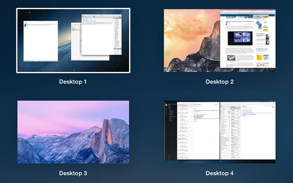
Being able to give each of your Spaces a different background image so you can tell which desktop you're looking at is pretty cool. But the killer feature that makes Spaces so compelling is being able to anchor different apps to a specific desktop...
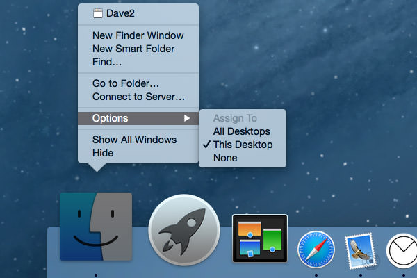
So now when you click on an app icon in the dock, you are sent to the associate desktop automatically without having to keep sliding between all your Spaces. Nice. I've become so accustomed to using Apple's "Spaces" desktops that I don't even think about it anymore... it just The Way Things Are.
Until this morning when they stopped functioning for some reason.
I tried working without virtual desktops, but was quickly driven insane. Instead of effortlessly switching between Spaces I was having to hide and unhide apps... sort through piles of windows... constantly resize app panes... it was a nightmare of inefficiency and trauma. So much so that I wasted precious time Googling a solution (had to kill some prefs) so I could get back to work.
And now I'm a little paranoid... wondering which technology I take for granted every day is going to be the one that gives out next. We've let tech take over our lives bit by bit, and now it has become so integrated into how we function that we don't even notice it.
Until it's gone.
Holy crap don't let Angry Birds be next.
 As a Certified Apple Whore I'm probably more critical of Apple than their harshest detractors. I don't know why that is, except I'm so used to things being awesome when it comes to Apple products that I'm pretty upset when things go wrong.
And it seems as though things go wrong more often than not lately.
As an example... I'm positively outraged that I still can't stream my iTunes movie and television purchases to my laptop or iPad/iPhone. Unlike every other media content provider on the planet, Apple doesn't allow streaming (except to their Apple TV device) and forces you to download video content in order to watch it. This is stupid as hell, makes no damn sense, and means iTunes is grossly inferior to alternatives like Amazon, Google, and Ultraviolet by a huge margin... but Apple simply doesn't give a shit. You do it their way or not at all.
You would think that past idiocy like this would prepare me for any new failures that Apple racks up, but I assure you it does not.
This was only confirmed today when I flew into an apoplectic rage when the two new features I've been waiting, waiting, waiting for in the just-released iOS 8.1 update don't actually work as advertised...
APPLE PAY
The idea is an intriguing one. Instead of using a credit card to pay for purchases, you use the credit card information stored on your iPhone 6. Why bother? Well, there's three very good reasons, actually...
Great, huh?
Well... kinda...
Adding a credit card to Apple Pay is pretty easy. You type in the card info (or take a photo of the card to enter it automatically), then confirm the added card via email, text, or phone call. When it works, it's pretty painless. My Chase Bank Disney Visa even brings up a photo of my physical card design so I recognize which card I'm using...

Once added, credit cards appear on PassBook along with everything else...

Except... it's not a flawless process by any means. For reasons unknown, my Citi card added just fine, but all subsequent attempts to verify it have failed. I've been trying for two days now...
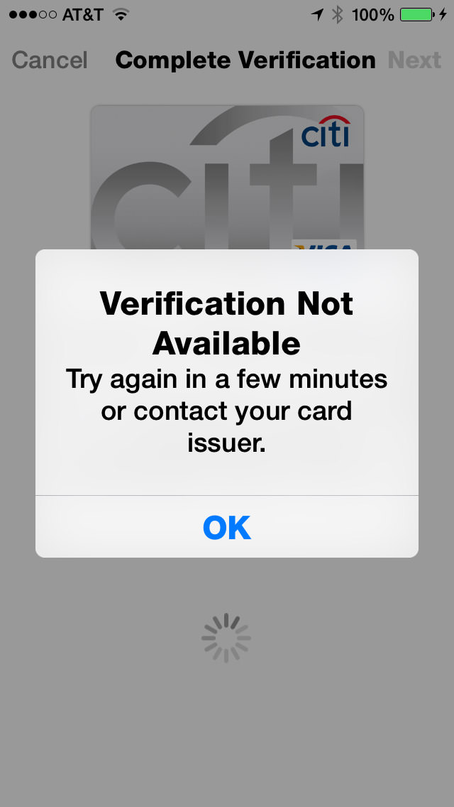
Needless to say, unverified cards are unusable, even though they show up in PassBook just the same. I don't know if this is an Apple problem or a CitiBank problem, but it doesn't matter... in the end it's an Apple problem because they obviously didn't test this crap as thoroughly as they should have.
UPDATE: Eventually I just deleted the card and started over. This time, the only option I had for verification was to call a toll-free number and tell a computer the name of my favorite teacher. Alrighty then...

And then, of course, there's those credit cards that aren't supported, like my US Bank FlexPerks account...

Now, I'm assuming this is not Apple's fault. I'm assuming that they presented Apple Pay to USBank along with all the other major credit card issuing banks, and USBank decided not to make it a priority.
Which is insane.
A major, major player like Apple comes up with a new method of making payment that DOESN'T cut credit card companies out of the picture... and US Bank is not onboard for launch? Like I said, insane. But hardly surprising. Do you know how long it took USBank to add chips to their cards? Years. Years of waiting for them to get off their asses and add a chip so I could use my card in Europe. Here's hoping that Apple completely removes credit card companies from Apple Pay within five years. Like record labels, they will NOT be missed, and technology will proceed much better without them.
Moving on...
According to Apple's FAQ, if a merchant requires you to give them your credit card number, you are to instead give them your "Device Account Number." Problem is, if you have "Display Zoom" turned on, you can't see the number and can't swipe to get at it. Most times when this happens, I am able to copy the information and paste it somewhere to look at it. Not with Apple Pay. I guess the only way to get my "Device Account Number" is to turn off Display Zoom first...
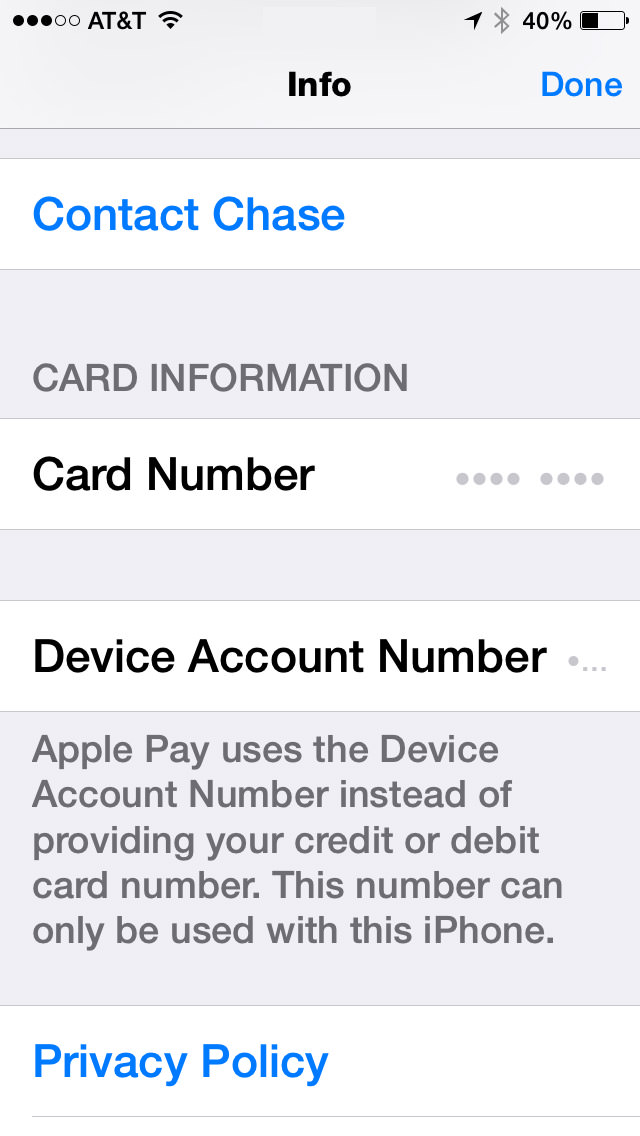
Now, I gotta ask... who the hell is beta-testing this shit? ANYBODY?!? Because every damn time Apple releases something, I find a half-dozen bugs within a day or two. Every. Damn. Time. Surely Apple can't be this inept, so the only conclusion I can draw is that they know about most of the bugs they ship, and just figure they'll get to them when they damn well feel like it. In the meanwhile, their customers have to put up with this bullshit. But anyway...
Once set up, how is it to actually use Apple Pay? Easy. Just hold your phone next to the NFC (Near Field Communication) terminal and your iPhone 6 will automatically come alive and ask you to approve the transaction with TouchID (and allow you to change to a different card than your default, if you wish). You then get a confirmation that the payment was made and a confirmation of the transaction on your card's "info" panel...
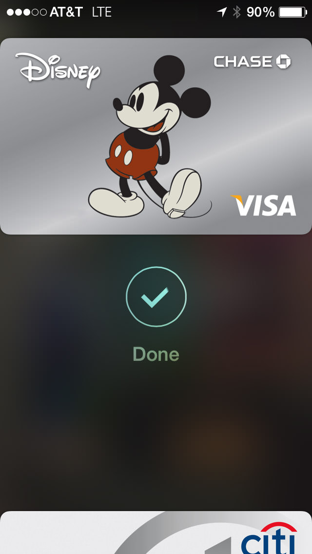
All of this is, of course, is entirely dependent on whether the merchant in question A) Has Apple Pay. B) Know what it is and how to process it. and C) Has it up and running. I tried four locations that were listed as Apple's "partners" and the result was a mixed bag...
So... 50/50 with only one of the two successful transactions working exactly as intended. Not bad for second day after launch, I guess. The one thing I didn't do was attempt to return something to the store, which is supposed to be a real mess. I can imagine that may take a while for stores to train their employees how to handle.
UPDATE: One interesting thing... as I mentioned above, my Device Account Number doesn't show up because I have Display Zoom enabled. But on both my Walgreen's and McDonald's receipt, it says "VISA ACCT" followed by four digits that are not from my credit card. I'm guessing this must be my DAN, so I've made note of it.
Ultimately, Apple Pay has amazing potential. If every transaction could be as utterly painless, seamless, and blazingly fast as my experience at Walgreen's was, I would never pay with any other method ever again. Which, of course, can't happen until all the bugs are worked out and every merchant gets off their ass and implements a NFC processing system... so we're a ways away on that. But still, the future of payment is here, it's really great, and it's Apple Pay.
AIRDROP & HANDOFF/CONTINUITY
For quite a while now, Apple has had a technology called "AirDrop" on their Mac OS and iOS devices. This wonderful feature allows you to transfer files between machines with very little effort. Except... not really. Despite being named the same, AirDrop on Mac OS was an entirely different system than AirDrop on iOS, and they were completely incompatible. This was stupid with a capital D, and Apple should have waited until they got Mac OS/iOS interoperability before unleashing unfinished shit. Well, that day has finally come with Mac OS Yosemite and iOS 8.1. Except not really.
I'm just going to set aside that since my iMac doesn't have Bluetooth LE, it is incapable of connecting in any way with my iOS devices...
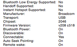
I can, however connect with other, newer Macs, but this involves entering an "Old Mac Compatibility Mode" on a more recent Mac to work. And once you are in that mode, you have to dump out in order to use the current AirDrop with "iOS devices and newer Macs" again...
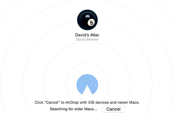
About as elegant as buttering a slice of toast with a hammer, but I'm assuming there's some kind of technical reason for it. But, hey, at least there's an option here. When it comes to getting files from an iOS device, I'm back to emails and DropBox.
But what about those Macs which have Bluetooth LE and are compatible with AirDrop 2.0? Well... I have good news and bad news.
The good news is that it works. Except... not really.
Connecting my MacBook Pro (mid-2012) with my MacBook Air (Early 2014) and iPhone 6 works nicely. Though there was some confusion at first as to what I was AirDropping with because all it shows is the device's owner. In order to know which device you've got a connection to, you have to connect to two or more devices at the same time, then the information pops up...
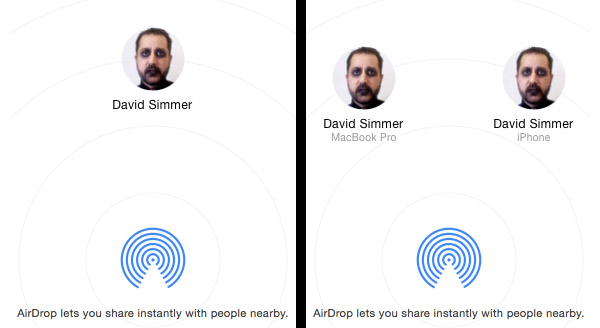
No. I have not one damn clue as to why Apple doesn't help you out with that info when there's only one device connected. Maybe it's aesthetically displeasing to the spirit of Steve Jobs or some crazy shit like that. With Apple, you can never tell. But anyway...
Going Mac OS to Mac OS works perfectly. Going Mac OS to iOS works as expected. But going from iOS to Mac OS? No joy...
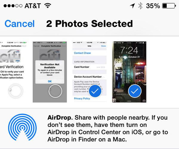
AirDrop is clearly connected... I can verify that on the Mac side in two places. But iOS simply will not acknowledge that it's part of an AirDrop network no matter what I do. I've rebooted my phone. I've disconnected and reconnected various devices in every order I can think of. I can send files TO my iPhone... but can't send a damn thing FROM my iPhone. At least to a Mac. To another iPhone 6 it works fine. I have verified in Apple's support forums that I am not the only one having problems. A lot of people are having problems. To which I have to say (again) who the hell is beta-testing this shit? ANYBODY?!?
Oddly enough, "Handoff" or "Continuity" (or whatever the hell Apple is calling their iPhone to Mac to iPhone to Mac app transfer service) only works in the opposite direction... I can hand off composing an email or looking at a web page from my Mac to my iPhone with no problem at all. A little icon of my current Mac activity shows up on the lock screen of my iPhone 6 (opposite the camera icon), I swipe up on it, login with Touch ID, and I'm picking up exactly where my Mac left off, as advertised...
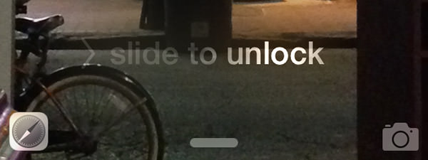
But the opposite direction? No joy. No matter what I do, nothing will ever handoff from my iPhone to my Mac. To which I have to say (again) who the hell is... well, you get the picture.
So Handoff, like Apple Pay, has some problems that need to be ironed out. Why Apple doesn't test thoroughly enough to iron them out before release is a complete mystery to me, but here we are. You'd have thought that Apple would have learned their lesson after the utter disaster that was iSync, but... well... apparently not.
The frustrating thing here is that Apple is developing these awesome technologies that are actually useful. Apple Pay, Air Drop, Handoff... all terrific, terrific stuff. On paper. In order for me to be impressed, Apple needs to make this shit work in reality. Apple Pay is close. AirDrop/Handoff isn't even in the ballpark.
I'm confident that one day things will get hammered into place. Apple has too much to lose if it doesn't. The only question is... how soon?
I want the future now.
