
 And so I installed the developer betas of Apple's latest and greatest OSs for my devices... iOS 26 on my iPhone, iPad OS on my iPad Pro, and macOS Tahoe 26. I dunno if watchOS is out yet.
I have mixed feelings about what's going on. Some of it looks great, but some of it is pretty bad. I'll write about it in full tomorrow, but what I can say right now is this: Using Apple's new "Liquid Glass" Graphic User Interface reminds me very much of that scene in Bedazzled* where Brendon Fraser gets turned into a star basketball player, ends up breaking the backboard, then spits the glass at the camera...

Which is to say I'm finding that Apple is spitting this glass effect everywhere, and it doesn't always land...


Now, at this size when displayed on a computer, it's not so bad. But keep in mind you're using it on an iPhone, which is smaller. And, if you're old like me, you have to hold it out so you can see it without reading glasses on. Apple desperately needs to refine this. Or even give you a way to turn the glass off so people with poor eyesight can read everything more easily...

What a mess.
Another quick observation before I take my leave of you... many of the icons look blurry. It gives me a headache.
![]()
Not at computer size so much... but iPhone size at a distance. Just look at the Photos app icon here...
![]()
But more tomorrow when I've had a chance to play with it all a bit more.
* If you've never seen Bedazzled (the Elizabeth Hurley version), I give it my highest recommendation. Here's that entire scene...
 Apple makes things so easy!
To turn off the annoying printer message that pops up EVERY TIME YOU PRINT ON LARGE PAPER, simply research the CUPS print server documentation for a half hour, find the IP address of your printer, open the Unix Terminal app to type in the command line which will enable the web interface, navigate to your printers, click on the printer whose defaults you want to save (if it is available, otherwise restart your computer and start over), work your way through all the pages until you find the defaults for "Request Offset," set it to "no," click SAVE, type in your admin username ("admin" will not work and neither will your ShortName, but you'll find that out the hard way), type in your system password, authorize the changes, exit out of the CUPS web interface, restart your computer... AND THERE YOU GO! NO MORE ANNOYING POP-UPS EVERY TIME YOU FUCKING PRINT! IT'S JUST THAT EASY!!! AREN'T YOU GLAD YOU BOUGHT A FUCKING MAC?!???
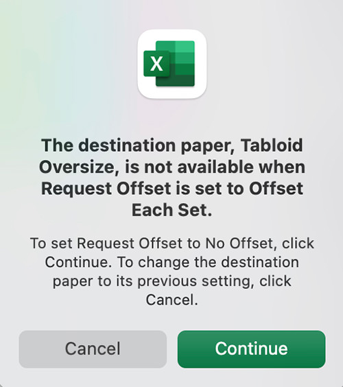
Look, I realize that Apple is not wanting people to print stuff to save the planet and all that... but there are people who actually have to print stuff. The fact that they don't want to make such a basic function of their operating system be easy to use and manage is reeeeally telling on the "It just works" company.
 And lo did Apple release another Mac OS X update.
Right off the bat, Stage Manager (the feature I was most looking forward to) is a pile of shit. It's supposed to make it easy to focus on the task at hand by shoving the apps you're not using to the left-hand side of the screen. But nothing acts in an intuitive manner and trying to figure out what will actually happen when you interact with something is an impossibility because there's no sense to it. I spent five minutes trying to access my Finder windows so I could drag files to an app only to give up in frustration and turn off the entire shit-show. Maybe I'm using it wrong, but if something acts this badly and you have to get training to understand how to interact with it, then it's a big ol' fail, isn't it? So back to "Spaces," once again, I suppose. One can only hope that Apple gets this figured out, because it's an intriguing idea.
Safari is a web browser that's both great and incredibly frustrating. Great because it's fast and capable... frustrating because there are sites which break on it. Facebook, for example, is horribly frustrating because stuff randomly won't work on Safari. Take, for example, not being able to click on story links and have them open (currently you have to control-click and tell Safari to open the link in a new tab or window). It would be nice if you could use Safari without having to worry about crap like this, but it is what it is. You'd just think that Apple would put the effort in to make sure that popular sites are compatible... because you know that Facebook doesn't give a fuck. Their solution is going to be "use Chrome."
Apple Mail is a shit program that keeps getting more and more shitty because Apple takes features away and never fixes the things that needs fixing. Take, for example, being able to select the outgoing server. You used to be able to change it right from message composer. But then Apple took it away for unknown reasons. The didn't even give the user the ability to hide it or show it depending on if they need it... they just took it away. This time around Apple is improving things (like actually having search work worth a shit) and adding things (like "schedule an email" so it will send at a later date... and "undo send" to retract an email you sent), but Mail is still trash. The only reason I keep suffering through it is because there are things that are much easier due to the Apple ecosystem integration. I'd probably be a lot more forgiving if the program would quit in a timely manner... I am sick to death of "Shutdown was canceled by Apple Mail" popping up all the damn time.
In happier news... ZOMG! MacOS X has a Clock app! Works about the same as the iPhone version. What the hell took them so long? Can a calculator for iPad be coming next?
Back in the olden days, you had to purchase a separate font manager to deal with activating and deactivating the tons of fonts that designers need to use (I was a fan of Suitcase then FontBaseFont). But eventually I just went with MacOS Font Book because it's built in and worked okay. The Ventura version isn't better or worse... it's just different. All the typefaces are displayed in tiles which now gives you a hint as to what the font looks like (it's just an "Aa" shown in the typeface). This is nice, but it sure would be helpful if you could view more characters in a secondary pane or something. As it is, you have to waste time double clicking every time you want to see the full character set... or you can switch to a "Quick brown fox..." Sample view which requires a lot of scrolling if you have a lot of fonts loaded. Overall I think this is an improvement, but it would be nice if they would keep working on it, because it sure could be better.
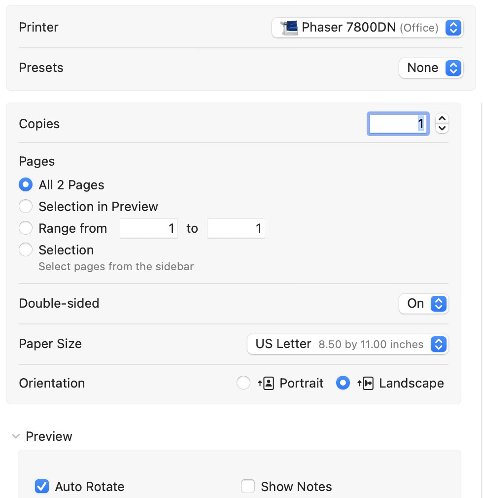
One of the bigger shocks in Ventura is the new "Print" dialogue box. The old one has been busted for years, and now it's how it should have been from the very start. No longer is the "two-sided" option on the "simple" page and all the other options on the "more..." page, there's just one page...
Photos has always been a kinda half-baked app. It really needs a way to switch to an "expert" mode where it acts more like Aperture than something so basic. That being said, there's some new toys that make the latest version an improvement. For one thing, your photos are now text searchable in Spotlight...
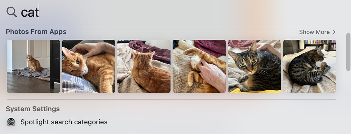
You can even search for a text string in your images if you've photographed a sign or something. Also available is automatic detection of duplicate photos which can be easily merged, and you can share custom photo libraries more easily.
Continuity Camera allows you to use the far-superior camera on you iPhone as a webcam instead of relying on the customarily mediocre-to-bad camera in Apple's displays. When I tested it, people couldn't really tell the difference. Where this feature shines is when it uses the wide-angle lens to look down at your desktop, changed the distortion, and pipe that to your video stream. It's very cool. But also kind of wonky, because the distortion correction gets weird when something comes up off the desktop. Even so, this is an awesome idea.
You can choose to edit or unsend text messages in Messages now. I haven't taken the time to find out if this is apparent on the other end... but I sure hope that it is. The idea that abusers and harassers could change the narrative of events when you have to seek help is a dangerous game to be playing. If somebody is in that position, switching to SMS is essential, so worth checking out if you need it.
When it comes to System Settings... they are just... gone. Replaced, but not really. I have no fucking clue where anything is and have to search for what I'm wanting to adjust in the hopes I'll know what to do when I get there. This is a bizarre change, but I suppose that they are trying to unify how to change system settings across all platforms.
And lastly there's "Passkeys." This is Apple's admirable effort to abolish passwords. You have a public key that's on the website which gets matched to your private key on your Mac (via TouchID) or iPhone (via FaceID). You don't have to type out anything... you just get logged in after verifying on your device. It's a nice idea. So nice that other companies like Google are signing onboard. The problem is getting apps and websites to adapt it. Until they do, Passkey isn't going to help. I had read that PayPal, eBay, and Google were using Passkey, but couldn't find anywhere to turn it on, so that's not good. If there's one technology that I want to really take off, it's Matter SmartHome (a universal protocol for smart devices). If there's two technologies that I want to really take off, the second would be Passkey. So fingers crossed.
All-in-all Ventura is okay. I wouldn't consider it a game-changer or an essential upgrade though. But since it doesn't cost anything, maybe that's okay. Since all three of my Macs are running Apple Silicon now, I have a feeling that there are a bunch of little optimizations going on behind the scenes that I can't really notice to appreciate, but am grateful are there just the same.
If there's a takeaway to be had from the more recent OS X versions, it's that the big feature-busting releases are a thing of the past. From here on out it's all optimization with an occasional cool new thing thrown in so Apple's marketing department has something to sell.
You'll have to forgive me that I still keep hoping for something revolutionary to come along.

Monday was the annual World Wide Developer Conference, and here's my thoughts on what came from that.
PASSKEYS
I'm putting this first because it's something that took me completely by surprise in the best possible way. Having to keep track of dipshit passwords in the year 2022 is absurdly stupid, and it's been more than a little shocking that nobody has thought to do anything about it. Sure Apple has made things better by having TouchID and FaceID auto-fill your passwords for you, but it's still stupid. For one thing, there's still a password floating around out there that can be compromised by a company with lax security. Apple wants to ditch passwords in favor of biometric handshaking. Finally. And because they want to get this up-and-running quickly, they're working with Google and Microsoft to make it happen. Can't happen soon enough.
CARPLAY
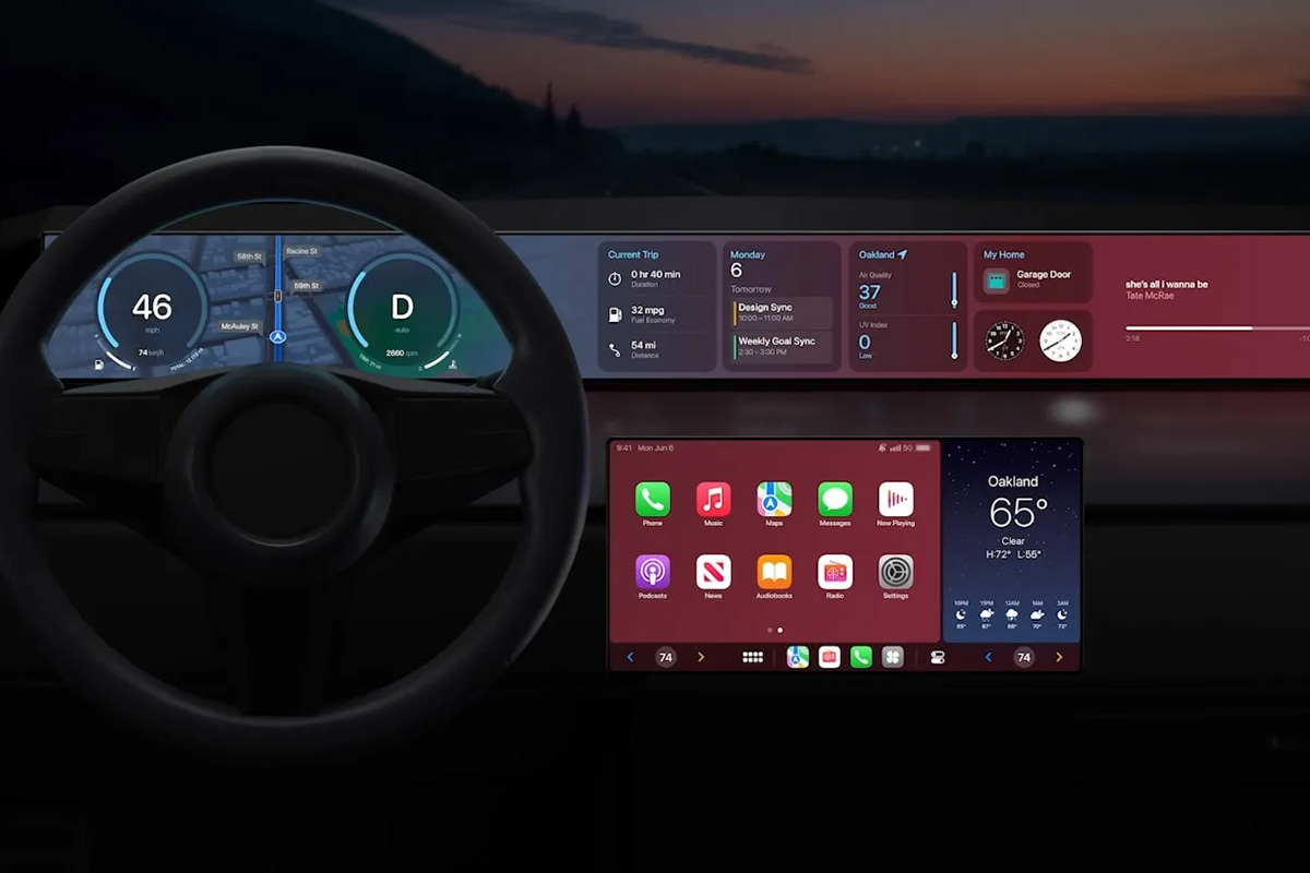
Up until now, CarPlay has been a curious diversion to me. It doesn't really do anything beyond what my iPhone can do when slapped on my car vent holder. Certainly nothing that makes me want to run out and buy a CarPlay stereo or a CarPlay-enabled car. But now? Apple has gone and made CarPlay take over the entire dash, and it's just phenomenally cool...
HOMEKIT HOMESHIT
My complete and total loathing of Apple's Smart Home standard, HomeKit, has not abated since it debuted in 2014 and was actually viable in 2016. It's the most absurdly stupid thing which works with nothing and what it does work with... works badly. I tried to get started with it twice and ended up hating it more after each go. Apple has now started over from scratch, which is about the best thing they could do. The new HomeKit will be built upon the new Matter standard, which is backed by everybody who's anybody in tech, which means that even if Apple shits the bed AGAIN, there will be other options so you're not trapped. I am 1000% looking forward to Matter, which means that I will be a part of HomeKit and not care.
MACBOOK AIR M2
This thing is sexy as hell with its four color options and beautiful design. But that's not even the best part... it's got Apple's shiny new M2 chip inside! If you don't need the power and ports of a MacBook Pro, this is a no-brainer ($1,000 for an M1 chip model, $1,200 for an M2 chip model).
MACBOOK PRO 13 M2
I am beyond confused by this machine. It's $100 more than the Air, has the same chip, a slightly smaller screen... and the only difference I can see is that the screen is OLED on the Pro. Not that it makes any difference to me... I need a 16" model, which this is not.
iOS 16
This update feels mostly cosmetic, allowing you to create custom lock-screens and switch between them like faces on an Apple Watch. The only part of this upgrade which excites me is that you can have "Live Activities" which update on your lock screen in real time, so you don't have to unlock your phone and navigate to the app to track progress on something. Also in this update is improvements to the Photos app (mostly to do with sharing) and the Messages app (you can edit and delete messages, which seems nice on the surface, but could be a nightmare for those being bullied or stalked via text who need evidence) and the Mail app (better search and the ability to undo a send, when supported by the recipient). There's also better dictation abilities (you can use the keyboard while dictating something by voice!) and some intriguing tech which allows hearing-impaired persons to have voices transcribed for them in real-time, which is all kinds of cool (the fact that iOS 16 is finally compatible with Nintendo Switch controllers after waiting for this for years is just icing on the cake).
macOS VENTURE
A lot of what the desktop is getting is the same stuff as what's happening in iOS. But there are a few perks that are unique here. First of all, you can now use handoff with FaceTime calls. So if I've started a FaceTime on my iPhone I can sit down at my Mac and transfer the call there with a click. That's very slick and useful. Likewise, you can use the superior camera on your iPhone as the webcam for your Mac and be able to use it as a Center Stage camera if your monitor doesn't have that ability (see above). And there are MagSafe adapters on the way to affix your iPhone to your Mac, which is a nice touch. Even nicer? An attempt has been made to make managing large numbers of Finder windows easier and for task switching not suck. Something called "Desk View" which allows you to use your iPhone camera to look down at your desk while still having a separate view on your face. This will be incredibly useful to me... it looks like Zoom will adopt the ability, which I truly hope happens since that's where most of my video calls happen. In addition to this stuff... games are faster... there's a lot of minor improvements all over the place, and there's now a shareable online whiteboard for collaboration called Freeform which is cool... but I don't know if it is cross-platform with Windows users? I missed it if this is possible.
iPad OS 16
Ever since iPad broke away from iOS, I keep waiting for this quantum leap change that's going to make it all worthwhile. A pretty big change was multi-tasking for using multiple apps at the same time... but then things kinda just... stalled. Of course iPads are getting all the new stuff from iOS (and the nice app-switcher from macOS Ventura), but all the coolest new stuff is only available for iPads with an M1 chip, which leaves me out. Of course, the thing that I most want from an iPad is a model with a much larger screen for drawing, which hasn't materialized yet.
And that was it. Since none of the OS stuff will be officially released until September (unless you like the idea of playing with the public betas which drop next month).
Until then... I guess I'm good.
 The temperatures may still be high, but the odds of me missing a post full of bullet problems is low... because an all new Bullet Sunday starts... now...
• Monster Problem! My favorite Disney cartoon movie is Lilo & Stitch. My favorite Pixar cartoon movie is Monsters Inc.. When they came out with a television series following Lilo & Stitch, (and a couple of Stitch movie sequels) I was cautiously hopeful. It ended up being really good. They came up with a terrific premise and it worked great. So when it was announced that a cartoon series based on Monsters, Inc. was coming to Disney+ called Monsters at Work. I was optimistic...
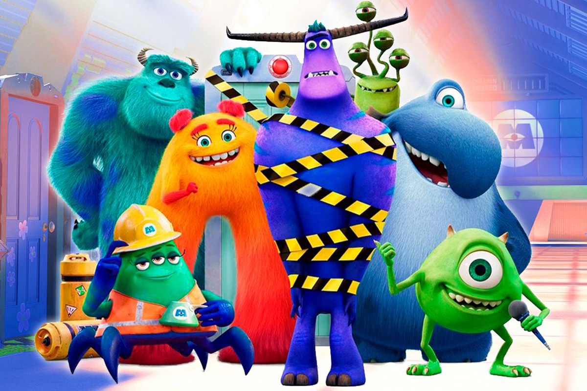
It's not terrible. But it doesn't really work either. When it came time for a sequel to Monsters Inc., Pixar went backwards to Mike & Sully's college days. It seemed a wise choice to me because the entire premise of the original movie was resolved. There was no place to go. And it turns out I was right. I thought perhaps they would expand on the world-building of a city filled with monsters because it was so cool... but they aren't really doing that, instead focusing on the operations of Monsters Inc. now that they are making kids laugh instead of scaring them. It's boring. Oh well. Sully is one of my favorite cartoon characters of all time, so at least I get to see more of him.
• Papa John Problem! This is likely the funniest thing I've seen all week...
@bluecollarwineguy ##pizza ##papajohns ##jimmyjohns ##vans ##GossipGirlHere ##mixup ##skate ##food ##fypシ ##foryou ##nocaptionneeded ##foryoupage
♬ original sound - Connor
• Night Nurse Problem! But this comes close...
@tiffanyharrell22 Night shift nurses and prostitutes do work with genitals all night 🤣 ##nurselife ##bethedifference ##nursetok ##laughteristherapy ##mysisterskeeper
♬ Oh No - Kreepa
• Train Problem! Why it's probably a good thing I don't have kids... because I would actually encourage this behavior...
@logedoge111 ##thomasthetankengine ##thomas##train ##screwthesepeople ##seeya ##moveouttathaway
♬ original sound - logedoge111
• macOS Problem! I finally got around to installing the latest beta of Apple's upcoming version of macOS... MONTEREY. It's more of the same more than it's not more of the same, but there's some things going on that are going to make it a worthwhile upgrade (eventually) I think.
That being said, there's some things that are inexplicably shitty as well. Many of them can hopefully be fixed up in subsequent releases (local servers cannot connect and internet access is horrific, even though my internet on other computers and on my iPhone and iPad are great), or fine-tuned (Apple's privacy setting for Safari is just glitchy as hell, with Google oftentimes just outright refusing to even load). But others? The other shitty things? Seem to be by design (the new way tabs are handled in Safari are fantastic at first blush... but then the horrors start settling in as you really start to use them). But it gets worse... some of the compelling new features (LiveText, for one) won't work on Intel-based Macs at all, which is monumentally shitty. And the icing on the cake? Monterey breaks existing apps (like Nord VPN).
My advice? Do not install this shit. It should have never gotten wide-release beta in this pathetic shape.
• Big Mac Problem! Yeah... how DID she know this?!?
@cbethanderson A true story for the over-30 crowd.
♬ BETTER.EVERY.DAY - Shaun Ward
• Fan Problem! And lastly I'd like to leave you with this heartworking story...
@jayandsharon I don’t usually post serious vids but hope this inspires others ❤️ ##CheapTok ##TrueStory
♬ Pieces (Solo Piano Version) - Danilo Stankovic
Isn't that enough problems for your Sunday?
 Here we go with yet another post-Apple-World-Wide-Developer-Conference keynote. This year's was really long, so I am only writing about things when I have a comment to make instead of summarizing every little thing that was presented. If you want to watch the keynote yourself, just head over to Apple.com and have a look!
• But First... Kudos to Apple for prefacing their WWDC Keynote with a statement on racism, equality, and injustice... and what they are doing to address racism in their industry and our communities. Not only that, but Tim Cook called out the "senseless killing of George Floyd," which is not as strong as calling it what it is... but at least they didn't diminish it by merely calling is "the death of George Floyd." This is not just lip service. Apple is putting their money where their mouth is too. Apple is investing $100 million to help in demanding equality in our communities. That's a drop in the bucket compared to the massive fortune they're sitting on, but it's a heck of a lot more than what other big companies are doing. Apple is also creating programs for Black developers and finding new ways to encourage involvement by POC in the developer community. As a step forward, all the developer videos from WWDC are completely free for anybody to look at this year. Good on them.
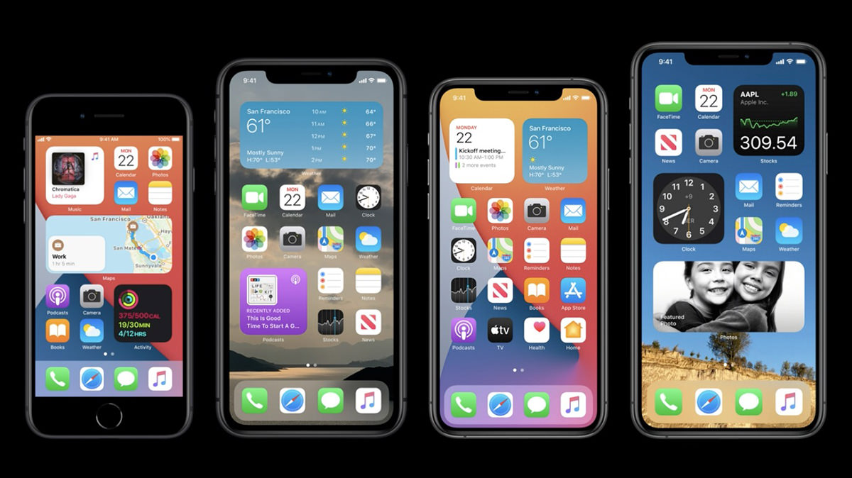
• iOS: Widgets. One of the things that I loved so much from MacOS X was the widget screen. So many incredibly useful tools are just a swipe away. Then Apple eliminated them and I was bigly sad. And yet... here they are in iOS?!? Does this mean we will see a return of widgets in MacOS? I am holding my breath. I have said many, many times how my favorite mobile phone to work on was Windows Phone. Yeah, I never gave up my iPhone for it but, upon release, Windows Phone OS had new ideas with fresh ways of doing things. By contrast, Android was just a poor iPhone copy. One of the best features of Windows Phone was "Live Tiles," and that's almost exactly what iOS widgets are looking to be like.
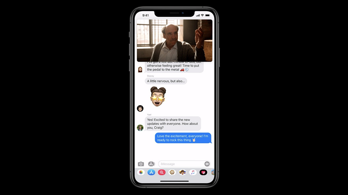
• iOS Picture in Picture Video. Before iOS 14, you had to stop watching a video if you needed to access your apps for some reason. Now Apple has made it so you can keep watching (and listening) while you use your apps. Given how many times a day I get a distraction, being able to keep watching while I'm glued to my phone while traveling is a serious big deal.
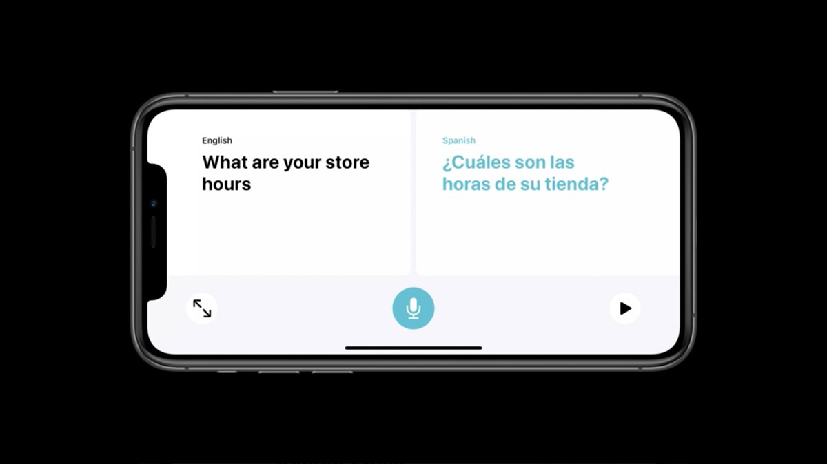
• iOS Translate. Holy shit. Offline machine learning translation with conversation mode? Sign me up! As translation gets better and better, this is going to open up the world in new ways. I cannot tell you how many times this would have come in handy with my work. Very exciting stuff.
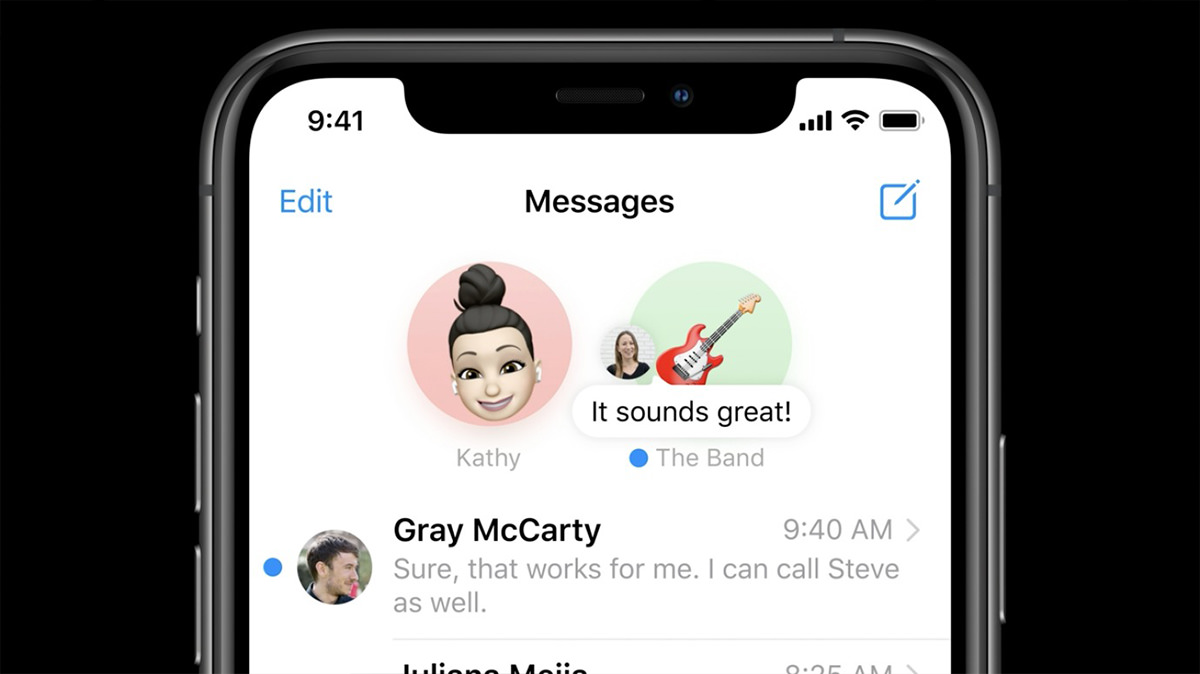
• iOS Messages. I hate phone calls. All my friends and co-workers know this. I will put off returning a phone call for as long as possible. But a text message? I will hop on that immediately. And yet... I still kinda detest text messages because it's such a messy way to communicate. Apple has started addressing this by adding new features. The one that's most important to me? Groups. Group texts have been vastly improved, which is a huge step towards organizing the madness that can ensue.
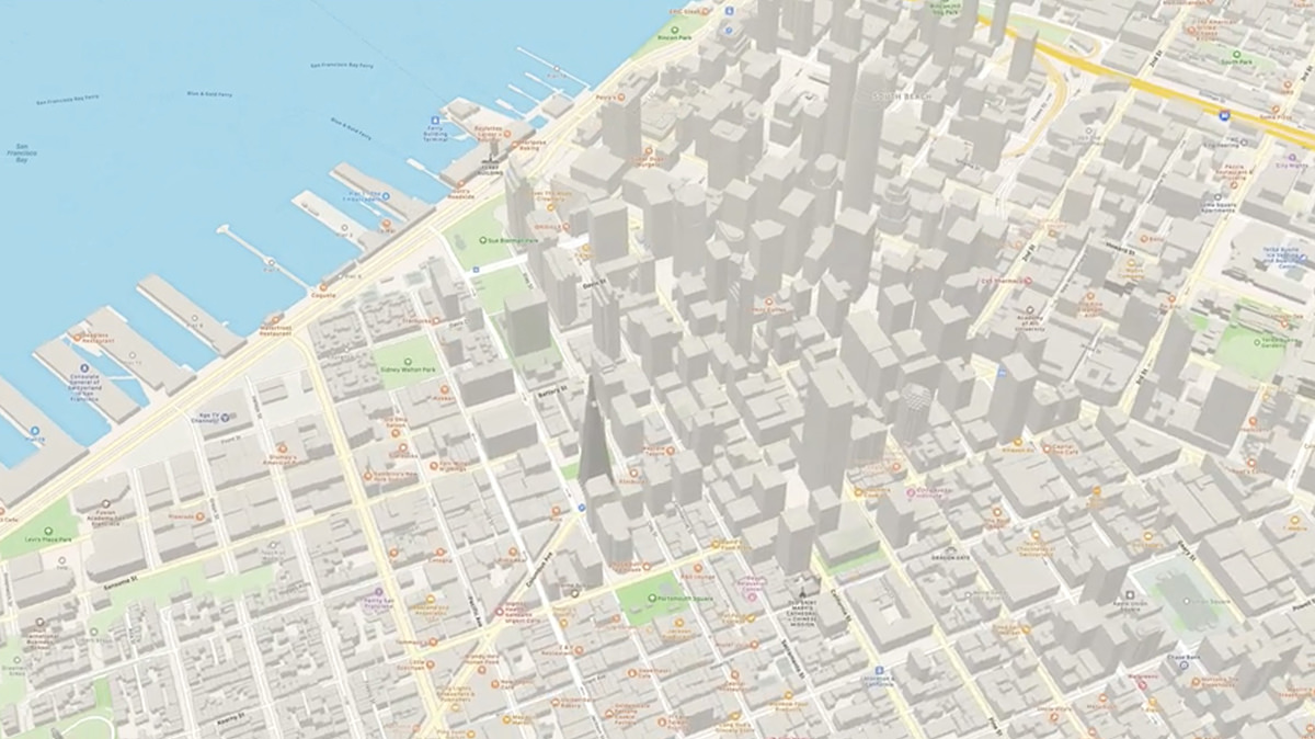
• iOS Maps. I never use Apple Maps for actual navigation because I'm addicted to Waze. I only use it for the cool 3-D views of cities and to have access to their "Walk-Around" feature, which is a greatly upgraded version of Google Maps' "Street View." But that may change. Sounds like they are upgrading their directions (which have been pretty awful). All they need now is automated traffic redirection like Waze has and they could be a contender.
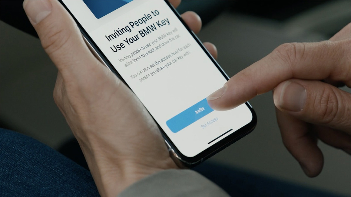
• iOS Digital Car Key. Being able to have my home unlock when I arrive is so cool. Apple is extending the idea further with digital car keys. Now not only can you use your phone to unlock your car, you can also message a digital key to somebody so they can drive or move your car if needed... no matter where you are in the world. Of course I would need to buy a new BMW in order to use it... BWAH HA HA HA... but a boy can dream, can't he?
• iOS Apps. No mention from Craig about the recent controversy of Apple being wishy-washy about which apps owe them a cut of their revenue, but I didn't expect there to be. Craig can likely get away with this because he's got almost offensively good-looking hair.
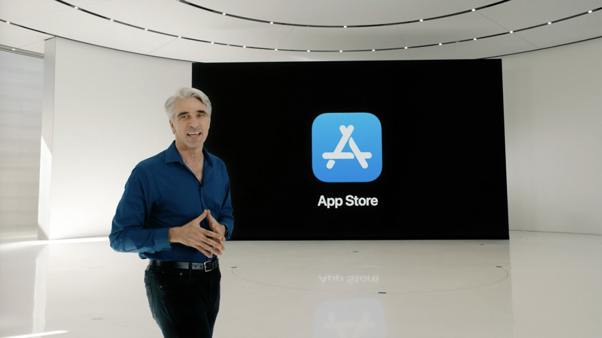
• iOS App Clips. Having to download a new app for some little task is frustrating. App Clips are tiny pieces of apps that handle simple tasks you need to get through your day. They load immediately and will streamline tasks because they integrate ApplePay and "Log-In With Apple" features. And if you want the full app after using the App Clip, you can easily download it. Simple!
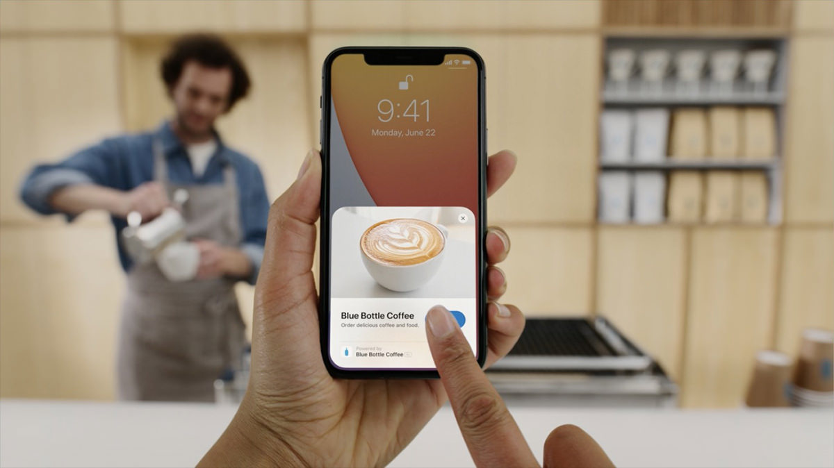
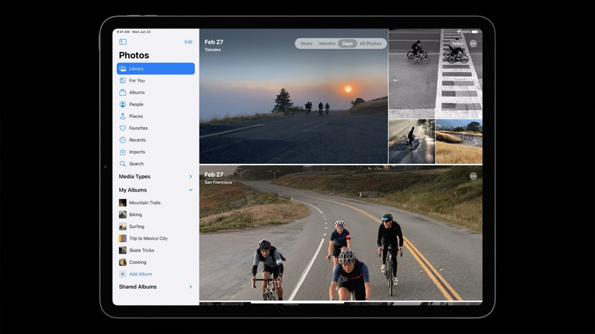
• iPadOS. I only use my iPad for two things... creating art and Zoom calls. That's it. Everything else happens on my iPhone or Mac. Apple is working hard to change my thinking on this by continuously upgrading the iPad experience. They started off with something that goes a long way towards addressing multitasking issues and app navigation... SideBar. This seems a no-brainer given the small screen of the iPad compared to a desktop Mac, but this is the first I've seen it. Smart stuff.
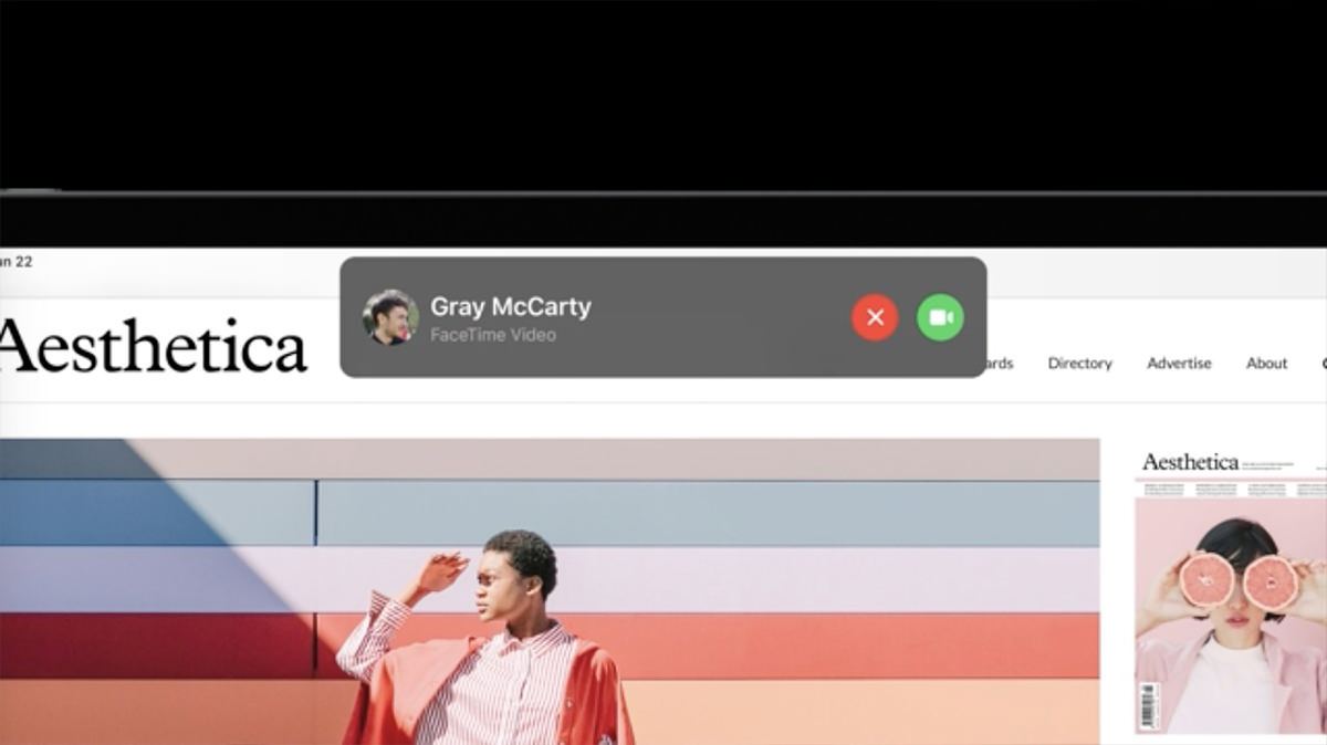
• iPadOS Phone Notification. The way iPad handles calls is kinda stupid. You are dropped out of your app in order to deal with it. Not any more. You can accept or dismiss calls or FaceTime or Skype requests with a popup. Much better.
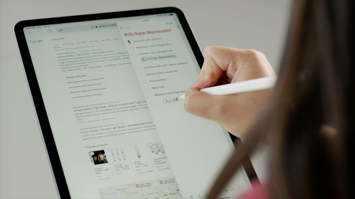
• iPadOS Pencil. iPad is now attempting to treat your handwriting like actual text. You can select it and move it easily. Or have it converted on-the-fly when you paste. iPad is essentially now full-on an Apple Newton with "Scribble" which instantly converts handwriting to text.
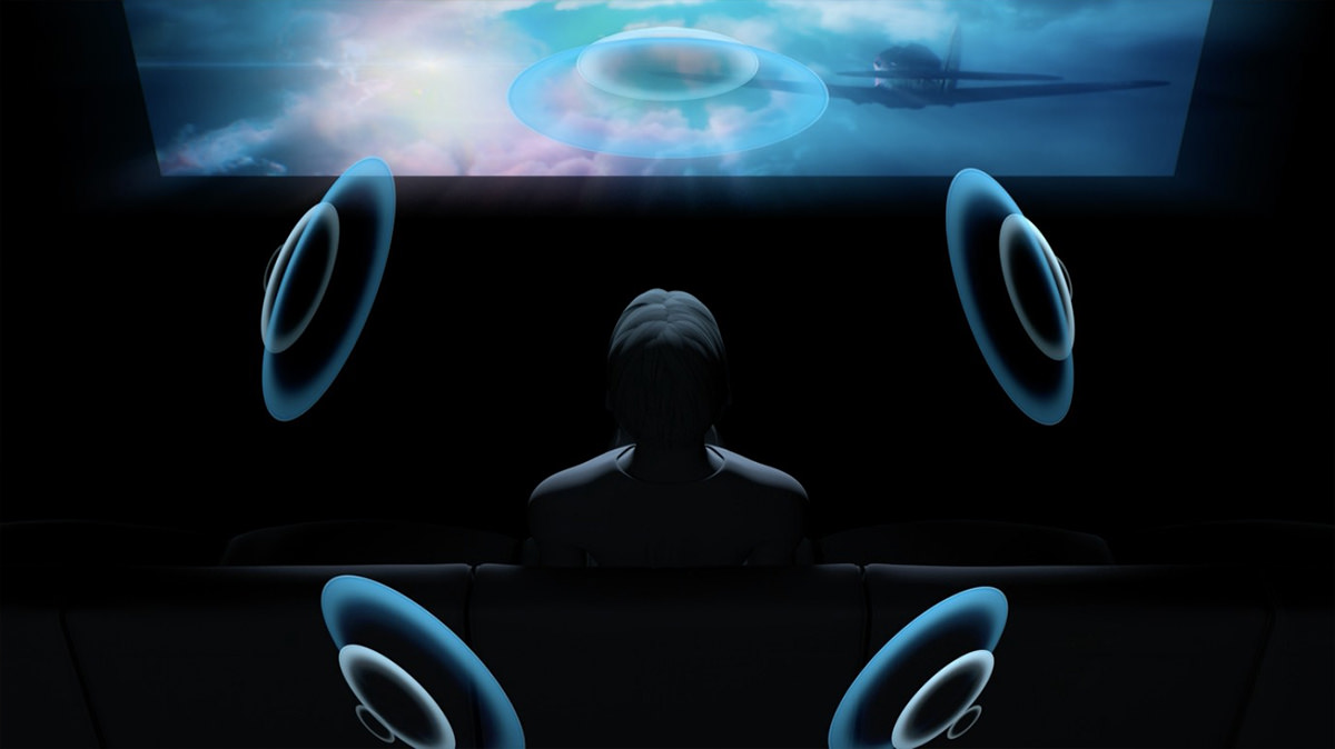
• AirPods. Auto-switching between devices? Magical. But the spatial audio feature being added to AirPods Pro is what has me really excited. If it actually works as advertised, this is Dolby Atmos Audio for one, and well worth investing in a new set of AirPods for me. The way the spatial audio ADJUSTS ON THE FLY when you move your head is incredible.
• WatchOS. I am fairly certain I will be buying into the Apple Watch ecosystem soon. I avoided it for the longest time because I find them so uncomfortable to wear. But after using Waze Band for a while now, I seem to have adjusted. My change of heart has everything to do with the Apple Health benefits which come with WatchOS. As I get older, I am more and more interested in taking advantage of the monitoring and active involvement of staying healthy. I will not, however, use the new "Dance" feature, which would probably result in injuries. Maybe if they add "pole dancing" I will reconsider?

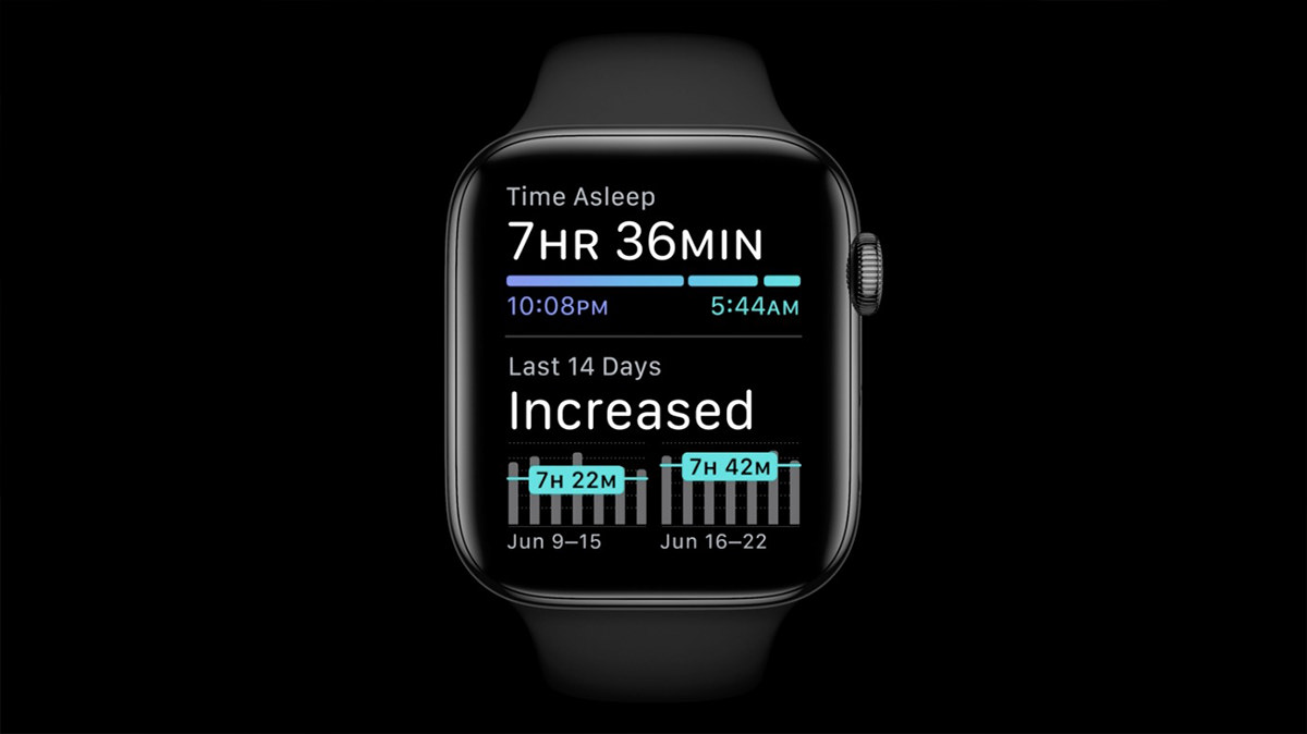
• WatchOS Sleep. The Waze Band ventures a little bit into sleep monitoring, but I don't have a lot of confidence in accuracy and there's no tools to help you get better sleep. Apple Watch seems like there's a lot more going on, making sleep features far more useful.
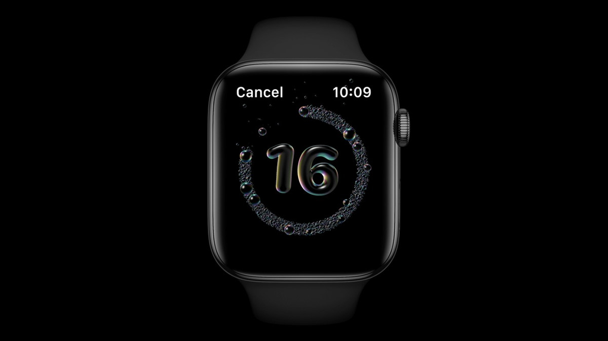
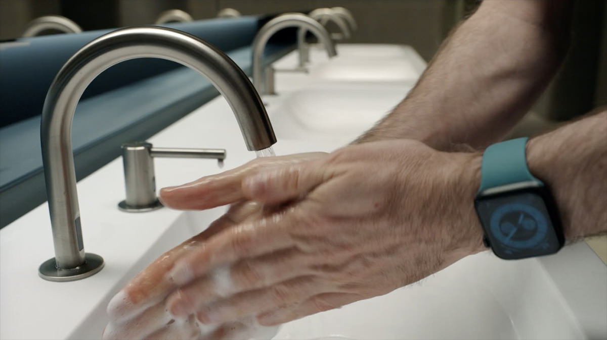
• WatchOS Wash. Talk about timely features... Apple has added a hand washing monitor which makes sure you are washing long enough to destroy the lipid layer of things like COVID-19 so the virus will die.
Note that Kevin seems to have thinner wrists like me, so he's wearing his watch quite a bit lower than you usually wear a watch because it's uncomfortable on the wrist bone for us. This is encouraging. If this guy is in charge of stuff with WatchOS, and he has to wear a watch like I do, that means all the hardware monitoring features will likely work for me because he's obviously going to be testing them. Sweet!
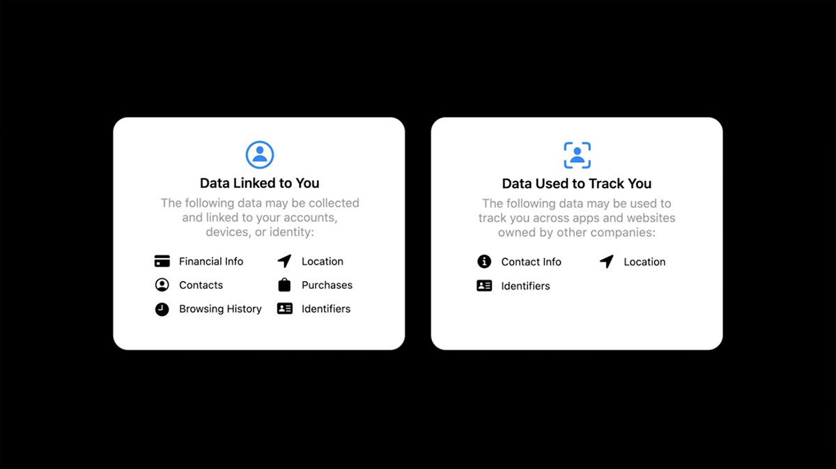
• Privacy. Apple seems to put a lot more thought into privacy than other companies. They are constantly providing more tools to protect us and keep moving data analysis locally so that it doesn't have to go out onto the internet. I don't have much to say about this except Good job, Apple! Our own government doesn't seem to be interested in guarding our privacy, so it's nice that somebody is stepping up.
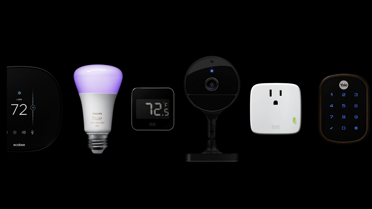
• HomeShit Kit. I detest HomeKit. I avoid it whenever possible because it's just an awful, awful system. Expensive, limited, and it barely works for me. Despite having multiple AppleTVs in my home to fully blanket everything with plenty of signal, sometimes I get an error which says that HomeKit can't communicate with my devices. Ugh. Apple has been steadily improving HomeKit with features and such, so maybe I will check it out again one day. But given my horrible past experience, I'm in no hurry. And yet... there's some compelling integration with iOS that has me wondering if I should be investigating it sooner. The one thing I am very interested in is Apple joining a new home automation consortium with Google. Does this mean my Nest cameras will integrate with HomeKit? Interesting to think about.
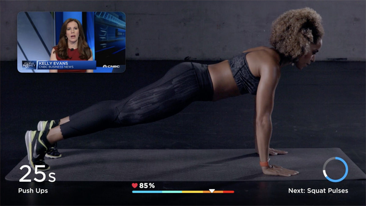
• AppleTV. My experience with AppleTV has been less than stellar. Sometimes it's downright bad. It apparently has very little RAM for streaming because there are times I get shitty, stuttering video. But the biggest problem is with Apple media itself. Even when other streaming services are working flawlessly on my AppleTV, the stuff I bought from iTunes will fail to load or not display properly. Until they address this, all the other bells and whistles (like new picture-in-picture for apps) don't mean much to me.
• AppleTV+. One of my favorite works of science fiction is the original Foundation trilogy by Isaac Asimov. Apple bought up the rights and teased the result...
No idea how this will play out, but I'm certainly excited to see what they've done with it.
• MacOS Big Sur. "Drug-fueled, mini-bus-driving, vision-quest?" — Okay, Craig. Settle down! If you believe the hype, this will be the biggest change to the visual interface of the Mac since the switch to OS X. I don't know if that's the case... these changes seem a more "evolutionary" than "revolutionary"... BUT THAT BEING SAID... I absolutely love what I'm seeing. WIDGETS ARE BACK? FUCK YEAH!!! Discontinuing them was a bigly stupid move, and adding them into Notification Center is okay by me.
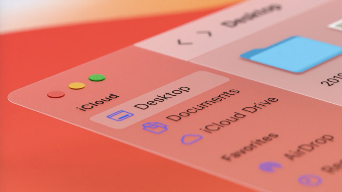
• MacOS Icons. MacOS has redesigned icons! Whee! What pisses me off is that Apple STILL hasn't allowed icons to be manually generated and "baked" into data files. Used to be when you saved a photo from Photoshop, the app would generate a tiny icon to attach to the file so you could see what image you've got. MacOS X eliminated this. Now data file icons are generated by the Finder. Which is so fucking stupid. No longer can you just scroll through all your images and see what they look like... you have to scroll and wait... scroll and wait... scroll and wait... it's infuriating.
![]()
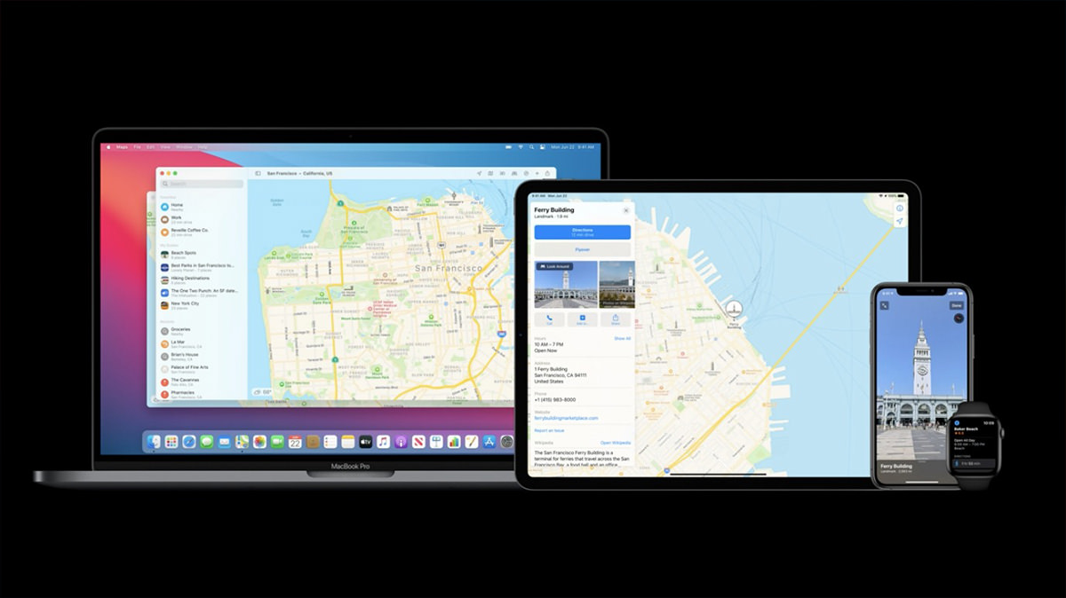
• MacOS Maps. And... MacOS is no longer the red-headed step-child of Apple's hardware when it comes to maps. Apparently they are adding more iOS Maps features that have been missing since Maps appeared on MacOS.
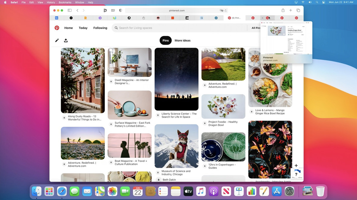
• MacOS Safari. Even though I remain unconvinced that Safari is the best browser out there, it's my default browser just the same. Apple wants to be sure that this remains the case, because they keep making it more responsive and faster with each new release. On top of that, they are constantly improving security and privacy features. By far the most exciting is that they will now notify you if your passwords have been compromised when a data breach is reported. How amazing is that? THESE are the features that are important to me. And, oh yeah, they made Safari more customizable and pretty as well. Whee. And what about those new tabs? NICE...
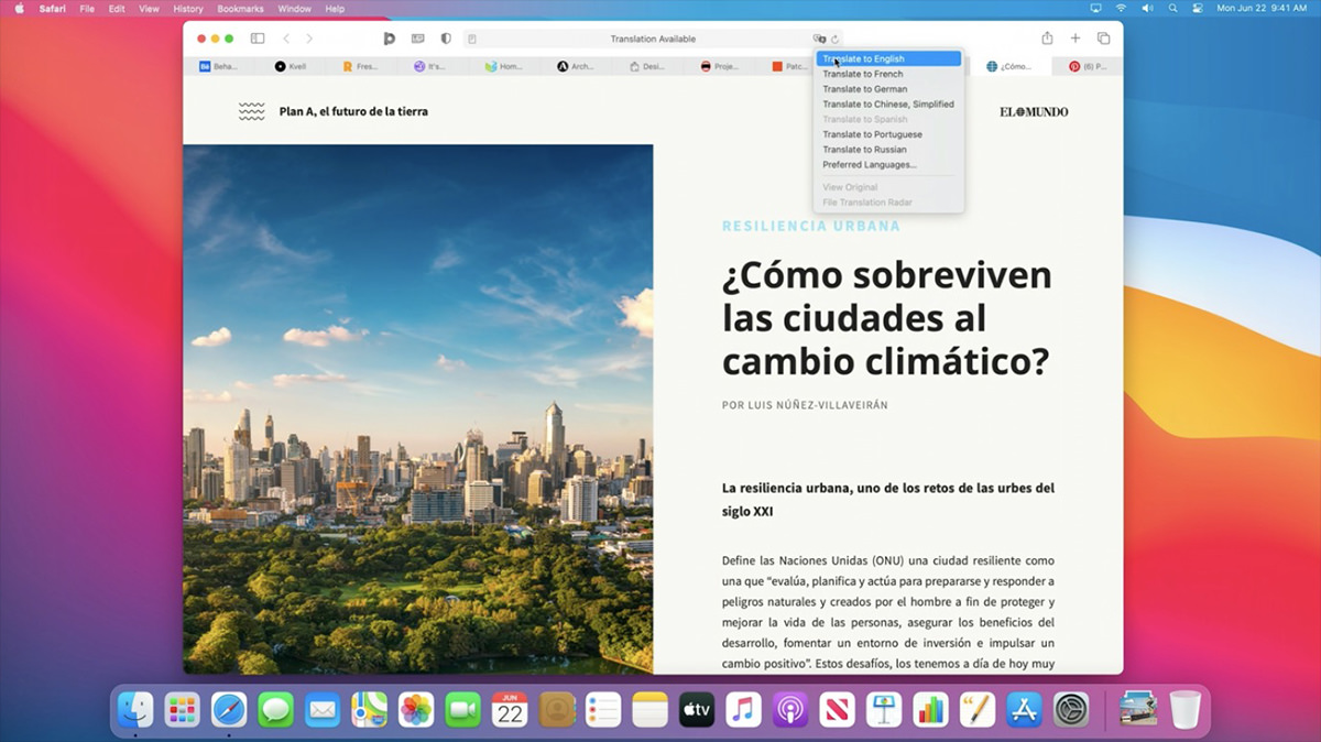
Plus... inline translation when the language of the site is different than your selected language. Looks like you have to click a button. I wish I had an option for pages to translate to English automatically for me... and just let me know with an icon indicator or something so I can switch back if needed.
• Mac on ARM. First it was a switch from 8086 to PowerPC. Then it was a switch from PowerPC to Intel. Now Apple is reeeeeally moving forward by developing their own silicon chips for Macs, just like they already do for iPhones and iPads. This is incredibly smart. By having MacOS work hand-in-hand with custom chips that they design and control, Macs will get faster, smarter, and have better battery life. They can tailor every aspect of the "brain" of their computers to do exactly what they want with no wasted processes or energy. Everybody knew this was coming. I honestly thought it was going to be years off yet. I'm happy to see that it's happening sooner rather than later. My only worry? That eventually Macs will just become big iPads. Because right now there are things that Macs can do which are clumsy or impossible on an iPad. But who knows what the future will bring?
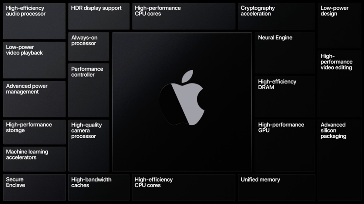
It looks like anything written in Apple's Xcode app development system will just have to be recompiled. Perhaps with minor tweaks. Simple. Microsoft and Adobe are already there for all their apps, and these are some really huge and complicated apps! What will be interesting is how these big companies use the custom hardware to add features to their products. This reminds me of the switch from PowerPC to Intel. All the apps would compile to work on both products via Universal Binary packages, and the user experience was seamless. But for those apps which weren't compiled to run on Intel silicon, they had a translation environment called "Rosetta." Now they've brought that idea back with Rosetta 2," so it looks like the transition is going to be just as seamless to Apple silicon, which is exactly what you want. Performance seems to be very good as well, so what's not to love?
![]()
• iOS on MacOS. A brilliant side effect of Apple making their own chips is that they can make it so iOS and iPadOS apps run natively on the new Macs. That's pretty great.
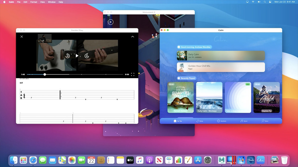
And that's a wrap. There's a lot of stuff to really appreciate here, but it's all vaporware until it ships and end-users have access, so I guess we'll see.
 Every year the Six Colors blog on all things Apple issues a report card. For the past week I've taken time when I have a free minute to make up a report card of my own.
I should start out by saying that I remain disappointed that Six Colors doesn't have a "Customer Service" section on their report card. If they did, I would give Apple an F- or whatever the lowest possible score is. The two horrendous incidents I endured in 2019... both of which were 100% Apple's fault... were so trauma-inducing that I STILL haven't been able to sit down and write out a blog entry on what happened. Every time I start, I get so overwhelmed with seething hatred that I have to stop. Maybe one day. But, suffice to say, Apple "customer service" is so downright horrific that the very thought of it has me questioning if I ever want to buy anything from Apple ever again.
But on to the report card...
Over the past five years I would have given Apple a D. Their shitty, shitty "butterfly" keyboards on their MacBook Pro laptops were a fucking disaster, and everybody hated them. But Apple being Apple felt that everybody was wrong and kept using the stupid things. They finally came to their senses and released a MacBook Pro with a "scissor" keyboard in 2019 and it made all the difference. I'm still upset that they removed Firewire, USB-A, and MagSafe from a so-called "pro" laptop, but I guess Apple is going to remain being Apple and ain't going to stop any time soon. The giant trackpad I was anticipating liking actually ended up being a negative, because it takes up a huge amount of space and is easy to touch when you don't mean to. Also? I have a hard time selecting text with it or click-dragging, something I've never had a problem with before.
When it comes to the desktop Macs, I have to drop Apple down a grade. They are so focused on the high-end Mac and iMac that it feels like the "models for the rest of us" are getting shafted. And don't get me started on the Mac mini. The original idea for that was to give people on a budget a way to afford a Mac by bringing their own periphreals. But now? The cheapest model is $800. EIGHT HUNDRED DOLLARS! If this is meant to be an entry model which is priced to be budget-friendly, it fails spectacularly.
When it comes to MacOS X, which is apparently included in this category, I am indifferent. It feels like MacOS has been stagnating for years. Nothing overly-exciting or truly fresh and new has been released in what feels like forever. To me, MacOS X Catalina was actually a step backwards. My MacBook Pro comes with a fingerprint sensor for TouchID. You would think that this means you are done with entering your passwords. You would be wrong. I am constantly entering my fucking Apple ID password. CONSTANTLY! It is fucking embarrassing just how bad Apple is at security. They put on this huge show of how they are encouraging people to use stronger passwords, then completely sabotage it by making people have to enter these longer, more difficult passwords over and over and over and over and over and over and over and over and over and over and over and over and over and over and over and over and over and over and over and over. Who the fuck is going to use a complex, hard-to-crack password when you have to keep entering it over and over again? Nobody. Apple's claim to be making strong passwords more common is 100% bullshit. If anything, Apple's piss-poor handling of passwords encourages easier-to-remember, easier-to-crack passwords.
I love, love, love the latest iPhone. The phone part is all the same... just a bit faster is all... but the camera is sublime. The camera is everything. I wrote extensively about the iPhone 11 Pro and its miracle-camera here. If anything, my opinion has only gone up since I wrote it. Between Night Mode, Deep Fusion, three lenses, and the amazing quality of it all, I almost never use my DSLR any more. Why would I drag it around everywhere when I can take shots like these with my frickin' phone?



Amazing. If this keeps up, in another couple years most people won't even think about buying an actual camera.
iPad is an amazing, amazing tool. Drawing and painting on it is a sublime joy that still amazes me. And, as they release newer models of iPads and Pencils, it just keeps getting better and better. Where the problem lays is with iOS for iPad. It's just so darn bad. I have been trying and trying to figure out how the gesture-based multi-tasking works, and just when I think I understand it something happens which makes me realize that I absolutely don't. In all honesty, this aspect of iOS for iPad needs to be completely gutted so they can start over from scratch. Just burn it to the ground and start over. The user interface is a place where Apple usually excels. But this? THIS?!? Complete shit. It doesn't matter how good the hardware is when the OS driving it is this cumbersome. And so I averaged them together to get my grade.
I'm probably not qualified to comment here because I don't own an Apple Watch and have no plans to buy one. They are just so darn thick that I find them uncomfortable. Why they aren't investigating putting the battery in the band somehow or doing something to make them thinner is a mystery. Because if you've got a thin wrist like I do, it's just not a very good option. It's a real shame too, because I really like the health features. That being said... if a chunk of money lands in my lap, I might bite the bullet anyway because there's just so much good stuff to be had so conveniently.
Apple seems content to let AppleTV languish, and it's really too bad. The interface is abhorrent. So horribly difficult to use. Have a ton of movies? I hope not. Because you'll spend a lot of time scrolling and scrolling. But what's worse is that Apple content is just plain shitty to stream. Constant buffering errors, drop-outs, and pauses. And before you blame my fiber internet (which is what Apple does)... I don't have this problem with ANY OTHER SERVICE when streamed on my AppleTV. Not even with Disney+ or Amazon Prime streaming on Ultra HD!
Then there's Apple's idiotic attempt at doing away with logins by tying services you purchase through them to your Apple ID. I say "attempt" because the shit DOES NOT WORK. I can't tell you how many times I've subscribed to a streaming service through the AppleTV in my living room then can't use it on the AppleTV in my bedroom. And since you don't get a login, there's absolutely nothing you can do... EXCEPT NEVER, EVER, EVER SUBSCRIBE TO ANY STREAMING SERVICE THROUGH APPLETV! As if that weren't enough, if you subscribe to a service through AppleTV that doesn't have a desktop app, you can't watch it on your computer. You could probably watch it online through the provider's website if you got a login from AppleTV, but you don't so you can't. It makes no sense... NONE... as to why you'd ever go through Apple.
And don't even get me started on the shitty, SHITTY fucking remote they bundle with the thing. It is the single worst remote control I have used on any product ever. Constantly grabbing it by the wrong end. Constantly having trouble navigating content. Constantly losing the little fucker in my couch. I HATE it. And I mostly hate AppleTV, even though most third-party apps are pretty decent... and those gorgeous screen savers are sublime.
I don't subscribe to Apple News+ or Apple Arcade, and only have Apple TV+ because I get it free for a year. I subscribe to iCloud, but it's so horribly priced that I only buy the bare minimum for iPhone backup. The only plus is that iCloud Drive is content to just be a cloud drive, which is more than you can say for DropBox, who keeps adding the most ridiculously shitty and bloated services to their cloud drive that I just don't want. About the only thing I can truly comment on here is paying for Apple services. For weeks I've been getting a pop-up on my Apple Wallet asking me if I want to link my Apple Cash as a payment method at Apple. I absolutely do. Except it fails when I make the attempt. EVERY FUCKING TIME!
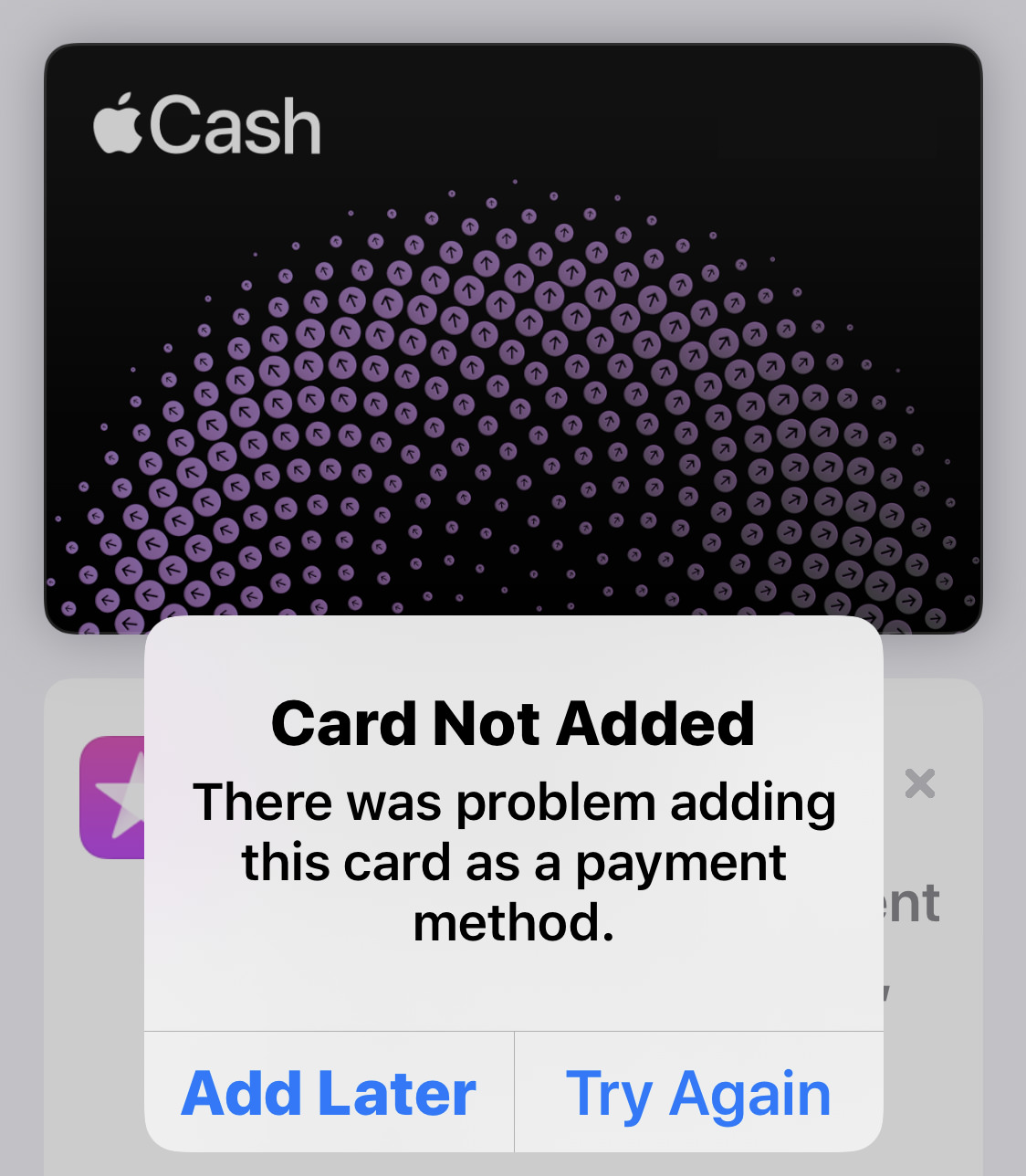
Why in the hell do they bother asking if it doesn't ever work?
I fucking hate HomeKit. It's a flakey, incomplete, crusty asshole of a technology. After waiting forever for compatible devices to come out, I started buying them... then immediately stopped because the experience was so bad. Rarely worked well. Sometimes didn't work at all. I'd recommend that Apple just give it up already, but they just joined a consortium with Amazon, Google, and the Zigbee Alliance, so maybe they're on the right track now. Hopefully this will at least result in a workable technology, because I am totally ready to have my home automation built into iOS.
My score is comparative. When compared to every other tech company, Apple reliability is pretty darn good. It's not perfect, however. I've had to replace hard drives in two Macs in two years because the internal drives started failing.
Where do I start? I hated iTunes. I railed against what a profoundly shitty app it was and how bad my digital life was with it. Then they released the AppleTV app for MacOS and the Music app for MacOS and they are so fucking horrendous that I find myself longing for iTunes again. The TV app is the worst of the bunch. Try finding anything. You can't. Can't find the content you own easily. Can't find new stuff to buy AT ALL. When I go to the "movies" tab, for example, there are a bunch of things that AREN'T EVEN FUCKING MOVIES...
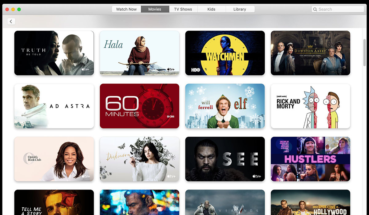
And that's just the tip of the iceberg. Everything from Photos to the App Store to Books to Messages have serious problems and Apple doesn't seem to give a shit just how bad an experience it is.
As I'm not a developer, I can't really comment here. Except to say that I still question Apple's App Store policy of taking 30% of in-app purchases. That seems high considering all they do is process payment. Credit card charges aren't nearly that high, and it seems an absurd percentage in exchange for the convenience. In-app purchases should just be another reason why developers love developing for iOS. As it is, many developers just don't use it because the cut is too high. Want to buy a comic book in Comixology? Sorry. Have to go to the website and buy it that way because Amazon apparently doesn't have margin enough on books to give away 30%.
And that's the end of that. Nobody wishes I could have given Apple better scores than I, but things are sliding so badly in so many areas that I really didn't have much choice. The lone exemption being the iPhone, which is better than it's ever been.
And one of these days... I promise... I will finally unload on the heinous state of Apple Customer Service that I had to endure. It is one of the most mind-boggling, mind-blowing things I have ever experienced in "service" and that is saying a lot considering the crap I've had to put up with over the years.
 As my enthusiasm for Apple has waned, so too has my enthusiasm for their "events" where they unleash their new products and services on the world.
I do watch them of course. I may not be the raving Apple Whore™ I once was but, as there is no better alternative, I am still tied to the Apple ecosystem.
THIS IS BIG
If you want to watch the event before reading what I have to say about it, knock yourself out...
If you'd rather just get an 108-second summary, here you go...
Gotta hand it to Apple... boy do they know how to make "stuff" seem cool.
APPLE PARK
After moving from Apple Campus to Apple Park (home of the Giant Donut HQ, AKA "The Apple Mothership"... a building larger than The Pentagon), information on the massive complex in Cupertino has been relatively scarce. Yes, there's been a good article, a few videos, and some interviews, but nothing showing a major behind the scenes look at any of it. At this year's event (held in the Steve Jobs Theater), there were new bits and pieces shown in the cute video that started things off. If you didn't watch the entire keynote above, here it is...
Gorgeous. Obviously I'm dying to visit. But since the only thing you can see when you show up is the 100 million-dollar visitor center, I don't know that it's worth the trip.
APPLE RETAIL
If there's one area where Apple continues to impress me, it's with their retail operations. The stunning architecture that is the hallmark of these gorgeous new spaces is mind-blowing...
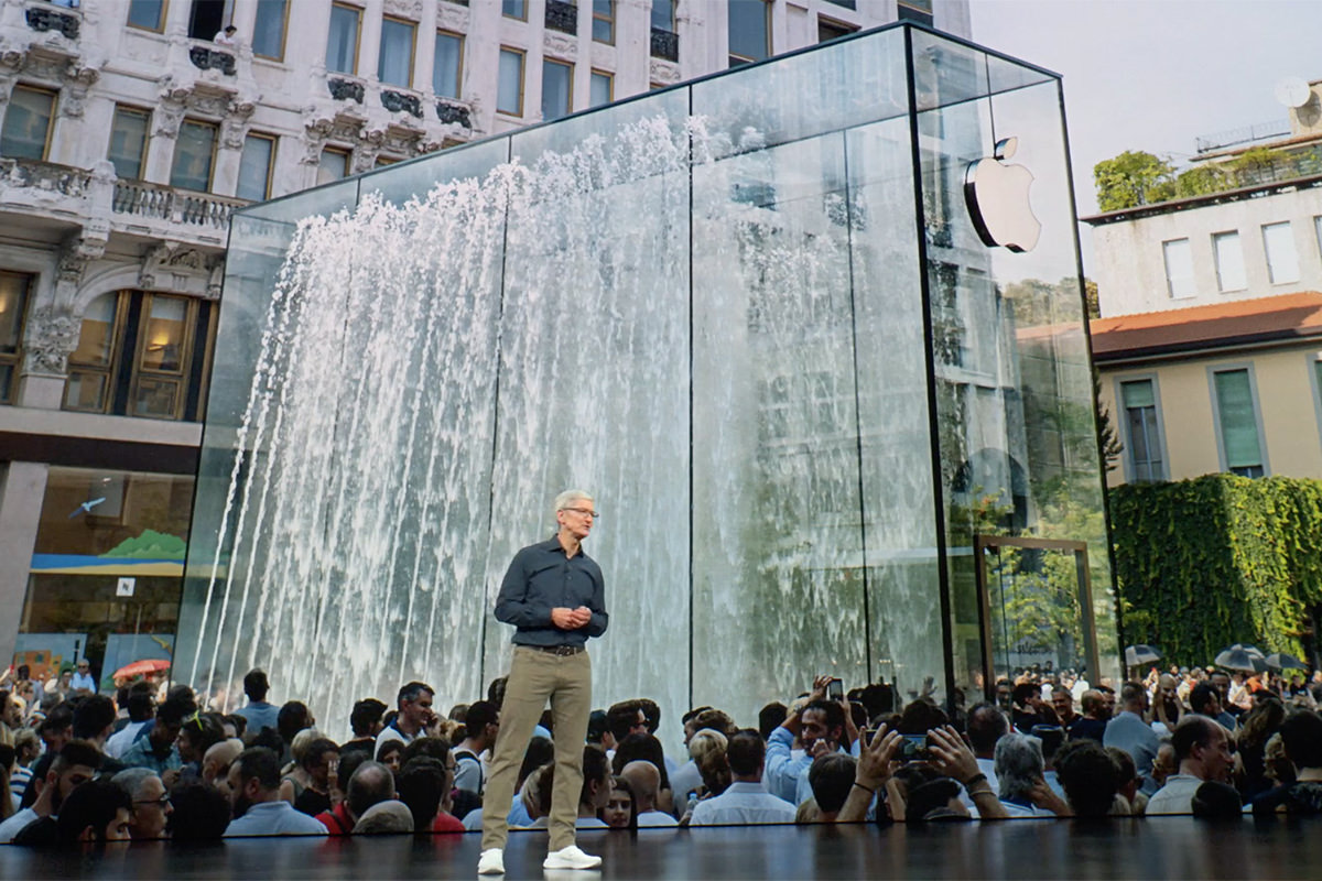
Now that Hard Rock Cafes have gone all hipster-lounge and are not nearly the destination-worthy attractions they used to be, one could make a strong argument for visiting Apple Stores around the globe.
APPLE WATCH
As I have said every time a new Apple Watch is released, the product is not for me. I have tiny wrists and wearing a massive piece of tech on my arm is not something that works. I'd much rather keep my iPhone in my pocket and use that than to be uncomfortable. Not that I don't see the appeal. Having so much so readily available is definitely something that interests me. Especially with the new Series 4 watches, which add all kinds of things that have me reconsidering my stance...
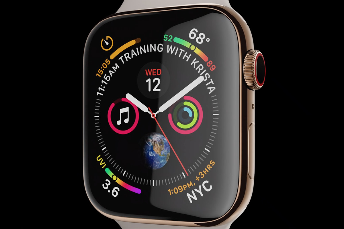
The sizing issue is helped by more of the product being devoted to the watch face... and that it is supposed to be thinner. Probably not so thin that I'd be happy to wear it, but anything to take bulk away is a step in the right direction. Perhaps it's time that I visit an Apple Store and see if the smaller watch is something I could handle? Maybe. Or, if you factor in the new EKG capabilities, probably...
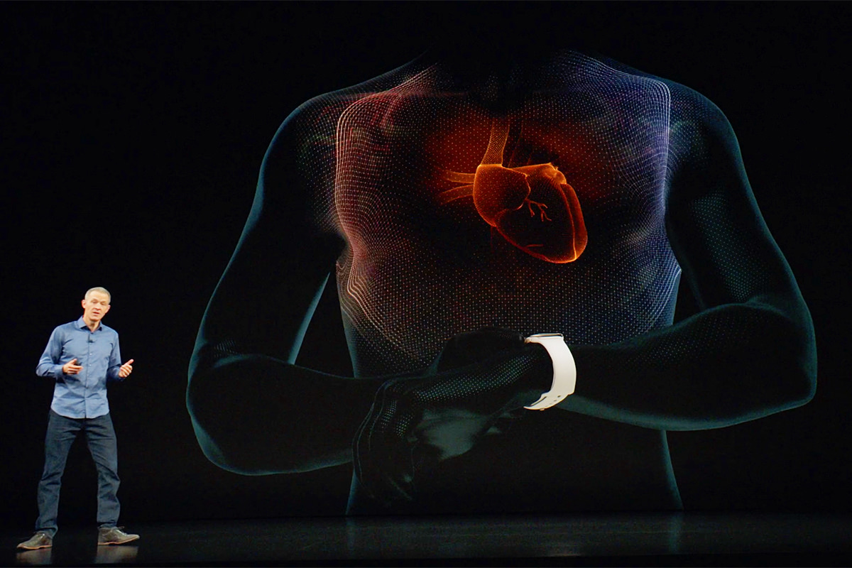
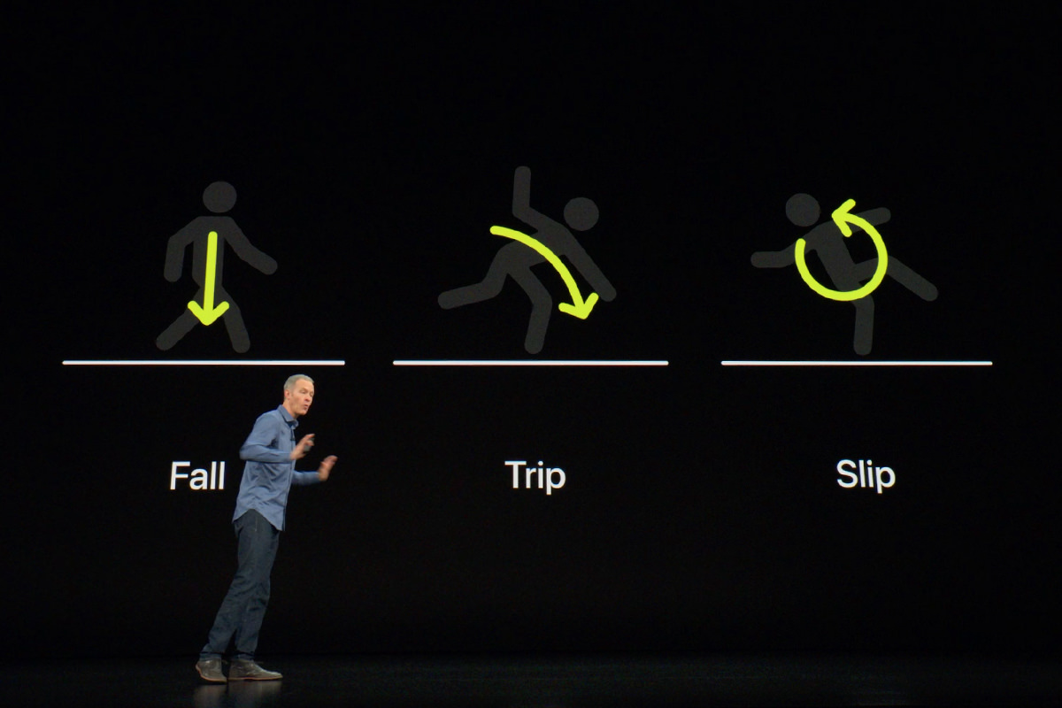
Yes, you read that right, the thing has a frickin' EKG built into it! I've always had issues with rapid heartbeat, so maybe the new pulse sensors and EKG stuff makes Apple Watch Series 4 a smart move? And now they've also added fall detection to the mix. Considering I just had a bad spill earlier this week, maybe this is more of a necessity than a luxury as I get older? It's certainly very cool. If my cats won't help me and I can't ask Alexa to get help because I'm unconscious, perhaps now is the time to invest...
We don't have an Apple Store in my corner of Redneckistan, but I think AT&T stores will be carrying them... so maybe there's that. Or a trip to Seattle to check things out.
iPHONE XS
It would be easy to dismiss the evolution of the iPhone X to iPhone XS with a big "meh" since things haven't changed a huge amount there. But there are three things that make Apple's latest and greatest worth a look. The first is that they are coming out with a "XS Max" version of iPhone X with a larger screen. I don't care about this, but I know a lot of people do. I was not happy having to go with the larger size of the "X" but ultimately adjusted. There's no way I want to have to get used to something even bigger in my pocket. Assuming it would even fit in my pocket...
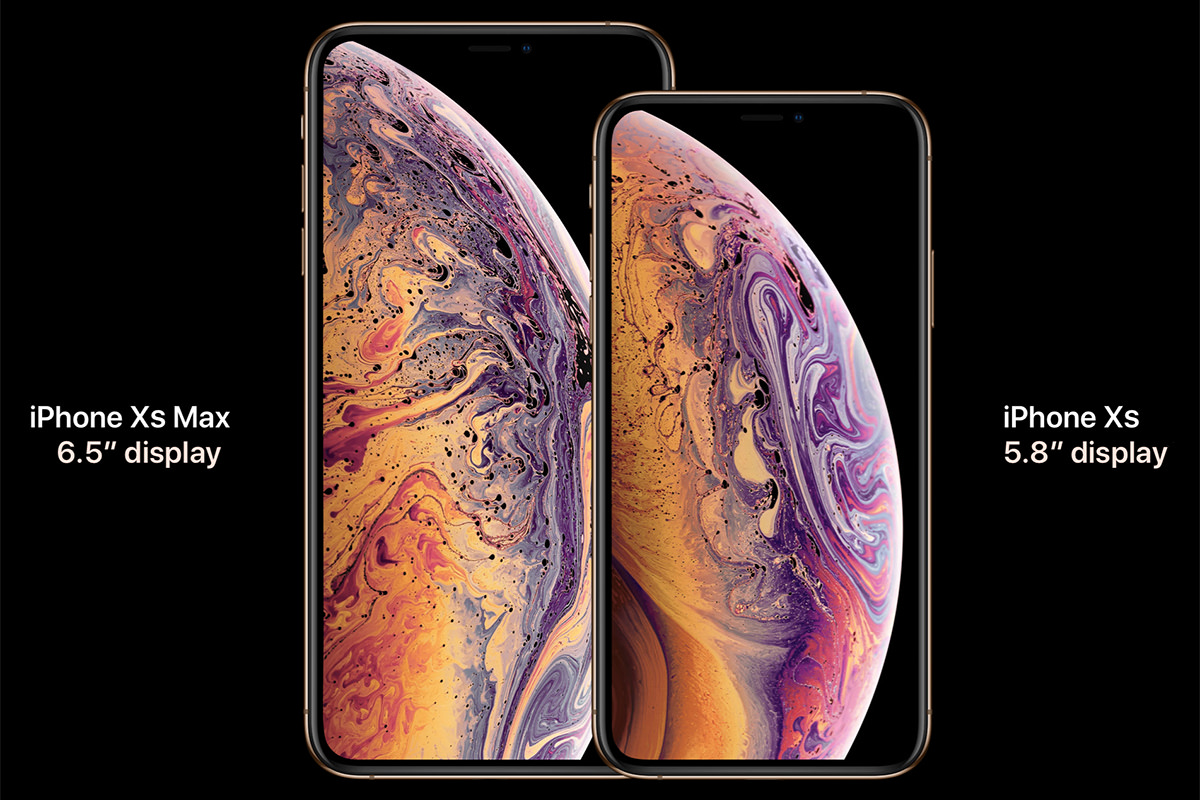
The second? Photography. The faster processor of the next-gen A12 Bionic chip sounds pretty sweet. The machine learning enhancements of the "Neural Engine" alone make for some exciting possibilities down the pipe... particularly in the arena of Augmented Reality stuff. I use my phone primarily for calls, texts, home automation control, and Facebook... none of which will benefit from all this additional power. What will benefit? The thing I use my camera for more than any other function (by a long shot!)... photography. And here's why... the new processing power will allow you to adjust aperture after the photo has been taken! So you don't have to tap anywhere to set focus points and depth of field, you just fire away and adjust after the fact. Amazing...
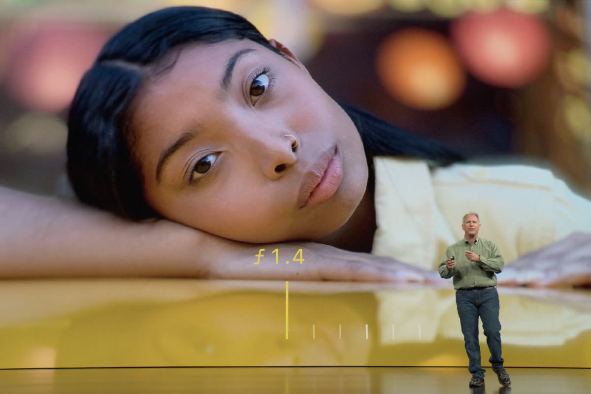
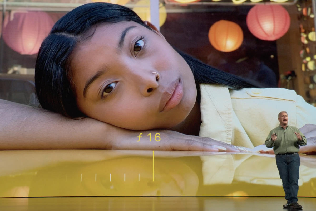
More than anything else Apple has tossed out at this event, this is what makes me covet the new iPhone XS. Well, this and the fact that they've upgraded the camera itself again. Better low-light shots with less noise and more detail. Better HDR. Better Bokeh. Stronger dual-lens capabilities. Apple just keeps getting closer and closer to DSLRs. Heck, I wish I had some of these capabilities with my DSLRs!
And that third thing? The display. Hands-on reports say that the display fidelity of the XS is pretty spectacular and a noticeable upgrade from the X. This intrigues me because I thought the OLED Super Retina X display was pretty great already.
There are a few other notable improvements. Apparently the new XS models are capable of "Gigabyte class" LTE cellular speeds. The lack of which was a big criticism of mine on the old X model. But until I know if "Gigabyte class LTE" equals "Gigabyte LTE" I have no idea what this means. It only matters if you travel in an area where it's available but, if you are in that area, it does matter. Another interesting change? Apple has gone with eSIM rather than traditional SIM cards. This is fantastic if you have two phones and would like to be able to use both in a single handset. I have no idea how this affects being able to use foreign SIM cards for cheap foreign service when I'm out of the country though. Everybody knows to contact me with WhatsApp, so the carrier doesn't matter when I'm abroad... all that matters is the price. If I can't easily change SIMs with eSIM, that kinda sucks.
iPHONE XR
In general, I've preferred to grab an older model phone over a new cheaper model if I don't have the cash for the latest and greatest. In my head, "former top-of-the-line" beats "cheaper newer alternative" when it comes to tech. Not necessarily every time, but often. Apple once again dips into "cheaper newer" territory with their XR model. And, once again, it's the only way to get cool colors like Blue, White, Black, Yellow, Coral, and Red...
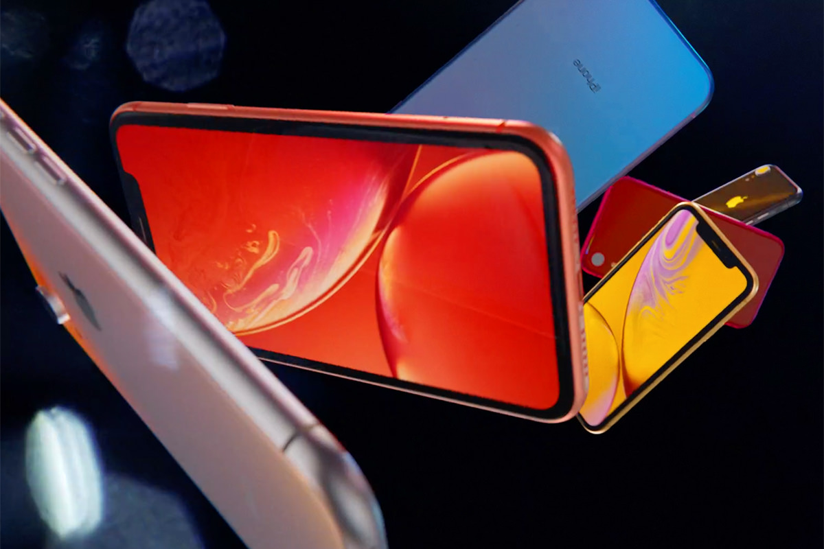
Boy would I like to have me a red iPhone! Guess I'll have to settle for a red case again. But anyway... the XR features the same amazing Bionic 12 chip, cool wireless charging, and fantastic TrueDepth sensor array (so everybody can use Face ID to unlock their phone, a feature I love). Where Apple cut corners to get a cheaper price is mainly with the display. Being LCD, its contract ratio is 1,400:1 instead of the stunning 1,000,000:1 ration of the OLED on the XS. Also? No 3D Touch on these displays. Another savings is with the single camera vs. the dual-cams in the flagship models. None of these are terrible compromises. Whether it's worth the $250 savings is the question people are going to have to answer. If I weren't already going with Apple's iPhone Upgrade Program, I would probably pick the XR in red and be done with it. But since I am with Apple's iPhone Upgrade Program (the only way I can really afford any new-model iPhone now-a-days), I'll just swap my X for an XS when my renewal comes in December.
MACINTOSH
Not surprisingly, MacOS X was once again shit upon at the event. Apple has long been used their World Wide Developers Conference for all things Macintosh, so all we got from Tim was a reminder that "OS X Mojave" is coming on the 24th and it has "Dark Mode." Wheee...
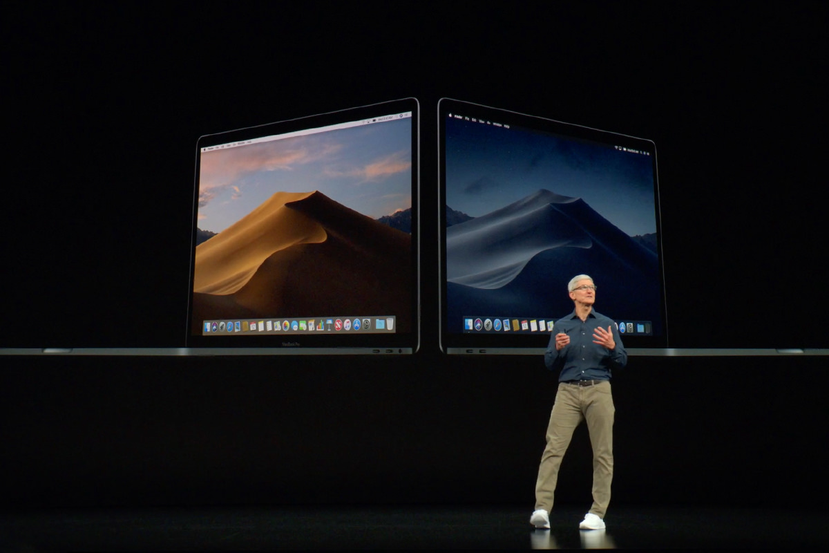
Boy I wish Apple would put some serious money into redefining the desktop experience. Despite annual upgrades, MacOS X feels stale (at best) and downright stagnant (at worst). Giving us "dark mode" ain't going to fix that. Given how most of their revenue comes from iOS, neglecting the Mac is hardly surprisingly. But it is disappointing. Almost as disappointing as their "pro" model hardware that's not really "pro" at all.
And that's a wrap. Until next time. Where hopefully we will get an update on Apple's AirPower charging mat... something that was supposed to be released by now?
 Another year, another macOS X release. And it's called "High Sierra."
This new operating system is one of those infamous "under the hood" releases where there's few actual changes you'll notice (nothing like the "hundreds of new features" Apple unleashed with "Sierra" back in September, 2016). And, while these are always disappointing releases on the surface, there is definite gold to be found in upgrading. Maybe. Rather than review the release (plenty of more capable sites than mine will be doing that), I thought I'd just write down my thoughts and comments.
Away we go...
INSTALL ME, YOU FOOLS... Installation, which used to be a major event back in the day, has been pretty much automated by modern operating systems. Apple, in particular, has made strides to have their OS upgrades be as painless as possible. The worst part about it is the waiting (well, unless your install goes wrong, in which case the worst part is having to recover your computer... please back up first!). Depending on your internet connection speed, the download and install can take around 25 minutes (at my office on fiber with a Fusion Drive) or 45 (at home on cable with an SSD). Both times it was a piece of cake. Bravo, Apple.
EXPRESS YOURSELF... Apple added a bunch of "emoji" to High Sierra. Most of them are charming, but useless to me. Others I'll probably actually use. Like these...

Emoji are actually a big help when trying to convey the sentiment behind your words. Not that they can always avoid a confusing message... absolutely they can just make things harder to understand depending on how you use them... but society is always evolving, and perhaps this will help move non-verbal non-visual communication to a better space. Because something has to.
A BOLD NEW FILE SYSTEM... Arguably the most critical and vital Big New Thing about High Sierra is the switch from HFS+ to APFS. For the non-geek set among you, that's changing the way your Mac handles data on it's storage devices. Apple created their own new thang (Apple File System) instead of hanging on to the antiquated old thang they had been using (Hierarchical File System Plus). It is a much-improved way of handling data, according to Apple. And this time, that is not marketing hype. First of all, cloning files (which used to be slow... and even risky... with large files or a lot of files) is now almost instantaneous. To test, I duplicated a folder filled with 3.6 GB of photos. I barely had time to blink and it was done. Amazing. Really amazing. That alone makes High Sierra worth the price of admission (which is FREE, by the way). But let's not stop there...
Obviously, my experience with APFS is limited right now, but I like what I read about it. Time will tell whether it's a blessing or a curse.
TIME WON'T GIVE ME TIME... I was surprised to find that the date and time were not in my menu bar. Installing High Sierra turned them off, so I had to go into prefs to turn them back on.
SPOTLIGHT NOT SO SHINY... I fucking hate "Spotlight," which is Apple's whole-system search tool. The menu bar "Spotlight Search" is so shitty and incapable that I don't even use it. Instead I use an ACTUAL TOOL TO GET THE JOB DONE, namely "Alfred," an app that makes search act exactly as one would expect search to act. What's weird is that when you use Apple's search box in a Finder window, it's actually not bad. For some reason, they save the shittiness for hot-key menu-bar-enabled Spotlight, where you inevitably always end up scrolling down to "Show All In Finder" because the results are so fucking worthless. Spotlight can also launch apps and do other shit... including the new shit of tracking a flight for you... but ultimately it's a system that's long overdue for a complete overhaul to become a serious tool instead of a toy add-on. Maybe now that there's a Core Framework in place in High Sierra, developers will make Spotlight something worth looking at but, for now, I couldn't care less and don't use it unless Siri uses it to answer one of my questions.
SIRI? WHEREFORE ART THOU, SIRI?... Apple's automated assistant, Siri, sounds like an all new gal (or guy, if that's how you've preferenced it) thanks to an improved speech synthesizer. To me the improvement is noticeable but not revolutionary (Siri takes a back seat to Alexa's speech quality, in my humble opinion). I also think that Siri is grossly minimalistic when it comes to being a smart and friendly part of the macOS. For example? She's not HomeKit integrated. You can't tell Siri on your Mac to unlock the front door when your hooker arrives, you have to grab your iPhone and tell that Siri to do it. Why? This is some amateur hour bullshit (though that's what I've been saying about HomeKit since day one... talk about an AppleFAIL). Still, the number of things you can ask Siri to look up for you and do for you are not insignificant, and she seems to be getting more capable all the time (especially with your music). I just wish Siri felt as much a part of macOS operations as she does to iOS operations (though even that isn't as stupendous as it should be)... and stop being treated as a happy afterthought on the desktop. Microsoft's Cortana and Amazon's Alexa are eating Apple's lunch here. Sink some of those billions of dollars into giving us the next-generation AI we can all love. And fear.
HEAVY METAL DREAMS, PART TWO... Apple's graphics display technology is divvied up into several pieces, all of which handle different parts of drawing out the information you see on your computer display. One of those display technologies is "Metal" which is (simplistically speaking) an application programming interface (API) which you can use to pass off intensive graphics chores to macOS for hardware-accelerated rendering. It's actually a very impressive technology which has been greatly improved in High Sierra with "Metal 2." The tech is pretty great at doing a lot of things well... so much so that Apple has actually taken things like drawing windows in the Finder and started passing them to Metal 2 to take care of. In addition, Apple has developed new stuff for Metal 2, like a virtual reality API, which should(?) make for some interesting new apps (though iOS is waaayyyy ahead of macOS in this area). I'm not sure exactly how compatible Metal 2 is with third-party graphic cards (none of my Apple stuff can even add a graphics card) but, if your card or Mac's internal graphics is compatible, you should see some display improvements... particularly with things like intense games written to take advantage of what Metal 2 has to offer... even over other technologies like OpenGL.
OH HOW I LOVE YOUR HIGH-EFFICIENCY CODEC... Computers today are vastly superior in capabilities to those ten years ago. Hell, even five years ago. I've been around personal computers since the beginning, so I know full well how far we've come... I've seen it happen. The one area that continues to surprise me is video. Back in the day you had to buy a Mac costing thousands, add a graphics card that cost thousands, then add a video board that cost thousands... just to be able to edit video. And even then it wasn't that great in ease of use, quality, or capabilities. Contrast and compare that with being able to capture and edit full-HD video on your frickin' smartphone with absolute ease today and you can see where I'm coming from. The problem is that, as photo and video quality gets better and better, you have to have more and more space to store it. High Sierra makes a quantum leap in addressing that problem. High Efficiency Video Codec (HEVC) and High Efficiency Image Format (HEIF) are built into the OS now, and will give you much smaller file sizes at the same quality (or even give you better quality photo and video at the same size). The samples I've seen of still photos with HEIF are jaw-dropping. Fantastic quality at half (yes, HALF) the file size? Yes! Video files that are half-the size but don't look it? Sign me up! Except... not really. My iMac is relatively new, but doesn't have the ability to encode HEVC. You have to have a special hardware processor onboard which my Mac does not. Nor does my MacBook. All I can do is decode the new video formats. And, bummer of bummers, the video is a bit choppy when I look at it. Oh well. While it may not be something I can currently take advantage of, the pieces are in place for a very bright future when it comes to photos and videos on the Mac.
MACHINE LEARNING FOR FUN AND PROFIT... While actually kind of a hard mix of exciting and scary all in one, "machine learning" is a technology that's going to revolutionize our lives. Or doom all humanity to extinction. One of those two things. Apple is buying into the former by introducing the CoreML API, which allows complex data analysis and categorization. From that, it can extrapolate the data to make "intelligent guesses" as to how the data should be interpreted and acted upon. Or something like that. The end-result is smarter software (some of which is going to happen in ways we can't even dream of) and more capable tools. At least that's the goal. The one thing that Apple got right in their version of "machine learning" is that it's not an internet-enabled technology. It all happens on your Mac or iPhone out of privacy concerns. Time will tell how much use Apple or third-party developers get out of CoreML, but it certainly makes for some exciting future prospects.
GOING ON A SAFARI... I have mixed feelings about Apple's web browser, Safari. On one hand, it's blazingly fast... and even faster now in High Sierra (seriously, you'll notice!). On the other hand, it fucks up way too much. Take for instance Facebook. Holy shit... everybody is on facebook, so you'd think that Apple could get it right for that one particularly critical site. Nope. You get everything from input errors to zoom display errors and everything in-between. Now, admittedly, this may be Facebook's fault for the way they code their site... but should that matter? Apple's job is to make their browser display sites the way they need to be displayed and they are not doing that. That's entirely on Apple. New to Safari with High Sierra are features like "enhanced pop-up blocker" which is supposed to do a better job of blocking annoying windows that sites love to generate with ads and shit. Which would be great... if it actually worked. Try to make a reservation at Hilton.com and they still manage to have a fucking "Room Key" pop-up window appear behind your fucking browser window so when you've made your fucking reservation you have to close another fucking window that you didn't fucking want. Yeah, it's fucking Hilton's fucking fault... but fuck Apple anyway for getting my hopes up that they could stop this fucking bullshit. Apparently Apple has also made privacy improvements in the way websites can track you, which is nice I suppose, but I wanted the pop-up window-blocking they fucking promised me. I mean, holy fucking shit... macOS has to be told to generate a window, and you're telling me that there's no way to stop this shit?!? Get the fuck out of here.
TAKING NOTES... Notepad can now make tables. Wheeee. It can also pin notes to the top so that it doesn't get dropped in the newness list when you write/modify a different note. About damn time.
MAIL CALL! ARE YOU THERE MAIL?... If I had to pick one thing that makes me crazy about Apple, it's that they just don't seem to give a fuck about what the end user wants. THEY decide what you want... and how you'll use it. Nowhere is this more apparent than their email app, Apple Mail. It used to be that you were able to select the mail server to use for sending your email within the message itself. Now? You have to go into prefs and turn servers off and on. And even that doesn't always work, despite being a huge time-waster and a fucking horror show of an inconvenience. Sending attachments as "Windows Friendly Attachments" was an option for a while, but never fucking worked, so now it looks like Apple abandoned it (apparently you can command-line a way of not sending embedded attachments, but sometimes I want embedded attachments, so that's useless to me). The list goes on and on. Apple Mail is a steaming pile of shit that's almost impossible to use in a way that makes sense or is in any way capable. And yet... despite a dozen alternatives... it's the one that works best with the Mac, and so I am stuck with it. Needless to say, Apple doesn't give a flying fuck about professionals who need a capable email app, so Mail still gets fuck-all in High Sierra. I mean, yeah, it gets better compression of your email archives... and I think it's supposed to have better search or something... but things that matter? Nope. And don't hold your breath that it will ever fucking happen. That's Apple in a nutshell. For fuck's sake... I know you want to keep things simple, Apple, but at least give power-users a fucking option to have options in the prefs, otherwise you're never going to be taken seriously. Meanwhile over at Microsoft, Outlook is embarrassing the fuck out of pitiful Apple Mail in countless ways.
MESSING WITH MY PHOTOS... Apple used to produce a sweet piece of software called "Aperture." It was a wonderfully intuitive and capable photo editing tool that also maintained a photo library for you. No, it wasn't Photoshop but, for photographers, it was a powerful way to manage and improve your photos. But then Apple dumped it, leaving their thousands of dedicated users to switch to Adobe Lightroom or some other tool that wasn't Aperture. I was incensed at the time. I was so mad that I started seriously thinking about moving to Windows and giving up on Apple the way that Apple had given up on me. Cooler heads prevailed and I stuck around, but I'm still pretty pissed about it. Apple's replacement "Photos" was a meager cataloging tool that didn't impress me in the least. With High Sierra, Apple has finally added basic editing tools like the iOS version has... and even added some tools that iOS doesn't have yet. Like a "healing brush" which allows you to edit out unwanted bits of a photo and have it magically fill in. Like taking a beach shot and erasing those tiny people spoiling your beautiful image. Photos is much slower than Photoshop as you add more and more edits, but at least you can do it... and do it fairly well as long as you're not asking too much. Overall, it's nothing that's going to make me switch from Adobe LightRoom (and a pale, pathetic shadow of Aperture) but for the casual photographer that just wants to make their photos look pretty, these are some welcome additions.
THOU SHALT NOT HAVE ANY OTHER APPS THAN 64 BIT... Any of your apps still 32-bit? Well, unless they get upgraded to 64-bit apps, High Sierra is as far as you go, since 32-bit will be unsupported after this. If you're clutching some old app you love that's been discontinued, you may want to buy an extra Mac now that you can keep in perpetual High Sierra Land to run in.
And so... here we are. The end.
Well, at least we're at the end of all the things I want to comment on when it comes to High Sierra.
Ultimately, I don't know whether to recommend an immediate upgrade. Given that the showpiece of this macOS update is file system changes that are massive and incomplete, it may be worth it to wait a while. At least until Apple gets APFS working on Fusion drives. Your data... especially if you don't have a good backup strategy... is the most endangered thing about your Mac, and dicking around with the system which controls all that is dangerous territory. And it's an update you really don't have to take. At least not yet. Partly because there are no absolute must-have features that make the risk worth the reward... but mostly because the biggest benefits aren't even available to all Macs, only those with hardware new enough to take advantage of it. Heaven only knows I don't want to end my comments on High Sierra with a "meh," but that's pretty much where I am.
What's not so "meh" is what happens in future OS releases that build upon the under-the-hood technologies that Apple is banking on now. APFS? Metal 2? CoreML? HEVC and HEIF? All things that could have big, big payoffs in the years ahead.
Assuming Apple will still give a fuck about the Mac by then. The way things are going, they could just abandon it and go all iPhone/iPad all the time.
What a shame.
