
 Apple's release of their new iPads got me to wondering about how much the Adobe apps have approved over the past three years. I had bought a 2020 iPad Pro because I heard that useable versions of Illustrator and Photoshop were out for iPad (or coming soon to iPad... I can't remember). But then found out that they weren't really in a state that I could use them to do actual work. They were but a shadow of the full program. It was a bummer, but I had something fun to play with during pandemic lockdowns, so it was all good.
Turns out that the apps have improved dramatically. Not only can I open and edit full-on Illustrator and Photoshop files, the feature set is rich enough that I can do real work on it. So that's nice. But it's not the most impressive thing I've discovered after ignoring my iPad for years.
That would be an app called "Adobe Fresco" which is around 4 years old now.
Meant to compete head-to-head with "Procreate," it's a drawing and painting program that's darn good. It has a different approach in some areas, and is a vast improvement in others (particularly with their animation tools and "live brushes"). It's matured a lot in the past few years...
And so... looks like I'll be taking a closer look at that this holiday weekend.
Though, call me old fashioned, but I will always prefer physical media over digital drawing tools. There's just something about getting your hands dirty that makes art seem more "real" to me.
 I'M TRAPPED! TRAPPED LIKE A RAT ON A BIG BOAT!!
Sea days on a cruise are tough. Two of them in a row is really tough.
The highlight of my day was watching some chefs cut fruits and vegetables into a variety of interesting shapes, then assembling these shapes into various birds, fish, and animals...
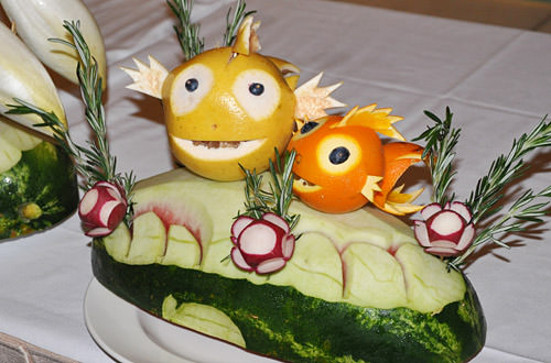
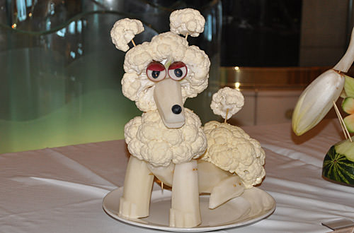
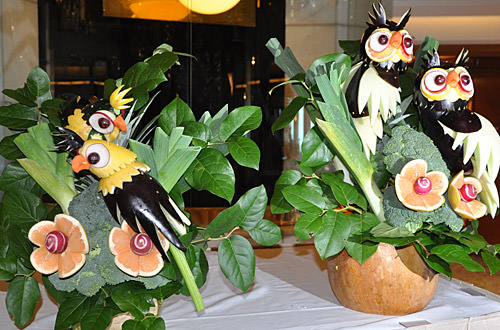
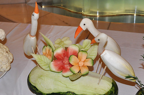
Yep, that was my day.
30 DAYS DRAWING CHALLENGE: Draw Your Favorite Candy...
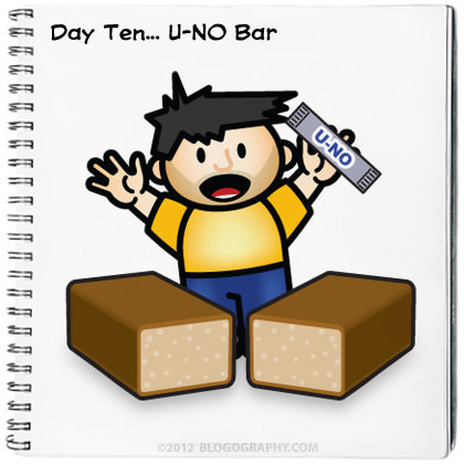
I love U-NO bars. The texture is sublime. They're sweet... but have little salty almond bits. I could eat them morning, noon, and night, but only seem to find them around Halloween where I live.
Probably a good thing.
But a little boring to draw.
 Yesterday was the very definition of chaos. Probably because I didn't get any sleep the night before, and was running on fumes all day long.
The day you leave for vacation is always like that, I guess, no matter how much you try to make it otherwise. There's always too much to be done and time is running out to do it. Oh well, it's over now. Even though I was pretty much dead by the time I got to my hotel at Seattle-Tacoma International Airport last night.
The one bright spot was the drive over Blewett and Snoqualmie passes, which nearly killed me in my exhausted state, but what a beautiful way to go...
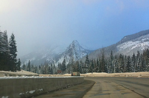
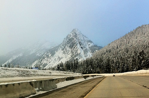
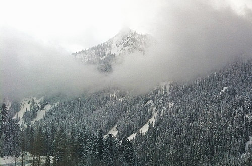
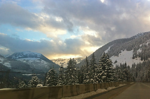

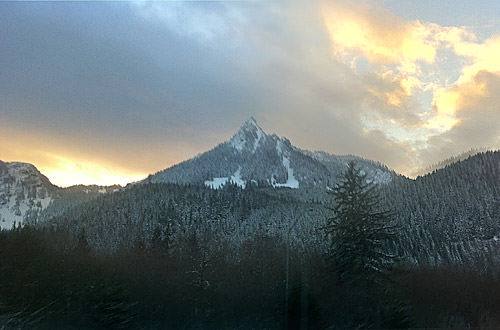
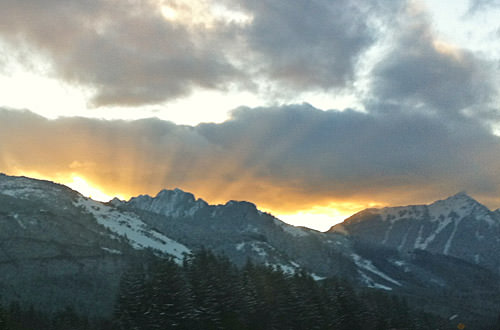
Always amazes me what you can pull off an iPhone that's been stuck to your windshield after you've cleaned, cropped, and sharpened up the mess of photos that were snapping away during your drive. Makes me wish I had time to pull off the road and take some photos with my real camera!
I'd say "there's always next time" but how can I be sure?
30 DAYS DRAWING CHALLENGE: Draw Your Favorite Word...
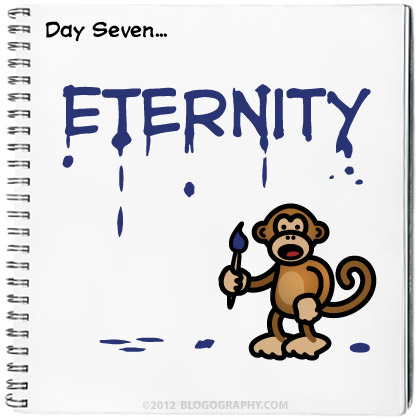
Not so much that I would care to live for an eternity... but because I like the idea of something that is infinite and never-ending. Something that is bigger than the sum of everything. It's a terrific word that encompasses so much with so little.
 Don't touch that dial... Bullet Sunday starts... now!
• Visionary. I was sad to learn that genius illustrator Ralph McQuarrie passed away this week. As a mega-huge Star Wars fan, one can't help but admire the conceptual designer who designed Darth Vader, Chewbacca, R2-D2, C-3PO, and loads of locations throughout the film. It was his visuals that helped sell the film in the first place so, in many ways, anybody who loves Star Wars loves McQuarrie...
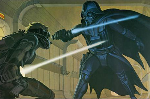
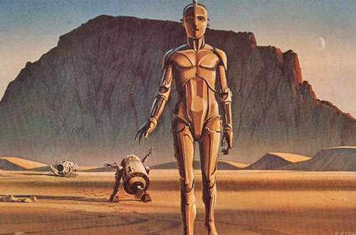
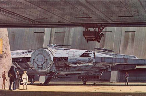
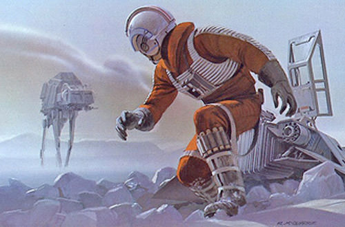
Still amazing. You will be missed.
• John Carter. My favorite science fiction novels of all time are the "Barsoom" books by Edgar Rice Burroughs. Starting with A Princess of Mars, the series is packed with action and adventure that set the benchmark for a lot of sci-fi that was to follow. After decades of waiting, we finally get a movie. It looks promising, even though Disney seems to be dropping the ball with the advertising. The latest trailer is pretty good though...
And if you're REALLY ambitious, there's a 10-minute chunk that's been posted online that shows John Carter before he was transported to Mars...
Oh yes. I want to see this one pretty bad. Arrives March 9th... mark your calendars!
• Television. If you're not watching NBC's latest show, Awake, you're missing out. There's nothing I didn't like about the premiere episode starring Jason Isaacs as a man who can't discern between dreams and reality after tragedy strikes...
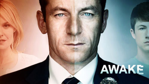
HIGHLY RECOMMENDED! Thursdays at 10/9c... and if you missed the first episode, you can get it from iTunes FREE!
• Whore. Apparently all Rush Limbaugh knows how to do is lie and attack people. And why not? It's built him a huge audience and made him a millionaire many times over. But, seriously... what a gaping asshole.
• 30 DAYS DRAWING CHALLENGE: Draw Your Favorite Place...
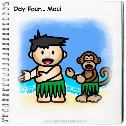
This was a difficult challenge, because I have dozens upon dozens of favorite places on this earth. But I am always wanting to go back to Maui. Especially now when it's cold outside. The nice thing about The Valley Isle is that I've been there many times, so there's no pressure to see or do anything. I can just park myself on a beach somewhere and kick back. What more could you want for a happy place?
 Welcome to a totally unexpected... PART FOUR of a series detailing the evolution of Lil' Dave and Bad Monkey over the years. I say unexpected, because I thought yesterday was the end of it, but I got some emails and questions, so I thought I would extend another day.
First of all, a look at what could have been with the "colorways" of the DaveToon vinly dolls I was working on before the company closed-up shop. Here's the painting instruction sheet I made for the manufacturer (I removed the paint color notations so you can see the characters better)...
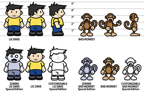
The dolls would have come as a set in a custom-designed box with a clear plastic window in the front and various "accessories" tied to a background card behind them. I hadn't actually drawn the box, because I was waiting to get the final shape, but I had sketched out some concepts based on an old G.I. JOE box I had found. The idea was to make it look slightly "vintage" and show all the features and accessories as EXCITING FEATURES on the back and sides. The box would be the same for all the versions, but a space would have been reserved to sticker the three variants...
And that's as far as I got. I was supposed to get prototype dolls and a bunch of other stuff for the deposit I payed, but I never saw any of it. For those who asked, the pricing is a tricky business, because I hadn't gotten information on duties and taxes and shipping fees. My goal was to sell the "Classic" dolls for $15-$17, the "Zombie" dolls for $22-$25, and the "Custom" dolls for $30-$35... but that could have gone up or down depending on how everything ultimately got costed out. Considering a single 6-inch doll usually sells for around $40, I thought my pricing was pretty good. The idea wasn't so much to make money, but to simply cover the costs of making the dolls... just because I wanted them! Oh well.
One of the most popular questions I continue to get is "How do you draw your DaveToons?" I had answered this question in a smart-assed way back in September, 2006 (NSFW!)... but it's probably time to give a serious answer. While I don't have time to create a comprehensive "How-To" showing every last detail as to how things are done, what I CAN do is run through all the steps it takes to draw one of my characters...
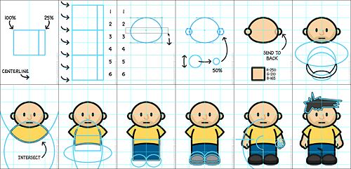
BUT FIRST, FAIR WARNING: I will absolutely concede that this will look a heck of a lot easier than it actually is. If you are not familiar with Adobe Illustrator, then you should understand that this is a program that takes years to master. I have been drawing with Illustrator most every day for over twenty years and there are still things I have problems with. I just want to be sure that somebody reading this doesn't think "Wow, this is simple! I'm going to draw cartoons too!" then run out and spend $600 on Adobe Illustrator only to find out that it's not quite as easy as all that.
With that having ben said, you can see the basic concepts that go into how I approach the "DaveToon Look" in an extended entry...
→ Click here to continue reading this entry...
 At long last... PART THREE of the story of how my DaveToon blog mascots came to be! If you haven't read Part One yet, you'll probably want to do that first... and then Part Two is right here.
Okay. Okay. I know. I made a promise that yesterday I would reveal for the first time anywhere NEVER-BEFORE-SEEN images of Lil' Dave and Bad Monkey in 3-D. But, because of some kind of technical problems with a software upgrade, I couldn't render them into 2-D pictures. So last night I made a few phone calls to get that sorted, and here we are.
But before I reveal the images, you're probably wondering exactly WHY Lil' Dave and Bad Monkey would be rendered into 3-D in the first place. That's a very good question. There's actually two reasons...
Now, you have to admit that either of those reasons were awesome enough for me to want to get 3-D models made. Lil' Dave and Bad Monkey dolls? AWESOME! A Lil' Dave and Bad Monkey video game? AWESOME!
And so I paid a very talented computer animator a lot of money to make the models.
Unfortunately, neither of these awesome projects came to be. I'll explain what happened in a minute, but let's get to the 3-D renderings, shall we?
First up... BAD MONKEY! Note that his tail is sticking straight out. This is on purpose, because it would be animated bouncing up and down as he walked in the video game, and it was easier to do this if it were starting from a straight position. The animator would curl it when he defined how it would move in the walk cycle...
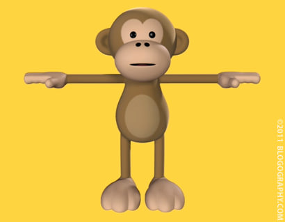
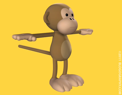
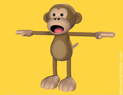
Pretty sweet, huh? It took a LOT of back-and-forth with the animator to translate a
And then there's Lil' Dave. Who needed to start out naked with no hair for video game reasons I'll explain later...
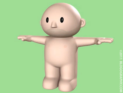
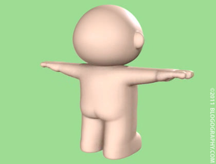
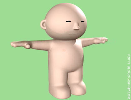
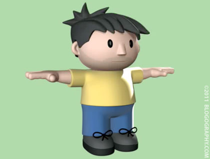
And here he is with clothes. The hair wasn't finished exactly right at this point, but it was getting close...
So the models look great, what's the story?
THE DOLLS.
The dolls were going to be very cool. VERY cool. Their arms and legs would move. They would have fun accessories. They would have awesome packaging. They would come in three versions (called "Colorways" in the biz)... 1) Classic Dolls, 2) ZOMBIE Dolls, and 3) Limited Edition BLANK "Paint Your Own" Dolls. Unfortunately, the company handling the job went out of business. My dream of having Lil' Dave and Bad Monkey vinyl dolls (along with an $800 deposit) vanished overnight.
THE VIDEO GAME.
If the loss of the vinyl dolls was tough on me, the loss of the video game was devastating. In addition to being out the money I invested in having the models made, I was out hundreds of hours in pesonal time. I wrote the game story. I helped design game levels. I designed the level maps. I drew hundreds of concept sketches. I painted hundreds of object textures. I invested time working on things like "walk cycles" and "cut scenes." Then one day I got The Call. The school was converting to some kind of learning internship agency. The theory was that this would be better for the students because they'd be getting hands-on experience at real gaming companies. The reality was that there wasn't enough internship positions to go around. So even if the guy working on my game could get an internship, he would then be working on the company's projects and not mine. Instead he lost his education financing and had to stop working on the DaveToon game so he could find a new school.
This was a real shame, because it would have been a pretty cool game. It was designed to be relatively easy, so young kids and adults with no gaming experience could play. But it was still funny enough that even a gamer would want to play to see what happened. The story revolved around Lil' Dave trying to avoid an invasion of robot monsters and solving puzzles so he could find his way home. Along the way, Bad Monkey would show up to help... and sometimes hinder... his progress. Lil' Dave replenished his health by finding chocolate pudding cups hidden around in the game. You couldn't really "die" while playing, but you could get thrown into "Zombie Mode" if your health ran out. If you couldn't get out of "Zombie Mode," you'd turn into a ghost (with no hair or clothes... just a glowing outline), fly back to the beginning of the level, grab a new body, then have to start over.
And there you have it. The NEVER-BEFORE-SEEN images of Lil' Dave and Bad Monkey in 3-D!
And the really sad story as to why you never saw them.
Maybe one day somebody will come along and want to work on the game again. Or maybe I'll get bored sometime and write a blog entry with the NEVER-BEFORE-SEEN sketches, paintings, bits and pieces that I spent a big chunk of my personal time working on in 2009. The good news is that you might finally understand what I was trying to say with this entry. And this entry.
So what's next for Lil' Dave and Bad Monkey?
Well... there are always possibilities. I definitely plan on new T-shirts. There will absolutely be more DaveToons on Blogography. And there are other things... secret things... I've got ideas for which may or may not happen.
When it comes to Lil' Dave and Bad Monkey, you just never know.
 Here it is... PART TWO of the story of how my DaveToon blog mascots came to be! If you haven't read Part One yet, you'll probably want to do that first.
Right off the bat, I'm going to have to apologize for lying to you yesterday. I had promised that I'd be sharing NEVER-BEFORE-SEEN images of Lil' Dave and Bad Monkey in 3-D but, alas, I'm going to have to wait until tomorrow so I can get a few problems with the 3-D to 2-D rendering sorted. It will be worth the wait though, I promise!
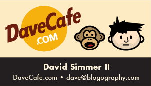
Anyway, getting back to the story... Bad Monkey and Lil' Dave had been languishing on my Hard Rock fansite, DaveCafe, for just over a year. Then, in September of 2003, I was preparing for a trip to visit Hard Rock Cafes in Reykjavik and Stockholm. A fellow Hard Rocker in Japan had once given me his "Hard Rock business card" and I decided that was a handy thing to have. I could put my email and website address on it and hand it out to Hard Rock fans I meet. My cheap-o ink-jet printed cards ended up looking like this...
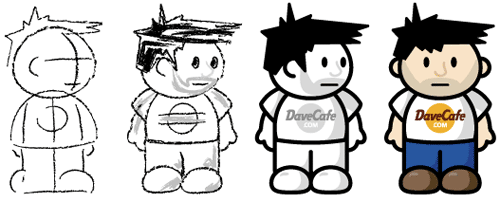
At this point, the DaveToons had (literally) become my calling card for DaveCafe. But it was this humble blog where most of my time and effort were going. Finally, inevitably, on February 11th, 2004, worlds collided. I had written a Blogography entry where I mentioned a monkey showing up at work with an ebola virus, and it occurred to me that I could make Bad Monkey be that monkey. But he and Toon-Dave were only heads, so I had to slap together some bodies for them. Since I thought it was important for people to know where they came from, I put the DaveCafe logo on Toon Dave's shirt...
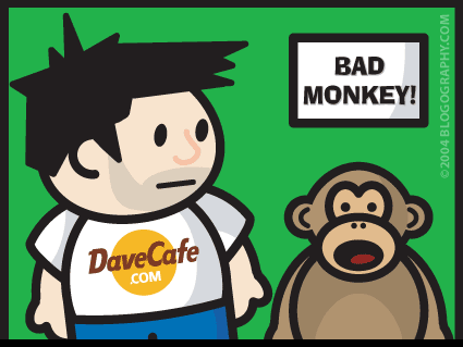
You'll also note that I had to figure out how to make Toon-Dave's head turn, which was a lot more complicated than you might guess. It took hours for me to figure out how that might work, since he's so firmly rooted in two dimensions. Eventually, I just slapped an ear on the side of his head where I thought it should go, then worked the hair around it.
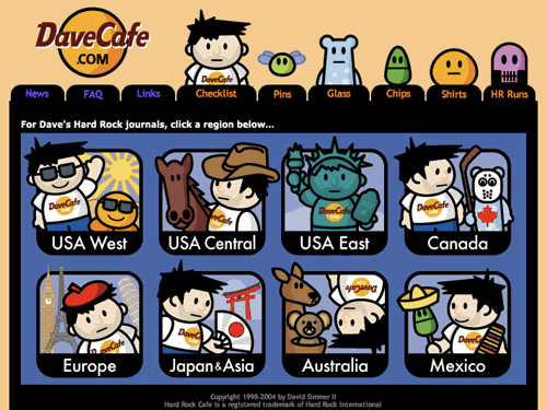
Now that Lil' Dave and Bad Monkey had more than just heads, it was time to redesign my DaveCafe site. I announced the coming change around the end of February, 2004...
And the site went live in April with Toon Dave doing all kinds of interesting stuff...
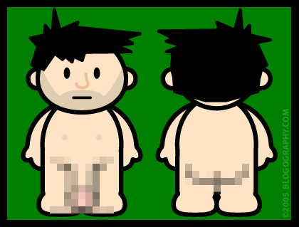
For the next couple of years, Toon Dave continued to make dozens of appearances at Blogography. Bad Monkey made zero appearances. He was meant to embody negativity over at DaveCafe, and I made a conscious effort to keep him there. About the only thing new to happen was that Toon Dave got a very important addition to his anatomy in January of 2005 (I thought it was pretty impressive, but Avitable would take it to an entirely new level a few years later)...
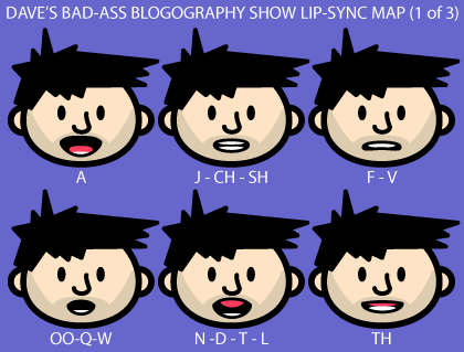
While not really "new," in June, 2005 I decided I wanted to try my hand at animating DaveToons. With absolutely no experience, I started studying what it would take to make them speak. The idea was to create a cartoon talk show called Dave's Bad-Ass Blogography Show...
The following month I played around with the idea of making them move using Flash...
It was a fun experiment, but proved far too time-consuming for me to take seriously. Maybe one day I'll find the time to actually make a complete animation. Maybe.
2006 was the year things started changing. First of all, Bad Monkey made the first of many, many appearances in January. I finally found a use for him where he could be as bad as he wanted to be...
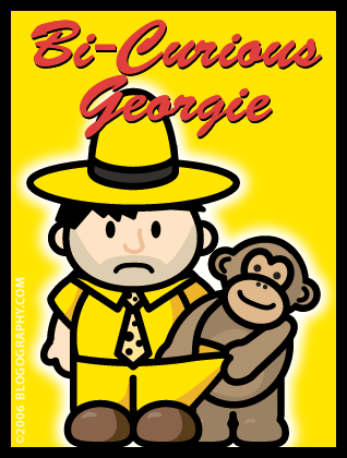
Granted, it was a pretty crappy appearance. Bad Monkey's body was just Toon Dave's body colored brown. Still, it was a start.
And then things really changed.
When DaveToons first started appearing in Blogography, they were specifically designed to be as fast and easy to draw as possible. Toon Dave didn't have hands, he had mittens. Fingers take time to draw. Bad Monkey didn't look like a monkey, he looked like a person dressed as a monkey. Lanky limbs and tails take time to draw. Everything was colored flat and boring. Shaded color takes time to draw. I was perfectly happy with all the DaveToons looking crappy because they took almost no time to slap together.
But eventually it started to reeeeaally bother me. The more appearances they made on my blog, the more upset I'd get that they didn't look as good as they should. So on May 6th, 2006, I spent a couple of hours and started over from scratch. With a DaveToon I titled Best Friends, Toon Dave and Bad Monkey were reborn...
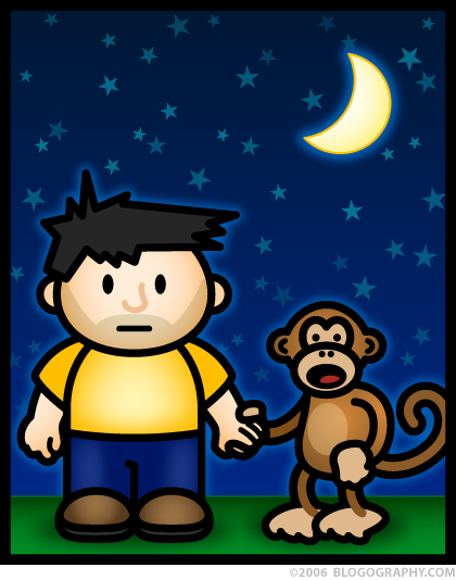
It took about a year for the transition to fully take effect, but the look had finally been fixed. Now that the look was fixed, it was the name "Toon Dave" that was bothering me. Toon Dave was no longer just a toon version of myself. He was an entirely different character with an entirely different life. Fortunately, when I guest-blogged over at Hilly's Snackiepoo blog in August of 2006, the solution was at hand. She called her mascot "Lil' Snackie" and so "Toon Dave" became "Lil' Dave" and the name stuck...
After that? Well, I briefly played around with animation again...

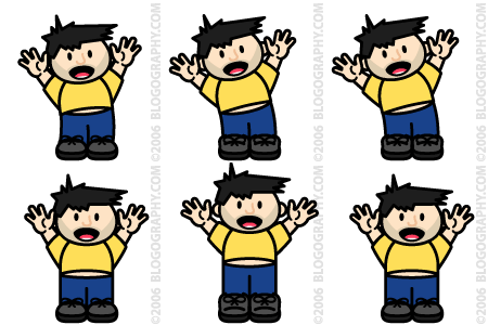
...but Lil' Dave and Bad Monkey would stay pretty much the same throughout their many new adventures over the next two years.
The next "Big Thing" wouldn't happen until the end of 2008.
And it was SO big that nobody ever saw it. Until tomorrow. Tomorrow, at long last, NEVER-BEFORE-SEEN images of Lil' Dave and Bad Monkey in 3-D! And exactly WHY were Lil' Dave and Bad Monkey in 3-D two years ago? Well, that's a very good question. And I'll explain that tomorrow too!
I have to warn you though, it's a very sad (and very expensive) tale, so bring a hankerchief.
 I have never told the whole story of how my blogging mascots, Lil' Dave and Bad Monkey, came to be. I thought perhaps I would save it for their tenth birthday in 2012, but something has come up to change my mind. Thanks to an offer too good to refuse, I managed to purchase a custom Gowalla stamp featuring the DaveToon Duo. For those not familiar with Gowalla, it is a location-based social networking game where you can follow where your friends go, collect location stamps, find interesting new spots, and keep track of the places you've been.
Until recently "custom stamps" were only available to "landmark" spots like The Eiffel Tower or to spots that the Gowalla Team liked (usually in Austin, where they are based). But there was an entry-price stamp test program I signed up for and, voilà, Blogography has it's own stamp...

My logo on the left, the Gowalla stamp interpretation on the right (enlarged 250%).
And now the story of how I cam up with Bad Monkey and Lil' Dave. So I can do a good job of it, I've got back through all my old file archives and pulled out all my early sketches and drawings, so you can see how things came together from the very beginning.

Surprisingly, Lil' Dave and Bad Monkey were not created for Blogography. They were originally drawn up to solve a problem at my other blog, DaveCafe, which is a travel journal and review site for all the Hard Rock Cafes I've been to.
The problem was that I love the Hard Rock, and I felt really terrible when I had something bad to say about one of my visits. Trying to distance myself from my own criticism, I came up with the idea of having an alter-ego who would talk about anything "bad" which would leave me to be the hero and talk about all the good stuff from my visit. Since I've long been fascinated by monkeys, I thought that it would be cool to have a kind of "Curious George" sidekick... but wicked-crazy instead of curious to deliver the bad news.
And thus the idea for "Dave and Bad Monkey" was born while I was in New York on July 13th, 2002.
When starting out on a project like this, I often fill an entire page with a "base" element (in this case, a head-shape) then draw up numerous variations around it. At this point, I was mainly concerned with getting the hair right, but was also working on the eyes and nose. The mouth was always going to be a simple slit from the very beginning, as the Dave character was supposed to be "neutral" when delivering his review...
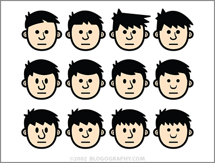
As I drew more and more variations, I was refining the hair to be more styled. In the beginning, it's simple shapes and pen-tool scribblings, but ends up having curves to look more realistic. Once I got to the last head, I thought the hair was getting a little too perfect. Which doesn't really look like me at all. My hair is a perpetual mess, and so I went back and redrew the last row to have a more spikey look in the bangs.
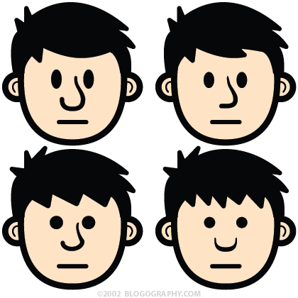
Below is a close-up of some of the characters above. Originally, the eyes were all round, but I went back and started trying ovals. I wasn't sure of the right size so I played with that as well...
After filling the page and getting to a hairstyle I liked, I realized that my head-shapes were too vertical. Computer screens are wider than they are tall so I wanted a character which would economize height. Working on a copy of the file, I turned all the heads horizontal and rearranged the hair and facial features to fit...
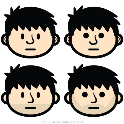
The wider head made Dave look much, much younger, so I toyed with the idea of adding a five o'clock shadow so he'd look more like an adult.
At this point, I thought the round eyes made Dave look stoned so I changed everything to ovals. Then I became convinced that the oval head-shape was lazy, and started playing around with the idea of using more of a squashed-egg look instead. Once I did that, the rounded hair was starting to look "over-styled" to me again, so I went back to my original concept and started messing around with simple pen-tool spikes for hair...
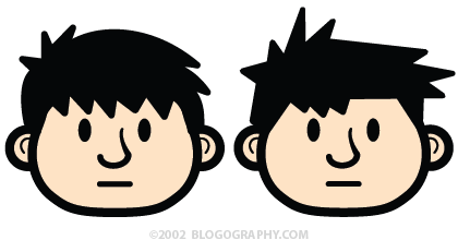
After a number of head-shape iterations I decided to go back to an oval. The egg-shape made his cheeks look pudgy, and I liked the simplicity of an oval better. Wanting to simplify things further, I removed the lines in the ears. I had abandoned the five o'clock shadow for a while but eventually came back to it because I thought it made my character more unique...
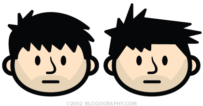
It was around this time that I became obsessed with the nose. Up until this point they had all tapered at the bridge in order to add depth to the shape. But I disliked having something so pointy on the face. The only thing spikey was supposed to be the hair, and so I re-drew the nose with a consistent pen width. It still bothered me, but at least it looked "right" on the face now. The last thing I worked on was the hair. Since Dave was flat I liked the idea of making the hairstyle two-dimensional. That way I could just flop his hair to make him point in the other direction.
After roughly two hours of sketching across six Adobe Illustrator pages, I had narrowed down the design to two choices...
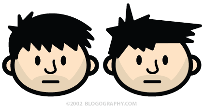
At this point, my decision was easy. The rounded hair looked like a strange comb-over and seemed a bit ordinary. The spikey hair was more cartoony, interesting, and reminded me of one of the greatest cartoon characters of all time, Calvin from Calvin and Hobbes. So all that was left was to create a Bad Monkey sidekick. There was no sketching this time around. I removed the hair and face from Dave, shrunk it, then just drew a monkey face on it. The total design time for my monkey pal was probably five minutes...
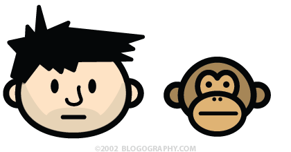
The problem was that he didn't look very "bad" and came across as kind of sedate. I thought the beady round eyes would add a little crazy, but it wasn't enough. Thinking I was over-thinking things, I went ahead and published the cartoon heads at DaveCafe and went to bed.
Then couldn't get to sleep. It really bugged me that Bad Monkey was getting short changed, since using him as a scapegoat was what caused me to create the cartoons in the first place. Rather than do variations of a dozen different monkey heads, I just kept tweaking and fine-tuning the drawing I already had. I remember adding spikey fur on his head, but he looked too much like Dave. Eventually I thought I'd just draw him screeching with his mouth open because it was the only way I could think of to make him look a little insane...
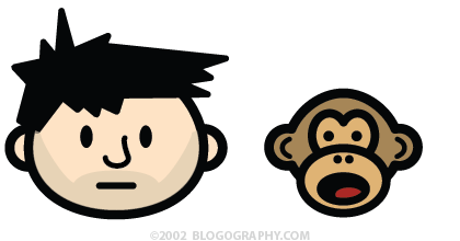
And just like that, I had found Dave and Bad Monkey!
Except not quite.
When I reduced the heads down to size, Dave's mouth looked a bit like a grimace, so I redrew it as a smile. And hated it. His nose, which had always bothered me, looked like a blob when outlined in black, so I changed it to something more subtle. I wasn't terribly happy with the end result, but it was getting very late, so I went ahead and published them anyway...
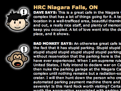
And that's how the characters would stay for nearly a year.
Tune in tomorrow for the exciting finale...
Can you feel the excitement? Can you? Well I'll see you tomorrow then!
