

Monday was the annual World Wide Developer Conference, and here's my thoughts on what came from that.
PASSKEYS
I'm putting this first because it's something that took me completely by surprise in the best possible way. Having to keep track of dipshit passwords in the year 2022 is absurdly stupid, and it's been more than a little shocking that nobody has thought to do anything about it. Sure Apple has made things better by having TouchID and FaceID auto-fill your passwords for you, but it's still stupid. For one thing, there's still a password floating around out there that can be compromised by a company with lax security. Apple wants to ditch passwords in favor of biometric handshaking. Finally. And because they want to get this up-and-running quickly, they're working with Google and Microsoft to make it happen. Can't happen soon enough.
CARPLAY
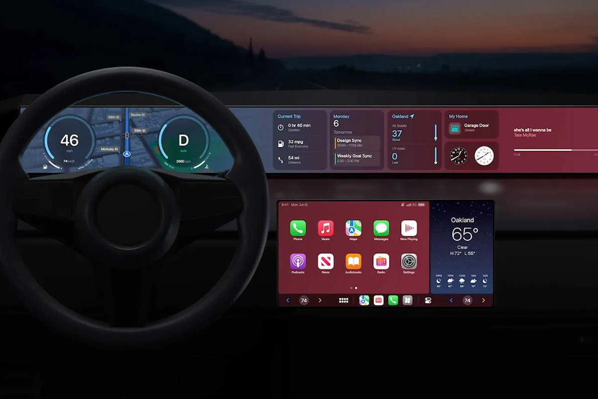
Up until now, CarPlay has been a curious diversion to me. It doesn't really do anything beyond what my iPhone can do when slapped on my car vent holder. Certainly nothing that makes me want to run out and buy a CarPlay stereo or a CarPlay-enabled car. But now? Apple has gone and made CarPlay take over the entire dash, and it's just phenomenally cool...
HOMEKIT HOMESHIT
My complete and total loathing of Apple's Smart Home standard, HomeKit, has not abated since it debuted in 2014 and was actually viable in 2016. It's the most absurdly stupid thing which works with nothing and what it does work with... works badly. I tried to get started with it twice and ended up hating it more after each go. Apple has now started over from scratch, which is about the best thing they could do. The new HomeKit will be built upon the new Matter standard, which is backed by everybody who's anybody in tech, which means that even if Apple shits the bed AGAIN, there will be other options so you're not trapped. I am 1000% looking forward to Matter, which means that I will be a part of HomeKit and not care.
MACBOOK AIR M2
This thing is sexy as hell with its four color options and beautiful design. But that's not even the best part... it's got Apple's shiny new M2 chip inside! If you don't need the power and ports of a MacBook Pro, this is a no-brainer ($1,000 for an M1 chip model, $1,200 for an M2 chip model).
MACBOOK PRO 13 M2
I am beyond confused by this machine. It's $100 more than the Air, has the same chip, a slightly smaller screen... and the only difference I can see is that the screen is OLED on the Pro. Not that it makes any difference to me... I need a 16" model, which this is not.
iOS 16
This update feels mostly cosmetic, allowing you to create custom lock-screens and switch between them like faces on an Apple Watch. The only part of this upgrade which excites me is that you can have "Live Activities" which update on your lock screen in real time, so you don't have to unlock your phone and navigate to the app to track progress on something. Also in this update is improvements to the Photos app (mostly to do with sharing) and the Messages app (you can edit and delete messages, which seems nice on the surface, but could be a nightmare for those being bullied or stalked via text who need evidence) and the Mail app (better search and the ability to undo a send, when supported by the recipient). There's also better dictation abilities (you can use the keyboard while dictating something by voice!) and some intriguing tech which allows hearing-impaired persons to have voices transcribed for them in real-time, which is all kinds of cool (the fact that iOS 16 is finally compatible with Nintendo Switch controllers after waiting for this for years is just icing on the cake).
macOS VENTURE
A lot of what the desktop is getting is the same stuff as what's happening in iOS. But there are a few perks that are unique here. First of all, you can now use handoff with FaceTime calls. So if I've started a FaceTime on my iPhone I can sit down at my Mac and transfer the call there with a click. That's very slick and useful. Likewise, you can use the superior camera on your iPhone as the webcam for your Mac and be able to use it as a Center Stage camera if your monitor doesn't have that ability (see above). And there are MagSafe adapters on the way to affix your iPhone to your Mac, which is a nice touch. Even nicer? An attempt has been made to make managing large numbers of Finder windows easier and for task switching not suck. Something called "Desk View" which allows you to use your iPhone camera to look down at your desk while still having a separate view on your face. This will be incredibly useful to me... it looks like Zoom will adopt the ability, which I truly hope happens since that's where most of my video calls happen. In addition to this stuff... games are faster... there's a lot of minor improvements all over the place, and there's now a shareable online whiteboard for collaboration called Freeform which is cool... but I don't know if it is cross-platform with Windows users? I missed it if this is possible.
iPad OS 16
Ever since iPad broke away from iOS, I keep waiting for this quantum leap change that's going to make it all worthwhile. A pretty big change was multi-tasking for using multiple apps at the same time... but then things kinda just... stalled. Of course iPads are getting all the new stuff from iOS (and the nice app-switcher from macOS Ventura), but all the coolest new stuff is only available for iPads with an M1 chip, which leaves me out. Of course, the thing that I most want from an iPad is a model with a much larger screen for drawing, which hasn't materialized yet.
And that was it. Since none of the OS stuff will be officially released until September (unless you like the idea of playing with the public betas which drop next month).
Until then... I guess I'm good.
 The last iPad I bought was the 1st generation 9.7-inch iPad Pro four years ago in 2016. It was my second iPad and, at the time I purchased it, the intent was to use it as a laptop replacement for travel. That didn't work out at all. It just wasn't capable enough for me to do real work on it. Any time I traveled with my iPad, I had to have my MacBook with me as well. Still, it was good for watching movies on the plane.
What the iPad did do for me was revolutionize the way I draw and paint digitally. Thanks to its blazing speed, virtually non-existent parallax, and low latency (with the right app)... plus the fantastic responsiveness of the Apple Pencil stylus... everything changed. I found it to be a better experience for creating art than an expensive Wacom Cintiq tablet paired with a high-end computer! If there was a flaw, it was that the 9.7-inch size was too small for me to work comfortably, and I regretted quite badly that I didn't spend the money to buy the 12.9-inch size.
In November 2018 Apple released their 3rd generation model iPad. It was compelling enough an upgrade from my older model that I started saving $50 a month until I could afford one.
A month ago Apple released their 4th generation model iPad Pro. It was definitely time to upgrade now, but I had only saved up $700 of the $1000 price tag. Then quarantine started dragging on so I figured I might as well blow through some of the vacation money I had been saving since I won't be using it any time soon... and went to order me a new 12.9-inch iPad!
Much to my horror, the specs stated that my 1st generation Apple Pencil wouldn't work with the new model and I would have to spend an additional $130 to buy an upgraded one of those as well. It would be another month until I could get the money together for that, so my plans were put on hold.
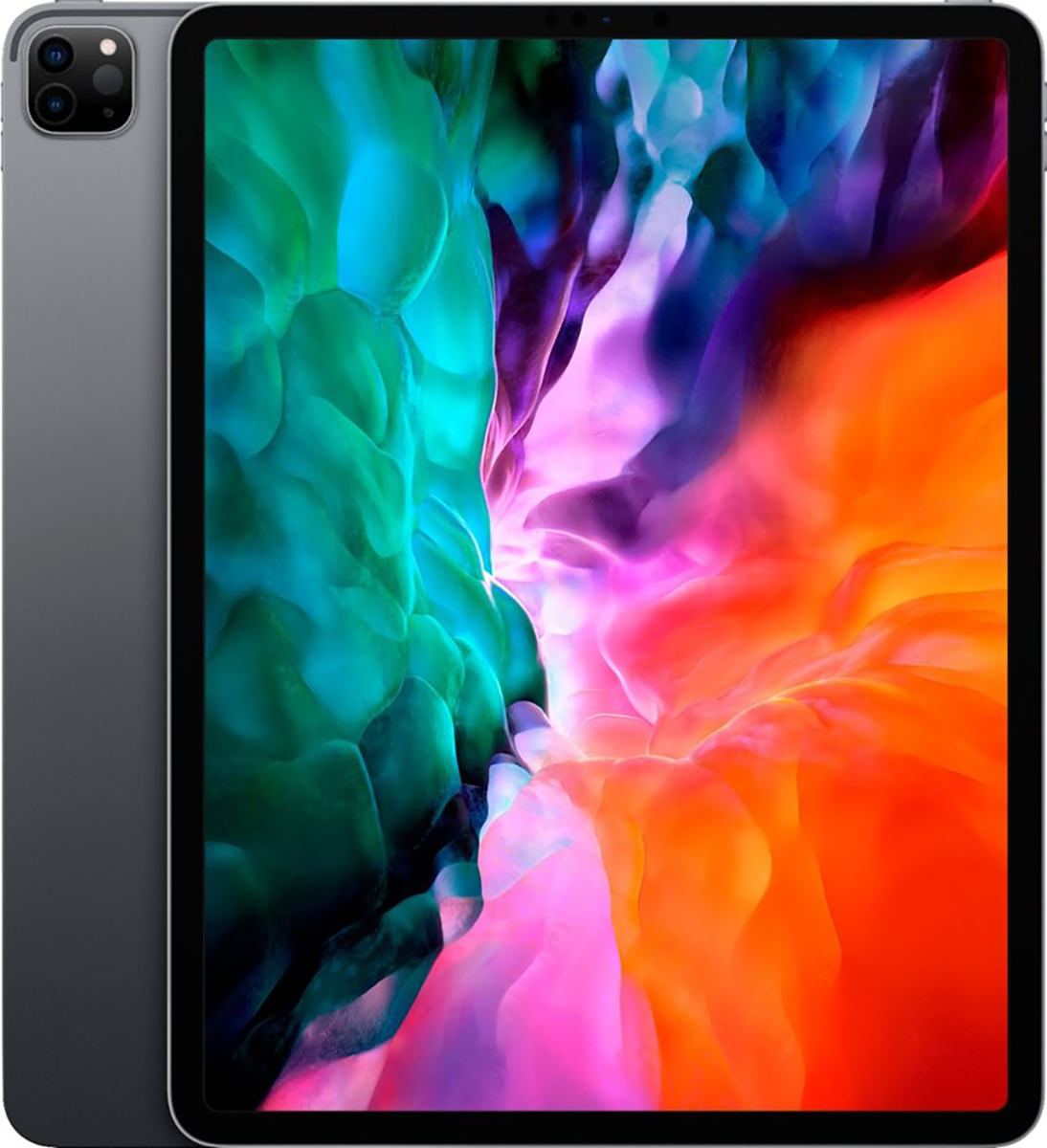
Eventually I managed to scrape the money together and order... then today it finally arrived!
And now for my thoughts...
Holy cow is this thing beautiful. And so impossibly thin! It's like a thick sheet of glass with metal on the back. I honestly don't know how they manage it, and thinking of how far technology has come in my lifetime makes my head hurt.
My old iPad was pretty darn fast, even when running modern apps. But this thing is ridiculously speedy. Everything happens instantaneously. There's no delay for anything. It's kinda how like you dream your computer would work... except it's reality. What I don't understand is why Apple put in an A12Z chip instead of the newer, faster, better A13 chip that's in my iPhone. The A12Z has an additional core compared to the A12X from the previous iPad (8 cores instead of 7) which aids in some areas, but it's a minor upgrade at best. If you're going to use a new chip, why not go with the best you already have instead of spending the money to retool an older one with minimal effect?
The "new and improved" $130 Apple Pencil drawing stylus is actually "new and improved." It has a matte surface instead of a glossy one so it also has a more natural texture when you grip it. I also like the thinner diameter (which I know some people do not). But the absolute best part? You don't have to plug it in to charge it! It magnetically attaches to the iPad and charges wirelessly in either direction (nice for lefties and righties)... but only on the right "long-side" of the iPad (when held vertically... it's the top when held horizontally). As a side benefit, the flat "charging" side of the Pencil means it won't roll off the table. Where the Apple Pencil is just frickin' brain dead is that it's not reversible. Most styluses can be flipped to erase something (mimicking a real-life pencil eraser). STILL NO ERASER ON A $130 STYLUS IS UNFORGIVABLE. They do have a tap sensor on the pencil, however. In Procreate a double tap switches to the eraser. Another double tap goes back to your pen. This is a really nice way of working, but I still don't understand why a stylus costing a fraction of what Apple's charging has an eraser end when Apple's doesn't. Even so, I like this stylus 1000% better than Apple's old one. If I have a complaint, it's that I don't understand how it costs $30 more than the previous model.

Back to the iPad itself... the larger size of the 12.9-inch model is far, far better for drawing and painting. Not as comfortable to hold, of course, but much easier than a tablet hooked up to a computer. EXCEPT... thanks to a feature called "Sidecar" you actually can hook your iPad up to your computer if you want to (assuming it's a new enough model to support it)...
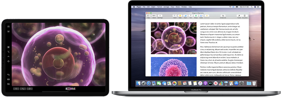
But it gets better... MacOS X apps which support pressure sensitivity can inherit this data from the iPad! Below is not a screenshot of my computer screen, it's Photoshop on my iPad in Sidecar mode. I drew a mustache on Jake to show how the pressure sensitivity on brushes allows you to get thicker lines as you press harder...
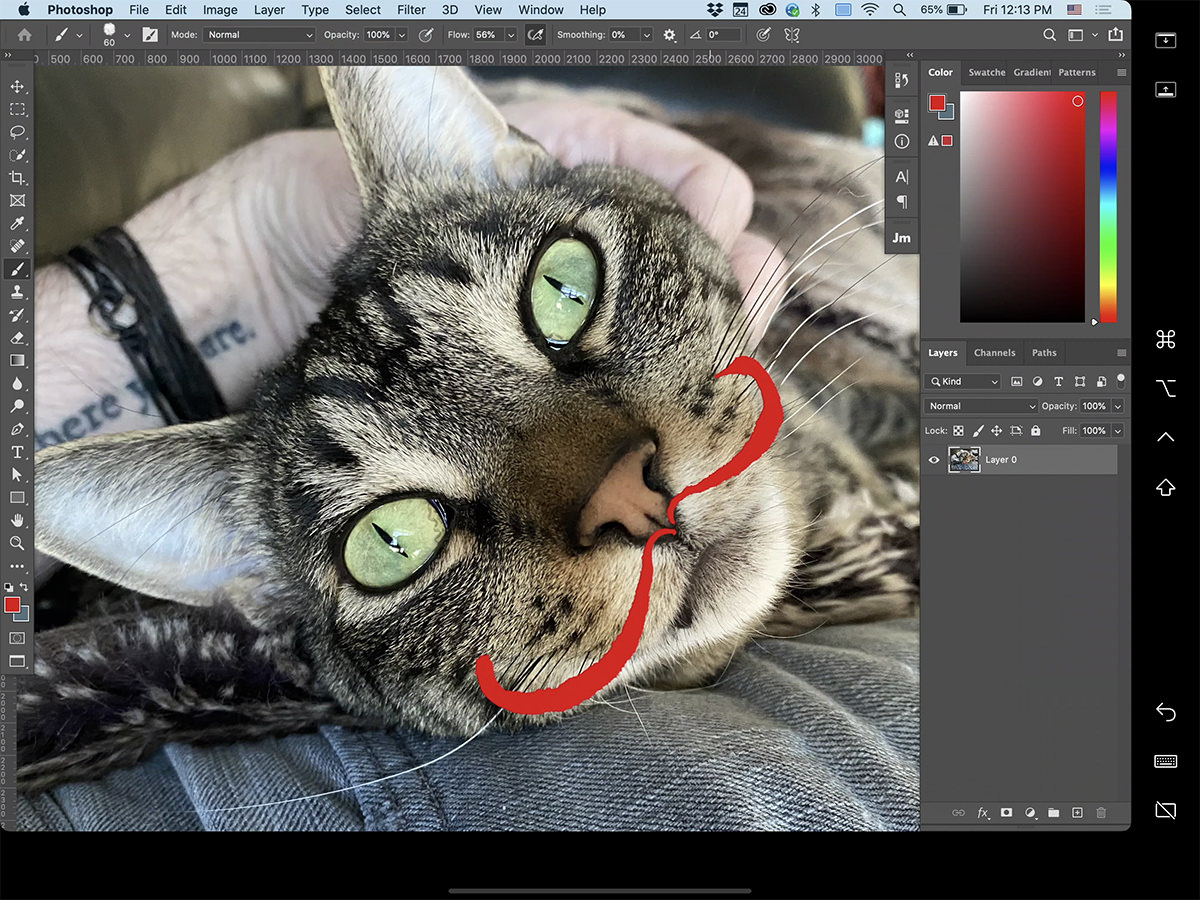
Not as flawlessly responsive as when using an iPad-native app like Procreate, but still perfectly useable! This is next-level-amazing, because now I won't have to save up $1,200 to get that Wacom Cintiq Pro 16 display tablet I've been dreaming of. My new 12.9" iPad is able to sit in for a 15.6" tablet, and still be useable as an iPad on its own! Disconnect the Cintiq from your computer and it doesn't do anything. iPad truly is the best of both worlds.
Not that I wouldn't love to have an even bigger screen than 12.9-inches but, finances considered, it's absolutely big enough. Still, can you imagine if Apple were to unleash a 16-inch iPad? A 20-inch iPad? As display technology gets more amazing and cheaper, it's gonna happen. The pro creative market pretty much demands it. Apple could match Wacom Cintiq models size-for-size and price-to-price and corner the market with display tablets that are also fully iPad-functional.
The display on this thing is brilliant. I mean really brilliant... as in bright and beautiful. I don't even need to turn the display brightness to maximum like I usually do! Colors are lush and saturated. The refresh rate is a mind-boggling 120Hz and buttery smooth when dragging shapes I've drawn. Just like my older iPad, it's still too slick for me to draw comfortably. To help with this I've ordered a
I don't think I've ever used the camera on either of my past iPads. My iPhone is better and more capable for taking photos (not to mention handier since it's always in my pocket). Never-the-less, the new iPad Pro has gone dual-lens with a wide and ultra-wide lens if I ever need them. The big technology here is the brand new LiDAR (Light Detection and Ranging) Scanner which can accurately map out your surroundings for things like Augmented Reality. I haven't had a chance to play with this much, and I don't know that it's something I will ever use regularly, but it does give us a hint as to how big Apple is betting on AR for the future.
Something else I haven't used in previous iPads was the front-facing "selfie" camera. But in the age of social distancing when video-conferencing has become the norm, I've found myself actually using it. And Apple's camera works fine... when the iPad is held vertically. But since I use my iPad horizontally the vast majority of the time, it's just bizarre. People can see me fine, but I'm looking off to the side and I got a comment that it's a bit disorienting. You may be thinking "All video conferencing cameras are like that!" and you're right. But it's very noticeable in horizontal mode because the camera is on the side of your screen instead of on top of it. And there's another problem there too... when held in portrait orientation, there's a good chance your thumb will cover the camera needed for FaceID unlock. Apple really, really needs to rethink this and put a camera for both vertical and horizontal orientations. Transmitted sound is really good, and I'm told it's not as "tinny" as my old one when I asked about it during video chat. Likely because Apple says they are using five "studio-quality" microphones.
There's no headphone jack, of course. I have AirPods so this isn't a problem, but I sure wish I could use my high-priced headphones from 1994 with the iPad and not have to use an adapter. Right now, my MacBook Pro is the only thing left which has a headphone jack. That being said, the sound quality coming from the built-in speakers floors me. Just as with my iPhone before this, I cannot comprehend how such good sound can come from speakers so thin! And, unlike the cameras, Apple has made darn sure that your stereo experience is good whether you hold it vertically or horizontally (though horizontal seems to give better dimension to the sound because the speakers are further apart). There are four speakers, two on the top and two on the bottom, and they seem to adjust automatically depending on the orientation of the iPad. So nice!
Given how stubborn Apple can be about cables and connectors, I was pleasantly surprised to see that the 2020 iPad has USB-C instead of Apple's proprietary Lightning connector. Granted, before USB-C was invented Apple had to do something to get away from the "this-side-up" idiocy of older, larger, slower USB connectors... but given how USB-C is on everything else Apple makes and working great, it seems silly to hold out on the iPhone. Hopefully that will be remedied soon.
And then there's the iOS that's running everything...
=sigh=
Having the greatest tablet hardware in the world means very little when the software isn't up to the task. And iOS is mostly there. But not completely. The gesture-based multitasking is just plain bad. It's confusing, complicated, unintuitive, and sometimes I can't even get it to work correctly (and never understand why). Sadly, this makes an otherwise amazing product feel half-baked. Given Apple's long history of sublime user experiences and interfaces, this is baffling to me. There are a number of "proof of concept" videos out there showing better alternatives to how Apple is doing things, yet Apple themselves just sits on their hands? Why? I can only imagine it goes back to their preposterous stubbornness (which was responsible for their laptops having shitty keyboards for years). Well, get off it, Apple. You can do better than this. You need to do better than this. The power users you're courting to break free of the "home and hobby" mindset of a tablet not being a "real" computer isn't going to change until you do.
And so...
In all the ways that matter, the 2020 iPad Pro is not that different from 2018 iPad Pro. It has one more core in the CPU and a LiDAR sensor that's of limited use, and that's pretty much it. But when compared to my 2016 iPad? It's a pretty big upgrade. And not just because I went from a 9.7-inch screen to a 12.9-inch screen... it's faster, smarter, and more capable in every way. And when you couple that with the fact that I can use it as a display tablet when hooked up to my desktop Mac? It's a phenomenal value... even with the $1,000 price tag (or, if you include the $130 Apple Pencil stylus I had to buy, the $1,130 price tag).
We are rapidly getting to the point where computers and tablets are converging. This is more apparent when you look at Microsoft Surface and the slew of touch-screen PCs being released, but things seem more kludgy on the Windows side than with Apple's more purposeful iOS/MacOS convergence. Next year Apple is said to be switching from Intel chips to their custom ARM chips in their Macintosh computers. The next step will be to have an iOS layer on MacOS to run iPad apps natively. Then, once all the apps have gone to iOS for the Mac, the MacOS is no more. As technology gets smaller and faster, it's pretty much inevitable. I have to wonder if it will be less than 10 years before you can get an iOS desktop? I dunno. More likely, it will just be iPad. And if Apple gets off their asses and stops being so stubborn, this might not be a bad thing.
To be honest, I would have rather spent my vacation money on an actual vacation. But, I am quite happy with my new iPad and am grateful to have gotten it ahead of schedule. Hopefully it will unleash my creativity and be worth the price.
 Every year the Six Colors blog on all things Apple issues a report card. For the past week I've taken time when I have a free minute to make up a report card of my own.
I should start out by saying that I remain disappointed that Six Colors doesn't have a "Customer Service" section on their report card. If they did, I would give Apple an F- or whatever the lowest possible score is. The two horrendous incidents I endured in 2019... both of which were 100% Apple's fault... were so trauma-inducing that I STILL haven't been able to sit down and write out a blog entry on what happened. Every time I start, I get so overwhelmed with seething hatred that I have to stop. Maybe one day. But, suffice to say, Apple "customer service" is so downright horrific that the very thought of it has me questioning if I ever want to buy anything from Apple ever again.
But on to the report card...
Over the past five years I would have given Apple a D. Their shitty, shitty "butterfly" keyboards on their MacBook Pro laptops were a fucking disaster, and everybody hated them. But Apple being Apple felt that everybody was wrong and kept using the stupid things. They finally came to their senses and released a MacBook Pro with a "scissor" keyboard in 2019 and it made all the difference. I'm still upset that they removed Firewire, USB-A, and MagSafe from a so-called "pro" laptop, but I guess Apple is going to remain being Apple and ain't going to stop any time soon. The giant trackpad I was anticipating liking actually ended up being a negative, because it takes up a huge amount of space and is easy to touch when you don't mean to. Also? I have a hard time selecting text with it or click-dragging, something I've never had a problem with before.
When it comes to the desktop Macs, I have to drop Apple down a grade. They are so focused on the high-end Mac and iMac that it feels like the "models for the rest of us" are getting shafted. And don't get me started on the Mac mini. The original idea for that was to give people on a budget a way to afford a Mac by bringing their own periphreals. But now? The cheapest model is $800. EIGHT HUNDRED DOLLARS! If this is meant to be an entry model which is priced to be budget-friendly, it fails spectacularly.
When it comes to MacOS X, which is apparently included in this category, I am indifferent. It feels like MacOS has been stagnating for years. Nothing overly-exciting or truly fresh and new has been released in what feels like forever. To me, MacOS X Catalina was actually a step backwards. My MacBook Pro comes with a fingerprint sensor for TouchID. You would think that this means you are done with entering your passwords. You would be wrong. I am constantly entering my fucking Apple ID password. CONSTANTLY! It is fucking embarrassing just how bad Apple is at security. They put on this huge show of how they are encouraging people to use stronger passwords, then completely sabotage it by making people have to enter these longer, more difficult passwords over and over and over and over and over and over and over and over and over and over and over and over and over and over and over and over and over and over and over and over. Who the fuck is going to use a complex, hard-to-crack password when you have to keep entering it over and over again? Nobody. Apple's claim to be making strong passwords more common is 100% bullshit. If anything, Apple's piss-poor handling of passwords encourages easier-to-remember, easier-to-crack passwords.
I love, love, love the latest iPhone. The phone part is all the same... just a bit faster is all... but the camera is sublime. The camera is everything. I wrote extensively about the iPhone 11 Pro and its miracle-camera here. If anything, my opinion has only gone up since I wrote it. Between Night Mode, Deep Fusion, three lenses, and the amazing quality of it all, I almost never use my DSLR any more. Why would I drag it around everywhere when I can take shots like these with my frickin' phone?


Amazing. If this keeps up, in another couple years most people won't even think about buying an actual camera.
iPad is an amazing, amazing tool. Drawing and painting on it is a sublime joy that still amazes me. And, as they release newer models of iPads and Pencils, it just keeps getting better and better. Where the problem lays is with iOS for iPad. It's just so darn bad. I have been trying and trying to figure out how the gesture-based multi-tasking works, and just when I think I understand it something happens which makes me realize that I absolutely don't. In all honesty, this aspect of iOS for iPad needs to be completely gutted so they can start over from scratch. Just burn it to the ground and start over. The user interface is a place where Apple usually excels. But this? THIS?!? Complete shit. It doesn't matter how good the hardware is when the OS driving it is this cumbersome. And so I averaged them together to get my grade.
I'm probably not qualified to comment here because I don't own an Apple Watch and have no plans to buy one. They are just so darn thick that I find them uncomfortable. Why they aren't investigating putting the battery in the band somehow or doing something to make them thinner is a mystery. Because if you've got a thin wrist like I do, it's just not a very good option. It's a real shame too, because I really like the health features. That being said... if a chunk of money lands in my lap, I might bite the bullet anyway because there's just so much good stuff to be had so conveniently.
Apple seems content to let AppleTV languish, and it's really too bad. The interface is abhorrent. So horribly difficult to use. Have a ton of movies? I hope not. Because you'll spend a lot of time scrolling and scrolling. But what's worse is that Apple content is just plain shitty to stream. Constant buffering errors, drop-outs, and pauses. And before you blame my fiber internet (which is what Apple does)... I don't have this problem with ANY OTHER SERVICE when streamed on my AppleTV. Not even with Disney+ or Amazon Prime streaming on Ultra HD!
Then there's Apple's idiotic attempt at doing away with logins by tying services you purchase through them to your Apple ID. I say "attempt" because the shit DOES NOT WORK. I can't tell you how many times I've subscribed to a streaming service through the AppleTV in my living room then can't use it on the AppleTV in my bedroom. And since you don't get a login, there's absolutely nothing you can do... EXCEPT NEVER, EVER, EVER SUBSCRIBE TO ANY STREAMING SERVICE THROUGH APPLETV! As if that weren't enough, if you subscribe to a service through AppleTV that doesn't have a desktop app, you can't watch it on your computer. You could probably watch it online through the provider's website if you got a login from AppleTV, but you don't so you can't. It makes no sense... NONE... as to why you'd ever go through Apple.
And don't even get me started on the shitty, SHITTY fucking remote they bundle with the thing. It is the single worst remote control I have used on any product ever. Constantly grabbing it by the wrong end. Constantly having trouble navigating content. Constantly losing the little fucker in my couch. I HATE it. And I mostly hate AppleTV, even though most third-party apps are pretty decent... and those gorgeous screen savers are sublime.
I don't subscribe to Apple News+ or Apple Arcade, and only have Apple TV+ because I get it free for a year. I subscribe to iCloud, but it's so horribly priced that I only buy the bare minimum for iPhone backup. The only plus is that iCloud Drive is content to just be a cloud drive, which is more than you can say for DropBox, who keeps adding the most ridiculously shitty and bloated services to their cloud drive that I just don't want. About the only thing I can truly comment on here is paying for Apple services. For weeks I've been getting a pop-up on my Apple Wallet asking me if I want to link my Apple Cash as a payment method at Apple. I absolutely do. Except it fails when I make the attempt. EVERY FUCKING TIME!
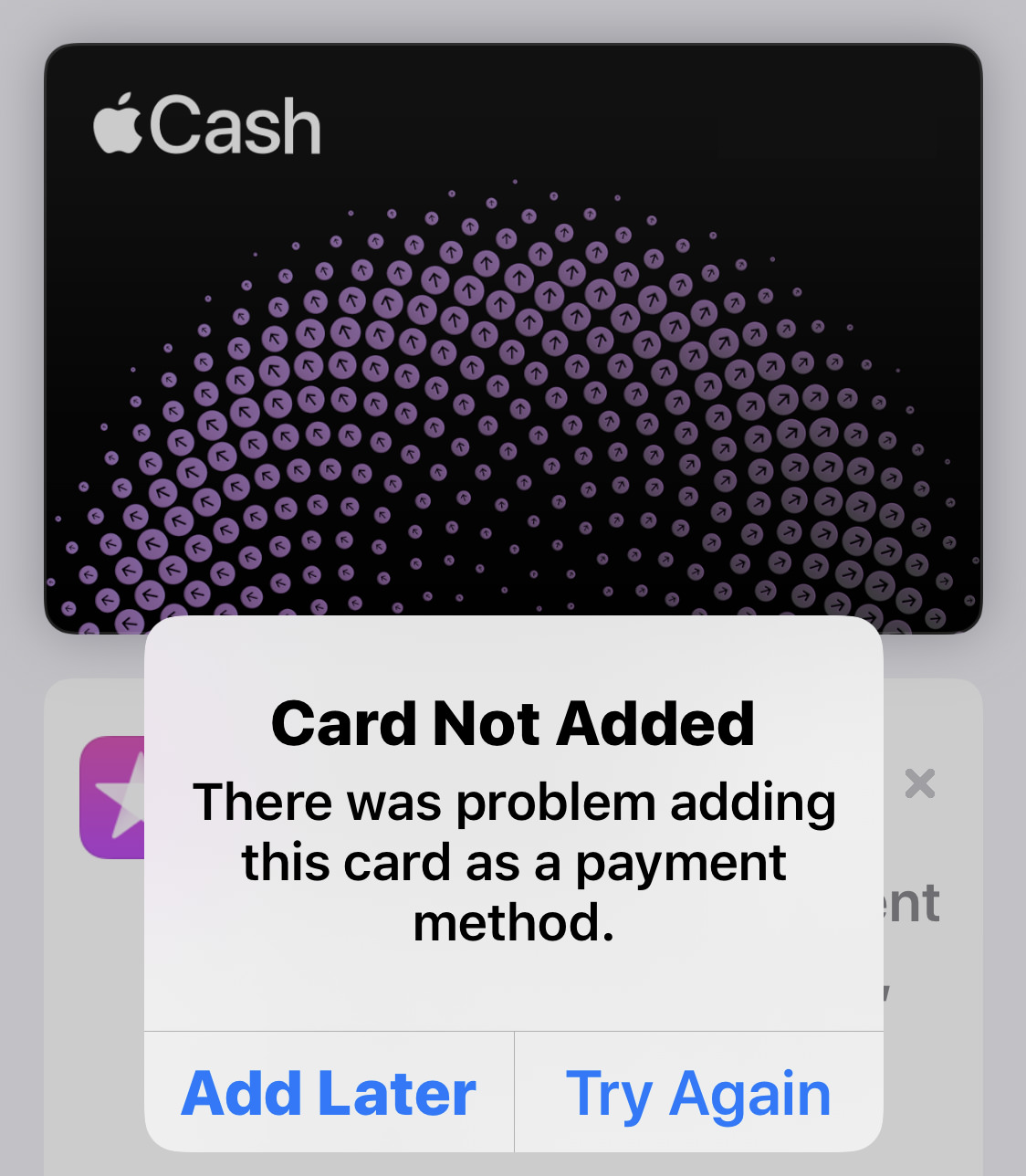
Why in the hell do they bother asking if it doesn't ever work?
I fucking hate HomeKit. It's a flakey, incomplete, crusty asshole of a technology. After waiting forever for compatible devices to come out, I started buying them... then immediately stopped because the experience was so bad. Rarely worked well. Sometimes didn't work at all. I'd recommend that Apple just give it up already, but they just joined a consortium with Amazon, Google, and the Zigbee Alliance, so maybe they're on the right track now. Hopefully this will at least result in a workable technology, because I am totally ready to have my home automation built into iOS.
My score is comparative. When compared to every other tech company, Apple reliability is pretty darn good. It's not perfect, however. I've had to replace hard drives in two Macs in two years because the internal drives started failing.
Where do I start? I hated iTunes. I railed against what a profoundly shitty app it was and how bad my digital life was with it. Then they released the AppleTV app for MacOS and the Music app for MacOS and they are so fucking horrendous that I find myself longing for iTunes again. The TV app is the worst of the bunch. Try finding anything. You can't. Can't find the content you own easily. Can't find new stuff to buy AT ALL. When I go to the "movies" tab, for example, there are a bunch of things that AREN'T EVEN FUCKING MOVIES...
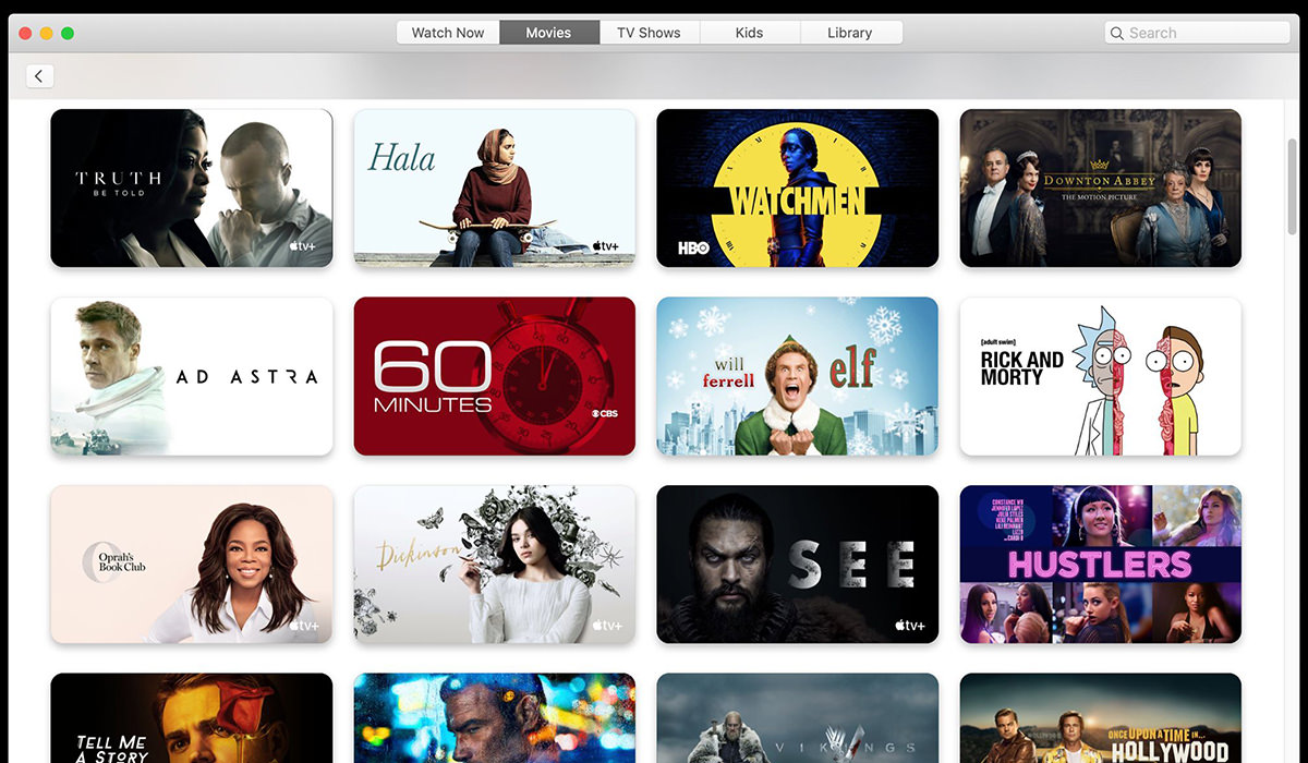
And that's just the tip of the iceberg. Everything from Photos to the App Store to Books to Messages have serious problems and Apple doesn't seem to give a shit just how bad an experience it is.
As I'm not a developer, I can't really comment here. Except to say that I still question Apple's App Store policy of taking 30% of in-app purchases. That seems high considering all they do is process payment. Credit card charges aren't nearly that high, and it seems an absurd percentage in exchange for the convenience. In-app purchases should just be another reason why developers love developing for iOS. As it is, many developers just don't use it because the cut is too high. Want to buy a comic book in Comixology? Sorry. Have to go to the website and buy it that way because Amazon apparently doesn't have margin enough on books to give away 30%.
And that's the end of that. Nobody wishes I could have given Apple better scores than I, but things are sliding so badly in so many areas that I really didn't have much choice. The lone exemption being the iPhone, which is better than it's ever been.
And one of these days... I promise... I will finally unload on the heinous state of Apple Customer Service that I had to endure. It is one of the most mind-boggling, mind-blowing things I have ever experienced in "service" and that is saying a lot considering the crap I've had to put up with over the years.
 This is the first post I’ve written entirely on my iPad. Thanks to iPadOS 13 (which was released today) and other apps stepping up their game, it’s actually a realistic option for me now.
Not that it’s easy, mind you.
It’s time consuming and clunky.
Take getting an image to appear in this post, for example. First I have to open the image in Adobe Lightroom for iPad so I can adjust it a bit. THEN I have to save it to my iPad so I can open it in Image Resize, because Lightroom DOESN’T ALLOW YOU TO FUCKING SPECIFY PIXEL DIMENSIONS WHEN YOU CROP A PHOTO. Once I crop it To 1200 × 800, I then have to save it to FTPManager Pro so I can upload it to my blog. It sounds simpler than it actually is. And it doesn’t end there. I then have to open up my WordPress admin panel to write the actual post. But since I want to use images where I put them instead of where WordPress wants them, I have to copy and paste code from old entries into new entries.
Like these photos of Jenny going after a fly in the window this morning...

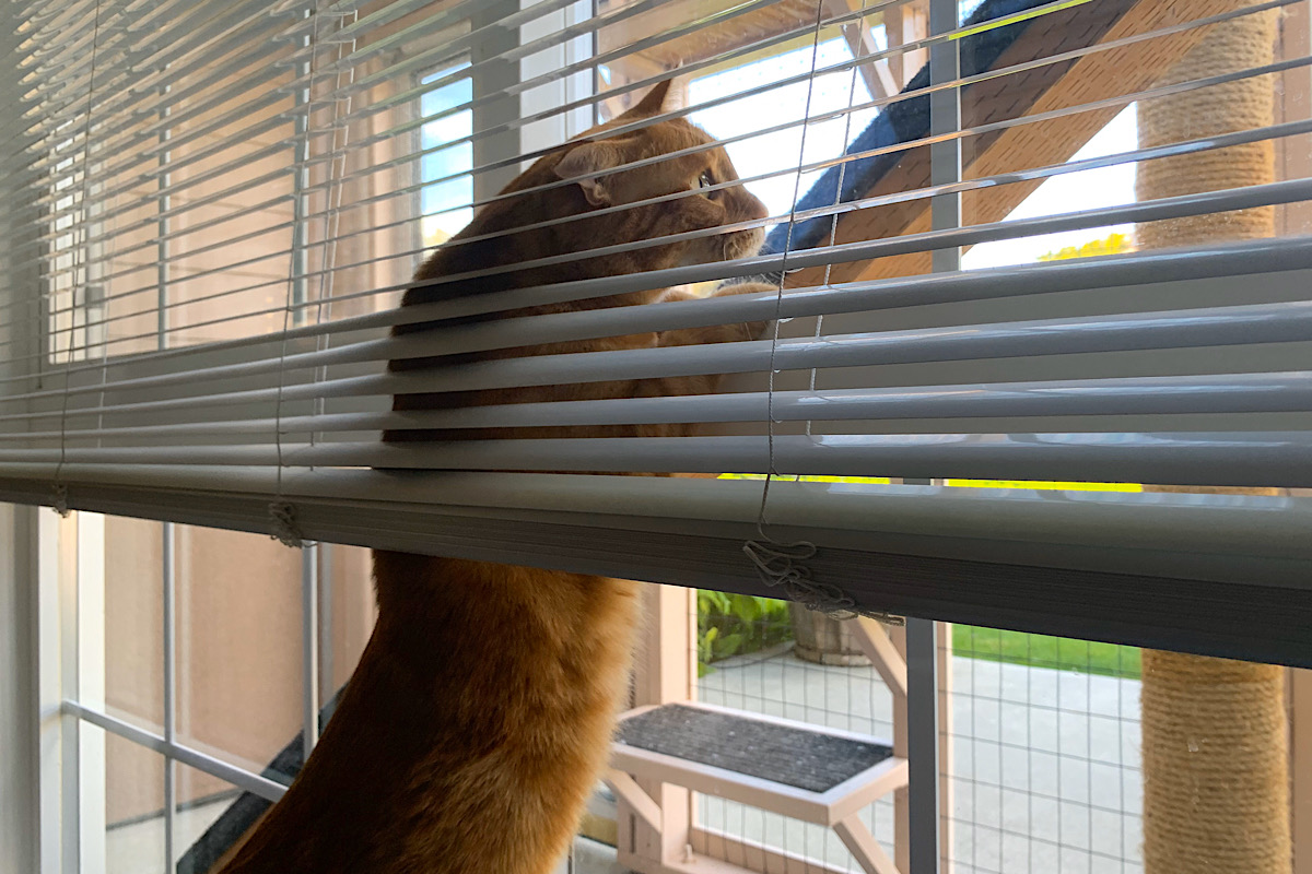
She’s adorable, I know.
Eventually (hopefully) one of these days it will be a more streamlined process to edit and upload images and write posts. I’m guessing it took me three times longer to post this on my iPad than it would have on my MacBook Pro. With practice, perhaps I could get it down to twice the time? I dunno. Right now I’m just happy I can do it. An iPad is a lot easier to lug around than a laptop.
