 My favorite novel of all time is Nobel House by James Clavell.
It is a masterpiece of storytelling that brilliantly weaves multiple complex storylines and fictionalized historical events into a highly entertaining story. I've read it at least ten times. But Nobel House, a story of modern Hong Kong circa 1963, is but one piece of Clavell's sprawling "Asian Saga" which includes his far more popular and well-known work, Shōgun...
Most people familiar with Shōgun know it from the 1980 five-episode mini-series event starring Dr. Kildare himself, Richard Chamberlain. So far as mini-series of the day go, it was pretty good. A fair amount of money was injected into the project, so it had good production values and a skilled cast. Here in the USA, it was a cultural phenomenon that was well-received. In Japan, however... well... it was a fictional accounting of their very real history, so it was not well-received at all. And understandably so. I mean, just look at this nonsense...
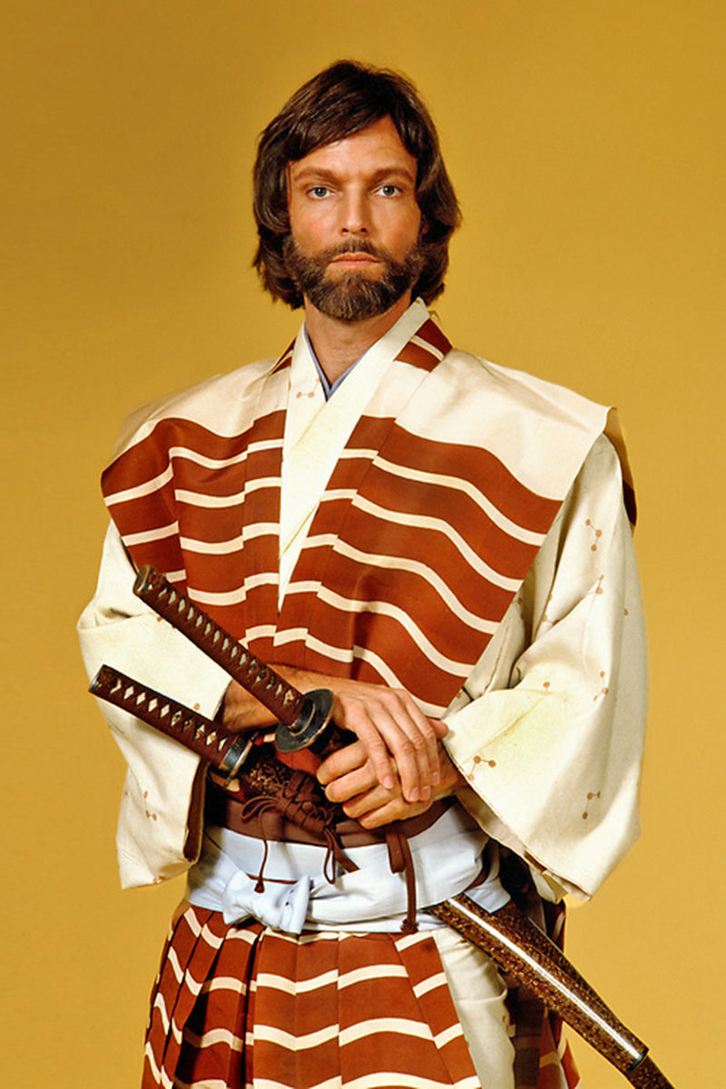
At the time I was mesmerized by the series. I think it was my second "event" mini-series after Roots, and I anxiously awaited each installment. And then I started reading the Clavell books (of which only King Rat, Tai-Pan, and Shōgun had been written). Then the following year in 1981 Nobel House was released and my literary world was turned upside-down.
But anyway...
FX Networks (via Hulu) has now begun a new 10-part adaptation of the novel. Gone is the over-the-top acting style of the 1980's, replaced by more reserved and powerful performances. Japanese is subtitled Japanese (thank heavens) and Portuguese is depicted with English so that the entire series doesn't have to be subtitled. In some ways the production feels a bit more intimate than the excessive 1980 series but not in a bad way. You still get the glorious money shots to establish scale (visual FX makes possible was could never have been realized 24 years ago), and the sets have authenticity which makes it a pleasure to watch. It's just that the focus is more on the performances than the spectacle. The first two episodes aired last night, and now we're getting a new one each week...
Taking place as the Edo period of Japan's history was being born, the world of Shōgun is truly bizarre by Western standards. An English guy ending up shipwrecked there at the time would very likely have gone mad. Violence and death was commonplace and intricately linked to a social caste system and honor code which is incredibly difficult for foreigners to even begin to grasp. Layer upon that the complex politics of pre-Edo, feudal Japan and it's amazing that Clavell managed to figure out a way of setting a story there that could be understood by Westerners to begin with. But set it there he does, and it's made even more complex because you have to understand the geo-politics in Europe as well. The English Protestants against the Portuguese Catholics who controlled trade in Asia.
The new FX series does a pretty good job of hand-holding the viewer through all of it, carefully dropping bits of exposition in a way that's not offensively obvious nor mind-numbingly boring. By the end of the second episode, you're pretty much set (which is probably why they were released at the same time) which means that the remaining eight episodes will be a ramp up to the heart of the story.
Now, when it was announced years ago that an adaptation was being made, I was really, really hoping for Michiel Huisman to play Pilot Major John Blackthorne. The character is English and Huisman is Dutch, but of all the actors working at the time of the announcement, he was the one I felt could best embody the character (driven mainly by his work on Game of Thrones). Ultimately the role would go to Cosmo Jarvis, who I was unfamiliar with. The guy does a phenomenal job with the part, which is great given that the entire show hinges on his performance. He has a very fine line to walk in the earlier episodes as he adjusts to the world around him but handles it with ease. Another standout is Tommy Bastow playing the Portuguese priest Father Albito. Despite him being an "enemy," you want to like him, which is critical to his role. Of course all of the Japanese parts are very well cast.
Especially Mariko.
Anna Sawai I actually recognize from, of all places, Fast and Furious 9 (more recently she was in Monarch: Legacy of Monsters). Near the end of the second episode her character has to hear some incredibly shocking news and then deliver it to her Lord Toranaga. But she has to be very Japanese about it, showing neither shock nor surprise... all while being totally shocked and surprised. And you read it all on her face. It's thrilling to watch.
So... yeah... so far so good, and I'm giving the show my highest possible recommendation. Knowing where the story is headed has me excited about future episodes, and I am almost certain to sit down and binge the whole thing over a weekend after finishing the final piece.
Can't give you more of an endorsement than that!
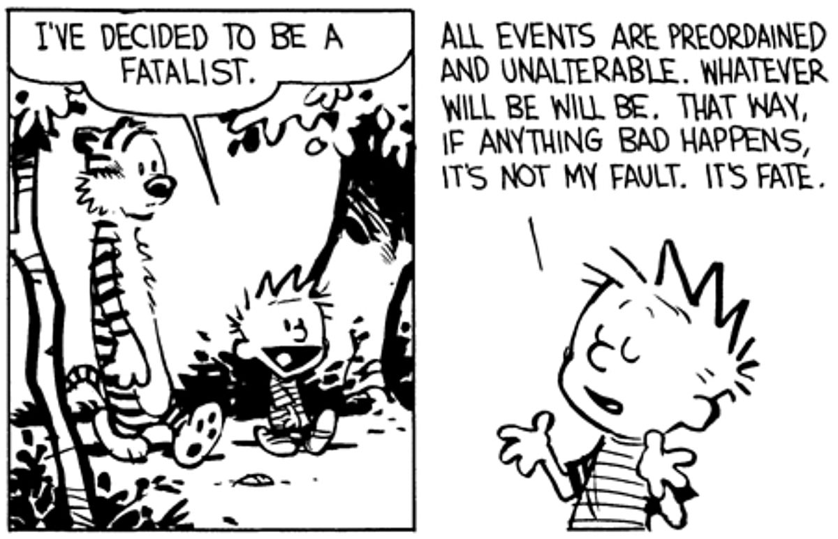
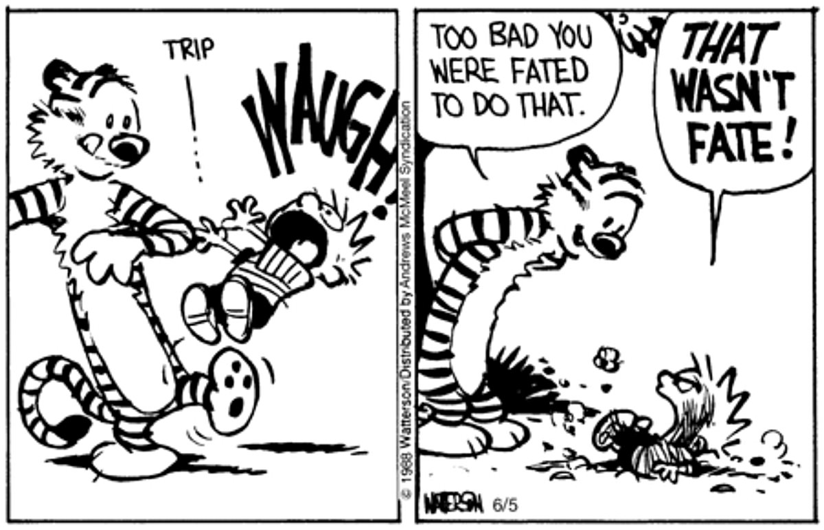
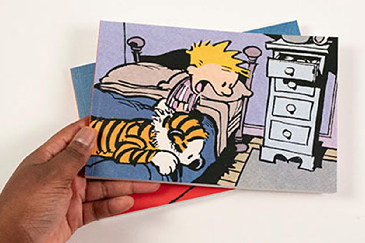
 My favorite comic strip of all time, hands-down, is Calvin and Hobbes. It's a joyous, imaginative, beautiful look at life through the eyes of a child and his imaginary tiger buddy. It hits in a way that's far different from the other strips I love... like Peanuts and The Far Side. Thanks to The Complete Calvin and Hobbes book set, I've re-read these strips dozens upon dozens of times. They never get old. And the minute I reach the final strip I have to resist the urge to go back and re-read all of them again.
I mean... just look at this genius...
Anyway...
The massive volumes of The Complete Calvin and Hobbes are really tough to lug around. So now the strips are being collected into small paperback sets that are easy to toss in your backpack or read on a train or whatever. Set 1, Volume 1 of The Calvin and Hobbes Portable Compendium was released back in August (Set 2 releases next March). They're fantastic...
It was while looking to see when Set 2 was being released that I waded through the massive number of illegal Calvin and Hobbes merchandise that Amazon allows on their site. And when I found this video...
My opinion of Calvin and Hobbes is always stratospheric. There's really no way it could be any higher. But I do enjoy hearing other people's take on why they love it.
Maybe one day a strip will come along that I end up liking better, but it seems to doubtful because it would have to be better than perfection.
I don't understand people who don't find space exploration utterly fascinating.
The United Arab Emirates has a Mars probe (named Hope) that sent back one of the most amazing shots I've ever seen. It's of the moon Deimos above The Red Planet, and the image composition is so amazing that you'd think it was Photoshopped. Or CGI. Or a painting. Or anything except a photograph...
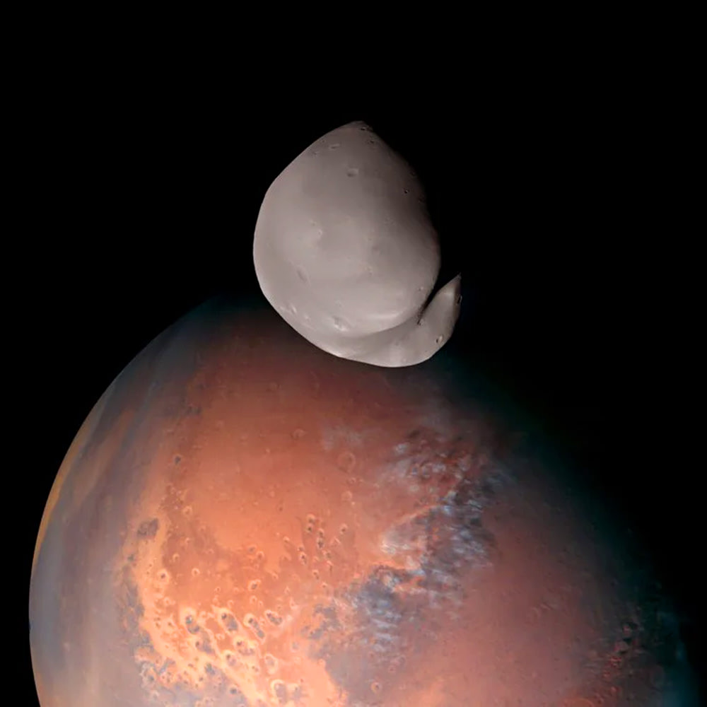
Photo from Emirates Mars Mission
The mission was originally set to end by now, but the UAE just extended it another year. The probe's wide orbit of the planet allows study of the planet and its moons in a way we haven't had before.
My fascination with Mars is directly attributed to the Edgar Rice Burroughs Barsoom novels...
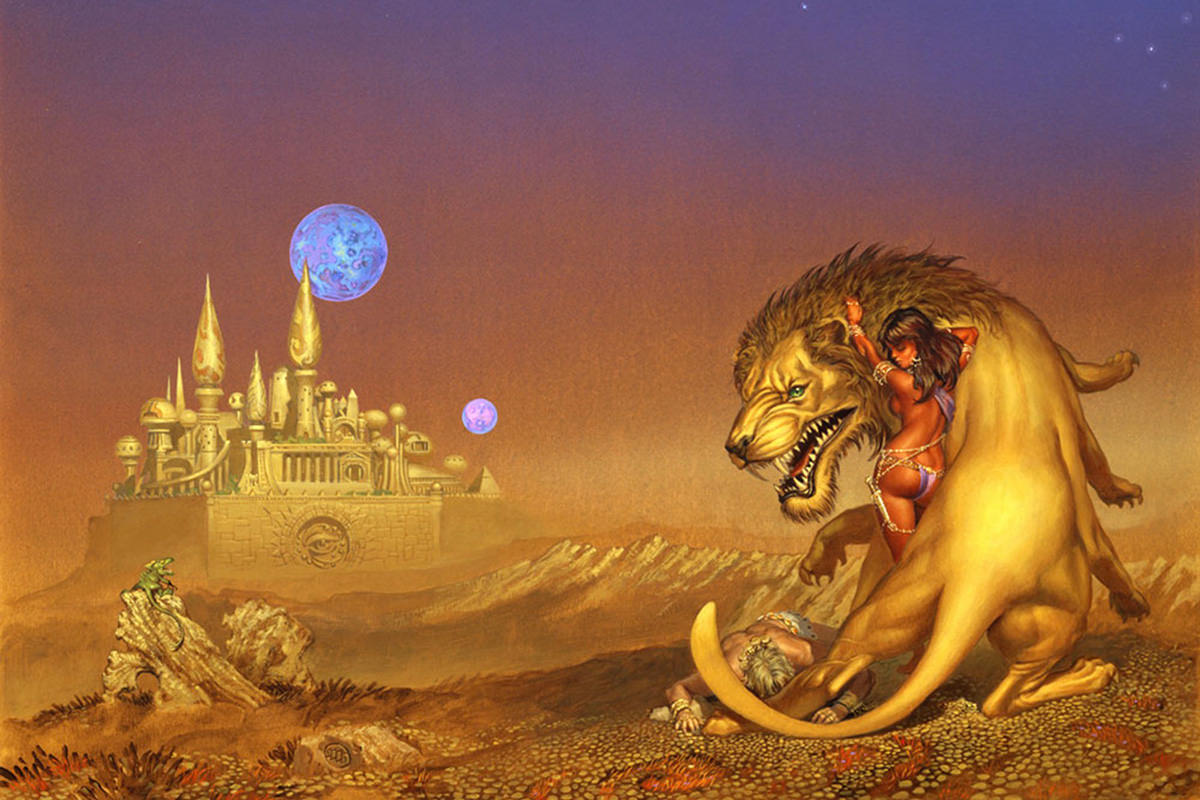
Incredible painting by Michael Whelan shown the Martian moons of Barsoom for Thuvia, Maid of Mars
Burroughs had a fascinating take on the moons Phoebus and Deimos, which Barsoomians (AKA "Martians") call Thuria and Cluros. Because the moons are very small... just 17 miles and 9 miles across, respectively)... people shrink when they approach them. John Carter visits Thuria in the book Swords of Mars only to find the surface area was similar to that of Mars, relative to his tiny size.
Phoebus and Deimos are notable not just because they are so small, but also because their orbits are really close to Mars. Phoebus is just 5,800 miles away... Deimos 14,500. Earth's moon, for comparison is 238,900 miles! But it gets worse. Phoebos's orbit is decaying 6 feet every hundred years. Which means it's likely to break apart (Mars gets a ring!) or crash into the planet in another 50 million years.
Thanks to NASA's Perseverance rover, we actually know what a solar eclipse looks like on Mars...
I could go on for pages writing about Mars and its moons. The exploration of our neighboring planet is a fascinating subject on which there are volumes of research, photos, speculation, and fiction available. It's a bottomless pit from which I'm happy to keep falling.
I save a lot of stuff throughout the week, then choose the top six or seven items for that week's Bullet Sunday post. But with this one I just can't wait.
I saw this video which shows how the book Dune compares to the movie Dune: Part One and was so frickin' impressed that I re-watched it on my television. I've read the book at least a dozen times... watched the movie a half-dozen... and this video flawlessly shows how smart choices have to be made when filming an "unfilmable" novel.
Dune: Part One leaves a lot of stuff out, because you pretty much have to, but the stuff they jettisoned built a movie that honored the spirit of the original in a way that you could only dream of...
So many movies fail... badly... by either keeping too much or keeping the wrong stuff... or making changes that ruin the story. Dune: Part One is an example of how you do it right, even though the video points out that some things get lost that changes how you perceive the story.
But hopefully if people enjoyed the movie they'll read the book to get all that stuff back. The movie adaptation really doesn't change anything in a way that no longer makes sense when you experience the source material, which is exactly how you should do it.
 In my work I've had the opportunity to be around vast wealth. I'm not talking mere millions (though that is certainly "vast" to me!)... we're talking obscene levels of wealth. People who never have to consider the price of anything. Dropping a million dollars at Crystal Shops on a Vegas weekend is like a drop in the bucket to them. They don't look at price tags because $5 or $50,000 is all the same to them. They have more money than they could spend in several lifetimes, so the idea of being concerned over such a pittance doesn't even hit their radar.
Now, I've never had ambition to be so wealthy. It's not something my value system can accomodate. So long as I can afford to pay rent, buy the things I need, and be able to afford cat food, I'm good.
However...
Every once in a while something comes along where I really, really wish that I had such vast wealth that I could just buy something cool without having to worry about paying for it. Or selling a kidney. Not like a Lamborghini or a beach house or anything like that (though I certainly wouldn't turn them down if you're offering). I'm talking about random stuff that should be accessible to everybody, but has been priced so that only the über-wealthy can afford it.
Like this book set called The Sistine Chapel. It's a massive tome filled with actual 1:1-sized images from some of the most remarkable art ever created (with Michelangelo's ceiling being the most well-known). The size you're looking at the art in the book is the size that it is in real life. It's sublimely cool...
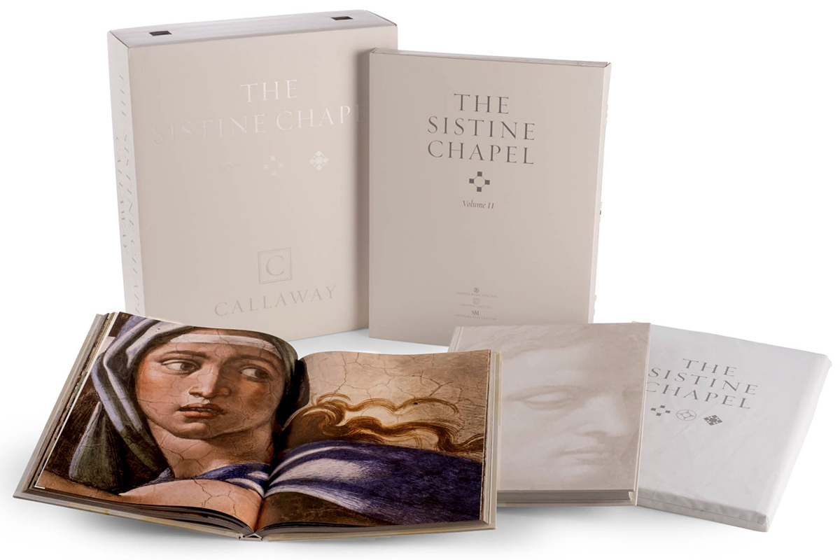
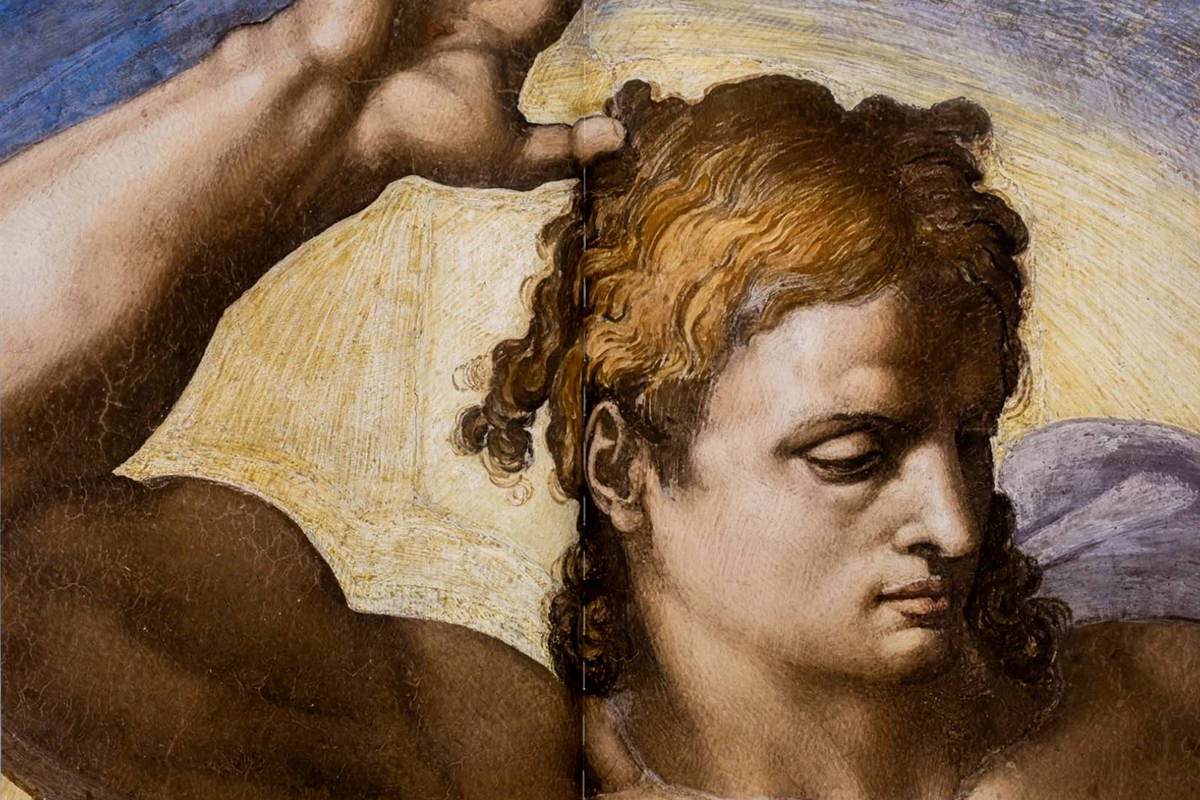
It's limited to 1,999 copies and costs $22,000.
Of course I can't spend this kind of money. And if I had the option of being able to pay off a chunk of my mortgage or have this book, obviously I'd put that money on my mortgage.
That's not the point.
The point is that it's insane how something like this is so far out of reach out of the people who might most appreciate it. People who could never afford to fly to Italy, make their way to Vatican City, then take the time off to stand in line and see it in person (not that you'd be able to study the images at the level of detail offered in this book, but still). Some struggling artist who can barely afford to afford groceries, but loves looking at such incredible works like this, is completely out of the loop. And that just seems... wrong. Because these books will end up in the homes at people who buy it to have it as a status symbol, barely look through the pages, then put it on a shelf with all the other expensive things that they buy just because they can.
Not that this is different than anything else now-a-days.
It's quickly getting to the point that only the über-wealthy can afford to own a home, let alone a $22,000 book.
And so I guess I will be waiting for the paperback release or whatever. Perhaps His Holiness the Pope will deem us pleebs worthy and consider such a thing one day.
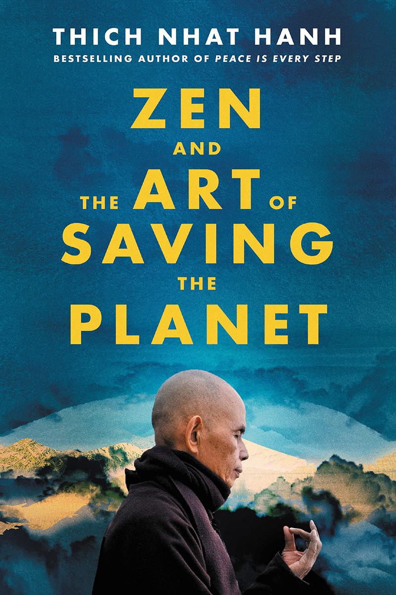
 I was deeply saddened to learn that Zen Master Thích Nhất Hạnh has died. He was a welcome voice and teacher for me since I became interested in Buddhism way back in 1998 (his book The Heart of Buddha's Teaching was one of the first I read). A consistent advocate for peace, the last book I read of his, The Art of Living: Peace and Freedom in the Here and Now was in 2017... and his last book from 2021 (Zen and the Art of Saving the Planet) is on my list...
In a world that's besieged by darkness, his teachings were a light that guided me. And will likely continue to do so for the rest of my days.
In the darkest time of my life Master Thích Nhất Hạnh was there. His words about his own mother's death got me through mine...
The day my mother died I wrote in my journal, "A serious misfortune of my life has arrived." I suffered for more than one year after the passing away of my mother. But one night, in the highlands of Vietnam, I was sleeping in the hut in my hermitage. I dreamed of my mother. I saw myself sitting with her, and we were having a wonderful talk. She looked young and beautiful, her hair flowing down. It was so pleasant to sit there and talk to her as if she had never died. When I woke up it was about two in the morning, and I felt very strongly that I had never lost my mother. The impression that my mother was still with me was very clear. I understood then that the idea of having lost my mother was just an idea. It was obvious in that moment that my mother is always alive in me.
I opened the door and went outside. The entire hillside was bathed in moonlight. It was a hill covered with tea plants, and my hut was set behind the temple halfway up. Walking slowly in the moonlight through the rows of tea plants, I noticed my mother was still with me. She was the moonlight caressing me as she had done so often, very tender, very sweet... wonderful! Each time my feet touched the earth I knew my mother was there with me. I knew this body was not mine but a living continuation of my mother and my father and my grandparents and great-grandparents. Of all my ancestors. Those feet that I saw as "my" feet were actually "our" feet. Together my mother and I were leaving footprints in the damp soil.
From that moment on, the idea that I had lost my mother no longer existed. All I had to do was look at the palm of my hand, feel the breeze on my face or the earth under my feet to remember that my mother is always with me, available at any time.
I cannot fathom how many lives this gentle man's teaching have touched. Because it's not just those who listened to his words, read his books, and learned from his teachings... it's all the people that those people touched.
Kindness can be more contagious than Omicron.
You will be sorely missed Master Thích Nhất Hạnh, but your love and light will never die so long as somebody somewhere offers a kindness to another. Because it's not irrational to think that a kindness you initiated was patient zero for a kindness today.
And tomorrow.
I don't see why we have to say "I will die," because
I can already see myself in you, in other people, and in future generations.
Snow has finally come to Redneckistan! But will it last? Doesn't matter... because an all new Bullet Sunday starts... now...
• MACGRUBER! This coming Thursday. Four more days. I love, love, loved the MacGruber movie. I've watched it an embarrassing number of times and have been wanting a sequel forever. But a TV series will do just fine...
It looks like it's going to be even better than the movie. Can't wait!
• Beautiful! Flawless...
Dumbass bigots self-own so often that I just accept it as their default.
• Enter the Matrix! I'm intrigued...
Though I remember being excited for the two shitty sequels we got last time, so I'm cautiously optimistic.
• Crossed-Stitched! This made my entire morning (here's a link if TikTok is being a dick)...
@landscapesareboring This. Took. So. Long. 😢 ##pleasehitlike ##myfingershurt ##TubiTaughtMe ##crossstitch ##xstitch ##summer ##foryourpride ##shecamedowninabubbledoug
♬ original sound - Collecting Weekly Clips
Priceless.
• BACON! In general, not buying Kellogg's products has been easy for me... except Morning Star Farms fake bacon. I eat this stuff by the truckload. I put it on sandwiches. I eat it for breakfast. I crumble it and put it on everything... E-V-E-R-Y-T-H-I-N-G... because it's such a great product. There are few alternatives in my area, and the ones I've tried have been awful. I seriously hope that Kellogg reconsiders their abhorrent behavior so I can start buying it again... but... oh well. I refuse to buy any of their products now, and may never buy them again. Hopefully stores will replace Morning Star Farms "Bacon" with Lightlife "Smart Bacon" or something I like.
It's so weird. I've been buying shitloads of Morning Star Farms since I first became a vegetarian in 1986. In many stores where I live, they were the only option. And many of their products remain a favorite... Grillers Original Burgers... Sausage Patties... OH LORD, THOSE GLORIOUS CORN DOGS... and, of course, the bacon. At most, it's been an inconvenience for me. I dipped and fried my own Lightlife corn dogs and they were every bit as delicious as the Morning Star Farms (better even!), but a hassle to make. I will have to see if I can made 100 of them and hope they freeze well? I dunno. Fingers crossed..
• Happy Holidays! The irony is not lost on me that it may very well end up that my favorite Hallmark Christmas movie of 2021 is actually a Hanukkah movie...
Maybe it's because they only get one Hanukkah movie each year that they get to put all their good ideas in a single movie... unlike Christmas where all the ideas are split between 40 movies... but this is another winner after an equally good flick last year.
• Interview! I met Anne Rice twice at book signings. When people ask me what she was like, I had the same response both times... "She was nice. But disconcerting because it felt like she could see right through me." And it's true. Nice as can be... made some sweet chit-chat with me... and made me feel like she had supernatural eyesight that was more than a little intimidating.
Which is why I was very sad to hear of her passing. I liked some of her books. Was less enchanted by others. But ultimately enjoyed the entertainment she generously offered me. But I'm more upset because I feel that a total stranger who knew me better than I knew myself has gone. And, yeah, I know that doesn't make much sense. But it does to me.
And I guess that's all I got to say about that.
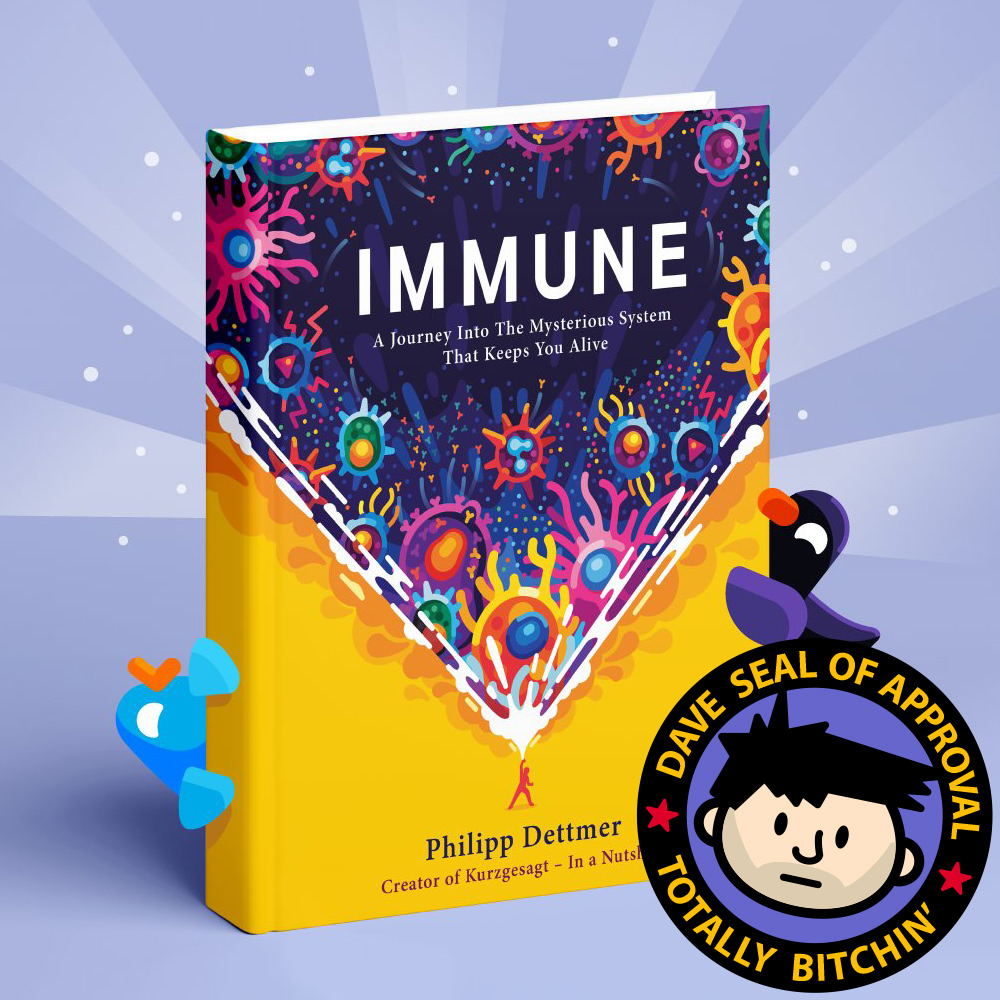
 You guys... YOU GUYS! Kurzgesagt is one of my favorite YouTube channels, and the first book from the channel's creator, IMMUNE, just landed. It is incredible. I swear, I'm only an hour into it and it's one of the most fascinating things I've EVER read. The book seems more like science fiction than science fact because it's just so bizarre and improbable...
If you'd like a taste, they've got the first two chapters as audio on a YouTube video...
But beware... you'll definitely want to buy a copy of the book if you listen to this! It's fascinating and gorgeous. Highest possible recommendation.
UPDATE: I'm loving this book so much that I went ahead and bought the AudioBook as well. The idea of having Steve Taylor read it to me was too much to resist. Now I can listen to the audiobook while looking at the illustrations in the book-book. The best of both worlds.
UPDATE-UPDATE: There's a cool new Kurzgesagt video that's supporting the book...
ZOMFG! FACEBOOK IS DOWN! FACEBOOK IS DOWN! Everywhere you look in the news today, it's the same story and the same headline... Facebook is indeed down. What a tragedy (insert eyeroll).
Which struck me funny because I recently re-read Watership Down... a beautiful story about rabbits which is surprisingly deep and smart for something meant to be a children's tale. If you haven't read it yet, I can't recommend it highly enough.
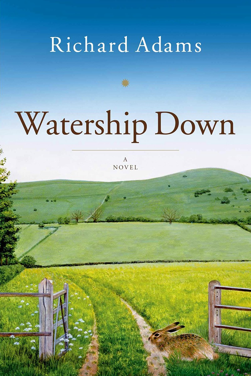
So every time I see "FACEBOOK IS DOWN!" I'm thinking "WATERSHIP DOWN!" which is a far more important thing to focus on.
And so I shall.
So I shall.
 Happy Martin Luther King Jr. Day, everybody!
I am fortunate enough to get the day off, but I still ended up working so I could get caught up while not having new work dropped on me. That's almost like a holiday right there!
As is my custom, I started my day by listening to his I Have A Dream speech in its entirety. I also pulled out my copy of The Autobiography of Martin Luther King, Jr. which I haven't re-read in a while. Last year I re-read Where Do We Go from Here and the year before that Strength to Love, so it's time to be inspired.
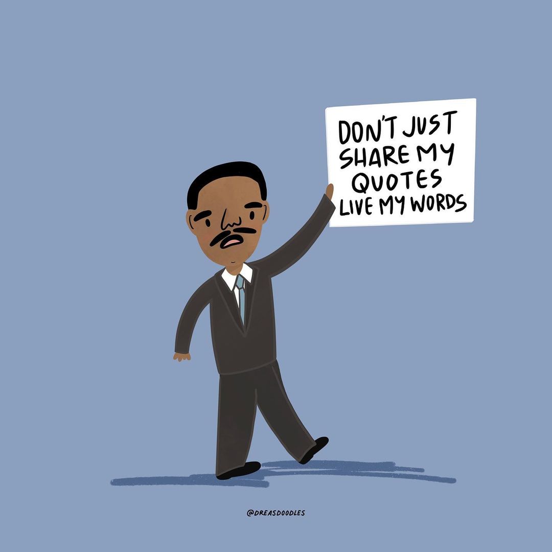
Illustration from Doodles by Drea
And now... I should probably clean my house or wash clothes or make dinner or do something productive. Though I've already performed a firmware update on my NAS and backed up my files, so maybe that counts as productivity?
Still need to make dinner and clean my kitchen though.
That's more than enough productivity.