
 Last night I was looking through my photos to send one to a friend who was asking for travel advice. While digging through the archives, I noticed something strange... before 2008, my photos were a lot less personal. Sure, I had photos of me and my friends when we're together, but so many things in my day-to-day life along more casual moments went undocumented.
It took me all of two seconds to figure out why.
The iPhone was released on June 29, 2007. I got one a month later.
Before iPhone, I was usually using a digital SLR as a camera which was (mostly) only taken on trips. I was never hauling it around with me everywhere I went. I also had a pocket camera, of course, but it was just one more thing to carry around, so I mostly didn't. On top of that, a lot of places... like concerts, shows, and such... wouldn't allow you to take a camera in with you anyway. You had to be a professional photographer with a permission card to take photos.
Then iPhone came along, and I had a camera with me wherever I went. And everything changed. It wasn't a great camera, but it was good enough. Far better than the cameras on the phones I owned before (which I never used because they were so bad).
It took a few months before my brain was suitably programmed to remember that I had a camera in my pocket, but by 2008 I was very much in the habit of whipping out my iPhone to snap a photo when something fun or interesting happened.
I didn't have cats yet, but suddenly my iPhone was filled with photos of all the cats I met...

And occasional selfies, which I had never taken before (note I'm off-center because a front-facing camera wouldn't appear until iPhone 4)...
And mundane moments, like the food I was served on a plane...

And of course food in general. I rarely photographed food before... only when it was incredibly special... but now? From 2008 onwards, food photos were everywhere in my camera roll and on my blog...


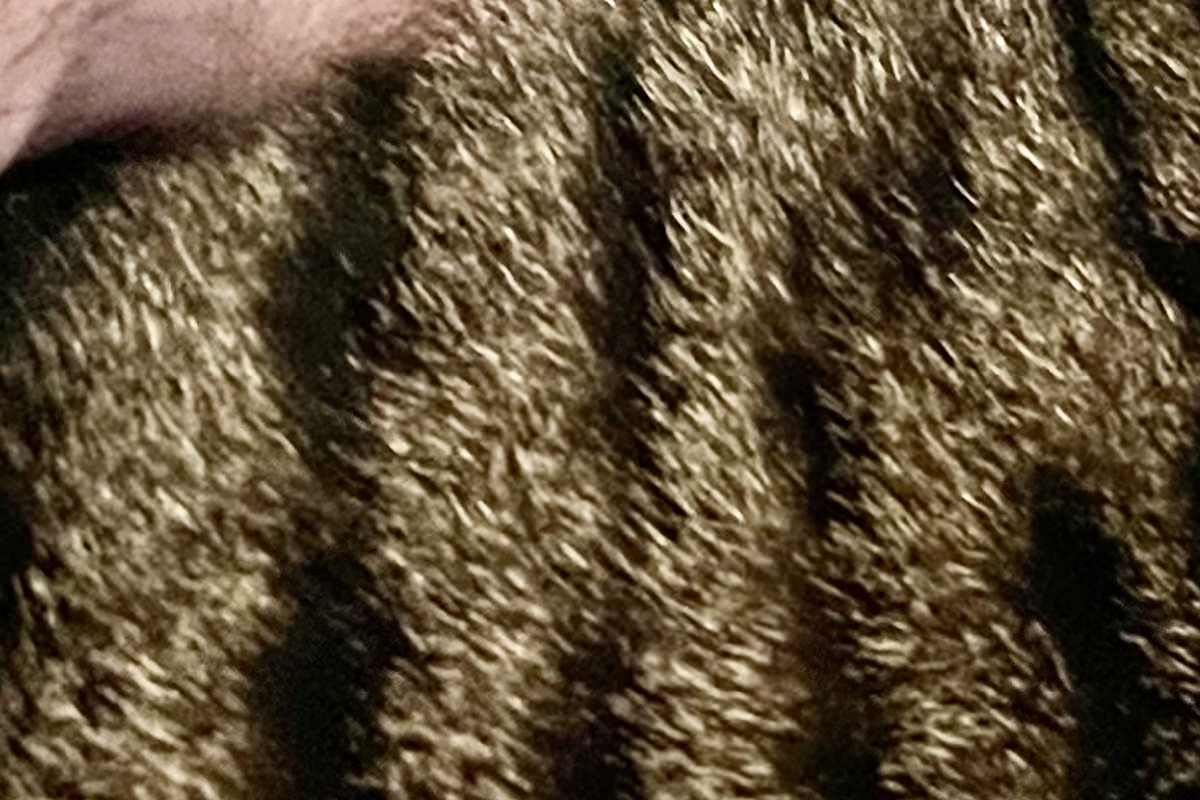
Yeah, yeah... the photos I was getting were only ever decent when the lighting was perfect (I took seven photos of that cat trying to find the best angle and position to get the best detail in the fur), but even drab, low-res, blurry shots were cool at the time! Documenting the stuff I did and saw became second nature.
Back then, like now, people were telling me that I was spending too much time taking photos instead of enjoying the moment... but they were (and are) wrong. At least when it comes to me. Unlike traditional photos which required planning and camera choices, iPhone photography was just pressing a button on an object you already had in your hand. It was seconds of your life captured forever.
And I loved that.
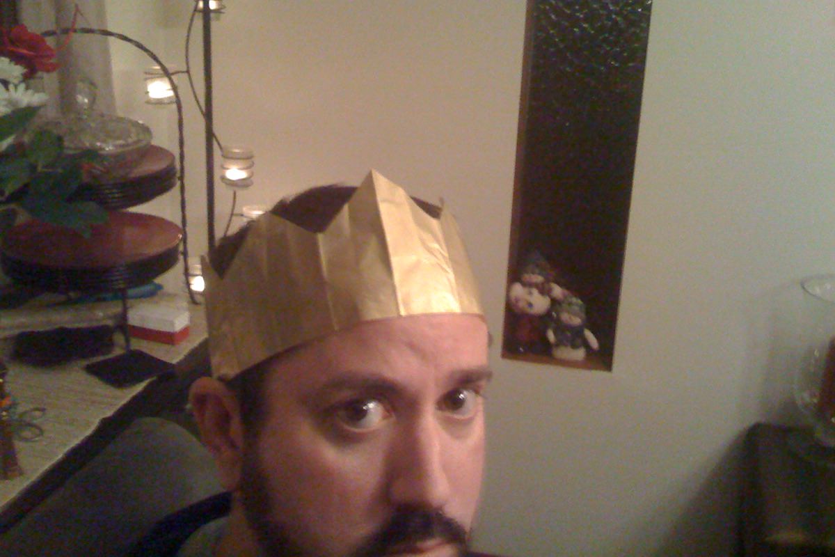
Every one of the moments captured in photos above would have been easily forgotten if I didn't have photos. But instead I remember the cat that sat in my chair at a photo shoot I was at in Seattle... I remember everybody wearing cracker crowns at my sister's house for Christmas dinner... I remember how disappointed I was that I was in First Class on a flight and feeling Last Class because all they had was Pepsi instead of Coke... I remember loving Chicago-style veggie dogs so much that I didn't eat anything all morning so I would have room to eat two of them at lunch... I remember the Key Lime pie I got for lunch at Universal Studios Florida right before I rode the Incredible Hulk Coaster three times in a row... and I remember how my life changed when I ordered extra cashews on my cashew-caramel-frozen-custard sundae on a work trip to Wisconsin. Little moments preserved in time that I probably wouldn't have given a second thought if I wasn't able to scroll through them over and over whenever I want.
I'm sure as I get older and memories are more difficult to recall, I'll be very glad to have so many things digitally captured to help me remember the life I lived.
Including that time I had to chisel my car out of a hotel parking lot while working in Maine after an ice storm hit the night before...
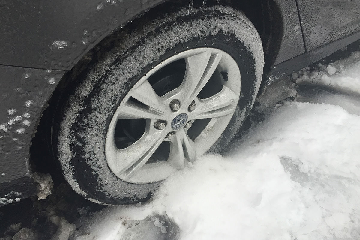
Who wouldn't want to vividly remember that?
 My days of running out and upgrading to Apple's latest and greatest are apparently over.
Because I've never been so overwhelmingly meh about a keynote that I can remember.
iPhone Pro Max 17
It's not that I wouldn't love to upgrade my 16 Pro Max to the latest model... I've always upgraded because of the cameras, and the improvements there are very nice indeed. 48MP cameras across the board on the rear, allowing for even more amazing "deep fusion" photos. A longer zoom. A 56% bigger sensor. Better low-light performance. Yes to all of that. And if I were still traveling regularly, I'd probably jump at it. But I'm not. I mostly take photos of my cats, and I can do that just fine with what I've got now. Everything else that's new doesn't mean much to me. My existing battery life, CPU speed, screen, enclosure, and the rest are already more than I already utilize. And what Apple "Intelligence" features I got in the year since they were supposed to be included on the 16 Pro don't impress me at all. I never use them because they're crap. I do like the orange color, having been dying for a Pro model that isn't drab and boring like we always used to get.
iPhone Air
I guess if all you wanted was a super thin and light iPhone, this is the model for you. But I want a phone for the camera, which is to say that this is not the phone for me.
iPhone 17
I guess if all you wanted was a less expensive iPhone Pro, this is the model for you. But I want a phone for the camera, which is to say that this is not the phone for me.
Apple Watch Ultra 3
Even if the size wasn't total overkill for me, the feature set would be. I'd make an exception if I were into the activities that the watch was designed for, but I'm just... not.
AirPods Pro 3
Even though these are the newest AirPods, you'd be forgiven for thinking they weren't given how there's AirPods 4 out there already. Regardless, Apple seems to be basing the price on how good the noise cancelation is. None is $129. Active is $179. World's Best Active is $249 (with Live Translation tossed in). I think the AirPods I own are the original Pro models, and they are still everything I need. Except the battery life is tanking, making them soon-to-be-unuseable. Which I'm sure is exactly what Apple is counting on... built in time bomb so you have to purchase new ones. Just like my Beats that died. At this point I think I'd rather go back to corded.
And so... guess I'm saving my money this time.
Even though it means I'm losing my Certified Apple Whore™ cred.
 The last time the Aurora Borealis was a thing back in May, I dragged out my camera and tripod and was disappointed with the shots I got compared to what others were getting. So when I heard that she would be making a repeat performance last night, I thought I'd study up how to take better photos this time around. Then ultimately decided I didn't care enough to do that. I'll just look at other people's photos and stay inside where it's warm
But then I remembered that I have a new iPhone and decided to throw on a jacket to see what happens when I used it to snap some photos...


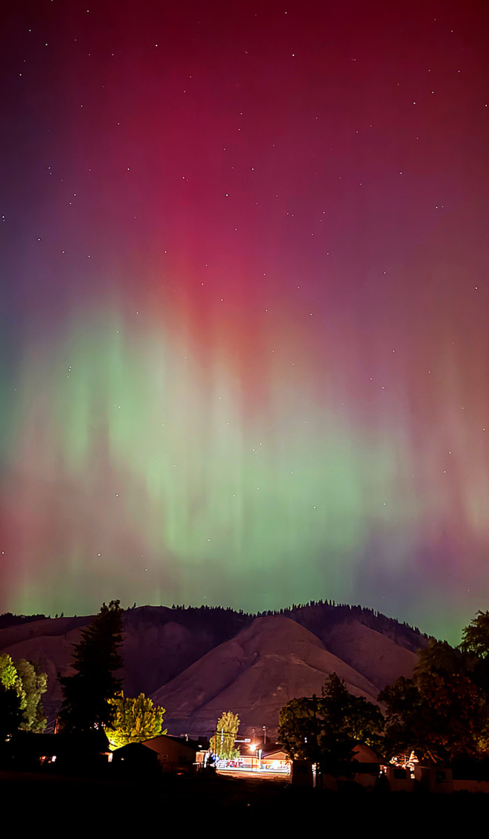

What people are not saying is that you don't just walk out your door and see this. It's barely visible until you pull out your phone or camera and make a long exposure. To actually walk outside and see this you need to go to Norway. Or Alaska (which is where I saw it for realsies). Or somewhere way north. Still... it's pretty to look at through my iPhone.
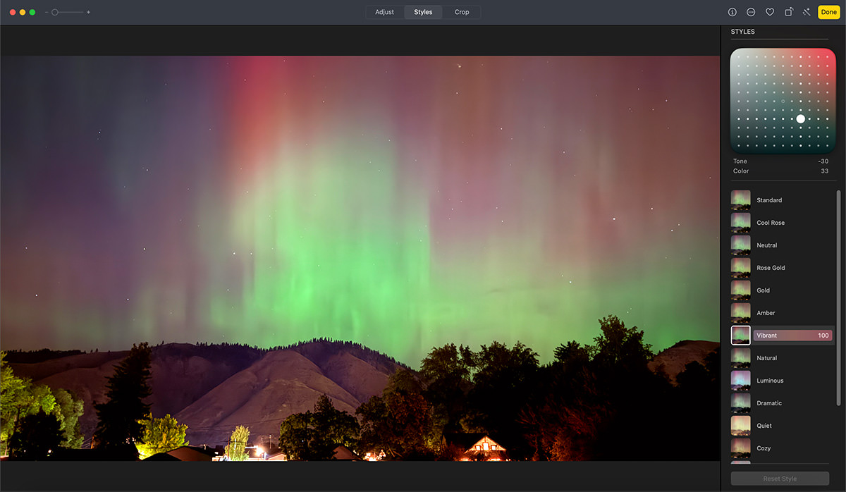
I kept looking through my bedroom window and waited to see if the pink/red got stronger before going outside, because at the start it was mostly green like last time. And yes, before you ask, I changed the photo style in iPhone Camera from my new go-to "Amber" undertone to the "Vivid" filter setting (which was my former happy place in the app before we got "Amber")...
Some interesting things to note...
First, all of the above photos were shot with the wide-angle lens. I was really hoping to get something cool out of the new 48MP ultra-wide lens, but the results were terrible. It's as if the shake reduction is not working and the "Vivid" setting wasn't doing anything to help. All I could get without a tripod were grim, blurry photos. So disappointing...

Second, I shot a couple videos to capture the shifting lights, but that turned out even worse. I think if I got my tripod that I could have gotten something worthwhile, but my cats were already pissed off enough that I had left them.
Third, when I looked through my photos more carefully this morning, I found that what I really liked was when the stars shined through the aurora. Now I really wish I had grabbed my tripod, because I would have liked to have gotten a crisper take of that. But still, the iPhone's shake reduction is darn good. Considering how small the stars are, I expected a lot more blur than what I got. This is a 100% pixel crop of how iPhone did with the wide-angle lens...

Fourth, I opened my laptop this morning and of course social media is overflowing with "tHIs iS nOt NORmal! ThIS IS The hEAVy metaLs ThAT thE GuberMINt aRE putTing InTO The air to CREaTE hURRICaNes!" Because of course. We can't have nice things any more because despite explanations by scientists and astronomers as to what's happening, everything has to fit into some nonsensical confirmation bias narrative. Everything. It must be fucking exhausting spending so much time trying to sus out what the latest conspiracies are and how they can sandwich into the demented fantasies that people are building to explain the world around them. Fantasies which don't rely on empirical evidence, rational thought, or all the evil lying scientists around the world who have been paid by NASA to deceive us from the truth. It's absolutely bonkers that we've regressed back to the Stone Age, and everything humanity has learned is being tossed out the window in favor of absolute bullshit. But that could just be my eight COVID boosters talking. I get vaccinated because I have respiratory issues and getting COVID could kill me, so I guess I'll just keep believing in science so I can survive even though it means that I am crazy-stupid for believing in science? Who the fuck knows any more.
And there you have it. A pretty nice display of this cool consequence of stronger-than-usual solar storms hitting earth's magnetic field and interacting with gasses in the upper atmosphere which is visible further south than usual.
Or it's Obama and the Deep State using unicorn blood as a sacrifice to satan for summing death and destruction upon the earth which our prayers to Jesus combated, thus creating pretty lights. Or what the fuck ever you want to believe. I give up.
 With the advent of the iPhone 16 (non-Pro version), Apple put the two lenses parallel to each other instead of on a diagonal so you can shoot spatial photos. Like your two eyes (assuming you have two functional eyeballs), shooting with two lenses spaced apart can add depth information to what you see (or photograph). Sure, the two lenses on the iPhone aren't spaced as far apart as your eyes, but it's still enough spacing to create a stereo image thanks to the iPhone's LiDAR depth sensor which can build a depth map.
The iPhone Pro has had parallel lenses for a while, but until the new 16 Pro, you've only been able to shoot spatial video. Now you can shoot spatial photos as well. These photos are meant to be displayed on Apple's astronomically expensive $3,500 Vision Pro.
Apple gives you no way of viewing spatial images on your iPhone. So if you don't have a Vision Pro, the only way I know to view the 3D image is, unbelievably, to post them to Facebook because they have had the ability to create 3D images for a while. It's just that iPhone's LiDAR depth data makes them better than usual since depth doesn't have to be interpreted.
But having to go through FACEBOOK?!? This is really fucking shitty of Apple.
They could easily build 3D viewing into iPhone's Photos app... drag your finger on the screen to change the angle... or pivot your iPhone to change the angle. It's about the biggest no-brainer there is, but nope. Apple demands you spend $3,500 additional in order to view what you shot on your iPhone.
So what I did to share them here is take some test shots of my cats, upload them to Facebook, then screen record my mouse changing the angle to see the 3D effect of the spatial images.
The result is very good (no thanks to Apple). When you play this shot of Jake showing off his junk, note how his foot in the air and the folds in the blanket have really good separation...
This shot of Jake is both impressive and a big ol' mess at the same time. The LiDAR sensor didn't register his whiskers, so they are merged with the background and look nuts. But the rest of him? How cool is this?
Shame about the whiskers. Maybe in the future Apple will add an improved LiDAR sensor to pick up smaller details. I wonder if there's a way to manually edit the depth map so I could paint the whiskers back in? Something I should look into...

Do I want an AppleVision Pro so I can see my spatial photos in real 3D? Of course I do. But do I have $3,500 to spend on one? No I do not. Hence Facebook. My guess is that Apple will eventually release an AppleVision (minus the Pro) which is actually affordable. Until then I'm hoping that Apple (or a third party) will at least give us a way of looking at the 3D images on our iPhone somehow. It's fucking embarrassing that Apple hasn't done something already.
Though given some of the curious decisions they made with my new iPhone 16 Pro Max, that's pretty much Apple in a nutshell.
 I don't have the money to buy a new iPhone Pro outright. They're $1000 minimum. Which is why I just lease my iPhone from Apple's "iPhone Upgrade Program." It's a known expense every month that I budget for, so I always upgrade when a new model comes out because the monthly cost is the same. This way I don't have to stress over my phone getting older and breaking or losing its value. I did it yet again this year.
Welcome to the new iPhone 16 Pro...
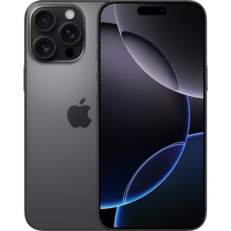
The tl;dr version is this: Unless you are a part of the iPhone Upgrade Program and don't mind being trapped in an eternal lease, I would not upgrade from the
And here we go...
ULTRA-WIDE. Apple finally increased the megapixels on my favorite lens... the ultra-wide, taking it from 12MP to 48MP. It seems to help most with macro shooting more than wide-angle photos. The only thing left to go 48MP is the 5X lens, which desperately needs to be better, but is still languishing in 12MP. Because? 48MP is nice! Especially when you warm the tone and shift the flatness out...

iPhone 15 Pro Max Macro Lens
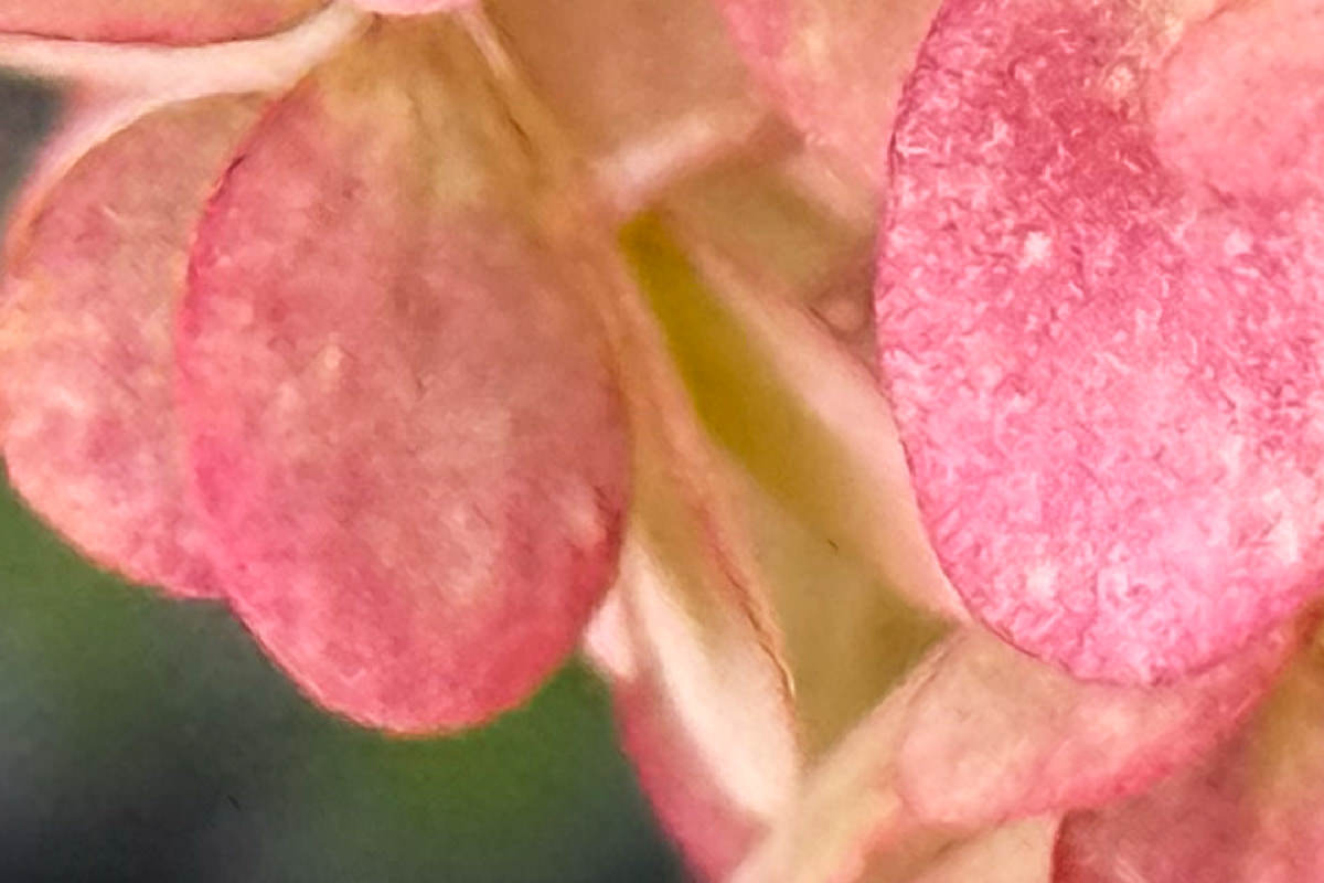
iPhone 16 Pro Max Macro Lens

iPhone 15 Pro Max Macro Lens — Zoomed
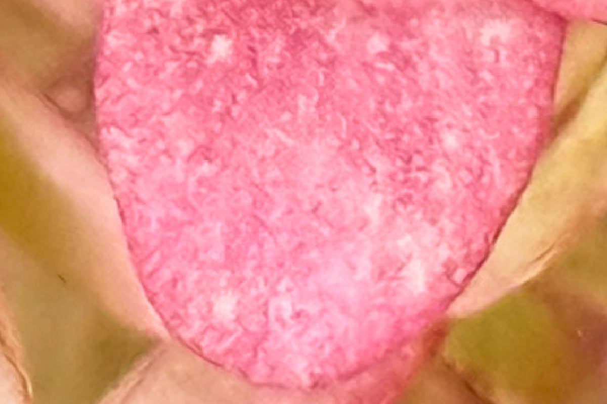
iPhone 16 Pro Max Macro Lens — Zoomed

iPhone 15 Pro Max Macro Lens

iPhone 16 Pro Max Macro Lens
TONE & STYLE. I'm just putting this out there... I fucking hate the Camera app in the 15 Pro Max. It shoots over-processed, boring, flat, shitty photos. There's no depth in the shadows. So there's no pop or subtlety to the images. Everything has an appearance that approaches cell-shaded. And, guess what, the default photos you get out of the 16 Pro Max are fucking worse. The difference is that you have the ability to set an "undertone look" which can offset this flat, boring, shitty, awful default. This photo I shared of Jake on Caturday had the highlights dialed back a bit in the Photos app, but that's the only adjustment I felt I had to make because it looked darn good right out of the camera...
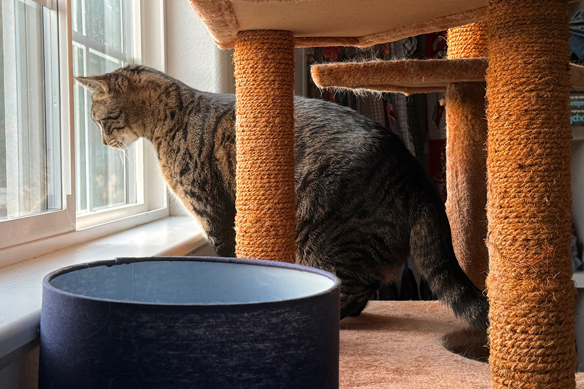
The rich warmth comes from slightly leaning into the "Amber" style... but you can see that I also drop out of the horrific fucking blown out shadows by lowering the tone a bit so there was some actual depth...
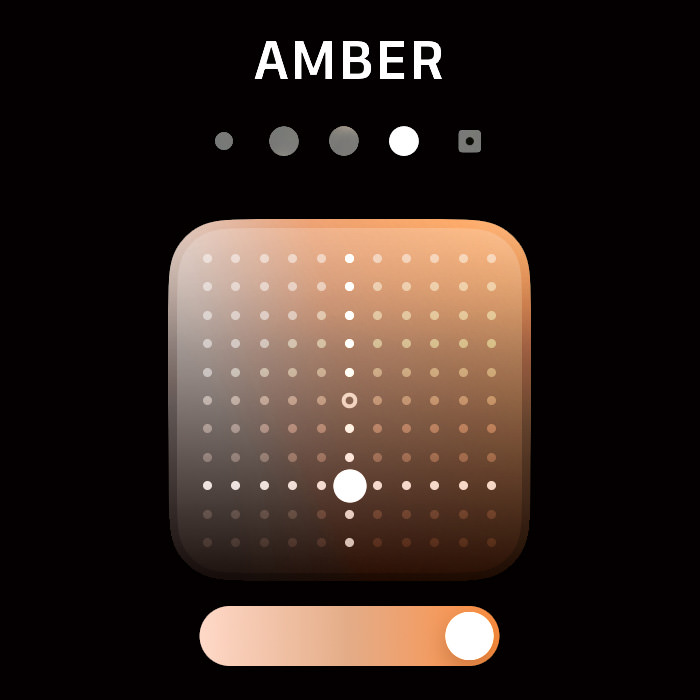
I realize that if I don't like the iPhone's Camera app that there are dozens of others I could use. And I own a lot of them. But the convenience of the default app is too handy to ignore... especially now that you can do something to improve how it shoots. I'm not saying Apple redeemed themselves with the new camera because they still have shitty defaults that most people will never change, but at least there's a way out if you're aware it exists and figure out how to use it. And, as a bonus, you can apply/adjust the undertone settings after the photo has been taken! Nifty!
THE DISPLAY. It's aces. It was aces last time. I find it bizarre that the non-Pro models are still 60Mhz, but the Pro has a buttery-smooth 120Mhz that looks incredible. Thanks to the smaller bezels (and slightly larger size) you get a few more pixels too. The 16 Pro Max has 2868 × 1320 pixels vs. the 15 Pro Max 2796 × 1290.
MICROPHONES. The new microphone array is not being overhyped. It really does make a difference.
4K 120FPS. The fact that a frickin' phone can shoot 4K video at 120 frames per second is mind-blowing. Usually you have to spend tens of thousands of dollars on a RED Cinema camera to get stuff like that. Assuming you have an external high-speed drive attached to hold the massive file sizes it requires. Apparently Danny Boyle is shooting his new 28 Years Later movie on an iPhone 15 Pro Max, and I'll bet it will look great... even though he will undoubtedly be slapping on a lot of additional tech to his phone. Wonder what people will do with the iPhone 16 Pro?
BATTERY. Before my 16 arrived, I logged a Saturday with my 15 doing common tasks with plenty of video watching, app using, and photo-taking. Then I repeated that day with the 16 as closely as I could. Apple did not lie. I was already very pleased with the battery life, but it looks like I would get an extra 40 minutes (with plenty left on both phones) on the newer model. This will be very cool if I have to travel somewhere, because that's when I use the most battery.
PERFORMANCE. For years the iPhone's CPU/GPU performance has been more than adequate. And yet it keeps getting faster and more capable anyway. It's a good thing because it allows the photo processing to keep getting better. The fact that this benefits intensive apps (like some games) is just the icing on the cake.
CAMERA WEIRDNESS. In most ways the camera is the same as 15 Pro Max. In some ways the camera is better than 15 Pro Max (like the new Ultra-Wide), but in some ways it's strangely worse. This may be a settings issue that I have to work out, but it's frustrating to take a photo on the 15 and have it look perfectly fine, then take the same exact shot with the 16 and have it blown out in the highlights or isn't as defined. Where's that coming from? No idea. Fortunately, it's not common, but it's common enough to be irritating. I hope this is a software issue that can be rectified.
THE SIZE. I started buying the "Pro Max" because it was the only way to get the best camera. But now both Pro models get the same camera spread, so I was very close to going back to the "no-Max" size because Apple made the Max model larger than it used to be. And it's like WHY?!?. My God... you sell fucking iPads, stop turning your iPhones into iPads. Yes, the size increase is small, but it's still an increase.
CAMERA CONTROL. The feature I was most excited to get is the new "Camera Control" (AKA the "not-a-button button"). And while the idea is good, the implementation is awful. It looks like Apple tried to position the control in a spot that is supposed to be accessible to both landscape and portrait shooters. In doing so, it's fucking terribly positioned for both. They should have just picked one (landscape, obviously) and put it where you naturally want to position your finger instead of having to stretch across the screen in a weird way to reach it. In addition, the half-press access to the actual "controls" of "Camera Control" is janky as hell. I've tried to get used to it, but it's unwieldily and strange. It actually screws up my shots sometimes because it activates when I didn't intend it to, and the action of pressing it to take a photo is so odd that I end up moving the camera while trying to press down, thus un-framing my shot. I've adjusted the pressure and dwell sensitivity in the "Accessibility Settings" and I'm really hoping that I can get the hang of it. Because... yikes. Did ANYBODY use this fucking thing before they slapped it on their phone?!? I'm seriously wondering if I'm going to end up turning this not-a-button off so I don't have to worry about accidentally fucking up the settings on my shots. I sure hope Apple adjusts this in software soon, because in reality it's nothing like what they advertise, at last not for me...
AI MISSING. This phone's entire reason for being is AI. Apple has literally said that it's "Built from the ground up for Apple Intelligence." So where is it? Nowhere. The brand new iPhones aren't shipping with it. Sure you can install betas and developer betas to get it (like I have), but it's profoundly stupid to ship the new model without its hallmark feature. This is once again a company caring more about a date on the calendar than customer experience. Apple, who has more money than God, should seriously reevaluate how they're operating. Because this "It's coming, I promise!" bullshit in tech is getting old.
THE COLORWAYS. It's so FUCKING stupid how the cheaper iPhones always get the nicer colorways. I don't know how it was decided that getting extra features means getting stuck with these shitty, drab, morose, ugly colors... but here we are. I picked "Black Titanium" because it was the least shitty. And the cases Apple sells mostly follow suit. At least this year we get a bright yellow and a nice "ultramarine" case for the Pro models which let you pretend you don't have a boring-ass phone. I am sick to fucking death of Apple's "Pro" aesthetic, and wish they would get the fuck over themselves and give us at least ONE bright, fun color each year. Instead we get "desert"... Good Lord. For the second time we don't get a Product (RED) version in the non-Pro iPhone (we've never been given a Pro version ever). And no (RED) case again this year for any model. I'm guessing Apple has given up on it, since there's no (RED) Apple Watch this year either.
THE PRICE. Let's face it, the iPhone Pro models are insanely expensive. I honestly don't know that they're worth it when you can get a model from two years early for less money that's going to still be very good. This year things are even more confusing because the non-Pro models are not as far away from the Pro models. Both have an Action Button now. Shockingly, they both got the Camera Control feature as well. As if that wasn't enough, base iPhones leapfrogged a generation of Apple Silicon and are now at A18 chips which is more on parity with A18 Pro, when previous years were always a generation behind. No idea what Apple is thinking on that. My guess is that they are trying to make base models better so they can better compete with equivalent Android phones. But they're starting to compete with the Pro models as well. With better colors.
And there's my 2¢ on my new iPhone. I'm now very curious to know what they're going to do for the 17 Pro models to keep things moving forward. At this point I think the only thing that could push me to upgrade would be a 48MP
 Today I was much like a kid at Christmas given that my new Apple Watch Series 9 and iPhone 15 Pro Max arrived. It happened the morning I was hanging out with my friends, so I was anticipating the transfer from my old phone to be shit-butt city as we went bar-hopping and I was climbing on and off Wi-Fi all afternoon.
Turns out I had nothing to worry about. Unlike last year when I upgraded to the iPhone 14 Pro Max, everything went off without a hitch. Well, almost. There's one teeny tiny problem that's giving me fits, but I'll get to that.
As I mentioned during the keynote, I had zero intention of upgrading my Apple Watch Series 6. There just doesn't seem to be anything worth upgrading for. Well, except having a new battery, since the one in my old watch would no longer last the day if I had the always-on display set to "on." Still. With the display off except for tap-to-wake, I easily made it through the day and it did everything I needed it to do.
What tipped the scales for me was the fact that Series 9 does most all Siri processing locally. Which means that simple requests aren't passing through the cellular radio on my iPhone for a round trip that causes a noticeable delay. And, sure enough, the Apple Watch is really quick with Siri requests, which makes the price of admission worth it for me (once you factor in the $115 that Apple will give me to trade in my old one).
But it turns out this isn't the best part of upgrading.
The display is not just brighter... it's bigger!
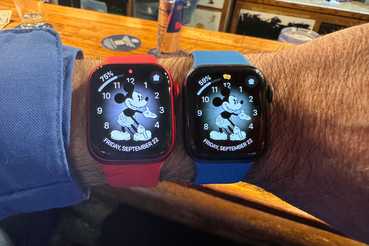
It's five o'clock somewhere...
I have to get the little watch since, as you can see, my arms are so thin. The Series 6 is 40mm. The Series 9 (in red) is 41mm. But there's also the fact that the display goes out further to the edges. Everything looks bigger. Very nice.
The double-finger-tap control works as advertised. Everything is very zippy. Fast and smooth. Overall, a good upgrade from where I was. I dunno if this is a worthy upgrade if you've got a Series 8, but for me it was a good choice.
I gave serious consideration to skipping an upgrade for a year so I could own my iPhone 14 Pro Max outright. But ultimately I figured one of the benefits of being in the Apple Upgrade Program is getting the latest and greatest, so I caved. Mostly because I use it more as a camera than a phone and the 5× optical zoom lens plus claims of better night photos swayed me. Along with the fact that iPhones hold their value well... but not so great that I'm leaving loads of money on the table from what I can tell looking at the 13 Pro Max used market.
Camera aside, I honestly don't notice a big difference with the 15. Sure it's a touch lighter, but all the things I like are mostly the same and the one thing I hate (Apple's silicone cases do not stay attached like they used to) is also the same. It's fast. It's capable. It runs all my apps very well. The end. Maybe I'll buy a game that has ray-tracing to see how that looks. Stunning, I'm sure.
Setup was far, far better than the past two years. Pairing my new Apple Watch was seamless. Everything copied over just fine. The only problem I have is that my phone app shows a red badge notification with a "1" in it... even though there's no fucking notifications when I look everywhere in the app. I've restarted three times and shut it down once. No joy. I finally just turned off badge notifications. Hopefully Apple will fix this shit one of these days. UPDATE: Turned off my iPhone for 20 full minutes then restarted. That did the trick.
Other than that, my complaints are A) They don't have a (Product)RED silicone case for it... B) The new Action Button is a cool thing, but it's WAY up on the side, so it's only hand if you're holding your phone horizontally... and you can't customize it for double-click or triple-click, and... C) The blue that I got is pretty much black with a blue cast... in the right light. And it's like... what's the fucking point? You've already got a black phone. So why not make a bright red (Product)RED phone or something that will truly look bold and different? Why do Pro users always get fucked with these boring-ass "premium" color choices? Of course, I'll take these over the fucking PASTELS that the regular iPhone 15's got. Because yikes. Those look like total shit. Maybe I should have gone with Raw Titanium color to have something different? Meh. It doesn't bother me that much. It's just disappointing.
Lastly there's USB-C 3.2 Gen 2 which will allow you to transfer much, much faster than Lightning (480 megabytes per second vs. 10 gigabytes per second). If you've got the right cable. And it's about fucking time. Jesus. Apple puts these massive sensors in their cameras and allow shooting RAW, but it takes an eternity to get them off of it because the resulting files are huge. I didn't even bother to shoot RAW, because it can take days to get them all in your computer to actually work on them. I've got USB-C 3.2 cables, so maybe now I will. Thank you to the EU for mandating USB-C on all phones... otherwise Apple would probably stick with obsolete Lightning ports for years longer. The one thing I don't understand it why they didn't just go with Thunderbolt4 (100Gps) compatibility to really make it worthwhile. Guess they're saving that to get you to upgrade in the future? In any event, you can record ProRes 4K 60Hz video directly to an external SSD now, which is pretty special.
First a caveat on that spiffy new 5× lens. It needs good light to function. If you don't got that, it switches back to you main camera. This did not happen with the 3× lens on my old camera. At least not that I recall. This is a pretty big downgrade, if you ask me. It may very well be a deal breaker for some people who would rather have a 3× lens with more flexibility. As for me? I'm greedy. I wish we would have gotten both. Add a fourth lens on the Pro Max to get the best of both worlds! Or, ideally, give us a 3× and a 10×. UPDATE: If you want to force the camera to use the 5× lens in low light, some third party camera apps (like Halide) will let you.
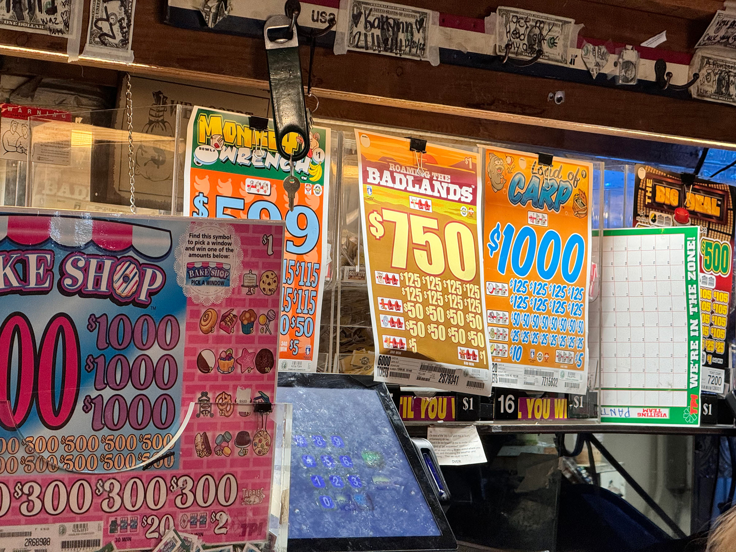
That being said, when you've got some light it's very nice. This was shot in a bar with not great lighting, but look how good it turned out at 5×! Very sharp and the color is beautiful, despite the fact that we're very clearly entering HDR "Deep Fusion" territory here...
Click here to look at a bigger version.
Click here to see the full size version.
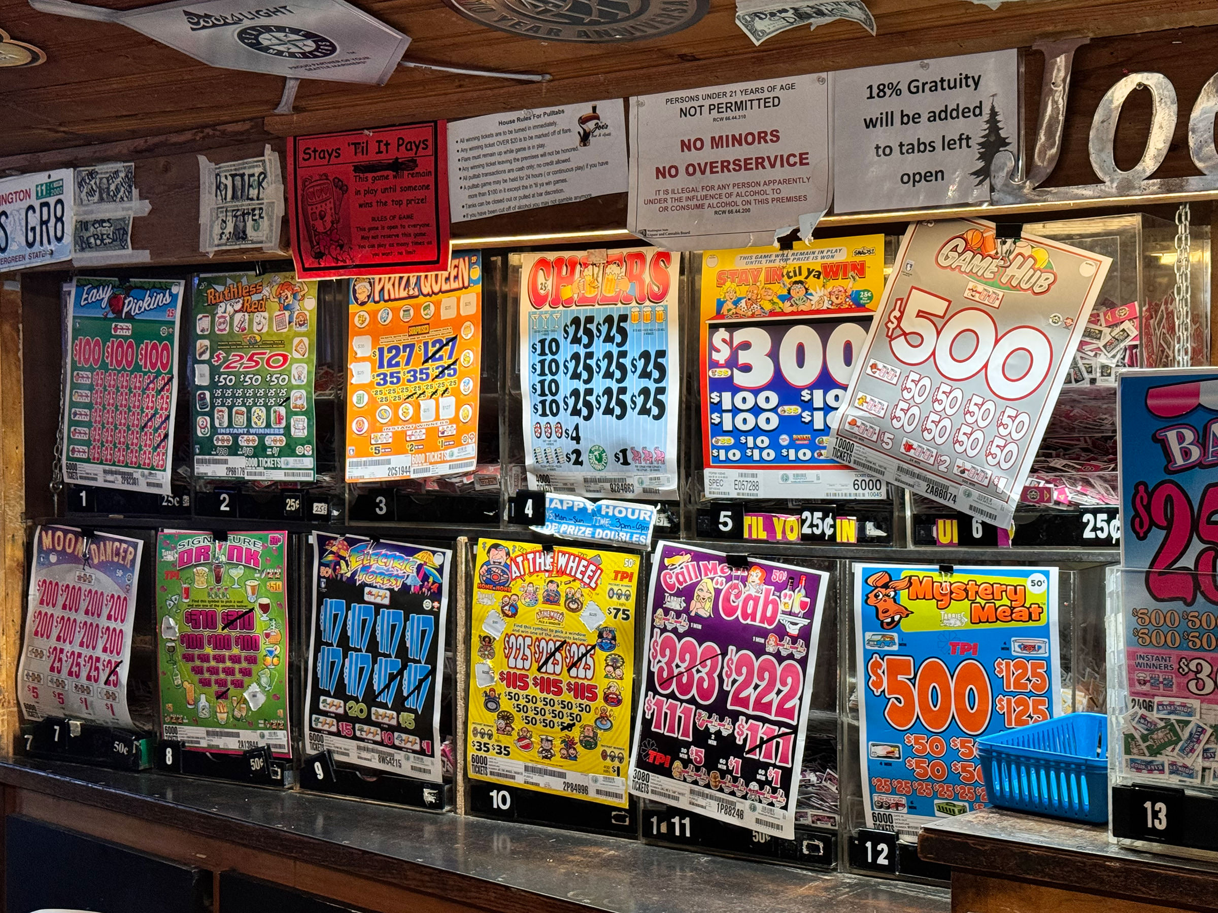
That's pretty impressive... but the main lens really looks great...
Click here to look at a bigger version.
Click here to see the full size version.
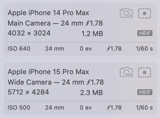
Interesting that Apple now calls the "Main Camera" the "Wide Camera" and the "Wide Camera the Ultra Wide Camera. Note that the "Wide Camera" has a goodly number of pixels more than the previous generation (but with bigger files, natch)...
Now... I have only had the camera for a tiny amount of time. I will obviously be taking more photos and a closer look at the features and quality sometime soon (especially when it comes to being able to change the focal point after the fact... because in playing around with it, this is a very cool feature). And of course I'll want to look at how well it shoots ProRes video (especially its ability to shoot LOG video that can be color graded easily and pushed in directions you can't get easily otherwise).
But last thing I want to say before I go is how Apple's claim that the new camera has "seven lenses" is not quite the bullshit it seems given that there's only three lenses on the back. The main lens allows you to use "virtual lenses" that crop into the data with common focal lengths (24mm, 28mm, and 35mm). But you still end up with 5712×4284 images, which means that Apple is upscaling or doing some kind of magic to get there. And the result is very good. I did the same thing in Photoshop to compare, and Apple's method always comes out on top. Which means that they must have specialized computational photography routines to come much closer than a mere crop.
Ultimately I don't know that going for the upgrade was the best choice for me. I likely could have gotten along with the 14 Pro Max for another year without issue. But as somebody who likes any improvement Apple will give me on the cameras, the 15 Pro Max will likely make me happier overall.
Until next year.
 When I ordered my new iPhone way back on October 9th I was told that it would be arriving between November 10th and 17th. A month away. But, unlike when I ordered my new MacBook Pro, I wasn't dying to get my hands on it. The only reason I was getting a new iPhone was because the camera improvements seemed worth a look, and it seemed silly to not take advantage of The iPhone Upgrade Program which allows me to afford these things in the first place. That's it.
Imagine my surprise when I got a notice telling me that my iPhone had shipped a whole week early! Well, shipped from China, naturally, but it still only took two days to arrive. I sure hope my new MacBook is sent early like this!
So let's take a look at things, shall we?
DESIGN
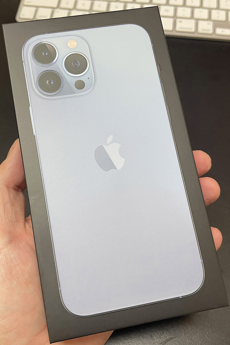
Other than a bigger camera bump on the back, you'll be forgiven if you don't think the 13 Pro MAX is different than the 12 Pro MAX at first glance. I legit thought that they had accidentally sent me an iPhone 12 Pro MAX by mistake until I turned it over and saw the slightly larger camera bump and bigger lenses. My phone is the "Sierra Blue" model, which is nice. The color is a little more subtle than what you see in the photos on the website... it looks almost white if you have any light on it. But the sides of the phone are absolutely gorgeous. A shiny steel blue color that looks so sharp. I love it but, if I'm being completely honest, I prefer the darker blue from last year (and, if I'm being even more honest, I prefer the dark green from the year before that)...
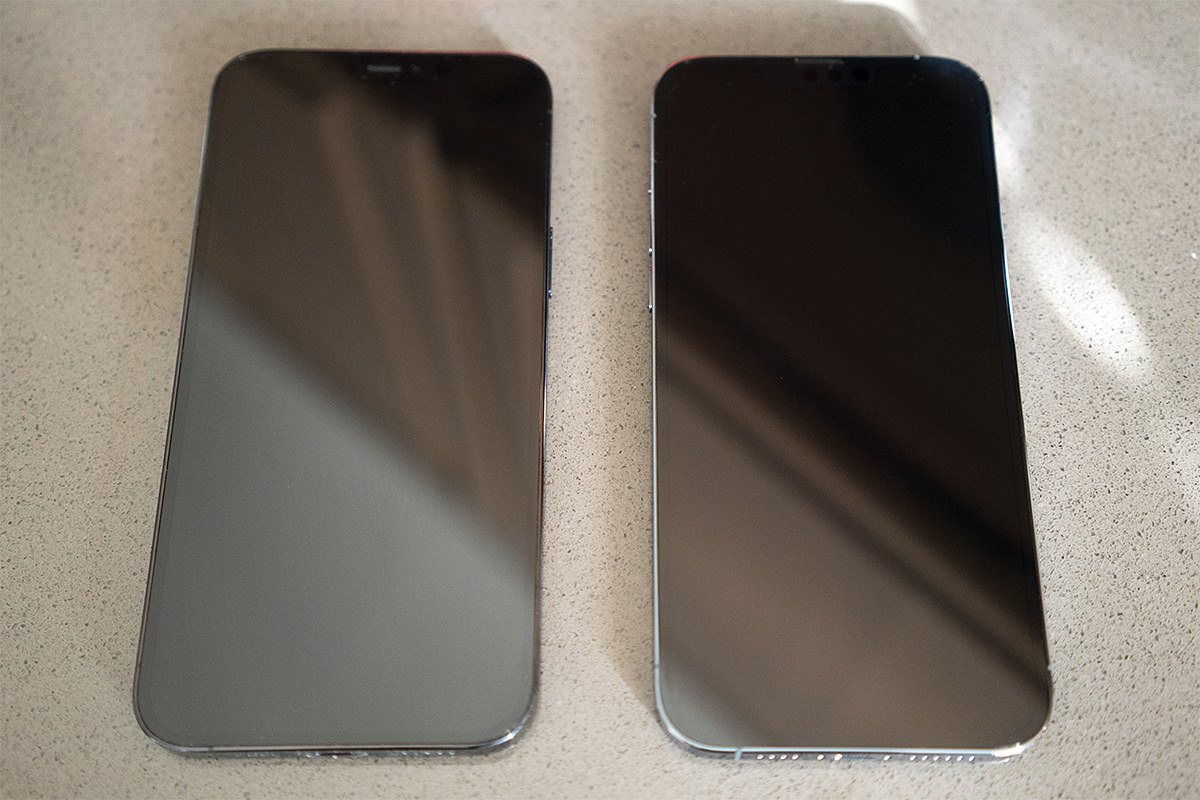
If you look very close, you can see the ear speaker has moved to the very top in the new model.
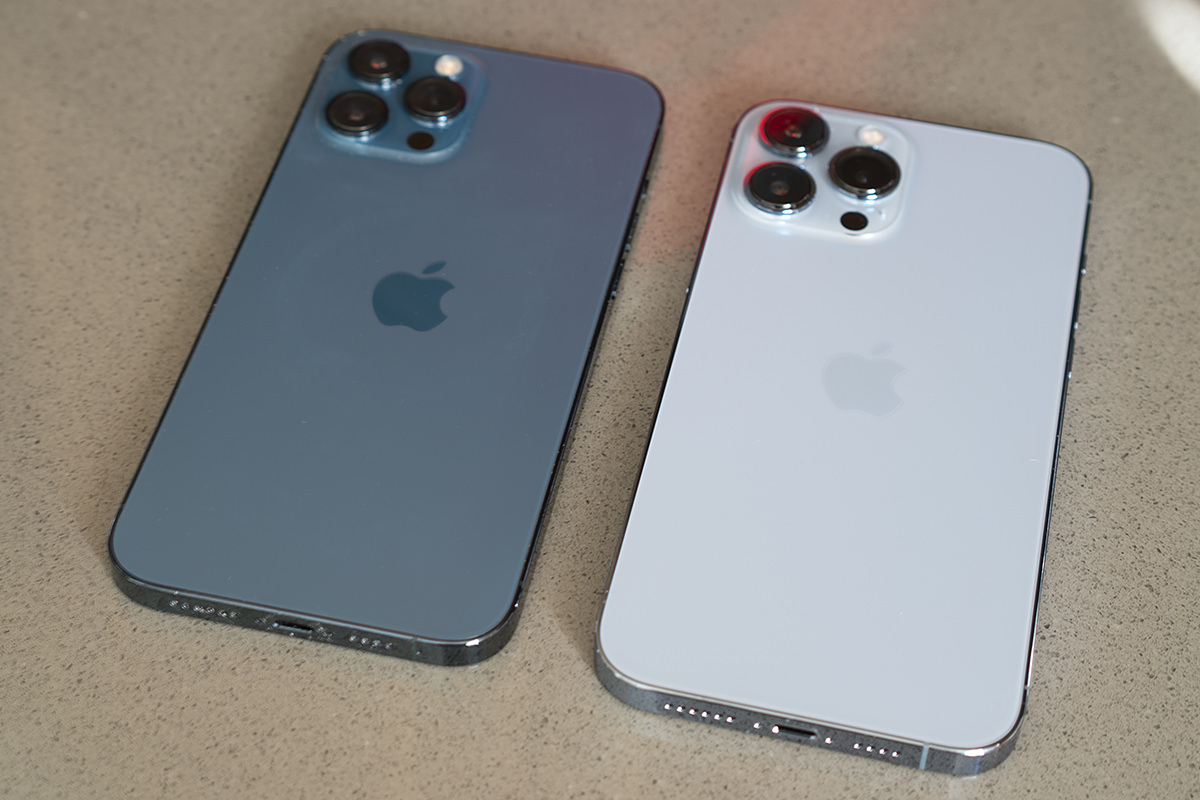
The deeper color just has a different "feel" to it that I prefer.
The weight is definitely a bit heavier, and I noticed it the minute I picked it up. It's even more noticeable when switching between hold my old and new phones. It's not going to be an issue. If I really stare at it on-edge I can see that it's a tiny bit thicker, but not in a way that I'm going to be noticing.
SETUP
If there's one thing that Apple has down to a science, it's setting up their devices. Mostly (this was not the case for me, which we'll get to). It's especially simple if you have an older Apple device. When I turned on my new phone, my old phone immediately lit up and was ready to transfer everything. I was given the option of either setting up the new iPhone from iCloud, which would allow me to use it in about 15 minutes because the non-essentials would be gradually downloaded after the essentials had been transferred... or I could transfer directly from my old iPhone and have absolutely everything set up exactly as before which takes about an hour. I wasn't in a hurry, so I opted to do the direct iPhone transfer. Also? I didn't want to risk the internet cutting out half-way through and screwing up the transfer.
Alas, the transfer was not all smooth sailing. Apps kept starting and stopping during the download, which meant it took a lot longer than an hour to complete (even though I could use what was loaded after about 45 minutes). The re-pairing with my Apple Watch failed spectacularly and was a total bitch to get fixed (read more at the end). And while the transfer initially seemed to go well, my old iPhone was stuck on "Time remaining 6 minutes" for at least a half-hour... probably longer. After everything was transferred and complete, I had to force-reset my old phone because it STILL was stuck on six minutes! I don't know why in the hell I should have these problems when Apple has clearly designed the process so people don't have any issues... but here we are.
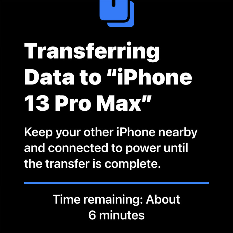
Stuck on six minutes... FOR ETERNITY!!!
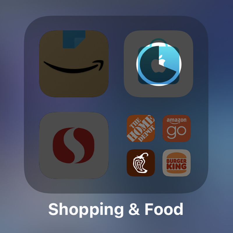
The irony is not lost that the first shopping app to load was Apple's own!
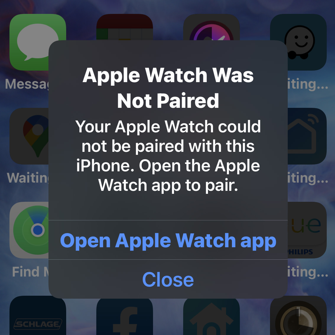
And nothing I did would work. Time to factory reset the Apple Watch... AGAIN!
DISPLAY
The size and resolution of the Super-Retina OLED display is the same as last year (2778 × 1284 pixels). The difference being that the newer model has a ProMotion 120hz refresh rate, meaning that scrolling is buttery-smooth and there's no tearing when there's rapid movement being displayed. This is not something that a lot of people will notice right away when upgrading. I barely did. Until I went back to my old iPhone! Then it becomes much more obvious and now I never want to go back! Scrolling is positively glorious now. Running at 120hz sucks more battery power, which is why Apple has delayed using it while other manufacturers were switching to it. Apple didn't want to sacrifice battery life, which is something that far more people would notice. Why we are getting 120hz now is that they figured out how to make it be adaptable. The screen runs at 120hz when there's fast-moving things to view... but drops down to a far slower refresh rate when there's not. The result is a superior display that doesn't hit your battery. That's pretty sweet.
BATTERY
Maybe it's because I just don't use my phone as much as other people, but I haven't had my iPhone run out of battery for years. On the contrary, there were many times that I wouldn't even bother to charge the 12 Pro MAX at night because my battery had barely moved. And now Apple as gone and improved the battery life again. In the day I've been using the phone, it's still at 40%... and that includes the setup, which had to be a battery-sucking procedure! Once I'm done using it constantly as I have been, it will be using even less battery. This is a long way from the days that I had to carry a battery pack with me so I could watch movies on a plane-ride!
PORT
When I first unwrapped the charging cable, I got very excited. "ZOMG! IT'S USB-C!!" But then I looked at the other end, and nope! Apple is still sticking with that stupid fucking "Lightning" port instead of moving to USB-C like they have with their iPads and computers. This is just mind-bogglingly ridiculous, and I cannot wrap my head around why Apple keeps dragging their feet. They claim it's because there are so many iPhone devices which still use Lightning and they don't want their users with many devices to have to re-buy them. To which I can only say "Where was this concern when you dropped the headphone jack?!?" The simple truth is that Apple will probably drop the port completely before switching to USB-C. So maybe their concern is valid. Don't make your users re-buy stuff that they'll just have to throw out in a year or two. Let's look at the math here... they've already got MagSafe for charging, WiFi 6 for transferring data, and the battery life is so good that quick-charging isn't as critical to have... so why keep the port at all? The day is definitely coming, because that would free up some room inside for new gadgets. I'm guessing that Apple's "concern" over customers with Lightning devices will mysteriously vanish then. Probably. All I know is that I'd like to travel with ONE charger and ONE cable before that day arrives. And wouldn't it be nice if Apple would just have one MagSafe standard for everything? Dare to dream.
VIDEO
I don't shoot a lot of video footage. When I do, it's usually for work. I prefer photography for my personal stuff. But there was something new with the iPhone 13 Pro MAX that had me intrigued... the ability to shoot Native Apple ProRes video. Apple ProRes is a codec (encoding/decoding file format) which many professionals use because it offers very good quality at a semi-decent file size. Problem is that you have to purchase a camera to record in it. My Sony Pro DSLRs record in AVCHD. Previous iPhones shot M4V. The iPhone Pro 13 series is my first chance to go with ProRes, so I leapt on it. I was so excited at the prospect that I actually upgraded the storage to 256GB, because that's what's required to shoot ProRes 4K at 30 frames per second (with the base 128GB model, you can only shoot 1080p maximum). Since I edit video in Apple Final Cut Pro (which is built around the ProRes codec) I already knew I could edit the format easily. But then Apple announced the M1-PRO and M1-MAX chips used in the new MacBook Pro would have special onboard hardware to support ProRes video! Which is to say that now I had even more incentive to play around with video on my iPhone. I'll probably post some footage once I've had a chance to play around with it a bit more.
CINEMATIC MODE
Way back in 2016, Apple introduced "Portrait Mode" for photography which would put the focus on people and pets by blurring the background. This is what larger DSLR camera lenses can do naturally, and it's nice because your subject "pops" out of the photo. Given the iPhone's tiny lenses, it was a nifty trick, but didn't always look that great. The edges around people would be blurry or weird. And forget about using it for pets because it just looked so bad. But then over the next few years "Portrait Mode" just kept getting better and better. And the fact that you can adjust the blurriness of the background after you've taken the photo is just icing on the cake. I don't use it a lot (I am mostly fine with the blurriness you get direct from the lens), but boy am I glad to have it available!
But "Portrait Mode" has never been available for video.
Until now. And Apple calls it "Cinematic Mode." It adaptively focuses on subjects to blur out the backgrounds and can even track when somebody looks away to automatically focus on what they're looking at. It's incredibly slick. And you can override the focus point after you've shot the video which is amazing.
Not surprisingly, this new tech not terribly great right out of the gate. But I'm guessing that this new "Cinematic Mode" will improve for video just like "Portrait Mode" did for photos. I've only shot a few videos using it just to see what's going on, but am not so impressed that I am using it by default. It has its uses, but I don't use my phone like that very often. Maybe I will when it gets to be as good as "Portrait Mode" is now?
PHOTOGRAPHY
Ever since the iPhone 11 Pro, I've not felt the need to lug my Sony DSLRs around everywhere. The camera on my phone had become so good that there just wasn't a need. Especially for travel, where not having to carry around anything additional was such a blessing. I still use my DSLRs for serious photo shoots where I require high-quality lenses to get what I need... but the way Apple has managed to use on-phone processing to mimic DSLR quality with such tiny lenses is pretty phenomenal, so I use actual cameras less and less. Now we're two generations later and the photography you can get out of the iPhone 13 Pro MAX is nothing short of jaw-dropping.
First of all, the telephoto lens has gone from 2.5× to a full 3×, allowing you to shoot better long-range photos because it's coming off the lens instead of being digitally zoomed. Second of all, whereas only the main lens had optical image stabilization in the iPhone 12 Pro models, the iPhone 13 Pro models have it for all three lenses. This allows you to shoot better photos while moving and much better photos in low-light. And speaking of low-light, Apple has improved that once again as well. The apertures are smaller so the lens can let in more light. The image sensors are larger which allows them to capture more light. Put these two improvements together, and your ability to capture very good night shots is pretty great. I went into my closet with no lights on, just ambient light from the hallway. The iPhone wants you to make a timed exposure for 2 seconds, so I did that...
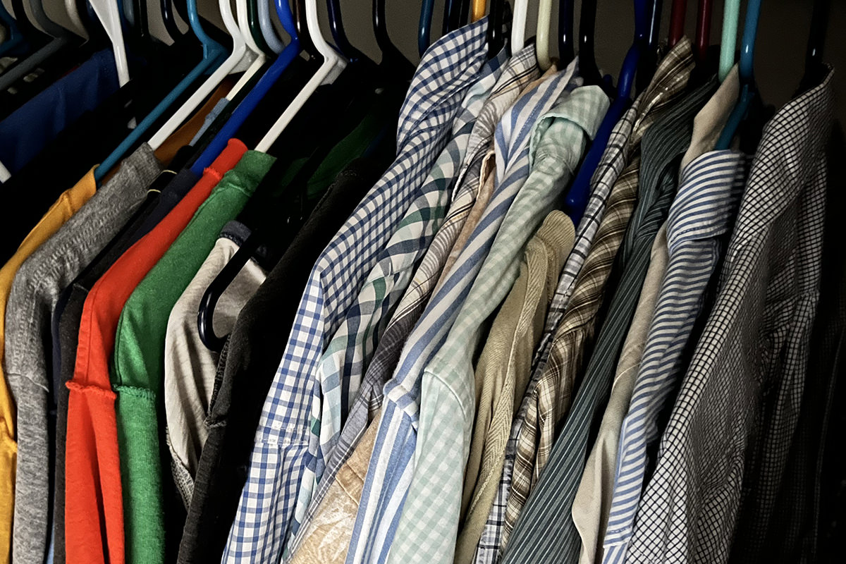
This is a 2 second timed exposure.
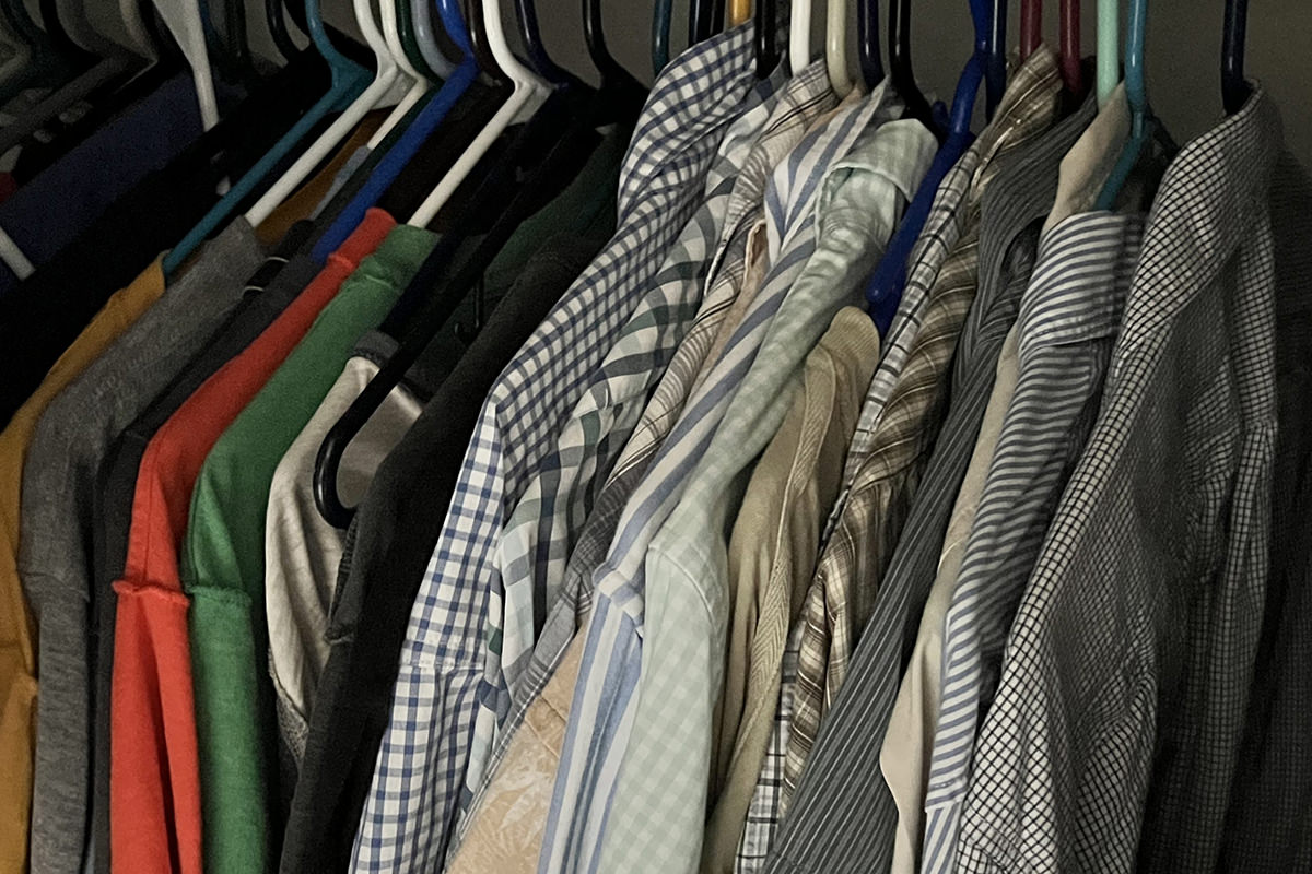
This is an untimed exposure.
Given how little light is here, both of these are pretty remarkable shots. The image stabilization keeps the 2 second shot crisp and gives pretty good color representation. The shadows are very deep though. The untimed exposure is a little dead-looking with drab colors, but the fact that you can see colors at all is impressive. A couple seconds in adjustments and you could salvage it fairly well if you don't mind a little grain...
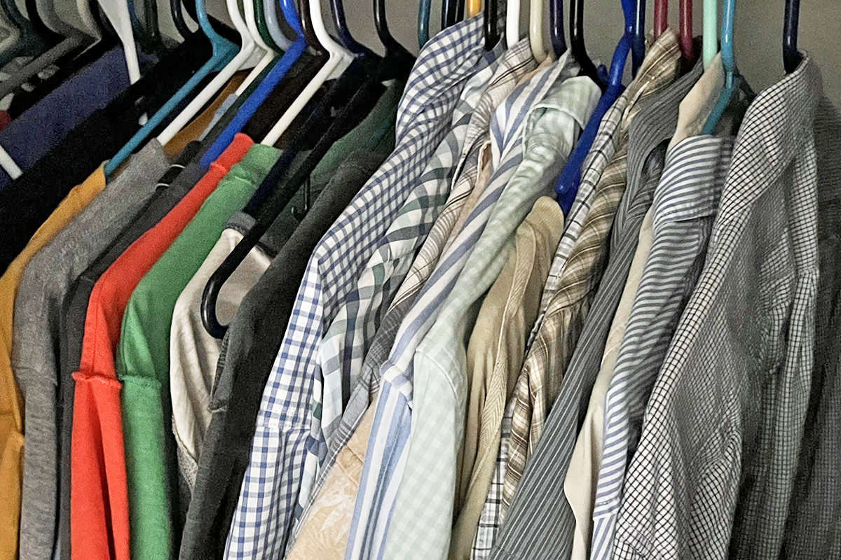
This is a an untimed exposure, with adjustments.
If anything, that's the more realistic option of the three, and pretty much what it would look like if I turned the lights on.
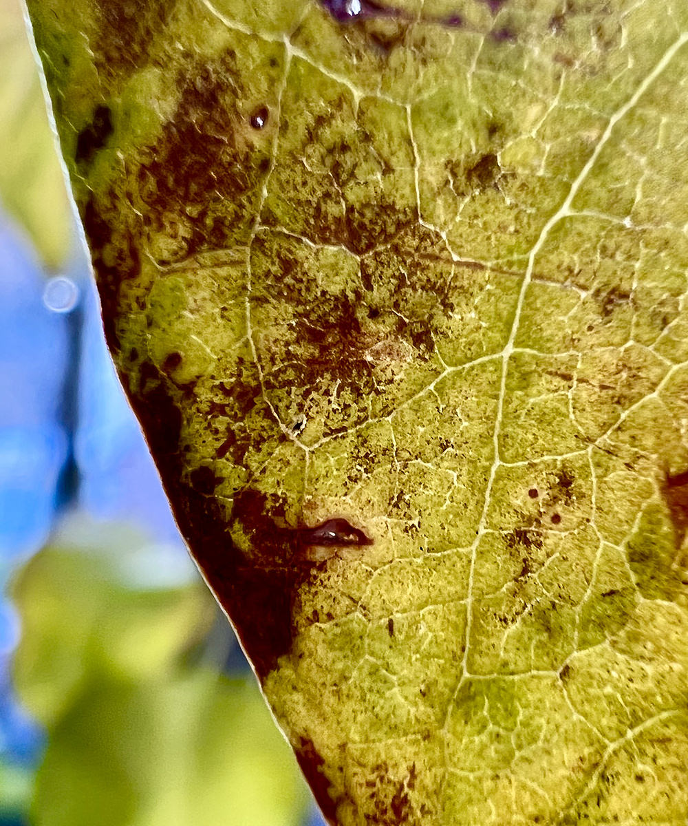
And then there's the ability to shoot macro. This allows you to get as close as 2cm to shoot some really cool close-ups...
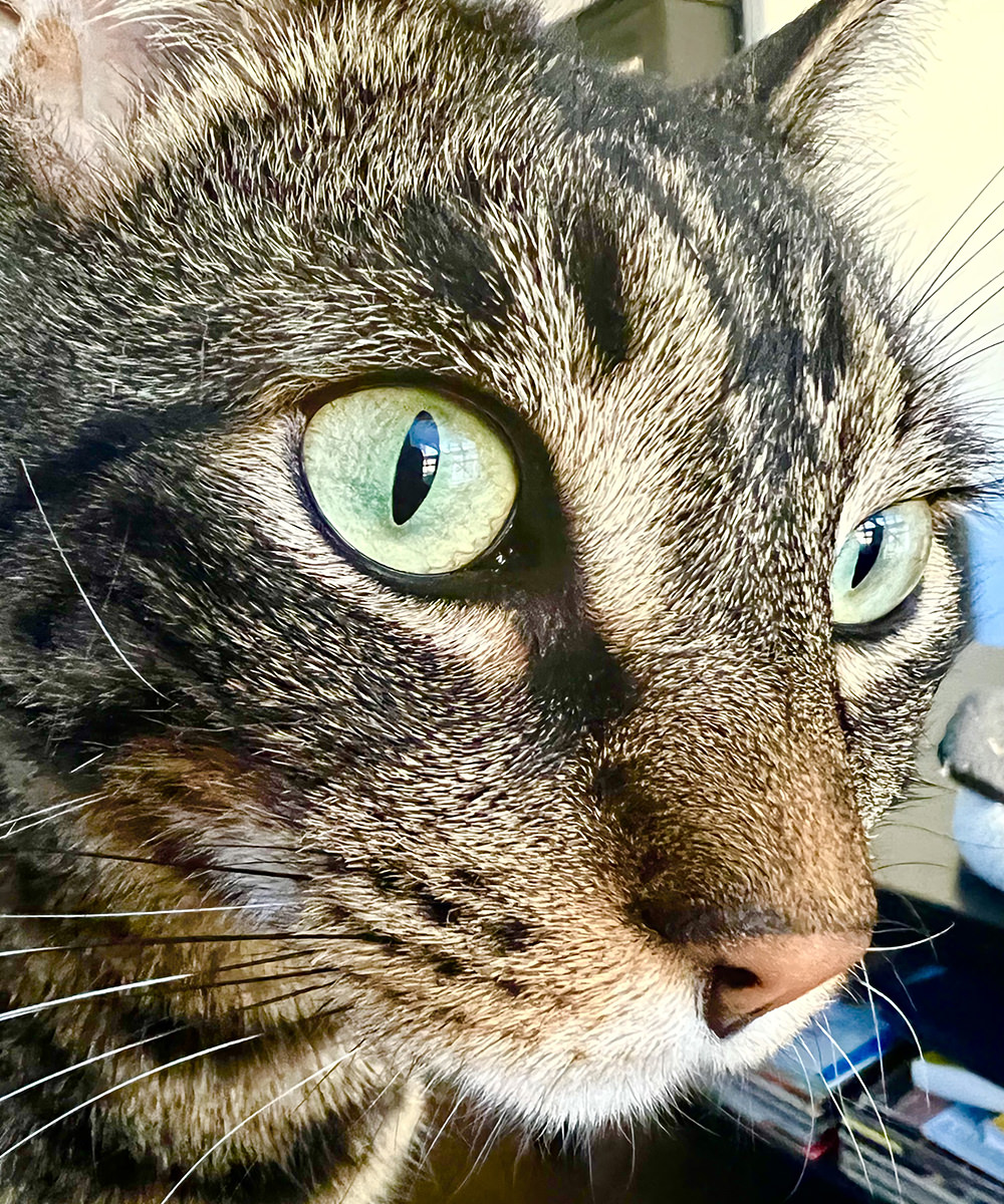
This is a full-width image crop.
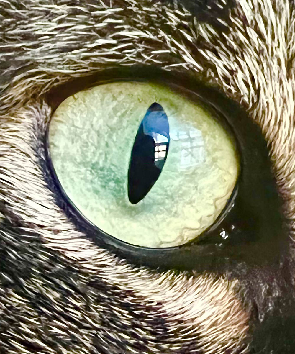
This is a 100% crop of the original image.
If this were Summer, I'd have some vibrant shots to take. But, alas, everything is dying, so that's what I got. Still... just about anything can be cool when you shoot it close-up!


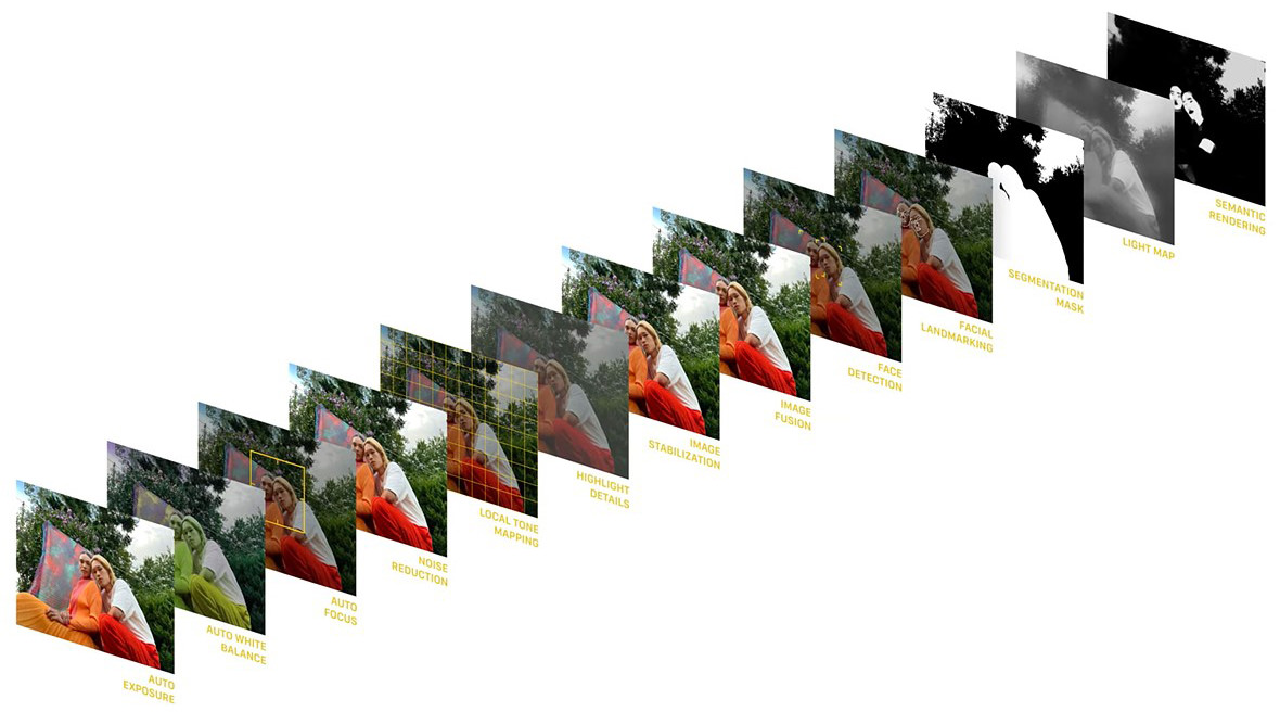
As mentioned above, Apple uses computational photography to go beyond what such small camera lenses are capable. The iPhone is so fast and powerful that Apple can shoot multiple images, analyze them, then assemble the parts to create a far better image (kinda a super-HDR, as it were). This is especially useful in getting good detail out of a shot...
Something new to the native Apple iPhone photo app (but available from other iPhone apps) is the idea of filters. If you like your photos to have more contrast, there's a filter for that. If you want deeper, more saturated colors, there's a filter for that. Want a warmer or cooler look? There's filters for that too. But Apple isn't just applying a filter over the images when you do this. Instead, Apple is selectively applying them locally. Which means that if you want more vivid color in your images and turn on the "vibrant" filter, any human skin in your shot isn't pushed to weird places, but instead preserved a bit and made less vivid so it still looks like human skin. It's a nifty trick.
GOING NEXT-LEVEL BIONIC
The new A15 Bionic chip that powers the iPhone 13 Pro has a lot more speed and power than the previous A14, but you'll hardly notice in your day-to-day use. Apps work pretty much the same. But there are some exceptions. The computational photography abilities and Cinematic Mode video are things that are only possible because of the new chip. And then there's some apps which definitely benefit. FaceID, for example, which was near instantaneous is 100% instant now.
A CASE FOR CASES
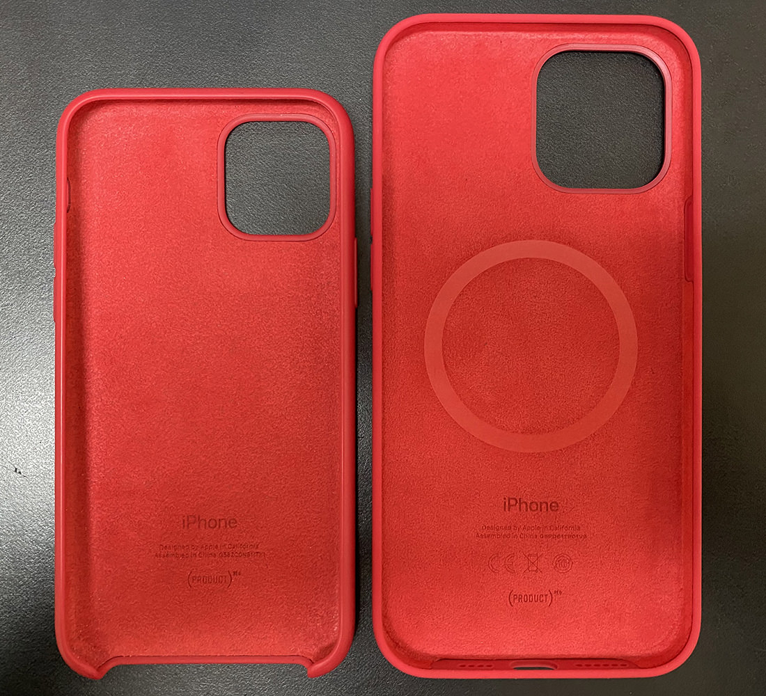
You can't really tell from the below photo, but the new Project RED case is a richer red. Less tomato-like. I absolutely love it. At first I thought that my old case looked less rich because it had faded, but I'm pretty sure that's not the situation because I remarked more than once that I wish I had a deeper red color. The the inside was never exposed to light, and you can really tell there. So... wish granted, I suppose. Though it's a bit of a nightmare to pay $50 for this thing...
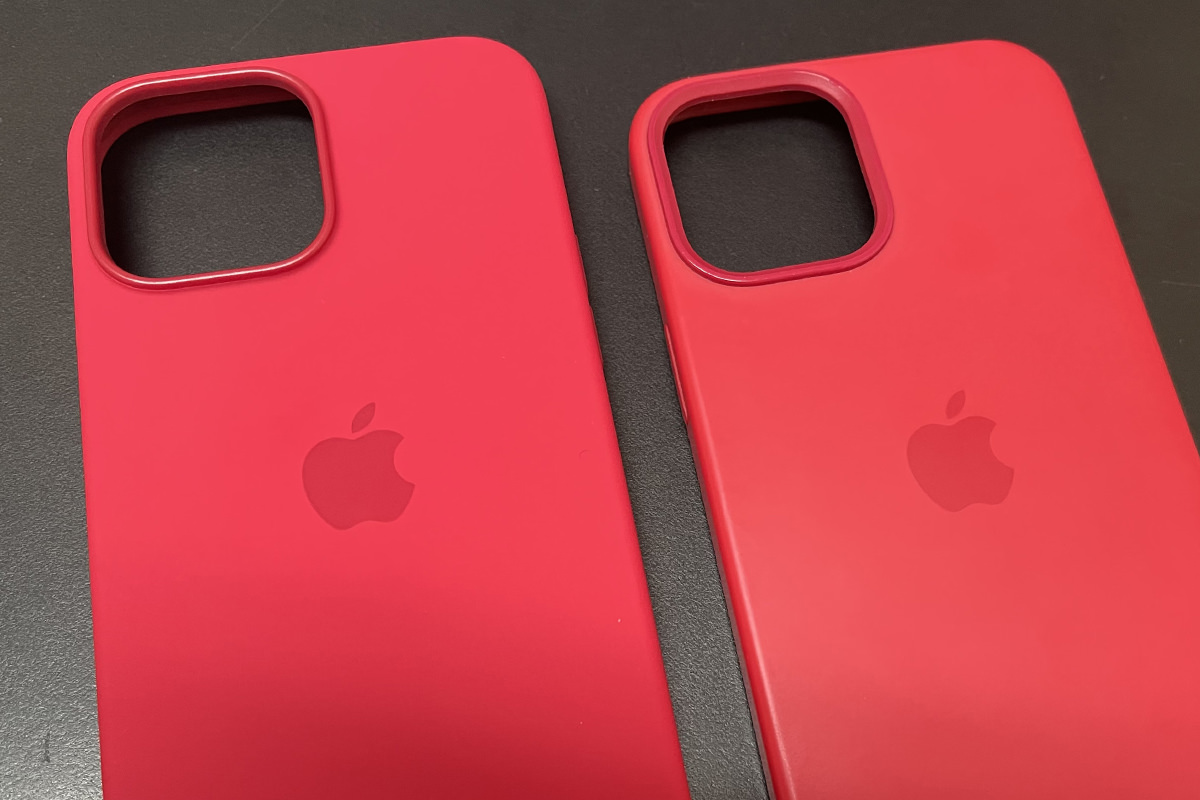
Newer, deeper red case is on the left... old tomato case on the right.
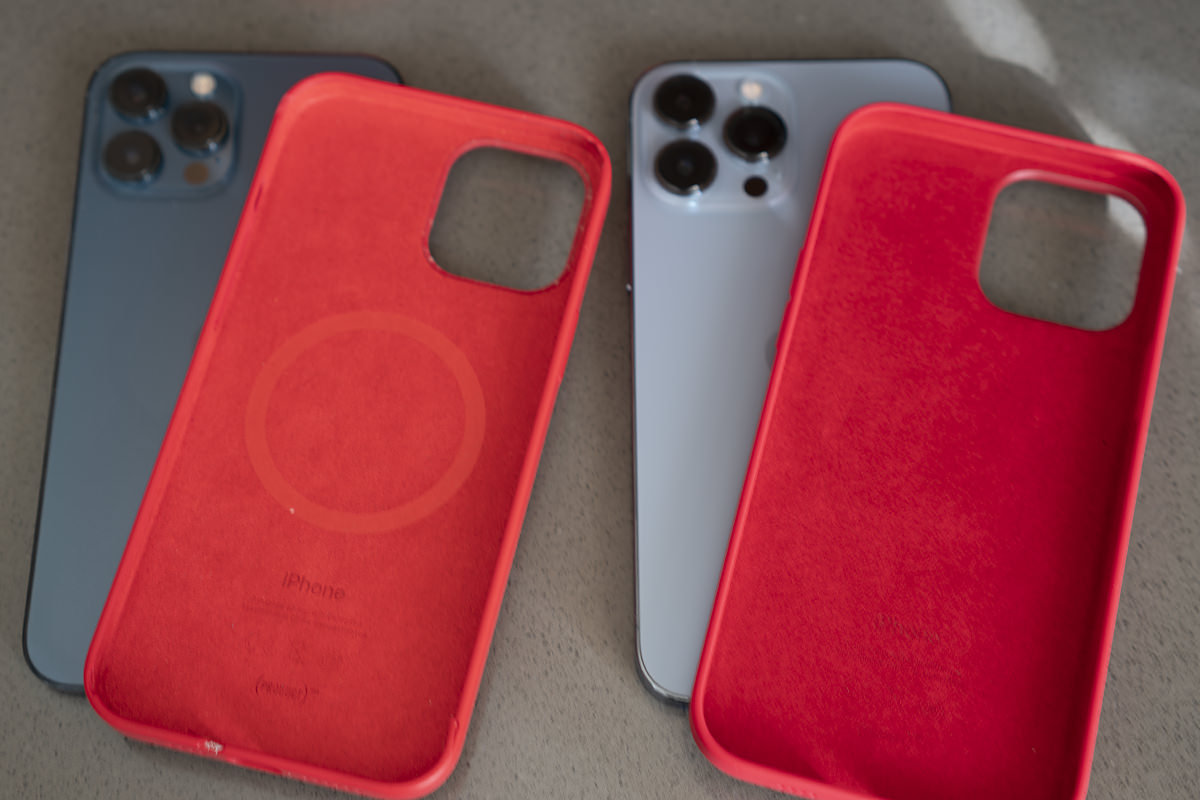
Newer, deeper red case is on the RIGHT this time... old tomato case on the left.
CONCLUSION
Camera features aide, this isn't an essential upgrade. I probably wouldn't have bothered if I weren't in the Apple iPhone Upgrade Program. That being said, the new cameras are pretty sweet. Not a revolutionary change... but an incremental step that's worth taking if you're serious about mobile phone photography.
But before we go...
ABOUT THAT APPLE WATCH PAIRING FIASCO
Same thing that happened last year. My new iPhone recognizes that I have an Apple Watch. It asks me if I'd like to pair it. I start the process by pointing the camera at my watch face while dots swim around it. A few minutes later I get an error message saying that my watch can't be paired. Then I go to the Watch app on my old phone to unpair the watch only to find out that the old phone can't find the watch to unpair it. Then I have to physically factory reset my watch entirely so I can start all over from scratch, which sucks copious amounts of ass because then I lose all my settings and credit cards and have to start all over again. This is so fucking stupid. Apple maintains the illusion that upgrading your phone is this simple, easy process... which it appear to be. Until it's not. God it's infuriating. Such a monumentally stupid, frustrating experience from start to finish, and it gets to the point where I'm ready to set my fucking watch on fire rather than have to deal with this shit. For the second year in a row! Next time I upgrade I'll try unpairing before transferring. If that works, I'm just going to be even more mad that Apple doesn't tell you to do that in the first place. But shouldn't they really find a way to make this work as designed? And isn't it absurdly embarrassing that it doesn't work as designed in the first place?
And lastly...
CARRIER UPGRADE FEE
Despite the fact that T-Mobile didn't have to do a fucking thing when I transferred to a new phone, they still charge an activation fee (despite it being completely automated). It's a cash grab that all the carriers do, and it's rage-inducing. I don't know what the fee is (I think T-Mobile charges $30... AT&T charged me $50) but anything more than $0 is too much. I know for a fact that I will be screaming "FUCK YOU, YOU ASSHOLES!" at my bill when I get it. Hopefully I remember to go out to my car so I don't scare the cats.
See ya when my new MacBook Pro MAX arrives, fellow Apple whores!
 It's my iPhone Upgrade Program anniversary date!
And you know what that means... I have the option to trade in my iPhone 12 Pro MAX for a brand new model! Something that I've ended up doing ever since I got into the program. But will I do it this year? Ah the dilemma...
Here we go then...
To upgrade or not?
Since the only way I can afford these very expensive iPhones is through the iPhone Upgrade Program and their monthly payment deal, I am faced with a bit of a tough choice every time a new model comes out. Do I upgrade after one year and keep paying for something I don't own? Or do I skip a year, pay out the phone after the two year term, and end up owning a phone that actually belongs to me? A phone that I can then trade in for a discount on the iPhone 14 Pro? That would be $500 in the bank... which is quite a lot of money. The problem is that it means I'm without the latest and greatest camera for an entire year, which is something I really, really use. Like a lot. A lot a lot. I likely don't use it $500 worth... but I do enjoy it $500 worth. And so... here I go upgrading early again.
Pro or Pro MAX?
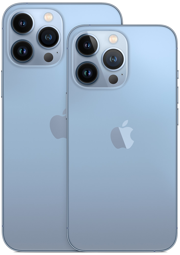
When the iPhone Pro 12 was introduced last year, the only way to get the best camera that Apple offered was to go with the MAX (gigantic) version. And I really, really struggled with that. The iPhone I had already felt too big... do I really want to go even bigger? In the end, I decided to go for it. If I didn't like it, I could always return it, right?
At first I hated it. Too big. Too difficult to type with one hand. Too clumsy. Not at all a nice experience compared to the smaller iPhone I was accustomed to...
But then...
Ya kinda get used to it. I especially got used to it for viewing videos and photos. And playing games, of course. That bigger screen makes a world of difference. And so I kept the iPhone 12 Pro MAX, better camera and all.
It's different this time around. The iPhone Pro 13 and iPhone Pro 13 MAX both have the superior camera. So do I stick with the Pro MAX version? Or go back to the "regular" size that I prefer. Because, seriously, I do miss being able to operate my iPhone with one hand. Sure the MAX has the ability to shift the keyboard towards the edge, but that only works to type. You can't reach much of the screen because it's just so darn huge. Even with my large hands.
But viewing photos on that big screen tho...
Yeah, I'm sticking with the Pro MAX. I may hate some things about it, but the benefits of that big, glorious display outweigh any foibles of having to deal with the larger size. Besides, I'm used to it.
Which Configuration?
I got the minimum memory 128GB model last year. I barely use over half that. So I really don't need more than 128GB in a phone. Except... in order to shoot the best video quality (something I am anxious to try) Apple requires a minimum of 256GB. That adds $100 more to the already outrageous price tag. But... wouldn't it be worth it to be able to shot the absolute best movies possible on the phone? Well, $100 spread out over the two years of my Apple Upgrade program is just an extra $4.17 more on my monthly payment, so it kinda seems like a no-brainer. Except on those months where I could really use $4.17, which is most months since I got a mortgage. Oh well. If things go sideways I guess I could always sell my house to keep my iPhone!
Which Color?
I want me a Product RED iPhone, dammit! But, once again, that isn't an option on Apple's flagship Pro iPhones. My choices are Graphite, Gold, Silver, and Sierra Blue...
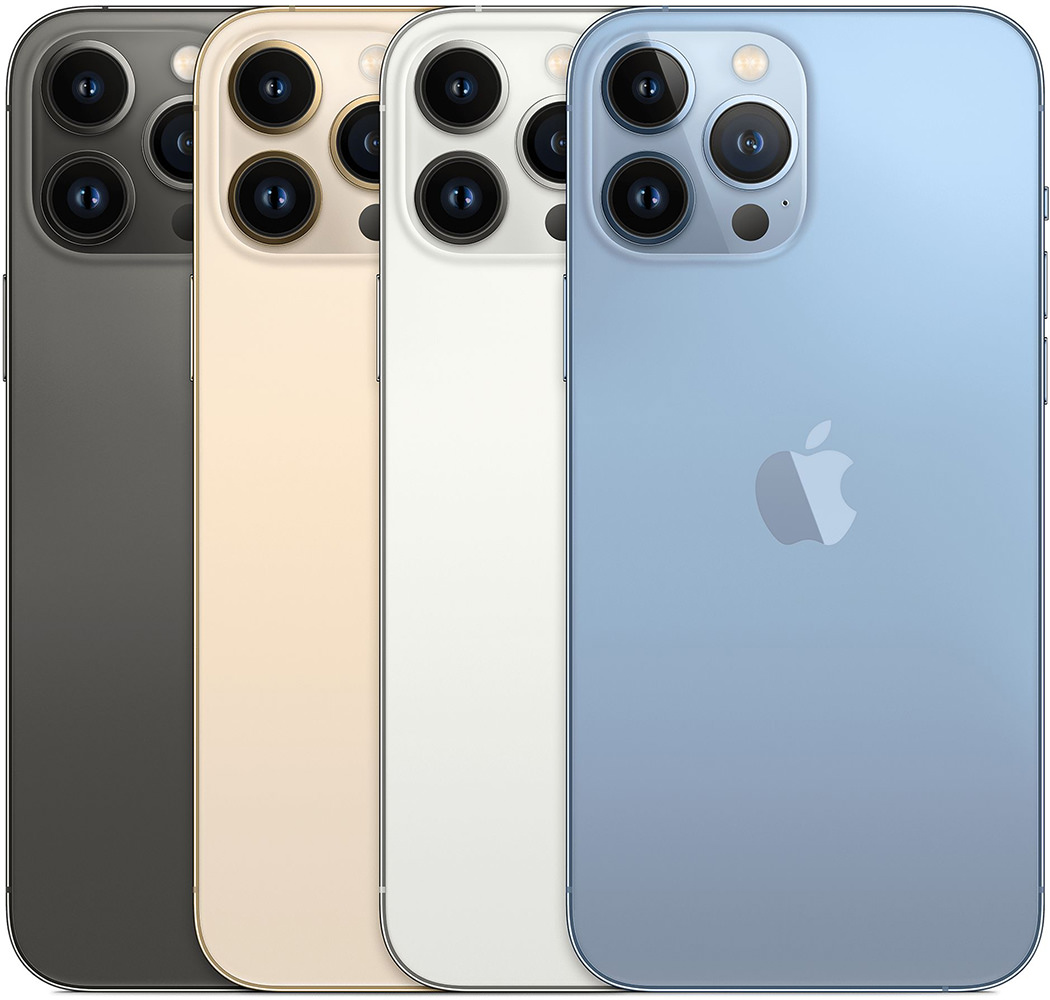
The Gold and Silver can be removed immediately. I'm not interested in either. So the question becomes... will Graphite or Sierra Blue look best in my Product RED iPhone case?
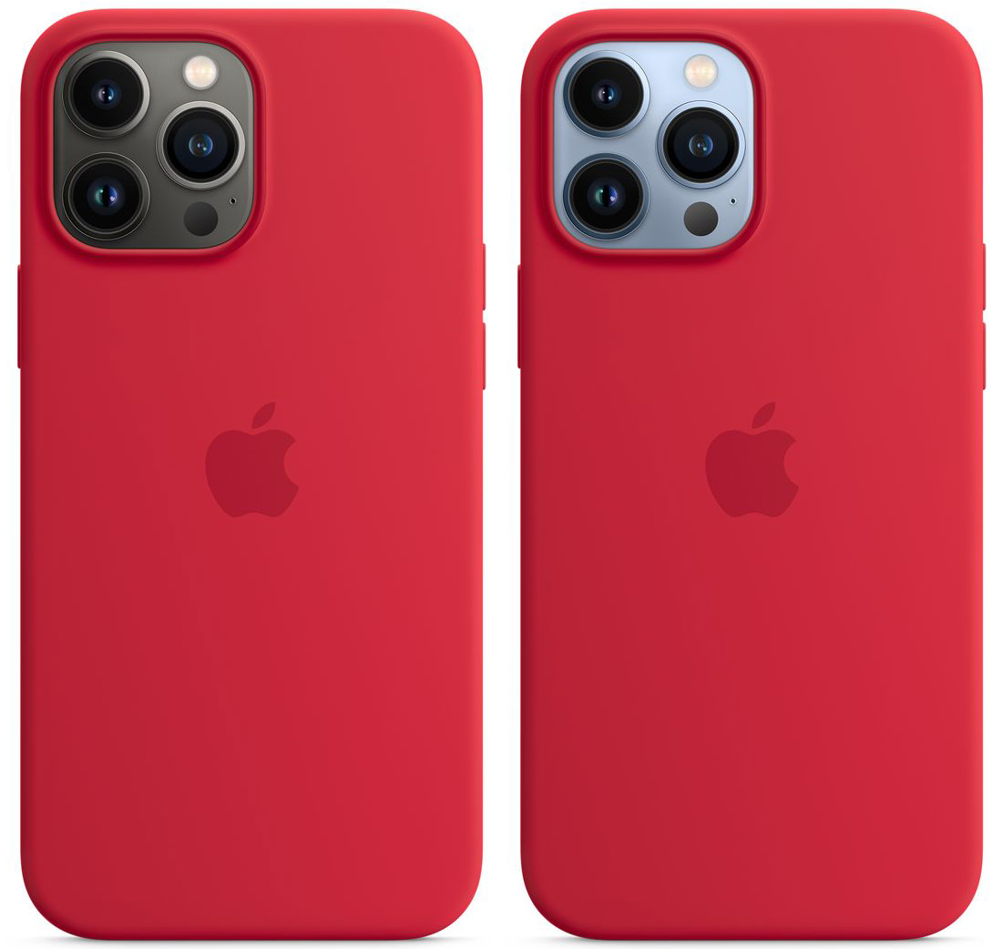
In all honesty, I think that the Graphite looks better. But it also looks pretty basic. The Sierra Blue, on the other hand, looks cooler and more interesting, so let's go with that. Seriously though... can Apple PLEASE PLEASE PLEASE bring Product RED to the Pro models next time? It's frustrating that the lesser phones always get the cooler colors. I mean...
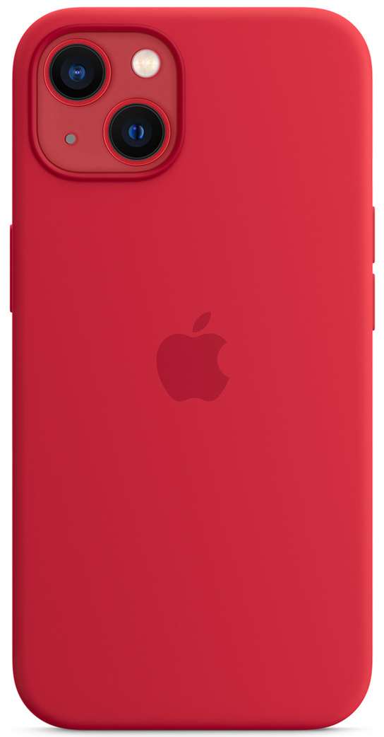
Like I said. Frustrating.
Order Up!
As usual, Apple makes ordering your shiny new iPhone a simple experience. I go to the upgrade program site, click on the options for the iPhone I want, then click the purchase button. My order is added to the queue and they'll send me a box to return my old phone when the new one ships. Simple.
EXCEPT... Look at this!
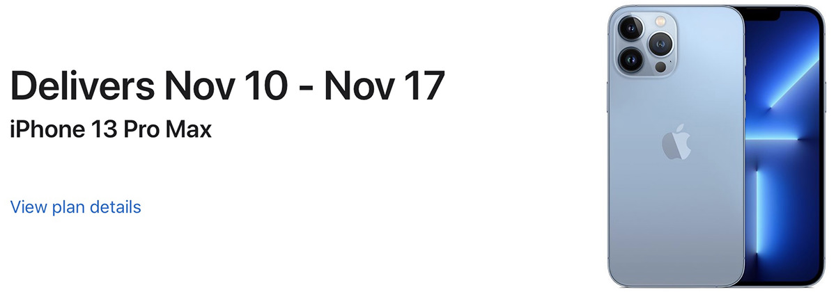
So... yeah. Simple. The waiting for a month, however? Not so simple.
 Another day. Another bit of terrible news to break my heart.
There's a meme going around Facebook and TikTok which says "The last photo in your camera roll is the reason you're alive."
Here's the last photo on my camera roll...

And here's the photo before it...
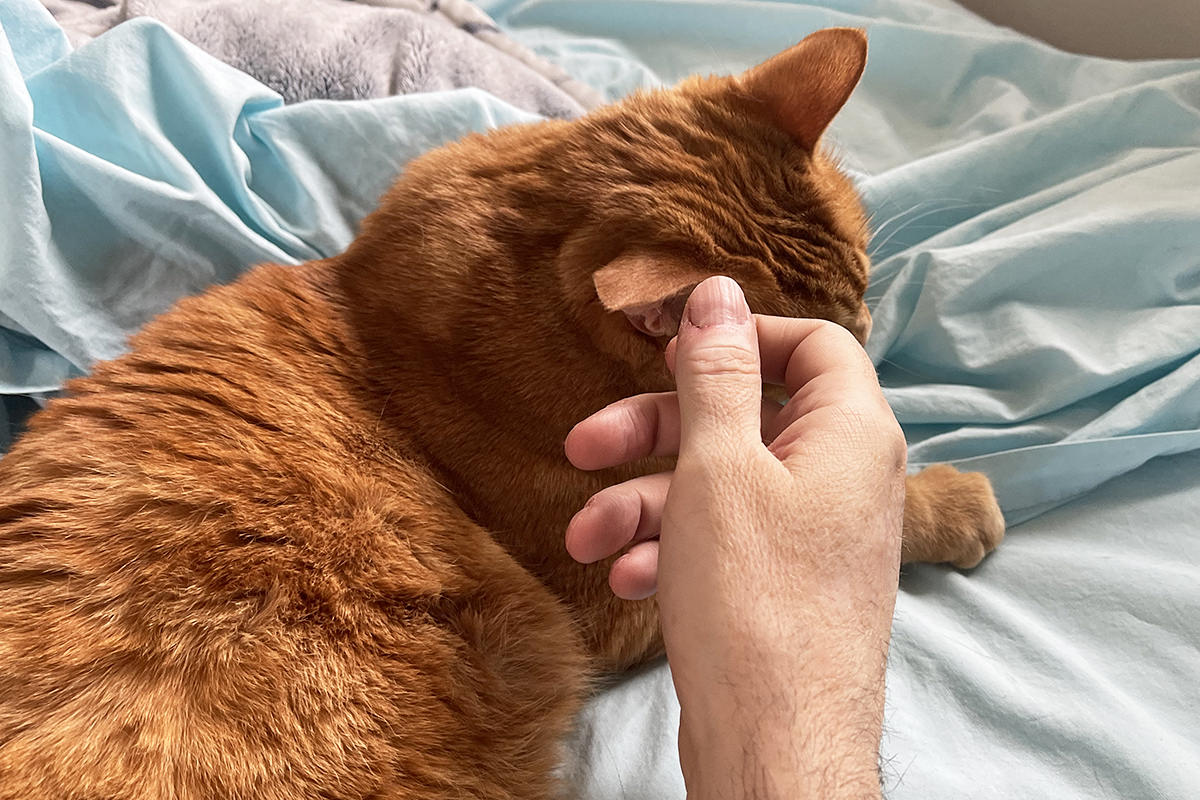
No surprise there.
And meme accurate.
 Back when my iPhone was mostly used as a phone, I didn't care so much about upgrading. But now that my iPhone is used mostly as a camera, getting the latest model has become increasingly important to me. The better my camera-phone gets, the less I have to lug around my "real" DSLR camera. And thanks to the Apple iPhone Upgrade Program I can actually afford to upgrade. This year, getting the best camera came with an added surprise... it's not available on the "Pro" model, it's only on the "Pro MAX" model. AKA Apple's "HUGE F#$!%@ PHONE" model. Knowing Apple has a two-week return policy, I decided to see if the MAX was something I could live with because I want that phone.
And today it arrived.
Let's just go straight to the elephant in the room... or, to be more accurate, the elephant in my hand. This phone is ridiculously huge. Almost bordering on comically impractically huge. And heavy. From a usability standpoint, Apple seriously should not have gone this large. Because there's simply no getting around the fact that this is a two-handed device. Even when Apple has features like a slim "side keyboard" for typing one-handed, you will still have way too many controls out of reach and end up using a second hand. Even when you have fairly large hands like I do.
But we'll get to that. We'll get to all of that
The packaging for my new iPhone is a classy, minimalistic affair. Apple kindly has pull-tabs on everything so it's easy to unwrap and open...
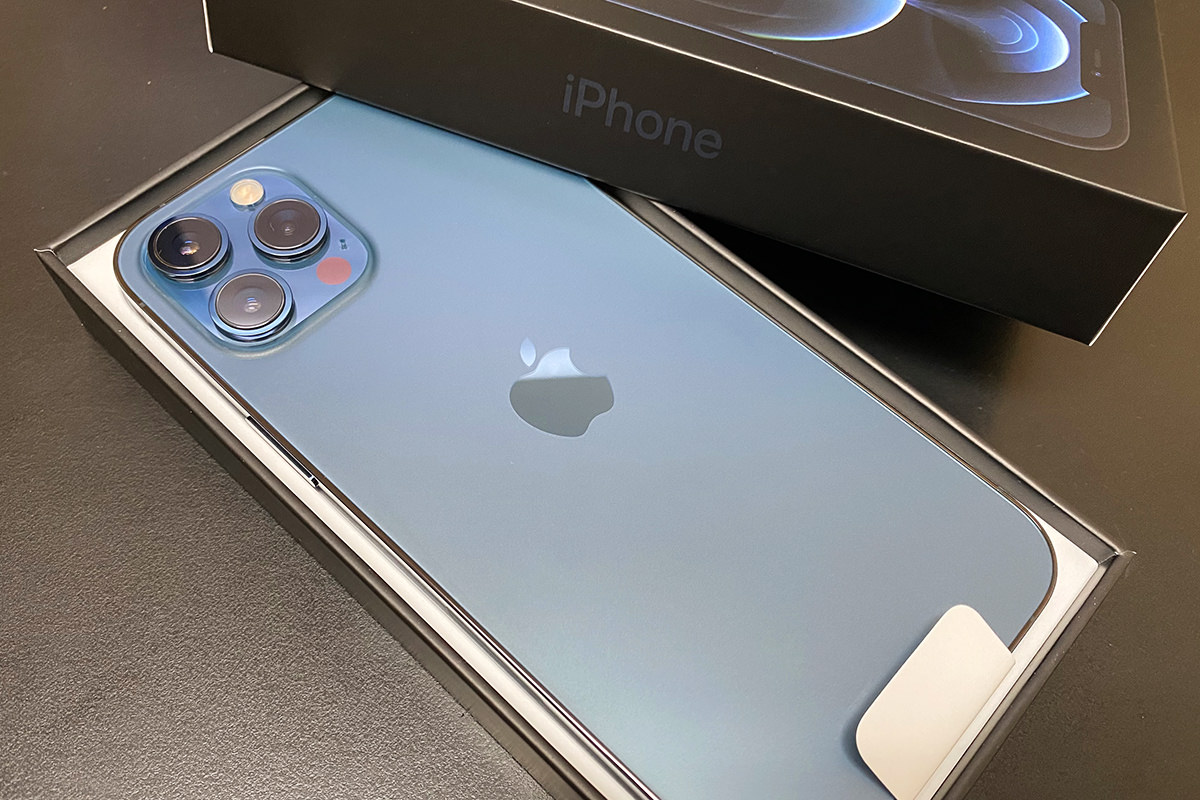
I bought the Pacific Blue color, which is very nice... though difficult to photograph. As has been widely reported, Apple does not include a charger or headphones. All you get is a cable. Apple says that this is because there are too many charger bricks out there already, but it's an absurd stance to take. The vast, vast majority of chargers are USB-A. Furthermore, even if you have a USB-C charger, it's very likely not the 20 watt brick which means you won't get fast charging. The brick I got with the 11 Pro is only 18 watt, so even last year's model isn't good enough. I guess I'm not too mad about it... my phone charges overnight so it can be slow... but it's still more than a little bit infuriating.
My favorite iPhone of all time is the iPhone 4. Absolutely stunning construction with that classy metal band holding everything together like a glass sandwich. They more-or-less carried over the design to the iPhone 5, but the 4 remained my favorite. Everything that followed was a step down... until Apple decided to resurrect the design for the iPhone 12 Pro. And, let me tell you, it's gorgeous. The band is now tinted stainless steel and looks amazing...
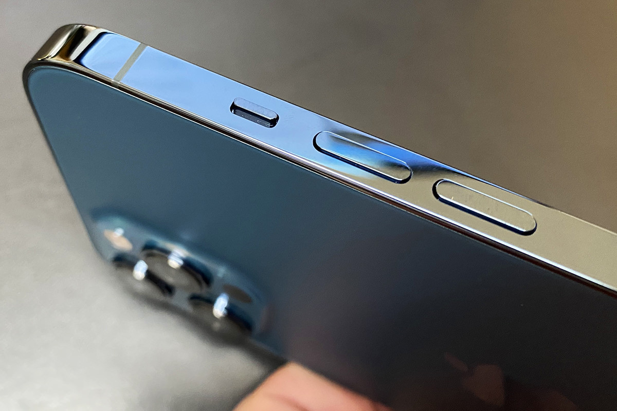
I deeply regret having to put a case on the thing because it's just so pretty, but I have to keep it in flawless condition for the Apple iPhone Upgrade Program. Oh well. When it comes to construction, the iPhone 12 Pro Max sure feels substantial and solid. The glass back is etched for grippability, but still feels a little slickery. The thickness seems the same as my old 11 Pro... with the exception of the camera bump which pokes out quite a bit more. So much more that the phone doesn't lay flat when you put a case on it and set it on a table. That's annoying, but it's the price you pay for the camera you get.
I'm going to break this out in it's own space because it' just so idiotic... the iPhone 12 line still doesn't use a USB-C jack for charging or connectivity! They finally moved iPad and Macs to USB-C, but iPhone is still tied to Apple's proprietary "Lightning" connector. This is just inexcusably stupid. Apple says they keep it because there's so many Lightning devices out there, but that's a laughably weak argument to make considering they've abandoned absolutely everything in their recent history. You are trying to tell us that there were not a lot of USB-A devices out there? Go sell that crap somewhere else. Just move to USB-C and get it over with.
A hallmark of Apple products is their ease of setup and use. But that's not always the case, and it seems that setup complications keep getting more and more severe while happening more and more often. Sadly, my iPhone 12 Pro MAX experience was far from ideal. The concept is that you set your old phone next to your new phone when you turn it on and everything transfers over. That part was fairly smooth. My activation and settings magically popped up with no problem. Mostly. Some apps, like Amazon Alexa and Schlage, required a login to get started. Other apps, like Smart Life and Hue, were ready to go immediately. No big deal. What was a big deal was when I got to my Apple Watch. You are not allowed to just click on the Watch app and have everything working. Nope! First you have to unpair with the old phone. Which would be fine. Except I couldn't make it happen because nothing... and I mean nothing I tried work. Either nothing happened or I couldn't get verified by the Apple ID Server...
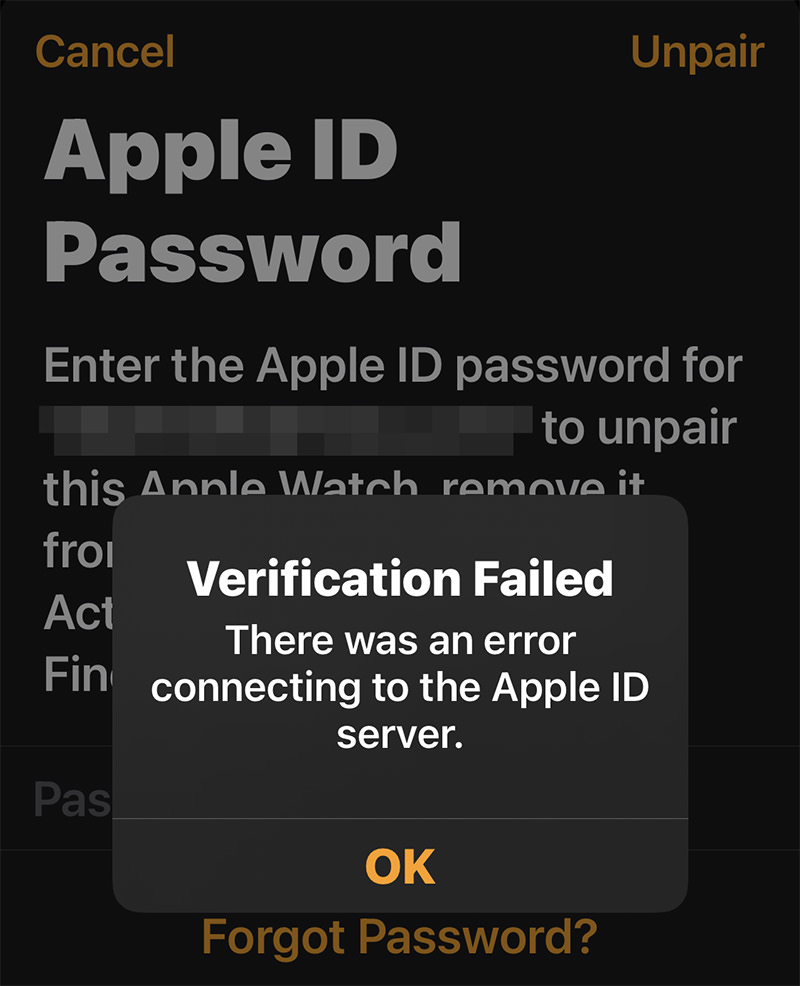
After trying over and over and over to get past this, I finally Googled to see if I could do it another way. Turns out I could unpair by remotely wiping it from iCloud. Jeez. That was a mess with a lot of trial-and-error that took 20 minutes of my time, but eventually it happened. But that was only the beginning. THEN I got this...
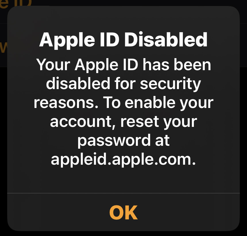
Which sucks because now I'm going to have to change the password on all my Apple devices. It's just so phenomenally stupid. YOU HAVE TO LOGIN WITH YOUR CURRENT PASSWORD TO CHANGE THE PASSWORD. IF SOMEBODY WASN'T ABLE TO GET IN TO BEGIN WITH, WHAT DOES THIS SOLVE?!? As it turns out, nothing. Because THEN I got this...
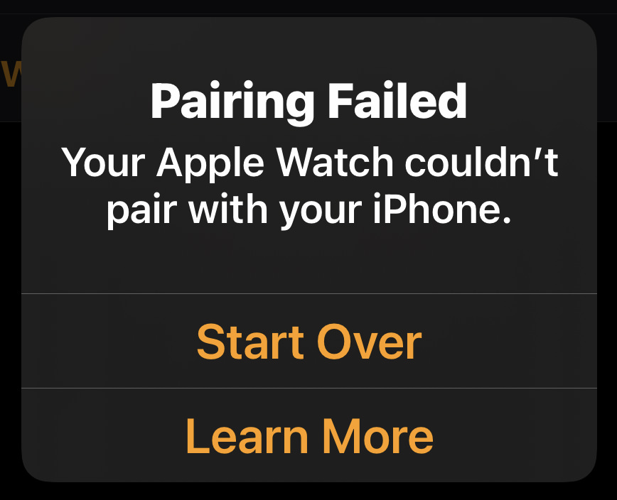
And this is exactly what I was talking about. Apple's ease of setup is only good when it works. When it doesn't work, the entire system is a massive barrier to getting anywhere. After nearly an hour-and-a-half of work, I finally got my watch to unpair, erase, pair and restore. But holy crap what a stupid ordeal. Do better, Apple. This is Microsoft-Windows-level pathetic.
My iPhone arrived this morning at 11:15am at about 75% full. It's now 10:00pm and it's down to 50% full. My guess is that it only dropped that much because of all the setup and playing around I've been doing. It seems likely that I won't ever have to worry about battery life seeing as how I charge it every night and never once had my iPhone X or iPhone 11 Pro run out of power. I expect that it will continue not being a problem with the 12 Pro MAX. The MagSafe charging puck I ordered hasn't arrived yet, so I can't comment how it works or how fast it is with my 18 watt charger instead of the brand new 20 watt charger you're supposed to buy in order to get fast charging. The phone is so huge that it's tough to position on my Qi wireless charger and I'm assuming the MagSafe puck will be easier. It better be for $30.
The OLED Super Retina display is definitely pretty. It's bright and saturated and anything you put on it looks great, just like it did on my old iPhone 11 Pro. However... after having seen the new "ProMotion" display on my iPad Pro which refreshes at 120 Hz, the poky 60 Hz refresh rate on this phone seems almost primitive. Other manufacturers have gone to 120 Hz, so I don't know what the deal is with Apple. My guess would be battery life, but it seems weird that they haven't been able to figure it out so that the user can choose whether display or battery is important to them. I barely use 25% of my battery each day, so I'd absolutely click the preference for ProMotion. Because once you've seen the buttery-smooth optics of a high refresh rate, going backwards is really quite jarring. For Apple's sake, I hope iPhone 13 Pro has ProMotion, because anything less is pretty embarrassing.
For some reason I thought that massive size of the MAX would have better sound than the "standard" size iPhone Pro. This doesn't seem to be the case. Out of their respective cases, the sound is not noticeably different between my old phone and new phone. Not that this is disappointing... far from it. I still cannot fathom how Apple manages to get such phenomenal sound out of a frickin phone that's so thin. No, it's never going to rival what you can get out of a dedicated speaker, but what you do get is better than I ever expect.
And so here we are. Remember how I was talking about how the iPhone 4 and iPhone 5 were my favorite iPhone designs of all time? One of the things I loved about them was how beautifully compact they were. When I made the jump from iPhone 8 to the iPhone X, the size increase was tough to take. Jumping up again to the MAX is beyond tough to take. Just look at the iPhone 5 next to my new iPhone 12 Pro MAX...
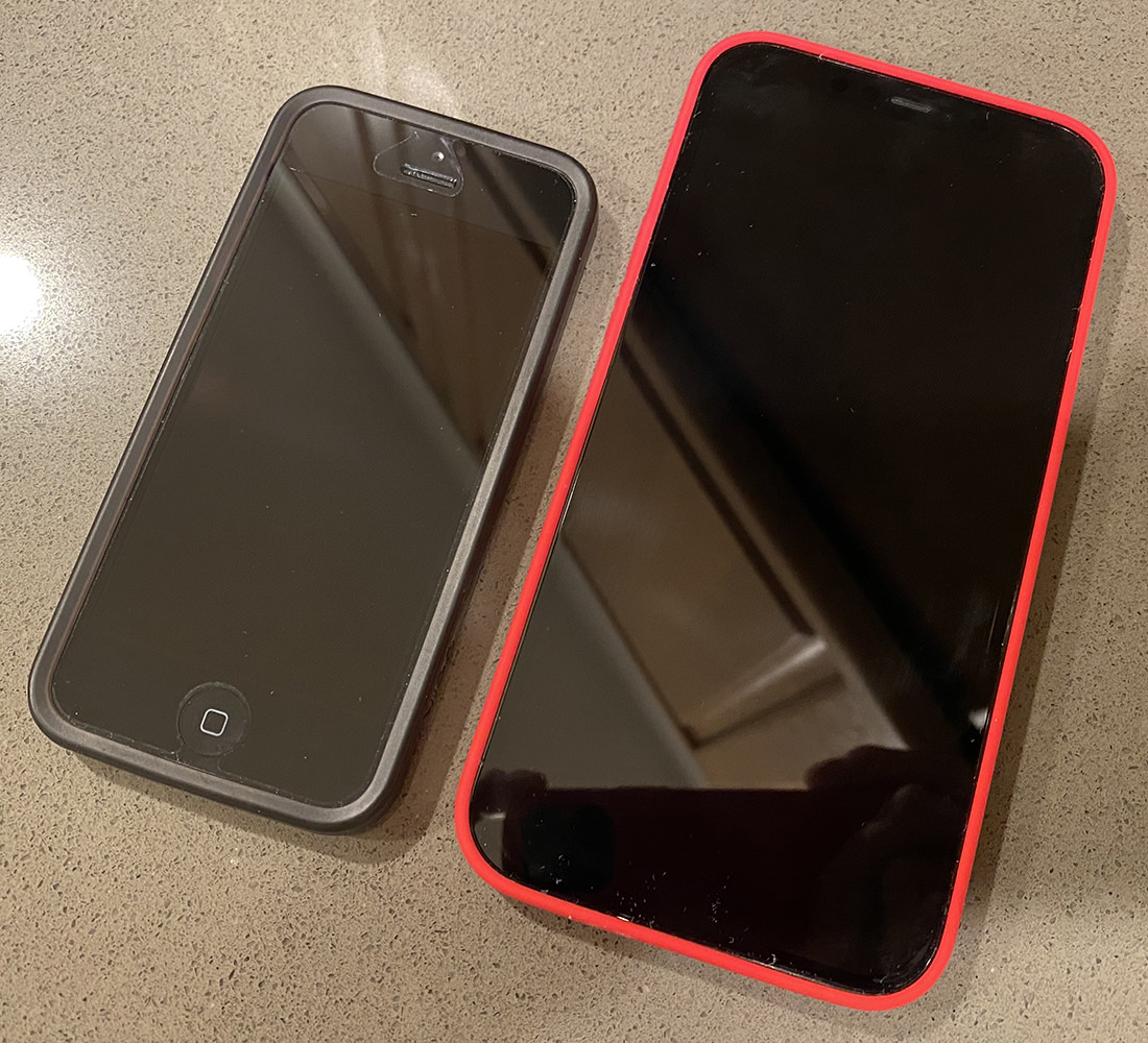
The MAX is what's considered a "phablet," which is a hybrid phone/tablet. I never thought I would own one. Who wants a massive phone to lug around? The jump from 11 Pro to 12 Pro MAX looks like this...
After spending the day with it, I'm still not sure how I feel about the size. I really hate not being able to operate it one-handed. With practice I might be able to get some functionality back, but way too many controls are always out of reach. It's hugely frustrating. On the plus side, the other size-related drawbacks that I thought would be a problem ended up not being a problem at all. It fits in my pockets just fine (shirts, pants, jeans, and jackets). I can shoot with the camera one-handed. It's not uncomfortable to hold or use as a phone. And it doesn't seem to get in my way like I imagined it would.
When it comes to what I like about the size? That large screen is phenomenal for looking at photos. This cannot be overstated. The difference is not subtle. It may not seem like a massive change on paper, but the MAX feels more like looking at a photograph. I absolutely love that. I think back to all the times I've shown people images from my phone and how they have to squint and put their face up to it... and it's hard to imagine going back. And then there's gaming. Slow 60 Hz refresh rate aside, the larger size is SO much nicer for playing games. And watching movies. And reading. And just looking at... well... everything. The larger size allows for things to display a touch larger as well, so if you have aging eyes like mine it offers a slightly better experience to boot.
My guess is that I will be keeping the MAX rather than returning it for the "regular" 12 Pro. Even setting the superior camera aside, there are too many nice things about the large screen I'm enjoying which offset the inconvenience of having to use two hands sometimes.
The initial hot take from reviewers who got an advanced phone sent to them was that the photography difference between the iPhone 12 Pro and iPhone Pro 12 MAX was not quite the leap everybody was expecting. The larger sensor does have slightly less noisy images in low-light... but it's nothing mind-blowing. You get more detail in the shadows... but not so vast that most people will notice. There's extra length on the telephoto at 2.5x vs. 2x... but it's not going to make a massive difference in the long run (so to speak). The sensor-shift optical stabilization reduces shake a bit... but not so much that you'll be able to get radically sharper photos while moving. It's all subtle degrees of change instead of some kind of revolution. And yet... I will take whatever advantage I can get, no matter how small. Most all I care about when it comes to my iPhone is the photos I can take. If the MAX is what it takes to get the best, then that's what I want.
Though the difference between 12 Pro and 12 Pro MAX cameras may not be huge, the difference between them and my 11 Pro very much is. The first photo I took was of Jake when he plopped down next to me after I got home. It was starting to get dark, so it wasn't especially bright. First I shot it with the 11 Pro, which dropped into 1-second Night Mode and got me this image (cropped to about 70%)...

Then the 12 Pro Max, which did not drop into Night Mode, got me this image (cropped to about 70%)...

Now, I don't mind saying that I was a little disappointed. They both look similar, don't they? The 12 Pro MAX is a little bit more clear, but that's just because it didn't have to expose the scene for a full second. Then I zoomed in further and saw just how much more clear the 12 Pro MAX is. Here's the 11 Pro...

And here's the 12 Pro MAX...
And... there it is. This is why I'm so grateful that Apple has an iPhone Upgrade Program which allows me to afford to upgrade every year. This is not a small difference. This is huge. The 12 Pro MAX has superior imaging which will allow me to zoom in tighter... print larger... and do more... with every shot I take. And this is just the first photo I took! I can't fathom what I'm going to see when I goof around with the camera over the weekend. I'm guessing I'm going to be blown away. I expect to be blown away.
One thing I'm dying to experiment with is Apple's new ProRAW photo image format. The file size is around 25 MB... each... but there's more information with less artifacts and a higher dynamic range. And the raw data you capture isn't touched as you adjust it in the Photos app, so the image doesn't degrade. You can always go back to exactly what you captured at any time. I won't be shooting ProRAW for casual shots, but I'm very excited at having it available when I'm shooting serious shots. Vacation scenery shots, portraits, photos for work... any time the bigger file is worth it. Alas, ProRAW isn't coming until iOS 14.3 which hasn't come out yet, so something to look forward to.
I'm sure early next week sometime I'll be posting photos I've been taking.
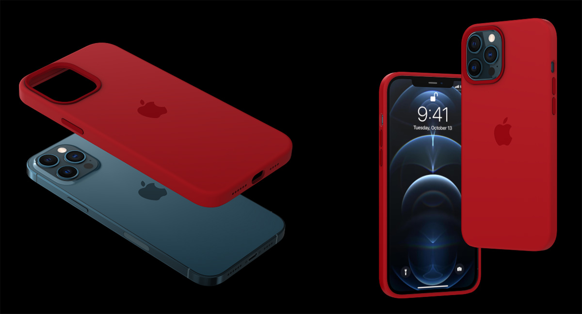
I ordered the (PRODUCT)RED version of the silicone case along with my iPhone like I always do. The red color makes it easy to spot, it will look all Captain America with my blue phone, and the Apple-branded cases have always been quality. The fact that some of the profits go towards fighting AIDS in Africa is just icing on the cake. Now Apple has a new "iPhone Studio" tool where you can see what your iPhone will look like when paired up with various color cases and MagSafe wallets...
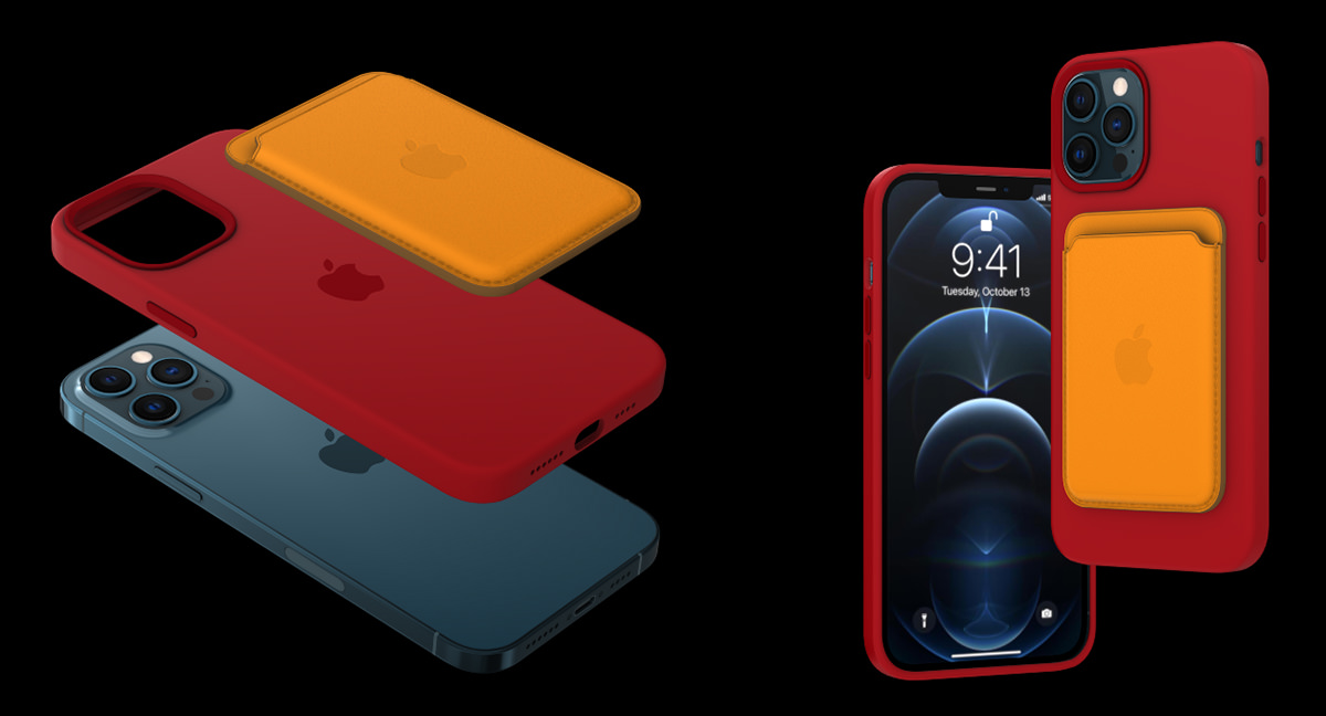
The new MagSafe that intelligently (and magnetically) attaches things to the back of your phone actually is pretty cool. My case is red, so when I pop it on the phone it is able to recognize that and give you a cool special effect that pulses across your display...
Had my case been green, the effect would be green, and so on. A nice touch.
Nice as the iPhone 12 Pro MAX is, it's not a foregone conclusion that I'm keeping this phone. There are times that I am not bothered by the massive size... there are times that it's just so overwhelming that I don't know if I can live with it. Maybe after a week it will seem "normal" but it sure doesn't now. I hate that it's so bad for working with one-handed. Part of that is just not being able to grip something so big. But a chunk of that is also Apple and 3rd party developers not doing a good job of adapting their apps to function well on a huge display like this.
But then...
...I pick up my old iPhone 11 Pro and it feels like a toy (I pick up my old iPhone 5 and it feels like it's fake). I love that bigger display so much that any time I drop back to a phone without it the thing feels wrong somehow.
I guess I'll have to wait and see.
Once thing I do know is that I can't wait to see what kind of photos I can get out of it.
