
 When I ordered my new iPhone way back on October 9th I was told that it would be arriving between November 10th and 17th. A month away. But, unlike when I ordered my new MacBook Pro, I wasn't dying to get my hands on it. The only reason I was getting a new iPhone was because the camera improvements seemed worth a look, and it seemed silly to not take advantage of The iPhone Upgrade Program which allows me to afford these things in the first place. That's it.
Imagine my surprise when I got a notice telling me that my iPhone had shipped a whole week early! Well, shipped from China, naturally, but it still only took two days to arrive. I sure hope my new MacBook is sent early like this!
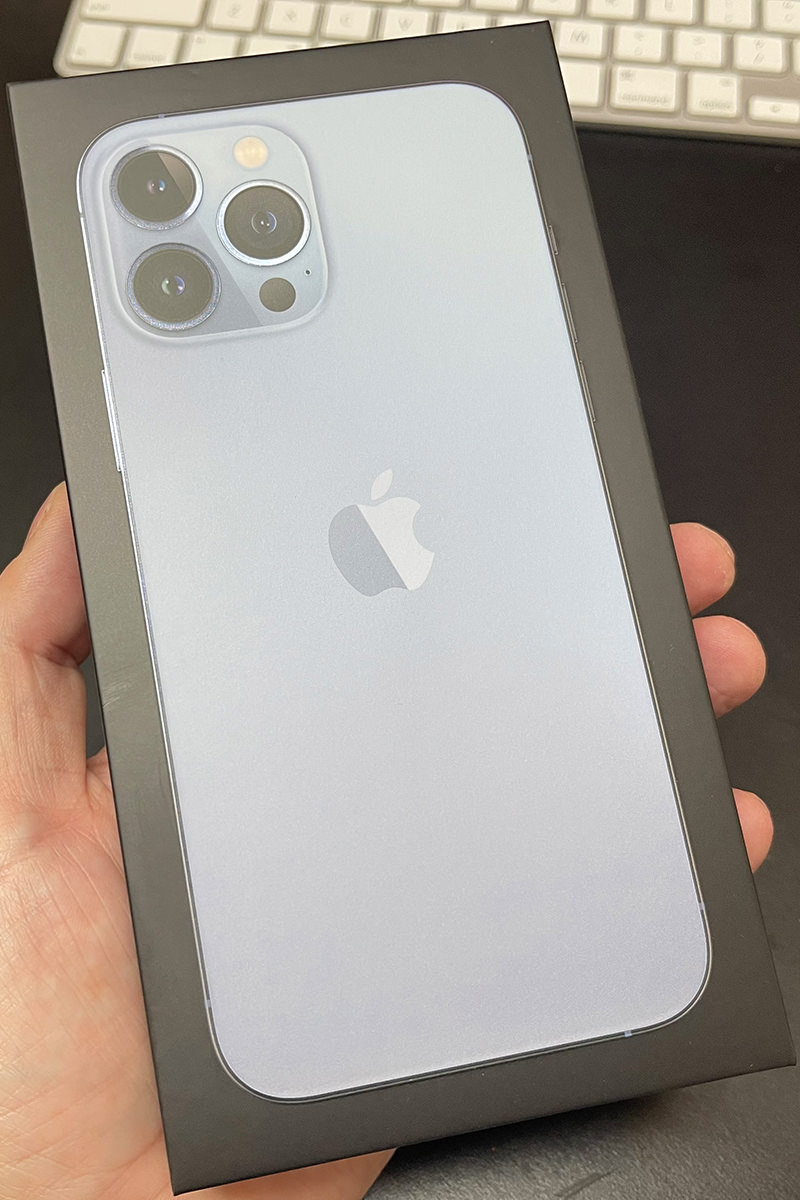
So let's take a look at things, shall we?
DESIGN
Other than a bigger camera bump on the back, you'll be forgiven if you don't think the 13 Pro MAX is different than the 12 Pro MAX at first glance. I legit thought that they had accidentally sent me an iPhone 12 Pro MAX by mistake until I turned it over and saw the slightly larger camera bump and bigger lenses. My phone is the "Sierra Blue" model, which is nice. The color is a little more subtle than what you see in the photos on the website... it looks almost white if you have any light on it. But the sides of the phone are absolutely gorgeous. A shiny steel blue color that looks so sharp. I love it but, if I'm being completely honest, I prefer the darker blue from last year (and, if I'm being even more honest, I prefer the dark green from the year before that)...
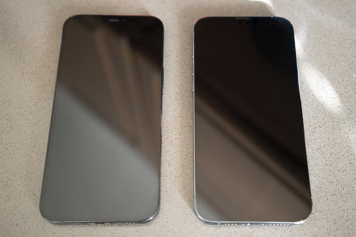
If you look very close, you can see the ear speaker has moved to the very top in the new model.
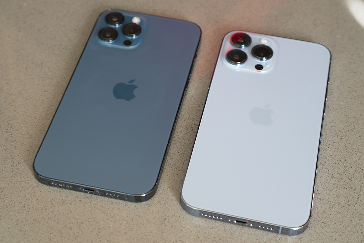
The deeper color just has a different "feel" to it that I prefer.
The weight is definitely a bit heavier, and I noticed it the minute I picked it up. It's even more noticeable when switching between hold my old and new phones. It's not going to be an issue. If I really stare at it on-edge I can see that it's a tiny bit thicker, but not in a way that I'm going to be noticing.
SETUP
If there's one thing that Apple has down to a science, it's setting up their devices. Mostly (this was not the case for me, which we'll get to). It's especially simple if you have an older Apple device. When I turned on my new phone, my old phone immediately lit up and was ready to transfer everything. I was given the option of either setting up the new iPhone from iCloud, which would allow me to use it in about 15 minutes because the non-essentials would be gradually downloaded after the essentials had been transferred... or I could transfer directly from my old iPhone and have absolutely everything set up exactly as before which takes about an hour. I wasn't in a hurry, so I opted to do the direct iPhone transfer. Also? I didn't want to risk the internet cutting out half-way through and screwing up the transfer.
Alas, the transfer was not all smooth sailing. Apps kept starting and stopping during the download, which meant it took a lot longer than an hour to complete (even though I could use what was loaded after about 45 minutes). The re-pairing with my Apple Watch failed spectacularly and was a total bitch to get fixed (read more at the end). And while the transfer initially seemed to go well, my old iPhone was stuck on "Time remaining 6 minutes" for at least a half-hour... probably longer. After everything was transferred and complete, I had to force-reset my old phone because it STILL was stuck on six minutes! I don't know why in the hell I should have these problems when Apple has clearly designed the process so people don't have any issues... but here we are.
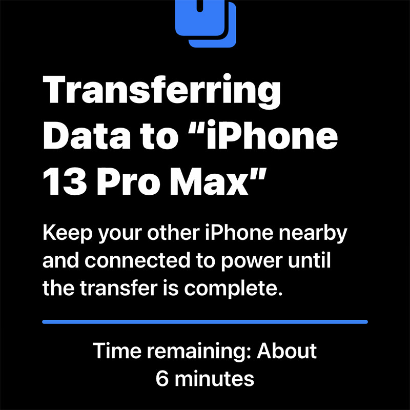
Stuck on six minutes... FOR ETERNITY!!!
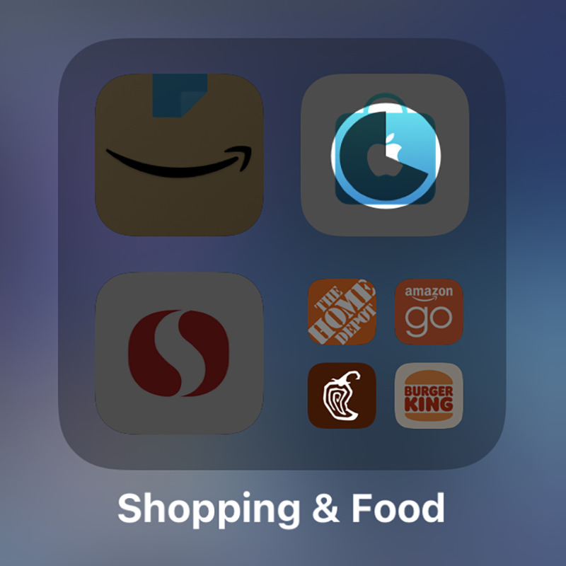
The irony is not lost that the first shopping app to load was Apple's own!
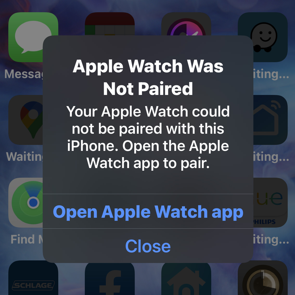
And nothing I did would work. Time to factory reset the Apple Watch... AGAIN!
DISPLAY
The size and resolution of the Super-Retina OLED display is the same as last year (2778 × 1284 pixels). The difference being that the newer model has a ProMotion 120hz refresh rate, meaning that scrolling is buttery-smooth and there's no tearing when there's rapid movement being displayed. This is not something that a lot of people will notice right away when upgrading. I barely did. Until I went back to my old iPhone! Then it becomes much more obvious and now I never want to go back! Scrolling is positively glorious now. Running at 120hz sucks more battery power, which is why Apple has delayed using it while other manufacturers were switching to it. Apple didn't want to sacrifice battery life, which is something that far more people would notice. Why we are getting 120hz now is that they figured out how to make it be adaptable. The screen runs at 120hz when there's fast-moving things to view... but drops down to a far slower refresh rate when there's not. The result is a superior display that doesn't hit your battery. That's pretty sweet.
BATTERY
Maybe it's because I just don't use my phone as much as other people, but I haven't had my iPhone run out of battery for years. On the contrary, there were many times that I wouldn't even bother to charge the 12 Pro MAX at night because my battery had barely moved. And now Apple as gone and improved the battery life again. In the day I've been using the phone, it's still at 40%... and that includes the setup, which had to be a battery-sucking procedure! Once I'm done using it constantly as I have been, it will be using even less battery. This is a long way from the days that I had to carry a battery pack with me so I could watch movies on a plane-ride!
PORT
When I first unwrapped the charging cable, I got very excited. "ZOMG! IT'S USB-C!!" But then I looked at the other end, and nope! Apple is still sticking with that stupid fucking "Lightning" port instead of moving to USB-C like they have with their iPads and computers. This is just mind-bogglingly ridiculous, and I cannot wrap my head around why Apple keeps dragging their feet. They claim it's because there are so many iPhone devices which still use Lightning and they don't want their users with many devices to have to re-buy them. To which I can only say "Where was this concern when you dropped the headphone jack?!?" The simple truth is that Apple will probably drop the port completely before switching to USB-C. So maybe their concern is valid. Don't make your users re-buy stuff that they'll just have to throw out in a year or two. Let's look at the math here... they've already got MagSafe for charging, WiFi 6 for transferring data, and the battery life is so good that quick-charging isn't as critical to have... so why keep the port at all? The day is definitely coming, because that would free up some room inside for new gadgets. I'm guessing that Apple's "concern" over customers with Lightning devices will mysteriously vanish then. Probably. All I know is that I'd like to travel with ONE charger and ONE cable before that day arrives. And wouldn't it be nice if Apple would just have one MagSafe standard for everything? Dare to dream.
VIDEO
I don't shoot a lot of video footage. When I do, it's usually for work. I prefer photography for my personal stuff. But there was something new with the iPhone 13 Pro MAX that had me intrigued... the ability to shoot Native Apple ProRes video. Apple ProRes is a codec (encoding/decoding file format) which many professionals use because it offers very good quality at a semi-decent file size. Problem is that you have to purchase a camera to record in it. My Sony Pro DSLRs record in AVCHD. Previous iPhones shot M4V. The iPhone Pro 13 series is my first chance to go with ProRes, so I leapt on it. I was so excited at the prospect that I actually upgraded the storage to 256GB, because that's what's required to shoot ProRes 4K at 30 frames per second (with the base 128GB model, you can only shoot 1080p maximum). Since I edit video in Apple Final Cut Pro (which is built around the ProRes codec) I already knew I could edit the format easily. But then Apple announced the M1-PRO and M1-MAX chips used in the new MacBook Pro would have special onboard hardware to support ProRes video! Which is to say that now I had even more incentive to play around with video on my iPhone. I'll probably post some footage once I've had a chance to play around with it a bit more.
CINEMATIC MODE
Way back in 2016, Apple introduced "Portrait Mode" for photography which would put the focus on people and pets by blurring the background. This is what larger DSLR camera lenses can do naturally, and it's nice because your subject "pops" out of the photo. Given the iPhone's tiny lenses, it was a nifty trick, but didn't always look that great. The edges around people would be blurry or weird. And forget about using it for pets because it just looked so bad. But then over the next few years "Portrait Mode" just kept getting better and better. And the fact that you can adjust the blurriness of the background after you've taken the photo is just icing on the cake. I don't use it a lot (I am mostly fine with the blurriness you get direct from the lens), but boy am I glad to have it available!
But "Portrait Mode" has never been available for video.
Until now. And Apple calls it "Cinematic Mode." It adaptively focuses on subjects to blur out the backgrounds and can even track when somebody looks away to automatically focus on what they're looking at. It's incredibly slick. And you can override the focus point after you've shot the video which is amazing.
Not surprisingly, this new tech not terribly great right out of the gate. But I'm guessing that this new "Cinematic Mode" will improve for video just like "Portrait Mode" did for photos. I've only shot a few videos using it just to see what's going on, but am not so impressed that I am using it by default. It has its uses, but I don't use my phone like that very often. Maybe I will when it gets to be as good as "Portrait Mode" is now?
PHOTOGRAPHY
Ever since the iPhone 11 Pro, I've not felt the need to lug my Sony DSLRs around everywhere. The camera on my phone had become so good that there just wasn't a need. Especially for travel, where not having to carry around anything additional was such a blessing. I still use my DSLRs for serious photo shoots where I require high-quality lenses to get what I need... but the way Apple has managed to use on-phone processing to mimic DSLR quality with such tiny lenses is pretty phenomenal, so I use actual cameras less and less. Now we're two generations later and the photography you can get out of the iPhone 13 Pro MAX is nothing short of jaw-dropping.
First of all, the telephoto lens has gone from 2.5× to a full 3×, allowing you to shoot better long-range photos because it's coming off the lens instead of being digitally zoomed. Second of all, whereas only the main lens had optical image stabilization in the iPhone 12 Pro models, the iPhone 13 Pro models have it for all three lenses. This allows you to shoot better photos while moving and much better photos in low-light. And speaking of low-light, Apple has improved that once again as well. The apertures are smaller so the lens can let in more light. The image sensors are larger which allows them to capture more light. Put these two improvements together, and your ability to capture very good night shots is pretty great. I went into my closet with no lights on, just ambient light from the hallway. The iPhone wants you to make a timed exposure for 2 seconds, so I did that...
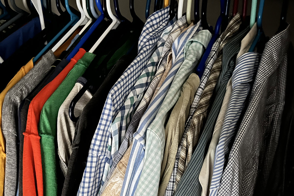
This is a 2 second timed exposure.
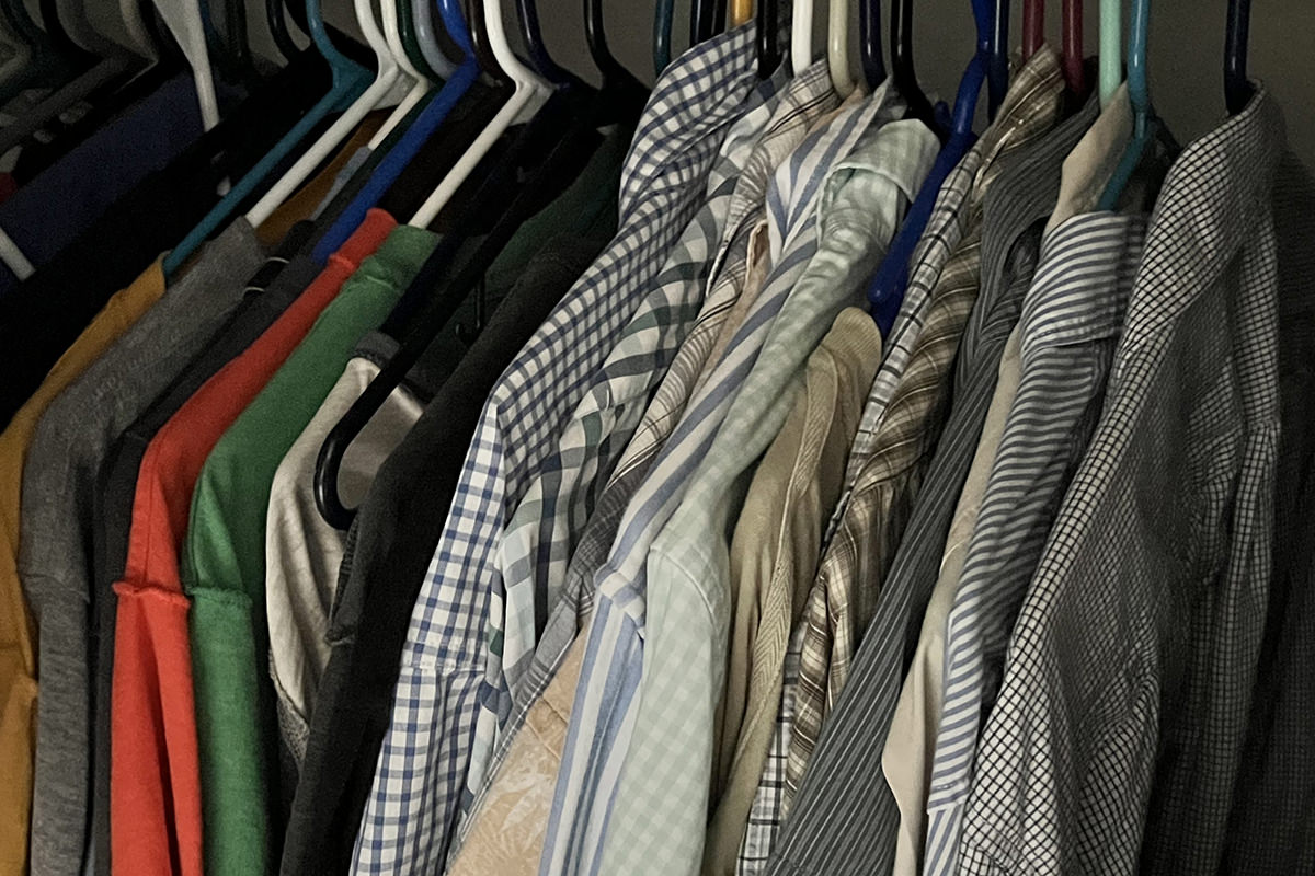
This is an untimed exposure.
Given how little light is here, both of these are pretty remarkable shots. The image stabilization keeps the 2 second shot crisp and gives pretty good color representation. The shadows are very deep though. The untimed exposure is a little dead-looking with drab colors, but the fact that you can see colors at all is impressive. A couple seconds in adjustments and you could salvage it fairly well if you don't mind a little grain...
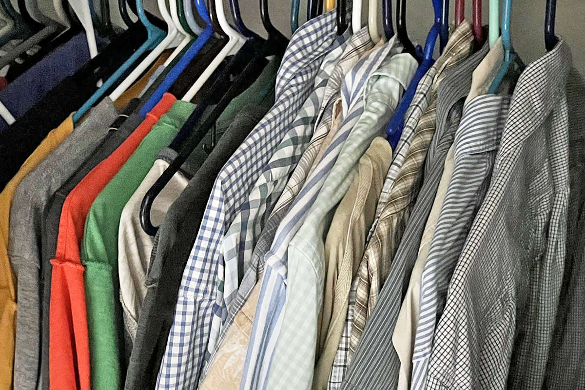
This is a an untimed exposure, with adjustments.
If anything, that's the more realistic option of the three, and pretty much what it would look like if I turned the lights on.
And then there's the ability to shoot macro. This allows you to get as close as 2cm to shoot some really cool close-ups...
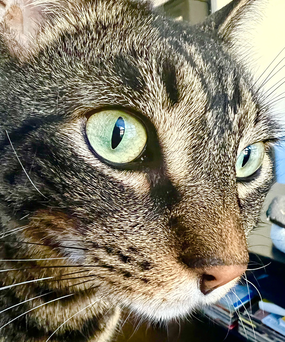
This is a full-width image crop.
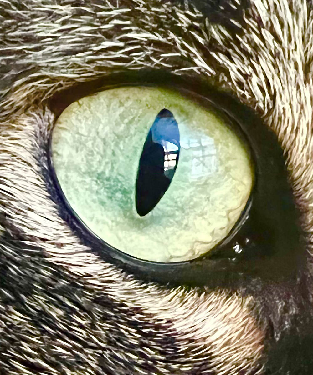
This is a 100% crop of the original image.
If this were Summer, I'd have some vibrant shots to take. But, alas, everything is dying, so that's what I got. Still... just about anything can be cool when you shoot it close-up!


As mentioned above, Apple uses computational photography to go beyond what such small camera lenses are capable. The iPhone is so fast and powerful that Apple can shoot multiple images, analyze them, then assemble the parts to create a far better image (kinda a super-HDR, as it were). This is especially useful in getting good detail out of a shot...
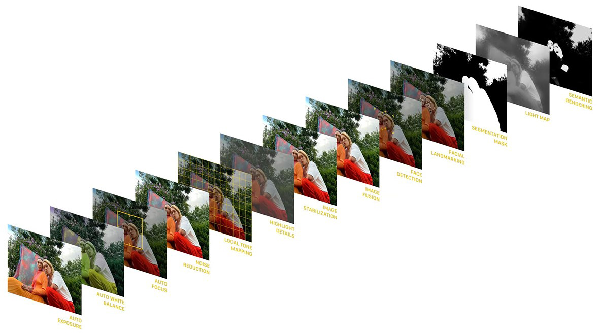
Something new to the native Apple iPhone photo app (but available from other iPhone apps) is the idea of filters. If you like your photos to have more contrast, there's a filter for that. If you want deeper, more saturated colors, there's a filter for that. Want a warmer or cooler look? There's filters for that too. But Apple isn't just applying a filter over the images when you do this. Instead, Apple is selectively applying them locally. Which means that if you want more vivid color in your images and turn on the "vibrant" filter, any human skin in your shot isn't pushed to weird places, but instead preserved a bit and made less vivid so it still looks like human skin. It's a nifty trick.
GOING NEXT-LEVEL BIONIC
The new A15 Bionic chip that powers the iPhone 13 Pro has a lot more speed and power than the previous A14, but you'll hardly notice in your day-to-day use. Apps work pretty much the same. But there are some exceptions. The computational photography abilities and Cinematic Mode video are things that are only possible because of the new chip. And then there's some apps which definitely benefit. FaceID, for example, which was near instantaneous is 100% instant now.
A CASE FOR CASES
You can't really tell from the below photo, but the new Project RED case is a richer red. Less tomato-like. I absolutely love it. At first I thought that my old case looked less rich because it had faded, but I'm pretty sure that's not the situation because I remarked more than once that I wish I had a deeper red color. The the inside was never exposed to light, and you can really tell there. So... wish granted, I suppose. Though it's a bit of a nightmare to pay $50 for this thing...
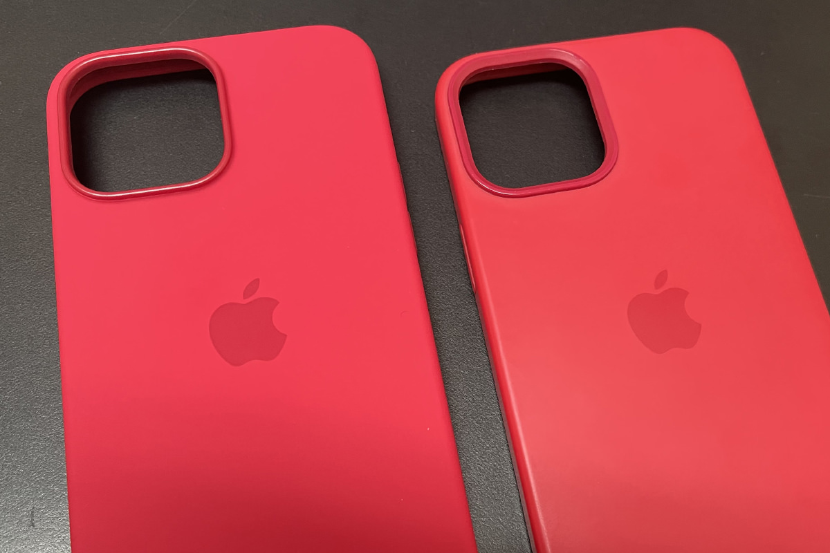
Newer, deeper red case is on the left... old tomato case on the right.
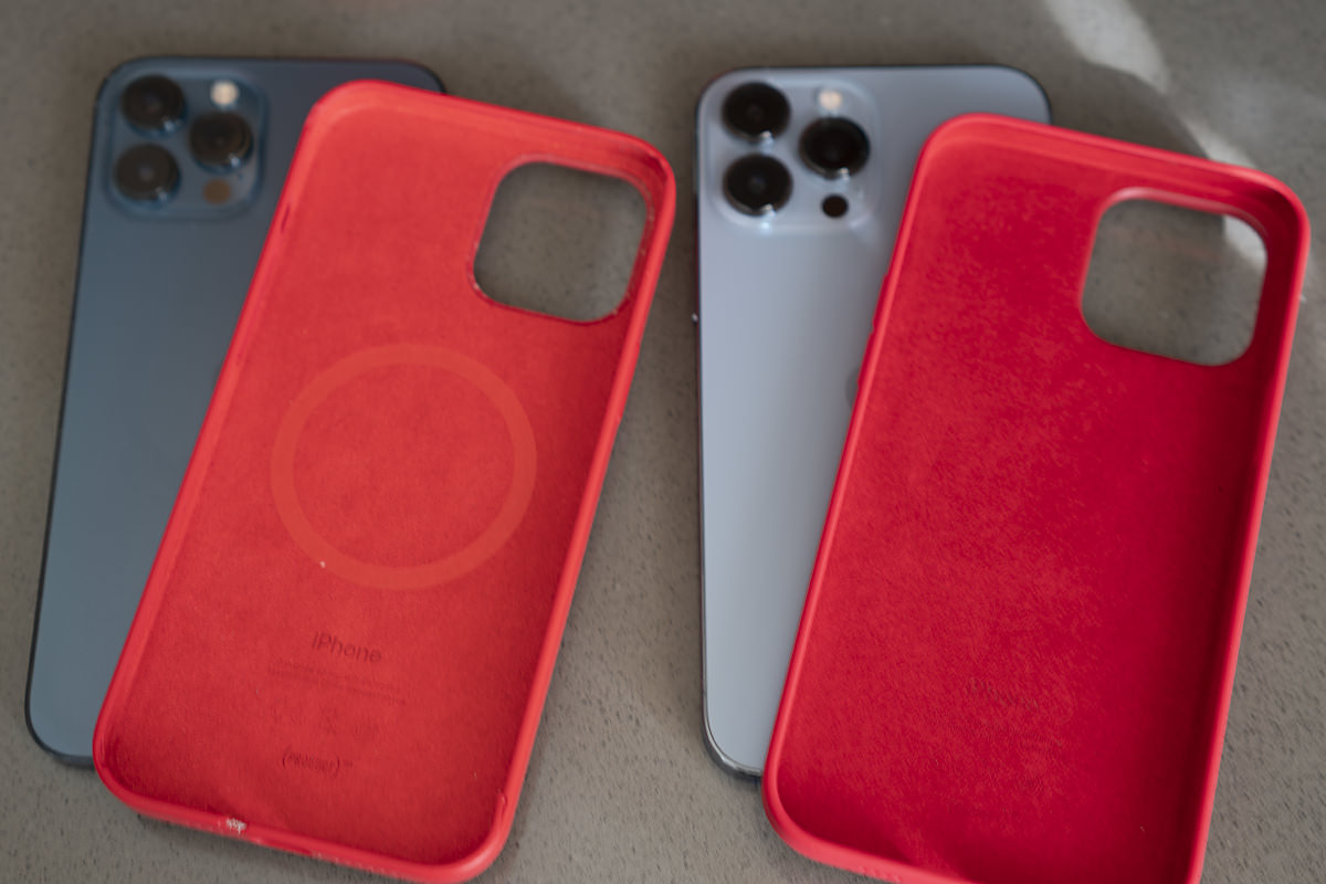
Newer, deeper red case is on the RIGHT this time... old tomato case on the left.
CONCLUSION
Camera features aide, this isn't an essential upgrade. I probably wouldn't have bothered if I weren't in the Apple iPhone Upgrade Program. That being said, the new cameras are pretty sweet. Not a revolutionary change... but an incremental step that's worth taking if you're serious about mobile phone photography.
But before we go...
ABOUT THAT APPLE WATCH PAIRING FIASCO
Same thing that happened last year. My new iPhone recognizes that I have an Apple Watch. It asks me if I'd like to pair it. I start the process by pointing the camera at my watch face while dots swim around it. A few minutes later I get an error message saying that my watch can't be paired. Then I go to the Watch app on my old phone to unpair the watch only to find out that the old phone can't find the watch to unpair it. Then I have to physically factory reset my watch entirely so I can start all over from scratch, which sucks copious amounts of ass because then I lose all my settings and credit cards and have to start all over again. This is so fucking stupid. Apple maintains the illusion that upgrading your phone is this simple, easy process... which it appear to be. Until it's not. God it's infuriating. Such a monumentally stupid, frustrating experience from start to finish, and it gets to the point where I'm ready to set my fucking watch on fire rather than have to deal with this shit. For the second year in a row! Next time I upgrade I'll try unpairing before transferring. If that works, I'm just going to be even more mad that Apple doesn't tell you to do that in the first place. But shouldn't they really find a way to make this work as designed? And isn't it absurdly embarrassing that it doesn't work as designed in the first place?
And lastly...
CARRIER UPGRADE FEE
Despite the fact that T-Mobile didn't have to do a fucking thing when I transferred to a new phone, they still charge an activation fee (despite it being completely automated). It's a cash grab that all the carriers do, and it's rage-inducing. I don't know what the fee is (I think T-Mobile charges $30... AT&T charged me $50) but anything more than $0 is too much. I know for a fact that I will be screaming "FUCK YOU, YOU ASSHOLES!" at my bill when I get it. Hopefully I remember to go out to my car so I don't scare the cats.
See ya when my new MacBook Pro MAX arrives, fellow Apple whores!

I love comments! However, all comments are moderated, and won't appear until approved. Are you an abusive troll with nothing to contribute? Don't bother. Selling something? Don't bother. Spam linking? Don't bother.
PLEASE NOTE: My comment-spam protection requires JavaScript... if you have it turned off or are using a mobile device without JavaScript, commenting won't work. Sorry.

There's no comments here...