
 I've had more that a couple people ask me if I've joined the Apple Mac OS X Yosemite Beta program. Of course I have, which always leads to the question "Well? What do you think?
The answer is not so easy to pin down... mostly because the beta is very much work in progress. And a lot of the more compelling features, such as all the nifty new iPhone integration, can't be tested because I don't have iOS 8 installed on any of my devices. So about all there is for me to comment on is A) How it runs with my existing stuff, and B) What it looks like. Those answers are as follows...
A) Seems to run fine, though I've noticed there is some lag when typing with a few apps.
B) I think it looks like shit. Garish, dated, and inexplicably messy on anything less than a Retina Display... which is a lot of people still have.
First of all, the new "flat" icon aesthetic isn't bad... it's the ugly day-glow color pallet that makes it appear that way. Even worse, the "flatness" is applied inconsistently. The icon for Mail, for example, isn't truly "flat" at all. It's got a lot of photo detail on it plus a watermark, which looks inconsistent next to all the other Apple icons that are so minimalistic...
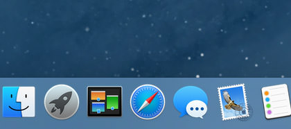
The Mail icon is new, so I'm guessing that's pretty much what it will look like when Yosemite is released. Unfortunate.
Even putting the garish app icons aside, there's an even bigger problem with folders. No longer a subtle element that recedes into the background so you can focus on what you need to, folders are now about as subtle as a slap in the face. They're like a plague of distraction...
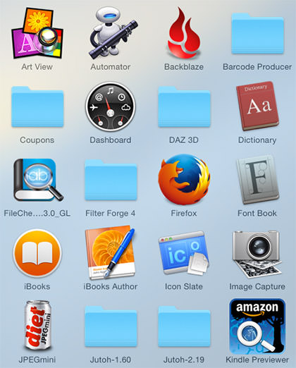
Get a grouping of them and it's almost worse...
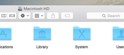
Compare and contrast to the much classier presentation of the older folders...
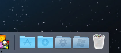
Also note the trash can, which no longer looks like an actual trash can... but instead like a frosted shot-glass filled with cigarette butts. Far more Windows-like than Mac-like in my opinion.
And it doesn't stop there... every single control element has been flooded in 80's day-glow colors which looks almost manic in it's distraction...
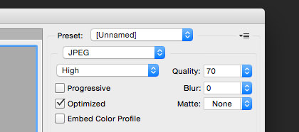
YES! WE FUCKING GET IT! WE CAN CLICK ON THOSE CONTROLS!! Praise be to Jobs that you can tone it down by switching the appearance controls to "Graphite"...
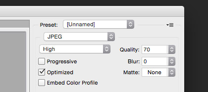
Unfortunately, there's no way to do that with the folders and icons. And, this being Apple, it's not like they're going to offer any skinning options so you can replace their shitty 1980's color scheme with something more sensible.
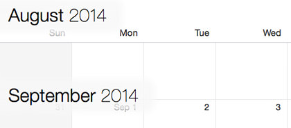
I haven't played much with the Apple apps that come with the system. Notepad and Contacts have been updated, but not noticeably so. The Calendar app looks a little different, but is still the same flaming pile of shit when it comes to usability. The only difference is that they've moved the laughably absurd and confusing month labels from the right to the left...
For the life of me, I don't understand Apple's new design mantra. It used to be that design was functional first... then that functionality was made beautiful. Now it's apparently design over function... which is made a hundred times worse because it's shitty design that's being painted over shitty functionality. Exactly the opposite of what Apple is supposed to be about. At least it's consistently shitty, which means they're still ahead of Microsoft. But for how long?
I was pleasantly surprised to find that the gimmicky transparency crap they've injected everywhere is much more subtle than I feared it would be. I still think it's entirely unnecessary, but at least it's not distracting me from getting things done. Even so...
John Hammond: I don't think you're giving us our due credit. Our scientists have done things which nobody's ever done before...
Dr. Ian Malcolm: Yeah, yeah, but your scientists were so preoccupied with whether or not they could that they didn't stop to think if they should.
That classic quote from Jurassic Park pretty much sums up my feelings about how Apple is operating now. Yes... yes... it's cool that the QuickDraw engine of Mac OS X allows effortless transparency to be added to any element... but just because you can do a thing doesn't mean you should do a thing.
One thing I rather like about Yosemite is iCloud Drive. It's basically DropBox integrated into the operating system. I am hoping... hoping with all my might... that this will make data sharing with iPhone have some semblance of sanity. If not, then DropBox it is. DropBox is not only dead-simple to configure and use... they just upped everybody who pays for their pro service to a whopping 1 terabyte at no extra charge. That's probably cheaper than what Apple will offer, which means the iPhone quackery you have to put up with is suddenly not the deal breaker it once was.
More random things to like...
And that's about all I have to say, really. Everything else is pretty much as it's being reported on every Mac website in existence.
While I think Yosemite has some interesting things going for it, ultimately it feels as if Mac OS X is taking a step backwards in functionality and design. Whether these things will be fine-tuned and improved before release is anybody's guess. I certainly hope so.
 For the longest time I've been dismissive of those who say that Apple has gone downhill since Steve Jobs left us (praise be unto His name). As a Certified Apple Whore, I pretty much have to, right? And besides, as great as His Steveness was, Apple has always been more than just one man. Steve Jobs didn't do it all alone, and the people who helped to make Apple into such a remarkable company are still around. So, yeah, Apple isn't going to be the same... but it couldn't possibly be the horrific disaster that all the nay-sayers keep insisting: "APPLE IS OVER!" "APPLE CAN'T SURVIVE!" "POST-JOBS APPLE IS DOOMED!" What nonsense!
Except...
As time goes on and the user experience with Apple products degenerates to complete and total shit, my opinion has been changing.
Don't get me wrong... I firmly believe nobody is doing it better... but the detail-oriented Apple that made me commit my eternal servitude over the past decade simply doesn't exist any more.
Let's walk through an example, shall we?
I perfectly understand the need to prevent random people from walking up to my computer and charging a bunch of crap to my Apple ID. Really I do. But having to enter my password four times? What kind of sadistic fucking asshole made that happen? And how badly would Steve Jobs explode over what a shitty user experience that is? I'd rather just buy a physical book at Amazon with their One-Click shopping.
This problem goes much deeper than just inconveniencing customers to enter their password over and over and over and over again... it encourages people to pick simple, short, easy-to-remember, passwords. Which is pretty much the opposite of what you want, because those are the passwords that are easiest to crack. What you want is people using heinously complicated passwords that are very difficult to crack. But to get this to work, you have to make it so the password only has to be entered rarely. The password should be remembered by the system and auto-populate whenever you want to buy something. Of course you have to secure the system with a password... otherwise you're back to square one. But THAT is the kind of stuff Apple figures out so well. Like the fingerprint scanner on the iPhone, for example.
So where is it?
And since one example doesn't build a compelling case, here are a few more things off the top of my head that have been bugging the shit out of me with Apple's "User Experience"...
Holy crap... and that was just the stuff off the top of my head. Had I put some actual thought into this list, it would be ten times as long, I'm sure.
And there's my problem with Apple. In the past, I would expect that insane shit ruining the Apple experience would eventually be fixed. Now? I honestly don't know. There's obviously people in charge of these problem areas. But is Tim Cook obsessing over making sure these people are getting things to work exceptionally well like Steve Jobs was? Or is he being distracted by shiny things to buy with Apple's massive bank account? Early after his take-over, I was willing to give him the benefit of doubt. But now? We're going on three years and I'm starting to worry.
I want... need... Apple to be insanely great.
Anything less isn't Apple.
 Okay then... it took me six hours to get my email restored after the new Apple Mail app in
And now, a quick pass at the new
"Mavericks" has broken away from the "big cat" naming conventions of its
From a user's perspective, Mavericks is an interesting mix. Yes, it features a new coat of paint on some of the visuals, but there's a lot interesting stuff happening under the hood as well. Add to that a few new features and bundled apps, and it's a compelling upgrade... especially given the price tag of zero dollars. But how will it stack up against my scathing review of its predecessor, "Mountain Lion?" Let's take a look, shall we?
BUT BEFORE WE START...
Please, please, please make a current backup of your computer before you upgrade to Mavericks! Sure, Apple's
And now... on with the show. My thoughts on Mavericks are in an extended entry...
→ Click here to continue reading this entry...
 And so I installed Mac OS X Mavericks on my work Mac.
This resulted in all my email being deleted in Apple Mail. "No big deal," I thought. "I'll just rebuild my mailboxes from Gmail." Except that's impossible when Apple Mail deleted all your mail off of Gmail.
And so now all my email... absolutely everything... is gone.
Fortunately I was smart enough to make a backup before I started, so I am hoping that I can restore everything... but this is a fucking horrendous situation. Thank you so much Apple for once again releasing a piece of shit OS that's fucked me over. Hard.
UPDATE: Apparently the problem cannot be laid entirely on Apple's doorstep. Gmail uses a highly non-standard form of IMAP, and doesn't really give a shit. They want you to access Gmail from their website or official Gmail client... and with any other method you're just taking your chances. But, again, Apple is not entirely blameless because Gmail is an incredibly popular service, and they shouldn't advertise as being compatible if they really aren't... whether it's their fault or not!
UPDATE UPDATE: In all seriousness, Gmail is the work of the devil. If you are using it with ANY email client not made by Google, including Apple Mail, you should archive your mail and walk away. Immediately. I've just gone back to using my host email for a while, as I know they are using standard IMAP protocols and aren't throttling bandwidth in any way like Google does.
 My morning routine is a rather complex series of events which is based on a number of "What-If" scenarios. Such as if I wake up and can't move because my joints are messed up, I then have to take pills so I can function properly. But these pills can trigger an idiopathic angioedema swelling attack... usually in dangerous or uncomfortable places.
Like the bottoms of my feet, which ballooned up with painful welts that made walking and driving a difficult and agonizing experience this morning. A massive dose of antihistamines helps some, but it still takes a serious chunk of time for the swelling to subside. In the meanwhile, I am having to hobble around in pain all day long. Not a fun time.
As of 10:00pm tonight, my feet are still in pretty bad shape, so I am taking some serious drugs which will probably have me passing out any minute now.
I'll see how far I can get...
I received a rather interesting comment about my rant yesterday from somebody accusing me of being "anti-Apple" (oh the sweet, sweet irony). I would have gladly published it... except they used a couple of slurs which I refuse to publish on my blog. The gist of the comment was that my "tirade" against MobileMe was unjustified, and I "obviously haven't been using it lately, because it performs flawlessly." This is laughable for a number of reasons, one of which being that I use MobileMe several times a day to sync information between my various Macs (when it feels like syncing anyway). But mostly it's bullshit because iDisk is a complete and total piece of crap which has NEVER worked. Here's an example...
Today I bought a couple new iTunes songs on my work computer. I wanted to transfer them to my laptop when I got home, so I thought I'd drag them into my iDisk where they'd be waiting for me. Except dropping the first music file in my iDisk immediately made The Finder drop to its knees and become unresponsive. After ten minutes, I decided to give up and restart the Finder. Except this is what I got halfway through the process...
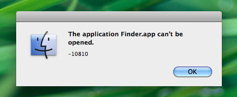
Game over. MobileMe's iDisk was able to crash the Mac's Finder file system so thoroughly that it couldn't even be restarted. A complete reboot of the entire computer was required. And this is not an isolated incident. This is an easily reproduced problem that happens ALL THE TIME for no apparent reason. So I am not talking out of my ass here. When I say MobileMe is a flaming pile of shit, it comes from experience.
And, in happier news, have you seen the latest images to come from the Hubble Telescope after it was updated and refurbished? Holy cats, it's beautiful stuff...

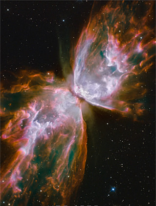
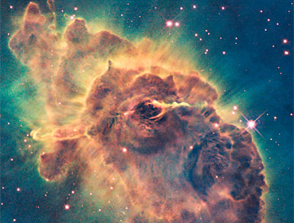
I could literally stare at stuff like this all day long. Thank you NASA for using some of my tax dollars in a way I whole-heartedly approve of. I look forward to many, many more incredible images from Hubble.
And now the drugs are starting to kick in, which means I should probably stop blogging before I hurt myself.
 Oh happy day!
I just noticed that Apple has finally... FINALLY... added a Finder preference so that your searches aren't brain dead. In previous Mac OS X versions, the Finder would always search the entire frackin' computer whenever you did a search from a Finder window. This is sublimely stupid, because odds are you just want to search within the folder you are already in! It's about time they fixed this, I just think it's a shame that it's not turned on by default.
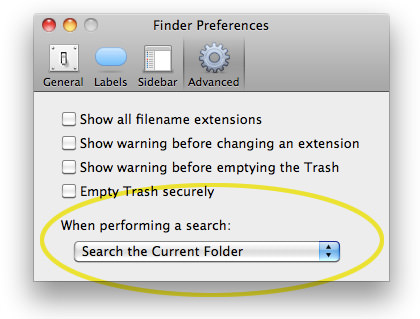
This has been such a major frustration for me day-in and day-out that discovering Apple had fixed it was enough to have me walking on air all day! It's the little things, I guess.
 Ooh! I'm actually home for this edition of Bullet Sunday!
• Garbage. Having a blog with nearly six years of material makes me an easy target for haters, since I'm bound to have written about something they disagree with. Most of the time I don't care. Either the person trashing me is so incredibly stupid that their garbage is impossible to take seriously, or they are criticizing me for something I never even said in the first place. I have no problem with healthy debate and welcome other people's respectful opinions... but that almost never happens. They're called "haters" for a reason, and are best just forgotten. Except sometimes they just won't go away. The anonymity of the internet makes them impervious to civilized behavior. I wonder if they realize that nobody is ever truly anonymous online? Something to think about, anyway.
• Hurt Locker. I have little to no interest in the whole "war movie" genre. That's because they usually fall into one of three categories: 1) Political statement against war. 2) Political statement for war. 3) Glorification of war and/or war propaganda. The last category is the worst. All those old movies where war is depicted as an entirely one-sided affair, with the horrors nicely sanitized (e.g. the ridiculous "Oh you got me, you dirty Nazi! while the guy grabs his chest and slumps over). But every once in a while there's a film with no obvious political agenda which tries to tell a very human story that just happens to take place during a war (Clint Eastwood's amazing Letters from Iwo Jima comes immediately to mind).
And now we get The Hurt Locker by the always amazing director Kathryn Bigelow...

Any attempt for me to explain the film would be a grave disservice to it. In simplest terms, it's about a three-man team of bomb disposal experts called "Bravo Company" in Iraq circa 2004, and their efforts to dispose of a never-ending supply of explosive weaponry that shows up in a variety of scenarios. After the death of their team leader, a new guy, Staff Sergeant William James, assumes command of the team and things get very interesting. You never really know if James is a reckless maverick who risks lives unnecessarily... or an absolute genius who is so great at his job that it only appears that way. All you do know is that Bravo company has just 38 days left in their tour, and the odds of them surviving long enough to return home grows dimmer with each new encounter. This is a film about guys in a very dangerous job, and there's no political bullshit or anti-war bias to get in the way of telling their story. Miracles do happen.
One of the very best movies of 2009 (I'd place it at #4, after Inglourious Basterds, District 9, and Star Trek), The Hurt Locker is where I'd put all my Oscar votes. Jeremy Renner as Sgt. James is one of the strongest performances I've seen in a film all year, and is backed up by an army of talent and some spectacular cameo role appearances (which it would be a shame to spoil here). Suspenseful, gritty, and very human, The Hurt Locker is actually worth your valuable time to see.
• Iconic. Every since installing Mac OS X Snow Leopard, I've been transfixed with the ability to view application icons at 512-pixel resolution. It's an entirely new ballgame at such a large size, and reveals surprising details that you would never even know existed at their original size... sometimes for better, sometimes for worse. Let's take these three icons as an example...
![]()
Transmit, which has always been a nifty little icon, is revealed to be a stunning piece of artwork when you get to see it at full size. The attention to detail is nothing short of amazing, and now people can actually see it...

Twitterific, on the other hand, is exactly the opposite. It looks cute and friendly when seen small, but blow it up to full size and it transforms into something vaguely scary. I don't know if the bird is molting... sweating... or has some kind of disease... or what. His beak doesn't even appear to be part of him, but instead bursting through his head, like there's a bird trapped in a bird suit and he's just now breaking out. Granted, this isn't really the designer's fault. This is what happens when you are forced to exaggerate details so they will show up when reduced to a tiny size. Otherwise, it would just look like a little blue blob...

But those issues pale in comparison to the scariness of Apple's own "Mail" icon. It makes absolutely no sense now. The drop shadow makes it appear that the stamp is floating above the surface... but the cancellation mark looks flat, like it's a projection of some kind. Furthermore, the cancellation mark doesn't even look like it's been printed. The gray ink looks like it's actual ink on the white parts of the icon... but mystically transforms into blue ink when it is on the blue parts of the icon. At giant-size, it all looks like some kind of bad Photoshop overlay trick, because it doesn't act like any cancellation mark I've ever seen...
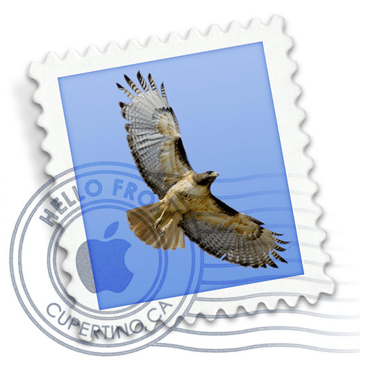
Icons, which have historically had to communicate information at very small sizes, are now having to stand on their own as artwork when presented at larger sizes. This is an incredible challenge for icon designers, because it's not easy trying to create one piece of art which works perfectly for two entirely different uses. I suppose the big worry is that designers won't even try, and we'll get icons that suck at any size.
And now I get to go back to work so I can (hopefully) get caught up before I leave again. Life, she is a bitch.
 Today Apple released the latest version of their Macintosh "Mac OS X" operating system... Snow Leopard (version 10.6). There's not many new features, as Apple has instead concentrated on speed enhancements and other refinements, but it's still well-worth the $29 upgrade.
The speed increase is noticeable. In some cases very noticeable. I never realized how pokey the Finder is at just about everything until I started playing with this new release. Snow Leopard is a leaner, meaner, cat compared to Leopard (Apple claims you'll recover 7GB of hard disk space, I got 9GB on both my desktop and laptop). This alone is worth the price of admission (assuming you have a newer Intel-based Mac that is capable of running it)...
This is not to say that there are not problems. I've only been playing around with it for a day, but I've ran into some things that boggle my mind. First of all, Apple's own software is incompatible. The 2008 version of iWork, which is their alternative to Microsoft Office, has display issues and there are no updates available to fix the problem. Instead, you have to run out and buy iWork 2009 to get working software. This is absurd. I'm not running some 10-year-old program here, but something dated LAST YEAR! Never mind that I already own iWork '09 and just need to install it, Apple should release a patch for iWork '08 for people who don't want to upgrade. Paying to get something that works is the Microsoft way of doing business, and I expect more from Apple.
Icons have been improved by giving you the option to display them up to 512 pixels square! This is glorious if the program/document supports the higher resolution...
![]()
And really crappy if it doesn't...
![]()
But nobody is going to need to display application icons that size... at least not yet. It's document icon previews where this becomes a useful feature. This was a kind of hit-and-miss feature with Leopard. Sometimes icon previews would just universally stop working. Other times they are so slow to update as to be useless. Fortunately, this seems to be solved with Snow Leopard. Previews always seem to work and are rendered blazingly fast. And now that Apple has added an icon-size slider at the bottom-right corner of each Finder window, it's almost like using iPhoto for file management! The ability to look at your photos at 512x512 without even having to open the file or enter QuickLook "preview mode" is awesome...
![]()
PDF documents or documents with PDF previews (like Adobe Illustrator docs) render nicely. Snow Leopard even adds a piece of graph paper behind the icon so that documents with transparency still look like document icons...
![]()
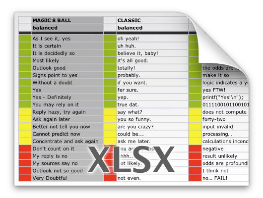
Remarkably, zooming in on any supported document, like an Excel spreadsheet, gives you a fully-functional preview...
My biggest problem with Snow Leopard has nothing to do with icon previews, which are pretty great... it has to do with the "improvements" they've made in the Dock. Some are worthwhile (LOVE being able to scroll through stacks and drill down in folder hierarchy within the Dock at last!) but the new contextual menus? Not so much.
It used to be that a double-click-hold on an application icon in the Dock would bring up a sweet contextual menu to perform program functions without actually switching to that program. Such as being able to double-click-hold on the Apple Mail program icon and tell it to "Get New Mail." Or double-click-holding on iTunes and telling it to "Mute Sound"... all without having to switch out of the app you're in...
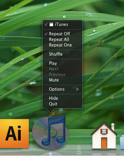
This is really convenient, and I use it all the time. But now a double-click-hold on an application icon will put it under the spotlight and reveal all program windows "Expose" style. I can see where this might be handy for an app that has tons of windows open. But for something like iTunes which only ever has ONE window open, it's just fucking stupid. A once handy feature is now practically useless...
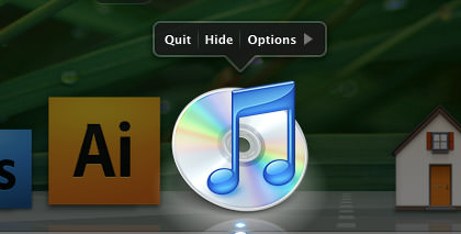
So now, in order to get the old contextual command menus, you have to RIGHT-CLICK on the program's Dock icon. Which isn't so bad... IF YOU HAVE A MOUSE WITH A RIGHT MOUSE BUTTON! But what about on my MacBook Pro WHICH DOESN'T HAVE A RIGHT MOUSE BUTTON?!? Oh... you have to fake it by reaching up to the keyboard and hunting down the "Control" key so you can press it while you single click. The new "shortcut" is actually MORE WORK than just switching to the program and interacting with it directly. This has put a serious crimp in the way that I use the Dock and I HATE IT! It's like Apple gave you a wonderful new toy in Leopard... then took it away and replaced with with a steaming pile of shit in Snow Leopard. Why not make this a preference so I can CHOOSE how I use the Dock instead of forcing me to deal with this "new and unimproved" bullshit?*
Oh well, I guess you've got to take the good with the bad. And, in this case, the good does outweigh the bad by quite a large margin.
There are other features to Snow Leopard (Universal Access has some impressive upgrades)... but the speed, hard disk savings, icons, and Dock changes are the ones I notice the most.
And now all we Mac-Whores start counting the days until the next Mac OS X 10.7 "Sabertooth" upgrade...
*UPDATE: Ren points out that a two-finger click will work to bring up the contextual menu in the Dock. And it does... if you have "secondary click" enabled in the Trackpad Preferences (mine was turned off for some reason). This is a little clutzy compared to how I used to do it, but it's certainly better than nothing! Thanks, Ren!
UPDATE: Sven over at Quarter Life Crisis has a much more in-depth review of Snow Leopard, and has found a terminal command line trick which can restore Dock functionality by Lap Cat Software.
