
 I have a deep love of finding beauty in every day objects.
Many a time I have spent more for something because it looks nicer than the competition. My kitchen utensils, for example. The basic corn peeler you can buy is functional and cheap. But the OXO Good Grips corn peeler looks nicer. It's pretty black and yellow. Probably works the same, but I like the look of it. So I pay extra to get the OXO Good Grips version and am happy to do it.
It will come as no surprise that I'm a Certified Apple Whote.
Apple has built an entire industry over making their products look better than the competition... sometimes at the expense of features and functionality. Yet the trade-off doesn't matter to me. The specs for Apple devices are always enough for me to work within, so I am always all-in on their products. Always have been. Sure there are a few products they made that weren't the best (that stupid-as-shit "sunflower" iMac G4 was a grotesque insult to design, and I remain baffled that Steve Jobs ever let it go into production with it's ugly-ass bulb base and heinous neck joint... GOOD LORD!).
Some of Apple's products I purchased knowing that they were shit specs because I just loved how beautiful they were. Take for example the Power Mac G4 Cube. Oh how I loved that thing! It was grossly overpriced for the features you got, but just look! LOOK AT IT! BASK IN ITS GLORY!...
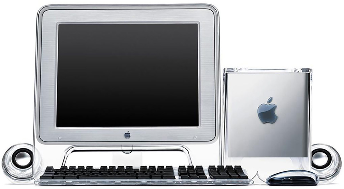
I have thought about buying an iMac mini and upgrading the guts of my G4 Cube many, many times. Then I could buy a better-looking monitor to match it and have one sick-looking showpiece of computing to display in my home!
But it's kinda senseless to go to the expense and effort when I can just buy an all-in-one iMac that looks beautiful in its own way. If I want the Mac Cube to be on display, I can just set it next to the iMac and leave it at that.
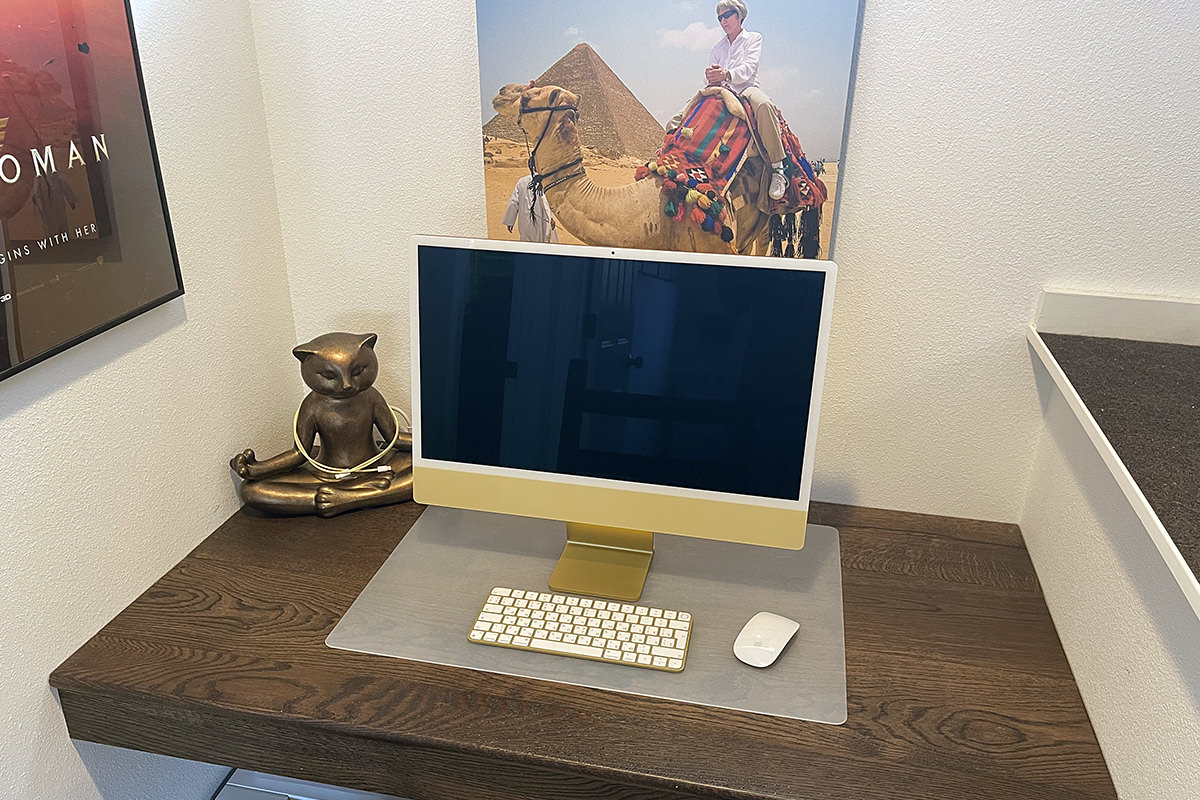
As I mentioned Tuesday, when my ancient iMac finally died for good, I took it as a Sign from Above that I should replace it with one of Apple's pretty new iMacs. More specifically? The pretty new yellow iMac, which you can see here on my built-in-computer desk (a necessity since my cats took over the room I was using as my office)...
THE COMPUTER
When it comes to the design of the iMac itself, the thing is beautifully and impossibly thin. 11.5mm to be exact. And the computer itself (thanks to the all-in-one M1 processor chip that sits in the iMac's "chin") doesn't really exist that you can see it...

Pictures seriously don't do it justice. You need to see it in person to comprehend just how thin this thing is. And the fact that there's just a single cord coming off of it in so many cases (most everything is wireless now-a-days) the thing literally looks like it's made of magic.
So... no complaints about the industrial... but the actual look? Yikes.
THE CHASSIS COLOR
Something I wanted to separate out here is the actual color of your computer. The color on the front is printed on plastic, so it's literally light yellow (as shown in the Apple photos). But since the rest of the computer color is printed on metal, it's not a flat, brilliant yellow like what's shown on Apple's website...
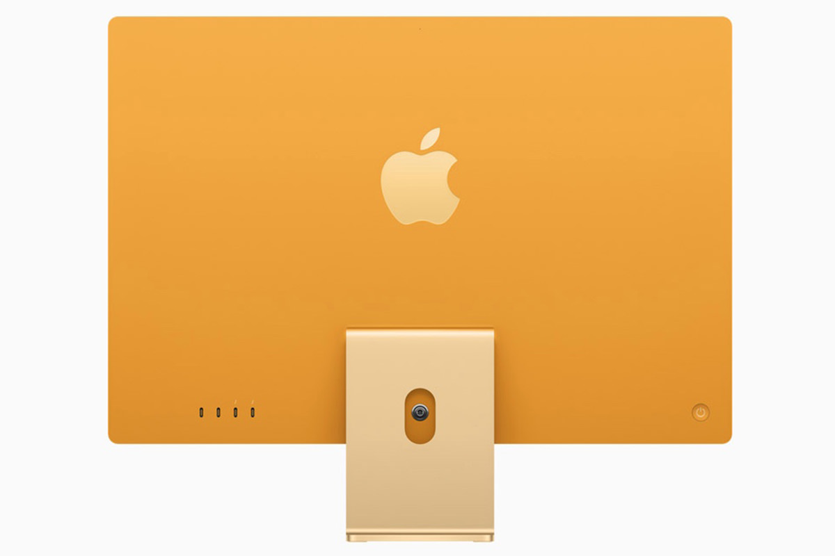

Not even close!
On the metal parts, my computer looks far more "gold" than "yellow." It's actually quite pretty on the back... which I'll never see because my computer is against a wall...
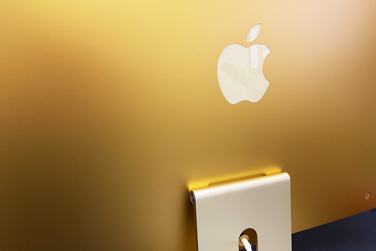
But the metal part I do see on the stand... well... looks like it's... ummm... urine-stained aluminum? It's nice enough when well-lit (as you can see above), but in the shadow that the iMac display casts over it? Looks like urine-stained aluminum to me...
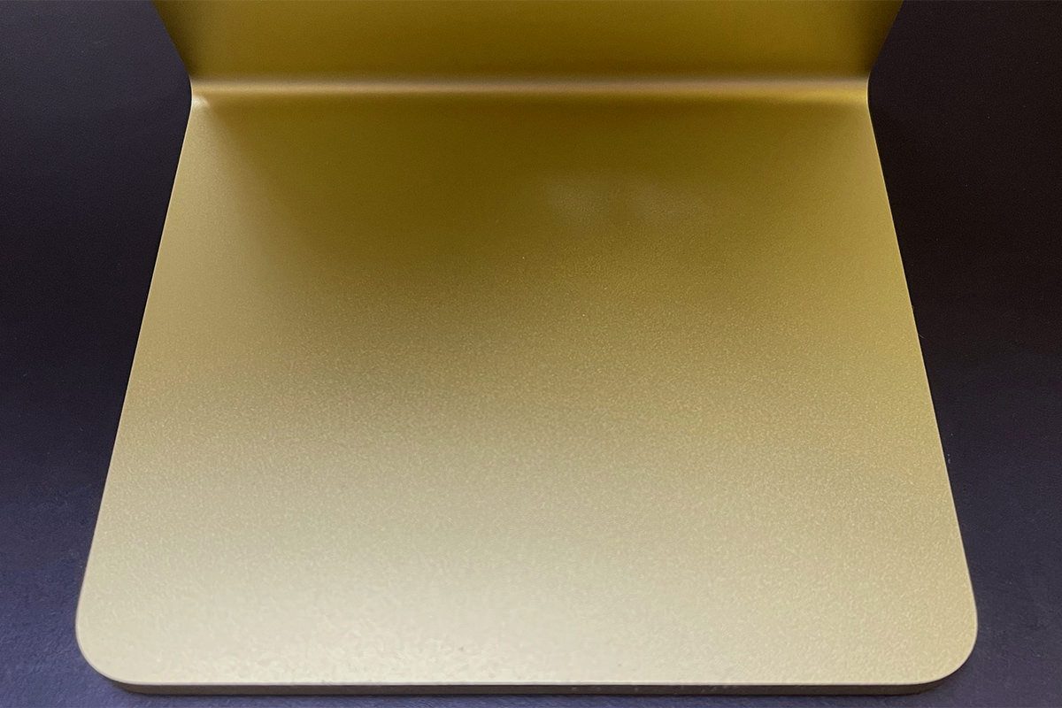
Overall, I think Apple's design aesthetic for the new iMacs is gross and shitty. Three different shades of yellow that don't match, don't harmonize, and look bad together. Maybe it's better on the other colors? I wouldn't know. There's not an Apple Store around her for me to see them. In the end, this is amateur hour bullshit. I definitely regret spending $200 extra to get the yellow color. If it were the same color as on Apple's website, I would have been thrilled. But this is a botched look that is just plain bad and Apple obviously had to Photoshop it so that people would order something that doesn't exist. Oh well. It's not distractingly bad, so it's easy enough to ignore... I just wish that I hadn't trusted Apple and spent the extra $200 for a pretty computer that I didn't get. If you're in the market for one of these things, I highly recommend seeing them in person before you purchase.
THE DISPLAY
The display is a 24" Retina Display that looks as incredible as you'd expect. Since it's bigger than my MacBook Pro and smaller than my 27" iMac at work, I'd describe the size as "cozy." The work I do demands a large screen for efficiency, but this is plenty big to get actual work done (especially since my old iMac was only 20"). Colors are vibrant. Brightness is better than good (actually too bright at maximum brightness!). Contrast is amazing. And since it's Retina, that means the pixels just disappear to make the screen look like a photograph. The glass is, oddly enough, somehow not as reflective as my other iMacs. It feels smooth, so the anti-glare coating must be under the glass. Whatever is happening, the display looks a touch soft. Not as crisp as my other Macs. This is not terrible, but it has taken some time for me to get used to.
The issue that many people have with the display is that it's surrounded by a white border instead of a black one. But, honestly? It doesn't look white when I'm working on it... it looks grey. And kinda blends into the wall that's behind it. It will only look white when you are shining a light directly on it, which you would never do because then you'd be fighting glare off the display. So settle down, yo. The color on the thing is superb. Just look at this...
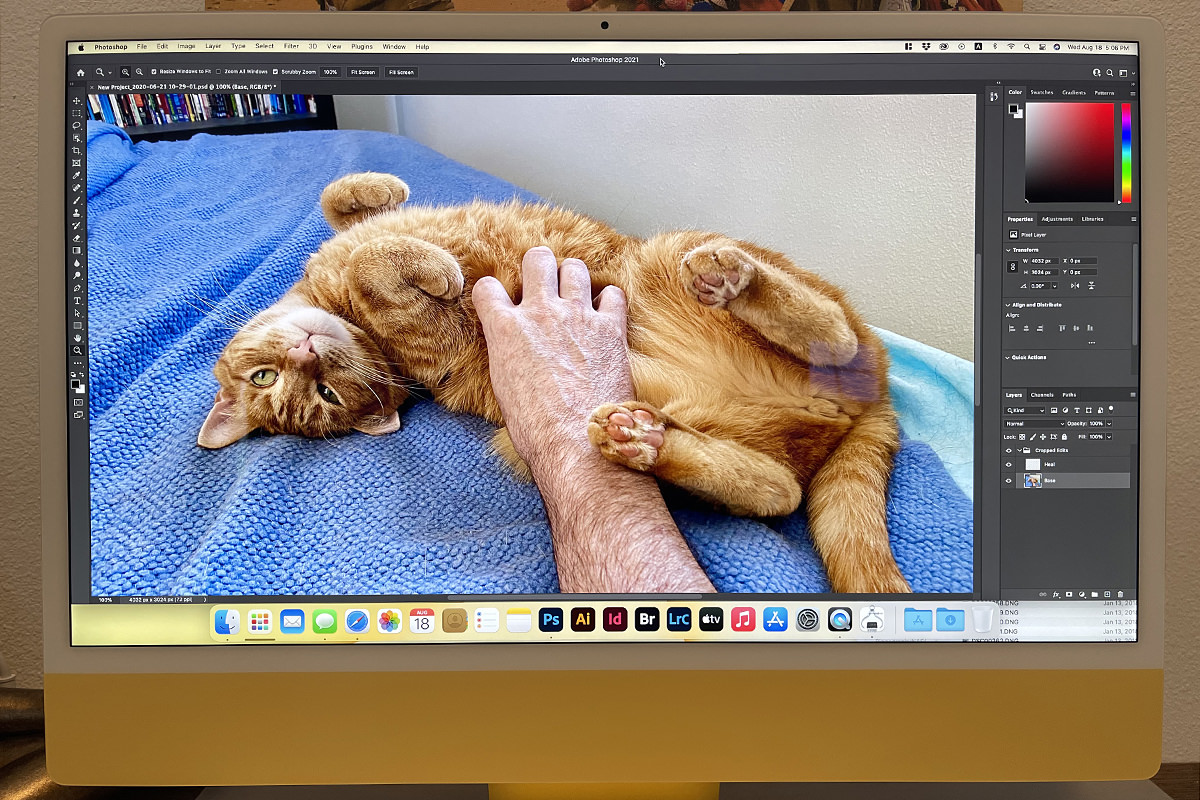
And that photo doesn't even really do it justice.
I have zero problem with the "white" border and don't understand what the fuss is about. The display for my Mac G4 Cube that I showed above didn't have a black border and I was fine with it... just like I am with the "white" border around the new iMac display. It's a complete non-issue, and helps to complete the aesthetic that Apple was going for (which, as I said above, is pretty fucking bad, alas).
THE SOUND
Despite Apple's hyperbolic claim that my new computer would have "The best sound ever put into a Mac," I was dubious. How could it possibly have better sound than my old iMac and my work iMac which have considerably more thickness to them for speakers? Well... I dispute Apple's claim. The sound is good... very good even... but I don't think it's quite as good as my
THE CAMERA
For whatever reason, Apple has consistently put shitty self-facing cameras on their hardware. No clue as to why. But if there's one thing that these COVID times made very clear, Mac users have gotten the short end of the stick when it comes to remote meetings. I Zoom with a colleague and they look great... while my image looks like shit because I'm on a Mac. Thankfully, Apple has finally gotten off of their ass and done something about this. Well, two things, actually. First, the new iMac's camera is 1080p, as it should have been for years now. Second of all, the M1 chip is so speedy that the camera image can be optimized in real time to give a better picture. Something I verified this morning on a Zoom call. Even if the person you're speaking to doesn't have internet speeds that can handle 1080p, the image still looks better thanks to the post-processing that the M1 does. Score. And score. I just find it pathetic that it took a frickin' pandemic to get Apple to do something.
THE ACCESSORIES
Regardless of the color you choose, I hope you really love that color... because Apple uses it everywhere! My keyboard is yellow (gold). The sides of my mouse are yellow (gold). The cable to charge my keyboard and mouse is yellow. The MagSafe power cable is yellow. The desktop background defaults to yellow. It's yellow-palooza up in here! The keyboard/mouse is the same metal as the stand. But since they aren't in shadow like the stand, they look like pretty gold instead of urine-stained. The cables are closer to the color on the front of my computer, but don't match exactly... adding a fourth yellow to the mix that doesn't harmonize with any of the other yellows. What in the hell was Apple thinking here? It would have been better to not match stuff color-wise if it's not actually going to match!
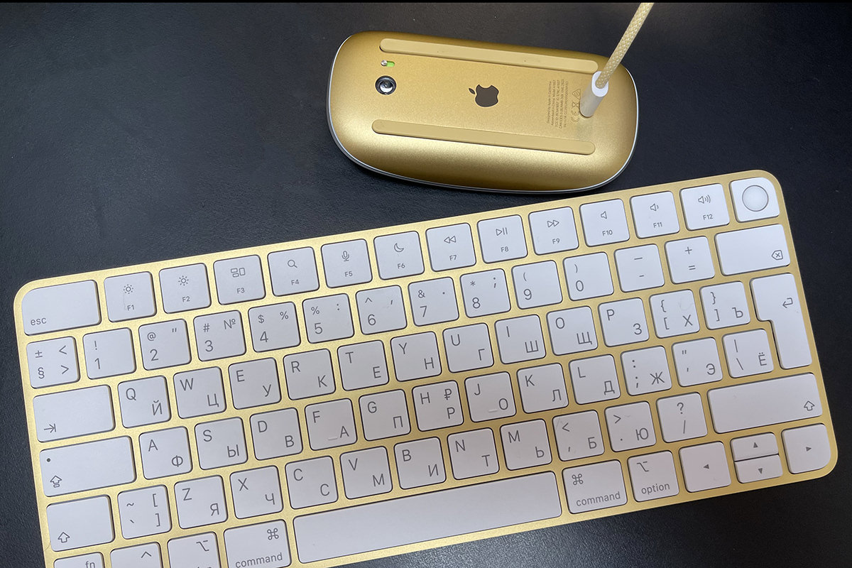
I am studying Russian at the moment, so I got a Russian keyboard. Interestingly enough, the iMac knows what language your keyboard is in when you connect to it over Bluetooth. So when I selected "English" as my preferred language, Russian was added as a keyboard input method automatically. Very cool. Very Apple. The keyboard itself is okay, for the most part. Keys have very little "travel" which is not great, but typing is not overly-difficult. I do wish that it was angled a bit more like my keyboard at work... it's like typing on a laptop instead of a desktop... but I think I can get used to it. INTERESTING TO NOTE: When not typing in Cyrillic (Russian), I would prefer to use an American English keyboard. I thought I might pick one up, but Apple doesn't let you order one in yellow... only silver. Had I known this, I would have ordered my keyboard in English and bought the add-on keyboard in Russian since I type in English much, much more often. But oh well. Eventually I'll get used to the shorter left-hand shift key and the super-skinny return key. I hope.
The mouse is Apple's Magic Mouse and just as crap a design as it's always been. Run out of battery? Sorry... you lose! The plug to recharge your mouse is on the bottom for some absurd reason, so you're without a mouse until you've charged it up. Is it really that damn difficult to design a mouse with the charging port coming out of the top like a corded mouse so you can plug it in and use it when the battery dies? Apparently.
I ordered the next-level-up from the base model so I could get my iMac in yellow (gold), which means Lemon included a gigabyte ethernet jack. But since an ethernet plug is deeper than the iMac, they couldn't put the port on the iMac itself. Instead they put it on the power brick. This is actually fine by me. If I ever get ambitious enough to run ethernet up to my desk, it will work just fine...
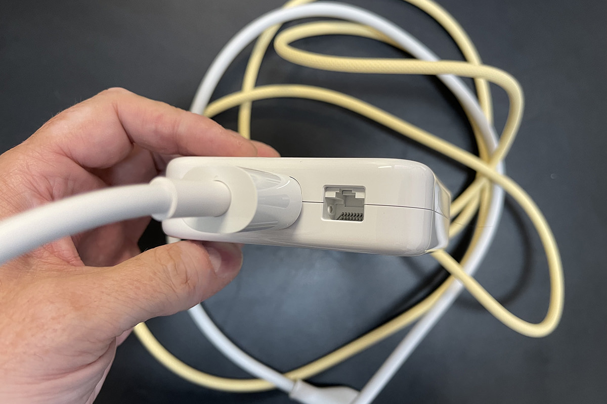
As an aside here, why is Apple using a 1GB port when everybody else in the known universe puts in 10GB ports? Not that it matters to me. My heinously expensive Amplifi Alien router doesn't have a 10GB port anyway. SO SICK OF THESE COMPANIES CHARGING A PREMIUM PRICE FOR NON-PREMIUM SPECS! Though that's par for the course for Apple, so why am I not surprised?
And that... plus a keyboard and mouse charging cable... is all you get in the box. As this is Apple, you don't even get an instruction booklet! Not that you need one. You plug it in and the iMac says "Hello" and tells you what you need to do to get started.
THE PORTS
As I mentioned on Tuesday, the base model comes with two USB 4 ports (that accept USB-C plugs). The next-step-up model that I got also includes an additional two USB 3 ports (that accept USB-C plugs). What I forgot to mention on Tuesday is that there's also a headphone jack! It's easy to miss because it's on the side of the iMac chassis (the plug is deeper than the computer, so they couldn't put it on the back!). This is kinda weird considering that Apple is obliterating the headphone jack everywhere else... but yay? I dunno. I've switched over to wireless for everything and don't even think I own a pair of wired headphones any more.
DESIGN CONCLUSION
How Apple managed to craft something this amazing only to make it look this shitty boggles my mind. I ordered a yellow iMac. Instead I got a gold/urine/yellow/pale yellow iMac where none of the "yellows" match... at all. A part of me wants to return this and get a blue one or something that might not look as shitty, but I don't think I care enough to go through the trouble. Which is something Apple is undoubtedly counting on. What's infuriating is that they very clearly Photoshopped the images on their website. I mean it's blatantly obvious that they Photoshopped the images, and that's some bait-and-switch-bullshit. What you see is not what you get. Because when you go to Apple.com, the yellow computer is very clearly yellow in every shot they show you. But as you can see from my actual and unretouched photos, it's clearly gold.
Anyway...
Tomorrow I'll do a dive into actually using the thing. Does the M1 live up to the hype? Or is it just another pack of lies from Apple?

I love comments! However, all comments are moderated, and won't appear until approved. Are you an abusive troll with nothing to contribute? Don't bother. Selling something? Don't bother. Spam linking? Don't bother.
PLEASE NOTE: My comment-spam protection requires JavaScript... if you have it turned off or are using a mobile device without JavaScript, commenting won't work. Sorry.

Great review, thank you. I always wonder what will I buy next? 24 inch vs 27 inch, do you find a big difference in working on the two? I have a 27 inch at home, was worried that the smaller size would feel small.
In my review I called the 24-inch model “cozy.” At home I think it’s perfectly fine for what I do… including occasional work projects. But for work I would absolutely want a 27-inch model. That’s what I’m used to and, for the work I do, I think it’s necessary to get the most speed out of my work day.
Well if only I had read this post first, the answers about the Russian keyboard were right here!
Also: I had NO idea there was a headphone port on the side until I read this. Not even sure I have any headphones that still use that, honestly. I had a pair of over-ear Skullcandy headphones I used with my older iPhones and first-gen iPad Air (up until I replaced those with models no longer having a headphone port), which I then used with my work laptop for calls for quite a while, till I started having mic issues. Pretty sure I tossed those, though!
The fact that they managed to put a headphone port on the side leads me to believe that they COULD have put an SD card reader on the side as well. It’s absolutely nuts that this is not the case. They want you to spend $36 for yet another stupid dongle. When you can pick up an SD card reader for $6. Utterly maddening. And could we have gotten JUST ONE USB-C on the side as well so we don’t have to turn around the entire computer to add the dongle in the first place? I keep waiting for like this to be released.
That yellow does tend to look more gold in color depth.
I have a white Magic Mouse 2 that I use as a backup to my Magic Trackpad 2. Who was the engineer that thought putting the mouse into “dead mode” to charge it was smart. I mean, at least put in the back not on the bottom. This is why Reba still uses Magic Mouse 1 with replaceable rechargeable batteries.