 Good news, everyone!
The twentieth issue of Thrice Fiction magazine has been released... just in the nick of time for the August cover date to still be in August! And you can read it online or download it for FREE at our website!
This time we are honored to feature a gorgeous cover illustration by Chilean artist Alvaro Tapia Hidalgo, who does work for The New Yorker, The Washington Post, Wired, Rolling Stone, New Republic, Forbes, Harper's Bazaar, and other fine publications. Many thanks for his kind generosity in allowing us to feature his artwork in this issue...
If you'd like to see more of Alvaro's stunning work, head over to his website and prepare to be blown away!
And now... what are you waiting for? Go take a look at the latest issue of the best fiction 'zine you're not reading: Thrice Fiction!
 Rather than focus on the hideous events from another tragic day in this country, I thought I'd search for something positive about the good ol' USA that doesn't fill me with overwhelming dread and embarrassment.
I didn't have to go far.
I recently got a notice that Rob Decker is having a killer sale through the month of August on his incredible US National Park posters. There are many people/companies creating these, but Rob's are my hands-down favorite (he studied under Ansel Adams!). He bases the designs on his own photography, and crafts them in the style of the old-time WPA Federal Art Project posters that were made in the 30's and 40's. They are magic...
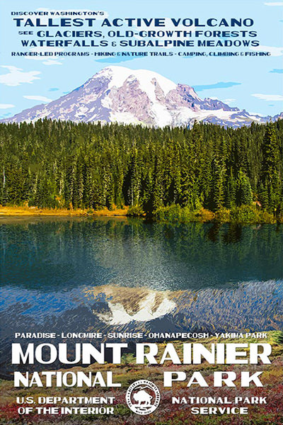
Artwork © Rob Decker
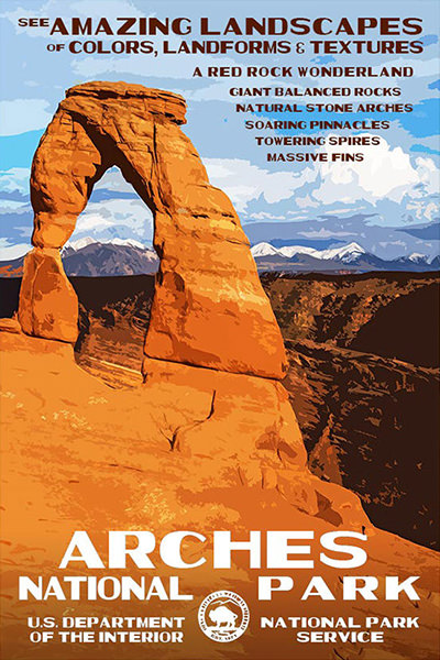
Artwork © Rob Decker
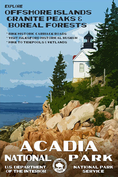
Artwork © Rob Decker
All of these gorgeous 13×19 posters are signed/numbered limited editions and usually retail for $30 each (which is a total bargain)... but with his sale, you can pick them up for as low as $20 each!
Talk about something Americans can be proud of... our incredible 59 National Parks are national treasures and truly showcase America the Beautiful. I visit them whenever I can, and have plans to visit more in the near future. Here's my list with a check next to the park posters I own (click on a National Park to visit its Wikipedia Page)..
| National Parks I've Visited (19) | Planning to Visit 2017-2020 (8) | Have Not Visited Yet (32) |
|---|---|---|
| Acadia ✓ | Death Valley | American Samoa |
| Arches ✓ | Joshua Tree ✓ | Badlands |
| Bryce Canyon ✓ | Kings Canyon | Big Bend |
| Canyonlands ✓ | Pinnacles | Biscayne |
| Capitol Reef | Sequoia | Black Canyon |
| Crater Lake ✓ | Shenandoah ✓ | Carlsbad Caverns |
| Everglades ✓ | Wind Cave | Channel Islands |
| Glacier ✓ | Yosemite ✓ | Congaree |
| Glacier Bay | Cuyahoga Valley | |
| Grand Canyon ✓ | Denali | |
| Great Smoky Mountains ✓ | Dry Tortugas | |
| Haleakala ✓ | Gates of the Arctic | |
| Hawaii Volcanoes ✓ | Grand Teton | |
| Mount Rainier ✓ | Great Basin | |
| North Cascades | Great Sand Dunes | |
| Olympic ✓ | Guadalupe Mountains | |
| Redwood | Hot Springs | |
| Yellowstone | Isle Royale | |
| Zion ✓ | Katmai | |
| Kenai Fjords | ||
| Kobuk Valley | ||
| Lake Clark | ||
| Lassen Volcanic | ||
| Mammoth Cave | ||
| Mesa Verde | ||
| Petrified Forest | ||
| Rocky Mountain | ||
| Saguaro | ||
| Theodore Roosevelt | ||
| Virgin Islands | ||
| Voyageurs | ||
| Wrangell–St. Elias |
Just for fun, I mapped them all out in Google Maps here...
Rob plans on eventually releasing posters for all 59 National Parks, so hopefully Hawaii Volcanoes, North Cascades, and Redwood will be added to my collection soon!
In the meanwhile, I rearranged my stairwell wall so I can fit my recent purchases into my collection...
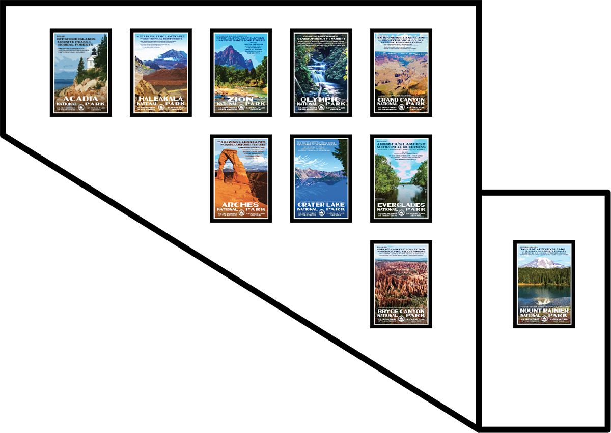
Annnnd... my wall is full now! As I visit more National Parks, I guess I'll have to add any new posters to my office the cat's room walls.
 Did you know that yet another issue of Thrice Fiction Magazine will be debuting this month (hopefully)?
Well, it's true!
And while I don't want to give any of the awesome stories away, I thought I'd take a minute to share one of the art pieces I put together last night.
My favorite way of creating art to accompany a story is to draw, paint, or photograph something of my very own. But there are times that it's just not possible for what I'm trying to communicate. For one particular story in our next issue, I wanted to create a Bon Appetit magazine-style page. My vision was to have a kind of fried fish/prawn hybrid sitting on a plate in a Japanese restaurant... perhaps with a dollop of wasabi on the side. Being a vegetarian who hates seafood, the idea of putting fish parts in my deep-fat fryer filled me with horror, so I decided the best way to get what I wanted was to buy stock photos and assemble them into what I was envisioning.
And so I searched Adobe Stock for the pieces I needed...
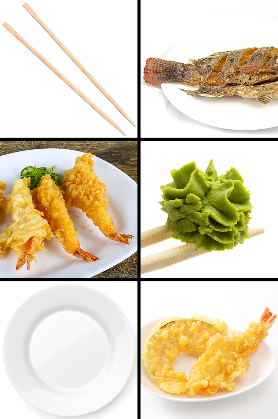
Then downloaded preview images into Photoshop so I could see if they would fit together well...
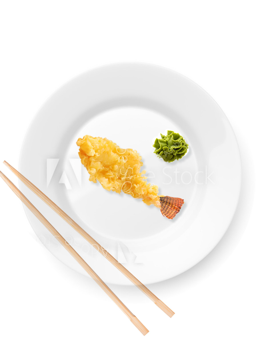
Then, once I was happy with all the parts and pieces I found, I'd purchase the full-res photos and get to work. I had to combine three pieces of fried fish/prawns into one... add it to a plate with some wasabi and chopsticks... then paint in shadows to bring it all together and make it look "real-ish"...
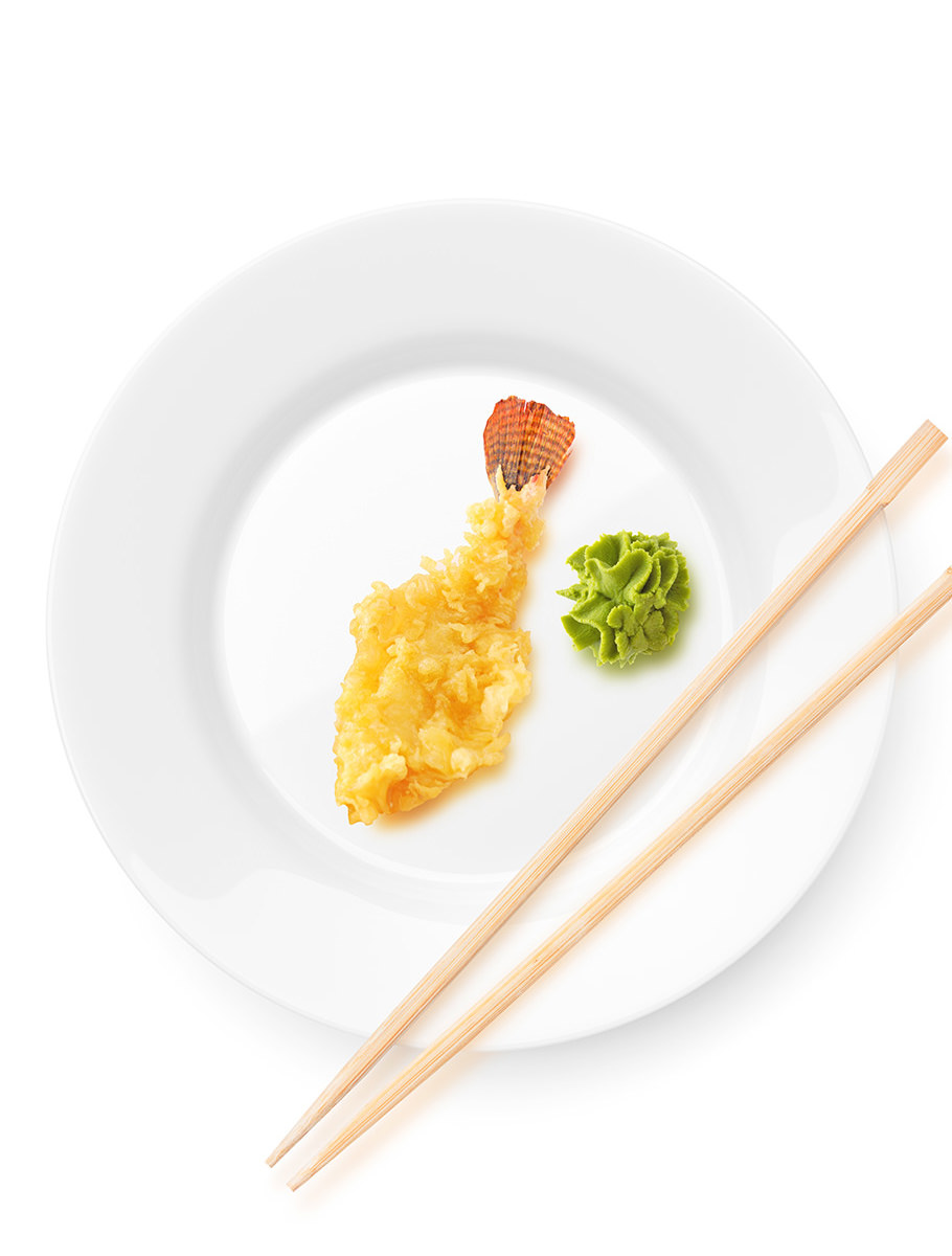
And voilà! A fish-prawn thing is served!
To find out why it's served... you'll have to download the April issue of Thrice Fiction, coming soon!
 Wow.
Wow.
This kind of artistry makes my heart ache...
Everything about these cookies is mesmerizing. I can only guess that they taste amazing as well...
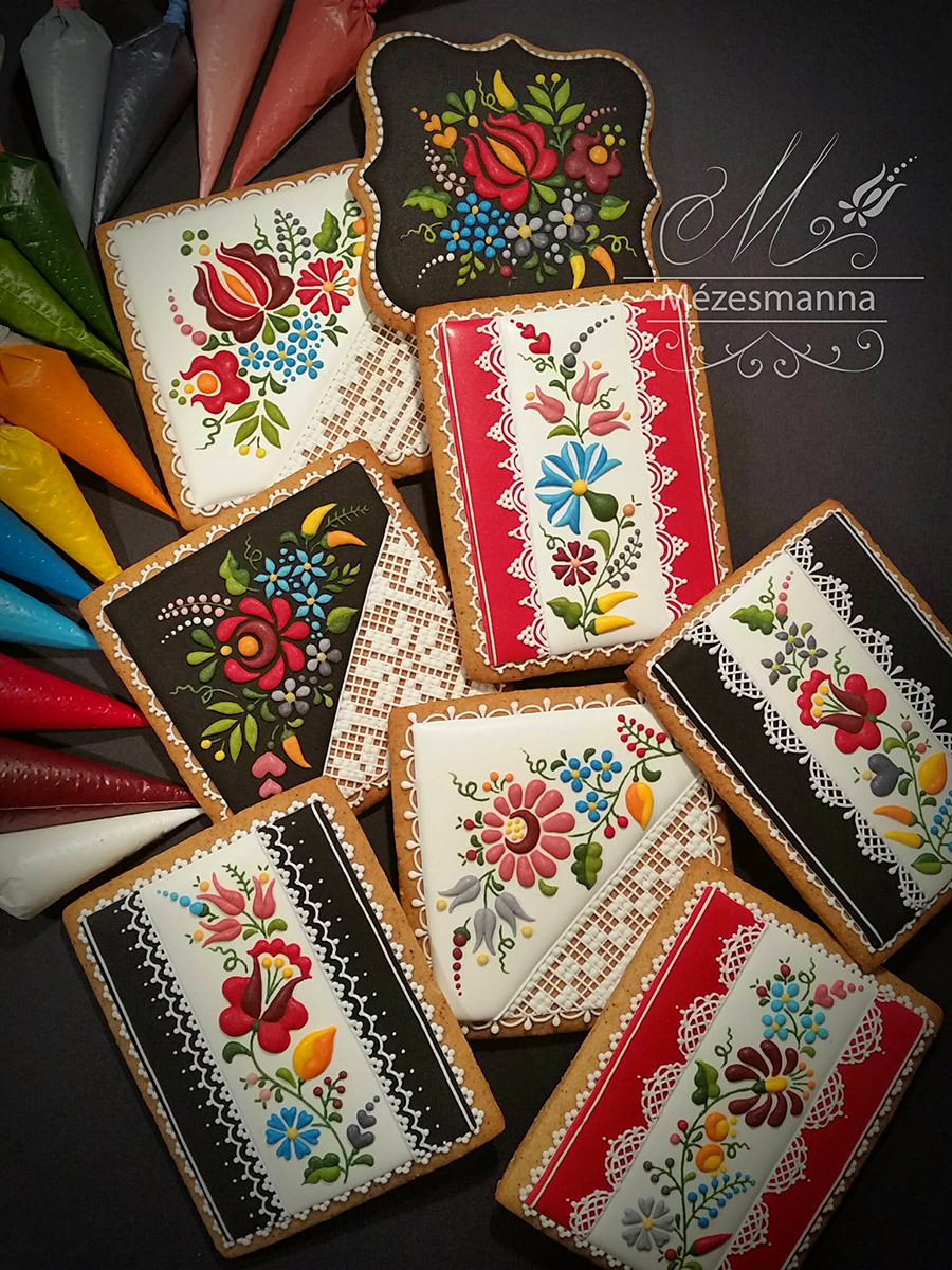
If you're looking to be completely blown away... here's her Facebook page.
 The holidays must be near, because the gift of Bullet Sunday starts... now...
• AVOID! I'd like to begin this entry with "Screw United Airlines," easily the worst airline going. They bring nothing but misery, and just don't give a fuck. I'd rather eat a piece of shit encrusted with pubic hair than to ever give United Airlines one cent of my money.
• Ware. Chris Ware is one of my favorite living artists. His work provides insight into the human condition in a way few people can match. This is his latest...
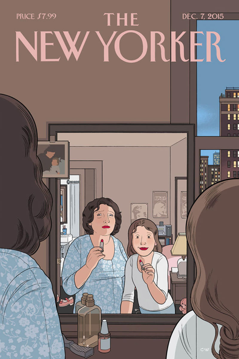
As if that wasn't gift enough, a "behind the scenes" exploration of the cover has been ANIMATED over at the New York Times website. Absolutely worth a watch. Click here immediately to experience it.
• Rescue. Speaking of cats... essential viewing...
Catfishing! Amazing that somebody probably abandoned the poor things out there.
• SvB. Oh gawd. The Superman vs. Batman film looks even worse than I imagined. Even worse than the pile of shit that was Man of Steel. How could DC have fucked this up so bad? Oh... Zack Snyder... that's right. Let's overdramatize the shit out of even the most mundane moments. People love that. Barf...
This makes Superman IV: Quest for Peace look like total genius... because at least that turd had Gene Hackman in it. Jesse Eisenberg's "Lex Luthor" is a fucking embarrassment. I can't help but wonder if this movie fucking tanks... as it rightfully should... what happens to the DC cinematic universe? Hopefully it gets flushed down the toilet so somebody who gives a shit about the comics can start over.
• Regerts. A kitten who regretted his life choice...
Does it GET cuter than this?
• Diamonds. Dayamn! No pressure...
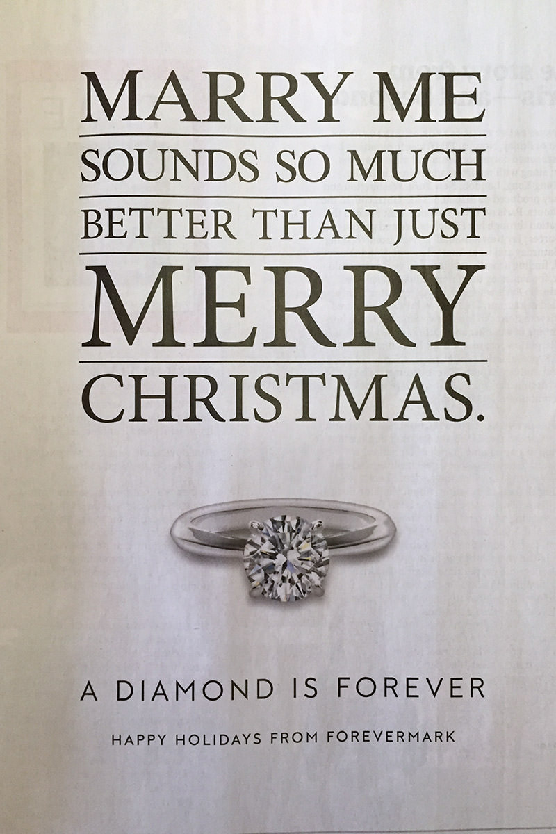
And also... WAR AGAINST CHRISTMAS!!!
I'm spent. No more bullets for you.
 Today's your lucky day! There's a brand-spanking-new (and FREE!) issue of Thrice Fiction out today!
As usual, I'll be discussing the artwork that went into our latest issue. This may or may not include spoilers for the stories, so I urge you to please read it before proceeding.
All done? Then... here... we... go...
Putting together the artwork for a non-profit magazine which relies solely on the generosity of its contributors is both a thrilling and frightening prospect. On one hand, you get to work with some amazingly talented people at the top of their game who regularly blow you away with their creativity and their kindness. On the other hand, people working for free can be an unreliable resource. And who can blame them? If a paying gig comes along that's going to take care of your rent and put food on your table, you drop everything and take the job. If you have an opportunity to do something that will advance your career as an artist, you drop everything and do it. Heck, even if it's something frivolous and fun that comes your way when the alternative is slaving away on something you're not getting paid for? Yeah, go for it. I get it. Honestly I do. And I try not to be upset when it happens, because that's just the way free work goes.
This month I had the grand ambition of letting our stable of "regulars" have an issue off. It's a busy summer for everybody, I've gotten plenty of new submissions for artwork, and it seemed a nice thing to do.
Except when all four of your new artists end up not working out. Then it's just plain folly.
Luckily for me, begging and pleading to Thrice Fiction staples Kyra, Katelin, and Chad were met with offers of help, or you'd be reading this is October. The fact that they not only took time out of their busy schedule to step up and bail me out... but that they did so at the last possible moment with a ridiculously short deadline is what I'm talking about when I say "amazingly talented people at the top of their game who regularly blow you away with their creativity and their kindness." Truly, from the bottom of my heart, thanks so much for your dedication to Thrice Fiction, which would be something entirely different if not for you.
And now for a look at the art that went into the first half of Issue No. 14...
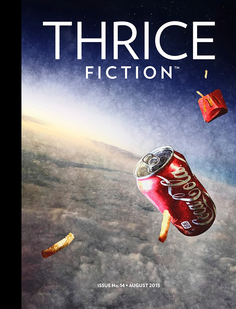
This installment's cover was dreamed up by yours truly. It came about as I was reading an article about the increasingly horrific consequences of all the "space junk" humans are leaving in orbit with breakfast one morning. Then, as I was driving to work, I saw that somebody had tossed a sack of McDonald's garbage on the road, and it occurred to me that it's only a matter of time before that stuff like this ends up in orbit as well. Yadda yadda yadda... heeeere's our cover! Originally I used a photo of that same McDonald's garbage (which I stopped and picked up) for the elements on the cover. But it wasn't blowing my socks off, so I decided to use a metal Coke can instead of the McPaper Cup since it reflects light better... and a previous photo of McDonald's fries that was more interesting than what I got. The background image is a photo I shot out of an airplane which has been layered with a starry night photo I took in Africa. All thirteen parts of the finished illustration were independently textured, shaded, then composited Photoshop.
It turned out rather good, if I do say so myself. If nothing else, it has terrific visual impact and a good sense of "What the heck?!?" which is what I like for our covers in the hopes that it makes people curious enough to download the magazine.
And now, for a look at the first half of the art included in this issue, read onward in an extended entry...
→ Click here to continue reading this entry...
 Welcome to PART TWO of a discussion about the art that's running in the latest issue of THRICE Fiction Magazine!
If you haven't read PART ONE yet, you should do that first.
And if you haven't downloaded a FREE copy of our April 2015 issue... then you should definitely do that first because, WARNING... SPOILERS MAY ENSUE!
Putting together an issue of Thrice Fiction is no walk in the park. There's hours of work put into it from myself and others before it all comes together. Once all the art is in, I then get to assemble the Print PDF (for those wanting to purchase a printed copy at MagCloud), the Download PDFs (for those grabbing their FREE copy off our website), and the ePub/Kindle versions (for those who have an e-reader, also available FREE at our website). Then there's proofing, revising, and correcting... it goes on and on. Until it doesn't, then we're done.
There are times along the way where I ask myself "Is this really worth all the time and effort it takes to put this thing together?"
And then I take one look at the finished issue and the answer is always the same... yes, it most definitely is worth it. This issue was more difficult than usual, which made the finished magazine even more worth it.
And in four months we do it all again.
Now on with the second half of the art you'll find in our latest issue...
→ Click here to continue reading this entry...
 Lucky you! There's a brand-spanking-new (and FREE!) issue of Thrice Fiction out today!
As usual, I'll be discussing the artwork that went into our latest issue. This may or may not include spoilers for the stories, so I urge you to please read it before proceeding.
All done? Then off we go...
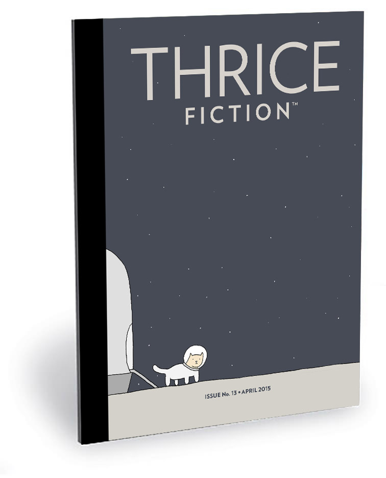
Our Editor at Large, RW, has long been lobbying to add some comics to Thrice Fiction. On the surface, this sounds easy. But finding the right comics to include in our pages is easier said than done. My first choice was the brilliant stuff that Reza Farazmand is doing over at Poorly Drawn Lines. Not only because I'm a huge fan... but because his work seemed the perfect "fit" for what we're doing.
Not that I expected he would say "yes," of course. Surely he has better things to do than hang out in our little lit mag, right? But nothing ventured, nothing gained, so I worked up some samples of how his work would be presented in Thrice and dashed off an email.
Much to my surprise and delight, Reza not only agreed to let us re-print some of his strips... he also agreed to re-work a panel from one of my favorite Poorly Drawn Lines comics as our cover! And that's how Small Cat came to end up fronting Issue No. 13...

Glorious, is it not?
And now, for a look at the first half of the art included in this issue, read onward in an extended entry...
→ Click here to continue reading this entry...
 Hey! Did you know there's a brand new issue of THRICE Fiction out?
Well, there is... and it's totally FREE! Click here to download a copy!
As usual, I'll be discussing the artwork that went into our latest issue. This may or may not include spoilers for the stories, so I urge you to please read it before proceeding.
All done? Then off we go...
This issue's beautiful cover was created by Allen Forrest. The guy has created a lot of covers for lit mags, and we're very lucky to have him gracing ours...
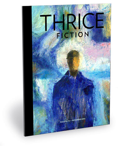
I try to make sure there's artistic variety in our collection of cover art, and am rather embarrassed that we didn't have any impressionistic pieces yet. To have that oversight rectified with such a great painting is icing on the cake. Thanks so much, Allen!
And now, for a look at the first half of the art included in this issue, read onward in an extended entry...
→ Click here to continue reading this entry...
 Welcome to PART TWO of a discussion about the art that's running in the latest issue of THRICE Fiction Magazine!
If you haven't read PART ONE yet, you should do that first.
And if you haven't downloaded a FREE copy of our August 2014 issue... then you should definitely do that first because, WARNING... SPOILERS MAY ENSUE!
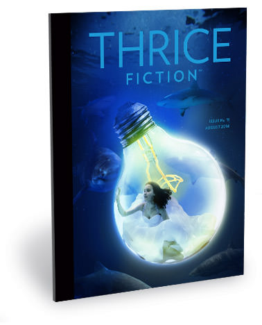
Okey dokey then.
I've said before that laying out an issue of THRICE Fiction is like trying to put a puzzle together where you don't have a box lid to see how it's supposed to end up looking when you're done. Not once have I just dumped all the stories into Adobe InDesign and said "Perfect! I'm done!" Not even close. I move things around over and over and over again... trying to come up with a "flow" between stories that makes for a cohesive reading experience from cover to cover. At least once every issue I'll wake up in the middle of the night and freak out because I suddenly realized I've got the page order all wrong. This issue took a little longer to figure out than most, but I was fairly confident in the layout when it was "finalized" back in June.
It didn't last, of course. Right before release I had a couple of discussions that convinced me I needed to move things around... again. Which wouldn't be a big deal if I wasn't so obsessive about having some symmetry between pages on a spread. Getting that sorted out takes a serious amount of time.
And even though it delayed our release by a few days, I think it was time well-spent. We hope you'll agree.
To read PART TWO of my ramblings about the art of THRICE Fiction Magazine No. 11, read onward in an extended entry!
→ Click here to continue reading this entry...
