 Another summer. Another issue of THRICE Fiction Magazine!
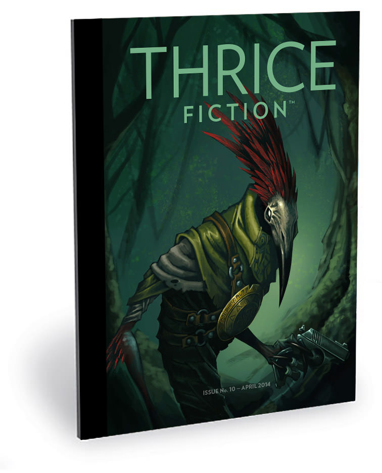
As usual, I'll be discussing the artwork that went into our latest issue. This may or may not include spoilers for the stories, so I urge you to download your FREE copy of Issue No. 11 and give it a read before continuing.
Alright? Alright!
This time around we are very fortunate to feature another beautiful cover by Katelin Kinney...
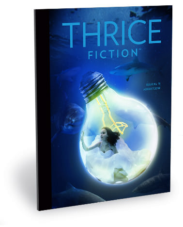
Even though I do composite photo work like this for a living, Katelin has a way of making it seem like magic to me. I've stopped asking her how she constructs these images for us because the magic is more fun.
For a look at the first half of the art included in this issue, read onward in an extended entry...
→ Click here to continue reading this entry...
 And here we are again... this time with a look at the art appearing in the second half of THRICE Fiction Issue No. 10, you might want to go read Part One from last Saturday first (if you haven't already).
Oh, and if you haven't downloaded your FREE copy of our latest issue, that should be your first stop!
Alright? All right!
Last week when discussing the art from the first half of the book, I talked a little bit about the formats we offer for FREE downloads... and how we're wanting to expand into others. Here's the breakdown average from December's issue...
Anybody looking at this breakdown would say "Wow... why do you even bother with anything but PDF?"
The answer is because our "circulation" was around 2850 last issue and, as always when we release a new issue, it has climbed a bit. As of yesterday, we topped 3200. Which means 4% translates into 130 people who prefer to read THRICE via eBook. That's worth the 90 minutes it takes for me to create it. The Kindle version is automatically created from the eBook, so now we're up to around 150 people.
The print edition is just a higher resolution version of the PDF that takes 2 minutes to generate and 5 to upload to MagCloud. For the 30-50 people who want to have THRICE in print (including yours truly), I'll spend the seven minutes to make it happen.
And if we can expand our readership by adding an online version... an iPad version... or whatever else we can think of? We're going to do that too. Because as our downloads continue to blast past our every expectation, even small percentages are going to account for more people than R.W. and I ever dreamed would be reading in the first place. We're happy... nay, thrilled... to provide THRICE in whatever format people want to have it.
So look for our "Cerebral Implant" edition, coming 2025.
And now... back to the artwork for THRICE Fiction No. 10, which you can read about in an extended edition...
→ Click here to continue reading this entry...
 One of the things R.W. and I set out to do when we created THRICE Fiction was to make sure it was available in a variety of formats so people could read it however they wanted. Want to read a printed magazine? You can order a copy. Want to view it as a PDF? It's there. Want to read it on an eBook reader? We got that. Have a Kindle? We got that too. We've had all of it since Day One, and all the digital editions can be downloaded for FREE.
Like our brand new issue released today (featuring a stunning cover by Chris Walton)...

And we're not stopping there.
Our next outlet for THRICE will be an online edition. We want for people to be able to read every issue right on the THRICE Fiction website. There are many, many solutions for doing this, and I've looked at dozens of them. You can see a sample of one solution (from JooMag) here...
If you expand it to full-screen and have a decent-resolution display, it's pretty nice. I don't know if this is the route we'll take, but we'll get it figured out eventually.
Anyway...
Back to THRICE Fiction No. 10! For a look at the first half of the art included in this issue, click onward to an extended entry...
→ Click here to continue reading this entry...
 And... I'm back!
But before I continue with a look at the art appearing in the second half of THRICE Fiction Issue No. 9, you might want to go read Part One from yesterday first (if you haven't already).
Oh, and if you haven't downloaded your FREE copy of our latest issue, that should be your first stop!
Okay? Okay!
Now then... before I get started, I was going to talk a bit about what it means to be closing out three years and nine issues of THRICE Fiction. On our Facebook somewhere, I was joking about how "People said we wouldn't last... shame on them." But it was more than a joke. People were literally saying that we wouldn't last. Apparently there's past precedent: "New magazines rarely make it past a year... two years if they're lucky," they would say.
At the time, I didn't know why that would be. I guessed it was because the magazine ends up being more work than people realize. You start out strong with the best of intentions... but life gets in the way, and eventually the time between issues grow longer and longer until you realize you just don't want to do this any longer. Or maybe the people who quit started their magazine to get rich (ha ha) and the money never came. Maybe they didn't feel enough people were reading to make it worthwhile. Maybe the experience just wasn't what they expected. I dunno. And while I can't speak for our Editor, RW, I can say that it has never occurred to me to pack it in. I'm as enthusiastic about THRICE Fiction now as I was at the beginning. More so, even, because the response we've received has exceeded my wildest dreams.
So many thanks to all our contributors who have made us look so good these three years... and also to our readers who continue to download issues by the thousands. We're so very grateful, and there's more to come in Year Four!
Oh yeah...
The art for Issue No. 9... Part Two!
You can find that in an extended entry...
→ Click here to continue reading this entry...
 There's no fate but what we make for ourselves.
The process of putting together an issue of THRICE Fiction seems simple... the editor hands you a stack of stories, you paste them into a document, you add some pictures, and BLAM! a magazine is born.
Except it's nowhere near that straightforward. And most of that is my own fault.
When R.W. and I first began discussing how THRICE was going to work, I had a very clear direction I wanted for the design of it all...
Of course, had I known three years ago what I know now... I probably would have done things differently. A lot differently. I'd hack stories apart, add art only if I could find it, and just cram stuff in any which way. It would have made my life much easier going forward.
But then THRICE Fiction wouldn't be THRICE Fiction, so I guess everything happened as it was meant to all along.
Which brings us to Issue. No. 9...
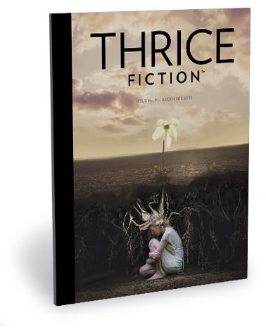
Download the issue for FREE by visiting the THRICE Fiction website!
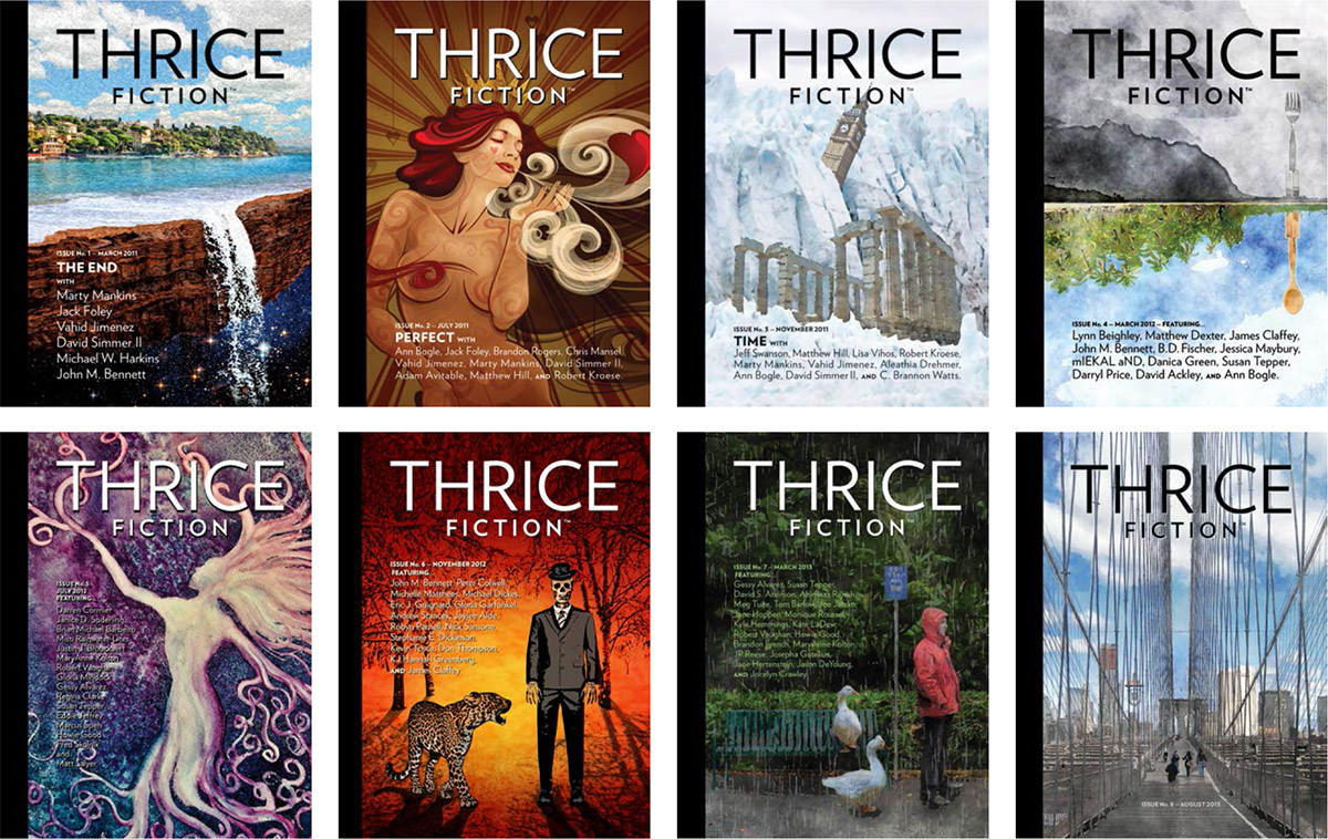
As always, the cover was a struggle. Originally I had done painting for it, but I had already done the past three covers and really wanted something different this time. I was working on an alternative, but that didn't come together this time around, so I was back to my design again.
Until...
I remembered an incredibly talented artist named Katelin Kinney that I was lining up for Issue. No. 10, and decided to throw a Hail Mary pass in her direction to see if she might have something available. Lucky for all of us, she was perfectly happy to let us borrow some works for her portfolio, and we ended up with this amazing cover to close out our third year. It's a photo art composite titled Seed of a Soul, and the reaction to it has been overwhelmingly favorable, so thanks, Katelin!
For a look at the first half of the art included in this issue, click onward to an extended entry... → Click here to continue reading this entry...
 On the bright side, you're half-way there!
This is PART 2 of a two part series on the art found in THRICE Fiction Magazine Issue No. 8. Needless to say, you should probably read PART 1 before continuing if you haven't already.
Or don't... either way, I get paid the same.
Anyway...
When last I left you, we were half-way through the magazine. Kinda. Because while I now have the luxury of going through the issue page-by-page, it doesn't work that way when putting the book together. Absolutely nothing is done in-sequence. Especially this time around, when things were running so late that I didn't have time to reach out to as many artists as I would have liked. Lucky for me, THRICE-regular Kyra Wilson painted two beautiful last-minute pieces she was able to work into her schedule... then Ira Joel Haber came along with his wonderful body of work that really saved my bacon! If not for him, this issue would have slid into September for sure! So, to both of these gifted artists, my heart-felt thanks for your help.


And now, on with the show.
The art of THRICE Fiction No. 8 continues after the jump...
→ Click here to continue reading this entry...
 Stand back, it's a big one!
Laying out an issue of THRICE Fiction is like putting together a giant puzzle where all the edge pieces have been removed. Stories have to "flow" into each other in a way that keeps the reader engaged, yet still manage to make them feel like separate entities. You'd think that the more stories you have, the easier it would be to fit the pieces together because there's more options to choose from. You'd be wrong. It's actually quite the opposite. It's the choice that drags things out and makes things hard. If you only have a few stories, then the way they should fit together is more obvious. With a lot of stories? Well...
Yet, it is what it is.
RW Spryszak and I made the decision early on that the size of the magazine would directly relate to what we have to put in it. If we only received two stories that were "right for us" then that issue has two stories. But we never accounted for THRICE getting as popular as it has. RW is getting hundreds of submissions each issue. Hundreds. Our odds of getting great stories that are "the right fit" for us have exploded.
So I ended up with an issue that was 84 pages which I then had to pare down to 70. Because things start getting expensive after that.
And since THRICE shows no signs of slowing down, we've adjusted our publishing schedule to allow more time. The last thing we want to do is start slapping an issue together haphazardly to meet a date on a calendar, so it was our only option. The good news is that the quality of the magazine can be maintained. The bad news is that our submission window has dropped to one month intervals.
I'm choosing to look at this as a good thing.
Anyway...
Once again I am going to write a blog post about all the art that goes into the issue. But this time it will have to come in two parts. Here is the first half...
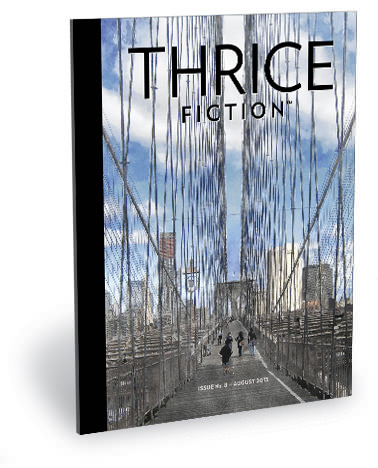
RW had an idea for a cover after reading one of the stories he accepted. He envisioned the Brooklyn Bridge all lit up at night in the fog. I thought it was a good idea, except I couldn't find a photo that would work. All my photos of Brooklyn were shot in the daytime, and any nighttime shots I found weren't working. I decided to just up and DRAW the idea, but I could never get it to come together. The Brooklyn Bridge is a very specific structure and people know when you get it wrong. I simply didn't have the time to get it right. Or I'm just not that talented an artist. Regardless, I had to try a new approach.
So night became day, fog became clouds, and away we go.
The photos I had taken from my last visit to Brooklyn were a good start. I wanted the cover image to be on the bridge instead of looking at it, and I had plenty of shots for that. But the clouds were never where I wanted them to be. This meant I had to painstakingly cut out the bridge so I could manipulate the sky as I wanted... namely, having a big ol' cloud at the top for the magazine title to sit on! After I composited the bridge and the revised sky, I was dismayed to find that the cables were falling away, so I then had to paint over each and every one to get them to stand out a bit. After a lot of work, I sent the photo through a couple of Photoshop filters to add a bit of watercolor feeling and, voilà, our cover was born.
Except not really.
Everybody thinks that Photoshop filters are a magic button you press to get cool stuff happening with no effort. And, for the most part, that's true. But I'm never satisfied with the "magic button" approach, so I always end up re-painting parts so that they filter better... or using different strengths of filter on different pieces of the photo... or whatever. In this case I ended up with a photo that had twenty-two separate layers in the final composite to get what I wanted.
As usual, I find myself thinking it would have been easier to actually take the time to paint the thing from scratch.
Oh well.
To read about the rest of the art in this issue, you'll have to take a look after the jump. And I'll see you tomorrow for part two!
→ Click here to continue reading this entry...
 Sometimes you get the bear. Sometimes the bear gets you.
Though I would never actually want to kill a bear, so that saying doesn't make much sense for me. Unless I'm "getting" the bear so I can give him a hug. A bear hug!
In any event, the March issue of THRICE Fiction actually slipped a day into April, and there are a lot of excuses I could give as to why that happened. But, the honest truth is that the issue just ended up being a much bigger project than usual (54 pages!), and I didn't budget enough time to get things done.
Oh well. It turned out great, so hopefully our readers will think it's worth the wait...
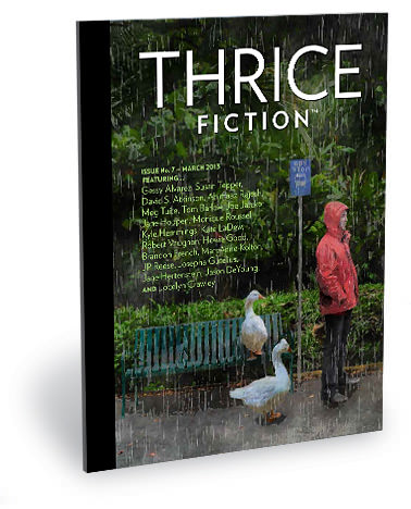
Download the issue for FREE by visiting the THRICE Fiction website!
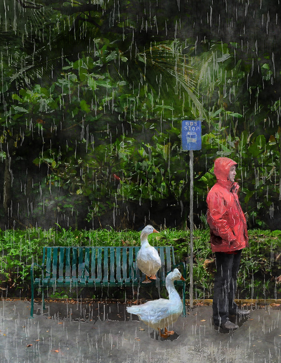
The cover this time around was a fun one. Fearless THRICE Fiction editor RW Spryszak told me that he kept on seeing "a man standing at a bus stop in the rain" for the cover as he was reviewing submissions. I thought this was a great idea for a Spring issue, so it didn't take any amount of convincing for me to take the idea and run with it. Especially since I could do a kinda tribute to one of my favorite films of all time... Hayao Miyazaki's wonderful My Neighbor Totoro...
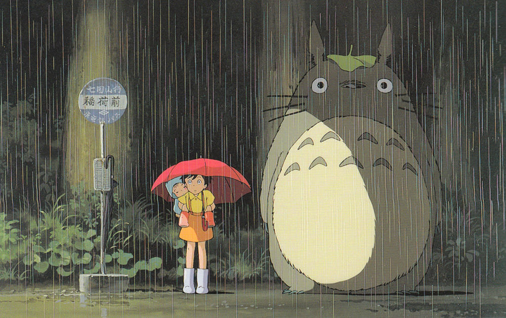
But since Totoro is trademarked, I decided to use geese instead. I also thought geese would be funnier.
The original cover image is composited from 23 separate photos from locations like Costa Rica, Maui, Barcelona, Vancouver, Seattle, and Fiji (among others)... plus one very important piece of stock photo art...
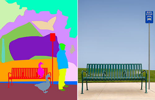
The process of stitching all the photos together into a single cohesive image is long and tedious (as I explained in a step-by-step for a past cover here). Once that's been completed, parts were painted over in Photoshop, then run through various filters to add rain and make the image look kinda-sorta like a painting. As usual, it would probably have been faster had I ACTUALLY painted the thing, but at least this way I didn't get any paint on my clothes. Anyway... here's the end result...
And that's that.
For a look at the rest of the artwork in this issue, click onward to an extended entry...
→ Click here to continue reading this entry...
 Unusually humid and 90° Fahrenheit with more thunderstorms on the way?
Not my favorite weather.
And so another episode of THRICE Fiction has been put to bed. This issue has some amazing stuff in it, arrives wrapped in a beautiful cover by Kyra Wilson, and it's absolutely FREE to download, so what are you waiting for? Head on over to our official site and grab a copy!
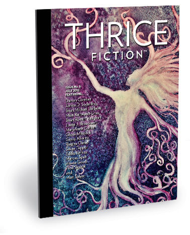
As I was on a conference call this morning, I took the time to write up some "Art Director Notes" which discusses my thinking behind all the visuals that are in this issue. If you're interested in that kind of thing, I've put it all in an extended entry. Needless to say, SPOILERS abound, so you might want to go read the issue before you click through...
→ Click here to continue reading this entry...
 Put down that Cadbury Creme Egg because Bullet Sunday starts now...
• Eggaxctly. I'm rather fond of eggs. I'll eat them just about any way you can fix them, but my favorite way to eat eggs are in a an egg salad sandwich. Which is why Easter is always an awesome holiday for me. Plenty of hard-boiled eggs means plenty of sammiches. But when I think about it, I'll eat eggs just about any way you can cook 'em...
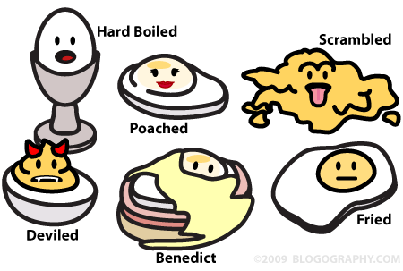
As a vegetarian, I had given up on eggs benedict, but last year I had it made with tofu bacon instead of ham, and it was awesome. Of course, the thing about eggs is that you can't tell if they're a raging salmonella bomb just by looking at them...

Which is why every time I'm served undercooked eggs I wonder if I'm going to get the plague. The last time I was caught in a salmonella outbreak, I spent two days with non-stop diarrhea and vomiting. Which isn't the worst thing that can happen... unless you're on the toilet when you have to vomit. And trying to puke between your legs is something nobody should have to experience twice in their life.
• RIP. And so Thomas Kinkade the self-proclaimed "Painter of Light" has gone dark. And while I feel bad that the guy is dead, I can't say I'm too broken up that his output of shitty paintings will stop. Yes, I understand why his unchallenging and mediocre work was popular... it was pretty and required zero thought... but his raging success never ceased to surprise me. I mean this boring crap is what people want hanging on their wall?

Painting ©™® Estate of Thomas Kinkade
I don't get it. But Kinkade obviously filled a need, so more power to him. Hopefully they have plenty of alcohol and things to get drunk and piss on in heaven... rest in peace you crazy bastard.
• Oppression. I don't normally post other people's cartoons and stuff, but this is absolute genius...

In four panels, the artist (whoever they are) has managed to perfectly summarize the disgusting hypocrisy that is running rampant through the Hard-Core Right. I am so sick and tired of hearing their whole "persecuted Christian" nonsense. Fighting back against lies, hatred, and persecution is not oppression so get over it. Believe what you want to believe and live your life... then let others do the same. Oh... and at some point you really should read that Bible you keep beating people over the head with.
• Nasty. Early this morning I received a nasty(?) comment on an old blog entry that made no sense. It was just a bunch of curse words followed by the words "I love your blog!" Much to my surprise, the commenter left what looked like a real email address. So I wrote and asked what the deal was. Almost immediately I got an automated response asking me if I wanted to make money commenting on blogs. I can only guess this means the company is trolling for trolls? Nothing on the internet surprises me anymore.
Now I've got to get back to work... so no more bullets for you!
