 Welcome to PART TWO of a discussion about the art that's running in the latest issue of THRICE Fiction Magazine!
If you haven't read PART ONE yet, you should do that first.
And if you haven't downloaded a FREE copy of our April 2015 issue... then you should definitely do that first because, WARNING... SPOILERS MAY ENSUE!
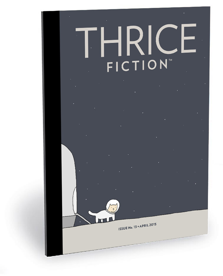
Putting together an issue of Thrice Fiction is no walk in the park. There's hours of work put into it from myself and others before it all comes together. Once all the art is in, I then get to assemble the Print PDF (for those wanting to purchase a printed copy at MagCloud), the Download PDFs (for those grabbing their FREE copy off our website), and the ePub/Kindle versions (for those who have an e-reader, also available FREE at our website). Then there's proofing, revising, and correcting... it goes on and on. Until it doesn't, then we're done.
There are times along the way where I ask myself "Is this really worth all the time and effort it takes to put this thing together?"
And then I take one look at the finished issue and the answer is always the same... yes, it most definitely is worth it. This issue was more difficult than usual, which made the finished magazine even more worth it.
And in four months we do it all again.
Now on with the second half of the art you'll find in our latest issue...

PAGE 23. I wanted this story for myself pretty bad. The title alone... LUNATIC STAGES DOLL’S MURDER (by Rebecca Bell-Gurwitz )... had so many beautiful artistic possibilities. But after reading through it a couple times, I knew in my heart that I wasn't the best fit. So I decided to see what Katelin would do. Needless to say, she killed it. The chalk outline around the doll's arm is clever, but it's that shoe... that shoe... which takes it to the next level.
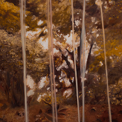
PAGE 27. Another beautiful piece by Katelin Kinney for Ron Burch's Our Lawn Was Dying. There was a moment after reading this piece that I was tempted to set the story on top of a full page photo of dying grass. After finally finding a photo that would work, I re-read the story and decided it needed something... more.
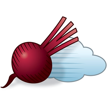
PAGE 28. This cool piece (titled the soul) by John M. Bennett was submitted several issues back, but I couldn't decide on a treatment for it, so it's been sitting on my hard drive. This issue I made a real effort to find a place for it, and decided on something simple for the accompanying art. Just a small sketch floating off in a corner. Thus my tiny beet dragging his cloud.
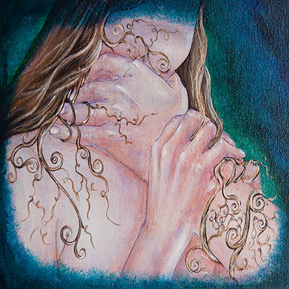
PAGE 29. When it came to deciding on art for The Eleventh Finger by Shira Feder, I admit to being more than a little intimidated. Once the narrator gets slapped so hard that she's knocked into the bathtub, it became apparent that my initial idea of a drawing "puppet fingers" was way off base. So I passed it along to Kyra to see where it would take her. The result is every bit as disturbing as the story it was created for, which is exactly what it needed to be.
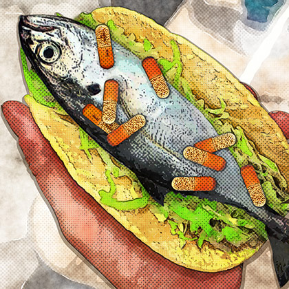
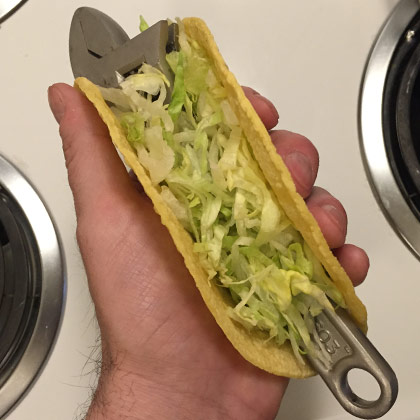
PAGE 31. Originally, this was one of the stories that was passed to an artist who ended up dropping out at the last minute. I was really glad to get it back, however, because I had such a vivid image in my mind as to what I wanted for the art on Kelsey Goudie 's Fish Tacos. Unfortunately, Adderall is a controlled substance, which precluded my using a straight shot out of the camera. Photoshop to the rescue! I refused to go out and buy a fish, so I used a wrench as a placeholder... then composited a fish photo I took at a market in Da Nang, Vietnam...
I wanted everything to be vivid and focused, so I experimented with outlining and toning filters until I got what I was looking for.
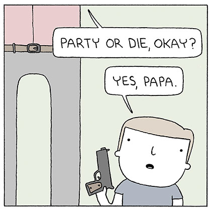
PAGE 33. As I mentioned yesterday, our Editor at Large has long wanted to feature comics in our pages. As a comic fan, I agreed with him completely. The trick is adding the right comics. I've been a fan of Reza Faramand's Poorly Drawn Lines for a while now, and it occurred to me in the middle of putting together issue No. 12 that his work would be perfect for us. I didn't hold out much hope of getting him, mind you, but I loved his stuff enough to try. In an attempt to "seal the deal" I took the time to cobble together a cover concept and create a sample page to show how his work would be presented. I don't know if it did anything to convince him how badly I wanted him to contribute to our pages, but I was beyond thrilled when he agreed. Poorly Drawn Lines was everything I wanted for our first foray into comics, and I'm hoping we'll be featuring more comic art in future issues.
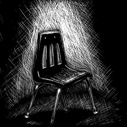
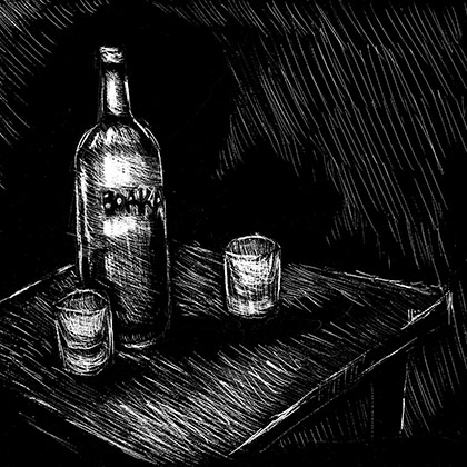
PAGE 34-35. These two terrific pieces... The Fig Eater by Jacquelynn Gothard and 38 by Mitchell Grabois... kept ending up next to each other no matter how many times I arranged the layout, so eventually I just gave in to the inevitable and decided to figure out how to tie the spread together later. My solution ended up being asking Chad to figure it out. Because I'm smart like that and he's talented like that.
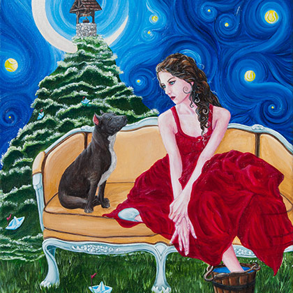
PAGE 36. Jill, Perhaps Not (by Matthew Brister) had a fantasy element that was right up Kyra's alley... and I gave her a full page to fill up with her imagination. Which she did. Perfectly. That she used up every square inch to such beautiful effect was just the icing on the cake. I shudder to think how long it took to paint out something this detailed, but am ever so glad she took the time!
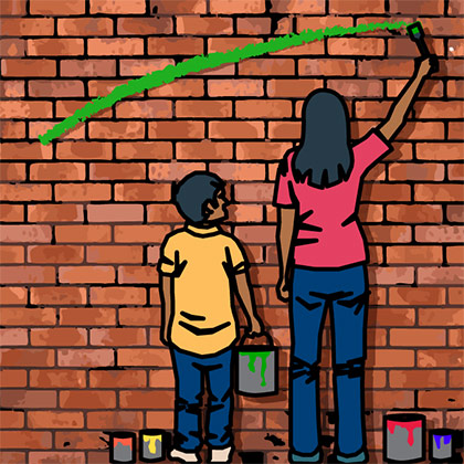
PAGE 38. I loved Boricua City by Melissa Castillo-Garsow, but struggled with how to best utilize the one tiny image I had available to represent it. After a half-dozen reads and a half-dozen false-starts, I set the story aside until I had time to give it another go. But my mind kept drifting back to one passage that kind of encapsulated the crux of the story to me... "Yeah, Luce was always my assistant growing up, handing me my brushes, mixing the paint and keeping look out for the five-o. But even outside painting, it never bothered me to have my baby brother follow me around." After that, the art came together quickly. Originally I had run it through some filters to try and get a Diego Rivera thing happening... but the more I worked with it the more I liked the simplicity of the initial flat sketch. Then it was just a matter of finding a background I was happy with and, boom, done. Probably my favorite of the pieces I worked on this issue.
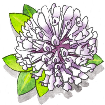
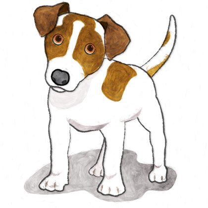
PAGE 42-43. Ed Higgins' Haying and James Claffey's Hardscrabble paired so beautifully together... and once I realized it, I knew I wanted them to anchor the issue. Figuring out what to do for the art was not so clear. With Haying I originally decided to go with a crushed bee. With Hardscrabble I originally decided to go with a damaged mosquito. Two insects that would play off of each other and tie the spread together nicely. But once I got started I realized that I had pulled two negative elements from the story which felt at odds with the hopefulness I felt after reading them. So instead I decided to pull two random elements that were more positive. Sure they don't pair as nicely, but they seemed to suit the stories better. These were drawn on my iPad, colored flat in Adobe Illustrator, then run through a painterly filter in Photoshop.
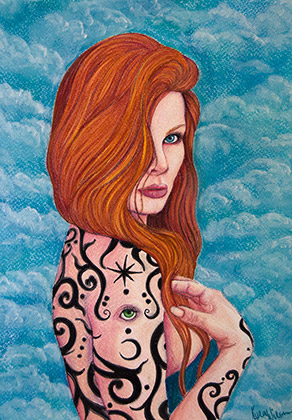
BACK COVER. The minute I saw Kyra's very cool Eye Spy I wanted it to close out the magazine. Kind of a "looking towards the future" (and the next issue!) kind of thing.
And... that's a wrap for issue No. 13.
See you in four months!

I love comments! However, all comments are moderated, and won't appear until approved. Are you an abusive troll with nothing to contribute? Don't bother. Selling something? Don't bother. Spam linking? Don't bother.
PLEASE NOTE: My comment-spam protection requires JavaScript... if you have it turned off or are using a mobile device without JavaScript, commenting won't work. Sorry.

There's no comments here...