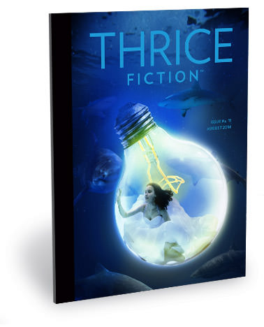
 Welcome to PART TWO of a discussion about the art that's running in the latest issue of THRICE Fiction Magazine!
If you haven't read PART ONE yet, you should do that first.
And if you haven't downloaded a FREE copy of our August 2014 issue... then you should definitely do that first because, WARNING... SPOILERS MAY ENSUE!
Okey dokey then.
I've said before that laying out an issue of THRICE Fiction is like trying to put a puzzle together where you don't have a box lid to see how it's supposed to end up looking when you're done. Not once have I just dumped all the stories into Adobe InDesign and said "Perfect! I'm done!" Not even close. I move things around over and over and over again... trying to come up with a "flow" between stories that makes for a cohesive reading experience from cover to cover. At least once every issue I'll wake up in the middle of the night and freak out because I suddenly realized I've got the page order all wrong. This issue took a little longer to figure out than most, but I was fairly confident in the layout when it was "finalized" back in June.
It didn't last, of course. Right before release I had a couple of discussions that convinced me I needed to move things around... again. Which wouldn't be a big deal if I wasn't so obsessive about having some symmetry between pages on a spread. Getting that sorted out takes a serious amount of time.
And even though it delayed our release by a few days, I think it was time well-spent. We hope you'll agree.
To read PART TWO of my ramblings about the art of THRICE Fiction Magazine No. 11, read onward in an extended entry!

PAGE 27. Richard Kostelanetz has a unique voice that we've been lucky enough to feature twice now, and I wanted to find a piece of unique art to pair with his latest story. Lucky for us, Rachel Slotnick agreed to create a custom piece especially for this story, and it turned out fantastic. When I received the piece it made me want to go back and re-read the story again, and I can't offer much higher praise than that! Rather than leave a lot of space at the end of the story, I filled it up with another gorgeous work from Rachel's portfolio. It's a rather short crop of the original piece, but it still looks amazing.
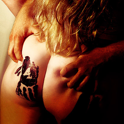
PAGE 30. Could Katelin Kinney have possibly come up with a better image to make you want to read Sarah Ann Winn's How to Make Love Without Feeling? It's a great piece of flash fiction, hitting all the right notes to build an experience in your head, which is a nifty trick given it's three paragraphs long! What I found really interesting about this image is that it's incredibly sensual while still landing firmly in the realm of art photography. That's a difficult line to walk, but Katelin makes it seem so effortless. Guess that speaks to her vision and incredible talent... and why we're very lucky she's here with us again this issue.

PAGE 31. Ah, Chris Fradkin... so happy to have another piece of his writing grace this issue! Because of Pictures was an immediate favorite when it landed in my in-box, and I was sorely tempted to keep it all to myself... the rhythm of the conversation bouncing through my mind like a flawless tennis volley. But I really liked the way it followed the previous story, so I reluctantly passed the whole spread to Katelin, knowing she would knock it out of the ballpark. I do so like being 100% right.

PAGE 32. A good writer is able to craft characters you can relate to. A great writer creates characters you can inhabit. Such was the case with Jon Sindell's Rabbit and The Professor. Once I read the passage... "The Needle flashed his old cutting grin, and Rabbit sensed that behind the grin was remembrance of the origin of nicknames: the rabbity shaking when Rabbit was bullied."... I became Rabbit, flashing back to that feeling of utter helplessness when your fate is in the hands of someone whose only goal is to break you down. That Rabbit kept his nickname after school can be seen as a sign of strength... he's owning it... but ultimately it's just a mask that covers the pain from having been bullied. After that, it was just a matter of finding a mask which conveys an upbeat attitude, but has a slight sense of tragedy to it. Fortunately, I have photos in my library of Jenny's "Sometimes Rabbit" mask that fit the bill perfectly. He was extracted from the photo, traced over, filtered in Photoshop, then dropped on a digital background like a cut-out.
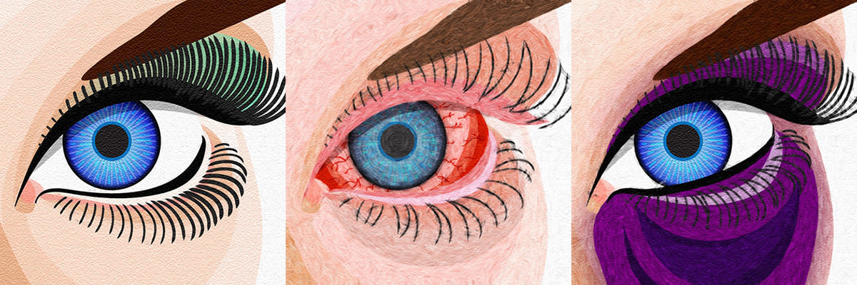
PAGE 33. And then there's that story that haunts you so strongly that you simply can't give the art chores to anybody else because you need them to work through what's stuck in your head. Such was the case of Larissa Shmailo's The Mudd Club. This was not a job I wanted... it was a job I needed. But what to do? My original idea was to draw sexy body parts as a reflection of how Nora's downward spiral led her "clients" to view her not as a person... but pieces of their fantasy. I started with her lips (of course) then moved on to a graphic depiction of her eye. At which time I realized that Nora's story was literally being told through her eyes in the story. Her eye color is never mentioned... all I could glean from the piece was that they probably weren't green. I settled on a piercing blue. Then I just had to re-draw her eye with a pink eye infection. Then re-draw it again with a black eye. I was quite happy with the result, even after a month had passed. That almost never happens.
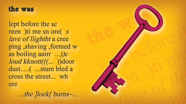
PAGE 38. God bless John M. Bennett... the was turned out to be the perfect space-filler between two stories. And, depending on how you read it, a perfect bridge between them. I worried that being subtle here might allow people to skip over the piece, so I went as bright and bold as I could... slapping a red-hot key from that burning lock onto a mustard yellow background. Just to be "artsy" I laid an enlarged copy of the work under the key to tie the two together.

PAGE 39. Peter Bracking's Fiesta was a very straightforward piece to work on... but only on the surface. As I read the story for a second and third time, I realized just how deep the words cut as the tragic events unfold. And that was my approach to the artwork. I wanted to layer everything on top of that fiesta... but without trying to be subtle, clever, or metaphoric about it so that Bracking could be the one to let the nuances of the tale to play out. He handled it so beautifully, after all. I did a little research as to what 22 automatic pistol might find it's way to Mexico on the cheap (I went for a Jennings .22) then drew one on my iPad. First ready to be shot into the air... then falling from the hand in defeat. I went with a hard "comic book" look so that the illustrations would stand out from the fiesta festival I punched out for the background.
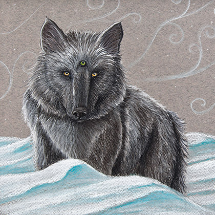
PAGE 41. The minute Wendy Ashlee Coleman's Programs That Run The Blood lit up my screen, I knew it must go to Kyra Wilson. By the time I got to the third sentence and the wolves with a "third eye," it seriously read as if it were created with Kyra in mind. And when this wonderful illustration arrived I couldn't have been happier to have been right, because I really enjoyed this story. Coleman has a real talent for finding metaphors to explain exactly what she's trying to get across.

PAGE 44. And speaking of things that seem as though they were written with Kyra Wilson in mind... Russ Bickerstaff's My Apartment Doesn't Allow Dogs of Cats is another perfect example. To try and literally render that "nebulous ball of uncertainty" you would have to be crazy. The smarter move would be to come up with an abstract that merely hints at it. Something I would fail miserably at, but a concept that somebody with Kyra's talent can probably do in her sleep. Knowing that I wanted to have a real show-stopper to jolt the reader during the final stretch, I gave her a full page to work with. And while I doubt she actually painted it in her sleep, she did fill that page beautifully.
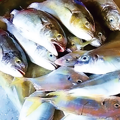
PAGE 46. The two stories I wanted to close out our eleventh issue were originally intended for Katelin Kinney. But she had a lot going on, and I already felt as if I was pushing my luck with all I had lined up for her, so I decided to go for it myself. With Georgina Parfitt's At the Fish Market, there was no need to overthink things... but I did so anyway. I wanted to capture that salmon wrapped like a baby in newsprint, and had several photos from Seattle's Pike Place Market to choose from. I composted a few images, popped it on the page, and it sat there for a month-and-a-half. Until one day I decided to re-read the story and realized that I was pretty much giving away the ending of the story. It was so visual and clever in words... why spoil it with pictures? So I found a photo I took at a fish market in Vietnam, saturated the color to match the text, then put it at the fish market for At the Fish Market.
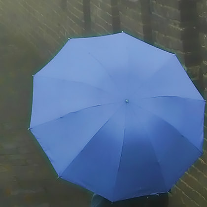
PAGE 47. Let's face it... the Nazis had one of the most effective propaganda campaigns married to one of the most beautiful identity packages in all of recorded history. Which is why it's so horrifying that they are among the most terrifyingly reprehensible group of humans to have ever existed. So when it came to B.Z. Niditch's The Nursing Home, I was going to milk that imagery for all it's worth... compositing a photo of an umbrella in a stand with the all-encompassing shadow of a swastika falling over the scene. But I just couldn't bring myself to do it because this wasn't their story. It was just a setting for how terrible people can be to each other, and I was taking the easy way out. So I drew two women walking under a stolen umbrella, used the Nazi colors of red, black, and white to add context, and called it a day. But even that seemed heavy-handed as I flipped through the pages of the magazine. I needed to be far more subtle so that B.Z. had space to tell his story. Once I decided that The Nursing Home would anchor the issue, I looked at the dreamy image of fish on the opposite page and decided a dreamy image of an umbrella might be the way to go. Perhaps the Jewish woman walking with her umbrella in better days? The photo is one I took at The Great Wall of China, but I built up the sides of the wall to make it look more like a building. Then it was just a matter of adjusting saturation, adding haze, then working in some blur. The umbrella color was altered to be a light shade of tekhelet, as a nod to the beautiful blue color mentioned in the Hebrew Bible.
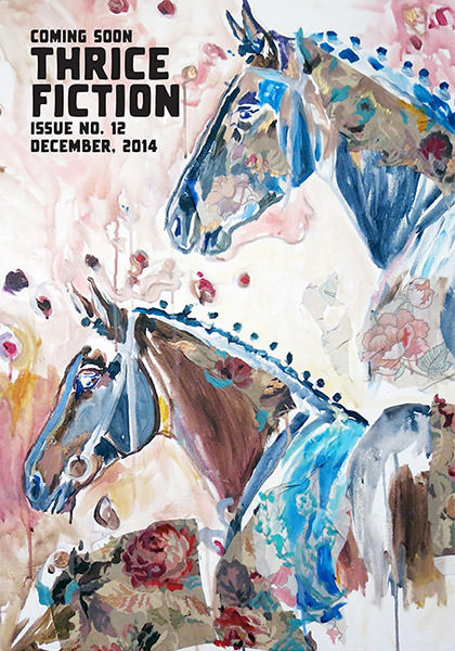
BACK COVER. And we wrap things up with this incredible piece from Rachel Slotnick's portfolio... the horse being a Native American symbol being a sacred messenger and harbinger of things to come. Such as THRICE Fiction Magazine No. 12, which will be heading your way sometime in December!
And that's a wrap! Thanks so much to all the talented writers and artists that keep us going. Your contribution defines who we are, and we are thrilled to have your hard work and passion representing our little magazine project here.
That's not quite so little any more.
:-)

I love comments! However, all comments are moderated, and won't appear until approved. Are you an abusive troll with nothing to contribute? Don't bother. Selling something? Don't bother. Spam linking? Don't bother.
PLEASE NOTE: My comment-spam protection requires JavaScript... if you have it turned off or are using a mobile device without JavaScript, commenting won't work. Sorry.

There's no comments here...