
 And here we are again... this time with a look at the art appearing in the second half of THRICE Fiction Issue No. 10, you might want to go read Part One from last Saturday first (if you haven't already).
Oh, and if you haven't downloaded your FREE copy of our latest issue, that should be your first stop!
Alright? All right!
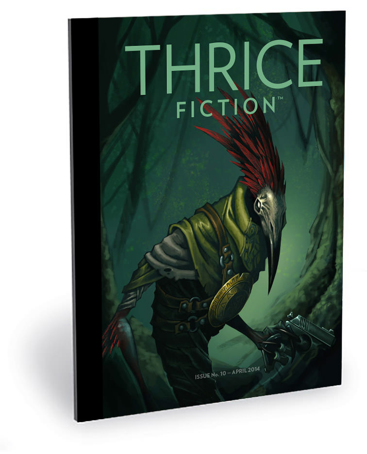
Last week when discussing the art from the first half of the book, I talked a little bit about the formats we offer for FREE downloads... and how we're wanting to expand into others. Here's the breakdown average from December's issue...
Anybody looking at this breakdown would say "Wow... why do you even bother with anything but PDF?"
The answer is because our "circulation" was around 2850 last issue and, as always when we release a new issue, it has climbed a bit. As of yesterday, we topped 3200. Which means 4% translates into 130 people who prefer to read THRICE via eBook. That's worth the 90 minutes it takes for me to create it. The Kindle version is automatically created from the eBook, so now we're up to around 150 people.
The print edition is just a higher resolution version of the PDF that takes 2 minutes to generate and 5 to upload to MagCloud. For the 30-50 people who want to have THRICE in print (including yours truly), I'll spend the seven minutes to make it happen.
And if we can expand our readership by adding an online version... an iPad version... or whatever else we can think of? We're going to do that too. Because as our downloads continue to blast past our every expectation, even small percentages are going to account for more people than R.W. and I ever dreamed would be reading in the first place. We're happy... nay, thrilled... to provide THRICE in whatever format people want to have it.
So look for our "Cerebral Implant" edition, coming 2025.
And now... back to the artwork for THRICE Fiction No. 10, which you can read about in an extended edition...
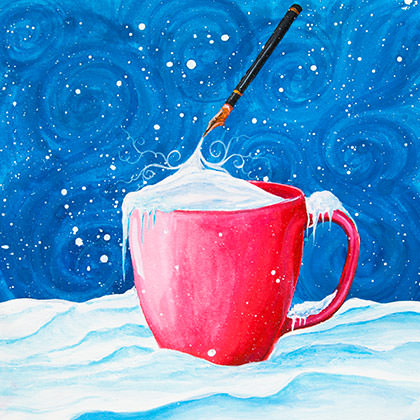
PAGE 14. I struggled for a long time with what to do with Gloria Garfunkel's piece, White. It wasn't fiction, so I felt I should do something to set it off from the rest of the book. It bounced from front to back several times, but it didn't feel right next to RW's Notes... and it seemed odd to close out a fiction magazine with a piece of non-fiction. Eventually it landed next to Emily Grelle's Drain and seemed a nice contrast. Since Kyra Wilson had already gotten the piece opposite, I asked if she could come up with something. Her beautifully-imagined solution for White was a nice compliment to Gloria's beautiful words, I thought.
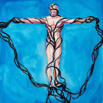
PAGE 15. Kyra described the art as "about being paralyzed by darkness." It was a take that hadn't occurred to me, but in re-reading the end of Emily Grelle's Drain, it really should have. Fortunately, Kyra got it right away and managed to tie everything together perfectly.
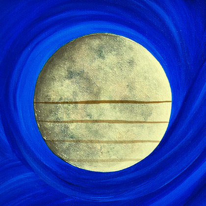
PAGE 16. When it came to Jeff Burt's The Wolf’s Legend, I immediately wanted one of Kyra's beautiful moons for it. She found a great one, then let me add some razor-thin clouds across it, as described in the story. I really like how it worked out... one of the few times that the end-result matched exactly what was in my head from the very beginning.
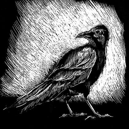
PAGE 17. Usually, I don't read the individual works that have been accepted as R.W. emails them to me. I prefer to wait until I have all of them, then read them together. It makes it easier to plan how all the stories fit together in the layout that way. But Mike Ekunno's Work In Progress had a note attached... "I am leaving this story unedited and as is. There is a ton of local patois, which I normally don't like, but there's so much fucking energy in this I consider it a wholly unique exception." — Needless to say, I decided to make an exception of my own and tore into the story immediately. I simply had to know what could get R.W. to change his mind on patois, which is indeed something he doesn't like very often (and strongly advises against in our Submission Guidelines). Sure enough, Ekunno managed to nail it. At first I wanted to do the illustrations myself, but my gut said Chad's style would fit better, so I sent it his way. When he emailed his work to me, he had a note which said "There's tons of religious overtones... but conveying religious overtones without resorting to religious symbolism in a small square? Anyway, I found some workable solutions..." And so he did. Not just once, but three times. Proving I should listen to my gut more often.
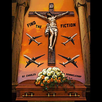
PAGE 22. With Charles Rammelkamp's Find the Fiction, I wanted to depict the funeral, since the story revolves around that moment. The image is a composite of stock photos I manipulated, and is framed by columns from a photo I took of a church in Malta. I wanted to exaggerate the individual elements, so I passed each one through a series of filters before assembling them. Originally there were no planes in the shot, but the plane crash in the story really stuck with me so I dropped out the wall behind the crucifix to get that in there. The title and author credit were worked into the image from the start, which is something I've long wanted to do, but had to wait for the right story.

PAGE 24. Believe it or not, I did not need to research Spinoza for Tom Gledhill's Weight. That didn't make coming up with the art any easier, however. My head kept coming back to the "the weight of the world" as an idea but, in this case, it seemed as though it was the weight of the mind driving the story. When looking at photos of brains, I was struck at how the frontal lobe looked like it could be sleeping, so I painted over it to exaggerate a face, then let him sleep on the world he was dreaming into existence (earth photo courtesy of NASA... my tax dollars at work!).
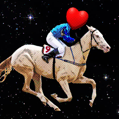
PAGE 25. Chris Fradkin's Question 922.06 worked so well following Weight that I had them paired up from the beginning. Originally, the art featured a giant number nine built from a patchwork of different colors floating in space, but I wanted something more. Eventually the idea of a love jockey riding the number 9 horse through the cosmos wouldn't let go, so I spent way too much time looking at stock photos of race horses. Eventually I found one I could manipulate to match the color of the brain on the page opposite. To tie everything together, I added some halftones over the tops of both pieces.
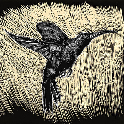
PAGE 26. The very first piece of art I created for this issue was the image of a cherry being held in front of a woman with a hummingbird on her shirt for Jill Owen's Spitting Out. It was a nice enough illustration, but every time I flipped through the pages, I ended up thinking the visuals were all wrong. I had gone kind of cartoony, and it felt like something more serious would be a better fit. So I abandoned the idea and handed the story to Chad to see what he would do with it. He offered a more grounded image that fit the tone I was seeking much better.
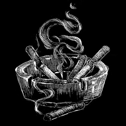
PAGE 27. I found myself overthinking the visuals for Shayna Murphy's Between the Pines, so I passed it to Chad to see if he could find a simpler element for the 2-1/4" square that the layout called for. He pulled the ashtray from the first sentence and went with it. Once he emailed it to me, I spent a good hour thinking "Why in the heck didn't I think of that?" Sometimes all you need is a fresh perspective.
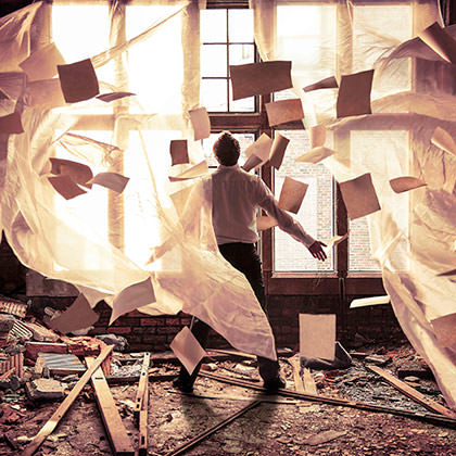
PAGE 30. Once I read the description of the "derelict hall" in Elizabeth Kroll's Stasis, it took all of two seconds to know Katelin Kinney was the perfect choice for the art. She did not disappoint. When I asked how she had managed to get such a beautiful and lively image, she wrote back with "There were about 20 or so images that were pulled together in this one image, but the Photoshop editing aspect was fairly simple and not terribly time consuming!"
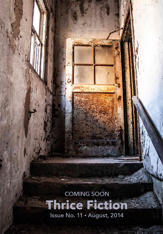
BACK COVER. This was one of the outtakes from the Stasis shoot (the ad on page 8 was another). I loved how the golden glow on the door built anticipation for what was coming next... namely, THRICE Fiction No. 11 in August, so there you have it!
And that's a wrap! See you in four months!

I love comments! However, all comments are moderated, and won't appear until approved. Are you an abusive troll with nothing to contribute? Don't bother. Selling something? Don't bother. Spam linking? Don't bother.
PLEASE NOTE: My comment-spam protection requires JavaScript... if you have it turned off or are using a mobile device without JavaScript, commenting won't work. Sorry.

There's no comments here...