
 As a Certified Apple Whore I'm probably more critical of Apple than their harshest detractors. I don't know why that is, except I'm so used to things being awesome when it comes to Apple products that I'm pretty upset when things go wrong.
And it seems as though things go wrong more often than not lately.
As an example... I'm positively outraged that I still can't stream my iTunes movie and television purchases to my laptop or iPad/iPhone. Unlike every other media content provider on the planet, Apple doesn't allow streaming (except to their Apple TV device) and forces you to download video content in order to watch it. This is stupid as hell, makes no damn sense, and means iTunes is grossly inferior to alternatives like Amazon, Google, and Ultraviolet by a huge margin... but Apple simply doesn't give a shit. You do it their way or not at all.
You would think that past idiocy like this would prepare me for any new failures that Apple racks up, but I assure you it does not.
This was only confirmed today when I flew into an apoplectic rage when the two new features I've been waiting, waiting, waiting for in the just-released iOS 8.1 update don't actually work as advertised...
APPLE PAY
The idea is an intriguing one. Instead of using a credit card to pay for purchases, you use the credit card information stored on your iPhone 6. Why bother? Well, there's three very good reasons, actually...
Great, huh?
Well... kinda...
Adding a credit card to Apple Pay is pretty easy. You type in the card info (or take a photo of the card to enter it automatically), then confirm the added card via email, text, or phone call. When it works, it's pretty painless. My Chase Bank Disney Visa even brings up a photo of my physical card design so I recognize which card I'm using...

Once added, credit cards appear on PassBook along with everything else...

Except... it's not a flawless process by any means. For reasons unknown, my Citi card added just fine, but all subsequent attempts to verify it have failed. I've been trying for two days now...
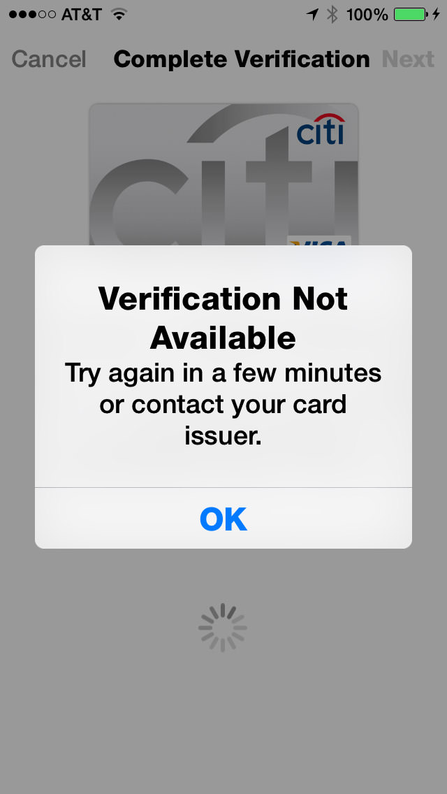
Needless to say, unverified cards are unusable, even though they show up in PassBook just the same. I don't know if this is an Apple problem or a CitiBank problem, but it doesn't matter... in the end it's an Apple problem because they obviously didn't test this crap as thoroughly as they should have.
UPDATE: Eventually I just deleted the card and started over. This time, the only option I had for verification was to call a toll-free number and tell a computer the name of my favorite teacher. Alrighty then...
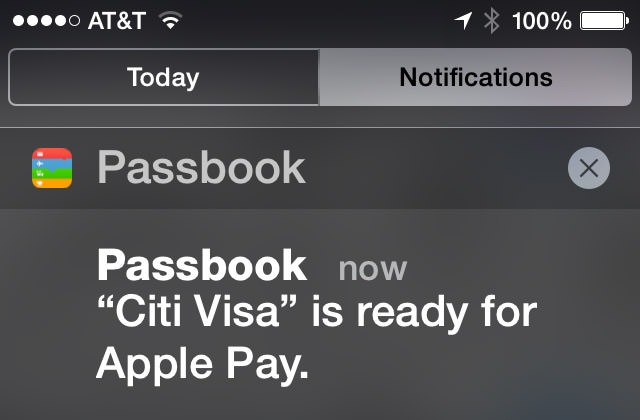
And then, of course, there's those credit cards that aren't supported, like my US Bank FlexPerks account...
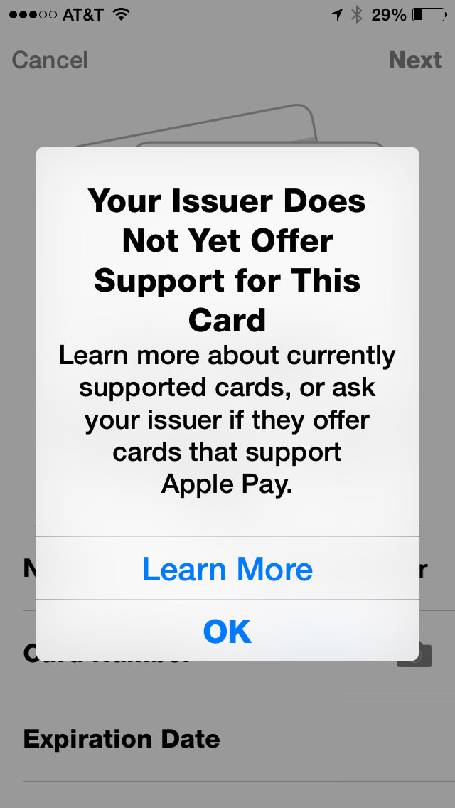
Now, I'm assuming this is not Apple's fault. I'm assuming that they presented Apple Pay to USBank along with all the other major credit card issuing banks, and USBank decided not to make it a priority.
Which is insane.
A major, major player like Apple comes up with a new method of making payment that DOESN'T cut credit card companies out of the picture... and US Bank is not onboard for launch? Like I said, insane. But hardly surprising. Do you know how long it took USBank to add chips to their cards? Years. Years of waiting for them to get off their asses and add a chip so I could use my card in Europe. Here's hoping that Apple completely removes credit card companies from Apple Pay within five years. Like record labels, they will NOT be missed, and technology will proceed much better without them.
Moving on...
According to Apple's FAQ, if a merchant requires you to give them your credit card number, you are to instead give them your "Device Account Number." Problem is, if you have "Display Zoom" turned on, you can't see the number and can't swipe to get at it. Most times when this happens, I am able to copy the information and paste it somewhere to look at it. Not with Apple Pay. I guess the only way to get my "Device Account Number" is to turn off Display Zoom first...
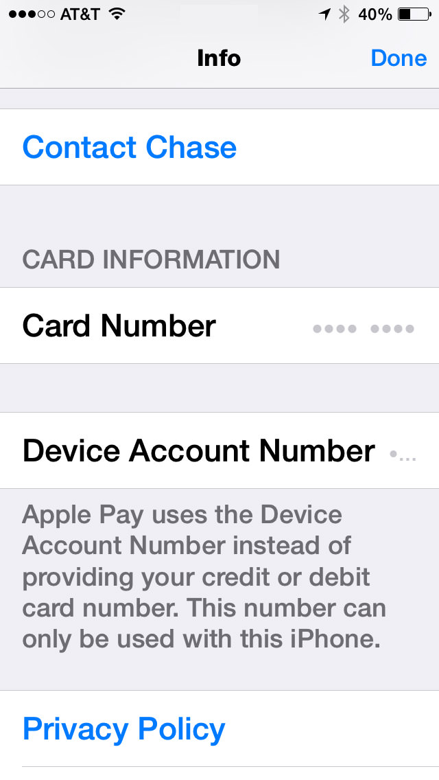
Now, I gotta ask... who the hell is beta-testing this shit? ANYBODY?!? Because every damn time Apple releases something, I find a half-dozen bugs within a day or two. Every. Damn. Time. Surely Apple can't be this inept, so the only conclusion I can draw is that they know about most of the bugs they ship, and just figure they'll get to them when they damn well feel like it. In the meanwhile, their customers have to put up with this bullshit. But anyway...
Once set up, how is it to actually use Apple Pay? Easy. Just hold your phone next to the NFC (Near Field Communication) terminal and your iPhone 6 will automatically come alive and ask you to approve the transaction with TouchID (and allow you to change to a different card than your default, if you wish). You then get a confirmation that the payment was made and a confirmation of the transaction on your card's "info" panel...

All of this is, of course, is entirely dependent on whether the merchant in question A) Has Apple Pay. B) Know what it is and how to process it. and C) Has it up and running. I tried four locations that were listed as Apple's "partners" and the result was a mixed bag...
So... 50/50 with only one of the two successful transactions working exactly as intended. Not bad for second day after launch, I guess. The one thing I didn't do was attempt to return something to the store, which is supposed to be a real mess. I can imagine that may take a while for stores to train their employees how to handle.
UPDATE: One interesting thing... as I mentioned above, my Device Account Number doesn't show up because I have Display Zoom enabled. But on both my Walgreen's and McDonald's receipt, it says "VISA ACCT" followed by four digits that are not from my credit card. I'm guessing this must be my DAN, so I've made note of it.
Ultimately, Apple Pay has amazing potential. If every transaction could be as utterly painless, seamless, and blazingly fast as my experience at Walgreen's was, I would never pay with any other method ever again. Which, of course, can't happen until all the bugs are worked out and every merchant gets off their ass and implements a NFC processing system... so we're a ways away on that. But still, the future of payment is here, it's really great, and it's Apple Pay.
AIRDROP & HANDOFF/CONTINUITY
For quite a while now, Apple has had a technology called "AirDrop" on their Mac OS and iOS devices. This wonderful feature allows you to transfer files between machines with very little effort. Except... not really. Despite being named the same, AirDrop on Mac OS was an entirely different system than AirDrop on iOS, and they were completely incompatible. This was stupid with a capital D, and Apple should have waited until they got Mac OS/iOS interoperability before unleashing unfinished shit. Well, that day has finally come with Mac OS Yosemite and iOS 8.1. Except not really.
I'm just going to set aside that since my iMac doesn't have Bluetooth LE, it is incapable of connecting in any way with my iOS devices...

I can, however connect with other, newer Macs, but this involves entering an "Old Mac Compatibility Mode" on a more recent Mac to work. And once you are in that mode, you have to dump out in order to use the current AirDrop with "iOS devices and newer Macs" again...
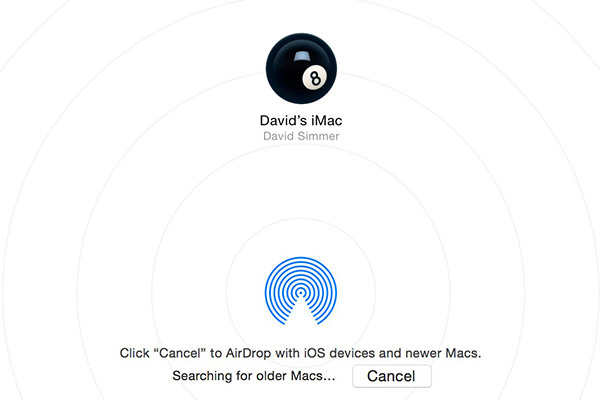
About as elegant as buttering a slice of toast with a hammer, but I'm assuming there's some kind of technical reason for it. But, hey, at least there's an option here. When it comes to getting files from an iOS device, I'm back to emails and DropBox.
But what about those Macs which have Bluetooth LE and are compatible with AirDrop 2.0? Well... I have good news and bad news.
The good news is that it works. Except... not really.
Connecting my MacBook Pro (mid-2012) with my MacBook Air (Early 2014) and iPhone 6 works nicely. Though there was some confusion at first as to what I was AirDropping with because all it shows is the device's owner. In order to know which device you've got a connection to, you have to connect to two or more devices at the same time, then the information pops up...
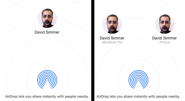
No. I have not one damn clue as to why Apple doesn't help you out with that info when there's only one device connected. Maybe it's aesthetically displeasing to the spirit of Steve Jobs or some crazy shit like that. With Apple, you can never tell. But anyway...
Going Mac OS to Mac OS works perfectly. Going Mac OS to iOS works as expected. But going from iOS to Mac OS? No joy...
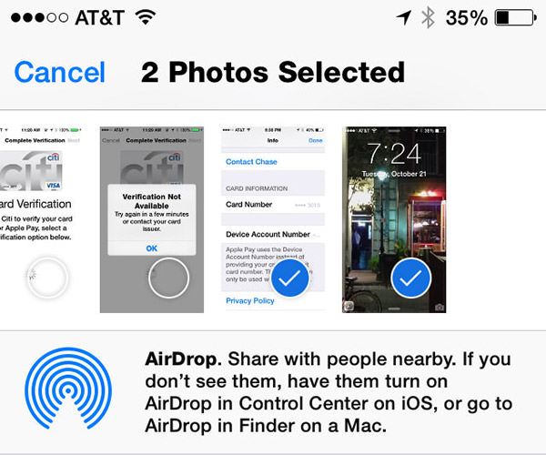
AirDrop is clearly connected... I can verify that on the Mac side in two places. But iOS simply will not acknowledge that it's part of an AirDrop network no matter what I do. I've rebooted my phone. I've disconnected and reconnected various devices in every order I can think of. I can send files TO my iPhone... but can't send a damn thing FROM my iPhone. At least to a Mac. To another iPhone 6 it works fine. I have verified in Apple's support forums that I am not the only one having problems. A lot of people are having problems. To which I have to say (again) who the hell is beta-testing this shit? ANYBODY?!?
Oddly enough, "Handoff" or "Continuity" (or whatever the hell Apple is calling their iPhone to Mac to iPhone to Mac app transfer service) only works in the opposite direction... I can hand off composing an email or looking at a web page from my Mac to my iPhone with no problem at all. A little icon of my current Mac activity shows up on the lock screen of my iPhone 6 (opposite the camera icon), I swipe up on it, login with Touch ID, and I'm picking up exactly where my Mac left off, as advertised...
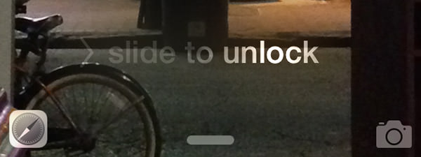
But the opposite direction? No joy. No matter what I do, nothing will ever handoff from my iPhone to my Mac. To which I have to say (again) who the hell is... well, you get the picture.
So Handoff, like Apple Pay, has some problems that need to be ironed out. Why Apple doesn't test thoroughly enough to iron them out before release is a complete mystery to me, but here we are. You'd have thought that Apple would have learned their lesson after the utter disaster that was iSync, but... well... apparently not.
The frustrating thing here is that Apple is developing these awesome technologies that are actually useful. Apple Pay, Air Drop, Handoff... all terrific, terrific stuff. On paper. In order for me to be impressed, Apple needs to make this shit work in reality. Apple Pay is close. AirDrop/Handoff isn't even in the ballpark.
I'm confident that one day things will get hammered into place. Apple has too much to lose if it doesn't. The only question is... how soon?
I want the future now.
 I'M UPGRADING MY iPHONE! NO TIME TO BLOG, MR. JONES!
CHECK BACK TOMORROW, NEVERMIND!
 "Android fragmentation is turning devices into a toxic hellstew of vulnerabilities."
— Adrian Kingsley-Hughes, ZDNet
This is the second half of my notes on Apple's Worldwide Developers Conference keynote, this time focusing on what's coming down the pipe in iOS 8. And something else entirely, which was an unexpected surprise.
To start things off, Apple CEO Tim Cook was back on stage to drop some rather startling statistics on iOS update adoption vs. Android update adoption...
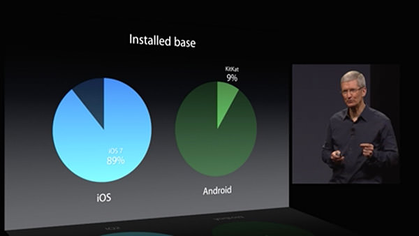
89% of iPhone users are on the latest version of iOS. A mere 9% of Android users are using the latest version of that mobile OS. For developers, this is a pretty big deal. If you are counting on new OS features for the functionality of your app, you have to be assured that your users have a version of the OS which has those features. From the looks of things, Android developers are going to be very slow to implement new stuff in their apps, because the vast majority of their users are on some older version where they are unsupported. Add to that the heinous fragmentation of the Android OEM variants, and Apple has made a very good case for developers to choose iOS as their platform of choice.
After Tim Cook's intro, Craig Federighi comes back to show everybody what end-user features and improvements we can expect with the next update.
One area where iOS has always been pretty horrible is dealing with interruptions. Get an alert, and you have to dump out of whatever you're doing to deal with it. iOS 8 takes a big leap forward by allowing you to handle common interruptions (like text messages and calendar alerts) without leaving the app you're in...
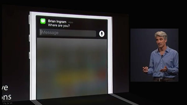
This is very cool, but it would be pretty useless if it were restricted to Apple-only interrupts. Fortunately, interactive notifications are available to 3rd-party apps, which is fantastic for people like me who communicate primarily through Facebook Messenger or other non-Apple services. What remains to be seen is how far the interactivity goes. Can developers customize the controls available to best fit their apps? Or does Apple limit interactivity to internal iOS buttons and text fields? Time will tell.
Taking a page from Windows Phone 8, iOS 8 now has some people-centric additions... like being able to access frequent and recent contacts on the app-switcher page. A terrific use of some wasted space...
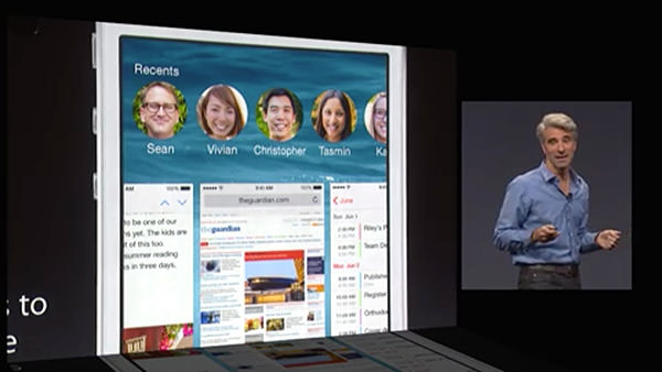
Unfortunately, the usefulness of this feature is hampered by Apple deciding how you can interact with these people. Right now you can text, call, or Facetime with them... but there's no option for Facebook messaging or a slew of other 3rd-party apps that people use to keep in touch with the people in their lives. So, ultimately, a step in the right direction... but not a very big one.
Next up was a beautiful new grouped tabs interface for Safari on the iPad...
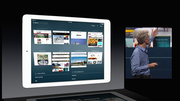
I do three things on my iPad... 1) Watch movies when I travel... 2) Read comic books... and 3) Surf the internet. The area in most need of improvement is Safari for web browsing, and it's nice to know that Apple is at least trying to make it a better experience.
One of the most exciting pieces of news at the keynote was Apple's announcement of an improved keyboard... now with predictive text. As you type, words appear above the keyboard where iOS is trying to guess what you're typing. Kind of like what happens now as words appear above your input cursor while you type... except now you get more than just one word, which should be a lot more productive. iOS doesn't stop there though... it also tries to predict words you'll use in response to emails based on the content and whom the email is from! The keyboard learns context, and tries to be smart about how it assists you...
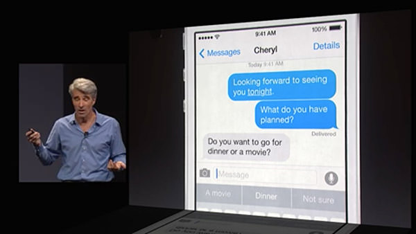
As if all that weren't enough... Apple is now going to allow you to install alternative keyboards! This means terrific technology like Swype, which allows you to slide your finger from letter to letter in a word... and Fleksy which has an amazing word-guessing algorithm and cool gesture controls... can be installed and used system-wide. This is fantastic news, because now users can test keyboards and find the one that will allow them to type the fastest.
And then, AT LONG LAST, Apple has finally given some love to their texting app, "Messages." I don't know what the heck took so long, but now we can finally manage users on group messages... and even dump out of a conversation if you want. If that's too extreme, you can put a thread on "do not disturb" so it won't keep buzzing your phone. Even better, iOS 8 has even more ways to communicate... allowing you to share your location, and even add voice memos and quick videos...
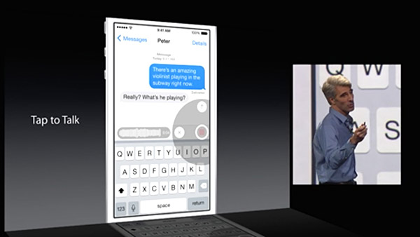
Now if Apple would only get off their ass and give the same attention to VOICE CALLS. I mean, come on... PC call center software has been around for decades which allows you to do simple things like record custom voicemail messages and selectively route callers... why in the hell is iPhone so far behind in this? It IS, after all, primarily a PHONE, isn't it? Oh well, I suppose I should be thrilled that we at least get to block a caller from calling again... how long did we have to wait for that?
And then we have HealthKit... Apple's portal to managing all your health apps...
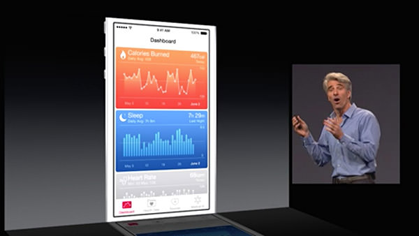
The ultimate promise of the idea is that one day you will be able to monitor various aspects of your health (like blood pressure and the like) which can automatically be transmitted and monitored by your automated analysis software and you doctor. If there's a problem detected, your doctor's office can then contact you to get it sorted out. It's a fantastic idea. In theory. In reality, I wonder how many doctor's offices are going to implement this stuff any time soon. I also wonder when we're going to get Apple's "iWatch" which will have health monitoring and syncing that makes HealthKit actually useful. Who knows.
From there we moved on to photo storage (in iCloud, of course) and the idea of Apple's "Smart Adjustment" technology which gives you the ability to perform comprehensive edits that are smart enough to do a lot of "behind the scenes" work to give you much better photos with little effort...
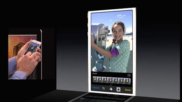
It will be bundled with iOS 8 and be added to Yosemite in 2015. Which is great and all... but I have to wonder where this leaves Aperture, Apple's high-end photo editing and storage software. How will it be able to handle edits made in iPhoto on iPhones, iPads, and Macs? Will they integrate, or be a separate set? Will flattened edits in Aperture be saved out so that devices reading from your iCloud Photos can actually view them? All of this is up in the air. And since Apple won't comment on future software (natch) it's tough to tell if Aperture is even going to be around in 2015. This is very, very frustrating... but so typically Apple. I honestly don't expect them to tip their hand and tell people what's happening with Aperture... but it would at least be nice to know that it's still going to be around.
A surprise to no one, Siri is being updated...
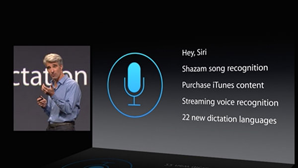
I use Siri all the time, so naturally I am thrilled to have improvements to his/her functionality. What bums me out is how far behind the Mac version is to the iOS version, and no mention has been made as to whether or not any love is going to be spent improving the Macintosh side of things. I would hope so, because the crappy dictation functionality on the Mac is pathetic. Why Apple can't keep up with the iOS side of things is a complete mystery. Why can't you ask Siri questions on a Mac like you can on an iPhone? It makes -zero- sense. And yet here we are.
And here's where things start to get interesting.
Very interesting, if you're a developer.
First of all, Apple is going to finally allow permission-based data sharing between apps. Something that is long overdue and will makes for some incredible extended functionality possibilities. Sure, the functionality will be limited so as to keep data safe... but this is such a massive leap in the right direction that I find it hard to not get excited at the prospect.
Game developers will get up to a massive 10x speed bump in their apps thanks to a new technology called "Metal" which allows them to get closer to the raw power of the iPhone/iPad processor than ever before.
And, lastly, something that took everybody by surprise... a new development language called Swift that takes the best parts of past programming languages and marries them to modern programming concepts while leaving all the antiquated baggage behind...
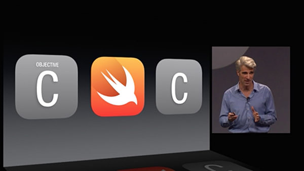
Without being able to see it and play with it, there's no way I can really comment on how useful Swift might end up being. But it certainly sounds promising. And powerful. And easier to use. And smart. I can't wait to take a look.
And that was that.
No new hardware. No new AppleTV. No new iWatch.
Just some interesting new features and a promising new future for Mac developers. Which is what I guess we should expect from a Developer's conference.
So I guess I'll try not to be disappointed with the lack of new toys.
 Because my entire day yesterday was spent catching up on work, I had the Apple Worldwide Developers Conference keynote running... but couldn't pay very close attention to it.
And so... today's the day I get to channel my inner Mac Whore and talk about new happings at everyone's favorite fruit-named tech company. If the thought of that bores you, here's your chance to escape! But don't come back until the day after tomorrow, because that'll be Part Two.
OS X YOSEMITE
The successor to OS X Mavericks, OS X Yosemite, was presented by Craig Federighi, the Senior VP of Software Engineering at Apple...
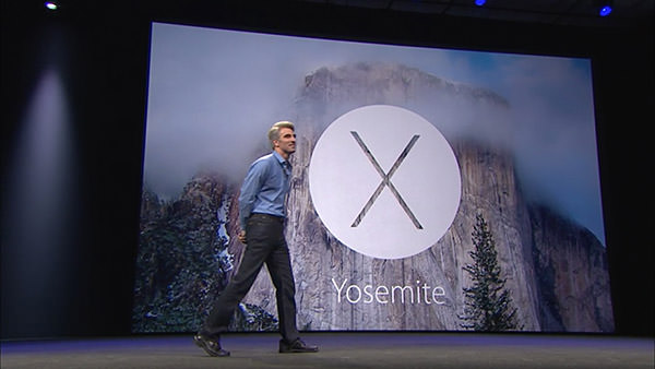
The guy is incredibly charismatic and engaging... reaching to near Steve Jobsian heights with his presentation skills. He's also darn funny, injecting wit and humor into his speech at a breakneck pace.
The look of Yosemite is very much a continuation of iOS7. All aspects of the OS from the controls to the icons have been simplified, saturated, and flattened. In addition, transparency effects have been liberally sprinkled all over the interface elements. Which is something I'm not thrilled about because I find it unnecessarily distracting. Hopefully users will have the ability to disable the transparency like they currently can with the menu bar.
Federighi seemed especially proud of the new look for Yosemite's trashcan...
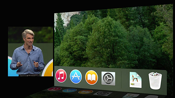
Personally, I don't give a shit what the trashcan looks like... I only care that it works. Which it currently does not in Mavericks. It will show as "empty" even when there's files inside. Hopefully somebody bothered to fix this incredibly basic and incomprehensibly ignored bug.
After talking trash, we moved on to the system font, which is no longer Lucida Grande. I don't know what the new typeface is called, but it's very pretty and easy to read. And as exciting as that improvement is, the next improvement is something I've been begging for... DARK MODE... where the menu bars and menus are darkened so they don't distract from what you're working on...
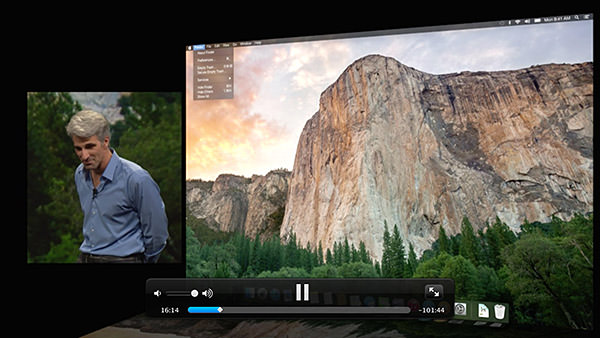
The window model for Yosemite continues to add functionality for title bars and devote more space to content, which is nice. Apple has also changed the way window controls work... with the green button now taking the window full-screen. Something I could get behind if they WOULD ONLY HAVE AN OPTION TO KEEP THE MENU BAR VISIBLE! I frickin' hate going full-screen because fighting the disappearing menu bar drives me insane. I need to be able to see my clock... my battery level... the date... all that important stuff that's so handy to have available... at a glance.
Notification Center is getting the ability to add widgets, which will finally make it useful to me.
Spotlight, Apple's search system for OS X, is getting an upgrade... and this time it looks more than just cosmetic. All I care about is that it's not a flaky pile of shit like the interface is now (How many times do you end up launching the unintended result? For me, it's practically daily). The addition of Sherlock-esque internet data for searching is a welcome throwback.
Next up, Apple puts the smack-down on DropBox by releasing an online storage option of their own called iCloud Drive. I don't know how it will be an improvement over DropBox, which makes cloud storage so drop-dead easy, but I'll definitely be taking a look.
Federighi then took a look at Yosemite's update for OS X Mail... currently the most-hated app I use every day. It is a buggy, slow, and overall shitty email client that looks downright embarrassing when compared to what Microsoft has going on with Outlook. He promises that they have worked very hard to make improvements with the basic functionality, which would be very nice. A new feature for Mail is "Mail Drop," which allows the seamless sending of files up to 5 gigs via iCloud Drive.
Safari is a world-class browser, but Apple's not resting on their laurels. They've added a number of new features for convenience, speed, and improved battery life... but the standout for me is being able to spawn separate windows for Private Browsing instead of it being an "all or nothing" game.
And then came the first surprise of the day... something Apple is calling "Continuity"... which works towards providing a seamless experience between MacOS X and iOS. The crowd erupted in applause when Federighi announced that FINALLY you can "Air Drop" between MacOS X and iOS. This omission has been categorically absurd and, if I had been in the audience, I would have been screaming "IT'S ABOUT FUCKING TIME!"...
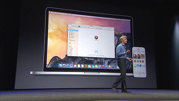
But Apple didn't stop there, because next came a new feature called "Hand-Off." This nifty bit of tech means your Mac and your iPhone (or other iOS device) now has proximity awareness of each other. You can start composing an email on your Mac, then hand it off to your iPhone so you can keep composing as you walk out the door. Additional features, like being able to answer an incoming call from your iPhone on your Mac or use your Mac to make calls through your iPhone is dead-sexy. That Federighi demoed this by calling a "new employee" — Dr. Dre — was just the icing on the cake.
And there's where Apple wrapped up their look at just some of the new features that will be available with the new MacOS X.
The beta for Yosemite has been released to developers already. Non-developers can join the beta program later this Summer. Then everybody will be able to grab a free copy come Fall.
Tune in tomorrow when I unleash my commentary on Part Two of the keynote... with iOS 8.
 For the longest time I've been dismissive of those who say that Apple has gone downhill since Steve Jobs left us (praise be unto His name). As a Certified Apple Whore, I pretty much have to, right? And besides, as great as His Steveness was, Apple has always been more than just one man. Steve Jobs didn't do it all alone, and the people who helped to make Apple into such a remarkable company are still around. So, yeah, Apple isn't going to be the same... but it couldn't possibly be the horrific disaster that all the nay-sayers keep insisting: "APPLE IS OVER!" "APPLE CAN'T SURVIVE!" "POST-JOBS APPLE IS DOOMED!" What nonsense!
Except...
As time goes on and the user experience with Apple products degenerates to complete and total shit, my opinion has been changing.
Don't get me wrong... I firmly believe nobody is doing it better... but the detail-oriented Apple that made me commit my eternal servitude over the past decade simply doesn't exist any more.
Let's walk through an example, shall we?
I perfectly understand the need to prevent random people from walking up to my computer and charging a bunch of crap to my Apple ID. Really I do. But having to enter my password four times? What kind of sadistic fucking asshole made that happen? And how badly would Steve Jobs explode over what a shitty user experience that is? I'd rather just buy a physical book at Amazon with their One-Click shopping.
This problem goes much deeper than just inconveniencing customers to enter their password over and over and over and over again... it encourages people to pick simple, short, easy-to-remember, passwords. Which is pretty much the opposite of what you want, because those are the passwords that are easiest to crack. What you want is people using heinously complicated passwords that are very difficult to crack. But to get this to work, you have to make it so the password only has to be entered rarely. The password should be remembered by the system and auto-populate whenever you want to buy something. Of course you have to secure the system with a password... otherwise you're back to square one. But THAT is the kind of stuff Apple figures out so well. Like the fingerprint scanner on the iPhone, for example.
So where is it?
And since one example doesn't build a compelling case, here are a few more things off the top of my head that have been bugging the shit out of me with Apple's "User Experience"...
Holy crap... and that was just the stuff off the top of my head. Had I put some actual thought into this list, it would be ten times as long, I'm sure.
And there's my problem with Apple. In the past, I would expect that insane shit ruining the Apple experience would eventually be fixed. Now? I honestly don't know. There's obviously people in charge of these problem areas. But is Tim Cook obsessing over making sure these people are getting things to work exceptionally well like Steve Jobs was? Or is he being distracted by shiny things to buy with Apple's massive bank account? Early after his take-over, I was willing to give him the benefit of doubt. But now? We're going on three years and I'm starting to worry.
I want... need... Apple to be insanely great.
Anything less isn't Apple.
 Go Go Gadget Web Browser... because Bullet Sunday starts... now...
• Penny. NEW CHRIS WARE AT THE NEW YORK TIMES!
You. Are. Welcome!
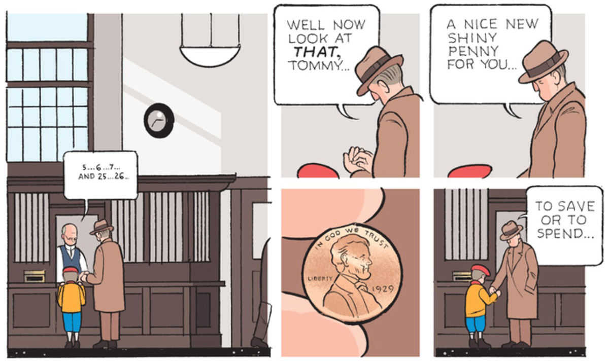
Nobody does what Chris Ware does. And why would they? Everything he creates is perfect.
• Shift? Bwah ha! This has to be one of Apple's biggest embarrassments. I frickin' HATE that I can never tell if my shift/shift-lock is on or not in iOS...

So now there's a new website in case you need a reminder! Sweet!
• Mail. Okay. Okay. I've used a lot of email programs. A lot. And while the features are tweaked from app to app, they all pretty much work the same way once you get down to brass tacks... no matter how different they look. Enter Unibox. Now THIS isn't just a different approach to email... it's different different. The biggest change? No inbox. There's a filter for your contacts, any attachments you've received, and that's it...
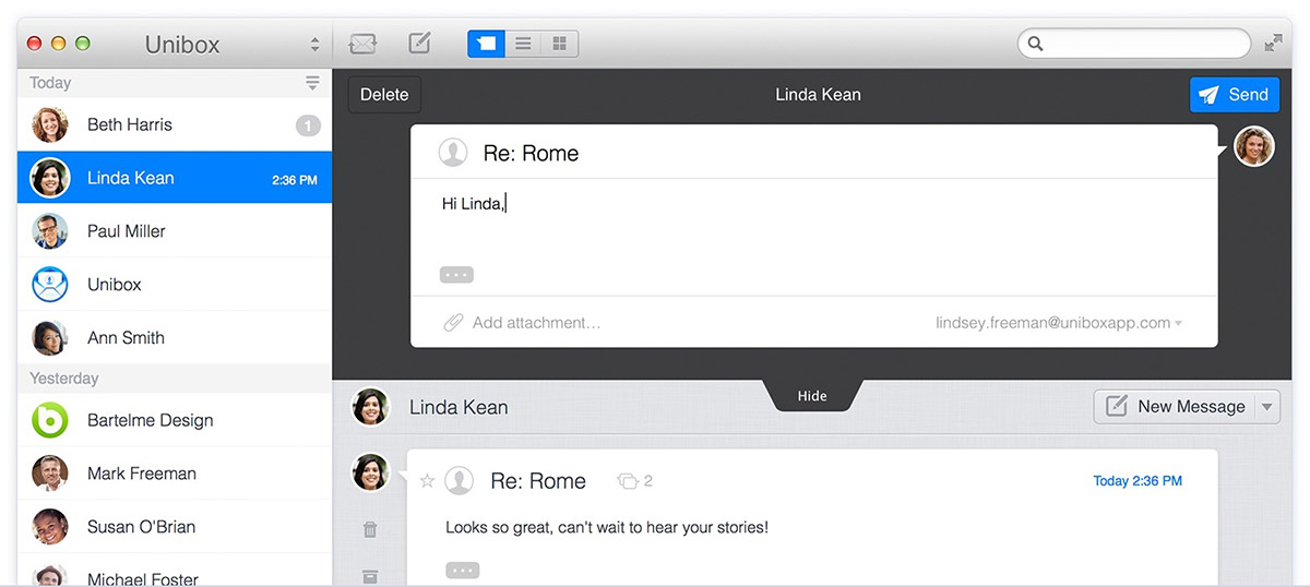
For my personal email, where I receive a cornucopia of crap every day, I prefer the "inbox approach." But for my work email? Where everything revolves around people? This has proven nothing short of revolutionary. Once I got used to it, I was amazed at how much of a timesaver this unique approach to email has been. If you're in a similar email situation and have a Mac... Unibox gets my highest recommendation.
• Flight. Every minute of this video is gold...
I don't know a better way to wrap up my Sunday than that.
• Good. Well, okay... maybe with this commercial from a Thai life insurance company...
Pretty much sums up why I love Thailand.
And... hope your weekend was a good one!
 And so iOS 7 was released at long last, and has been trumpeted as "The biggest update to the iPhone since the original iPhone." After using it on my development iPhone for weeks, I'd have to say that's pretty much all marketing hype. Yes, it looks fresh, but it's pretty much a few really good new features tacked on to the iOS we know and love... but with a fresh coat of paint.
Not that this is a bad thing! Truth be told, Apple got so many things right when they first created the iPhone that there's not a lot that needed to evolve and change. I'd take old iOS 6 over my Microsoft Windows Phone... and I'd definitely take old iOS 6 over any of the four Android mobiles I own. Now that we're at iOS 7, that goes double. It was a rough start, but now I like it. A lot.
And so now I'm going to talk about some iOS 7 stuff. It's not going to be in-depth, because there's a gazillion websites out there that have this covered, but it will be things I feel are a bit annoying. Because that's what I do.
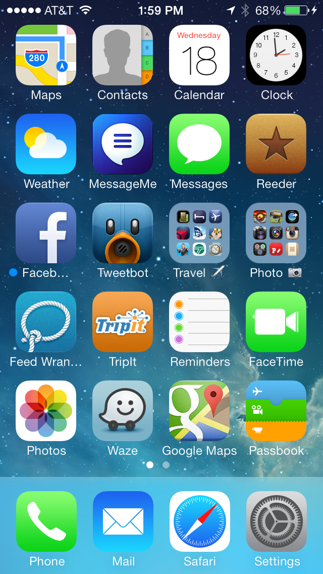
HOME...
The text is crazy thin... almost too thin... which makes it tough to read in spots. Fortunately there's an option for "bold text" under the General/Accessibility settings, so it's an easy fix. There's no fix for Apple's new boring-ass icons, however, and that's a shame. Yes, some are not too bad... Weather is simple, but effective... Passbook is kinda cool... but what in the hell is going on with Photos and FaceTime? I don't know what the hell Photos is trying to say, and FaceTime uses a video camera shape for an icon that practically doesn't exist any more. And then there's Safari and Settings... both of which are somehow overly-detailed and plain-ass boring at the same time. Total garbage. Give me the beautiful icons for Tweetbot and Reeder any day.
EFFECTS...
Overall, I like Microsoft Phone 8 well enough... but the nonstop barrage of time-wasting animations, flippy-tiles, and other inane bullshit drives me insane. I was always much happier with the more restrained approach that Apple took with iOS 6... pretty animations, but not in your way or wasting time. So of course Apple threw all that out the window with OS 7. Now the phone fades on and fades off... icons glide in slowly from beyond... apps zooooom open and closed. And while it's nifty the first fifty times you see it, by the fifty-first you just want your life back. Hopefully Apple tightens these up in the future, because wasting people's time like this is just wrong.
NOTIFICATION CENTER...
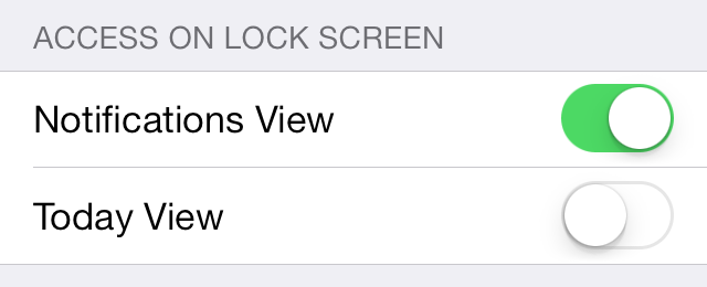
An essential tool for managing all the alerts and info your iPhone is throwing at you, Notification Center was a welcome addition. Unfortunately, it's taken a dive in iOS 7. The super-thin text makes readability difficult, and will probably be what convinces me to turn on "bold" text in Accessibility settings. Also, the addition of a "TODAY" tab is something I really, really don't want. Just give me a newest-first list of alerts, and I'm fine. If iPhone would stick to the tab I last used, it would be okay, but it randomly switches to "TODAY" for no discernible reason. Oddly enough, you can turn off "TODAY" in the lock-screen. Why they don't allow you to turn it off in Notification Center is a mystery.
PASSBOOK...
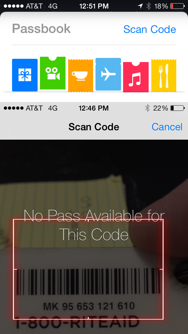
If there's one feature that has become essential in my travels, it's Passbook. It has my loyalty cards, train tickets, airline boarding passes, and other great stuff available instantly without adding bulk to my wallet! So imagine how thrilled I was to find out that the new iOS 7 Passbook was going to allow you to scan barcodes on cards so you can add them to your iPhone arsenal! Except... it doesn't let you create cards at all. It scans your cards and sees if it can find an existing card to add. Except in the ELEVEN cards I tried, it worked on exactly zero of them. Suckage. GIVE US A FREAKIN' CARD DESIGNER, APPLE!
SIRI, PART 1...
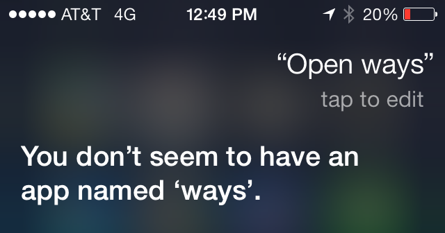
Apple's "personal digital assistant" which is called "Siri" is something people either love or hate... use or don't use. I love her. I use her. And with iOS 7 Apple has given her a higher quality voice and even more functionality. They've even given us a way to make her smarter, thanks to being able to tell her when she's pronounced a word wrong. At first I thought that she would also be learning from the new "tap to edit" link that appears after your query has been parsed, but she doesn't. For example, if you say "Open Waze" to have her open the Waze app... she thinks you are saying "Ways" and so I tap to edit it and type "Waze." Simple, right? But Siri forgets what I've taught her, so next time I say "Open Waze" she gets it wrong again. Bad enough she doesn't even try to find the app when she knows I'm asking for an app, but not being able to teach her that I actually have a Waze app is pretty lame.
SIRI, PART 3...
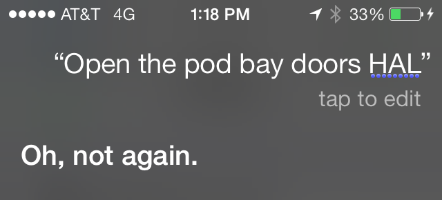
One thing I was excited about with the New and Improved Siri was the option to have her become a him and speak with a male voice. This would allow me to live with HAL from the movie 2001 in my pocket, which is a dream come true for somebody with my name. "I'm sorry, Dave, I'm afraid I can't do that...
Except... male Siri doesn't sound like HAL. He sounds like female Siri who has been pitch-shifted to have a deeper voice. This wouldn't be terrible if Apple allowed 3rd party voices so somebody could build HAL for iPhone, but they don't. Boo.
SIRI, PART 3...
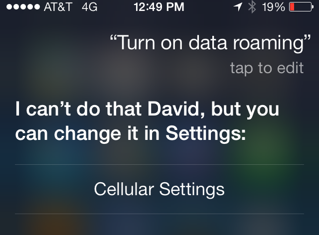
As I mentioned, Siri has new functionality that's kinda handy. When you tell her "Turn on Bluetooth" she understands and takes care of it. Cool! Except... she appears to be severely limited here, and it's maddening. Why is it I can say "Turn on data roaming" and she understands it, knows it's located in "Cellular Settings," and provides a link to get there... but she won't just change the damn setting for me? These kinds of omissions drive me nuts.
CONTROL CENTER...
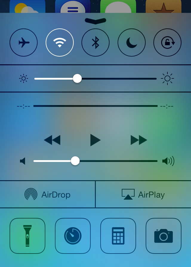
Apple did us a huge, huge favor when they finally gave us a way to access frequently-used settings and tools in iOS7's new "Control Center." And it's great. Just swipe up from the bottom, and you're there! Except... it's not configurable, which sucks ass. When I'm traveling, I use international data roaming, which is very expensive. In order to save money, I find myself turning it on and off frequently. As mentioned above, Siri can't do this. Instead it takes multiple taps to get to the settings because I can't configure Control Center to have it, and this is nuts. I rarely use my phone as a calculator or stopwatch, why in the hell are they taking up space that could be designated for something I will use.
DATA ROAMING...
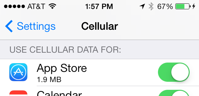
Falling in line with my previous point, turning off International Data Roaming wouldn't be so important if I could choose which apps are able to use it. But, while iOS 7 does allow you to choose which apps can use cellular data, it's all or nothing. There's no way of saying "This app can use Cellular data at home, but not Data Roaming abroad." So, basically, Apple has screwed international travelers not once here, but three times. Does nobody on the iOS team ever leave the US?
And... that's about it for the things I would like changed in iOS 7.
Today.
Tomorrow the list may be entirely different.
 I've been fighting a pinched nerve in my neck ever since returning from San Francisco. I have no idea what I did to make it happen, but over the past week it's gone from "uncomfortable" to "agonizing." Today I couldn't even get Migraine-Strength Excedrin to touch it, which made for an uncomfortable day. And inconvenient, given the amount of work I have to get caught up on.
Not the best Saturday on record, but I've had worse.
While trying to find a comfortable position to lay down (which doesn't exist), I was using my iPhone to peruse the Apple rumor sites. Everybody's favorite fruit-themed computer company has a "special event" this coming Tuesday, and sites are abuzz with what Apple might have up their sleeve...
The rumor mill suggests new low-cost plastic iPhones (in colors!) and a new iPhone 5S which will come in a gold/champaign color for the first time (in addition to black and white models) plus have a fingerprint reader for privacy/security purposes. It's also speculated that we'll get an updated look at iOS7 along with a release date.
Well, okay then.
I should probably be a lot more excited about what's going to happen on Tuesday than I actually am. Part of that is because my upgrade cycle won't allow me to get a new iPhone until the iPhone 6 arrives... and it's partly because my neck and head are killing me.
But mostly because Apple has gone with random polka dots for their new theming? Dots. Really, Apple?
 And so... today I got pulled over for expired license tabs. Which means that I never got my renewal notice, because I always pay my annual licensing fees immediately after I receive that little card in the mail. Fortunately, the police officer wasn't a dick about it, and just asked me to get it taken care of. Which I did, straight away. And now I've told my iPhone to remind me every year so I don't have to rely on state government efficiency.
In other driving-related news... Google Maps is now available as an app for iOS...
Apple dropped Google for their mapping service because Google wasn't updating the iOS maps as quickly as their own Android mapping service. Android got turn-by-turn directions... the iPhone did not. And so on. This put Apple at a competitive disadvantage, so they really had no choice but to drop Google and create something of their own that would feature-map what the competition was getting.
And we all know how that turned out.
Except...
Now that I've actually been using Apple Maps... I prefer some aspects of their app more than I do Google (even on my Android phone). Especially when it comes to caching map data, turn-by-turn directions, and the look and feel. But there was one area where Apple falls flat. And continues to do so. Location data. Google's database for mapping locations is insanely massive. Apple's is pretty much shit. And, as if that wasn't bad enough, it's also stupid. Google can make pretty good guesses, even when you misspell something. Apple has a hard time finding shit even if you spell it out completely and accurately.
This is something that Apple will get better at with time.
And they do have to keep getting better (=cough= public transit maps =cough=).
Because that's what's going to keep Google from shitting all over iPhone users by refusing to give them the same features of their own Android OS maps. Odds are, if Apple hadn't dumped Google, we would still be without turn-by-turn directions.
But now iOS users have turn-by-turn on both Apple maps and Google maps. They can choose what works best for them.
For me, it will probably be a combination of both.
Whichever one will get me to the Department of Licensing on time.
 Getting a whole six hours sleep last night (pharmaceutically-induced, alas) was everything I dreamed it would be.
Anyway, just a few things I keep forgetting to review...
• Chilly Pad! A while back I was shopping for a soldier at AnySoldier.com (which I talk about here and here) when I was told about a product by Frogg Toggs called "Chilly Pad." It was billed as some kind of "cooling towel" that sucks the heat away via evaporation. That sounded like a load of crap to me, but who am I to deny a soldier something to make his life easier... especially if it only costs $12? Just for kicks, I ordered one for myself too.
Imagine my shock when, holy crap, it actually works!

Just pour some water on it and be amazed as the super-evaporation cells go to work, causing the darn thing to become cool to the touch! Amazing! For the ultimate test, I wore one around my neck on my trip to Waverly Hills where there was a heat index of 105° and was pretty darn comfortable the entire time. I now keep one in the trunk of my car and will always have them on hand to send with my AnySoldier care packages. Worth checking out! I got mine at Sports Authority, but I'm sure they're available other places too.
• Spotify! Europeans have been enjoying the music mega-service Spotify for years, but Americans have been left out. Until now. For those unfamiliar, Spotify has a massively huge database of music available for streaming. In order to get at it, you have to sign up for an account. Free accounts are ad-supported and have a song limit. Unlimited accounts ($4.99/mo.) are ad-free, allow unlimited songs to be streamed, and have added sharing and organizational features. Premium accounts ($9.99/mo.) have even more features (like the ability to listen offline and stream to your mobile phone) and better sound quality. Free accounts weren't available yet, so I went for the $4.99/mo. Unlimited package.
The biggest selling point of Spotify is that they have a plain crazy-huge collection of songs. They pretty much boast that they have any track you want...

Except they really don't. There are many songs both obscure and popular I wanted to listen to which aren't available. That alone is a bummer, but what makes it unbearable is that a big chunk of their library is karaoke versions of songs, and every frickin' search you make is literally overwhelmed with karaoke crap I have absolutely no interest in.
Here's an example. Today I wanted to listen to Miley Cyrus's The Time of Our Lives (don't judge until you listen to it... it's a nice song!). Spotify doesn't have it available. What they do have is four karaoke versions...

WTF? And it gets worse when you do more generic searches like "Hall & Oates" where you get all kinds of karaoke shit mixed in. After a while, I figured out that you can do restrictive searches to cut out karaoke. Well, most karaoke... not all karaoke songs are described properly...
![]()
This should be an option in preferences to get rid of karaoke tracks if you don't want to see them, but I couldn't find one so I have to instead add "-karaoke" to every search, which is a pain in the ass. Other irritations? The Spotify app is clutzy and unintuitive compared to the iTunes interface I'm used to. I've also experienced "outages" of a sort, where certain artists simply will not play. Today I tried for quite a while to listen to Weird Al's new Alpocalypse album without success.
As you might guess, my final verdict is more negative than positive. I will be happy to keep my free account for occasional ad-supported listening, but I'm going to cancel my $4.99 "Unlimited" membership. Perhaps eventually they'll address my issues and I'll find it worthwhile, but for now I'm giving it a pass.
• Suits! Burn Notice. White Collar. Covert Affairs. Fairly Legal. Psych. When it comes to successes, USA Network has a pretty good track record for airing some really good television shows. Because of this, I'm willing to give any new show they come up with a shot. Their latest, Suits, sounded good on paper... but I wasn't sure how it was going to play out on the screen...

The story premise is that of a very smart guy with a photographic memory, Mike Ross (played by Patrick J. Adams) who tries to escape his dicey past by going to work at a prestigious law firm. He passed the bar on a dare, but doesn't have a law degree. His new boss (played by Gabriel Macht) is impressed enough to hire him anyway. The result is an uneasy partnership that is beneficial to both of them, even if they have to hide Mike's true nature from everybody at the firm.
And it works.
It works very well.
The cast is fantastic (Gina Torres!), the writing is sharp, the stories are smart, and the show as a whole is entertaining. My only concern is how long they can keep the premise interesting. Will people eventually find out about Mike? Will his scary past catch up with him? In all honesty, it doesn't really matter, and I hope they don't keep hanging the show on them when there's no need to do so.
Right now? Highly recommended. Only time will tell if they can keep it that way.
• Fotopedia! If you're a fan of travel photography and have an iOS device, run... don't walk... to the iTunes Store and grab everything you can from Fotonauts. Their Fotopedia apps have always been great, but the new stuff they've been cranking out has been amazing. North Korea (free) and Dreams of Burma (free) are well worth your time... but their latest collaboration with National Geographic, Above France ($2.99) is stunning...

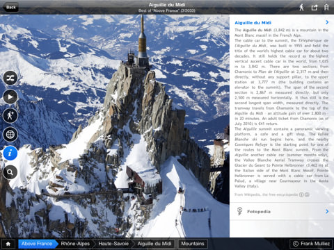
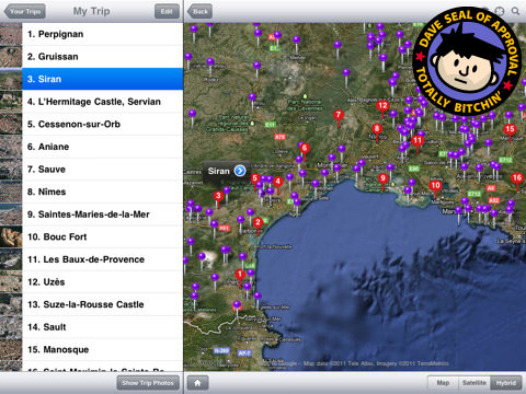
They work on iPhone but, obviously, have a better presentation on iPad. Highest possible recommendation.
And now... bed. And hopefully another night of half-way decent sleep.
