
 And so iOS 7 was released at long last, and has been trumpeted as "The biggest update to the iPhone since the original iPhone." After using it on my development iPhone for weeks, I'd have to say that's pretty much all marketing hype. Yes, it looks fresh, but it's pretty much a few really good new features tacked on to the iOS we know and love... but with a fresh coat of paint.
Not that this is a bad thing! Truth be told, Apple got so many things right when they first created the iPhone that there's not a lot that needed to evolve and change. I'd take old iOS 6 over my Microsoft Windows Phone... and I'd definitely take old iOS 6 over any of the four Android mobiles I own. Now that we're at iOS 7, that goes double. It was a rough start, but now I like it. A lot.
And so now I'm going to talk about some iOS 7 stuff. It's not going to be in-depth, because there's a gazillion websites out there that have this covered, but it will be things I feel are a bit annoying. Because that's what I do.
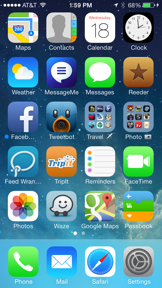
HOME...
The text is crazy thin... almost too thin... which makes it tough to read in spots. Fortunately there's an option for "bold text" under the General/Accessibility settings, so it's an easy fix. There's no fix for Apple's new boring-ass icons, however, and that's a shame. Yes, some are not too bad... Weather is simple, but effective... Passbook is kinda cool... but what in the hell is going on with Photos and FaceTime? I don't know what the hell Photos is trying to say, and FaceTime uses a video camera shape for an icon that practically doesn't exist any more. And then there's Safari and Settings... both of which are somehow overly-detailed and plain-ass boring at the same time. Total garbage. Give me the beautiful icons for Tweetbot and Reeder any day.
EFFECTS...
Overall, I like Microsoft Phone 8 well enough... but the nonstop barrage of time-wasting animations, flippy-tiles, and other inane bullshit drives me insane. I was always much happier with the more restrained approach that Apple took with iOS 6... pretty animations, but not in your way or wasting time. So of course Apple threw all that out the window with OS 7. Now the phone fades on and fades off... icons glide in slowly from beyond... apps zooooom open and closed. And while it's nifty the first fifty times you see it, by the fifty-first you just want your life back. Hopefully Apple tightens these up in the future, because wasting people's time like this is just wrong.
NOTIFICATION CENTER...
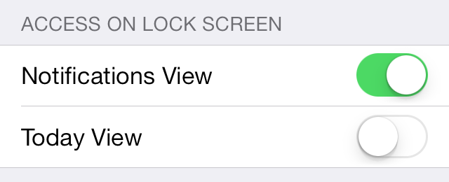
An essential tool for managing all the alerts and info your iPhone is throwing at you, Notification Center was a welcome addition. Unfortunately, it's taken a dive in iOS 7. The super-thin text makes readability difficult, and will probably be what convinces me to turn on "bold" text in Accessibility settings. Also, the addition of a "TODAY" tab is something I really, really don't want. Just give me a newest-first list of alerts, and I'm fine. If iPhone would stick to the tab I last used, it would be okay, but it randomly switches to "TODAY" for no discernible reason. Oddly enough, you can turn off "TODAY" in the lock-screen. Why they don't allow you to turn it off in Notification Center is a mystery.
PASSBOOK...
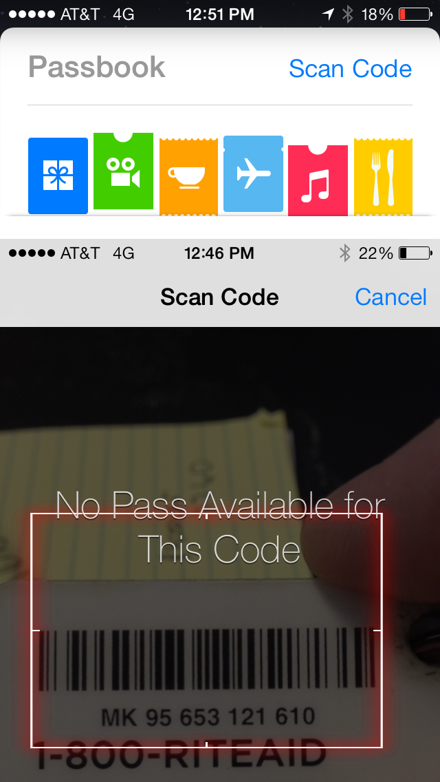
If there's one feature that has become essential in my travels, it's Passbook. It has my loyalty cards, train tickets, airline boarding passes, and other great stuff available instantly without adding bulk to my wallet! So imagine how thrilled I was to find out that the new iOS 7 Passbook was going to allow you to scan barcodes on cards so you can add them to your iPhone arsenal! Except... it doesn't let you create cards at all. It scans your cards and sees if it can find an existing card to add. Except in the ELEVEN cards I tried, it worked on exactly zero of them. Suckage. GIVE US A FREAKIN' CARD DESIGNER, APPLE!
SIRI, PART 1...
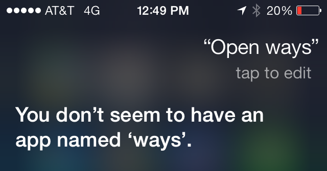
Apple's "personal digital assistant" which is called "Siri" is something people either love or hate... use or don't use. I love her. I use her. And with iOS 7 Apple has given her a higher quality voice and even more functionality. They've even given us a way to make her smarter, thanks to being able to tell her when she's pronounced a word wrong. At first I thought that she would also be learning from the new "tap to edit" link that appears after your query has been parsed, but she doesn't. For example, if you say "Open Waze" to have her open the Waze app... she thinks you are saying "Ways" and so I tap to edit it and type "Waze." Simple, right? But Siri forgets what I've taught her, so next time I say "Open Waze" she gets it wrong again. Bad enough she doesn't even try to find the app when she knows I'm asking for an app, but not being able to teach her that I actually have a Waze app is pretty lame.
SIRI, PART 3...
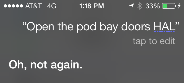
One thing I was excited about with the New and Improved Siri was the option to have her become a him and speak with a male voice. This would allow me to live with HAL from the movie 2001 in my pocket, which is a dream come true for somebody with my name. "I'm sorry, Dave, I'm afraid I can't do that...
Except... male Siri doesn't sound like HAL. He sounds like female Siri who has been pitch-shifted to have a deeper voice. This wouldn't be terrible if Apple allowed 3rd party voices so somebody could build HAL for iPhone, but they don't. Boo.
SIRI, PART 3...
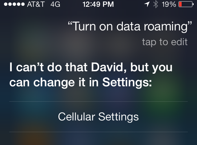
As I mentioned, Siri has new functionality that's kinda handy. When you tell her "Turn on Bluetooth" she understands and takes care of it. Cool! Except... she appears to be severely limited here, and it's maddening. Why is it I can say "Turn on data roaming" and she understands it, knows it's located in "Cellular Settings," and provides a link to get there... but she won't just change the damn setting for me? These kinds of omissions drive me nuts.
CONTROL CENTER...
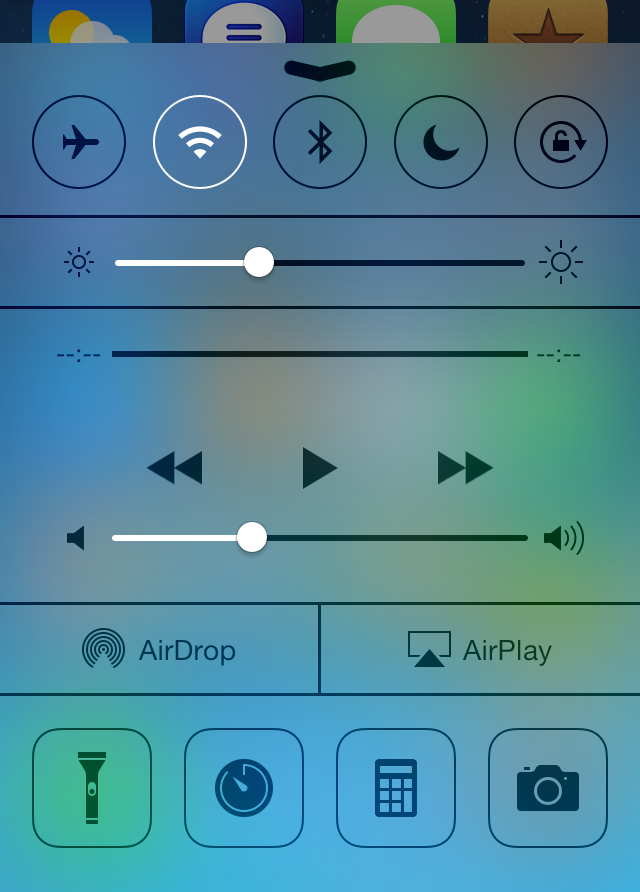
Apple did us a huge, huge favor when they finally gave us a way to access frequently-used settings and tools in iOS7's new "Control Center." And it's great. Just swipe up from the bottom, and you're there! Except... it's not configurable, which sucks ass. When I'm traveling, I use international data roaming, which is very expensive. In order to save money, I find myself turning it on and off frequently. As mentioned above, Siri can't do this. Instead it takes multiple taps to get to the settings because I can't configure Control Center to have it, and this is nuts. I rarely use my phone as a calculator or stopwatch, why in the hell are they taking up space that could be designated for something I will use.
DATA ROAMING...
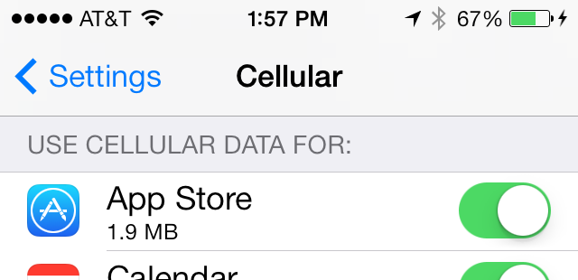
Falling in line with my previous point, turning off International Data Roaming wouldn't be so important if I could choose which apps are able to use it. But, while iOS 7 does allow you to choose which apps can use cellular data, it's all or nothing. There's no way of saying "This app can use Cellular data at home, but not Data Roaming abroad." So, basically, Apple has screwed international travelers not once here, but three times. Does nobody on the iOS team ever leave the US?
And... that's about it for the things I would like changed in iOS 7.
Today.
Tomorrow the list may be entirely different.

I love comments! However, all comments are moderated, and won't appear until approved. Are you an abusive troll with nothing to contribute? Don't bother. Selling something? Don't bother. Spam linking? Don't bother.
PLEASE NOTE: My comment-spam protection requires JavaScript... if you have it turned off or are using a mobile device without JavaScript, commenting won't work. Sorry.

I had to go for the bold text option. There is an “increase contrast” option just below it but I can’t see that it’s doing anything. I’ve got white text that just can’t be read on some backgrounds (I’m just going to have to change my background I guess).
They’re killing me with the camera selection, I have to slide to pick video (or the others), I can see the word, I can’t just click it?!? I liked the old way which was faster and more importantly, I could with out my glasses; I can’t see the image (and trust apple to focus) but I can’t read the text options…
The icons are weird, I personally don’t think any look any better. On my phone it doesn’t matter, I know where many of them are by geography (or I have to search by name). But on my iPad the suckers move if I’m in portrait or landscape, that’s making me a little cRaZy (always has).
The animations are cute, but any day now I’m going to do the math as to how much time they are actually wasting for me and the world at large. Don’t need animations, just need my things to pop up! I think it feels more like they skinned iOS 6 with some icons and a few animations.
The cellular data restrictions is neat, on my limited data iPad this is nice. But they really need to have some other settings, let ME decide what’s a slow network (I feel the same for my computer). Don’t update the OS at McDonald’s it’s WAY too slow, but it’s WiFi so it thinks it’s fast. Plus, I’ve got a cellular WiFi hotspot box (which I’m going to use instead of the data on the iPad) and I don’t want those apps using data on that cellular, but Apple thinks it’s WiFI (because it is).
Ah well, in a few weeks I guess I’ll be used to most of the items in it.
(And I feel like the signal strength indicator is taking up the whole status line!)
Since I’m switching iPhones in a week, I’ve only updated my iPad 3 to iOS 7. And so far, I really like it. The app switching is my favorite, which is very much like webOS (which I loved as a mobile OS)
I use Siri more often than I used to, so am looking forward to trying to open apps by voice. And sending a tweet via Siri is another option I want to try. Although I do miss the Send Tweet option that was in the Notification Center on iOS 6. I’ve not found a setting to turn that back on (or if it’s moved to a new location on iOS 7)
Overall I like the update. Not entirely sold on the icons and the font has taken some getting used to.
Animations seem a little laggy on my 4S. Might just be my perception mind you.
The ‘collections’ feature in Photos is all over the place and location accuracy is not something Apple appears to have been going for here. Not sure they are deciding that photos I’ve taken all over the State were taken at my house. Er, no.
And then there was the bloody battle I had after upgrade with no third party apps being able to access the camera roll. Settings->Privacy->Photos showed no apps listed nor any means to add any. Turns out it was Settings->General->Restrictions->Privacy->Photos (how obvious, duh) that was overriding Settings->Privacy->Photos.
Still, this upgrade forced me to get with 2013 and upgrade to iTunes 11. I initially restored my Mac from backup last year specifically to get iTunes 10 back. I hated the new font in iTunes 11 that much it made me not want to use it. Luckily the internets came to my rescue last night and revealed how to change the font back to LucidaGrande. So now I’m happy 😉
Aside from a bug where many of my photos come out as a box of black instead of the photo I actually took, I like iOS 7. Too bad one of the biggest reasons I use my iPhone is for taking photos………!!!!!!!!!