 I have never told the whole story of how my blogging mascots, Lil' Dave and Bad Monkey, came to be. I thought perhaps I would save it for their tenth birthday in 2012, but something has come up to change my mind. Thanks to an offer too good to refuse, I managed to purchase a custom Gowalla stamp featuring the DaveToon Duo. For those not familiar with Gowalla, it is a location-based social networking game where you can follow where your friends go, collect location stamps, find interesting new spots, and keep track of the places you've been.
Until recently "custom stamps" were only available to "landmark" spots like The Eiffel Tower or to spots that the Gowalla Team liked (usually in Austin, where they are based). But there was an entry-price stamp test program I signed up for and, voilà, Blogography has it's own stamp...

My logo on the left, the Gowalla stamp interpretation on the right (enlarged 250%).
And now the story of how I cam up with Bad Monkey and Lil' Dave. So I can do a good job of it, I've got back through all my old file archives and pulled out all my early sketches and drawings, so you can see how things came together from the very beginning.
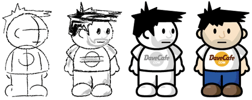
Surprisingly, Lil' Dave and Bad Monkey were not created for Blogography. They were originally drawn up to solve a problem at my other blog, DaveCafe, which is a travel journal and review site for all the Hard Rock Cafes I've been to.
The problem was that I love the Hard Rock, and I felt really terrible when I had something bad to say about one of my visits. Trying to distance myself from my own criticism, I came up with the idea of having an alter-ego who would talk about anything "bad" which would leave me to be the hero and talk about all the good stuff from my visit. Since I've long been fascinated by monkeys, I thought that it would be cool to have a kind of "Curious George" sidekick... but wicked-crazy instead of curious to deliver the bad news.
And thus the idea for "Dave and Bad Monkey" was born while I was in New York on July 13th, 2002.
When starting out on a project like this, I often fill an entire page with a "base" element (in this case, a head-shape) then draw up numerous variations around it. At this point, I was mainly concerned with getting the hair right, but was also working on the eyes and nose. The mouth was always going to be a simple slit from the very beginning, as the Dave character was supposed to be "neutral" when delivering his review...
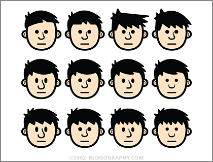
As I drew more and more variations, I was refining the hair to be more styled. In the beginning, it's simple shapes and pen-tool scribblings, but ends up having curves to look more realistic. Once I got to the last head, I thought the hair was getting a little too perfect. Which doesn't really look like me at all. My hair is a perpetual mess, and so I went back and redrew the last row to have a more spikey look in the bangs.
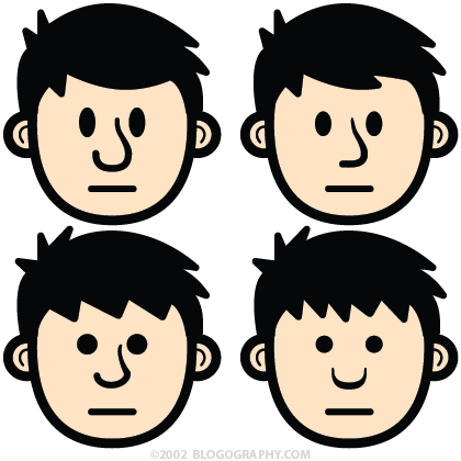
Below is a close-up of some of the characters above. Originally, the eyes were all round, but I went back and started trying ovals. I wasn't sure of the right size so I played with that as well...
After filling the page and getting to a hairstyle I liked, I realized that my head-shapes were too vertical. Computer screens are wider than they are tall so I wanted a character which would economize height. Working on a copy of the file, I turned all the heads horizontal and rearranged the hair and facial features to fit...
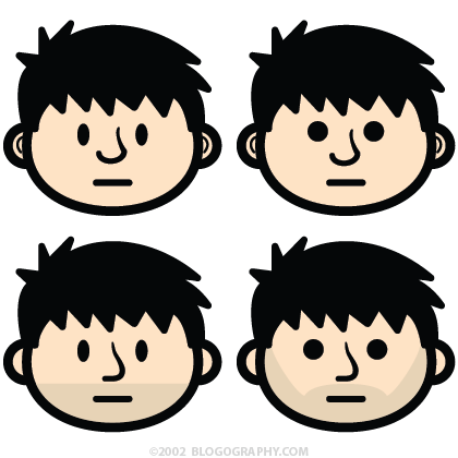
The wider head made Dave look much, much younger, so I toyed with the idea of adding a five o'clock shadow so he'd look more like an adult.
At this point, I thought the round eyes made Dave look stoned so I changed everything to ovals. Then I became convinced that the oval head-shape was lazy, and started playing around with the idea of using more of a squashed-egg look instead. Once I did that, the rounded hair was starting to look "over-styled" to me again, so I went back to my original concept and started messing around with simple pen-tool spikes for hair...
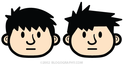
After a number of head-shape iterations I decided to go back to an oval. The egg-shape made his cheeks look pudgy, and I liked the simplicity of an oval better. Wanting to simplify things further, I removed the lines in the ears. I had abandoned the five o'clock shadow for a while but eventually came back to it because I thought it made my character more unique...
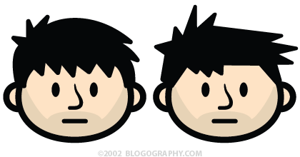
It was around this time that I became obsessed with the nose. Up until this point they had all tapered at the bridge in order to add depth to the shape. But I disliked having something so pointy on the face. The only thing spikey was supposed to be the hair, and so I re-drew the nose with a consistent pen width. It still bothered me, but at least it looked "right" on the face now. The last thing I worked on was the hair. Since Dave was flat I liked the idea of making the hairstyle two-dimensional. That way I could just flop his hair to make him point in the other direction.
After roughly two hours of sketching across six Adobe Illustrator pages, I had narrowed down the design to two choices...
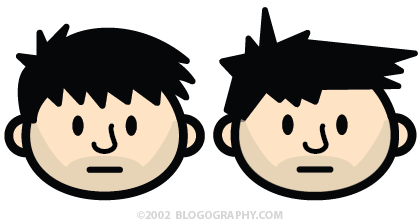
At this point, my decision was easy. The rounded hair looked like a strange comb-over and seemed a bit ordinary. The spikey hair was more cartoony, interesting, and reminded me of one of the greatest cartoon characters of all time, Calvin from Calvin and Hobbes. So all that was left was to create a Bad Monkey sidekick. There was no sketching this time around. I removed the hair and face from Dave, shrunk it, then just drew a monkey face on it. The total design time for my monkey pal was probably five minutes...
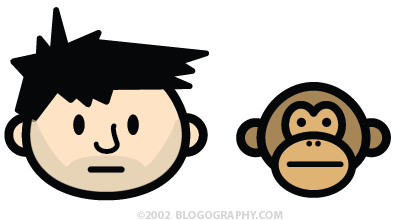
The problem was that he didn't look very "bad" and came across as kind of sedate. I thought the beady round eyes would add a little crazy, but it wasn't enough. Thinking I was over-thinking things, I went ahead and published the cartoon heads at DaveCafe and went to bed.
Then couldn't get to sleep. It really bugged me that Bad Monkey was getting short changed, since using him as a scapegoat was what caused me to create the cartoons in the first place. Rather than do variations of a dozen different monkey heads, I just kept tweaking and fine-tuning the drawing I already had. I remember adding spikey fur on his head, but he looked too much like Dave. Eventually I thought I'd just draw him screeching with his mouth open because it was the only way I could think of to make him look a little insane...
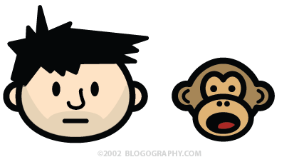
And just like that, I had found Dave and Bad Monkey!
Except not quite.
When I reduced the heads down to size, Dave's mouth looked a bit like a grimace, so I redrew it as a smile. And hated it. His nose, which had always bothered me, looked like a blob when outlined in black, so I changed it to something more subtle. I wasn't terribly happy with the end result, but it was getting very late, so I went ahead and published them anyway...
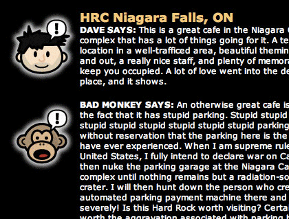
And that's how the characters would stay for nearly a year.
Tune in tomorrow for the exciting finale...
Can you feel the excitement? Can you? Well I'll see you tomorrow then!

I love comments! However, all comments are moderated, and won't appear until approved. Are you an abusive troll with nothing to contribute? Don't bother. Selling something? Don't bother. Spam linking? Don't bother.
PLEASE NOTE: My comment-spam protection requires JavaScript... if you have it turned off or are using a mobile device without JavaScript, commenting won't work. Sorry.

I’m actually excited to see the conclusion. This is fascinating.
I can’t wait. This is a great story!
I love the behind the scenes info into the creation of Lil Dave and Bad monkey! SUPER COOL!!!!
Fascinating! I know nothing of such processes, so I actually found this interesting.
That’s really nice. I DID enjoy reading “Evolution, Part One.” So funny, but so genius! I can’t wait to read the rest. Please, hurry up :-)Have you ever thought of writing a comic book?! Maybe, you have! Awesome stamp, by the way!
I’m with Poppy (not literally). That was actually pretty fascinating. It’s always interesting to see how the sausage is made and the fudge is packed, so to speak.
I love this look inside Lil Dave and Bad Monkey and can’t wait to see more. Your creative process fascinates me.
yesterday the (not so) new guy and i took his mother and also his son on a day trip. zak sat in the back seat with his gram and asked her to play cards. i was driving and silently impressed that the kid who is 11 years old remembered to bring something to entertain himself on the drive. of course i almost wrecked when he told his grandmother the story of becky giving him cards for his 10th birthday that her friend created with his own characters, lil dave and bad monkey. then he went on to show her the different stories and tell her that lil dave is always happy and positive while bad monkey handles all the negativity.
i’m looking forward to showing the budding artist your process! thanks for this, dave.
I love these behind the scenes type posts too. Can’t wait for the conclusion. More posts like this one. A+++++ would read from again.
what they said.
I feel it! 😀
I love this kind of stuff – thanks for sharing your creative process. Can’t wait for part 2.
Your Lil’ Dave and Bad Monkey shirts are pretty much the only thing I like in Vahid’s wardrobe.
As always, I’m very impressed!
I love this post. I’m fascinated to see the process at work & am so glad you saved all the steps.
VERY cool. But when do we not only get the 3-D Lil’ Dave, but the 3-D IMAX version? I’m holding out for that.
Congrats on the Gowalla thingie, and thanks for sharing the story. Always fascinating to see how works of art evolved.
You know I am a big fan of your “How did they come to be” posts. I’m on the edge of my seat waiting for part 2 (honestly, I am)
How does Gowalla compare with Whrrl or Foursquare?
I’m enjoying the back story.
To use Dave’s words when I asked, “It’s prettier.”
I’m on both Gowalla and 4square.
I was hoping this story would be told with hand puppets… 🙂
I love Bad Monkey…..if you made a Bad Monkey doll, I would buy one….and you should write a Bad Monkey book and sell it on Amazon……he is so fresh and a-peeeling…..