
 Welcome to a totally unexpected... PART FOUR of a series detailing the evolution of Lil' Dave and Bad Monkey over the years. I say unexpected, because I thought yesterday was the end of it, but I got some emails and questions, so I thought I would extend another day.
First of all, a look at what could have been with the "colorways" of the DaveToon vinly dolls I was working on before the company closed-up shop. Here's the painting instruction sheet I made for the manufacturer (I removed the paint color notations so you can see the characters better)...
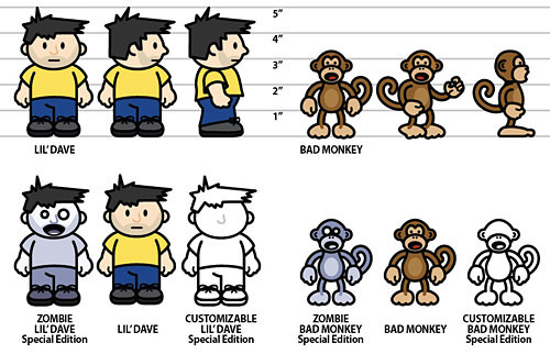
The dolls would have come as a set in a custom-designed box with a clear plastic window in the front and various "accessories" tied to a background card behind them. I hadn't actually drawn the box, because I was waiting to get the final shape, but I had sketched out some concepts based on an old G.I. JOE box I had found. The idea was to make it look slightly "vintage" and show all the features and accessories as EXCITING FEATURES on the back and sides. The box would be the same for all the versions, but a space would have been reserved to sticker the three variants...
And that's as far as I got. I was supposed to get prototype dolls and a bunch of other stuff for the deposit I payed, but I never saw any of it. For those who asked, the pricing is a tricky business, because I hadn't gotten information on duties and taxes and shipping fees. My goal was to sell the "Classic" dolls for $15-$17, the "Zombie" dolls for $22-$25, and the "Custom" dolls for $30-$35... but that could have gone up or down depending on how everything ultimately got costed out. Considering a single 6-inch doll usually sells for around $40, I thought my pricing was pretty good. The idea wasn't so much to make money, but to simply cover the costs of making the dolls... just because I wanted them! Oh well.
One of the most popular questions I continue to get is "How do you draw your DaveToons?" I had answered this question in a smart-assed way back in September, 2006 (NSFW!)... but it's probably time to give a serious answer. While I don't have time to create a comprehensive "How-To" showing every last detail as to how things are done, what I CAN do is run through all the steps it takes to draw one of my characters...
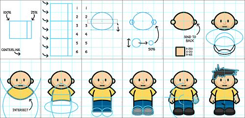
BUT FIRST, FAIR WARNING: I will absolutely concede that this will look a heck of a lot easier than it actually is. If you are not familiar with Adobe Illustrator, then you should understand that this is a program that takes years to master. I have been drawing with Illustrator most every day for over twenty years and there are still things I have problems with. I just want to be sure that somebody reading this doesn't think "Wow, this is simple! I'm going to draw cartoons too!" then run out and spend $600 on Adobe Illustrator only to find out that it's not quite as easy as all that.
With that having ben said, you can see the basic concepts that go into how I approach the "DaveToon Look" in an extended entry...
Alrighty then.
DaveToons are meant to be as fast and easy for me to draw as possible (hey, nobody is paying me to blog!). Because of this, I don't actually "drawn" them. Instead, I take a shortcut by using basic shapes (like ovals and squares) to construct the pieces. Sometimes these shapes are chopped up by other shapes... sometimes I move around the draw-points to distort them a little bit... but it's all just shapes in the end. The example below is how I draw Lil' Dave, but it can be applied to absolutely everything I draw in a DaveToon. Hopefully after you see how this works, you'll be able to spot the shapes in other objects you see.
Anyway, here we go...
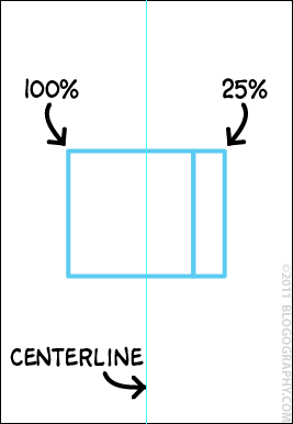
Since most of the stuff I draw is symmetrical, I always start by drawing a centerline guide. Lil' Dave's measurements are based on a cube. Since he's wider than he is tall, I widen it by adding a cube that's 25% the width of the base dimensions like this...
I stack three cubes on top of each other, then draw a grid to work on by placing a guide at the top, bottom, and middle of each cube, then a guide on each side like this...
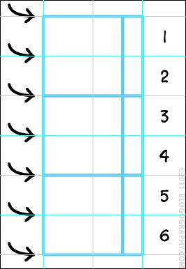
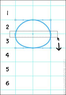
This will give you 12 cubes side-by-side that are 100% by 125% each. After that's done, we can draw an oval for the head. We don't want Lil' Dave's head to be perfectly egg-shaped, so I use the point selector to grab the two side draw-points, then pull them down a bit like this...
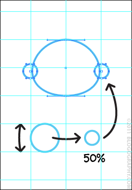
Now that we have an oval head with a little bit of a droop to it, we can draw the ears. Each ear is a perfect circle that's one block high, then shrunk 50%. After you have the shape, you can center it next to the sidepoint of the head (don't center on the grid or they'll be too high!)...
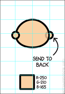
Some people I know don't even think about coloring until they've drawn everything. I prefer to color things as I go along so I don't get lost (I can always change them later!). You can see what I mean below. Since the ears were drawn after the head, they're on top, which is not what we want. By coloring them, we can see this and know to send them to the back...
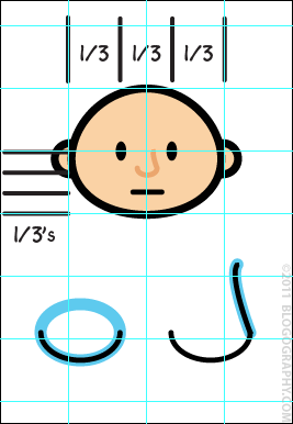
Lil' Dave's 5-O'clock shadow is made using Illustrator's Pathfinder tool. You copy the head shape, then draw ovals on it to define the shape you want. To make it easy for you to see, I've outlined the shape we're trying to make in black, then drawn the shapes which define it in blue..
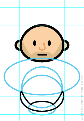
Here's a step-by-step showing how I use Pathfinder to make new shapes by subtracting/adding/intersecting with other shapes...

Once the 5-O'clock shadow is finished, set it to a blue-grey color and the opacity to MULTIPLY, then slide it into place. For the sleeves on Lil' Dave's shirt, draw two large intersecting ovals BEHIND his head like this...
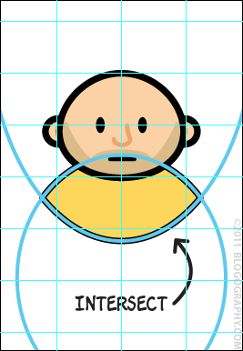
His shirt is part of a skinny oval merged to a rectangle with the top cut-off. I then subtract from all that with a wide oval to get the shape of the shirt-bottom that I'm looking for...
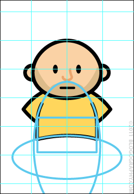
His trousers are just a blue rectangle sitting in back of everything else. I then draw two ovals for the feet. Originally, Lil' Dave's feet were a full-square wide. But over the years they've become a little skinnier, so I shrink the width just a little bit, then butt them up against each other on the centerline...
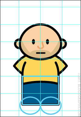
I then drag the bottom draw-point upward to the guideline on his feet so they're flat on the bottom. Once I have the foot-shape, I sometimes duplicated it and intersect with the original to put a sole on the bottom of the shoe...
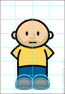
Originally, Lil' Dave had mittens for hands. The arms were just a big flesh-colored oval sitting behind everything else, then I'd merge a small oval "thumb" onto both sides. But eventually I wanted him to have hands and fingers, so I just distorted a bunch of small ovals by moving their draw-points, then merged the whole mess together. On the LEFT side below, you can see how the arms are made from an oval that's been cut off. On the RIGHT you can see how the hand is a glob of oval shapes...
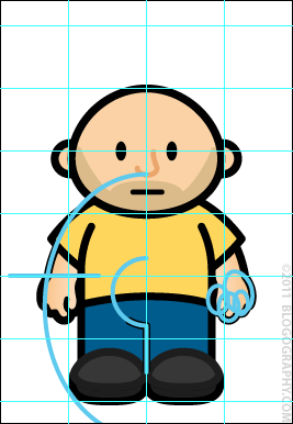
I added some shading to the arms so you can more easily see the thumb. Oh... and you can see how the split between his legs is just a line drawn up to a tiny part of a circle that was made one gridline high.
All that's left is the hair. This is the ONLY place where I actually "draw" anything. I just grabbed the pen tool and traced out a spiky mess on top of his head like this...
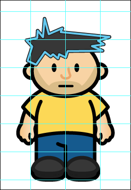
And that's it! The finished outline looks like this...
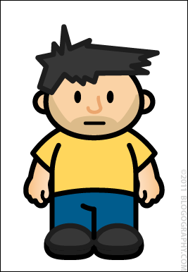
Then I use the gradient tool to fill the various shapes so they appear shaded and a little 3-dimensional. Lately I've also been drawing some small ovals to add shoelaces to the top of his feet as well..
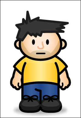
Violá, it's Lil' Dave!
Most of the time, I don't draw a new character from scratch, I'll just re-use an old one. When I DO end up drawing a brand new character, they usually change in some way. If you look at old DaveToons, you'll see that Lil' Dave's shirt used to be a straight-line at the bottom. Then it changed and dropped down in the middle. Recently I decided I wanted his legs to look a little longer, and so I made the shirt-bottom climb up a little bit. Everything is always evolving so I don't get bored and have more flexibility with the characters.
If you'd like to try drawing cartoons with a vector program yourself, you'll need a vector drawing tool...
There are many others, of course, Wikipedia has an entire list of them... I'm just throwing out a few I am familiar with.
And that's pretty much all I got. I apologize that I can't be more comprehensive, but even this basic steps guide took me two hours to make, and I just don't have time to break everything down further. Hopefully it will at least give you a hint of how I approach making DaveToons, and show you how shapes can make vector-drawing a little easier.

I love comments! However, all comments are moderated, and won't appear until approved. Are you an abusive troll with nothing to contribute? Don't bother. Selling something? Don't bother. Spam linking? Don't bother.
PLEASE NOTE: My comment-spam protection requires JavaScript... if you have it turned off or are using a mobile device without JavaScript, commenting won't work. Sorry.

That is SO cool! I have Illustrator because it came with the Creative Suite but I don’t know a thing about it. I am still working on learning Photoshop! Thanks for showing us some of your magic!
I wish I knew how to use Illustrator so that my Avitable drawings could have the consistency of your DaveToons. I hate how different they look every single time.
Really? Because I always thought that was part of the charm. Your cartoons are actual drawings, whereas mine are more like Colorforms or something. 🙂
I don’t get anything you just did but it was pretty cool to see.
I always wondered how you drew your sidekicks. I draw with pencils all day, but have never attempted to render anything on the computer.
We have Adobe Illustrator, but I’m quite confident I can’t do stuff like this, so I won’t even try.
Illustrator has been a thorn in my side for years. I have the worst trouble getting it.
I am SO glad Lil’ Dave doesn’t have mitten hands! That would’ve creeped me out.
🙂
It’s all about the vectors, man. I learned a little of Illustrator back in the day and it takes wrapping your head around some things.
I may just have to check out Inkscape.
Thanks for the wonderful Lil’ Dave rundown!
I’ve really enjoyed these BTS posts, Dave!
Zombie Dave would have made a sweet Christmas present. As it was, I spent a fair bit of time looking for shirts with zombies on them.
Well that looks SO simple. I’m going to go spend $600 on Illustrator today and draw cartoons! Not.
I’m still trying to master Photoshop. I can’t even begin to imagine attempting Illustrator although I’ve wanted to play with it for about 20 years!
Wow. Best post ever. I absolutely love these. More, more.
I start to cry every time I am forced to open Illustrator, so this is super impressive. My dad spent his career as a creative director and graphic artist, but unfortunately none of his talent was inherited by me.
Thanks Dave. This li’l series has been interesting and very cool!
loved this behind the scenes. i’ve always said you are incredibly talented and seeing as how, even with this step by step, so many of us couldn’t do what you quickly do…i’d say i was right!
I have no interest messing with your perfection. I leave Lil Dave, Bad Monkey, and all other toons to you.
I have totally loved this serie of how Li’l Dave and Bad Monkey came to be. You should add professor/teacher to your CV of genius.
It saddens me that the vinyl dolls are not “live” in the near future!
Very cool. I’m clueless about drawing programs, but it was interesting to see how you make Lil Dave and Bad Monkey.
I still would love to see the dolls come to life someday (as in an actual product for your fans).
As for Illustrator, I use CS3 and am no where as skilled in it as you are. I have done some logos, like the one I use for Scooter/ScUtah Sunday. And one I did recently for my business cards. Simple, but I can get around and do some basic vectoring.
I also have the Adobe Classroom in a Book for Illustrator, which I went through about 20% of it, getting myself acclimated to the basics. Imagine what I could do if I finished the lessons in the book.