
 Another Apple event?
Apparently this is for all the crap they didn't want mucking up their big iPhone 6 slash Apple Watch event last month.
So what's on-deck this time around? Let's take a look, shall we? Needless to say, there will be spoilers for those who haven't seen the broadcast.
• iPhone 6 Launch! Before Tim Cook takes the stage, we get to look at the hysteria surrounding the launch of the iPhone 6 from around the world. Holy crap. As big of an Apple Whore as I like to think I am, even I felt this was way, way over the top and embarrassing. It's not a cure for cancer, people... it's a frickin' PHONE. Albeit a pretty phone. That's too big. I want the same size iPhone I used to have. Not surprisingly, it's the biggest iPhone launch ever, because aren't they all?
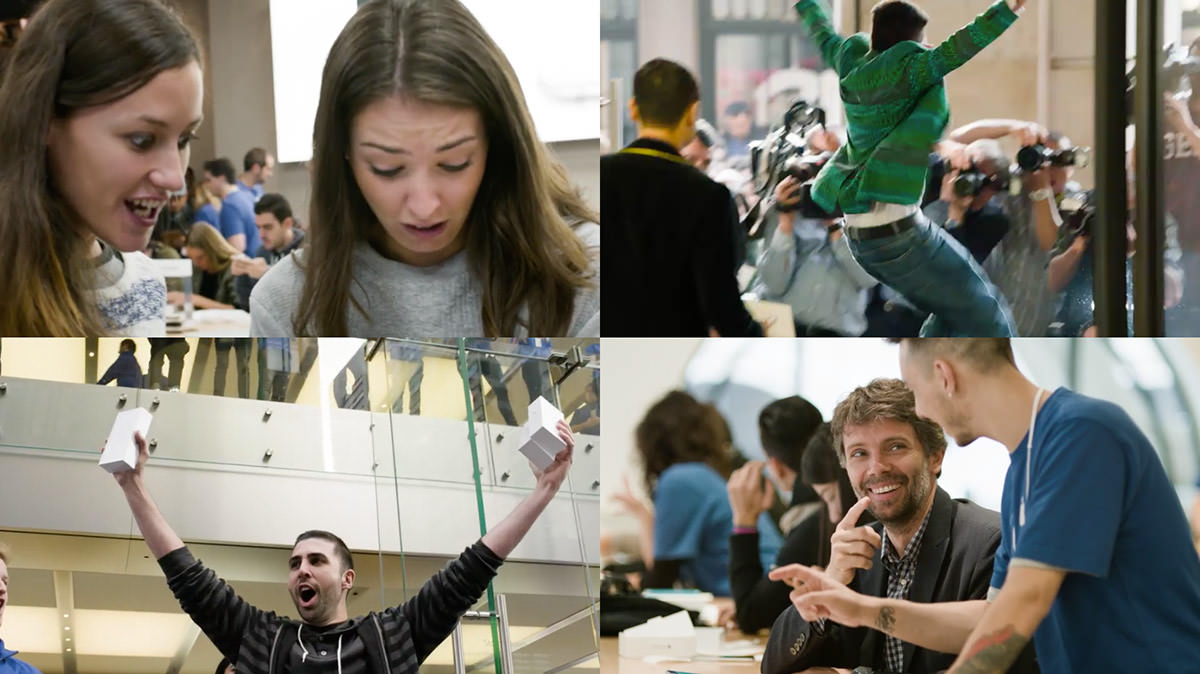
1. ZOMFG, WHITNEY, IT'S A PHONE! ZOMFG, BRITTANY, THIS IS THE BEST DAY OF MY LIFE!
2. There may be genocide in Syria... BUT iPHONE, MUTHAFUCKER!!!
3. SECOND MARKET VICTORY IS MINE! SEE YOU ON eBAY, BITCHES!
4. YOU, SIR, ARE A FUCKING iGENIUS! I'd like to book some one-on-one training!
As if that weren't enough hype, Apple dusts off Walt Mossberg for one of his idiotic quotes designed to make people think that Walt Mossberg is still relevant to tech journalism when all it does is reaffirm that Walt Mossberg will continue to say anything he has to in order to keep Walt Mossberg firmly implanted up the collective asses of giant tech companies so as to give the illusion that Walt Mossberg is relevant to tech journalism.
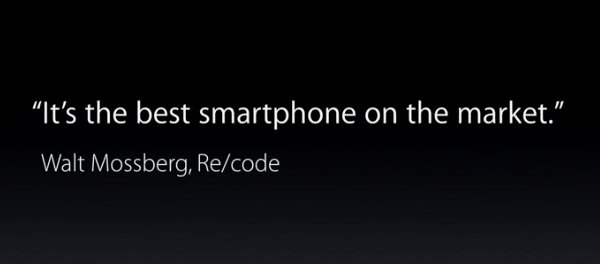
WALT MOSSBERG!!!
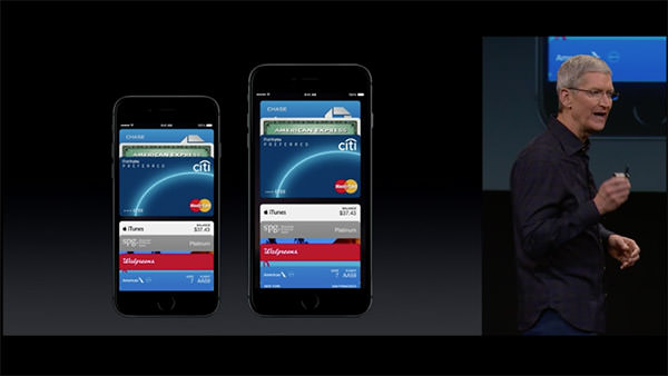
• Apple Pay! Heaven help me, I'm actually excited about being able to pay for things with my iPhone and not have to lug around a crap-ton of antiquated credit cards, debit cards, reward cards, and the like...
• Apple Watch! For the first time in a long time, Apple has announced a product that I'm not immediately wanting to buy. Sure, Apple Watch looks great, and it seems a handy thing to have (assuming you own an iPhone)... but until I see one in person, the idea of having a giant klutzy bangle strapped to my write holds little appeal...
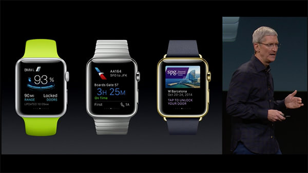
Naturally, it's better-looking than anything else on the market... but I was hoping Apple would figure out a way to make a thinner profile... put the battery in the band or something... to make it not be such a boat anchor. Oh well. Maybe Apple Watch 2.0.
• iOS 8.1! In addition to iPay, Monday's update will also include a beta for iCloud Photo Library. WHEEE! THAT TOTALLY MAKES UP FOR KILLING OFF APERTURE!
NOT!
But if they finally... FUCKING FINALLY... allow you to AirDrop files between OS X and iOS devices... I'll be happy.
• MacOS X Yosemite! I've been using the beta. I'm not too impressed. Yes, there are some nifty features (I am really loving being able to use my Mac as a speaker phone... and being able to send an SMS from your Mac through your iPhone is fantastic)... but it's just so damn ugly. Hideous day-glow colors I thought had been abolished in the 80's permeate absolutely everything. Tacky, distracting, and just inexplicably bad GUI. Perhaps I'll get used to it. But I doubt it.
• Continuity! The ability to seamlessly transition from your iPhone to your iPad to your Mac is a pretty killer feature. The problem being that it doesn't always work the way you'd expect it to. Much like the early days of iSync, it would seem that Continuity has a ways to go before it actually becomes the user nirvana it claims to be. Bonus points to Apple for getting Stephen Colbert onboard for his Supreme Commander of Security bit though.
• iPad Air 2! Not a lot of new features and improvements here. Certainly not enough to get your average iPad Air user to buy the latest model. And yet... LOOK HOW THIN IT IS! IT'S THINNER THAN A PENCIL! TWO iPAD AIR 2's ARE THINNER THAN THE ORIGINAL iPAD! THEY'RE SO THINNNNNNN!

The bonded, glare-resistant display sounds nice. Wish they'd update all their other shit to have less glare on them. A speedier processor is great if you're playing a lot of games and such. Using an iPad as a camera is weird to me, but a lot of people do it, so I suppose they'll appreciate the camera upgrade. Adding Touch ID is a no brainer, as iPad Air 2 can be used for Apple Pay.
The ridiculous thing here is that, like with the iPhone 6 before it, Apple doesn't start the base model with 32GB. $499 for 16GB? Absurd. And then it jumps all the way to 64GB... WTF?
• iMac Retina 5K! Okay... this... THIS... is frickin' incredible. Phil Schiller's presentation pretty much said it all... for the entry price of $2,500 you get a mind-bogglingly beautiful 5K display that's cheaper than most 4K displays... and a computer thrown in for free...
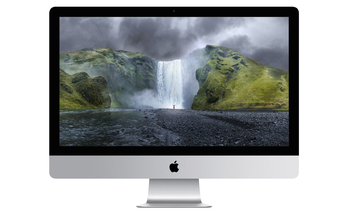
Forget the Mac Pro... THIS is a photographer and graphic designer's wet dream...
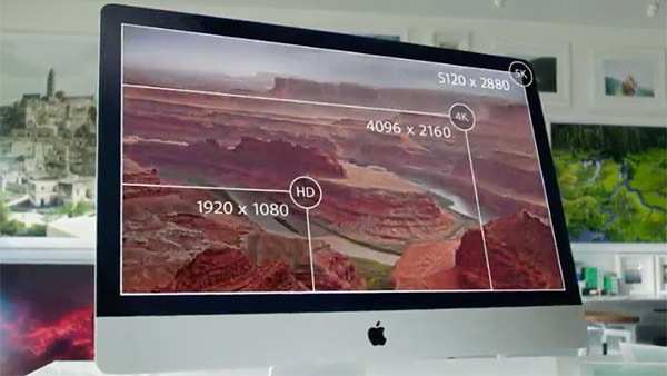
Once I got used to the Retina Display on my MacBook Pro, it's almost painful to use a machine that doesn't have a Retina Display. Assuming I can ever afford to buy this, I won't have to.
WANT!
WANT SO BAD!
• Mac mini! Kind of a wacky product to still have around. I mean, sure, when you were trying to get Windows users to switch, it made sense to have a cheap Mac that could use your existing monitor, keyboard, and mouse... but now? Well... I suppose there's still an audience out there given that Mac mini is half the price of an iMac... but it's really not the best way to experience a Mac, and I'm surprised Apple is still dredging the bottom of a dying computer market.
Then again... market share is market share, and Apple is about the only computer manufacturer out there still able to be in it at a profit, so what do I know?
UPDATE! The internet is having a field day over the fact that the new Mac mini no longer allows user-upgradable RAM. A valid concern, to be sure... and I really hate what this says about the disposability of computer equipment that can't be upgraded... but, again, this is the bottom-feeder Mac of a dying PC market. Can't really blame Apple for cutting every possible corner they can to keep prices at a point that the audience for this item expects?
Annnnd... that's a wrap...
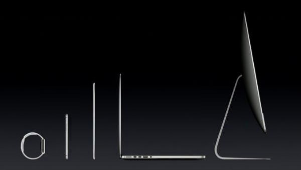
Kind of a lackluster event, so far as Apple is concerned, but it does solidify the ideal that Apple has their shit together when it comes to creating a complete line of products that will integrate into every aspect of your life. They're not just a computer company... or even a tech company, really... Apple is a lifestyle company.
Now if they'd just come out with their own television and DVR service for my lifestyle, I'd be really happy.
 "Android fragmentation is turning devices into a toxic hellstew of vulnerabilities."
— Adrian Kingsley-Hughes, ZDNet
This is the second half of my notes on Apple's Worldwide Developers Conference keynote, this time focusing on what's coming down the pipe in iOS 8. And something else entirely, which was an unexpected surprise.
To start things off, Apple CEO Tim Cook was back on stage to drop some rather startling statistics on iOS update adoption vs. Android update adoption...
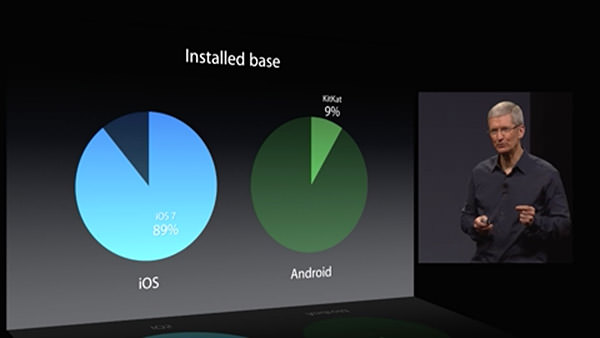
89% of iPhone users are on the latest version of iOS. A mere 9% of Android users are using the latest version of that mobile OS. For developers, this is a pretty big deal. If you are counting on new OS features for the functionality of your app, you have to be assured that your users have a version of the OS which has those features. From the looks of things, Android developers are going to be very slow to implement new stuff in their apps, because the vast majority of their users are on some older version where they are unsupported. Add to that the heinous fragmentation of the Android OEM variants, and Apple has made a very good case for developers to choose iOS as their platform of choice.
After Tim Cook's intro, Craig Federighi comes back to show everybody what end-user features and improvements we can expect with the next update.
One area where iOS has always been pretty horrible is dealing with interruptions. Get an alert, and you have to dump out of whatever you're doing to deal with it. iOS 8 takes a big leap forward by allowing you to handle common interruptions (like text messages and calendar alerts) without leaving the app you're in...
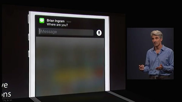
This is very cool, but it would be pretty useless if it were restricted to Apple-only interrupts. Fortunately, interactive notifications are available to 3rd-party apps, which is fantastic for people like me who communicate primarily through Facebook Messenger or other non-Apple services. What remains to be seen is how far the interactivity goes. Can developers customize the controls available to best fit their apps? Or does Apple limit interactivity to internal iOS buttons and text fields? Time will tell.
Taking a page from Windows Phone 8, iOS 8 now has some people-centric additions... like being able to access frequent and recent contacts on the app-switcher page. A terrific use of some wasted space...
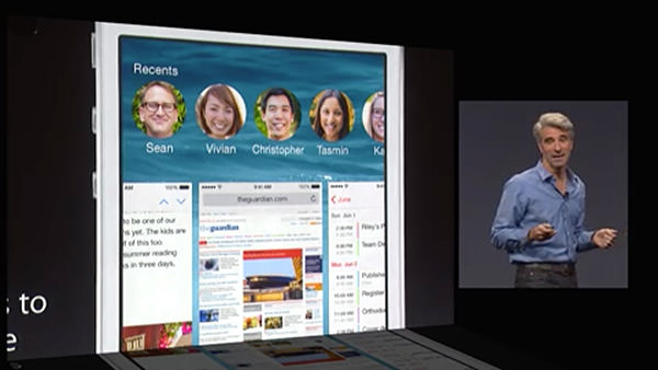
Unfortunately, the usefulness of this feature is hampered by Apple deciding how you can interact with these people. Right now you can text, call, or Facetime with them... but there's no option for Facebook messaging or a slew of other 3rd-party apps that people use to keep in touch with the people in their lives. So, ultimately, a step in the right direction... but not a very big one.
Next up was a beautiful new grouped tabs interface for Safari on the iPad...
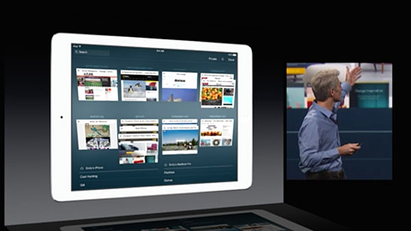
I do three things on my iPad... 1) Watch movies when I travel... 2) Read comic books... and 3) Surf the internet. The area in most need of improvement is Safari for web browsing, and it's nice to know that Apple is at least trying to make it a better experience.
One of the most exciting pieces of news at the keynote was Apple's announcement of an improved keyboard... now with predictive text. As you type, words appear above the keyboard where iOS is trying to guess what you're typing. Kind of like what happens now as words appear above your input cursor while you type... except now you get more than just one word, which should be a lot more productive. iOS doesn't stop there though... it also tries to predict words you'll use in response to emails based on the content and whom the email is from! The keyboard learns context, and tries to be smart about how it assists you...
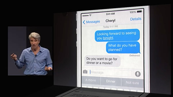
As if all that weren't enough... Apple is now going to allow you to install alternative keyboards! This means terrific technology like Swype, which allows you to slide your finger from letter to letter in a word... and Fleksy which has an amazing word-guessing algorithm and cool gesture controls... can be installed and used system-wide. This is fantastic news, because now users can test keyboards and find the one that will allow them to type the fastest.
And then, AT LONG LAST, Apple has finally given some love to their texting app, "Messages." I don't know what the heck took so long, but now we can finally manage users on group messages... and even dump out of a conversation if you want. If that's too extreme, you can put a thread on "do not disturb" so it won't keep buzzing your phone. Even better, iOS 8 has even more ways to communicate... allowing you to share your location, and even add voice memos and quick videos...
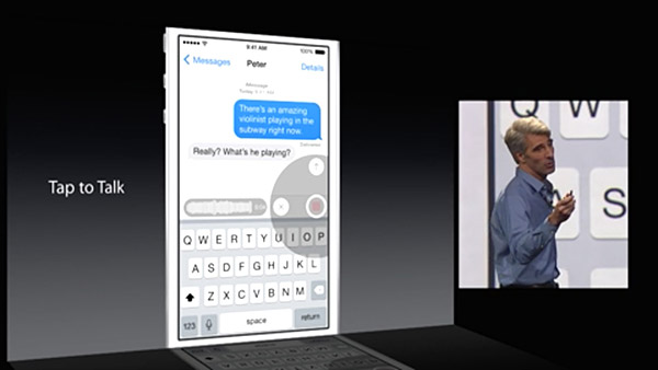
Now if Apple would only get off their ass and give the same attention to VOICE CALLS. I mean, come on... PC call center software has been around for decades which allows you to do simple things like record custom voicemail messages and selectively route callers... why in the hell is iPhone so far behind in this? It IS, after all, primarily a PHONE, isn't it? Oh well, I suppose I should be thrilled that we at least get to block a caller from calling again... how long did we have to wait for that?
And then we have HealthKit... Apple's portal to managing all your health apps...
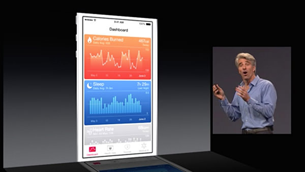
The ultimate promise of the idea is that one day you will be able to monitor various aspects of your health (like blood pressure and the like) which can automatically be transmitted and monitored by your automated analysis software and you doctor. If there's a problem detected, your doctor's office can then contact you to get it sorted out. It's a fantastic idea. In theory. In reality, I wonder how many doctor's offices are going to implement this stuff any time soon. I also wonder when we're going to get Apple's "iWatch" which will have health monitoring and syncing that makes HealthKit actually useful. Who knows.
From there we moved on to photo storage (in iCloud, of course) and the idea of Apple's "Smart Adjustment" technology which gives you the ability to perform comprehensive edits that are smart enough to do a lot of "behind the scenes" work to give you much better photos with little effort...
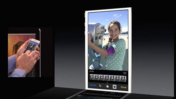
It will be bundled with iOS 8 and be added to Yosemite in 2015. Which is great and all... but I have to wonder where this leaves Aperture, Apple's high-end photo editing and storage software. How will it be able to handle edits made in iPhoto on iPhones, iPads, and Macs? Will they integrate, or be a separate set? Will flattened edits in Aperture be saved out so that devices reading from your iCloud Photos can actually view them? All of this is up in the air. And since Apple won't comment on future software (natch) it's tough to tell if Aperture is even going to be around in 2015. This is very, very frustrating... but so typically Apple. I honestly don't expect them to tip their hand and tell people what's happening with Aperture... but it would at least be nice to know that it's still going to be around.
A surprise to no one, Siri is being updated...
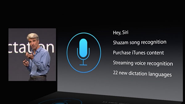
I use Siri all the time, so naturally I am thrilled to have improvements to his/her functionality. What bums me out is how far behind the Mac version is to the iOS version, and no mention has been made as to whether or not any love is going to be spent improving the Macintosh side of things. I would hope so, because the crappy dictation functionality on the Mac is pathetic. Why Apple can't keep up with the iOS side of things is a complete mystery. Why can't you ask Siri questions on a Mac like you can on an iPhone? It makes -zero- sense. And yet here we are.
And here's where things start to get interesting.
Very interesting, if you're a developer.
First of all, Apple is going to finally allow permission-based data sharing between apps. Something that is long overdue and will makes for some incredible extended functionality possibilities. Sure, the functionality will be limited so as to keep data safe... but this is such a massive leap in the right direction that I find it hard to not get excited at the prospect.
Game developers will get up to a massive 10x speed bump in their apps thanks to a new technology called "Metal" which allows them to get closer to the raw power of the iPhone/iPad processor than ever before.
And, lastly, something that took everybody by surprise... a new development language called Swift that takes the best parts of past programming languages and marries them to modern programming concepts while leaving all the antiquated baggage behind...
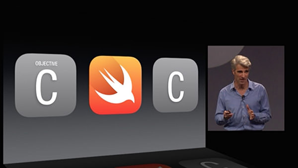
Without being able to see it and play with it, there's no way I can really comment on how useful Swift might end up being. But it certainly sounds promising. And powerful. And easier to use. And smart. I can't wait to take a look.
And that was that.
No new hardware. No new AppleTV. No new iWatch.
Just some interesting new features and a promising new future for Mac developers. Which is what I guess we should expect from a Developer's conference.
So I guess I'll try not to be disappointed with the lack of new toys.
 Because my entire day yesterday was spent catching up on work, I had the Apple Worldwide Developers Conference keynote running... but couldn't pay very close attention to it.
And so... today's the day I get to channel my inner Mac Whore and talk about new happings at everyone's favorite fruit-named tech company. If the thought of that bores you, here's your chance to escape! But don't come back until the day after tomorrow, because that'll be Part Two.
OS X YOSEMITE
The successor to OS X Mavericks, OS X Yosemite, was presented by Craig Federighi, the Senior VP of Software Engineering at Apple...
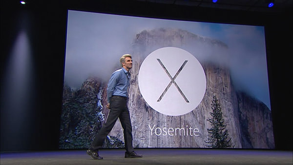
The guy is incredibly charismatic and engaging... reaching to near Steve Jobsian heights with his presentation skills. He's also darn funny, injecting wit and humor into his speech at a breakneck pace.
The look of Yosemite is very much a continuation of iOS7. All aspects of the OS from the controls to the icons have been simplified, saturated, and flattened. In addition, transparency effects have been liberally sprinkled all over the interface elements. Which is something I'm not thrilled about because I find it unnecessarily distracting. Hopefully users will have the ability to disable the transparency like they currently can with the menu bar.
Federighi seemed especially proud of the new look for Yosemite's trashcan...
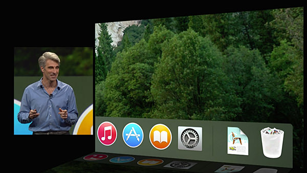
Personally, I don't give a shit what the trashcan looks like... I only care that it works. Which it currently does not in Mavericks. It will show as "empty" even when there's files inside. Hopefully somebody bothered to fix this incredibly basic and incomprehensibly ignored bug.
After talking trash, we moved on to the system font, which is no longer Lucida Grande. I don't know what the new typeface is called, but it's very pretty and easy to read. And as exciting as that improvement is, the next improvement is something I've been begging for... DARK MODE... where the menu bars and menus are darkened so they don't distract from what you're working on...
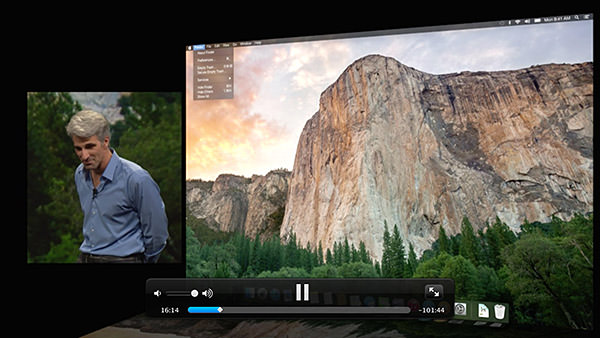
The window model for Yosemite continues to add functionality for title bars and devote more space to content, which is nice. Apple has also changed the way window controls work... with the green button now taking the window full-screen. Something I could get behind if they WOULD ONLY HAVE AN OPTION TO KEEP THE MENU BAR VISIBLE! I frickin' hate going full-screen because fighting the disappearing menu bar drives me insane. I need to be able to see my clock... my battery level... the date... all that important stuff that's so handy to have available... at a glance.
Notification Center is getting the ability to add widgets, which will finally make it useful to me.
Spotlight, Apple's search system for OS X, is getting an upgrade... and this time it looks more than just cosmetic. All I care about is that it's not a flaky pile of shit like the interface is now (How many times do you end up launching the unintended result? For me, it's practically daily). The addition of Sherlock-esque internet data for searching is a welcome throwback.
Next up, Apple puts the smack-down on DropBox by releasing an online storage option of their own called iCloud Drive. I don't know how it will be an improvement over DropBox, which makes cloud storage so drop-dead easy, but I'll definitely be taking a look.
Federighi then took a look at Yosemite's update for OS X Mail... currently the most-hated app I use every day. It is a buggy, slow, and overall shitty email client that looks downright embarrassing when compared to what Microsoft has going on with Outlook. He promises that they have worked very hard to make improvements with the basic functionality, which would be very nice. A new feature for Mail is "Mail Drop," which allows the seamless sending of files up to 5 gigs via iCloud Drive.
Safari is a world-class browser, but Apple's not resting on their laurels. They've added a number of new features for convenience, speed, and improved battery life... but the standout for me is being able to spawn separate windows for Private Browsing instead of it being an "all or nothing" game.
And then came the first surprise of the day... something Apple is calling "Continuity"... which works towards providing a seamless experience between MacOS X and iOS. The crowd erupted in applause when Federighi announced that FINALLY you can "Air Drop" between MacOS X and iOS. This omission has been categorically absurd and, if I had been in the audience, I would have been screaming "IT'S ABOUT FUCKING TIME!"...
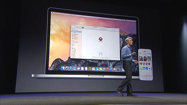
But Apple didn't stop there, because next came a new feature called "Hand-Off." This nifty bit of tech means your Mac and your iPhone (or other iOS device) now has proximity awareness of each other. You can start composing an email on your Mac, then hand it off to your iPhone so you can keep composing as you walk out the door. Additional features, like being able to answer an incoming call from your iPhone on your Mac or use your Mac to make calls through your iPhone is dead-sexy. That Federighi demoed this by calling a "new employee" — Dr. Dre — was just the icing on the cake.
And there's where Apple wrapped up their look at just some of the new features that will be available with the new MacOS X.
The beta for Yosemite has been released to developers already. Non-developers can join the beta program later this Summer. Then everybody will be able to grab a free copy come Fall.
Tune in tomorrow when I unleash my commentary on Part Two of the keynote... with iOS 8.
 And so iOS 7 was released at long last, and has been trumpeted as "The biggest update to the iPhone since the original iPhone." After using it on my development iPhone for weeks, I'd have to say that's pretty much all marketing hype. Yes, it looks fresh, but it's pretty much a few really good new features tacked on to the iOS we know and love... but with a fresh coat of paint.
Not that this is a bad thing! Truth be told, Apple got so many things right when they first created the iPhone that there's not a lot that needed to evolve and change. I'd take old iOS 6 over my Microsoft Windows Phone... and I'd definitely take old iOS 6 over any of the four Android mobiles I own. Now that we're at iOS 7, that goes double. It was a rough start, but now I like it. A lot.
And so now I'm going to talk about some iOS 7 stuff. It's not going to be in-depth, because there's a gazillion websites out there that have this covered, but it will be things I feel are a bit annoying. Because that's what I do.
HOME...
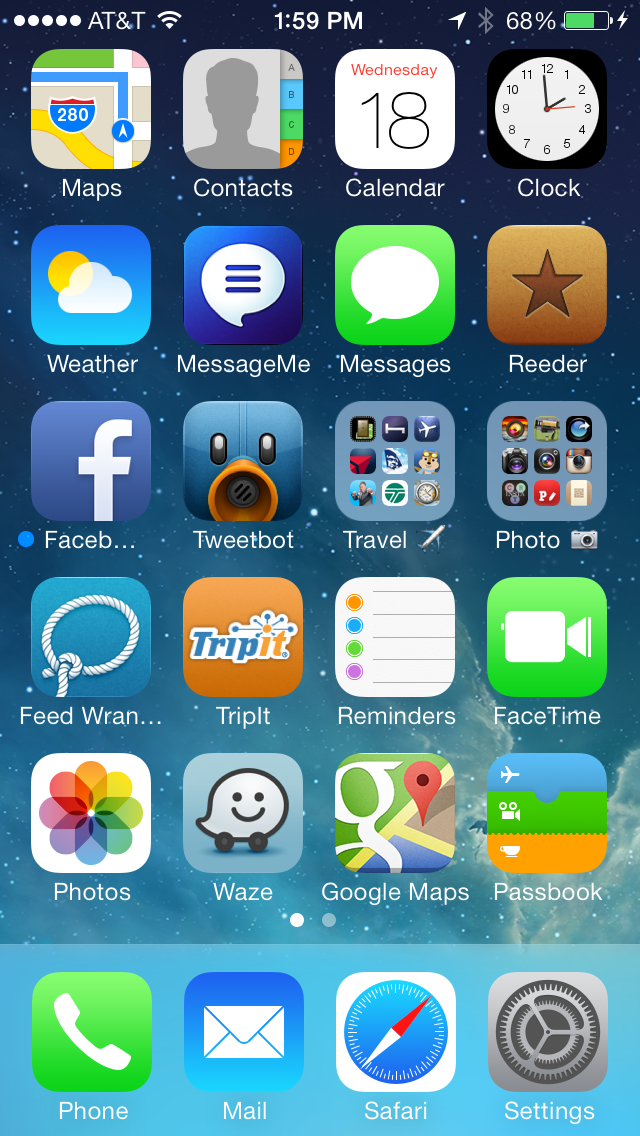
The text is crazy thin... almost too thin... which makes it tough to read in spots. Fortunately there's an option for "bold text" under the General/Accessibility settings, so it's an easy fix. There's no fix for Apple's new boring-ass icons, however, and that's a shame. Yes, some are not too bad... Weather is simple, but effective... Passbook is kinda cool... but what in the hell is going on with Photos and FaceTime? I don't know what the hell Photos is trying to say, and FaceTime uses a video camera shape for an icon that practically doesn't exist any more. And then there's Safari and Settings... both of which are somehow overly-detailed and plain-ass boring at the same time. Total garbage. Give me the beautiful icons for Tweetbot and Reeder any day.
EFFECTS...
Overall, I like Microsoft Phone 8 well enough... but the nonstop barrage of time-wasting animations, flippy-tiles, and other inane bullshit drives me insane. I was always much happier with the more restrained approach that Apple took with iOS 6... pretty animations, but not in your way or wasting time. So of course Apple threw all that out the window with OS 7. Now the phone fades on and fades off... icons glide in slowly from beyond... apps zooooom open and closed. And while it's nifty the first fifty times you see it, by the fifty-first you just want your life back. Hopefully Apple tightens these up in the future, because wasting people's time like this is just wrong.
NOTIFICATION CENTER...
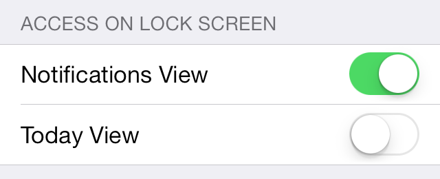
An essential tool for managing all the alerts and info your iPhone is throwing at you, Notification Center was a welcome addition. Unfortunately, it's taken a dive in iOS 7. The super-thin text makes readability difficult, and will probably be what convinces me to turn on "bold" text in Accessibility settings. Also, the addition of a "TODAY" tab is something I really, really don't want. Just give me a newest-first list of alerts, and I'm fine. If iPhone would stick to the tab I last used, it would be okay, but it randomly switches to "TODAY" for no discernible reason. Oddly enough, you can turn off "TODAY" in the lock-screen. Why they don't allow you to turn it off in Notification Center is a mystery.
PASSBOOK...
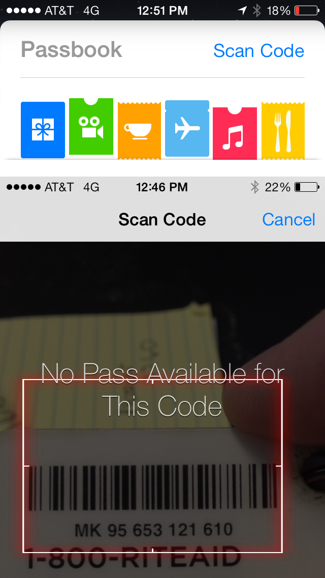
If there's one feature that has become essential in my travels, it's Passbook. It has my loyalty cards, train tickets, airline boarding passes, and other great stuff available instantly without adding bulk to my wallet! So imagine how thrilled I was to find out that the new iOS 7 Passbook was going to allow you to scan barcodes on cards so you can add them to your iPhone arsenal! Except... it doesn't let you create cards at all. It scans your cards and sees if it can find an existing card to add. Except in the ELEVEN cards I tried, it worked on exactly zero of them. Suckage. GIVE US A FREAKIN' CARD DESIGNER, APPLE!
SIRI, PART 1...
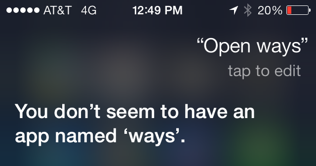
Apple's "personal digital assistant" which is called "Siri" is something people either love or hate... use or don't use. I love her. I use her. And with iOS 7 Apple has given her a higher quality voice and even more functionality. They've even given us a way to make her smarter, thanks to being able to tell her when she's pronounced a word wrong. At first I thought that she would also be learning from the new "tap to edit" link that appears after your query has been parsed, but she doesn't. For example, if you say "Open Waze" to have her open the Waze app... she thinks you are saying "Ways" and so I tap to edit it and type "Waze." Simple, right? But Siri forgets what I've taught her, so next time I say "Open Waze" she gets it wrong again. Bad enough she doesn't even try to find the app when she knows I'm asking for an app, but not being able to teach her that I actually have a Waze app is pretty lame.
SIRI, PART 3...
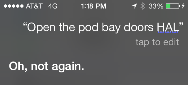
One thing I was excited about with the New and Improved Siri was the option to have her become a him and speak with a male voice. This would allow me to live with HAL from the movie 2001 in my pocket, which is a dream come true for somebody with my name. "I'm sorry, Dave, I'm afraid I can't do that...
Except... male Siri doesn't sound like HAL. He sounds like female Siri who has been pitch-shifted to have a deeper voice. This wouldn't be terrible if Apple allowed 3rd party voices so somebody could build HAL for iPhone, but they don't. Boo.
SIRI, PART 3...
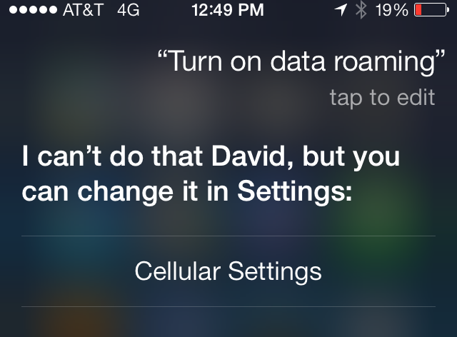
As I mentioned, Siri has new functionality that's kinda handy. When you tell her "Turn on Bluetooth" she understands and takes care of it. Cool! Except... she appears to be severely limited here, and it's maddening. Why is it I can say "Turn on data roaming" and she understands it, knows it's located in "Cellular Settings," and provides a link to get there... but she won't just change the damn setting for me? These kinds of omissions drive me nuts.
CONTROL CENTER...
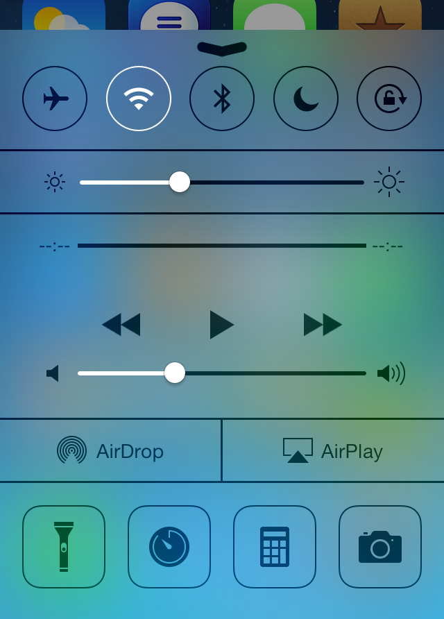
Apple did us a huge, huge favor when they finally gave us a way to access frequently-used settings and tools in iOS7's new "Control Center." And it's great. Just swipe up from the bottom, and you're there! Except... it's not configurable, which sucks ass. When I'm traveling, I use international data roaming, which is very expensive. In order to save money, I find myself turning it on and off frequently. As mentioned above, Siri can't do this. Instead it takes multiple taps to get to the settings because I can't configure Control Center to have it, and this is nuts. I rarely use my phone as a calculator or stopwatch, why in the hell are they taking up space that could be designated for something I will use.
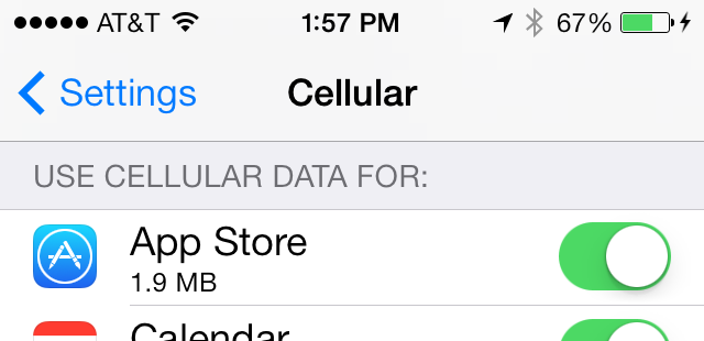
DATA ROAMING...
Falling in line with my previous point, turning off International Data Roaming wouldn't be so important if I could choose which apps are able to use it. But, while iOS 7 does allow you to choose which apps can use cellular data, it's all or nothing. There's no way of saying "This app can use Cellular data at home, but not Data Roaming abroad." So, basically, Apple has screwed international travelers not once here, but three times. Does nobody on the iOS team ever leave the US?
And... that's about it for the things I would like changed in iOS 7.
Today.
Tomorrow the list may be entirely different.
 As expected, Apple unleashed their iPad Mini at today's event... along with some other surprises...
• iPad Mini! The entire point of this product is to compete with the legions of other 7-inch tablets out there... in every way except price. Apple doesn't play the price game, they play the quality & value game... they make their product worth that extra money. Even so, I thought for sure the Mini would start at $299 and was fairly shocked that they went with $329 on the low end. Regardless, Apple is going to sell a bazillion of these things over the holidays...
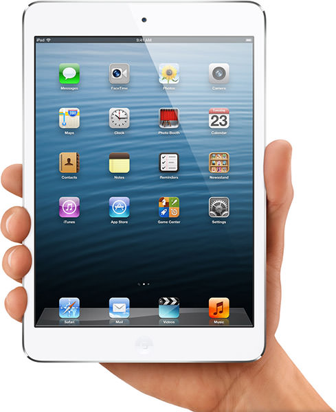
But... not to me. My iPad 3 with Retina Display is absolutely perfect for the one thing I most use an iPad for... reading comics a full page at a time. The Mini's lower resolution would require that I read my comics panel by panel (again, like with iPad 2) instead of page by page.
But... I still want one. It's that sweet-spot size between an iPhone and iPad that would make it so perfect and handy for everything else I find myself reaching for the iPad to do... surf the web... read a book... check email... play games. And, unlike every other iPad I've owned, I would want it with a cellular connection so I could have internet everywhere instead of having to find a free WiFi hotspot.
I will resist the temptation, of course, because my iPad 3 is enough. But when Apple comes out with an iPad Mini with Retina Display... I just might break.
• iPad 4! The smartest thing Apple did at their press party was something nobody expected... a brand new iPad. This has a lot of people who just bought the iPad 3 six months ago in an uproar because the latest version is faster, has speedier WiFi, and better LTE connectivity. I don't care because I can't read comics twice as fast if the iPad is twice as fast, but there's a lot of people feeling burned.
Two things... 1) Apple simply had to get on a holiday release schedule with their new iPads because that's when most of them are sold... and 2) In the Android tablet world, there are a dozen manufacturers that are coming out with something newer and better every month. Apple is the only seller of iPads, so it feels worse than it actually is.
• 13-inch MacBook Pro with Retina Display! While the small size is a killer feature for a traveler like me... I need a bigger screen to do the work I do. The 15-inch MacBook Pro with Retina Display I have is perfect... and will be even more perfect when Adobe's apps are fixed to take advantage of the additional pixels. Still, for a lot of people, the compact size of this new model will be plenty big with the denser display being able to show so much more information than the old models.
• Mac Mini! For somebody wanting a cheap Mac, the new Mini is about as good as it gets. Even the low-end $599 model will provide an excellent experience for running desktop apps. And it's so ridiculously tiny, taking up almost no space. You'll still need a display, keyboard, and mouse... but a lot of people have those sitting around from their previous computer, so the Mini is pretty much a dream come true for somebody wanting to switch to Mac in the most affordable way possible.
• iMac! And here it is. The new product from the event that I am most jealous of... the new impossibly thin iMac...
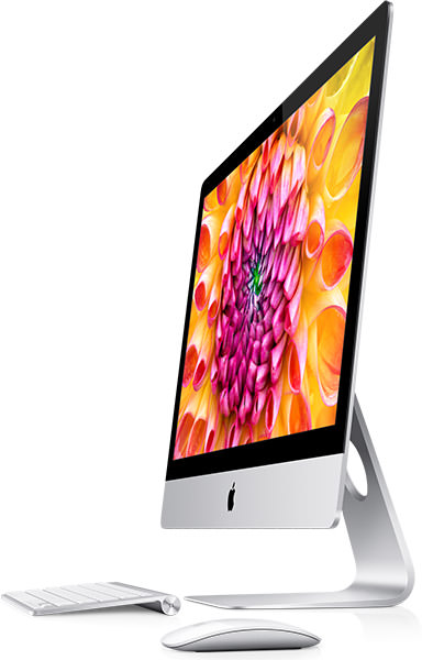
I bought the last generation model of iMac for work, which now seems like a clumsy piece of crap compared to this stunningly beautiful machine.
People who have seen the display say it's one of the most amazing computer displays ever, even though it hasn't got Retina resolution. I still don't know how Apple is going to come up with the processing power to even run a
Apple also made it a lot more powerful... even though it's so damn THIN. But it's not the faster chips that make me covet the new iMac... it's the new "Fusion Drive."
I bought both a Solid State Drive and a "regular" Hard Drive so I could use the SSD for speed and the HD for storage. To make work go faster, I put the project I'm working with on the SSD, then move it back to HD when I'm done. A little bit of a hassle, but the speed increase makes it worth the trouble. Now Apple has come up with "Fusion" which combines the two drives and does all this automatically and seamlessly. New files go on the SSD half of the drive, which are automatically moved to the HD half when you stop working on them. Genius.
Of course I want one... I just can't afford one. Wah!
• Mac Pro? Still no Mac Pro. Apple obviously feels that the iMac line is powerful enough that professionals who use Macs will move to them. They added wicked-fast transfer technology like "Thunderbolt" to make sure of it. And they're right... I moved to iMac because there wasn't a new Pro model available, and I've been very happy with it. But... there is a gaping hole in their lineup that Apple has got to address sooner or later or else they are going to start losing customers (if they haven't already). Supposedly the new Mac Pros are coming next Spring. But it would have been really smart to surprise people with a release today to show that Apple is still serious about professionals that need the serious raw power and expandability that an iMac can't offer. Oh well. That ship has sailed for me, so I won't worry about it.
And... it looks like Apple is all set for the holidays. All their consumer products have been refreshed and made better than ever. Which means they are going to be raking in a fuckton of money over the next two months. Which is nice... I hear Apple could use the money.
 And now... continued from yesterday... my observations on Apple's iOS 6 update. For everybody who hates Apple stuff, sorry... but you have one more day to go.
• Messages. If there's one feature I was most excited about when it comes to iOS 6... it would be Unified Messaging. This means that whether I am on my iPhone, my iPad, iMac, or my MacBook... any time somebody texts me via Apple Messages it will appear on all of them. And I can reply from all of them using my mobile number as the return address so it's seamless to the person I'm communicating with. As if that weren't awesome enough, all my devices archive the complete conversation so it's seamless for me to move between them too. This feature alone makes the upgrade to iOS 6 worthwhile.
The only problem is setting it up. I thought it would all happen automatically but, when it didn't, I finally figured out that you need to log out and log back into your iCloud account on your iPhone, THEN do the same on all your other devices and computers. Works like a charm. All you have to do is choose which email addresses you want people to message you at... and whether you want your mobile phone number to receive messages on that device. Easy.
• Mail. Apple always seems to be hesitant to adopt things they didn't invent. Even when those things are superior to what they've developed. Which is why you could have knocked me over with a feather when I found out that Mail has adopted "pull to refresh"... a feature I've loved ever since I first saw it in Tweetie. Not only that, but they added a really cool widget that stretches and snaps when you pull. It's awesome. And I've been begging for it to happen in Mail for a long time. Another new feature is a VIP Mailbox which collects important email from Very Important People you designate. This can be tied to VIP alerts which will let you know when VIP email arrives. It's quite cool...
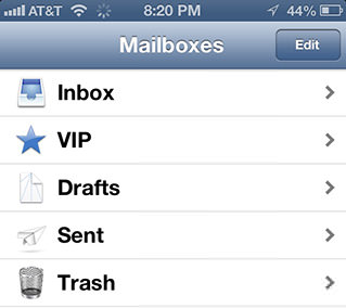
AND DID I MENTION THEY FRICKIN' ADDED PULL TO REFRESH?!? HOLY CRAP DOES THAT MAKE ME HAPPY!
• Do Not Disturb. It's a bit tough for me to dig up praise for a feature THAT SHOULD HAVE BEEN INCLUDED ON iPHONE FROM DAY ONE. but I'm going to try. Because being able to have your iPhone or iPad shut the hell up during the middle of the night is something worth praising. Even if it's years overdue. Suffice to say that being able to selectively (or automatically) make your iPhone ignore everything but calls from critical people you designate is part of what makes a smartphone a SMART ... PHONE! Long overdue and much appreciated.
• Passbook. One of the buzzword technologies hitting mobile phones is "NFC" which is "Near Field Communication." This allows you to buy stuff or unlock stuff or transfer stuff very simply over very short distances. It sounds kinda cool. No more fumbling for your credit card or airline ticket or room key when you've got your mobile phone! Except... not many people are using it. Yet. And, like all new tech, we don't know if it will really catch on. So Apple is conveniently ignoring it. For now. As a stop-gap, they've come up with Passbook. It's kind of like a wallet for your cards and tickets and stuff. Except instead of using NFC, it relies on good old-fashioned bar codes...
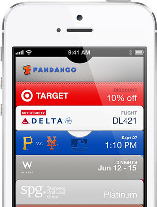
The above image comes from Apple, because Passbook itself hasn't really caught on yet. I think it will. It's just too good of an idea to be ignored. Especially since the cards/tickets/whatever are "location aware" and will pop up automatically when you are near the place they can be used. I look forward to using it. Eventually.
• Facebook/Twitter. And so now you can Tweet and Facebook directly from the Notification Center. You can also Tweet and Facebook stuff from other various apps like Photos and Safari courtesy of the "Share" button. It's kinda nifty...
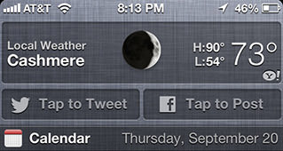
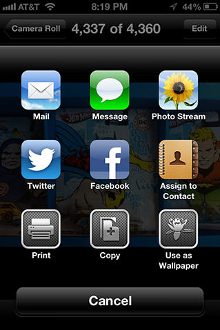
• Maps. There's no subtle way to say this... Apple's replacement for Google Maps (titled simply "Maps")... sucks. And sucks hard. First of all, there's NO Public Transit Directions. This is just awful for somebody like me who travels to new places a lot and uses public transportation. Second of all, the map data is often good, but sometimes pretty terrible. Things are missing or on the wrong place. Satellite views for some locations are so bad as to be indecipherable. It's just a mess, and even if Apple starts throwing millions of dollars at the problem, it's going to be a while before they are even close to Google Maps.
The good news is that when Maps works, it's pretty frickin' incredible... and so very very pretty. PLUS YOU CAN MAKE THE LABELS BIG SO YOU CAN ACTUALLY READ THEM! Sweet! But the feature that sets Apple Maps apart is their amazing "Flyover" feature that allows you to swoop around some cities in beautiful 3-D. I could play with it for hours...


Turning off the satellite gives you the geometry for Flyover...
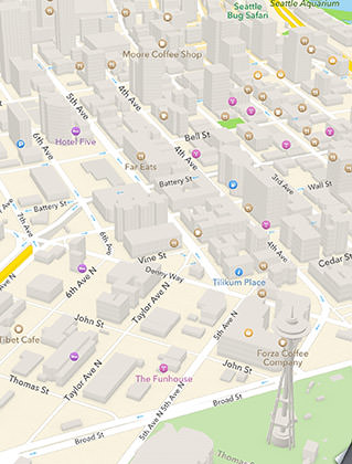
There is some freaky imagery with Flyover in places... but when it works, it's pretty great. Like the Hard Rock Hotel in Chicago...

Some famous places like The Coliseum and The Vatican are well-rendered...


Others, like the Eiffel Tower? Not so much...

I have no doubt that Apple is going to invest the time and money to keep improving Maps to the point that it eventually eclipses Google. The question then becomes... how long is that going to take? Could be years. Which means I really need my Google Maps back for serious use. Hopefully Google will give us an app for that... but, until then, I guess there's always their mobile maps site. Sure I'll lose the "turn-by-turn directions" that Apple has... but I'd take time-tested, reliable maps over flashy add-ons any day.
• Photo Stream. One of the things that drives me insane is how difficult it is to transfer photos. Transfer to my iPad. Transfer to my Mac. Transfer to friends. Transfer anywhere, really. At first I just emailed them to myself. Then I bought an app that had a klutzy way of setting up a link between my iPhone and my Mac. Apple's "Photostream" technology came along, but YOU don't choose what gets put there. Enter "Shared Photo Streams" with iOS 6. Now you can create your own custom streams, invite whomever you want to view them, then post photos until your heart's content. Bonus? You and others can COMMENT on the photos. Pretty sweet. It's not direct, instant transfer to somebody you're talking to, but it's good enough.
• Facetime. And so FaceTime over cellular is now possible with iOS 6. Unless you're unwilling to give up your grandfathered unlimited data plan. Then AT&T decides they're going to FUCK YOU JUST BECAUSE THEY CAN... THEY ARE GOING TO DENY YOU THE ABILITY TO FACETIME OVER CELLULAR LIKE THE GREEDY BASTARDS THEY ARE. Data is data. How they can differentiate how you use that data is pretty fucked up and should be illegal. And what about their customers that are deaf?!? A deaf person could really make use of this technology... but only if they want to sign up for a data plan that AT&T decides they can make money off of. Holy crap do I loathe cell companies.
That's not all the new features in iOS 6, but it's the ones that matter to me. Sure there are loads of other niceties... like being able to dismiss calls with a text... and the nifty panorama camera feature that's head and shoulders above the third-party apps for shooting panos... and shared iCloud tabs across devices from Apple's Safari browser is sure handy... etc. etc.
Any downside?
Well, as I said, Maps is a problem. It can be pretty, but it's not nearly as usable as the Google Maps it replaces. At least not yet. I wish Apple would have waited a while longer until their Maps were more functional. Other than that? Not a lot. My older iPhones don't seem to run any slower, which is always a concern. All the features that are available on each of my iPhones seem to be working as advertised. I suppose I could nitpick on little things, but the truth is that I am very happy with iOS 6... despite the fact that it's not much of a leap over previous iOS versions when it comes to the experience. Probably because Apple got it right the first time, but I fully admit I'd like to see a few more bells and whistles in the way things work. The iPhone 5 that's coming out tomorrow is leagues faster and more powerful than the original iPhone... why doesn't it have more whiz-bang visuals to take advantage of that? Not enough to distract or slow-down the gadgets running iOS, but something to make it feel a bit fresher than the original iPhone.
Because other mobile OS's like Windows 8 and Android may be behind the curve... but they're closing in a lot faster than Apple is willing to admit. Publicly. Hopefully behind the closed doors of Cupertino it's a different story.
 And so Apple has (finally) unleashed the latest version of there iPhone-iPodTouch-iPad operating system. Unlike the Mac OS X updates which get cool names like "Mountain Lion," iOS updates get a boring number increment, which means we're at "iOS 6" now.
I had no problem updating my iPad 3, iPhone 4, & iPhone 4S and, so far as I know, everything is working perfectly. I'll get to my thoughts on the bulk of the iOS 6 new features tomorrow. But tonight I want to focus on Apple's controversial virtual assistant software named "Siri."
Siri is considered "controversial" because "she" is a feature that sparks a lot of strong feelings amongst iPhone users. Some people I know love her. Some people I know hate her. Most people I know ignore her and rarely (if ever) use Siri. Personally, I love love love Siri and use her constantly. For the most part, she understands me and interprets my instructions correctly. And there's just something magical about being able to say "I have a doctor's appointment tomorrow at 3pm" only to have Siri add it to your calendar without you having to type a thing. Welcome to the future!
Kinda.
Because, unlike the computer on Star Trek, Siri can be one fickle bitch. One minute she will understand something odd that you never thought she would get... the next minute she'll completely blow a simple instruction for reasons you can't fathom. Fortunately, Apple is improving Siri all the time, so she's getting smarter and more capable with each new release, but life with Siri is far from perfect.
One of the new thing Siri understands with iOS 6 is movies. I had thought this would be limited to displaying showtimes at local theaters, but she's much smarter than that. Want to know what the last movie Gene Hackman appeared in? No need for IMDB, Siri has got you covered...
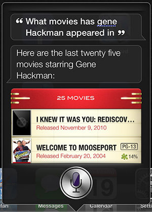
Interesting that Siri knows to capitalize "Hackman" but not "Gene"... even though she spelled "Gene" correctly. But she still knows how to answer, which is pretty darn cool. Unfortunately, she's less smart for other queries. For example, Siri will still ask you "Which one?" when asking about a movie title that's been used for multiple movies, even if you specify the one you want...
![]()
With the new iOS 6 update, Siri also knows sports. As I type this, the Mariners are playing a game. When I ask how they are doing, Siri responds with a score and some stats...
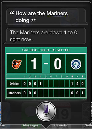
Nice! One of the things Siri also knows about is players. At the Apple Event where iOS 6 was introduced, they showed how you could find out "Who is taller, Kobe or LeBron?" just by asking. This seemed very cool... until I found out that the number of players Siri knows is severely limited. If I want to check up on how Jarrod Saltalamacchia is doing, Siri goes brain dead. She doesn't know who Salty is no matter how I pronounce his name... or even if I ask for him by number. And she doesn't seem to know what "stats" are, even if you say a player she recognizes. This seems crazy given that she will bring up a player stats card when you ask somebody's height, but oh well...
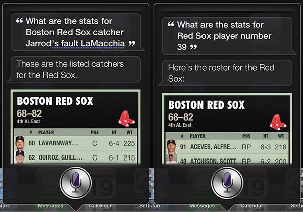
Siri does have Saltalamacchia listed as a player, so I guess there's that...
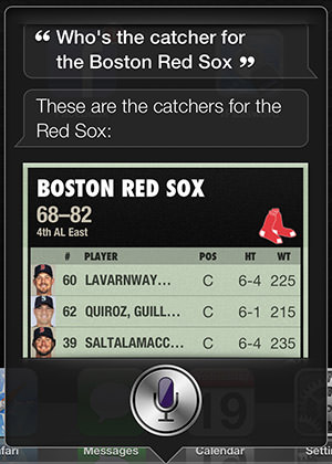
Siri is supposed to have a handle on international sports, so I thought I'd try a name that wasn't as complicated as "Saltalamacchia." Like Chelsea footballer Frank Lampard...

Lampard is a hugely famous player. He's been with Chelsea for ten years now. How can Siri not know who he is? I dunno... maybe if I were in the UK this would be different, but overall I find player stats to be a hugely underwhelming feature (unless you're wanting to know about Kobe Bryant or LeBron James!). Maybe I'm asking wrong or something. But I tried dozens of questions about Frank Lampard covering everything from his height to goals and still nothing.
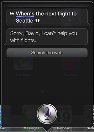
One area I was hoping Siri would get smarter about is travel, because she doesn't seem to know a damn thing. Train schedules, bus routes, flight times, or whatever... Siri is clueless. And nothing has changed in iOS 6. This would seem to be a no-brainer. I would love to get to the train station and ask "When does the next train arrive?", but I guess that's too complex for Siri to figure out. And she knows it...
When it comes to alarms, Siri can still be inexplicably stupid. She can't even recognize alarms she just made for you...
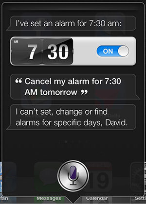
You can't set, change, or find an alarm for a specific day? Why the fuck not? These are the very basic things a virtual assistant should know how to do. And you set the alarm just fine, so why is deleting the alarm with the same language I used to set it a problem? It's things like this that make me understand why some people are not Siri fans.
One of my favorite things I use Siri for on my iPhone is setting reminders. They are frickin' genius because they are location-based. Tell Siri to remind you to make a call when you get to work, and she will do exactly that. So now that Siri is available on third-generation iPads, I was excited that I could add reminders from there too. Except... turns out you can't...
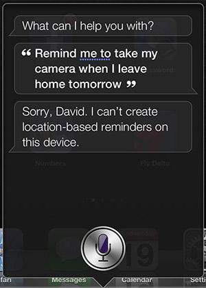
Can't create location-based reminders on this device? WHY THE FUCK NOT?!? You DO realize that any reminders I make on my iPad will be synced to my iPhone, right? I mean, I know that my WiFi iPad doesn't have a GPS, but I'm not expecting it to remind me of a damn thing... that's what my iPHONE is for! Siri should just create the damn reminder and warn you that it will only work for iPhone or something... not flat-out refuse to do something that makes total sense.
With iOS 6, Siri now knows about dining. You can ask her about restaurants in your area or types of foods or whatever, and she'll link with Yelp! to help you out. This is a very nice feature for travelers like me who end up in cities they're unfamiliar with. It can also be a very depressing feature when you're hungry for falafel and the nearest place to get it is over 70 miles away...

Added coolness points to Siri for being able to link up with OpenTable so you can make reservations in the restaurant you find.
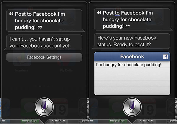
Another new feature is being able to post to Twitter and Facebook as easily as you can send texts and emails. Siri will even warn you if you need to set this up before she can take action...
As always, Siri dumps anything she doesn't understand into a catch-all "Wanna look that up in a web search?"...

Not that I was expecting Siri to get into a deep discussion over how Mitt Romney has been so terminally fucking stupid every time he opens his mouth lately... or how utterly fucking tragic it is that politicians are screwing the men and women who risk their lives to defend this country... I just wanted to show how Siri does a bang-up job of figuring out what I'm saying, even if she doesn't know what to do with it.
And so there she is... the new and improved Siri virtual assistant.
Slowly getting smarter, but still in desperate need of an intelligence upgrade.
Which pretty much describes every person on this planet, so it's hard for me to fault Siri. Most of the time I still love her more than buttered toast.
To be continued...
 Back in April, I wrote about a Kickstarter project that I desperately wanted funded...
"The holy grail for Stanley Kubrick fans (outside his movies, obviously) is a copy of a book called Full Metal Jacket Diary by Matthew Modine, who was an actor in the film. The reason it's such a big deal is twofold...
I was over the moon when the project was successfully funded.
Today the app was finally released. And it doesn't suck...

The menu system is fantastic, and disappears when not needed.
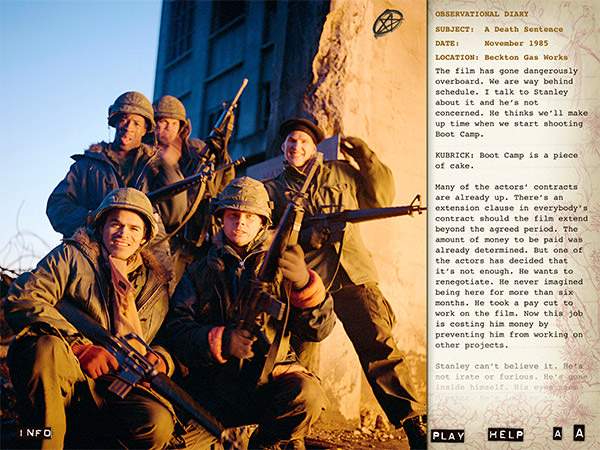
The photos change as you scroll the text, which you can have author/actor Matthew Modine read to you.

All the amazing photos have been scanned at hi-resolution and can be zoomed in on at any time.
On the contrary, it is a stunning app. Not only do you get the entirety of the original diary book, but you get complete audio narration by author Matthew Modine. All of which means nothing if the app is bad and hard to use... but it isn't. This project was a labor of love through and through and it shows. Everything is really well thought out... and optimized for Retina Display, which means if looks fantastic.
If you have any interest in film and want some insight into the mind of a true artist of the medium... or you're a fan of Full Metal Jacket... or you're a fan of Kubrick... or you just want to see the kind of apps that iPad was made for... click here to go get a copy. It's just $14.95, and worth every penny.
 As I catapulted off the runway of San Francisco International Airport this morning, a kid in the row across from me shouted "WOW! THIS IS JUST LIKE ANGRY BIRDS!"
This was good for a laugh, which I desperately needed. Because as we were taking off at 10:10am, I knew that I'd be missing out on all the cool stuff happening back on the ground in San Francisco's Moscone Center. It was there that Tim Cook would be taking the stage to introduce some of the cool new stuff that Apple had been working on, and I was going to miss it.
After landing in Seattle, I drove 2-1/2 hours, went to work until 7:30pm, then (finally) made it home so I could plop in front of the television and watch the Apple WWDC Keynote stream from my iPad to my Apple TV box. What follows is the deranged ramblings of a Certified Apple Whore, so proceed at your own peril...
• WELCOME
The Siri intro was pretty darn funny. Tim Cook was suitably channeling his inner Steve Jobs. The crowd was enthusiastic and the energy in the room was high. Then Tim ran through the astounding numbers touting the unprecedented success of the company and its products. After that, it was time for one of those heartwarming videos that Apple does so well... informative and inspiring without being sappy or tacky. And then? Off to what people really want to see.
• MACBOOKS
I need a new laptop to replace my aging, banged-up MacBook Pro, so I was understandably excited when Phil Schiller took the stage. I wanted so badly to have a machine with the power and 15-inch screen-size of a MacBook Pro, but the thinner form, lower weight, and fantastic SOLID STATE HARD DRIVE from the MacBook Air. At first, I didn't think I was going to get it, because Phil just rambled off expected bumps in speed and features for the existing models. But then something happened...
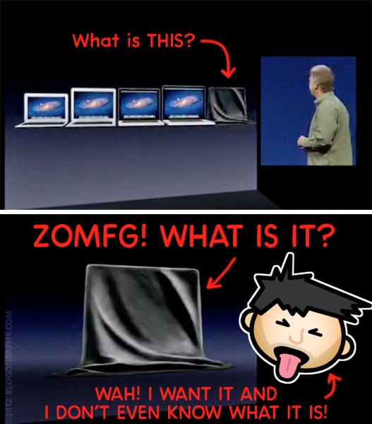
Introducing the MacBook Pro with Retina Display... AND ALL THE STUFF I WANTED IN A NEW LAPTOP! Thinner? Lighter? Faster? Quieter? SOLID STATE HARD DRIVE?!? Yes please. I am now officially poor, as there was no way I could pass up on something that will save me a lot of time, money, and agony when trying to work while on the road...
• MAC OS X - MOUNTAIN LION
Call me jaded, but it seems as though innovation is coming a lot slower to Apple's desktop products than their mobile products. In fact, the features shown for OS X that interest me most were those that make it easier to go from my laptop to my iOS mobile devices. Where are the compelling new OS X features that are redefining the non-mobile user experience? I dunno. Instead we get tighter integration with Twitter and Facebook. Whee. Don't get me wrong, any improvements or new features are appreciated)... especially for a jaw-dropping $20 price tag... but come on. This was kinda lame. Especially when you take a look at what Microsoft is up to for their next OS.
• iOS 6
Uhhh... yeah... it all sounds great. BUT I HAVE TO WAIT UNTIL THIS FALL?!? I'm assuming that this release date will coincide with the release of a new iPhone, but sheesh.
In any event, the new features really do sound great. The new maps look fantastic (and apparently the data is served up by TomTom, so they're be functional too!). Siri just keeps getting better. FaceTime over cellular and Mail "pull-to-refresh" are long overdue. Passbook is going a long way towards helping people lighten their wallet. The new integration with Twitter and Facebook is nifty. And the Accessibility enhancements are GOLDEN when configuring iOS products for non-techies.
BUT WHAT ABOUT THE "PHONE" PART OF iPHONE?!?
I still think it is embarrassing (and fucking stupid) that there's no auto-redial on my iPhone. WHY?!? Why in the hell would such an obvious and useful feature keep getting the shaft at Apple? Insanity! But at least they are addressing my long-standing complaints regarding having some control over your incoming calls. They call it "Do Not Disturb"...
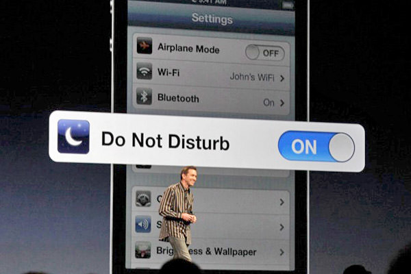
FINALLY... AT LONG LAST... I will be able to block unimportant calls and mute non-essential notifications when I don't want to deal with the shit. LIKE WHEN I'M SLEEPING! And, from what I can see, it looks pretty smart. Apparently you can one-touch do not disturb AND have an automatic do not disturb schedule going... hopefully both at the same time.
And that's all she wrote. No new iPhone... yet. No new desktop Macs... yet. No new iToast... yet.
I guess there's always next year.
 I've been so busy that I haven't had time to play with the new iPad (third generation) much. That's a darn shame, because it's kind of expensive to just have sitting around on my nightstand. I had to get one for the apps I help develop, so what can I do but sink even more money into Apple's ample coffers? The latest iPad has an all-new hi-res screen, and I have to be sure that stuff I design looks good on it. Otherwise, the iPad3 didn't look to bee much different than the iPad2, so I probably wouldn't have bought one otherwise.
Except, now that I've had a chance to read my comic books on it, I would totally have spent the money on it. I've read a few reviews in the press bitching about how iPad3 wasn't enough of an improvement over iPad2 for Apple to have bothered... which I now know is a huge load of bullshit. If you do any reading on iPad, this is a complete game-changer. Four-times the pixels make for a hundred times better screen, and I am loving it more than I ever thought possible.
The screen is so crisp and clear that I can now read ComiXology "CMX-HD enhanced" pages full-screen without having to zoom in on the individual panels...

Now, when looked at on a "regular resolution" computer screen, the change may appear subtle. But when reduced four-fold, the "SD" panel on the bottom becomes a blurry mess that's a bit difficult to read. The "CMX-HD" panel on the top, however, is razor sharp on iPad3.
So now the iPad is a real option for reading comics. Yes, the screen size is smaller than a "regular" comic book, but it's bigger than a digest, which is perfectly acceptable. And, unlike a digest, you can zoom in and see details if you want without having to find a magnifying glass.
So, my hat is once again off to Apple for once again making an awesome product even more amazing. iPad2 was already leagues above any of the competing "tablets" I've had a chance to play with, but this is entering a whole new dimension, as this snapshot from Apple's website demonstrates...
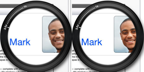
A few things...
Otherwise, for the most part, iPad3 is pretty much the same as iPad2. Which is not a bad thing at all, because iPad2 was so kick-ass. Indeed, when it comes to comparing it with all the tablets I've seen, Apple has the only game in town. Sure iPad is a bit pricey, but you get what you pay for, and what you get is pretty darn amazing.
It's products like iPad3 that make it so dang easy to be an Apple Whore.
