
 On the bright side, you're half-way there!
This is PART 2 of a two part series on the art found in THRICE Fiction Magazine Issue No. 8. Needless to say, you should probably read PART 1 before continuing if you haven't already.
Or don't... either way, I get paid the same.
Anyway...
When last I left you, we were half-way through the magazine. Kinda. Because while I now have the luxury of going through the issue page-by-page, it doesn't work that way when putting the book together. Absolutely nothing is done in-sequence. Especially this time around, when things were running so late that I didn't have time to reach out to as many artists as I would have liked. Lucky for me, THRICE-regular Kyra Wilson painted two beautiful last-minute pieces she was able to work into her schedule... then Ira Joel Haber came along with his wonderful body of work that really saved my bacon! If not for him, this issue would have slid into September for sure! So, to both of these gifted artists, my heart-felt thanks for your help.


And now, on with the show.
The art of THRICE Fiction No. 8 continues after the jump...
As with yesterday, a warning. There be spoilers from here on out, so please go download a FREE copy of THRICE Fiction No. 8 before proceeding!

Page 24. Very rarely do my ideas go unchanged from concept to completion. As I'm working on a piece, things will morph and change along the way. Not this time. Googling a pair of Lagerfeld frames and filling them with the universe was my idea, and I knew exactly how I wanted it to look. It would be a Patrick Nagel-esque drawing done in brush-strokes that was very simple and clean so the focus was on the glasses. A half-hour later with a Wacom tablet and Adobe Illustrator and Peter Clarke's pretty girlfriend from the story was there.

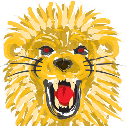
Every issue there's at least one story that knocks me flat, and this time it was Lion Tamers by Cara Long. So much of what was happening was between the lines, which I found very engaging. So I decided to do two pieces for the story... the first a preliminary sketch... leading to a finished painting at the end. Like the story, the reader would fill in the blanks. And so I took out my No. 2 pencil and sketched a lion... scanned it... then painted over it with acrylics. The problem was that it fell flat. The sketch at the beginning was too sparse and the painting at the end was overwhelming and distracting. So I threw them out and decided to wait a while. Then, after finishing the illustration for the previous page, I came up with my solution... finger paints. Nini in the story is a young girl, and so the art should come from that perspective. I drug out my Wacom tablet and sampled colors from The Shape of the Frames to paint a lion sketch... then kept "finger-painting" over it until I got my end-piece. Then I moved Lion Tamers to follow Shape of the Frames and was surprised to find they kinda work together. Serendipity.
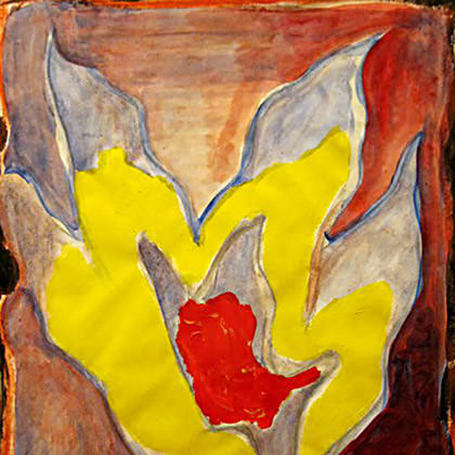
Page 28. The art for Jenny Ferguson's piece was going to be a pineapple. I thought it was a nice coda for the story. Which it would be... if the art came at the end. So the pineapple was scrapped and I decided to play off the active volcano angle. That's when I spotted this piece by Ira which looked like a volcano exploding and somewhat pineapple-like (well, the top of a pineapple, anyways). I am really fond of the pairing, and having real art lead into the piece feels right.
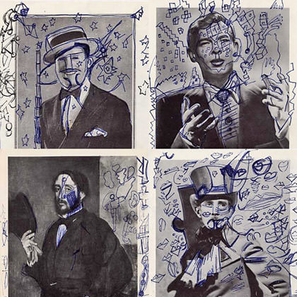
Page 29. Sometimes when RW passes me a story, he'll include a note with it. For Mercedes Lawry's The Spy Goes Shopping he said "I couldn't help it, I kept seeing White Spy trying on hats..." (he was, of course, referring to Antonio Prohías' Spy vs. Spy from Mad Magazine). Knowing how much RW likes Spy vs. Spy, this was a pretty big compliment for the story. So much so, that I didn't want to do the art myself to dare risk disappointing him! Thanks to Ira Joel Haber, I didn't have to. Ira has these wonderful "doodles" where he draws over old photos. A number of them had men with hats. I was going to pick a favorite but, at the last minute, realized the perfect idea for the story was staring me in the face. Just like the spy trying to decide on a hat... so was I... so I needed to do a collage of choices for the reader to choose from as well! I don't want to go so far as calling myself a genius, but, well, here it is.
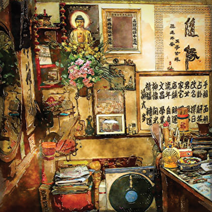
Page 31. Adalena Kavanagh unleashed a bucket of awesome with her story Superstition. Since we're a fiction magazine, I'm guessing it's a work of fiction, but it felt so autobiographical that I honestly don't know. But anyway... I honestly did not know what I was going to do for this story art-wise. There were several elements to pull from, but I felt that none of them reflected the overall "mood" of the piece. So I started looking through my photos of China and Hong Kong for inspiration when, all of a sudden, this photo I took inside a fortune-teller's shop (filled with superstitions!) in Hong Kong punched me in the face. At first I wasn't sure if it would work, but I kept manipulating the photo more and more until I could get it to look beautiful when run through Photoshop filters. Perfect. Except... it's not. In the story, the mother rails against Cantonese people and China, preferring to deal with Taiwanese shops, which would imply a preference for Mandarin. Hong Kong is Cantonese. And so I am basically using a photo which the protagonist's mother in the story would definitely not approve of. Then, just as I was moving the image to my Mac's trash can... I actually took a second to think about all that in the context of the story. "ZOMG! IT REALLY IS PERFECT!"... I almost squealed. The two "doors" images that appear later on are meant to reflect back on an important conversation earlier in the story. I had found several doors in my photo collection that were blue and red, but they didn't work because they needed to look the same to communicate the concept properly. Fortunately, iStock photo had two identical doors colored just as I needed them. I re-shaped them a bit, added a porch, then added some house siding in the background, then Photoshopped them to fit.
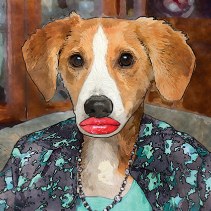
Page 38. Phillip Sterling's short story had so much awesome imagery that I really didn't know where to start. After a number of false-starts with a biplane, I latched on to the puppy turning into a mother and didn't let go. Found three great photos from iStock (puppy, lips, mother dress) and spent a lot of time blending them all together. The result was too mundane, so I made the puppy head larger and the lips as big as I could fit on her head. That was more like it, so I loaded it into my iPad and painted over it all, then popped it back into photoshop for some filter work. I think it turned out great! One of those images which pretty much compels you to read the story.
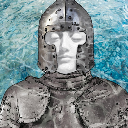
Page 39. Originally, I had decided on a woman floating underwater with her face bleached so much that she started resembling a statue. Then, for whatever reason, I looked at what I was creating and remembered that the M. Night Shyamalan film Lady in the Water had the exact same concept. So... back to the drawing board. I played around with armor for a while, since that's kind of an important concept in Nells Hanson's story, but it just didn't fit. The Lady in the River needed a lady in the river. But I didn't want to use a statue because that would be too obvious. Except... what if I combined the armor with the statue? The statue could wear the armor! So I tracked down a photo of armor that I shot in Malta, took the face off a beautiful statue of The Virgin Mary I saw in Santa Margherita Ligure in Italy, then bought a stock photo of a riverbed. Everything was composited, simplified, painted, then Photoshopped. Then I added water reflections on the top and shaded everything blue. It looked terrible. But the idea was good. So I went back to my source material and started over. This time I made the statue face bigger... too big for the helmet so it would look oddly out of place... I roughed up the armor... I changed the water from blue to turquoise... I worked hard to make it look more like a collage of concepts instead of something real. THIS I liked. A lot. I think it works with the story too, which is all that really matters.
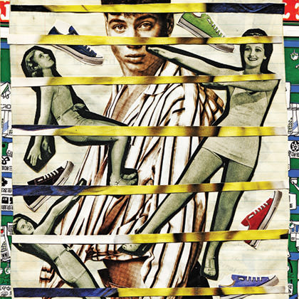
Page 47. If I had gone to an artist and asked them to create something specifically for Eleanor Levin'e story, The Boy Who Used the Curling Iron, I couldn't have done better than these collages I found that Ira Joel Haber had already created. And yet... it was not so easy a journey as that. When I began reducing the page count for this issue, more than a couple stories lost some extra art. But, when it came to this story, I had to put my foot down. Not because it was a terrific story... THRICE only publishes terrific stories. Not because it "needed" a bunch of art to help it in any way... everything you need to feel this story is on the page. But because I loved the way the words and collages complimented each other. Everything was just so perfectly executed (if I do say so myself), that I couldn't imagine taking Ira's wonderful works away from Eleanor's wonderful story. They just go too well together. And so I didn't. This meant dropping some pieces that I worked hard on from other places in the book, but I was looking at the bigger picture. At the end of the day, that's the only thing that matters.
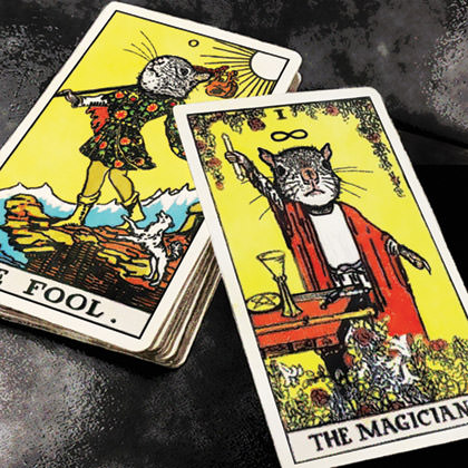
Page 51. When it came to Squirrels, I do what I always do with a piece by Susan Tepper... read the story over and over and over again until something sticks. The first couple of times, it was a squirrel attack. I had visions of a squirrel leaping off the page with claws and teeth bared... ready to rip into the reader. But it was way too literal for the story (and too obvious, given that the first four words of the story are "after the squirrel attack"), so I set the story aside for a couple days. Then, while I was drawing a lion for another story, the tarot cards from Squirrels popped into my head. Which got me thinking... "The image for the tarot's STRENGTH card is a lion, isn't it? Yes, I believe it is. Why couldn't Susan have written Lions instead of Squirrels? A lion attack would have been awesome... and easier to work on a tarot card!" — And then,

Page 54. I had lined-up a guest artist whose style was exactly perfect to pair with Andrew Mangan's clever story Couching. I reserved a full page specifically for the occasion. It ended up not working out, which was a shame. Kinda. Because, hey, I get a whole page to play with! So I sketched out some grandiose plans (it was a six-panel cartoon at one point) only to eventually realize that I wasn't supplementing the story, I was telling my own story. This is completely opposite the purpose of having art in THRICE Fiction, so I stopped. I re-read the story. Then I understood that the only thing I should be saying is that this guy's entire world is on his red couch. So I decided to put the world on a red couch. This piece started as stock photos I purchased, but I ended up having to manipulate the couch quite a lot. The globe was painted down in stages, then everything was composited and selectively outlined in thick pen. I originally had the piece very small on the page, but changed my mind and decided I wanted it as big as possible. This meant I had to start over from scratch so the image would have enough resolution for print. A few curse words may have been said.
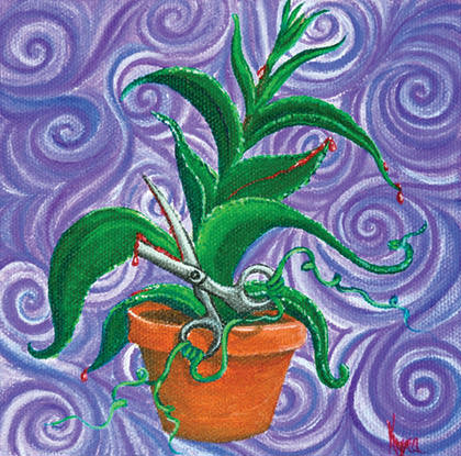
Page 58. I was running so late that I wasn't going to impose on THRICE regulars Kyra or Chad to help out this time around. But when I ran across this story, it had Kyra written all over it. I would be DEPRIVING THE WORLD if I didn't at least try to get her to illustrate Isabella Kerr's wonderful bit of story. And so I emailed it to her. Kyra asked when the deadline was. I said tomorrow. Kyra fainted. I told her a week would work fine. Kyra said she'd make it work. I asked if she would do the facing page as well so I had a cohesive magazine spread. Kyra fainted again. I asked really really nicely. Kyra said she would stop eating and sleeping so she could get them painted. And so she did. JUST LOOK AT IT! LOOK AT HOW PERFECT IT IS! And that, dear THRICE Fiction reader, is what I go through to get you the best magazine possible. Your pity is not required, but it is appreciated.
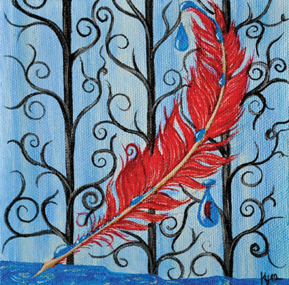
Page 59. Katie Darby Mullins' piece was haunting and beautiful. I moved it opposite of 77 Mexican Hat Plants because I knew Kyra would do it justice. Of course she did. And then some.

Page 60. I'm a big James Claffey fan, and creating art for his stories is both a thrill and a challenge. This one more than most. The last sentence of this piece is so perfectly realized... so... Claffey-esque (if you will)... that I had given serious thought to not using any art at all. I wanted quite badly to let it just float there on its own and let the reader find their own picture. And then I realized I was just being a big baby, so I put on my big-boy briefs and decided I wanted a heart made of clouds floating in front of the most beautiful sunrise I had ever seen. It turned out pretty weak. It was distracting in it's boringness. So I found a medical model of a 4-chambered heart and stuck it on there. It went from being weak and boring to just plain silly. So I spent the next hour re-shaping the clinical heart into a heart-heart. I placed it on the canvas. I added the glow of sunrise. I moved the sun to the top of the heart so it was on fire like you see in all those paintings of Jesus. But instead of thorns there were veins around it. And that's how James Claffey led me to finding Jesus. Well, in a Google search anyway...

I've always felt that reading Claffey was akin to a religious experience. This time it happened to be literally true.

Page 61. I really, really like Gary Powell's story. But not at first. I fully admit that when I began reading it, I was a little shocked that RW had accepted it. "Really, Bob? Some Wall Streeter losing their fortune? That's what we're doing now? Really?" Which, given RW's excellent track record of finding stories for past issues, may sound insane... but, hey, it was a long night. I ended up being wrong, of course. What Thirty-Two Mil does... and does so damn well... is that it takes both the sympathy and the demonization out of the equation. Given that every other story in this territory seems to be a single-note construct of one or the other, I was pleasantly surprised. It didn't hurt that it was also written so beautifully. And so I was wrong. But that's what made the story such a treat. Which got me thinking... how can I extend what I experienced to other readers? How can I lull them into thinking this is a story they've read before, when it's actually so much better than that? The answer? By using the same expected, over-used, clichéd art they've seen before. Like money growing on trees! Odds are, most people won't "get" this. They'll think that I just phoned in the artwork with little or no thought... or that I ran out of ideas... or I just gave up. In reality, exactly the opposite was true. I worked harder on getting the visual right for this story than any other piece in the book. I owed it that much. Oh well, at least you'll know the truth! In any event, this is a stock photo of a tree that I pasted scans of money on, then ran through the "Oil Paint" filter in Photoshop.
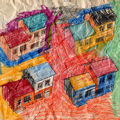
Page 65. Reading Holly Day's The Neighbors brought back a series of collage colorings that I had seen by Ira Joel Haber. Just as he colored those houses, we color our neighbors, so it was perfect. After making the poor guy send me a half-dozen different versions he had in his archives, I finally got the one I wanted, which was the one you see above. Then, because I wanted Ira to both open and close this issue of THRICE Fiction, I anchored the book with it. It wasn't until I re-read the issue from start to finish that I realized the final line of Holly's story was the perfect close to the book... and this blog entry: "I want this to be over." Not because it was a terrible experience or anything like that... this was a fantastic issue and loads of fun... but because I'm anxious to start in on THRICE Fiction No. 9!
But first, a well-deserved break.
See you in four months.

I love comments! However, all comments are moderated, and won't appear until approved. Are you an abusive troll with nothing to contribute? Don't bother. Selling something? Don't bother. Spam linking? Don't bother.
PLEASE NOTE: My comment-spam protection requires JavaScript... if you have it turned off or are using a mobile device without JavaScript, commenting won't work. Sorry.

So going from laughing to crying is normal, right? Beautiful artwork as well. I am going to order this in print form for my mother.
Aww thank you! Love the issue! I’m just going through it today!
I love the lion!
And the Tarot cards!
And the jesus.