
 Time for another BEHIND THE SCENES episode of Blogography!
Thanks so much to everybody who has supported the debut issue of Thrice Fiction magazine! RW and I have been surprised... shocked even... by the number of people who have been kind enough to take a look and give us some nice feedback. In all honesty, I thought maybe 40-50 people would bother to download the thing. Sure it's free, but time is valuable, and I didn't think many people would give it a chance. Even more surprising, a good chunk of you actually bought the printed magazine from MagCloud. We don't make any money off of those sales, but knowing people like the magazine enough to buy it... well, that's better than money!
Okay, probably not... but when you combine all the downloads and printed issues, we've "sold" around 320 copies. Considering we haven't done any promotion outside of our blogs and Facebook, this is pretty remarkable.
Some of the nicest comments I received were saying good things about the artwork, which is really special to me considering most of it was a last-minute addition. Though, considering most people only see the crappy cartoons I slap together for this blog, I guess anything would be "good" by comparison! A few people had asked about the "medium" I used for the pieces, so I thought I'd do another "behind the scenes" entry to explain how the front cover came together...
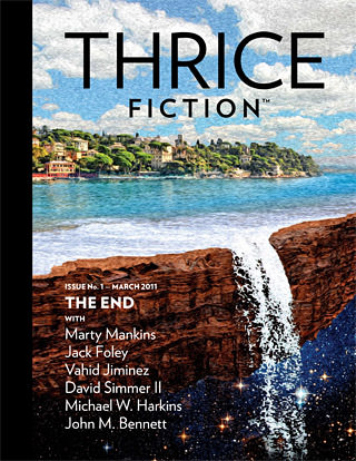
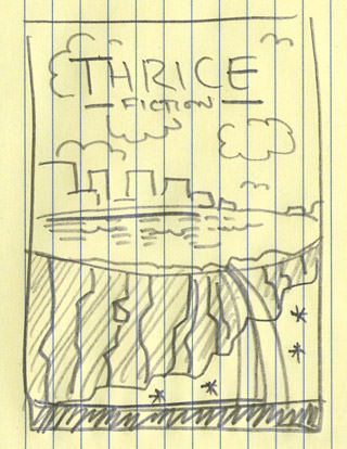
I suppose the first thing I should say is that this is not a painting. The painted "look" is just a couple of Photoshop filter effects. So what is it? Just a bunch of photo pieces that have been blended together to create an image based on this sketch I made to show "The End" of the earth...
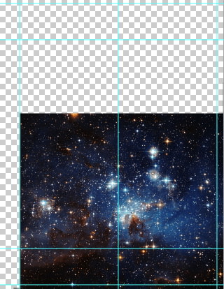
The first step was to find me a good star-field image. Fortunately, our tax dollars have funded the Hubble Telescope, which has provided thousands of hi-res images to choose from. I ended up rearranging the stars a bit, but this was the image that was most like I had in mind....
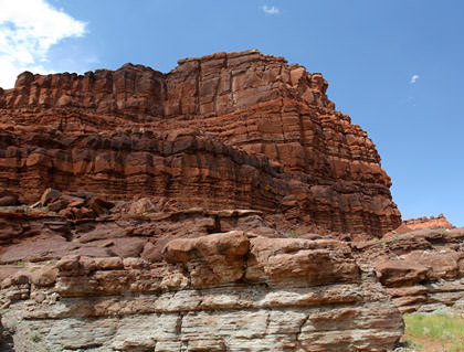
All the other photos were taken from my extensive collection of travel photos. That way, I don't have to worry about obtaining permission to use them or get in trouble for copyright infringement or whatever. "The earth" is just a photo I shot in Southern Utah that has been turned upside-down and warped into the shape I needed...
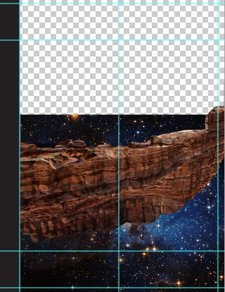
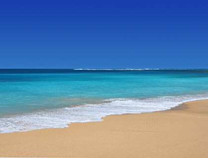
The water was some tricky business. I found a photo I took on Kauai's north shore which made for a pretty good start...
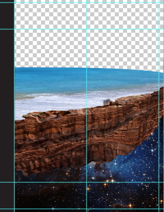
Kind of rough there, but I didn't want to start painting the pieces together until I had the waterfall in place. Fortunately, that was made easy thanks to a photo I took at one of the Walt Disney World resort hotels (don't ask me which one)...

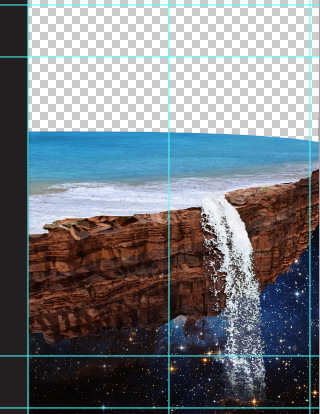
In my original sketch, I had wanted a metropolitan cityscape in the background. The problem was that I couldn't make it look good. And believe me, I tried. I spent a good hour cobbling together skyscrapers in an attempt to get it looking right. But it never did. Rather than waste the rest of my life trying, I tossed everything out and started over. But this time I thought I'd go for something less urban, and found a shot I took last year at Portofino in Northern Italy. Cutting the city out, it fit perfectly. All I had to do was add a reflection in the water and paint in a shoreline, and I was set...
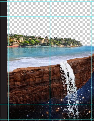
I also cobbled together some photos of flat red rocks in order to make a better surface for the waves to sit on. I thought it looked a little more realistic. Though I suppose "realistic" is all relative when you're talking about a city floating in space.
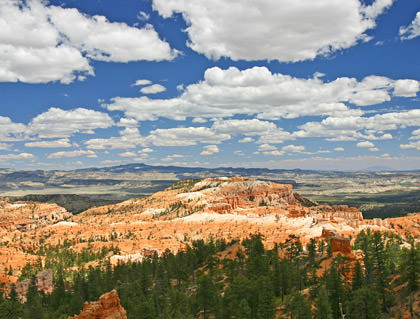
Anyway... next up was the sky. I wanted a bright, almost surreal sky so that it would contrast nicely with the darkness at the bottom. So I went back to Southern Utah and found exactly what I wanted at Bryce Canyon. Well, not exactly. I had to do a bit of touch-up and color adjustment, but it's still a really cool sky...
After I popped it in the shot, I added a little bit more coastline waaaayyyy in the background to help add some depth.
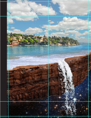
Time elapsed: 1 hour, 15 minutes. It would have been less, but I wasted time trying to smoosh New York and Chicago into a new city.
Then the fun begins. Hours of Photoshopping all the pieces together so they look like one cohesive scene. In particular, the ocean edge and waterfall. They never really "fit" together, and so it took extensive painting, warping, and blending to make it work. It's kind of hard to see in these tiny images just how much work I had to do, but at full print-resolution size, it's a big mess, and required a lot of time to make happen. I also had to adjust the colors of all the individual pieces so they look like they were in the same shot. It's only a subtle alteration, but it makes a big difference in the overall "feel" of the image.
Time elapsed: 3 hours, 30 minutes.
After that was all finished up, I ran a couple of Photoshop filters on the photo to make it look like a painting and, voilà, a cover was born...
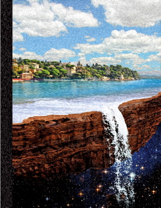

Most of the other stuff in the issue was drawn in Adobe Illustrator, then ran through the same "painterly" Photoshop filters so I had a kind of "look" going on...
And there you have it! Join us in two months for issue #2! And if you haven't checked out issue #1, you can download it for FREE at ThriceFiction.com!

I love comments! However, all comments are moderated, and won't appear until approved. Are you an abusive troll with nothing to contribute? Don't bother. Selling something? Don't bother. Spam linking? Don't bother.
PLEASE NOTE: My comment-spam protection requires JavaScript... if you have it turned off or are using a mobile device without JavaScript, commenting won't work. Sorry.

As always, I love the “making of” posts you do. This one, because I was a part of it, was a step more enjoyable.
Nice to know there were parts of Utah used for the cover.
Excited for Issue 2.
This is great! Thanks for a peek at your process. Woohoo!
There was pretty much nothing about Thrice Fiction that I didn’t love, but the artwork in particular put it over the top for me. You called them “crappy cartoons” but I think the artwork you do on this blog is brilliant. It was awesome to see something else, other than just you and your monkey.
Though I do love that monkey.
Maybe it sounds weird, but thanks for putting Thrice Fiction together. It has positively impacted my life, which I think is the best you can hope for from art.
I can’t even begin to tell you how blown away I am right now at the process behind the cover art. Creativity like that stuns me. Even more so now that I know how you put it all together. Wow.
How do you cut out all the parts and not have them look cut out (I’m especially thinking about the waterfall). I would have no idea how to do this with out sharp edges or under/over cutting the images.
Well… it depends. There are plug-ins to assist with isolating parts of an image, but I rarely use them. Usually I pick a color channel that I can copy and manipulate with levels to get a good mask going… then use that to knock out the stuff I don’t want. Since I am intimately familiar with Adobe Illustrator’s pen tool, I will often use Photoshop’s pen tool to outline sections I want… this gives nice clean edges. On rare occasions, I find the “magic wand” tool works fine… but it’s usually kind of messy. Photoshop CS5 has pretty good tools to help create masks, but sometimes they’re more trouble than they’re worth.
Ultimately, I use whatever looks like it will work best, and sometimes it’s a combination of several techniques.
Thanks. I’ve never used masks before. I’ll have to google it and find out how it works 🙂
I love the cover. I always love these posts about how you put everything together.
You are one crazy talented dude.
Look at you with the fancy schmancy Photoshopping! Thanks for sharing that with us. Very cool.
Loved “Thrice” and can’t wait to see the next edition. There’s some awesome writing there. I also look forward to when you all start to take outside submissions as I would love to have a shot at participating.
So cool!
And I didn’t even realize I could own an actual copy of the magazine! Geez!
I love your behind-the-scenes posts. I am always in awe of what photoshop can do in the hands of someone who knows how to use it. I barely know how to sharpen eyes to make the catchlights pop and that’s about it. Oh and make a color photo black and white.
Very cool, Dave! Thanks for sharing!
I downloaded Thrice Fiction as soon as I heard about it. Loved it. And I loved this blog post. I know I’ve mentioned it before but I do love the behind the scenes “this is my kit and this is what I do with it” type posts.
I always think I’m pretty good with photo editing software, until I read something like this and see what someone who actually *knows what they’re doing* can create. Gorgeous work, Dave2.
Your line up there, “Since I am intimately familiar with Adobe Illustrator’s pen tool, I will often use Photoshop’s pen tool to outline sections I want…” made me laugh out loud. I have a similar opinion, based on many frustrated hours.
And now I’m off to download “Thrice.”
That was amazing!! Thank you for showing us 🙂 It’s a really beautiful picture! Congrats for your success!
Great! Love these.
By the way, I would have purchased a copy if y’all were getting a portion. Instead, I just read (and enjoyed) the downloaded version. Will I regret not having a physical copy someday? I hope so!
That scene is more or less exactly the visual of the last ~30 pages of Terry Pratchett’s The Color of Magic. Great minds think alike.