
 Time for another BEHIND THE SCENES episode of Blogography!
Thanks so much to everybody who has supported the debut issue of Thrice Fiction magazine! RW and I have been surprised... shocked even... by the number of people who have been kind enough to take a look and give us some nice feedback. In all honesty, I thought maybe 40-50 people would bother to download the thing. Sure it's free, but time is valuable, and I didn't think many people would give it a chance. Even more surprising, a good chunk of you actually bought the printed magazine from MagCloud. We don't make any money off of those sales, but knowing people like the magazine enough to buy it... well, that's better than money!
Okay, probably not... but when you combine all the downloads and printed issues, we've "sold" around 320 copies. Considering we haven't done any promotion outside of our blogs and Facebook, this is pretty remarkable.
Some of the nicest comments I received were saying good things about the artwork, which is really special to me considering most of it was a last-minute addition. Though, considering most people only see the crappy cartoons I slap together for this blog, I guess anything would be "good" by comparison! A few people had asked about the "medium" I used for the pieces, so I thought I'd do another "behind the scenes" entry to explain how the front cover came together...
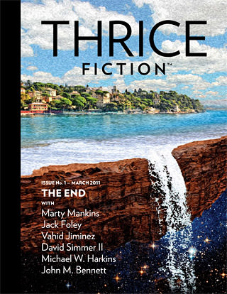
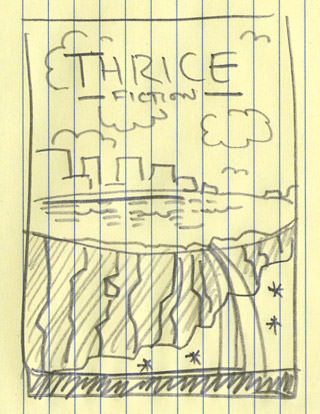
I suppose the first thing I should say is that this is not a painting. The painted "look" is just a couple of Photoshop filter effects. So what is it? Just a bunch of photo pieces that have been blended together to create an image based on this sketch I made to show "The End" of the earth...
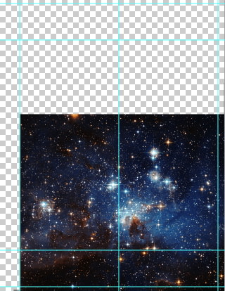
The first step was to find me a good star-field image. Fortunately, our tax dollars have funded the Hubble Telescope, which has provided thousands of hi-res images to choose from. I ended up rearranging the stars a bit, but this was the image that was most like I had in mind....
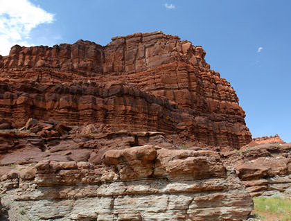
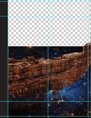
All the other photos were taken from my extensive collection of travel photos. That way, I don't have to worry about obtaining permission to use them or get in trouble for copyright infringement or whatever. "The earth" is just a photo I shot in Southern Utah that has been turned upside-down and warped into the shape I needed...
The water was some tricky business. I found a photo I took on Kauai's north shore which made for a pretty good start...

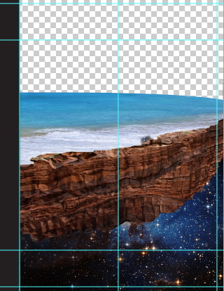
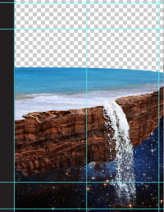
Kind of rough there, but I didn't want to start painting the pieces together until I had the waterfall in place. Fortunately, that was made easy thanks to a photo I took at one of the Walt Disney World resort hotels (don't ask me which one)...

In my original sketch, I had wanted a metropolitan cityscape in the background. The problem was that I couldn't make it look good. And believe me, I tried. I spent a good hour cobbling together skyscrapers in an attempt to get it looking right. But it never did. Rather than waste the rest of my life trying, I tossed everything out and started over. But this time I thought I'd go for something less urban, and found a shot I took last year at Portofino in Northern Italy. Cutting the city out, it fit perfectly. All I had to do was add a reflection in the water and paint in a shoreline, and I was set...
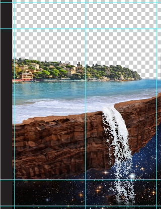
I also cobbled together some photos of flat red rocks in order to make a better surface for the waves to sit on. I thought it looked a little more realistic. Though I suppose "realistic" is all relative when you're talking about a city floating in space.
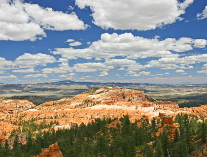
Anyway... next up was the sky. I wanted a bright, almost surreal sky so that it would contrast nicely with the darkness at the bottom. So I went back to Southern Utah and found exactly what I wanted at Bryce Canyon. Well, not exactly. I had to do a bit of touch-up and color adjustment, but it's still a really cool sky...
After I popped it in the shot, I added a little bit more coastline waaaayyyy in the background to help add some depth.
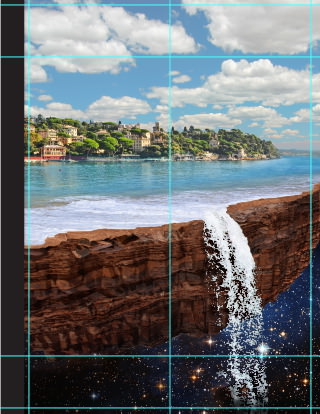
Time elapsed: 1 hour, 15 minutes. It would have been less, but I wasted time trying to smoosh New York and Chicago into a new city.
Then the fun begins. Hours of Photoshopping all the pieces together so they look like one cohesive scene. In particular, the ocean edge and waterfall. They never really "fit" together, and so it took extensive painting, warping, and blending to make it work. It's kind of hard to see in these tiny images just how much work I had to do, but at full print-resolution size, it's a big mess, and required a lot of time to make happen. I also had to adjust the colors of all the individual pieces so they look like they were in the same shot. It's only a subtle alteration, but it makes a big difference in the overall "feel" of the image.
Time elapsed: 3 hours, 30 minutes.
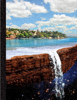
After that was all finished up, I ran a couple of Photoshop filters on the photo to make it look like a painting and, voilà, a cover was born...

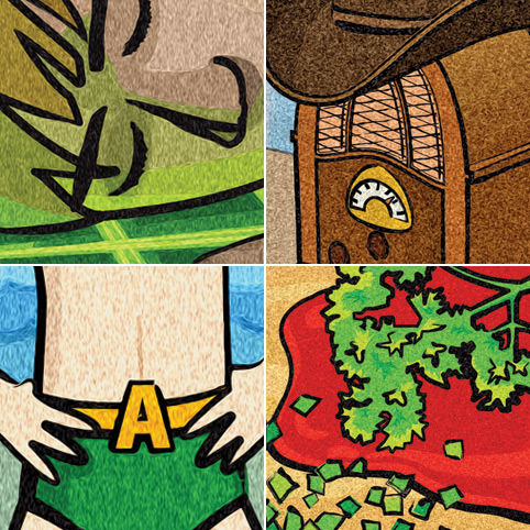
Most of the other stuff in the issue was drawn in Adobe Illustrator, then ran through the same "painterly" Photoshop filters so I had a kind of "look" going on...
And there you have it! Join us in two months for issue #2! And if you haven't checked out issue #1, you can download it for FREE at ThriceFiction.com!
 I love creativity. I love art. I love art museums. I love traveling to art museums around the world and experiencing the amazing creatings of beauty and imagination I find there.
And yet... even though I travel quite a lot, it would be impossible for me to see all the museums and works of art that I'd like to see. That's why I'm thrilled that more and more museums are starting to put their collections online. Sure it's not the same as seeing them in person, but it's certainly better than nothing. Especially when you look at the amazing quality of the digital representations they're giving us.
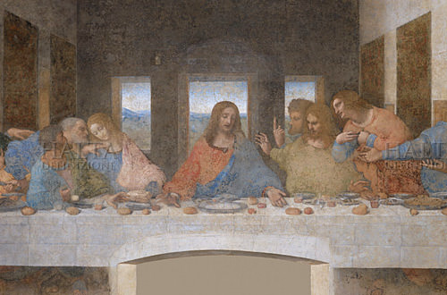
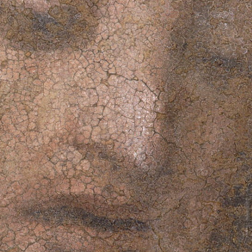
First up is Haltadefinizione, with their astounding hi-res scans of some famous works. You can zoom in so close as to see the actual brushstrokes and cracks in the plaster. Like this breathtaking view of Jesus from The Last Supper by Leonardo da Vinci...
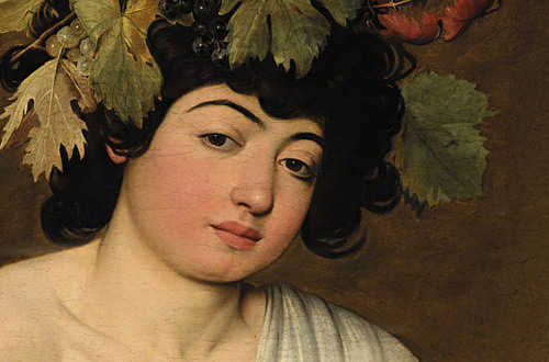
Or this stunning zoom of Bacco by Caravaggio...
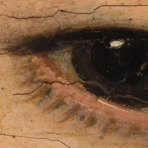
Amazing. Just amazing. And they also offer gallery prints of the various works and selected zoom prints as well. I wish I could afford them.
In equally amazing news, The Vatican has graciously put a virtual "window" into the Sistine Chapel on their site so you can explore Michelangelo's master works of the cieling and Last Judgement (along with the works by other geniuses such as Raphael, Bernini, and Botticelli)...
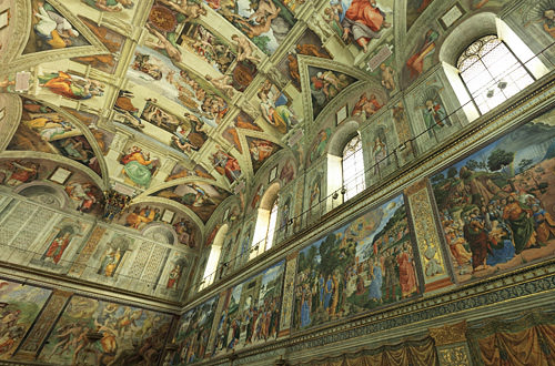
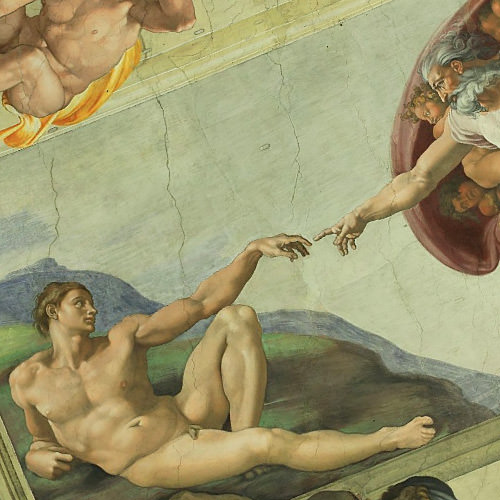
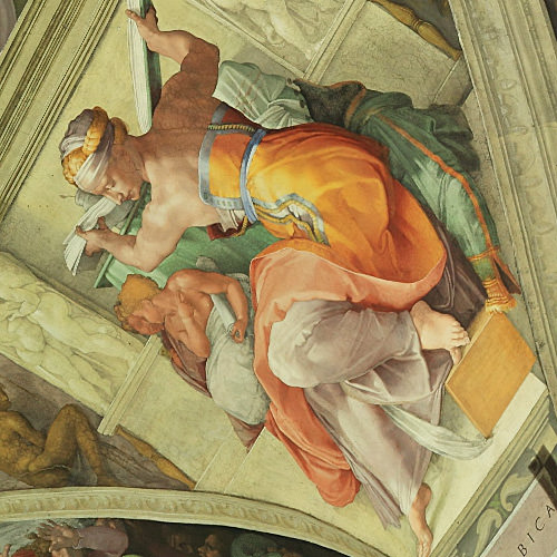
Even though I've seen these works in person, I've never seen them like this. To be able to zoom in and study great masters in such detail is just too good to be true.
Art deserves to be enjoyed by everybody. Museums who choose to share their treasures over the internet are enriching the world for us all, and I couldn't be more grateful for their efforts.
Now, if you'll excuse me, I'm going to get lost in some art for a while...
 I am not a big fan of the new "Dr. Who" as portrayed by Matt Smith, but when I saw that last week's episode was pretty much being billed as "Vincent van Gogh, Monster Slayer" I had no choice but to set my DVR to record it. Vincent is one of my most favorite artists, responsible for my favorite painting of all time, and the idea of seeing him doing cool stuff in Dr. Who was too much to resist.
I was not disappointed. SPOILERY STUFF AHEAD, if you haven't seen it yet!
Admittedly, my expectations were pretty low... mostly because I fully expected van Gogh to be treated as a novelty throw-away character who was done all wrong. Imagine my surprise when a real effort was made to portray him in a sympathetic and realistic manner. Kudos to writer Richard Curtis for a great script!
The episode did indeed end up being a monster hunt, but that was almost secondary to Vincent's real-life story of torment and unappreciated genius, which was the real focus of the story...
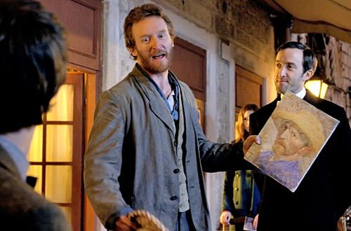
The casting was perfect, as they managed to not only find an actor (Tony Curran) who resembled Vincent van Gogh, but was also talented enough to play the more subtle intricacies of the tortured artist...
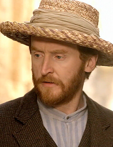
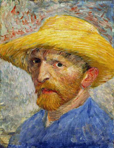
The production values were amazing, as they faithfully recreated the world that Vincent inhabited, including his room at Arles...
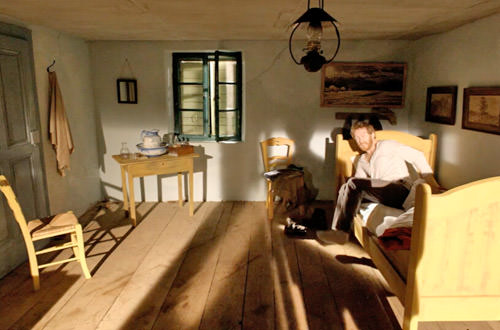
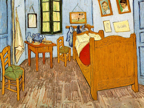
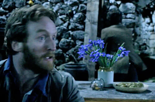
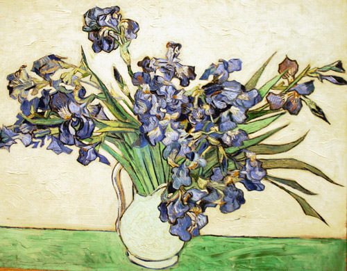
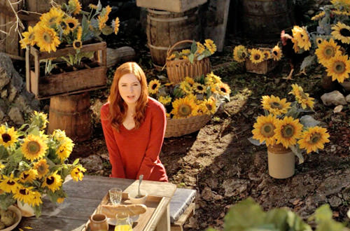
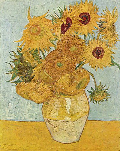
No detail was too small, as the set designers even added a few touches to make everything seem like Vincent actually could have lived there. Like occasional glimpses of the irises and sunflowers that inspired so many of Vincent's paintings...
And I thought it was utterly fantastic how they took the time to explain the wonderful way that Vincent sees the world. It was like an art appreciation moment...
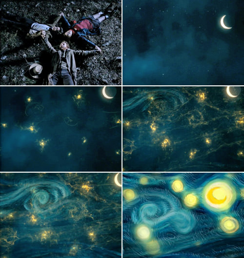
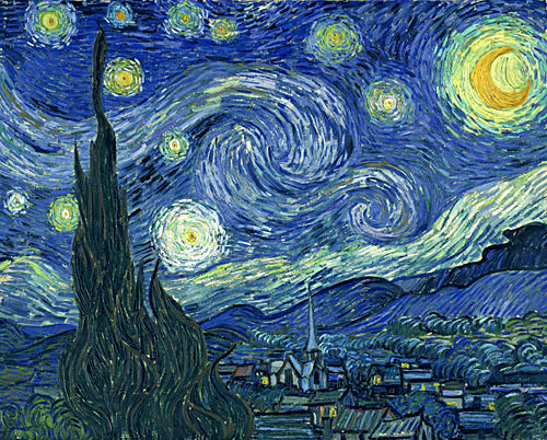
But it was the ending that made the show so sublimely awesome.
The Doctor, feeling sad that Vincent lived a life of depression and pain in a time when his every effort as an artist was rejected, decided to show him a glimpse of the future. A quick trip in the TARDIS later, and van Gogh gets to see that one day he will be regarded as one of the world's greatest artists. It was a magical scene that righted a terrible wrong, and has to be my feel-good moment of the year so far...
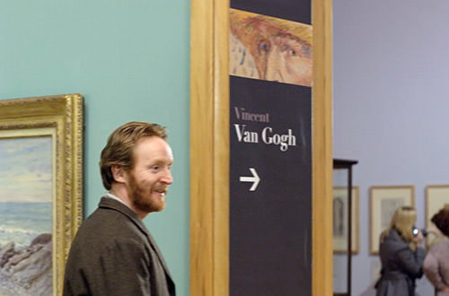
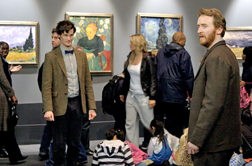
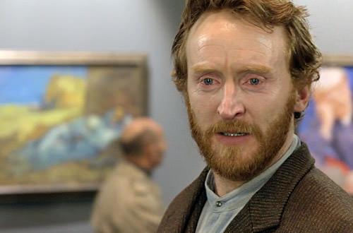
And then came Vincent's moment of vindication when The Doctor arranged for him to overhear what people thought of his work...
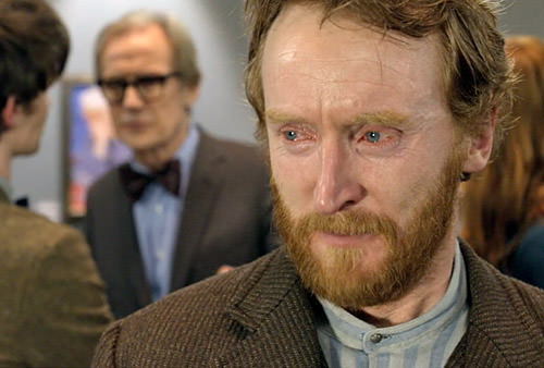
Listening the museum curator (played by the ever-awesome Bill Nighy) talk about Vincent in a way that could have come from my own brain was an almost surreal experience...
"In a hundred words, where do you think van Gogh rates in the history of art?"
"To me, van Gogh is the finest painter in the world. Certainly the most popular great painter of all time. The most beloved. His command of color is magnificent. He transformed the pain of his tormented life into ecstatic beauty. Pain is easy to portray. But to use your passion and pain to portray the ecstasy and joy and magnificence of our world... no-one had ever done it before. Perhaps no-one ever will again. To my mind, that strange, wild man who roamed the fields of Provence was not only the world's greatest artist... but also one of the greatest men who ever lived."
Alas the ending was bittersweet but, where Vincent Van Gogh is concerned, it pretty much had to be...
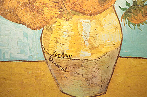
The entire episode was like a love letter to Vincent van Gogh and his beautiful art, and I loved every minute. Even when he was fighting monsters. Highest possible recommendation. If you didn't catch it on BBC or BBC America, you can grab it on iTunes (well, in the US you can... other countries may vary).
Many thanks to Steven Moffat, Richard Curtis, Edward Thomas, Tony Slater Ling, and everybody else who had a hand in this wonderful episode.
