


 Stand back, it's a big one!
Laying out an issue of THRICE Fiction is like putting together a giant puzzle where all the edge pieces have been removed. Stories have to "flow" into each other in a way that keeps the reader engaged, yet still manage to make them feel like separate entities. You'd think that the more stories you have, the easier it would be to fit the pieces together because there's more options to choose from. You'd be wrong. It's actually quite the opposite. It's the choice that drags things out and makes things hard. If you only have a few stories, then the way they should fit together is more obvious. With a lot of stories? Well...
Yet, it is what it is.
RW Spryszak and I made the decision early on that the size of the magazine would directly relate to what we have to put in it. If we only received two stories that were "right for us" then that issue has two stories. But we never accounted for THRICE getting as popular as it has. RW is getting hundreds of submissions each issue. Hundreds. Our odds of getting great stories that are "the right fit" for us have exploded.
So I ended up with an issue that was 84 pages which I then had to pare down to 70. Because things start getting expensive after that.
And since THRICE shows no signs of slowing down, we've adjusted our publishing schedule to allow more time. The last thing we want to do is start slapping an issue together haphazardly to meet a date on a calendar, so it was our only option. The good news is that the quality of the magazine can be maintained. The bad news is that our submission window has dropped to one month intervals.
I'm choosing to look at this as a good thing.
Anyway...
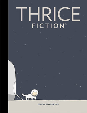
Once again I am going to write a blog post about all the art that goes into the issue. But this time it will have to come in two parts. Here is the first half...

RW had an idea for a cover after reading one of the stories he accepted. He envisioned the Brooklyn Bridge all lit up at night in the fog. I thought it was a good idea, except I couldn't find a photo that would work. All my photos of Brooklyn were shot in the daytime, and any nighttime shots I found weren't working. I decided to just up and DRAW the idea, but I could never get it to come together. The Brooklyn Bridge is a very specific structure and people know when you get it wrong. I simply didn't have the time to get it right. Or I'm just not that talented an artist. Regardless, I had to try a new approach.
So night became day, fog became clouds, and away we go.
The photos I had taken from my last visit to Brooklyn were a good start. I wanted the cover image to be on the bridge instead of looking at it, and I had plenty of shots for that. But the clouds were never where I wanted them to be. This meant I had to painstakingly cut out the bridge so I could manipulate the sky as I wanted... namely, having a big ol' cloud at the top for the magazine title to sit on! After I composited the bridge and the revised sky, I was dismayed to find that the cables were falling away, so I then had to paint over each and every one to get them to stand out a bit. After a lot of work, I sent the photo through a couple of Photoshop filters to add a bit of watercolor feeling and, voilà, our cover was born.
Except not really.
Everybody thinks that Photoshop filters are a magic button you press to get cool stuff happening with no effort. And, for the most part, that's true. But I'm never satisfied with the "magic button" approach, so I always end up re-painting parts so that they filter better... or using different strengths of filter on different pieces of the photo... or whatever. In this case I ended up with a photo that had twenty-two separate layers in the final composite to get what I wanted.
As usual, I find myself thinking it would have been easier to actually take the time to paint the thing from scratch.
Oh well.
To read about the rest of the art in this issue, you'll have to take a look after the jump. And I'll see you tomorrow for part two!
First, a warning. There be spoilers from here on out, so please go download a FREE copy of THRICE Fiction No. 8 before proceeding!

INSIDE FRONT COVER. This issue is such a beautiful roller coaster of a magazine that I wanted a "moment of zen" before the reader digs in. This photo fit the bill perfectly. The cat in the photo has no name, but I called him SCUBA-Cat because he hung around a SCUBA shop in Fiji where I was vacationing (you can read more about it here). I renamed him "FijiCat" for the magazine because it seemed a little confusing otherwise.

Page 2. RW talking about "things" got me to thinking about "Thing 1" and "Thing 2" from Dr. Suess's The Cat in the Hat. His wacky, wonderful illustrations reminded me of a piece that Kyra had done with beautiful turquoise twisty trees against a red sky and, luckily, Kyra let me have it for this issue! This is a crop of a bigger work you can find over at Kyra's website.

Page 3. Originally, I had sketched out a topiary in a "Rocky victory pose" for Ann Bogle's Rocky 4. But ultimately I thought that was a disservice to her story in a lot of ways... not the least of which being that it spoiled the ending. Enter artist Ira Joel Haber. As I was looking through his works, this piece immediately jumped out at me as perfect for Rocky. Doesn't he kind of LOOK like a Russian lawn ornament?

Page 4. At first I wanted to recreate the ad which Maroula Blades describes on the back of the truck... she makes it seem so appealing! But then I realized that nothing I could come up with would match her words, so I looked elsewhere. Eventually I decided that the feet of the guy on the bench was the way to go, as it would resonate with the final line of the story. I searched for feet in iStock Photo for a long, long time looking for the perfect pose, and eventually found it. Then I had to search for a bench with frost on it. Then some jeans so the guy wouldn't be pantsless. All three were composited, painted over, then run through a filter in Photoshop. The feet didn't look "cold" enough, so I kept making them bluer and bluer until I got them where they needed to be.

Page 5. This is a story that Bud Smith had posted in his Facebook feed that I fell in love with the minute I read it... at which time it ended a bit differently...
Chaz couldn't help himself, he kissed her lips. Her eyes shot open. Green
ethereal fire projected from her eyes and mouth. The chains exploded. Her
hands wrapped around him. They erupted up into the sky, flew over the
moon. Then they came back down to the earth and went out for a nice
Italian dinner at that place next to the park.
It was their spot.
Those final four words were a really clever turn, so when Bud wrote a new ending, I was a little surprised. Then I read what he came up with and liked the new ending equally well. After I decided to use Betty for the illustration, I was thankful for the new ending because it would fit my idea for the art better. This piece is actually a composite of five photos (including a very pretty woman from iStock) that I spent over an hour compositing before I got what I wanted. Then I painted over it all and ran it through Photoshop. Easy!


Page 6. This is an excerpt from a Richard Kostelanetz collection called Lovings. Originally there were five but, when we had to reduce our page count, it (sadly) dropped to three pieces. Since they are full-page works, my first instinct was to just drop them on blank pages exactly as they were given to us. But I worried all that white space would get the pieces overlooked. Then I got the idea that THRICE No. 8 was glued onto a copy of Lovings and I could just tear away pieces here and there to reveal Kostelanetz's work. I thought it was pretty clever, and Richard signed off on the idea, so here we are.

Page 7. Maybe it's the kid in me, but I wanted to draw a cartoon version of the talking clock from the minute I read the first paragraph of David Bowman's clever story. I usually find comical illustrations don't work for THRICE, but I was really happy with the synergy between the art and words here. This was drawn on a tablet in Adobe Illustrator, then transferred to Photoshop for a run through the "Oil Paint" filter.

Page 10. I came up with many, many ideas for Eric Hawthorn's work here. In the end, I decided that the best thing to do would be to give the reader a start, then let Eric take them the rest of the way. So I decided to use the very first thing from the very first line. This is a stock photo which I played with quite a bit to get the tone and shading I wanted... then I drew an X on it and added some texture. It's very simple, but I really think it fits the piece perfectly.

Page 11. These two pieces from Howie Good were originally on two pages, but had to be merged when we were reducing page-count. I liked the art for Good Day for a Landslide better, so it got the top spot. I found a stock photo of a goldfish in a bag that I was going to use, but painted over the goldfish and dropped a candy heart in there. I spent quite a lot of time choosing the message for the heart. After re-reading the piece many times, I decided on "good bye" because I felt the words were saying goodbye to the person you imagined, leaving you with the reality of what you got. Maybe I dug too deep, but I do like it.

Page 12. For Kevin Tosca's latest piece, I had only one image in mind... a foul, nasty mouth chewing food with their mouth open. I shot dozens of photos of my own mouth filled with macaroni salad, but it ended up looking a bit TOO nasty, so I went stock-photo shopping. I couldn't find a mouth like what I wanted, so I bought one that was close and warped it to be more annoying. Then I dropped in a fork with some spaghetti and composited it all over a red dress shirt to match the curtains on the opposite page. The position of the tongue looks nasty enough to make the poor woman in the story dread eating with her husband, so mission accomplished I think!

Page 13. Given that a raccoon is the unofficial THRICE Fiction mascot, I found it very clever that John Riley would sneak one into the story he submitted! I found the idea of a dancing raccoon irresistible, so that's where I went. The animal is a composite of five different raccoon photos which I had cut-and-pasted to make dance. I then added a hat and cane I found on the internet, bought a red curtain for the background, and flattened it all for a trip through some Photoshop filters. This was a lot of work, but I thought the story really earned it!

Page 14. As I mentioned, figuring out which story goes where in an issue of THRICE Fiction can be a challenge. It's hours and hours of shuffling until I get a "flow" going between stories. Joel Allegretti's The Intruders was paired up with Momina Mela's Good Enough at the very start, and they never left each other's sides. And when it came time for the art, I wanted very much for the pages to reflect each other. Allegretti came first, as there wasn't really much I could do to directly reflect on the story except draw out that lime green ashtray. Sure I could have gone abstract, but I really wanted to supplement the story rather than add to it. And if you think that was easy, it most definitely was not! I played with the angle for hours, the position of the cigarette for even longer, and agonized over whether there should be discarded butts from other cigarettes in the tray. Ultimately I went as sparse and generic as possible... with one exception, which I'll get to in a minute...

Page 15. Momina Mela created an entire world in just eight lines of prose. Like with Allegretti's piece, I wanted to be very, very careful that I didn't leave any footprints on what she created. So I lifted the glass of tea with a lipstick print out of the story, then let Momina dazzle the reader unobstructed. Except when I stepped back and looked at the spread... I felt that I wasn't doing quite enough to visually support either story. So I added a little skull into each illustration. The idea came from The Intruders (I don't think the owner is ever coming back, so the person waiting will be there until they die!), but it worked perfectly for Good Enough too! I could not be happier with this spread, as it ended up doing everything I set out to do.

Page 16. In every issue of THRICE I try to have a "show-stopping" double-page spread. It's kind of a tradition. And Jane Flett's wonderful Whale Lessons was perfect. I just searched for a stock underwater photo I could purchase, tweaked the colors so Jane's prose would float above it, then stenciled in the outline of a whale on the side. Done! I hope readers are a bit surprised when they turn the page to find this spread.

Page 18. And here we begin a long string of Ira Joel Haber (my savior!). When I read about the "magazine clippings of sexy models" in Rachel Anderson's story, Disclaimer, I went hunting through Ira's works until I found the perfect fit. I like that the "sexy models" are from older magazines where the entire definition of "sexy" was very different than what it is today. Kind of worked better with the story than if I had gone with a more modern take.


Page 19. Okay... it's just eerie how well these collages from Ira work with the text. The second collage relates so perfectly to the buildings mentioned by Brandon Patterson in his story that it felt as if they were fated to go together. Who am I to fight fate?
Annnnnd... that's a wrap! Tune in tomorrow for the second half of the artwork in THRICE Fiction No. 8!

I love comments! However, all comments are moderated, and won't appear until approved. Are you an abusive troll with nothing to contribute? Don't bother. Selling something? Don't bother. Spam linking? Don't bother.
PLEASE NOTE: My comment-spam protection requires JavaScript... if you have it turned off or are using a mobile device without JavaScript, commenting won't work. Sorry.
Incredible artwork on many levels. I just skimmed through the entire issue (and extended lunch, if you will) and the growing size has not affected the readability nor the page placements in any way.
Bring on part 2.
Being a total art loving freak, this blog post mesmerized me. Fascinating approach to how you put the images in with the words. Can’t wait to read the next parts…
I miss RW on the Internet.
I love the moment of zen. 🙂