
 Sometimes you get the bear. Sometimes the bear gets you.
Though I would never actually want to kill a bear, so that saying doesn't make much sense for me. Unless I'm "getting" the bear so I can give him a hug. A bear hug!
In any event, the March issue of THRICE Fiction actually slipped a day into April, and there are a lot of excuses I could give as to why that happened. But, the honest truth is that the issue just ended up being a much bigger project than usual (54 pages!), and I didn't budget enough time to get things done.
Oh well. It turned out great, so hopefully our readers will think it's worth the wait...
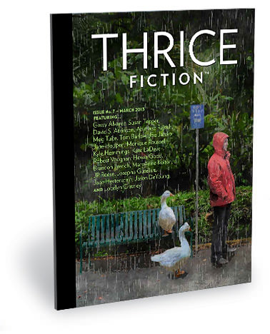
Download the issue for FREE by visiting the THRICE Fiction website!
The cover this time around was a fun one. Fearless THRICE Fiction editor RW Spryszak told me that he kept on seeing "a man standing at a bus stop in the rain" for the cover as he was reviewing submissions. I thought this was a great idea for a Spring issue, so it didn't take any amount of convincing for me to take the idea and run with it. Especially since I could do a kinda tribute to one of my favorite films of all time... Hayao Miyazaki's wonderful My Neighbor Totoro...
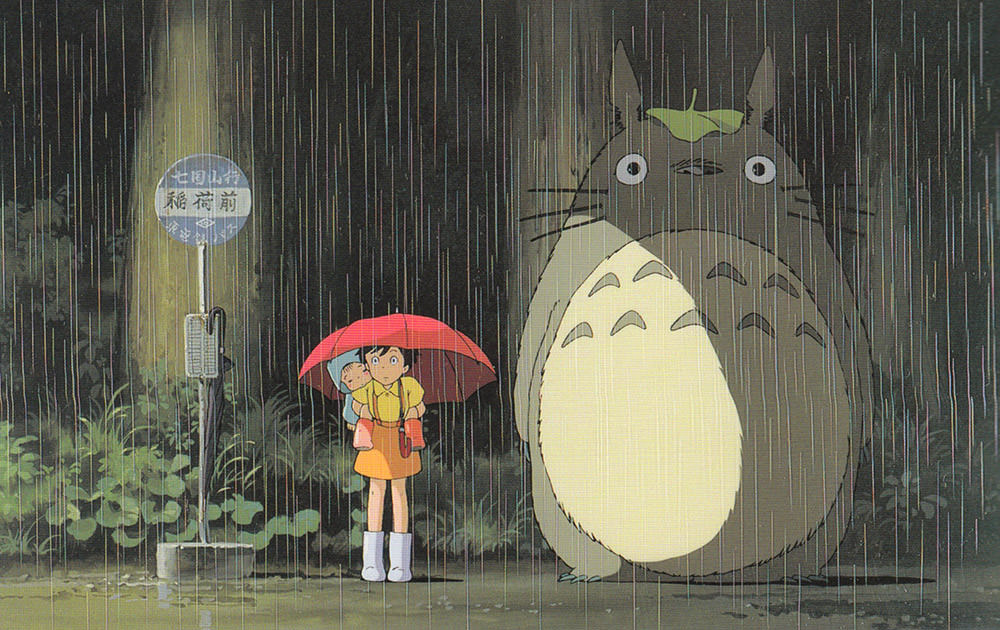
But since Totoro is trademarked, I decided to use geese instead. I also thought geese would be funnier.
The original cover image is composited from 23 separate photos from locations like Costa Rica, Maui, Barcelona, Vancouver, Seattle, and Fiji (among others)... plus one very important piece of stock photo art...
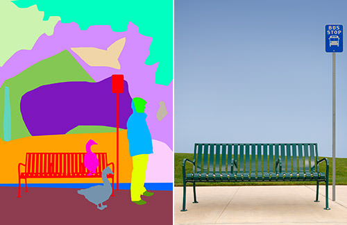
The process of stitching all the photos together into a single cohesive image is long and tedious (as I explained in a step-by-step for a past cover here). Once that's been completed, parts were painted over in Photoshop, then run through various filters to add rain and make the image look kinda-sorta like a painting. As usual, it would probably have been faster had I ACTUALLY painted the thing, but at least this way I didn't get any paint on my clothes. Anyway... here's the end result...
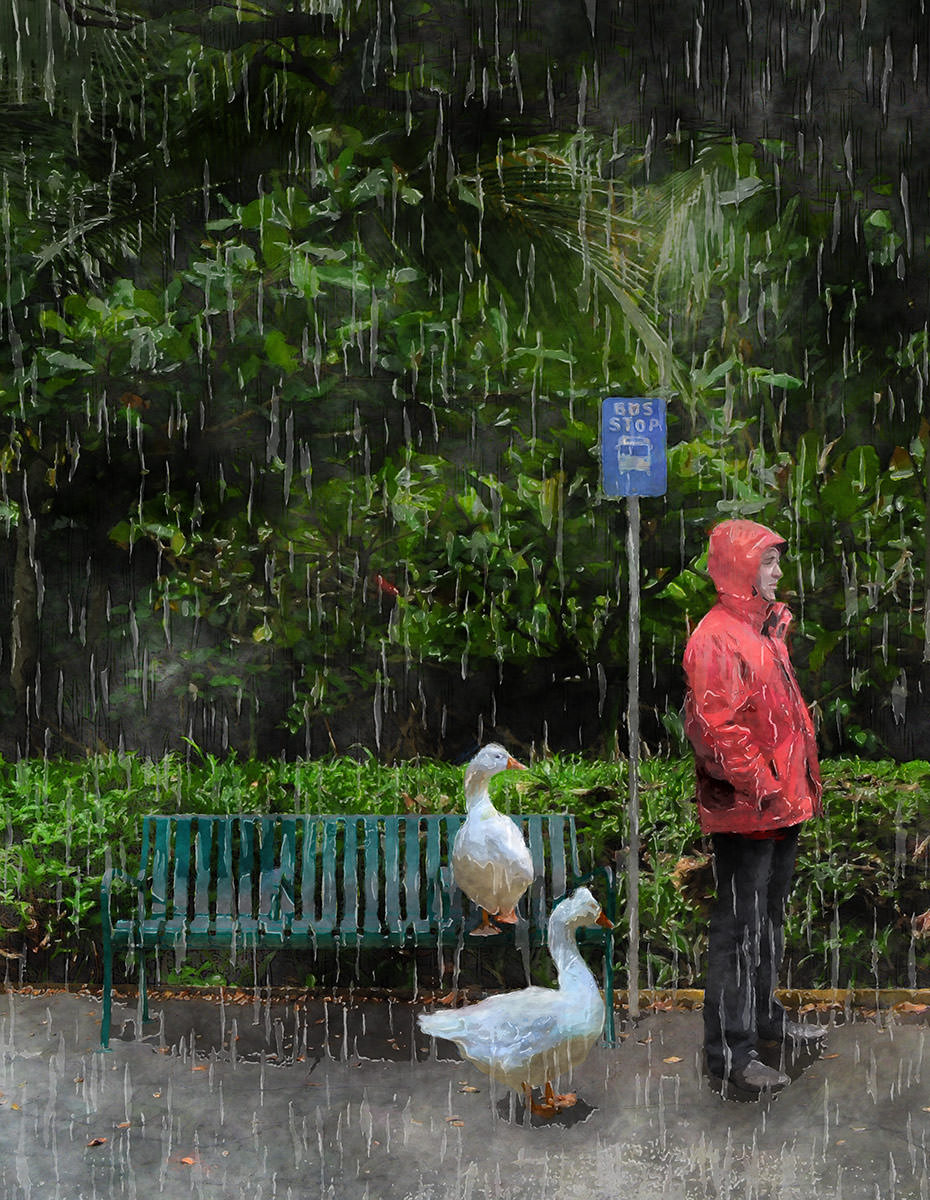
And that's that.
For a look at the rest of the artwork in this issue, click onward to an extended entry...
First, a warning. There be spoilers from here on out, so please go download a FREE copy of THRICE Fiction No. 7 before proceeding!
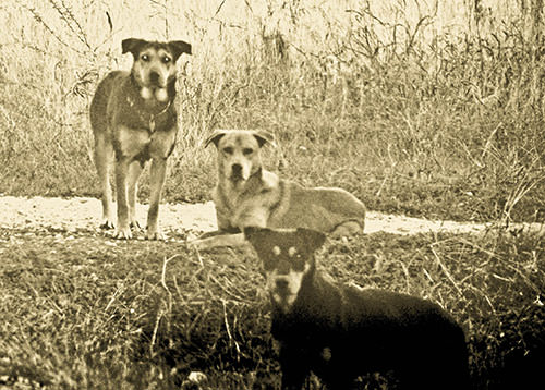
INSIDE FRONT COVER. Now that we're three years in, I decided to start playing around with photography for the magazine. So our readers understand this, I used this awesome piece by Christopher Woods to open the magazine, which he describes thusly: "I like this pic a lot. Those three musketeers were tough customers. They lived next to a pasture where we kept our horse for a time, and every time we drove by they came at us. Which is why the photo was taken from the safety of the inside of my car."
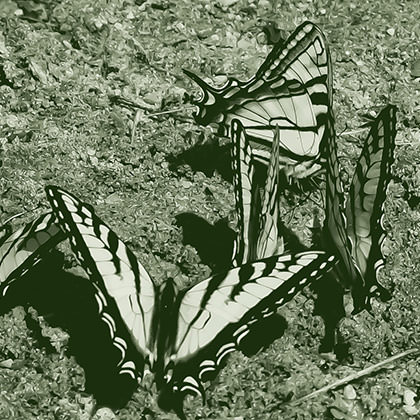
Page 2. Frequent THRICE Fiction art contributor Kyra Wilson not only is an incredibly creative painter... she takes photos as well. I liked this image because it fit RW's notes for this issue to a T. And it's really beautiful.
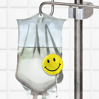
Pages 3 & 4. Having gone through cancer with two people I love, Gessy Alvarez's The Happy Couple was a read that meant a lot to me. I lead the issue with it because it played nicely off of RW's notes on the previous page. Unlike most stories where I agonize over the artwork, I knew immediately what I wanted to do here. I took the saline IV and pinned a smiley button on it. The second piece was equally easy, as I just took the "fruit punch" from the story, added a syringe, and stirred...
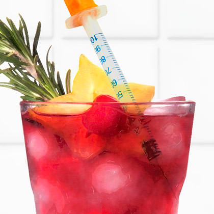
Both of these images are stock photo composites which have been painted over then filtered in Photoshop.
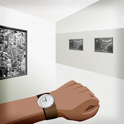
Pages 5 & 9. As somebody who loves museums, I thought Susan Tepper's "behind the scenes" look was a great read. Whenever I visit museums, I always see the "guards" checking their watches, so that's the direction I went. The "Modern" exhibit gallery in the story sounded like it took place in a kind of sterile environment, so I drew it in black & white. The second image is a stock photo of a rusted can. I pictured readers saying "It's one of the missing CANS!" when they saw it.
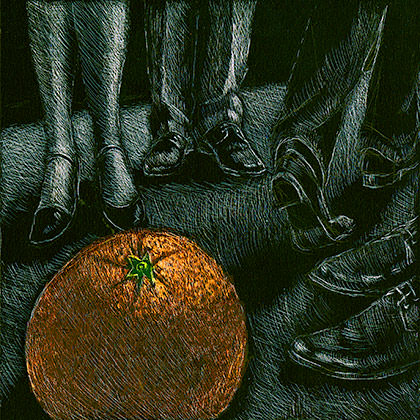
Page 11. I didn't get four paragraphs into this story before I knew it would benefit from Chad's point of view on the art. After I wrote him about it, he replied with this: "The oranges story is pretty funny. Some douchebag wanders through and everyone forgets the strange rift in the universe allowing self-propelled oranges." Obviously, I was 100% right about this one.
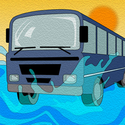
Page 13. After reading this nifty short by Ahimaaz Rajesh, I felt that any attempt to interpret the visuals he described would distract the reader and inhibit their ability to form their own visuals. So I drew an abstract pattern and that was the end of it. But eventually I decided this was a cop-out, so I went with the bus. Now I'm glad I did, because it kind of sets a funky tone for the writing.
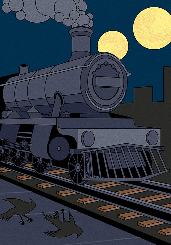
Page 14. As I read through Howie Good's cool bits of flash fiction, I originally had the idea of cramming in everything I could from all of them into one drawing. But once I reached the final story, I knew what I had to do. The image of a train at night under two moons with the broken birds on the sidewalk is literally too good to pass up. To make it look kind of surreal, I went superflat and didn't add any shading. The train drawing is based on the "Hogwarts Express" prop train at Universal Studios Orlando's Wizarding World of Harry Potter, believe it or not.
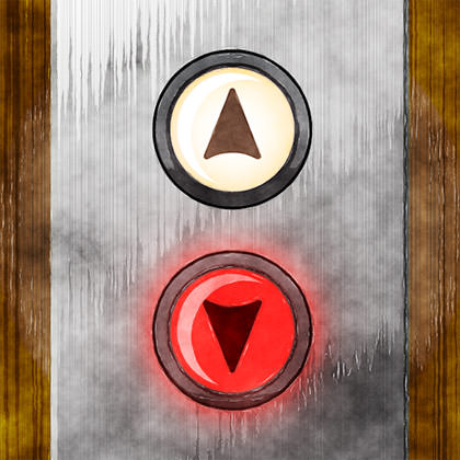
Page 16. Originally I was going to give this story to somebody else to draw... but I liked it so much that I ended up keeping it for myself. The image of an elevator call button "going down" with an ominous blood-red glow was kind of a no-brainer.
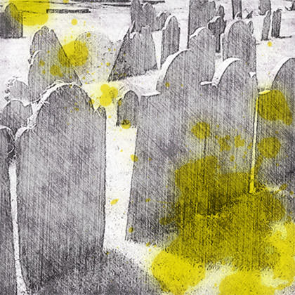
Pages 17, 18, & 21. This is the third time I've illustrated a story featuring urine. This means I'm getting pretty good at making pee stains. The trick was deciding on what imagery I was going to piss on. Fortunately, this story by Tom Barlow was really smart, so I didn't mind running through it a half-dozen times until I got it figured out.
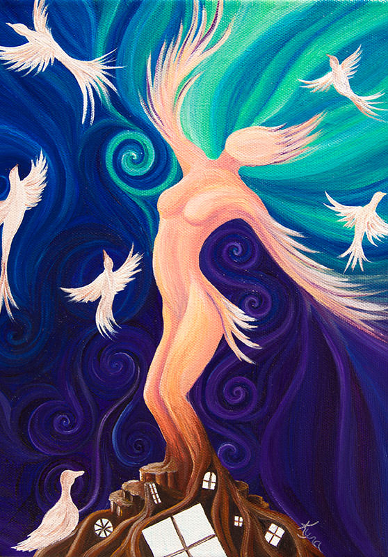
Pages 22, & 24-25. Editor in Chief RW suggested that Kyra get this story. After reading it, I came to the same conclusion. It should surprise nobody that she totally nailed it. Again. It didn't hurt that Jane Hoppen crafted a really great story.
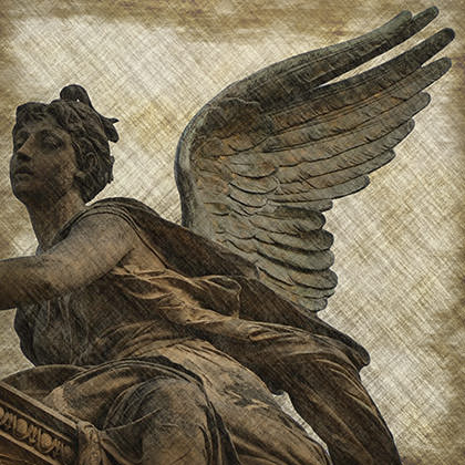
Pages 27 & 29. This story is a wonderful ramble of imagery by author Monique Roussel, and I struggled a bit in trying to decide what route I wanted to go. Ultimately, pulled from her mentions of angel wings and finally got to use these beautiful photos of an angel marker I took while I was in Prague. I think they compliment the story wonderfully, and I added a nice acid etch filter to mute them a bit so they don't overwhelm the text.
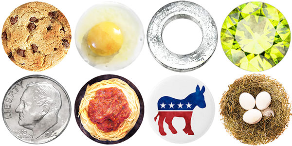
Pages 30 & 31. When trying to come up a presentation for these awesome bits of flash by Kyle Hemmings, I decided I wanted to do little icons. As I got half-way through, I realized that most all of the ones I was coming up with were round. So I found the stock photos to make them all round. How cool is that?
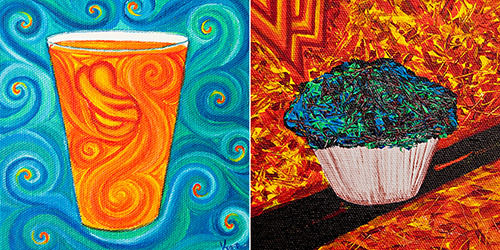
Pages 32 & 33. When these two really good stories ended up next to each other, I was kind of mystified as to how to tie them together on the spread. Then I saw the connection... BREAKFAST! The idea of drawing a glass of orange juice and a muffin were mine. But I knew I wasn't the best person to bring them to life. I figured Kyra would have a much more interesting approach... and, of course, she did.
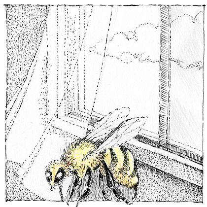
Page 34. I really, really liked this story by Joe Jatcko. Which is why it was hard for me to admit that I was not the right artist for the job. So I reluctantly handed it off to Chad knowing he would figure it all out. When I got the artwork back, I was pleased to see he used a light touch for a beautifully subtle approach that I would have missed.
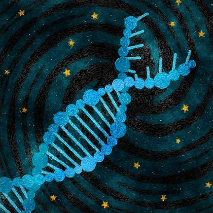
Pages 36 & 38. I drew this piece three times. The first image was two Matchbox cars crashing together, but that felt like I was trivializing the story. The second was a Jackson Pollock inspired car crash, but that was pathetically literal. Ultimately I latched onto the double helix and black hole from the story and decided that would be a much better approach. Third time's a charm! At least it was until I re-read Brandon French's words and realized I needed to unravel that double-helix a bit to better reflect the story. Maybe it's the science geek in me, but I really like these paintings I came up with, so I patted myself on the back.
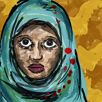
Pages 39, & 40-41. I must have read MaryAnne's story a half-dozen times before I had the guts to start drawing for it. I decided I wanted something that walked the line between being fragile and brutal. So I decided to combine a sweet image of Sabeen with the rough brushes found in Adobe Illustrator. Sabeen is based on a little girl I met in Cairo who tried to sell me a sand sculpture. She looked into my soul with pleading eyes, but I didn't buy anything because then I would have felt obligated to buy something from the twenty other kids trying to make a sale. It's haunted me ever since. Kind of like this story.
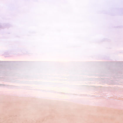
Page 42. There was really no way to come up with something for JP Reese's poetry without trouncing all over the delicate structure of her words. I didn't even try. Instead I found a pretty image of a Maui beach and faded it away so her prose would float effortlessly on top. All that was left to do was shift the color until I got those copper-tipped waves.
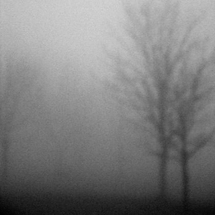
Pages 43 & 45. I wanted something special for this story, and thought Christopher's haunting images would be perfect. This is what he had to say: "I really enjoyed the story. Josepha Gutelius has a very rich and measured writing style, often surprising. A grim portrait of this couple, to be sure, but the surreal aspects are attractive. I laughed out loud at the Target smoking jacket. What was that man thinking? Ha! I think the photos come close to matching the moodiness of the story. Good choices. Hope you're pleased. Hope Gutelius is as well."
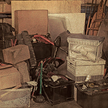
Pages 46-47. I loved these connecting bits of flash by Jane Hertenstein, and wanted to link them all together in an interesting way. At first I was going to draw all the various items and present them like an old-fashioned Sears catalog. But then I found this fantastic stock photo and decided it would be less obtrusive as a background. All I had to do was age it a bit then lay the texts over the top. The final slip of paper was layered behind Jane's bio box, because I wanted it to look like she was saying it.
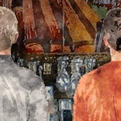
Pages 48-49. When I read this story by Jason DeYoung, the only thing I knew for sure about the art was that I wanted a bar going widescreen across the top. I sketched it out seven times before I got the look I thought worked best. At first I imagined the "Smokejack" to be a kind of dive bar with a couple bottles of rotgut whiskey knocking around on aging shelves. But after a few more readings I decided I wanted more of a saloon look with lots of bottles to signify the many, many choices we have in life. I searched stock photos for hours but couldn't find anything I liked. Then, as I was looking through my Egypt photos for another story, I found a shot of the now-closed Hard Rock Cafe Cairo and it was perfect. That's Nelson on the right in his nice new birthday shirt, by the way.
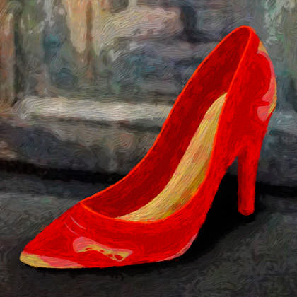
Page 50. Jocelyn Crawley's nice little pieces of prostitute flash were perfectly-defined by the first five words of the first story. So I drew up a worn high-heel shoe and put it on The Street. I couldn't think of a more perfect finale to this issue, so I dropped it on the final page and called it a day. Which is kinda ironic considering this is the very first story I illustrated.
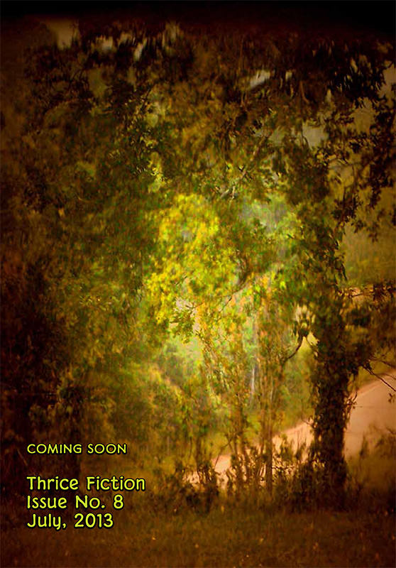
Back Cover. When I found this shot by Christopher Woods, I liked it so much that I was actually trying to figure out how I could make it work as a cover. When I couldn't find a way, I put it on the back cover instead. Christopher says: "This is one of my favorite photos, maybe a bit of magic in it. A fortunate early morning shot. For your purposes, the back cover, it comes across as something inviting." It also implies that something interesting is ahead... namely, THRICE Fiction Issue No. 8!
And that's a wrap! See you in four months.

I love comments! However, all comments are moderated, and won't appear until approved. Are you an abusive troll with nothing to contribute? Don't bother. Selling something? Don't bother. Spam linking? Don't bother.
PLEASE NOTE: My comment-spam protection requires JavaScript... if you have it turned off or are using a mobile device without JavaScript, commenting won't work. Sorry.

How lovely! Can’t wait to dive in. And I am intrigued by the addtion of photos.
I was fascinated reading about how the art in this new issue ‘came to be.’ Being a museum habituee, myself, (though not a painter or sculptor) it amazes me how those art forms come to life. I can barely hold a brush straight. These by Dave and Kyra lift the stories up on their wave.
For me it’s more, sometimes you see the bear, sometimes the bear jogs past unseen.
I’ve got bears on the brain since the snow is melting and it’s that time of year [when bears may stroll through the yard].
Cool art!
I am always amazed at how much work you put into each issue of THRICE FICTION. I need to brush off some of the stories I had been working on and re-submit them (RW gave some great criticism some months back on one of my submissions)
Thanks for the cool art work!