
 I've been keeping busy designing and building... but no worries, because a Special Edition of Bullet Sunday starts now...
• Cat Feeding Station! When it came time to decide where I wanted my "designated cat areas to be," everything came together fairly easily. Their food would be in a corner of the dining room next to the kitchen... the litter box goes next to the cat tree... and so on. The problem is that I'm not happy with how things work. The litter box really needs to be moved to the garage, but I'd have to build a pass-through and a containment cage. That's a big project. A smaller project? Building a feeding station...
And so? This weekend was the weekend to build that feeding station!
• Planning! I always start with a sketch like this...
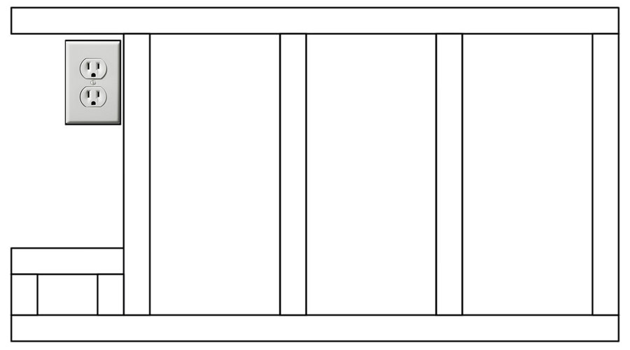
On the left there is the power outlet and an open space large enough to hold the power strip and all the cords for the water fountain and auto-feeders. All the posts in the framing seem like overkill, but since I'll be leaning on it I wanted it to be sturdy.
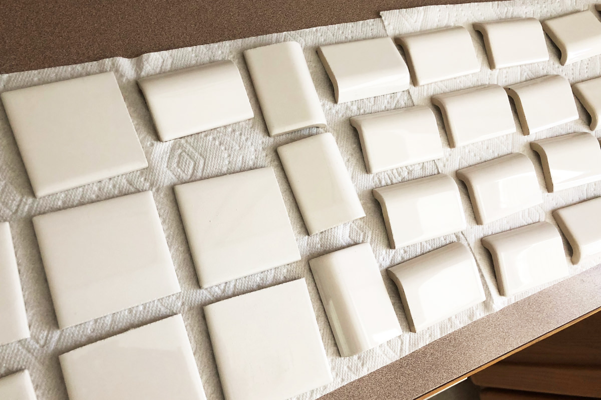
• More Planning I had a hundred bucks worth of subway tile in my garage that I bought to put a partial backsplash in my kitchen. I decided I wanted a full backsplash, so it's all been collecting dust. I decided to use it for the feeding station, but had to make sure I had enough of the stuff, so I laid it all out...
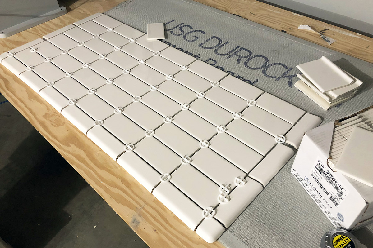
I also wanted to make sure that I had enough rows so a "bricklayer" pattern would alternate nicely between the edging.
• Even more planning! I am horrified at the thought of wasting material or having a project turn out wrong, so I am very careful when planning things out. It's not enough to calculate the dimensions... I also have to stack up the materials to verify the calculation... then I have to actually model things out to make sure that I am accommodating things like baseboards, plywood underlay, cement board, thinset thickness, tile spacing, and so on...
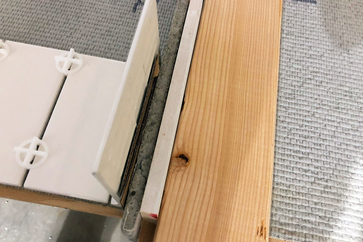
Sure it's a big time-waster, but at least I know that everything will turn out perfectly.
• Framing! Once I've figured out how big everything has to be, I cut some cement board for the floor and frame everything out...
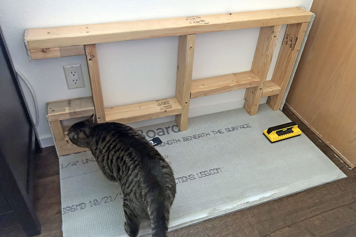
Because I'm leaning on this, I have to be sure I'm bolting it to the studs in the wall, hence the frame has to match them.
• Corded! I mocked up the space I would need for the power cords and such so I could make sure everything fit easily. Thanks to this advance planning, it did, even if the wall bolts had to be off-center a bit on that last stud...
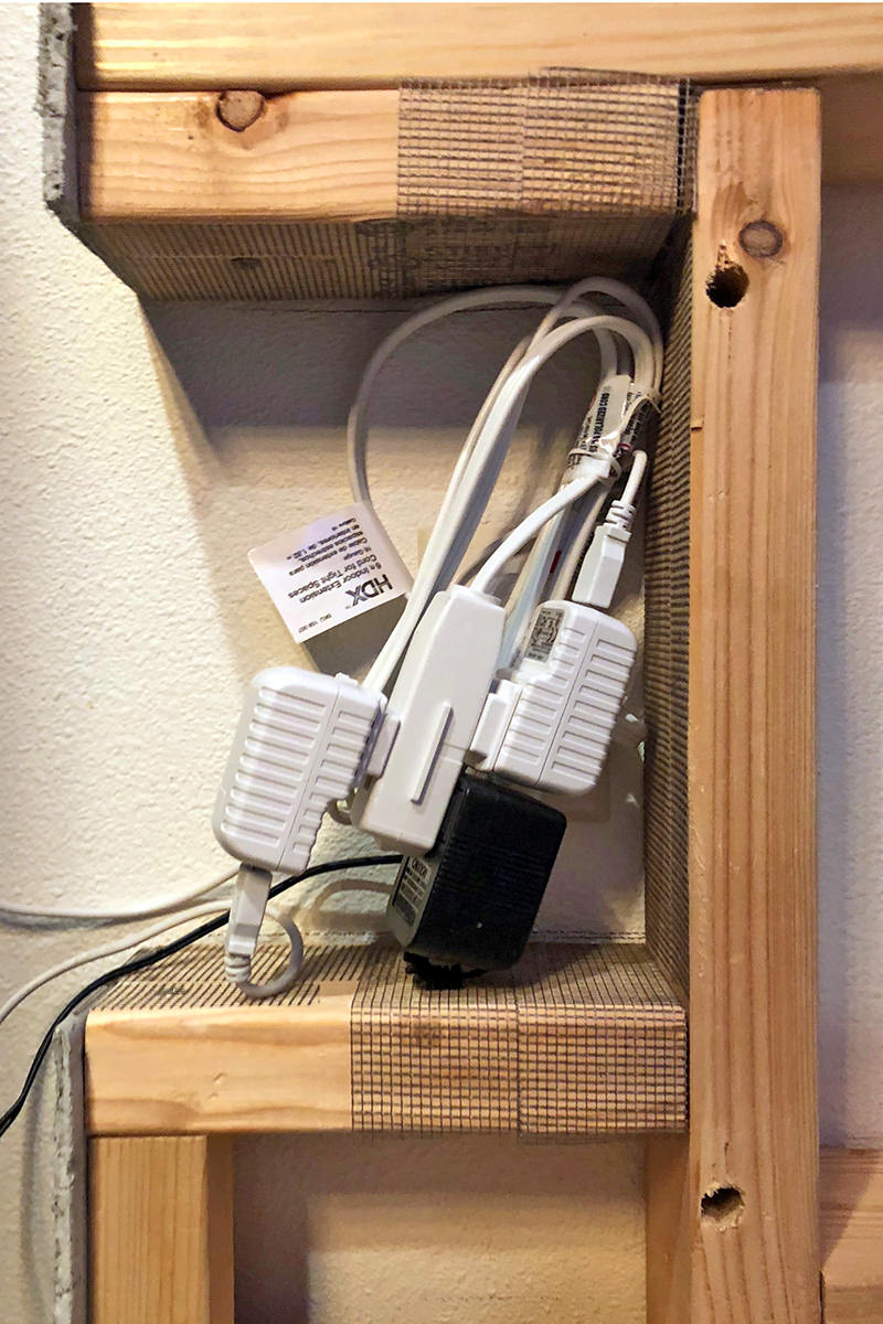
That's cords for two auto-feeders and a water fountain power adapter.
• Power Supplies! At the last minute I decided to add a conduit pass-through for power cords...
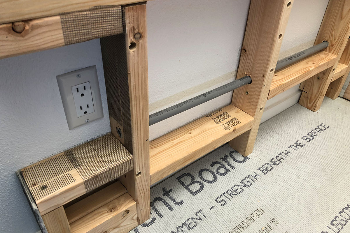
This way I can minimize the amount of cords hanging out everywhere.
• Underlay! And here's where everything gets covered up with plywood...
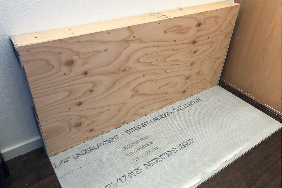
I went pretty thick for stability... I don't want the tiles popping off when I lean on it.
• Underlay Part Two! I don't like working with cement board at all, but it's a necessary precaution when you are working with a tiled surface that's going to get wet. That way if you do end up with a leak, everything won't swell and flex...
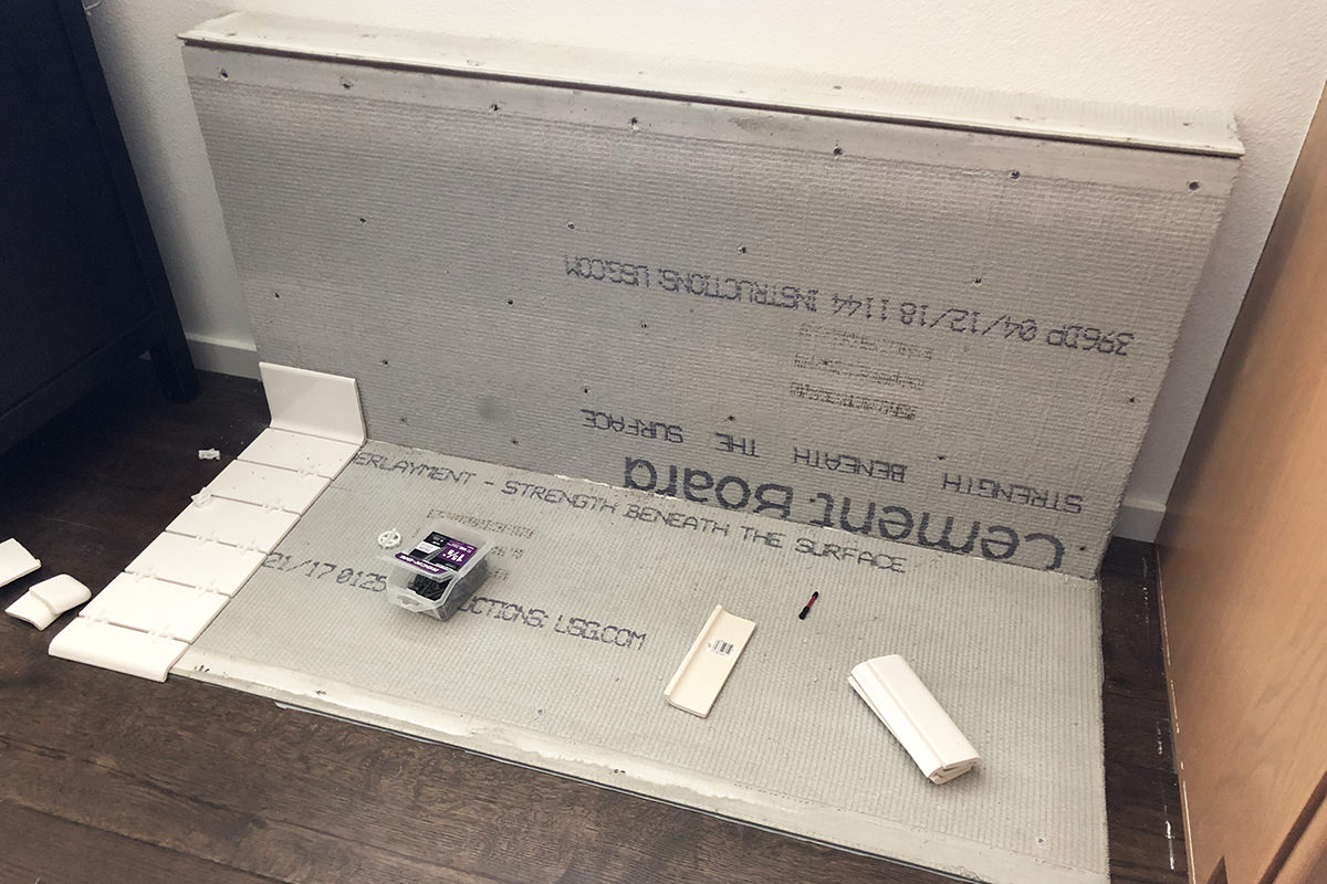
Note that careful advance planning resulted in a perfect fit for my tiles.
• Wet Cutting! I bought a "wet cutter" for chopping up tile, but had only used it once before on flat tile. I had no idea if curved (mud-cap) tile would be a problem. Thankfully, it wasn't...
If you are doing a tile project I highly, highly recommend buying (or borrowing or renting) a wet cutter. I bought a cheap one for $80 that spits water everywhere and makes a heck of a mess... but it gets the job done (I just cut a piece of plastic to make a full bib when I use it!). I've tried the tile-score units, but they never do as nice a job and can result in busted, chipped tiles.
• Tile Up! This is my second tile project. If you look real close, you'll see that I'm not very good at it yet. But so long as you use a grout color that's not high contrast (like black for white tile) it will look just fine. How I learned this was watching Flip or Flop on HGTV. The one thing that Tarek seems to be capable of is laying tile. I figured if he could do it, I could certainly do it... because any time there is a close-up of his work, it looks pretty bad. Furthermore, any time I've hired a professional, it never looks perfectly set either, so I figured "what the heck" and dove in. Thanks to YouTube videos, you can learn how to do anything...
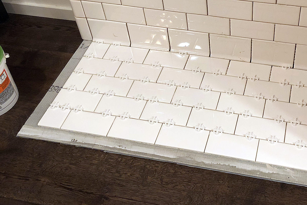
Note that on the floor I didn't set the edge tiles at the same time as the rest. The reason for this is that I am trying not to damage the flooring as much as possible. This means not getting thinset mortar on the hardwood. Instead I put a bead of clear silicone on the edge that touches the floor, then "butter" the backs of each piece so I can carefully drop it into position. Sure it's a lot of extra work, but ultimately worth it. Under the cement board is plastic sheeting to protect the floor even more. About the only damage I did was three screws to secure the board in place (and there was probably a little leakage on thinset that would have to be chiseled off). So now if I ever change my mind on the feeding station, I can tear it out with minimal restoration needed to the original structure.
• Busted! I use a Dremel tool with a ceramic cutting attachment to roughen the edges of the cove base tile (getting rid of the glaze so the grout will stick better). I figured if I was going to damage a tile, that would be the time. Fortunately, that wasn't the case. Unfortunately I ended up with a damaged tile anyway. One of the mud-cap pieces was cracked when I pulled it out of the box...
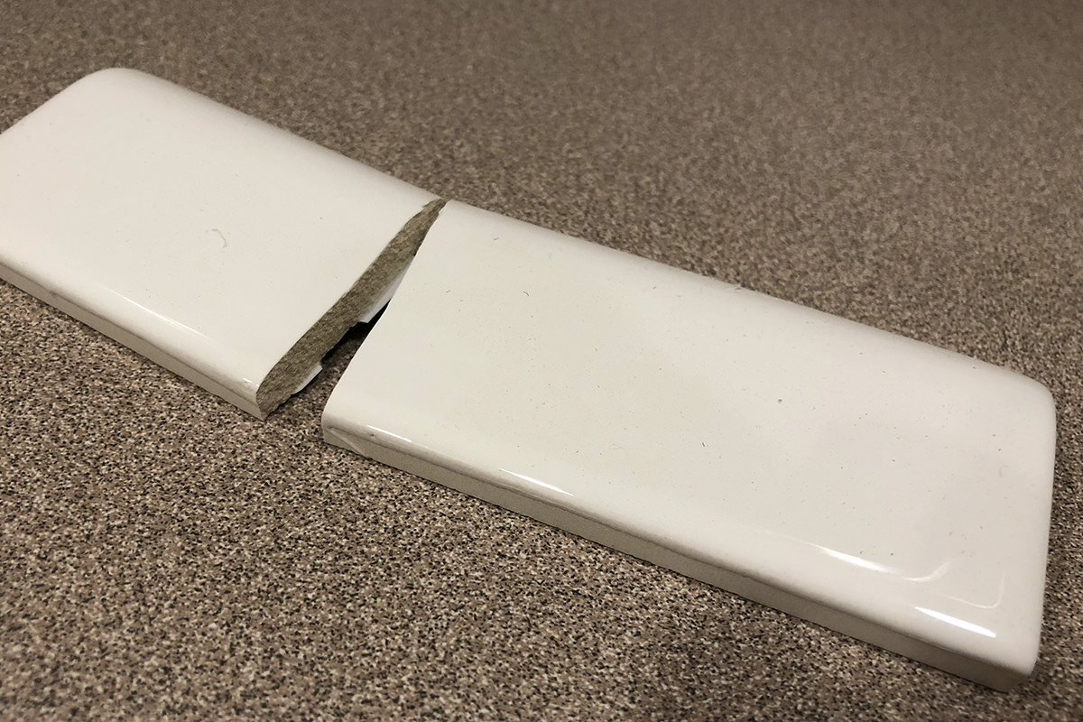
Since I had exactly the number of pieces I needed, I was in a panic. I bought the tile from Lowes at least a year ago... would a replacement tile match? Fortunately, the answer was yes.
• Finale! Tiling done! Now I just have to wait for the thinset to dry so I can grout it up!
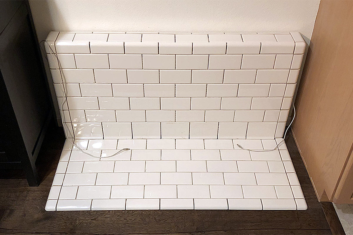
Note that I am so concerned about having the tile pattern be balanced and equal that I even put a thin line of pencil tile in the back so it begins and ends on a row of full tiles (I also made sure that the alternating pattern was maintained around the corners!).
And so... almost complete. Overall I'm quite happy with how it turned out. Jenny's messes can be cleaned up easily. The power strip and wad of cables is concealed. The power cords can be hidden when I'm not using the auto-feeders. And I have a really good support to lean against when setting down or picking up food bowls when my back is out! On top of that, it will match what I'm planning to do in my kitchen/laundry room remodel (and matches the square tile used in my bathrooms).
The nice thing about it being tile is that I can hang stuff on it with suction cups! I can label their bowls and even decorate for the holidays... assuming my cats would leave it all alone!
• Inside! Given how much I love to design and build things, I will probably be the one who ends up tearing this out to make something different. But, in case I'm not, I left a note for future owners if they decide they don't want a pet feeding station...
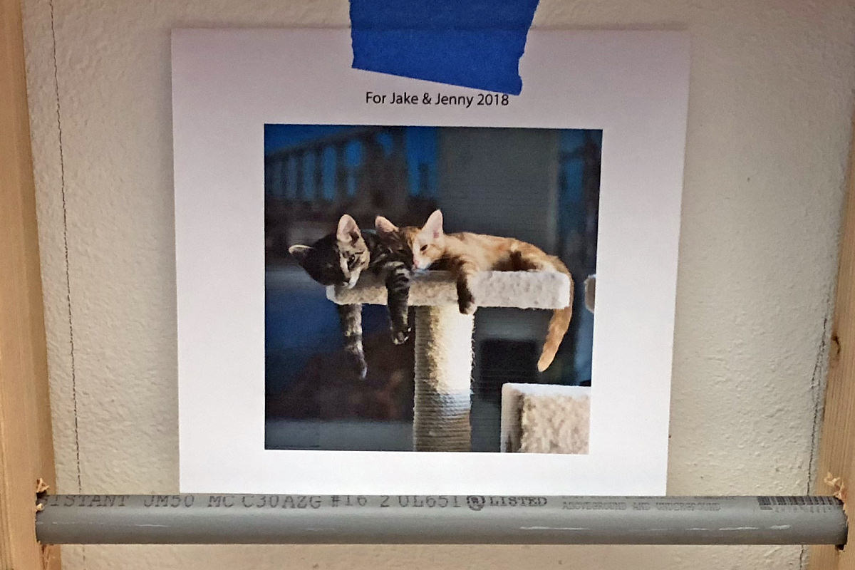
Now they know who to blame that there's this ceramic tile construct in their dining room!
And that's all she wrote... FOR TOMORROW WE GROUT!
 Welcome to Remodeling Week at Blogography!
After buying the furniture and textiles, then decorating the place, all I had left was to add all the things the room needed to feel like home for my guests.
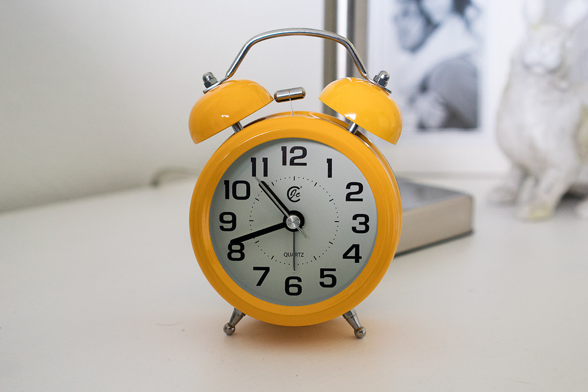
I started with an alarm clock. I was going to go with white or blue to match everything else in the room, but the Diego Rivera print above the bed had some yellow in it, so I decided to mix things up a bit...
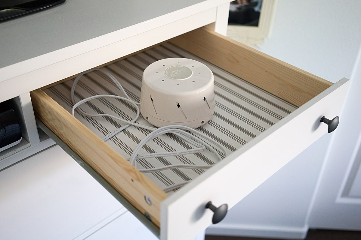
I live in a relatively quit neighborhood, but there's barking dogs and other distractions on occasion, so I got a Marpac white noise machine in case a guest needs a way to block sounds so they can sleep...
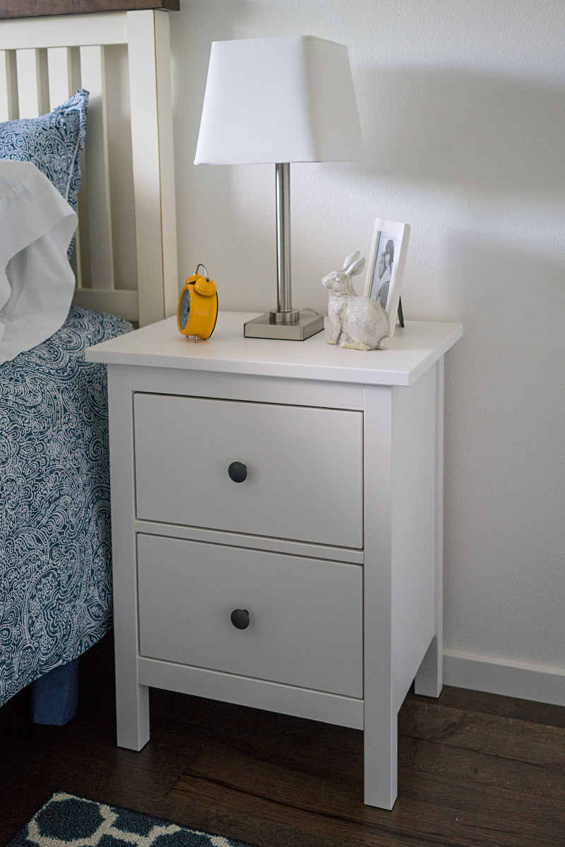
Nightstand lights are simple chrome models with white shades...
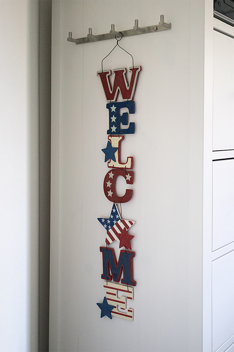
To camouflage the screws I used to secure the DVD player shelf in the dresser, I bought a chrome hook bar that guests can hang their keys and stuff on...
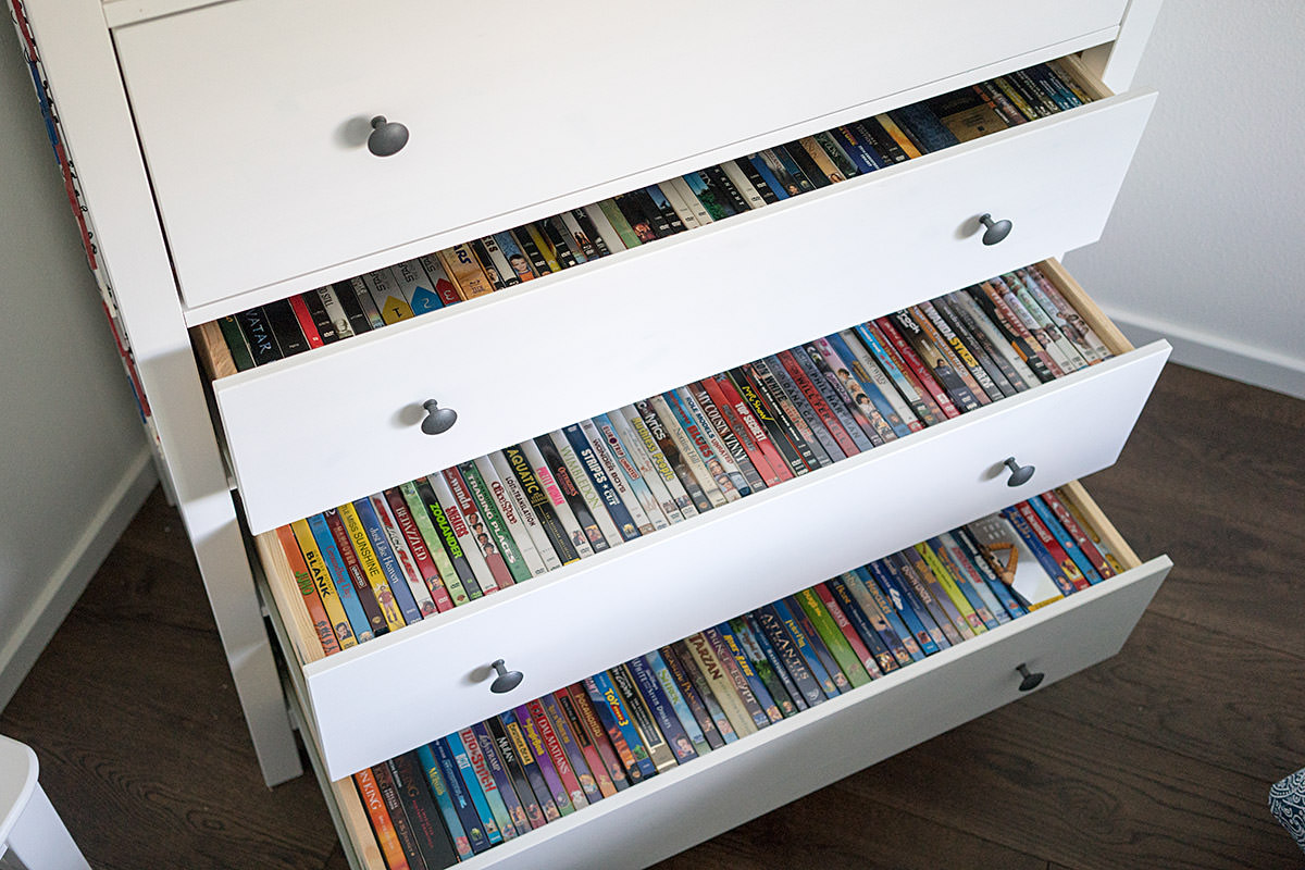
The top drawer is for guests to use, but the bottom three I used for a selection of DVDs... divided into Action/Drama, Comedy, and Kids. If a guest can't find something they want to watch, they can go to the main collection in the garage...
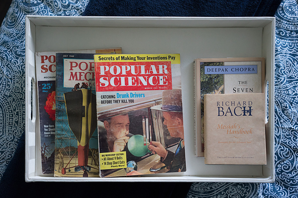
For fun-time reading, I bought some antique magazines. I also found some inspirational phrase books in my collection from Richard Bach and Deepak Chopra...
And thus ends Remodeling Week at Blogography!
 Welcome to Remodeling Week at Blogography!
After jamming bunnies everywhere, I considered getting bunny pictures to add to the walls, but that seemed like entirely too much rabbit.
After tossing around ideas for a couple weeks, I was at an antique mall when the solution jumped out at me... vintage license plates!
Not only are they very cool-looking, but they are available in dark blue to tie into the textiles I bought. I found five great ones for above the closet...
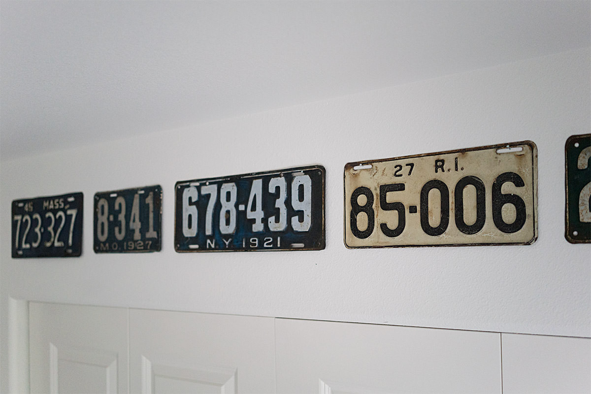
One of the plates I bought was so worn there were no letters left on it... and it was pre-embossing... so I could barely make out that it was an Ohio plate from 1914. I wanted a companion plate, so I went hunting on the internet and found that the 1915 Ohio plates were dark blue... perfect!
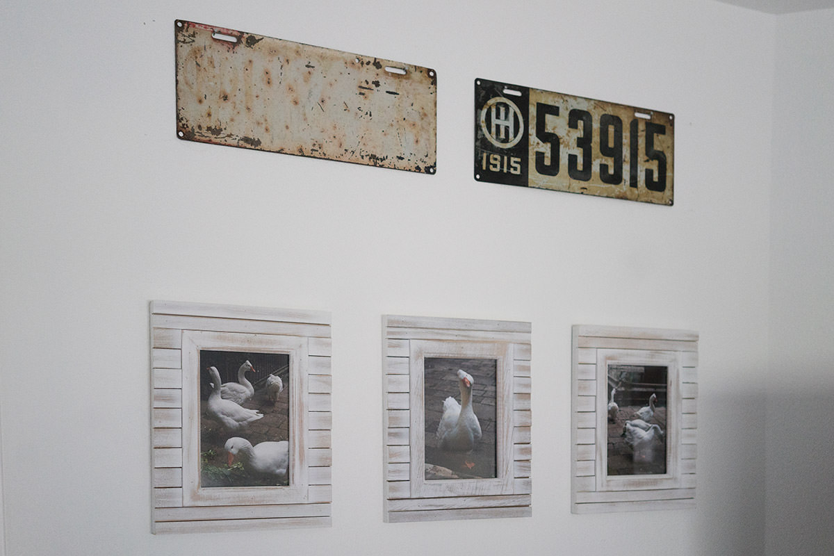
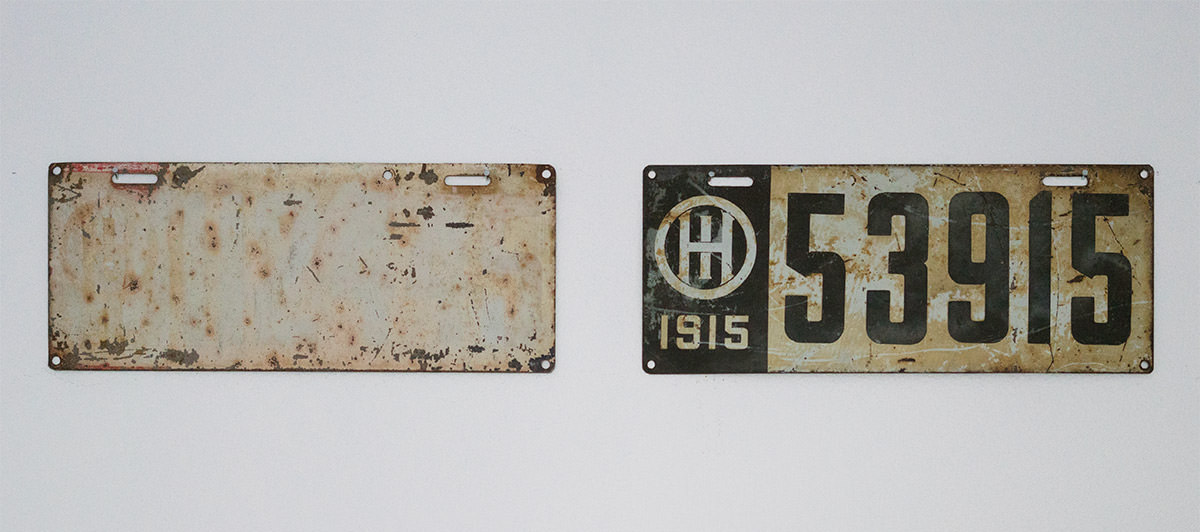
The main wall has my Diego Rivera print on it, which has rich reds in it, so I found a license plate to match that I could put it above the mirror on the same wall...
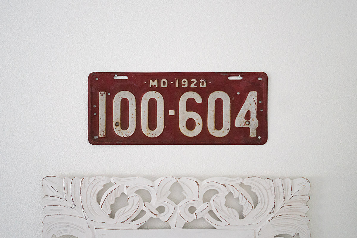
Overall, I'm really happy with the license plates. The only down-side to acquiring them is that all the coolest ones are also the most expensive.
 Welcome to Remodeling Week at Blogography!
I wanted some kind of "theme" with the decorative junk I wanted to add to my guest room, but no idea what that might be. Then, while trying to find the right rabbit for an image I was working on for Thrice Fiction magazine, I found myself knee-deep in bunnies and thought I'd give that a try.
Not bad at all.
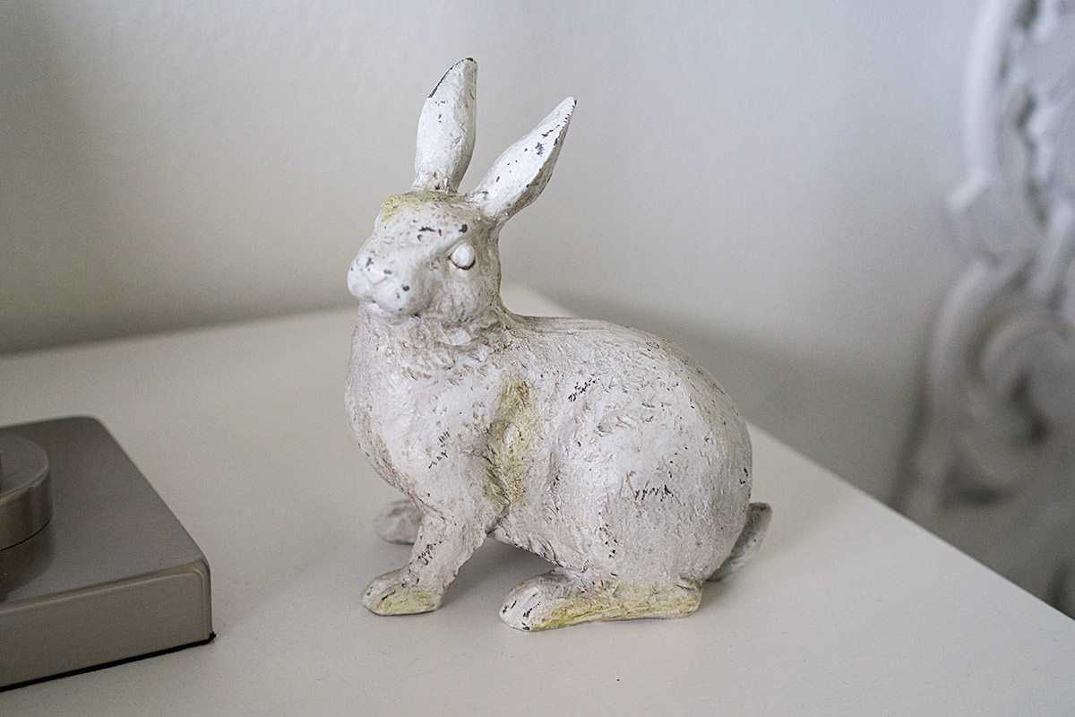
I started on the nightstand with this cool ceramic bunny I found in Fred Meyer...
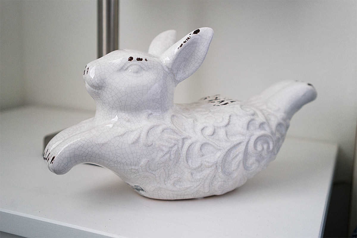
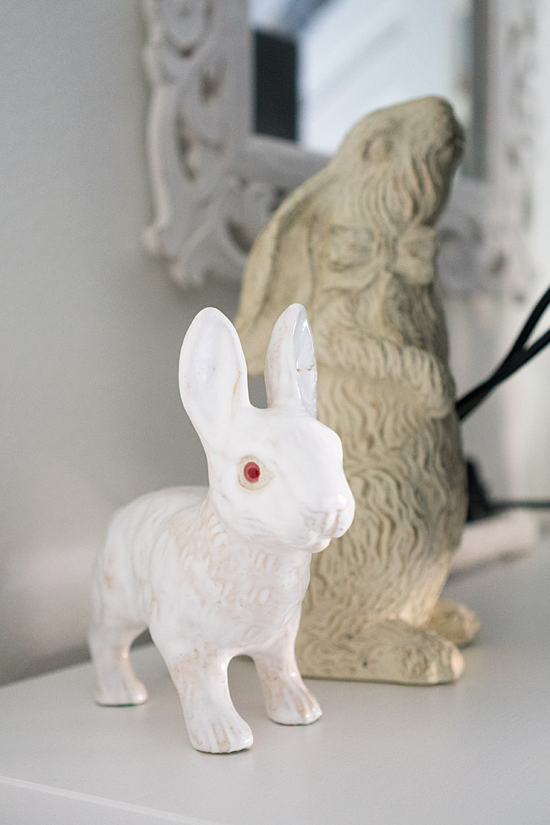
That didn't work for my Thrice project, so I found a smaller vintage bunny at an antique store which ended up on the opposite nightstand...
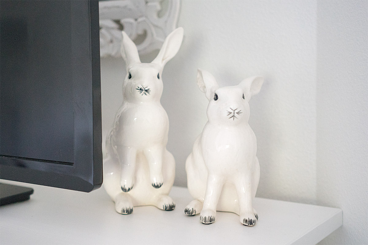
That rabbit didn't work either, so I found another antique store rabbit plus a tall fellow that was on sale at Pier One. They're on the dresser behind the television..
When neither of those rabbits worked, I finally struck gold with bunnies that did work. Those ended up on the other side of the television...
With all my rabbit decor needs met, I ended up buying a plush bunny for the bed to tie everything together...
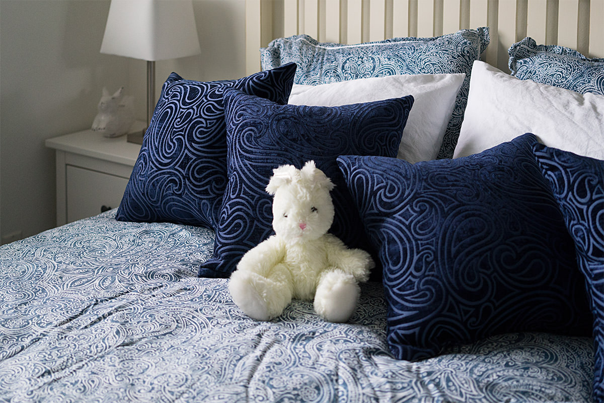
The cats like to attack the thing every chance they get...

And that's it for bunny rabbits.
 Welcome to Remodeling Week at Blogography!
Rooms are made more homey and comfortable by adding some art and photos to the wall, so I worked hard to find picture frames that were interesting, but not overpowering. Shades of white that would work with the walls and furniture seemed the way to go.
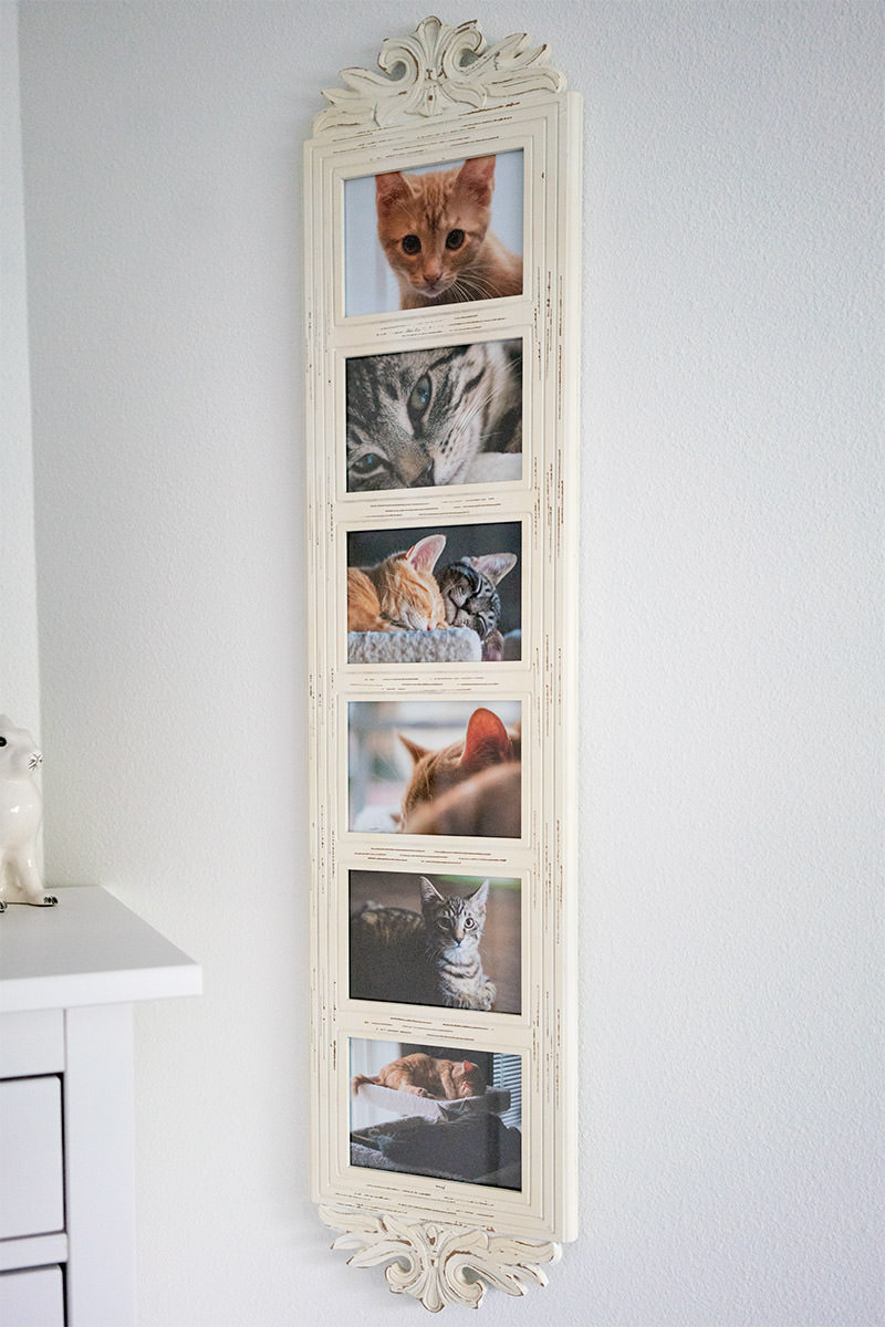
I started with a vertical frame to fill the space between the dresser and the closet. Pier One (my favorite place for frames) had an option in cream that was perfect. I filled it with pictures of my kittens...
The centerpiece of the room is one of my favorite paintings, The Flower Bearer by Diego Rivera. It has a black frame, so it stands out from everything else in the room...
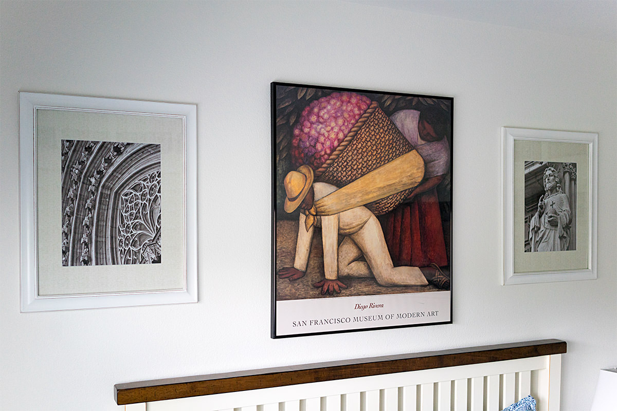
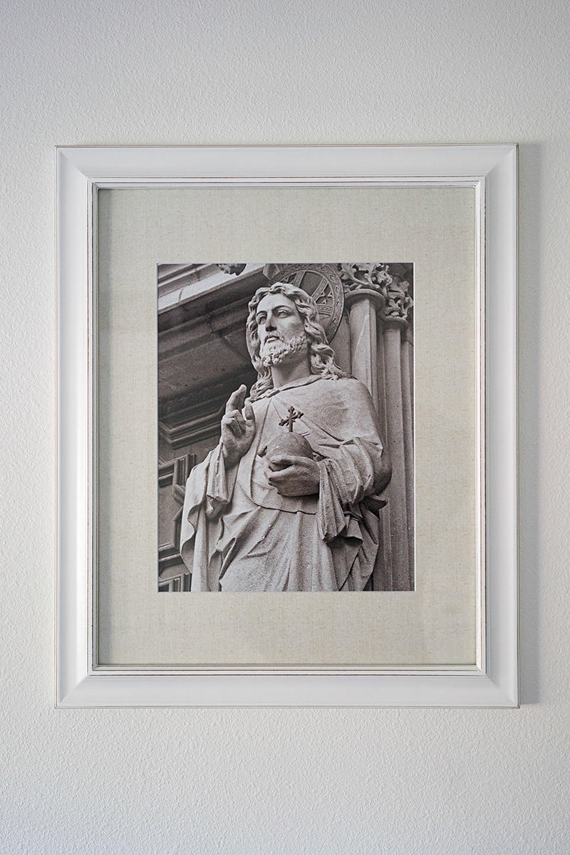
The two photos on the sides I took while visiting Barcelona Cathedral in Spain. The frames I found at Fred Meyer had cream mats to play off the cream vertical frame on the opposite wall...
To tie into the Diego Rivera, I had two postcards also by Rivera framed on both sides of the window. I think they came from Pier One as well...

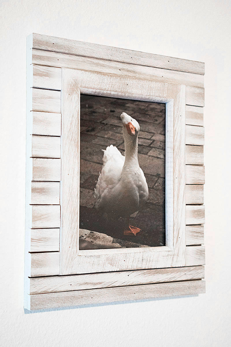
To tie into the photos of Barcelona Cathedral, I framed photos of the geese in their courtyard on the opposite wall...
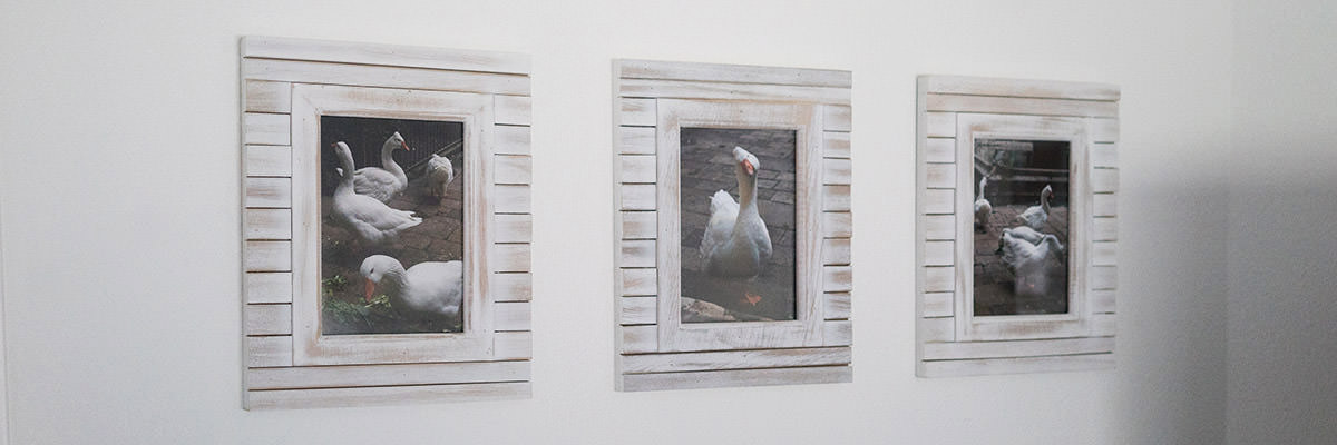
The frames I found at Target, and are my favorite in the room...
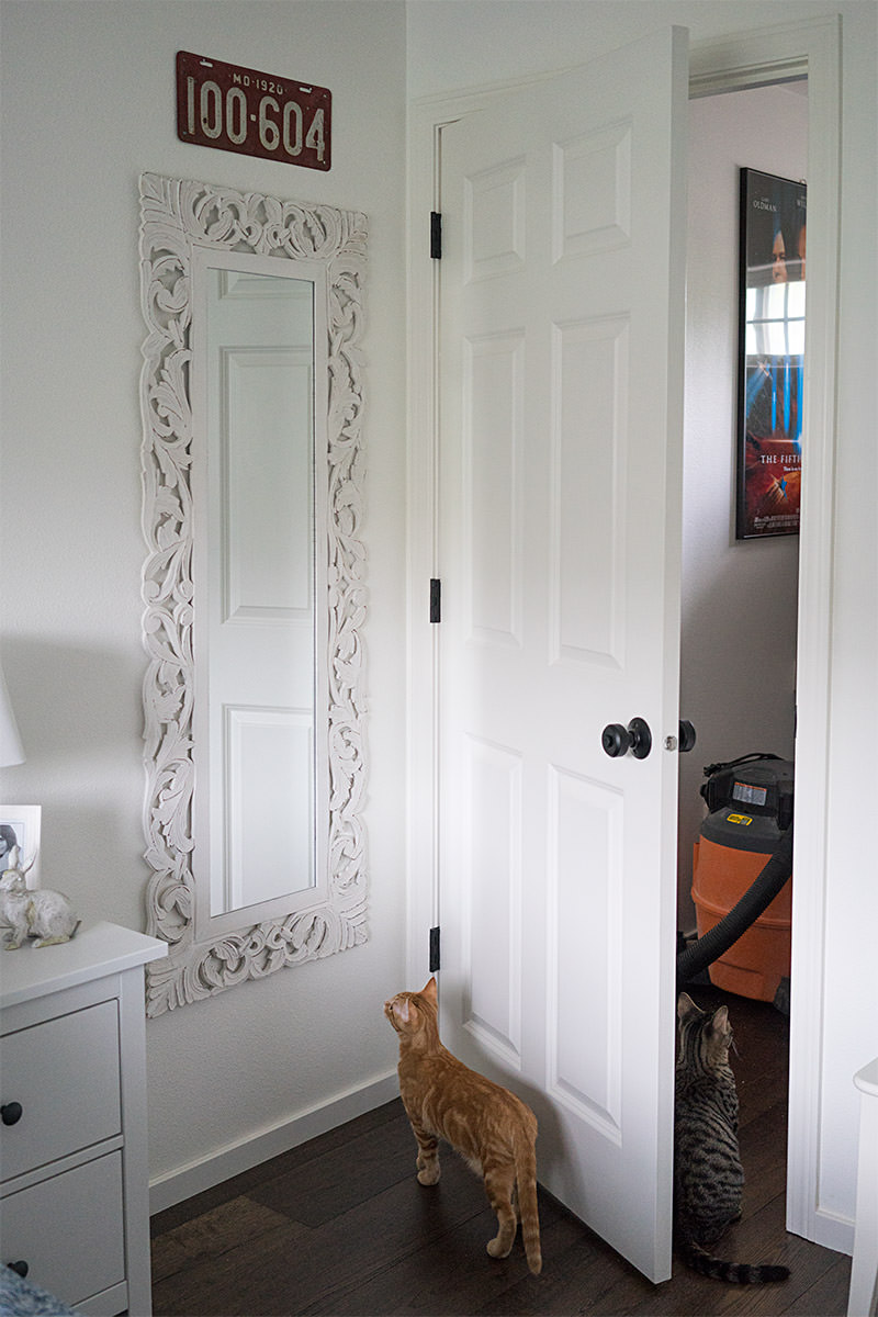
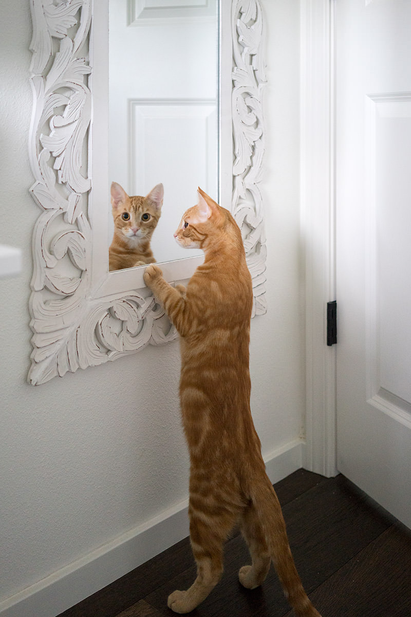
I needed a full-length mirror for my guests to get dressed in, and I found an interesting one at Fred Meyer. It was pricey, but the detail was pretty cool...
The wall with the TV was boring and needed something, but I didn't want anything too distracting, so I got the matching mirror from Freddy's to stick back there...
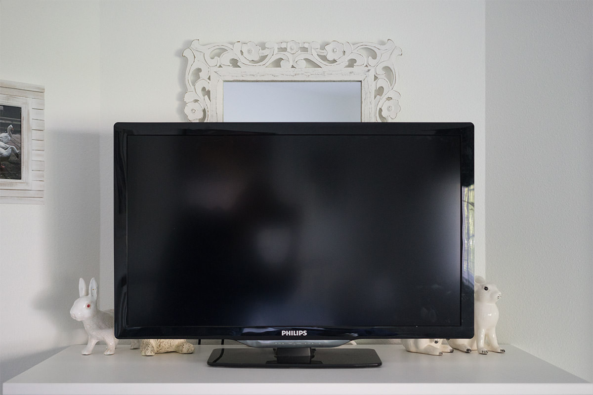
And... enough with the expensive wall decorations.
 Welcome to Remodeling Week at Blogography!
After the guest room furniture had been purchased, the next step was to figure out what I wanted to do for the textiles. Eventually I settled on a Liz Claiborne bed set that had a pattern I didn't hate. The matching window valance was incredibly expensive, so I found a Liz Claiborne solid that matched (I needed two because the window is apparently wider than average)...
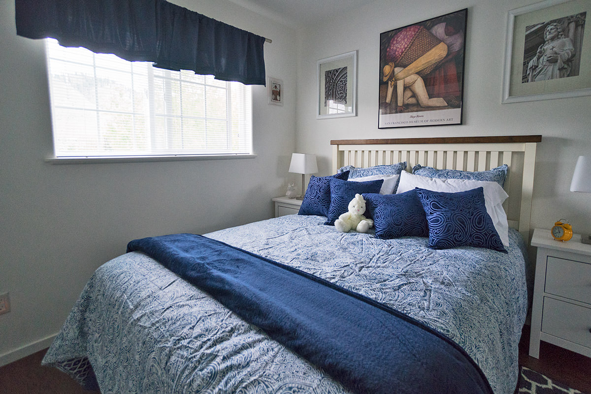
The pattern on the bed cover is called "Arabesque" but it's reversible to a paisley kind of design I liked better...
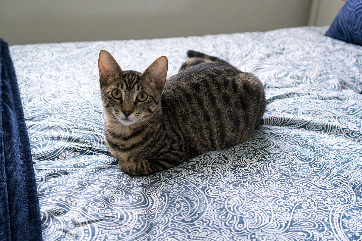
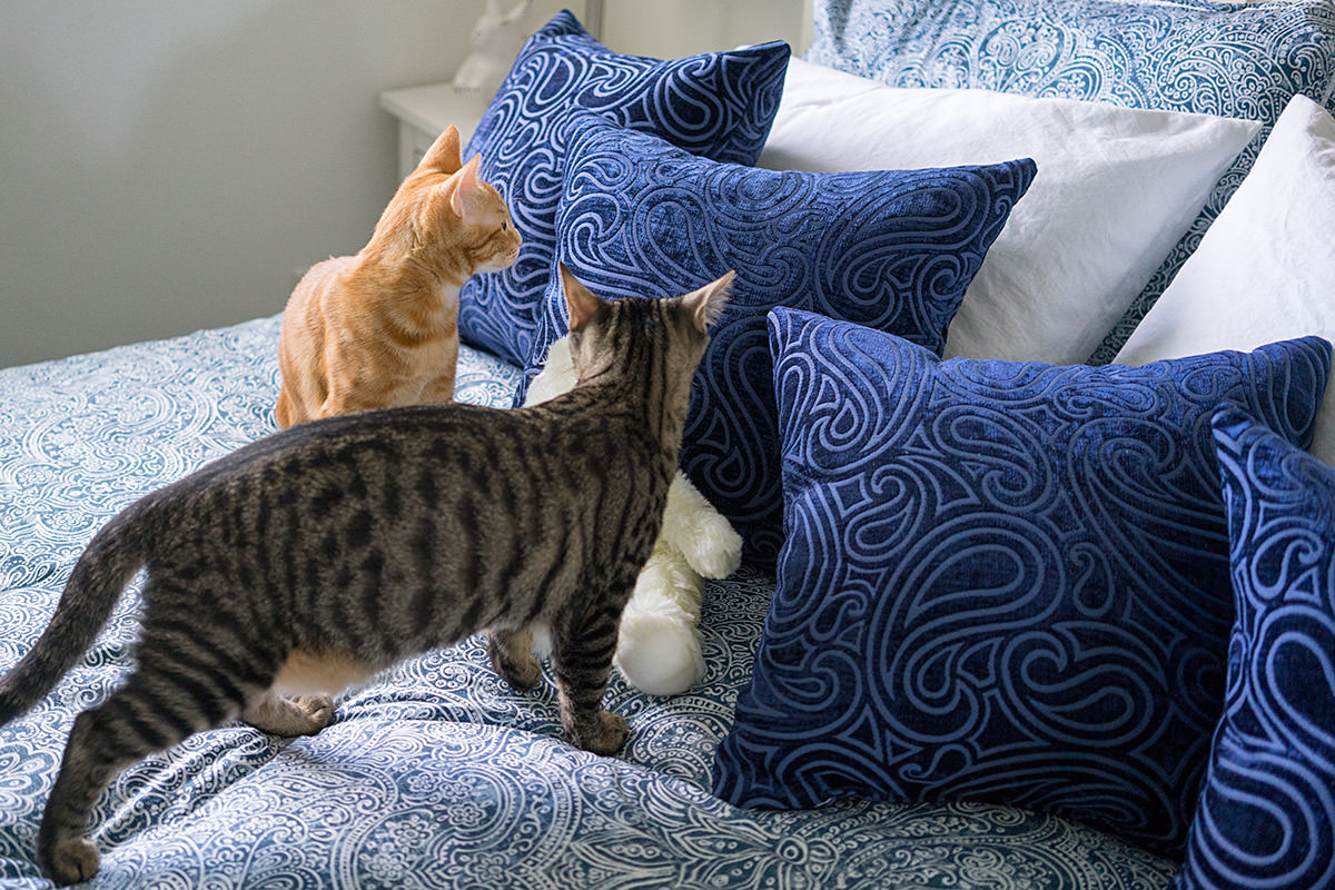
The bed looked a little plain, so I took a cue from my sister's guest room and added pillows. I found them on close-out at Fred Meyer, and they worked perfectly...
When it came to the rugs, this time I went back to the "Arabesque" pattern for inspiration and found some nice-looking options at Shopko that weren't matchy-matchy blue, but a darker grey-blue...
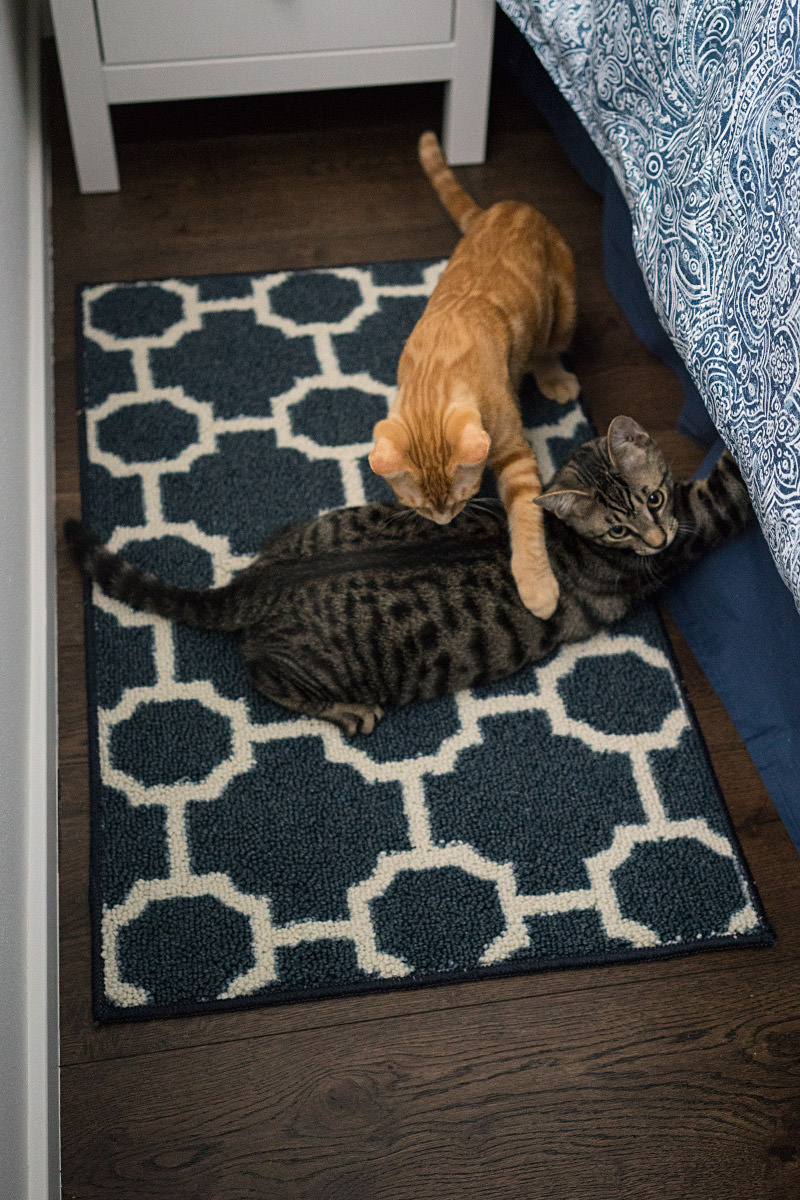
Yes, the cats decided to get in the way everywhere I pointed the camera. The hams.
In addition to the blanket across the base of the bed, I bought a comforter and some cotton blankets in case my guests get cold. IKEA has nice "under-bed" scooters that work perfectly to store them...
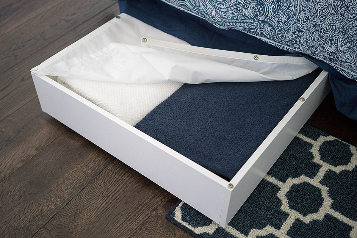
And that's that for textiles.
 Welcome to Remodeling Week at Blogography!
This time, we'll be taking a look at my guest-room remodel, which didn't require moving walls or tearing anything apart or anything extreme like that, so it was actually the easiest to work through. Kinda. The problem being that I've never had a guest room before, so it required all new furniture and stuff. In the end, the guest room actually ended up being one of the pricier expenditures I had.
The room itself is oddly-shaped, has one off-center window, and is kinda small, which left me limited options. I wanted a queen-sized bed, and it couldn't go under the window because I'd only have room for one nightstand, and I wanted two. So here we are...
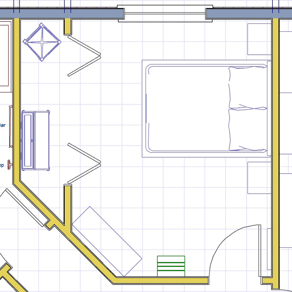
The overall color theme for the room is white. In order to make things interesting, I went with as many shades and style of white as I could find. Then added dark blue to keep it from looking stark.
And now... on to the furniture...
The bed is just a metal frame because I didn't have room for anything extravagant... also, I wanted to put the money where it counted by getting a great mattress (Bellagio at Home by Serta). I did try and dress it up a bit with a pricey headboard from Target though...

Nightstands are IKEA. Originally I didn't want drawers, but ultimately thought they'd be less effort to dust than shelves...

Originally, I wanted to have a desk and chair in the room with the dresser in the closet. But the desk wasn't tall enough that both people could see the television while laying in bed, so I swapped them around, which works really great. Except there's no outlet in the closet, so I mounted an extension cord to a hook on the side of the desk. Both desk and chair are IKEA...
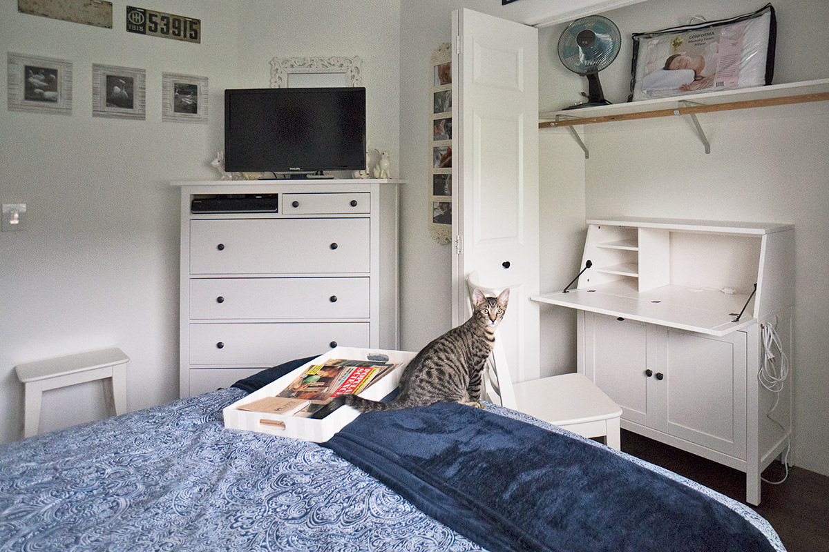
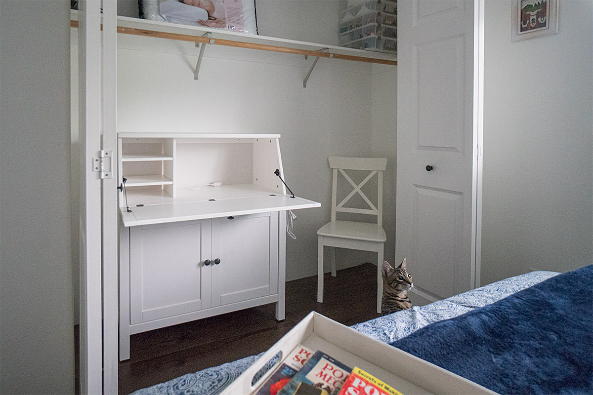
I had the chair by the door, but it looked like it would be easily tripped over, so I put it with the desk in the closet and bought an IKEA stool there...
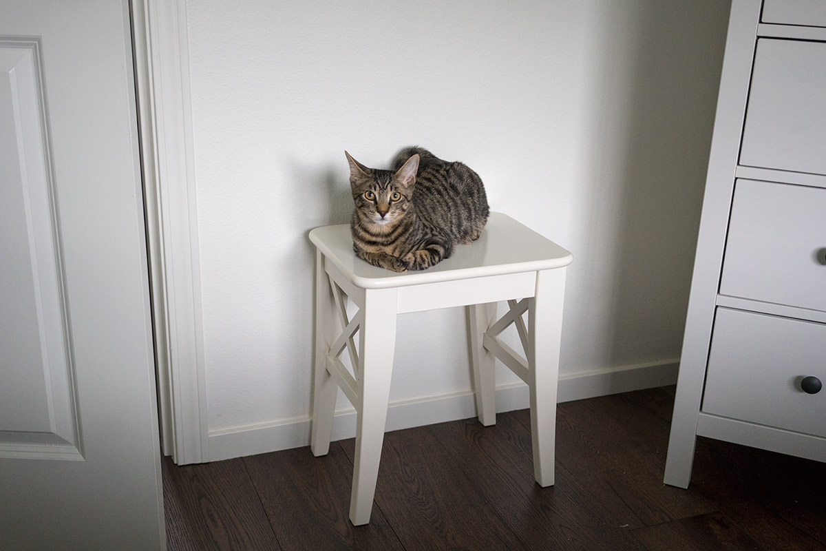
I should mention that I don't usually allow cats in this room in case my guests have allergies or something... but the minute they hear the door open, they run to get in. It's apparently their favorite room in the house. Probably because it's the one place they can't normally go.
Meanwhile, back at the dresser...
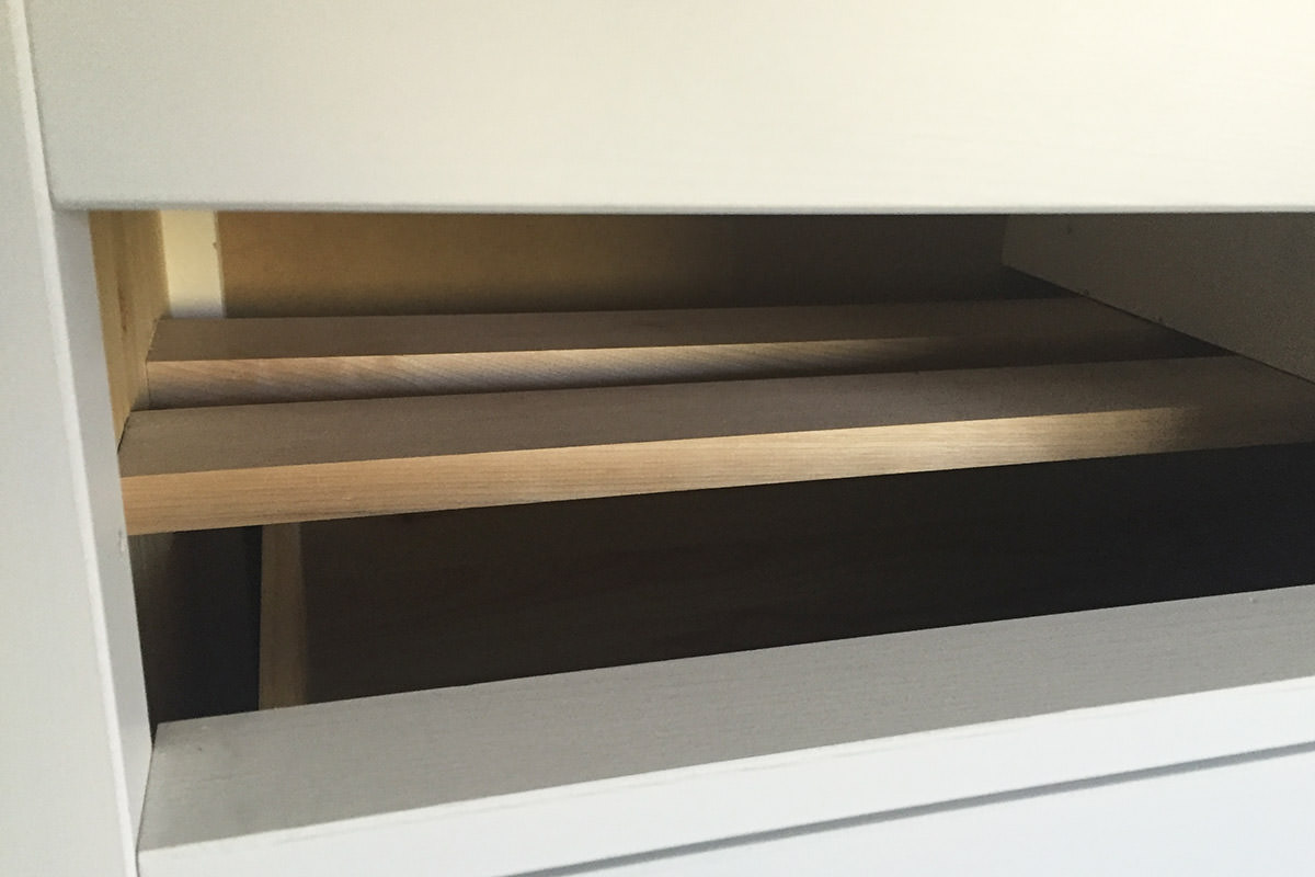
The television is at the perfect height on top of the dresser, so adding the DVD player underneath wasn't working. I decided to remove one of the small drawers and see if I could make a space. I started by attaching some wood strips to the center support, then secured them to the side of the dresser...
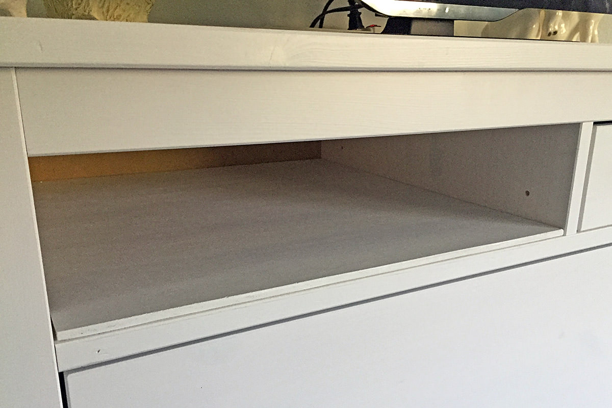
Then I whitewashed a thin piece of wood to match and secured it to the strips with carpet tape...
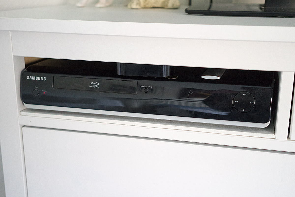
After drilling a hole in the back of the dresser for the cords to pass through, the DVD player (and AppleTV) fit perfectly...
And... that's it for furniture. Thank you, IKEA.
