 Ooh! I'm actually home for this edition of Bullet Sunday!
• Garbage. Having a blog with nearly six years of material makes me an easy target for haters, since I'm bound to have written about something they disagree with. Most of the time I don't care. Either the person trashing me is so incredibly stupid that their garbage is impossible to take seriously, or they are criticizing me for something I never even said in the first place. I have no problem with healthy debate and welcome other people's respectful opinions... but that almost never happens. They're called "haters" for a reason, and are best just forgotten. Except sometimes they just won't go away. The anonymity of the internet makes them impervious to civilized behavior. I wonder if they realize that nobody is ever truly anonymous online? Something to think about, anyway.
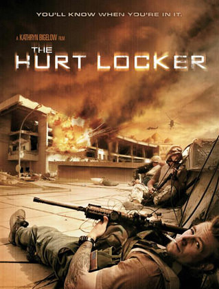
• Hurt Locker. I have little to no interest in the whole "war movie" genre. That's because they usually fall into one of three categories: 1) Political statement against war. 2) Political statement for war. 3) Glorification of war and/or war propaganda. The last category is the worst. All those old movies where war is depicted as an entirely one-sided affair, with the horrors nicely sanitized (e.g. the ridiculous "Oh you got me, you dirty Nazi! while the guy grabs his chest and slumps over). But every once in a while there's a film with no obvious political agenda which tries to tell a very human story that just happens to take place during a war (Clint Eastwood's amazing Letters from Iwo Jima comes immediately to mind).
And now we get The Hurt Locker by the always amazing director Kathryn Bigelow...

Any attempt for me to explain the film would be a grave disservice to it. In simplest terms, it's about a three-man team of bomb disposal experts called "Bravo Company" in Iraq circa 2004, and their efforts to dispose of a never-ending supply of explosive weaponry that shows up in a variety of scenarios. After the death of their team leader, a new guy, Staff Sergeant William James, assumes command of the team and things get very interesting. You never really know if James is a reckless maverick who risks lives unnecessarily... or an absolute genius who is so great at his job that it only appears that way. All you do know is that Bravo company has just 38 days left in their tour, and the odds of them surviving long enough to return home grows dimmer with each new encounter. This is a film about guys in a very dangerous job, and there's no political bullshit or anti-war bias to get in the way of telling their story. Miracles do happen.
One of the very best movies of 2009 (I'd place it at #4, after Inglourious Basterds, District 9, and Star Trek), The Hurt Locker is where I'd put all my Oscar votes. Jeremy Renner as Sgt. James is one of the strongest performances I've seen in a film all year, and is backed up by an army of talent and some spectacular cameo role appearances (which it would be a shame to spoil here). Suspenseful, gritty, and very human, The Hurt Locker is actually worth your valuable time to see.
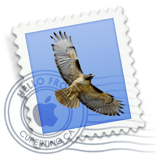
• Iconic. Every since installing Mac OS X Snow Leopard, I've been transfixed with the ability to view application icons at 512-pixel resolution. It's an entirely new ballgame at such a large size, and reveals surprising details that you would never even know existed at their original size... sometimes for better, sometimes for worse. Let's take these three icons as an example...
![]()
Transmit, which has always been a nifty little icon, is revealed to be a stunning piece of artwork when you get to see it at full size. The attention to detail is nothing short of amazing, and now people can actually see it...

Twitterific, on the other hand, is exactly the opposite. It looks cute and friendly when seen small, but blow it up to full size and it transforms into something vaguely scary. I don't know if the bird is molting... sweating... or has some kind of disease... or what. His beak doesn't even appear to be part of him, but instead bursting through his head, like there's a bird trapped in a bird suit and he's just now breaking out. Granted, this isn't really the designer's fault. This is what happens when you are forced to exaggerate details so they will show up when reduced to a tiny size. Otherwise, it would just look like a little blue blob...

But those issues pale in comparison to the scariness of Apple's own "Mail" icon. It makes absolutely no sense now. The drop shadow makes it appear that the stamp is floating above the surface... but the cancellation mark looks flat, like it's a projection of some kind. Furthermore, the cancellation mark doesn't even look like it's been printed. The gray ink looks like it's actual ink on the white parts of the icon... but mystically transforms into blue ink when it is on the blue parts of the icon. At giant-size, it all looks like some kind of bad Photoshop overlay trick, because it doesn't act like any cancellation mark I've ever seen...

Icons, which have historically had to communicate information at very small sizes, are now having to stand on their own as artwork when presented at larger sizes. This is an incredible challenge for icon designers, because it's not easy trying to create one piece of art which works perfectly for two entirely different uses. I suppose the big worry is that designers won't even try, and we'll get icons that suck at any size.
And now I get to go back to work so I can (hopefully) get caught up before I leave again. Life, she is a bitch.

I love comments! However, all comments are moderated, and won't appear until approved. Are you an abusive troll with nothing to contribute? Don't bother. Selling something? Don't bother. Spam linking? Don't bother.
PLEASE NOTE: My comment-spam protection requires JavaScript... if you have it turned off or are using a mobile device without JavaScript, commenting won't work. Sorry.

“Hurt Locker” is really good, I’ll agree.
And I’m very lucky in that the haters don’t seem to peruse my archives.
I have never heard of The Hurt Locker, but the guy on the ad looks a lot like Luke Perry, to me!!
Haters suck at life. There’s always that. 🙂
Sweaty bird! Sweaty bird!
Thanks for the tip on The Hurt Locker. I’ve seen tidbits about the film around, but nothing that made me want to see it. This did.
And I finally saw Inglourious Basterds over the weekend. Easily my favorite film of the year thus far.
Wow. Transmit is totally freaking awsome!! Matches the app 🙂
Wow. Eyepopping icons. I won’t experience the 512k icons until I get my new MBP last next week, but now I have something to look forward to.
I haven’t seen Inglorious Basterds yet – not sure if I will. But I totally agree with your review of Hurt Locker. My nephew had that job (disarming IEDs) in Iraq for 2 tours. I won’t recommend this film to his parents.
We want to see “The Hurt Locker”, but finding it in a theater around here has been difficult. I keep hearing such great things about it…. We may have to drive all the way to LA to find it.
Nothing’s better than the title “The Hurt Locker”.
And leave it to Mac users to get all teary-eyed over icons. Goodness knows they can’t actually DO anything with the apps that come with the system, so they have all this time to FEEL GOOD about how it LOOKS.
/jab
As a Windows sufferer, I can understand how YOU might think that apps don’t work and don’t do anything… but this is a Macintosh we’re talking about. It just works!
Faster than most crappy PC’s! Intel Macs can run Windows at full-speed with their included Boot Camp software.
This is one of my favorite posts of yours. Maybe it’s just because I enjoy looking at super-large icons. I got into this minor hobby with (((gasp))) Win7. But the icons are not as large as the Mac ones. The shame! The shame!
I am absolutely dying to see The Hurt Locker. Everyone single person I know who’s seen it is on and on about how good it is.