
 Few things can sum up Apple better than going to their website so you can watch the March 2015 Special Event Keynote and having to click on a link which says "Experience the keynote." You may watch a keynote with "lesser" companies... but with Apple, you experience a keynote.
The reason this sums up Apple so perfectly is that, in the end, it IS just a keynote... but Apple brands it as some kind of life-changing "experience" so they can inflate the hype around it. Which is exactly the direction they seem to be going with their products, so at least they're consistent.
So, yeah... on with this keynote thingy...
RETAIL
The show opened with a look at the absolutely stunning flagship Apple Store in West Lake, China...
I mean, holy crap... like so many Apple Stores I've visited, you don't need any hype... this jaw-dropping, magnificent, astounding architectural achievement IS something to be experienced. I hate shopping, but I'll go out of my way to visit an Apple Store... especially one that looks like this. ZOMG! THAT SECOND FLOOR IS DEFYING GRAVITY!
I had to laugh when Tim Cook said "This is the way we like to see our stores" while a photo of it completely packed with people pops up behind him. Apple stores are always packed. At least when you compare them to the shop that Microsoft has undoubtedly plopped down across the aisle at the mall, which is undoubtedly mostly empty.
No doubt, Apple's retail presence is impressive. And so very, very smart. People wander in to see what all the buzz is about... have a killer retail experience... get sucked into the Apple Reality Distortion Field... and end up leaving with an armload of Apple products. I still marvel at all the doomsayers that predicted Apple would fall flat on their face. "If Dell can't do it with their numbers, what chance does Apple have?"
A pretty good one, as it turns out. Apple used retail to build their brand and their customer base (120 million visitors last quarter!). And where is Dell? I rarely hear anything about them any more.
APPLE TV
AppleTV is a product I actually like quite well. That being said, it is feeling a bit antiquated compared to the competition. I'm sure Apple is working on that but, in the meanwhile, Apple is lowering the price of the product to $69. Which may sound like a bargain... but you just know it's a precursor to releasing a better/faster/stronger product come the holidays.
The HBO Now announcement was long overdue. Having access to all of their award-winning content whenever you want it pretty special... I just don't know that it's $14.99 special compared to what you get from Netflix. I'll probably subscribe off and on as shows I want to watch arrive... but I can't see paying for it every month.
iPHONE
Never one to pass up an opportunity to plug the money-shot, Tim ran through some impressive numbers, confirming the massive success of iPhone 6 that everybody already suspected. Other than the larger size, which I still struggle with, I'm pretty happy with mine. Apple Pay is frickin' amazing, when you can use it. The camera is mind-boggling for a phone, and I prefer it over the "superior" cameras in their competitor's offering because they just look so much better... but there's still a lot of room for improvement.
CARPLAY/HOMEKIT/HEALTHKIT
All of this is pretty much "meh" until real-world applications I give a crap about start appearing. I love the idea of HomeKit... it's the next step in home automation... but where is it? Where are all the home-kit compatible doohickeys that fulfill the promise of the technology? On it's way, I'm sure. But until I can actually buy it, it means nothing to me.
RESEARCHKIT
Using a device you carry with you every day to contribute to medical research seems like a no-brainer. And heeeeeeeere's Apple with HealthKit. If this truly helps with research, then more power to them. Otherwise, more meh. EXCEPT... if anybody needed proof that Apple is working overtime to find new ways to get integrated into your life, TA DAAAAA! Add this to the rumor of Apple developing a car, and you can see how there's nowhere they won't go to inject themselves into every aspect of everything you do.
THE NEW MACBOOK
It's remarkably small and light. It's stunningly beautiful. It's everything you could want in a travel laptop...
And here's Jony Ive gushing over its every feature as only Jony Ive can...
Now... before I get to the part where I say "ZOMFG! I WANT ONE SO BAD!"... a rant...
FUCK ME SIDEWAYS... YET ANOTHER CONNECTOR I HAVE TO INVEST IN?!?
First it was Firewire, which Apple abandoned after pushing the entire industry to adopt it.
Then it was Thunderbolt, which Apple was all excited about for about two minutes... before, apparently, abandoning it for USB-C... which is the only port on the new MacBook, combining power, display, and peripheral connectors in one tiny connector.
Which means I now have to buy an adapter for my Thunderbolt periphreals, even though I just got them? Dick move, Apple. Dick move.
But, yeah... I want one pretty bad. It takes everything I love about my 11-inch MacBook Air and ups the game exponentially.
APPLE WATCH
A nice idea, really. And Apple did it better than anyone who's tried before But, in the end, TOO THICK! TOO THICK! TOO THICK!
Seriously, it's too damn thick. If it were half as thick, I'd be placing my preorder right now. But having a giant dongle stacked on my arm? I just don't know. Some of the features are there... it's Dick Tracy come to life... but until I try one on, I'm just not convinced. Especially when the price of admission starts at $350.00
And yet... if somebody wants to buy me an Apple Watch Edition in gold, by all means, please drop the $10,000 to $17,000... and do so. I'd absolutely wear it from time to time!
When it comes to the Apple Watch features, I'm impressed/not impressed. Some of the interactivity with the iPhone looks truly helpful and worthwhile... the Apple Pay component is fantastic... but all the tactic crap? The "I'm sending you my heartbeat" and such? Who gives a shit? Being able to send a crappy, crude drawing? Might be fun the first two times you do it... but after that? Why?
Tim Cook made a good presentation for how Apple Watch will integrate into your life in meaningful ways... but is it enough? I'll let you know when I've tried one. Until then I remain skeptical yet optimistic to the possibilities.
And leaning towards the "Sport" edition in Space Gray with a Black Sport Band.
Or waiting for Apple Watch 2.0 which is a damn-sight thinner.
Heh.
 Alrighty then. As a Certified Apple Whore, it's required by law that I post my thoughts on all the stuff Apple talked about in the keynote speech of the 2013 World Wide Developer's Conference (watch it for yourself right here!).
So for all you Apple-haters, I apologize. Come back tomorrow and I promise to draw a monkey or something.
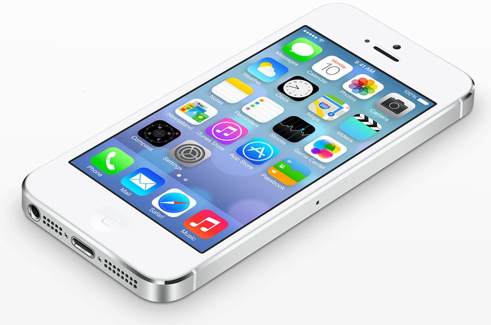
At Apple, our new visual design direction is lickable like it's 1998!
Apple's new iCEO, Tim Cook, is no Steve Jobs... but I really like the guy. He gives a good presentation, represents Apple well, and inspires confidence in his company, which is all that matters. Seeing Phil Schiller is always fun. The guy has a genuine enthusiasm about Apple that's hard to beat. It's good to see more from Eddy Cue, Apple's internet services guru too. But the real standout this time around? Craig Federighi, vice president of software engineering. The guy is funny as hell, and has a conversational tone when he's presenting that sucks you in and compels you love Apple and the things they do. Seriously, the keynote is totally worth watching just to see this guy at the top of his game.
MAC OS X!
It looks like most of the stuff going on here is under-the-hood improvements, which is fine. But there are a chunk of notable usability enhancements as well, so I'm hopeful that I won't have as many problems with Mavericks as I had with Mountain Lion. Unfortunately, the one thing... THE ONE THING I WANTED TO SEE... was not shown. And that's the option to keep the menu bar showing at all times with full-screen apps. I am so sick and fucking tired of dealing with the bouncing menu bar intruding when I don't want it... and having to go hunt for it when I do want it... WHICH IS ALL THE TIME!!! The clock is there. My battery status is there. My sound volume indicator is there. Just give me a check-box option to keep the menu bar showing always and I'll be fine. Anyway... on with the show...
MACBOOK AIR!
I love my MacBook Pro with Retina Display. It is unquestionably the best bit of tech I have ever owned, and the size, weight, features, and speed are amazing. That being said, there are times when I'm traveling where I would really appreciate having a much smaller machine to lug around. Basically, an iPad that's a fully-functional computer when I need it. The tiny 11-inch MacBook Air has always been so close to what I wanted. Now I think it's there. All I need is a thousand dollars and I'm golden.
MAC PRO!
"Can't innovate any more, my ass! — Phil Schiller, Vice President of World-Wide Marketing.
I honestly don't know where to go with this. I finally gave up on Apple ever releasing a new Mac Pro a year ago, and am now using an iMac that I'm quite happy with. That being said, I would much rather have a "pro" machine that can tear through the bigger projects I have to work on... especially when it comes to 3-D modeling and rendering... and video editing. And here it is. Except... it's not really a "pro" machine, is it? Sure it's got all kinds of killer pro features and looks fucking amazing... BUT EXTERNAL EXPANSION ONLY?!???? WHAT THE BLOODY FUCK?!?? One of the major differences between consumer machines and pro machines is that you can open the guts and configure the thing the way you need it for the kind of work you're going to be doing. But Apple has lived up to every criticism by choosing design over functionality, and it's a load of bullshit. Because it's BADLY DESIGNED! So you can rotate it to plug things in. That sounds cool, right? But what happens when you've got a ton of crap plugged into it? How does it rotate around when you've got a dozen cables anchoring it in place? I'm not debating whether innovations like the new "tri-core cooling technology" is cool... it's frickin' awesome... but this is not the machine pros are after, and it's a really shitty thing for Apple to do to those who have been waiting so damn long for a new Pro machine to come out. When I bought my iMac, I worried I was making a mistake, and a new Mac Pro would be released that would work so much better for my needs. Well all those worries are gone. If I had the choice even today between an iMac and a Mac "Pro"... I'd go with the iMac. This is the fucking Mac Cube all over again! Did NOBODY at Apple learn a damn thing from that fiasco?
iCLOUD!
Nobody is more convinced that the future of computing lies in The Cloud than I am. Having access to all your stuff wherever you are with whatever device you have is the future. The problem is that nobody is doing it very well... including Apple. But, to their credit, they do seem to be the most interested in figuring it all out. More and more cloud functionality is coming into place. Apple's cloud services are getting more reliable and robust every day. And things like iTunes Match are demonstrating the promise of what "cloud computing" is all about... have access to my entire music and movie/television library anywhere there's internet from my Mac, iPad, or iPhone? Yes please. It's all magic, right? Well... not really. Because Apple is constantly sabotaging themselves. Want to stream your purchased movies to your Mac or iDevice? Tough shit! Apple only allows streaming to AppleTV... anything else requires that you download the whole fucking file first. Never mind that Amazon, Netflix, Hulu, and the rest of the known fucking universe allows video streaming, Apple doesn't. Will this be fixed with iOS 7 and OS X Mavericks? Who the fuck knows? Will Apple fix the myriad of problems that prevent developers from integrating iCloud into their apps? Who the fuck knows? It goes on and on. The fact that Apple is working so hard on getting The Cloud done right is meaningless if they can't see the forest for the trees. YOU HAVE TO FUCKING COMPETE! Except Apple doesn't seem to care when the competition is trouncing all over them... they're Apple, so they don't have to! Except they really do. We finally get keychain syncing back, but it almost feels like too little too late when services like Dropbox and solutions like 1Password stepped up to the plate when Apple wouldn't for so damn long. And there's the crux of everything that's wrong at Apple... THEY decide what's important to their users rather than responding to what users find important and are actually doing. I love Apple and all, but I'm just so fucking sick of this.
iTUNES RADIO!
Well, it looks a little more polished than Spotify or Pandora... and it looks a lot smarter, even if the details are sketchy (how many skips do you get an hour?). I will probably use it. I will probably discover new music. I will probably end up buying a shitload more music than I am now. So, mission accomplished, I guess. The fact that iTunes Match subscribers don't have to deal with ads is kind of a nice bonus.
CLOUDY iWORK!
Oh... so Apple hasn't killed iWork on the Mac after all! It's just so hard to tell, what with them NOT UPDATING IT FOREVER. Just like with Aperture, buying iWork almost immediately makes you feel like you've purchased abandonware. Sure they'll fix a big or add a little fluff every once in a while (NEW! Documents in The Cloud!)... but it's hard to have faith with Apple as a serious app developer when they don't maintain a consistent release schedule. Years can go by with no major release or update, so you just never know. And here we are at long last... iWork is getting updated. Or is it? Because the focus seems to be on competing with Google Docs with a browser-based solution. Well, I have to tell you, this has me worried. Very worried. And it all comes down to this... will future releases of iWork (the app) be limited by iWork (the web app)? Is an Apple software engineer going to say "Here's a great idea for iWork Numbers... won't it be cool to give our users this functionality?" Only to be greeted with "Oh shit, we can't add that feature... we'd never be able to implement that in a web browser!" Well, I just don't know. But that would suck. And it wouldn't be surprising from Apple. All that being said? How frickin' amazing was that demo of iWork in the Cloud?
iOS 7!
Well, here it is... the moment the world has been waiting for... the next generation of Apple's iOS. The operating system which powers gazillions of iPhones, iPods, iPads, and whatever new iDevices Apple comes up with (iWatch?). I'll reserve comment on the new design visuals until I've actually seen them up-close-and-personal, but my initial reaction is mixed. I like the flatness of it all, which feels modern and forward-thinking. The typography and the stark, clean layouts are stellar. But the bright candy colors that I thought were banished with the old iMac aesthetic feel more "dated and tired" than "retro cool." Yet... Apple is nothing if not a trend-setter, so maybe it's a look that's making a comeback. I guess we'll find out this Fall. If I were to summarize, I'd say that I like most of what I'm seeing... but not everything. If nothing else, I think it's a consistent visual language that competitors lack will help keep Apple at the top of the heap.
PARALLAX!
Okay. There's one thing I saw in the keynote that has completely haunted me about the new design, and I love it more than sliced bread. The new iOS is multi-plane display capable...
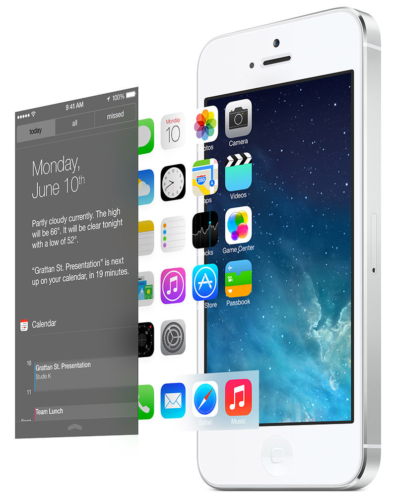
This basically means that everything is set on three-dimensional layers, so as you move your phone around, the different planes move to communicate depth. Allowing you to "see around" stuff on upper layers as the camera is rotated. In video games and animation, this is called "parallax scrolling" (or something like that), and it's some visual trickery that really pays off. The idea of having such lush visuals on my frickin' PHONE is pretty spectacular. It's the little touches like this that makes Apple be Apple, and keeps Apple Whores such as myself in a constant state of geek heaven.
Annnnnnd... the end.
For now. As I get a better look at all this stuff, I'm sure I'll have more to say.
 And so Apple has made me poor.
Again.
Except not really. Yes, their new MacBook Pro with Retina Display has put me in debt, but it's also replacing my aging and busted MacBook Pro which I use constantly for my work. And replacing it beautifully. It is without question the most remarkable laptop... most remarkable computer... I have ever seen or had the privilege to use...
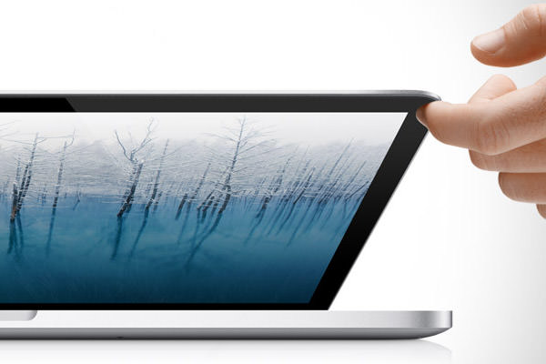
And while the "Retina Display" alone would make this machine a quantum leap beyond any other portable, Apple didn't stop there. They have adopted many of the same features which make their beautiful MacBook Air line so revolutionary. It's the crossroads of power and portability, and hands-down the ultimate laptop for graphics work like I do every day.
Except it's gonna cost ya. The cutting edge always does.
I'm going to run through all the specific features in an extended entry, but the bottom line is that the minimum baseline configuration for this machine costs $2,199. For work like I do, you really need the next step up, which runs $2,799. But I felt I needed something stronger, so I customized a machine that has the faster 2.7/3.7GHz CPU (+$250) and a maxed-out 16GB of RAM (+$200), which totaled a whopping $3,249. I stuck with the 512GB Flash Storage (Solid State Drive) because it was enough for me (it's bigger than the 320GB hard drive in my old MacBook Pro!) and I couldn't justify the additional $500 to bump that up to 768GB.
Now, when I look at that $3,249 price tag, a part of me wants to start screaming. But this isn't a toy that I use to just read email and surf the web... it's a critical work tool which I use to make a living every day. For me at least, it's a bargain. And every time I sit down to use it, I know exactly where that money went. The MacBook Pro with Retina Display is a boon to my productivity and a pleasure to use. I love it passionately, and can't imagine going back to a "regular" laptop.
If you want to know why, all my notes are in an extended entry...
→ Click here to continue reading this entry...
 I'm not a very material guy. At least not anymore. I'd rather spend my money on traveling than on "things." As long as I have my MacBook Pro, my iPhone, and my camera, I'm pretty indifferent about any other stuff I've accumulated. So much so that for the past several months I've been getting rid of the clutter in my life by the box-full. About the only thing I want to buy is a new improved MacBook Pro, new improved iPhone, and new improved camera.
And then...
It's a frickin' onesie! It's baby pajamas for adults! How genius is that?
Even the name is genius... FOREVER LAZY!

Who doesn't want to be forever lazy? Sitting around the house eating junk food and watching television. And when that gets to be too much for you, you can just take a nap right there on the couch because you're wrapped in a blanket already. About the only effort you have to put out is when you poop. But wait... they even made that easy!

So now I'm torn. If I want to eventually upgrade my MacBook Pro, my iPhone, and my camera, then this isn't an option. It's not like the money to do all that is going to fall from the sky once I stop working to be Forever Lazy.
I need to find a way to make money at being a lazy asshole that doesn't have to think or make sense and can sit around being stupid as a hell all day long...

Hmmmm... wonder where I can find a sweet gig like that?
 I just got done watching the live video stream of Apple's special event: BACK TO THE MAC and jotted down some observations. But, since I've already posted today, you'll be seeing them a day late. And FYI, my notes are in reverse chronological order...
MACBOOK AIR!
The new MacBook Air is thin. Shockingly thin. Razor thin. So thin that my only remark about it on Twitter (other than "OH GAWD I WANT ONE SO BAD!") was "Wow, you could seriously cut a bitch with the new MacBook Air!"...
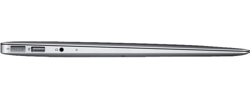
This is awesome on a number of levels. But mostly because you could use it as a weapon if the need should arise. Like meeting Jared the Subway Sandwich Whore on the street and needing something to decapitate him with...

Of course I am dying to own one. For the frequent traveler, it's tiny size and miniscule weight is a dream come true. Unfortunately, it's just not "enough" of a Mac for me to justify buying one. Even maxed out, the speed and storage aren't in the ballpark I need to get my work done.
And yet... I still covet the dang thing.
MAC OS X LION!
The real magic behind the Mac is the Mac OS X operating system. The previous OS update, "Snow Leopard" made the Mac faster, friendlier, and even more reliable, but added few new features. The next OS release, "Lion" (slated for release in Summer of next year) builds on this with some interesting and cool new features, a few of which were shared with us at the event...
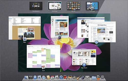
The idea here is to take some of the things that Apple learned from creating the iPhone's iOS and bring those features "back to the Mac." To sum up... The OS X APP STORE is nice because it makes managing your applications so much easier. Not that it's all that difficult now, but updates are sure better the iPhone way. Of course, that doesn't mean much if companies like Adobe and Microsoft choose not to use it. LAUNCHPAD brings the elegant and easy iOS app launcher to the Mac. I like the look of it quite a lot, though don't know how critical a feature it really is. FULL-SCREEN is a simple technology that makes the current app fill the screen completely. It dovetails nicely with the growing trend of making app interfaces go full-screen. MISSION CONTROL is the feature I am most happy about. It brings several separate technologies (like Exposé, Spaces, and Dashboard) under a single interface (shown in the image above). It's pretty slick, and will make working between apps much more fluid and easy.
Sadly, none of these features are really blowing my skirt up. They're just nice refinements and borderline unnecessary trinkets that aren't really revolutionary in any way. Don't get me wrong... evolution is nice too... but nothing here inspires confidence that Apple is spending many resources developing for Mac anymore (iPhone leftovers?). Granted, there's a lot of time between now and next summer and many things can change or be added, but overall I am pretty "meh" about Lion after this presentation.
FACETIME!
Apple made video conferencing dead-simple in the latest iteration of iOS for iPhone and iPod Touch. It's fast, easy, fun, and highly addictive. But there's two problems. 1) It doesn't work over cellular networks, you must have wifi available to use it. 2) You can't talk to people on Macs or PC's, even if they have a video camera. Well, #2 is finally being addressed...
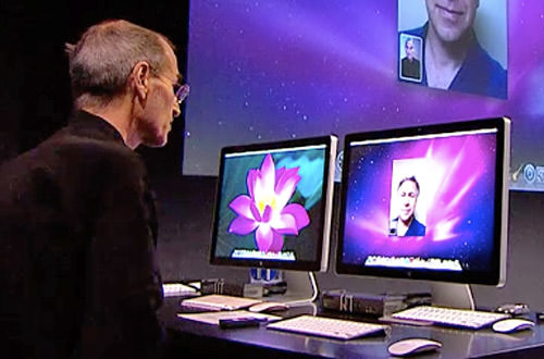
No client for Windows or Linux or other mobile platforms yet, but since FaceTime is supposedly an "open" platform, I'm sure they'll come soon. Still waiting for being able to FaceTime on my iPhone over 3G. Hopefully one day. In the meanwhile, 3G alternatives are starting to appear. Apple better step it up. Soon. Or bitch-slap AT&T if they're the problem here.
iLIFE '11!
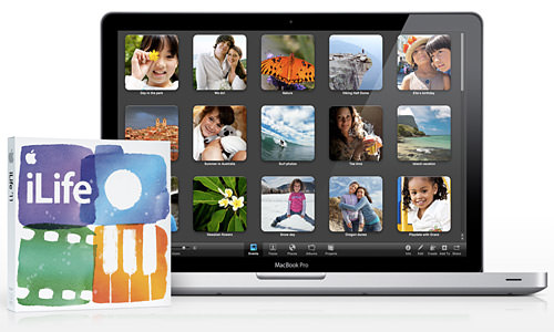
The first "new" thing that Apple decided to talk about was their spectacular "iLife" suite of digital lifestyle applications. It comes free with every new Mac, and you can upgrade to the newest 2011 version for just $49... which is astounding if you stop to consider what you get for your money. All the new features are fantastic, once again bringing professional results with minimal effort and an even more minimal learning curve...
MACINTOSH!
The event started out with a lot of talk about the "State of the Mac" and how it's rated #1 in everything... customer satisfaction, support, reliability, usability, blah blah blah. Basically, all the things that makes me buy a Mac in the first place. It was a nice segue into the true highlight of this segment... and yet another area where Apple is clearly #1 around the world: Retail. They have some of the most beautiful, jaw-dropping, amazing stores you'll ever see, both inside and out. During the event, they showed off a few of their latest...
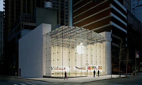
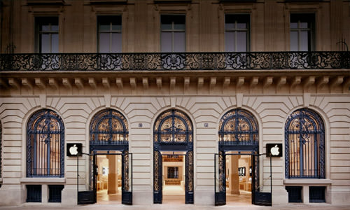
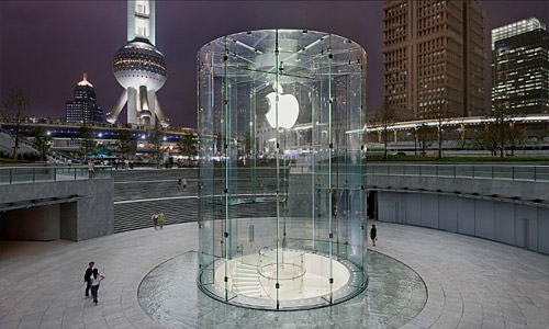
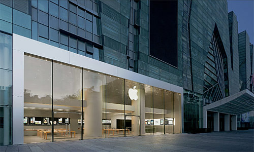
They're all so very different, yet equally stunning. If you have time to kill, I highly highly recommend clicking through their list of stores at Apple.com. So many incredible architectural wonders to be seen.
I'd say "the end" but since this is in reverse order, I gues this is "the beginning?"
Regardless, way to go Apple!
