 Avitable has announced this year's theme for his annual Halloween bash, and it's a good one: INVADED!
Like last year, Adam asked me to create a T-shirt design to help raise money for the party, and with an awesome theme like "alien invasion," I could hardly say no. The challenge would be to find a new way of having fun with the DaveToon characters so that I wouldn't be bored. After a little thought, I decided to try an old "Sci-Fi Comic Book" design and see if I could make that work. All the best alien invasion stuff could be found in the pulp comics and films of yesteryear, so it seemed like a good fit.
After an hour of goofing around, this is what I came up with...
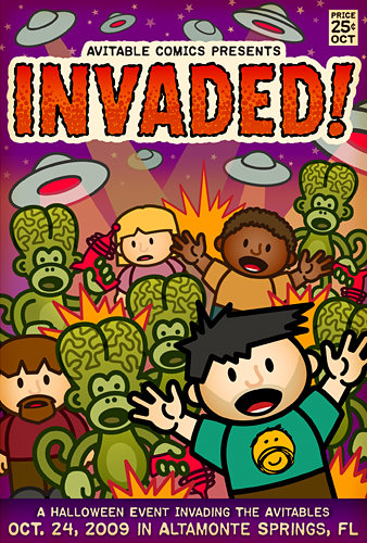
If you want to support the Avitaween party (or just want to look really cool), you can buy the shirt at Adam's Zazzle Shop.
If you want a behind-the-scenes peek at how the design was created, I've got that in an extended entry...
Call me old-school, but I still think it's best to grab a pencil and paper and sketch out a design before starting work on the computer. When designing on the computer, your head is limiting you to stuff that you know you can do with it. By drawing on paper, your brain is free to sketch whatever you can dream up, and you worry about the technical stuff later. I spent about 15 minutes doodling on a yellow pad until I had come up with this...
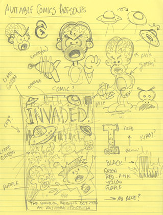
Pretty much angry alien monkeys and an idea for how I wanted the type to look. I then scanned in my rough sketch into the computer and fired up Adobe Illustrator.
In my head, the most important part of the design was getting the type right. I wanted a kind of spooky, shivery lettering to set the tone for the rest of the project. Fortunately, Comicraft has the perfect font, called "Chills" which fit the bills perfectly...
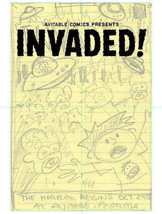
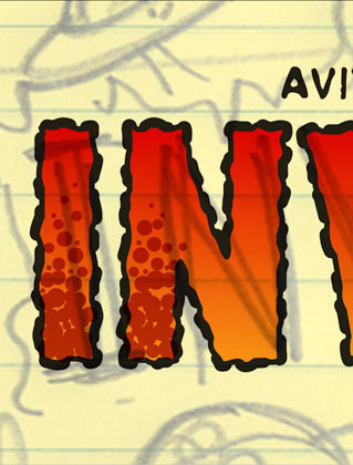
When displayed at large sizes, this font is a little TOO rough, so I always smooth out the letters a bit to make it more readable. After that, I started on adding "Kirbyesque" elements to the letters so they looked a little more threatening and cool...
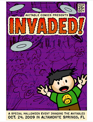
The color pallet I came up with avoided blue, and focused mainly on purple, green, orange, and red. Sometimes, by eliminating a common color from a design, you can force yourself to be more aware of how everything flows together. Since DaveToons are mostly "cute" and I wanted something a bit "spooky and sinister," I tried to give everything a kind of "warm and bruised" look with color. Purple seemed like a good start. To get Avitable somewhere in the design, I decided to put him on Lil' Dave's T-shirt, which is kind of how I did it last year...
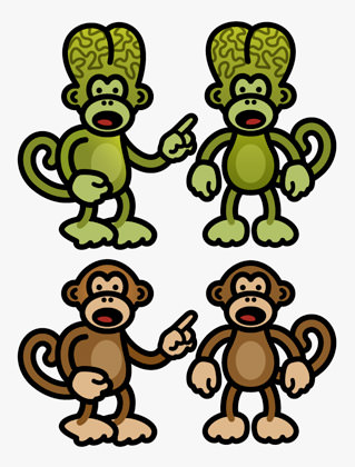
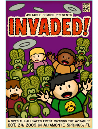
The main design element in the invasion was to have alien monkeys swarming on the cover. I love Tim Burton's Mars Attacks! movie, and used his martian's giant brains as the defining element of the characters. To make it funnier, I cleft the heads even more to look kind of like butt-heads, which seemed only natural for Bad Monkey...
Since my DaveToons are famous for reusing elements over and over again, I found my other invasion victims from a Jeopardy parody I had drawn earlier. Alien monkeys were sprinkled in as placeholders. I also added a tinge of yellow to the edges of the book so it looked aged...
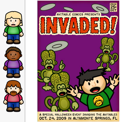
The humans in place. I crammed a few more aliens in there too...
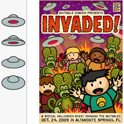
Now it was time to add the spaceships. I created one "master ship" and then drew it from four different angles to make them look more interesting and random. Death rays were then overlaid on the background and explosions added. I then went back to my sketch and drew up some ray guns for the alien monkeys. Earlier plans to have humans getting vaporized were abandoned, because I wanted to keep it kid-friendly...
From there, it's just a matter of playing with the colors until I'm happy. The text at the bottom was too glaring, so I changed it to be in a purple box so it would better blend with the background. So that Lil' Dave would stand out, I eliminated black from the background characters and outlined them with darker versions of the elements' fill color. So the Avitable sketch would show up better, I made Lil' Dave's shirt lighter..
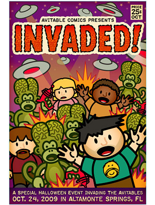
And that was all she wrote! Time from sketch to completed design: one hour and six minutes.
If you'd like to have a shirt of your very own, you can buy one at Adam's Zazzle Shop.

I love comments! However, all comments are moderated, and won't appear until approved. Are you an abusive troll with nothing to contribute? Don't bother. Selling something? Don't bother. Spam linking? Don't bother.
PLEASE NOTE: My comment-spam protection requires JavaScript... if you have it turned off or are using a mobile device without JavaScript, commenting won't work. Sorry.

Wow! This is an awesome design! Loving it! Good job Dave!
I love the design. But most of all I love reading about how you come up with the design and then your workflow to achieve the final product. More techie “how to” posts like this. Yes yes.
More brilliancy 🙂
fan fucking tastic design. but, then again, you already knew i loved it.
thanks so much for sharing the behind the scenes “making of” information. to you it is old hat, but to me it is fascinating. go dave, go dave…
Fucking genius. As with Kevin, I love how you show the creation of your works.
And the time it takes you to do all of this… obvious talent.
Gives the rest of us something to work towards.
I hope I didn’t throw of the design when I ordered it on a light grey shirt with red neck and arm hems. I was going to get it on black or dark grey, but I have many black T-shirts and realized that I often avoid wearing them if I expect to spend much time out in the sun. I would have used purple hems to match the background, but they didn’t offer that color. I decided that the red would probably work okay with the lettering. We’ll see….
Wow! You did this on 2 hours of sleep? You are so totally awesome. I wouldn’t even be able do something as mindless as watch Gilligan’s Island on 2 hours sleep. Kudos on top if kudos, Dave.
That looks awesome. I always like this little behind the scene things to see how you come up with stuff.
I’ve been lucky enough to see this artwork up close and it’s amazingly brilliant, Davey-Joe!
Sweet design Dave2!
I like the background extras on the creation too!
I used to like movie extras on DVDs but they’ve just gotten too long and elaborate! You do it just right.
It turned out great! And I love the homage to Mars Attacks! One of my fave films!
Very retro-scary. The big brained alien monkeys make me think of extraterrestrial zombies.
I love watching it come together from the initial sketches. I purchased shirts and a travel mug earlier. WOOT!
Fantastic! I also like seeing the process when you post these behind the scenes posts. You are amazing!
Definitely going to have to get one of these this year – and a travel mug!!
Dave, you’re F’in’ brilliant.
My process is so convoluted compared to yours. Maybe I should take a class or something. Mine took like three hours!
Love the design and thanks again for contributing – it really makes a huge difference!
I especially love the Avitable face on L’il Dave’s shirt!
It is awesome. 🙂
lmao- love it
I love when you post this kind of stuff. You are really talented!
Wow. It’s amazing you did all this in just over an hour.
I took an hour and six minutes to compose this comment. I started with a rough sketch and then took a nap. Woke up with 2 minutes to spare so I quickly donated to Palin’s 2012 campaign and quickly headed back here to finish it up.
MISSION ACCOMPLISHED!
Always love seeing you work, friend. And this is genius as usual.
You’re so awesome. As always, I’m in awe. awe-some-sauce.