
 I've been crapping on Apple a lot lately.
But not without reason.
Apple used to be the GOLD STANDARD in interface design. Everything was incredibly well-thought-out and intuitive. But now-a-days? Most everything they do is shit. And I simply don't understand why. Yes, Steve Jobs is gone, but surely there are people in Apple who give a crap about making sure that you can use their apps without wanting to beat the shit out of somebody?
But apparently not.
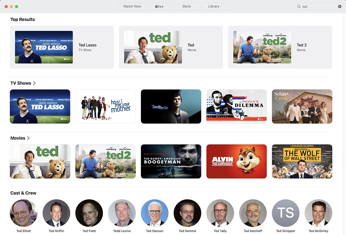
Because I was reminded about this when I was having to use the GUI abomination that is the AppleTV app (whether it's on a Mac, AppleTV, iPad, or iPhone). This app has been shit for ages. It was made even worse when Apple decided to prioritize AppleTV+ over absolutely everything... ramming their service down your throat like a fucking jackhammer. Even over content you purchased. Like when you search for the movie Ted...
But that's just the beginning with their idiotic search. Want to search your library? You can't just click on LIBRARY and search. If you do that, you'll end up searching within AppleTV+ and their media store content. Oh no. To search your library, you have to type into the SECOND smaller search box. And do you know how many times I forget to use the tiny box? ALL THE FUCKING TIME! And do you know why? The second smaller search box DOESN'T FUCKING EXIST UNTIL YOU CLICK ON A TINY FUCKING MAGNIFYING ICON THAT'S UNDER THE SEARCH BOX!!!

Only then does the search box even bother to appear...
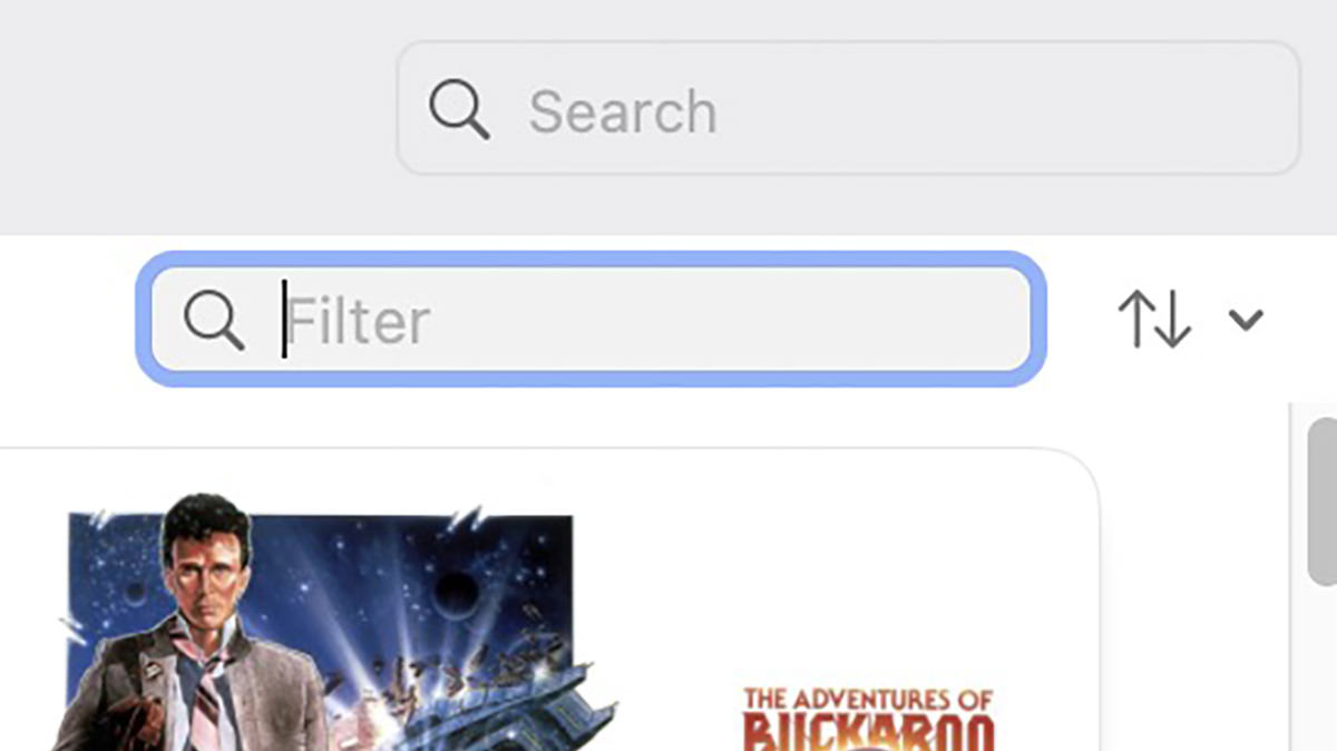
Absolute fucking lunacy.
But wait! It gets worse! Let's say that you use the universal search box anyway to get to your movie because you forgot about the smaller search box. What happens then? As you see from the first screenshot above, you have no fucking clue where the movie is at. Is it on AppleTV+? Is it in the store? Do you have to buy it? Do you own it? Who the fuck knows?
You have to click through to see where in the hell it comes from. In this case, I own it... although it doesn't tell me I own it... I just have to infer that I own it because there's a "Play" button instead of a price tag...

But let's say you're on your AppleTV and don't want to type out the title to get to it since it's a huge pain in the ass? Well, then you get to scroll through your entire fucking catalog of titles! And since I own hundreds of them, that will take a while. Let's say that I want to watch the movie 4th Man Out. With Apple, it's scrolling and scrolling and scrolling and scrolling because Apple puts numbers after letters...
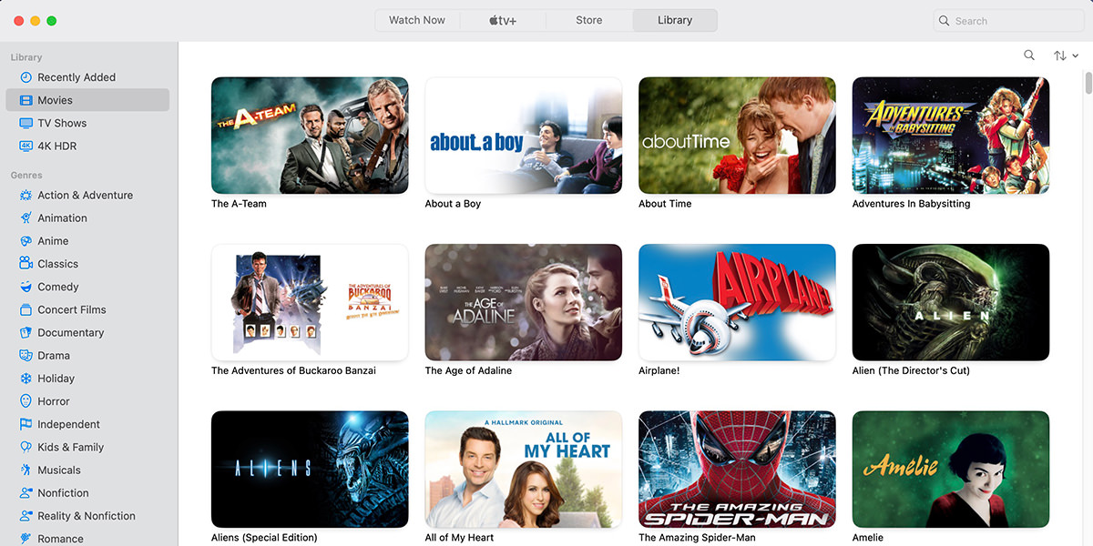
Here it is! Right after Zoolander...
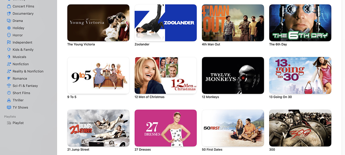
Let's compare that to how Plex allows you to navigate. I use Plex to catalog all my ripped DVDs (which is a legal backup of my massive DVD library). Since I paid for 4th Man Out both digitally and on DVD, it's in both places. Although since Plex puts numbers in front of letters, I don't have to actually scroll anywhere. It's right there at the start...
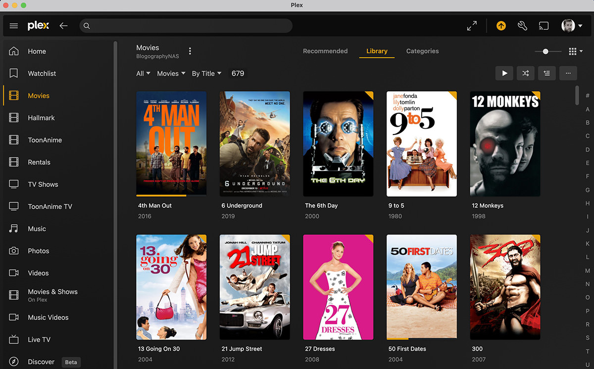
Not really a fair contest. So let's try another. Zoolander. Another movie I bought on both DVD and digitally. With iTunes, I have to scroll through hundreds of titles to get to it. But look on the right hand side of the Plex interface. See those letters there? No scrolling needed. I just click on "Z" and there it is!

This is especially fantastic on the Plex app for AppleTV... which is far, far superior to what AppleTV itself actually offers.
How embarrassing.
HOW FUCKING EMBARRASSING FOR APPLE!
For the love of God, spend the tiniest fucking portion of your billions of dollars and DO SOMETHING!
Don't get me wrong... there's still a lot of companies who are even worse at this than Apple. But given where Apple started, this is nothing short of tragic.
And I have no idea what it's going to take to get Apple off their stupid asses to actually fix this crap.

I love comments! However, all comments are moderated, and won't appear until approved. Are you an abusive troll with nothing to contribute? Don't bother. Selling something? Don't bother. Spam linking? Don't bother.
PLEASE NOTE: My comment-spam protection requires JavaScript... if you have it turned off or are using a mobile device without JavaScript, commenting won't work. Sorry.

I don’t specifically disagree with any of this, but I guess I’m just lucky enough that it almost never impacts me. I just tell Siri what I want to watch, and it usually just works. Sometimes, it takes me to a purchase view or a service I don’t have, in which case I just switch to Plex and (voice) search there. Yes, this means that I’ll often stream something that I own, but I don’t care. In fact, that’s often preferred as a lot of my “owned” stuff is SD DVD rips in Plex, while a good portion of it will stream in HD if not 4K. And if that still doesn’t work, then I look up the movie and Just Watch to see if there is a way to watch it.
Earlier today I even told Siri via a HomePod Mini rather than via the AppleTV remote, and that also worked.
To the larger point though, I do wish Apple would step away from their over-emphasis on minimizing UI controls. This particular search example reminds me of a similar problem I have in the Amazon app whenever I want to search my order history. I almost always inadvertently type in the main search box at the top rather than in the smaller order search box below.
It’s not even just that… you’d think that on my Mac I’d AT LEAST be able to type the first letter of the title I want and have it jump to there! That’s just sloppy. I use the AppleTV app on my Samsung television, so I can’t use Siri to voice search. I dunno. Maybe it’s time to switch to AppleTV exclusively?
I was using the built-in apps on my LG TV, which are pretty good, actually, but I ended up switching to the AppleTV apps for the “Continue watching” feature (for just about all services I use other than Netflix), and for the ability to switch between apps without them losing state as easily. It’s been a while, so I don’t remember if the LG apps preserve state at all — it seems like they might — but if so, I’m pretty sure it doesn’t do it as well as the AppleTV. Also, at least for apps that support it, scrubbing with the AppleTV remote is better than most other methods. The exception is that some LG apps let you use its pointer-cursor to click in the timeline, which can sometimes be better than the Apple scrubbing, though I think the thumbnail preview doesn’t work as well even for that.