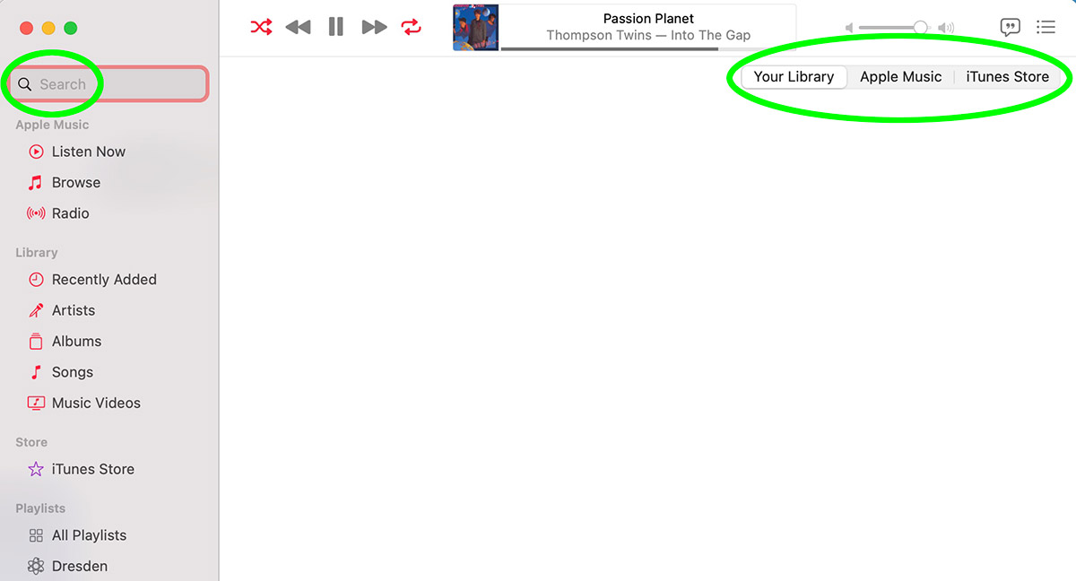
 It's not that Steve Jobs is spinning in his grave... it's that he can't even maintain a proper etherial state AT ALL because Apple's current UI direction is 100% crap.
ALL OF IT.
Icons are overly-complicated and shitty-looking.
Nothing is elegant, clean, and simple.
Nothing is adequately configurable.
Controls are scattered, unintuitive, and seemingly disappear at random.
Take for instance searching your iTunes library. The DEFAULT for search is not to search your library of songs you own... the DEFAULT is to search Apple Music and the iTunes Store (to encourage you to re-purchase the shit you own, I guess?). In order to search your library, you have to travel ALL THE WAY ACROSS THE SCREEN to controls that are easy to miss so you can specify that...

And I inevitably miss it EVERY FUCKING TIME so I waste time searching Apple Music because I forgot to click off of something I DON'T WANT.
JUST LET ME FUCKING SEARCH WHAT I WANT WITHOUT THIS BULLSHIT!!
Why in the name of Steve Jobs can't the search DEFAULT to your library?
And why is Apple Music even an option IF YOU DON'T FUCKING SUBSCRIBE TO APPLE MUSIC? If you must return results from Apple Music, why not just show results from ALL THREE SOURCES on the SAME SCREEN (with your fucking library at the top since, you know, YOU OWN THAT SHIT)? Is Apple hoping that you'll eventually give up and just subscribe to Apple Music so you can find shit without having to go through this hassle? This is senseless.
Who the fuck is running UI at Apple? They used to have the best of the best talents... now they have people who don't know even basic fucking UI design to make the apps not suck shit at a level that even Microsoft hasn't reached. I am so fucking embarrassed for Apple not being able to do even the simplest shit without completely screwing it up now-a-days that I feel like I want to vomit every time I turn on my Mac.
Get your fucking shit together, Apple. The "Music" app has been garbage SINCE DAY ONE!

I love comments! However, all comments are moderated, and won't appear until approved. Are you an abusive troll with nothing to contribute? Don't bother. Selling something? Don't bother. Spam linking? Don't bother.
PLEASE NOTE: My comment-spam protection requires JavaScript... if you have it turned off or are using a mobile device without JavaScript, commenting won't work. Sorry.

These days I’m all in on Spotify, but for years I was a rabid files on disk iTunes nut. Whenever an album is missing from Spotify I yearn for those days again and ponder going back. But yours isn’t the only post I’ve read about the shitshow that is the Apple Music app. If I could just go back to the last good version of iTunes I probably would.
It truly is the most heinous app I have used. And that’s saying a lot given I’ve been using home computers from the very beginning! No clue what in the heck is going through Apple’s head on their media apps.
“Who the fuck is running UI at Apple?”
Probably the same person who thought it was a good idea to put the charging connector for the Magic Mouse 2 on the bottom of the device so it can’t be used while its charging. Because… who would ever need to use their computer while its charging for a few hours?
Regarding the ITunes/Music debacle, after “upgrading” to Big-Sur I was so fed up with the defective media apps that I installed the JellyFin media server locally and access my music library via a browser.
It kinda sucks… but it also kinda works now.
I haven’t switched my primary desktop machine over to Linux yet but that dark dystopian day gets closer with every Stupid Apple UI Trick.
-S
I keep thinking that I’ll just download all my iTunes Match stuff and bail. I’ve already got most stuff in Plex anyway. But even with the crappy UI, iTunes Match is incredibly convenient for old stuff or rare stuff I’ve bought and ripped that is not available anywhere on any streaming service. It’s uploaded to Apple’s servers and they play it for you seamlessly along with other stuff that has been matched. It’s pretty great. Even if I never could get it to work with HomePod, even though Apple advertised it working with HomePod. Why it’s all gotten saddled with shitty UI is inexplicable.
Looking forward to your rant about the new Safari, assuming they don’t abandon it by release time. I mean, I’ve read and heard plenty of other critiques of it, but I think yours could be something special.
The new Safari is both good and bad. Good because they’ve fixed some things so that they work better… bad because I can never tell which tab is active since they all look basically the same. Inevitably I click the wrong tab to close, which is infuriating. New Safari on iPad is an entirely different animal and I don’t know how I feel about it.