


 Today on his social media, James Gunn announced the start of production for his Superman sequel, Man of Tomorrow. And he did it by revealing the logo for the film.
Now, it's been no secret that the big bad for the flick is Brainiac. A villain that could be very cool indeed if Gunn has cracked a way to make it interesting. And, let's face it, there's no reason to believe that he hasn't.
But anyway...
When I saw the logo my mind screamed "GAAAAAAAAAAHHH!"
Then I took a second look and my mind screamed "GAAAAAAAAAAHHH!" again.
First of all, here's Brainiac in several incarnations (including his ancestor, Brainiac 5)...
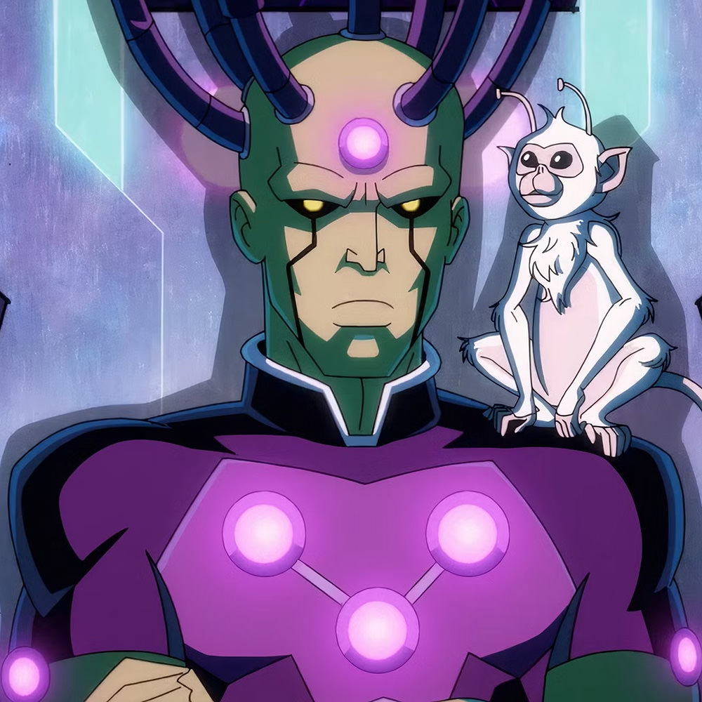
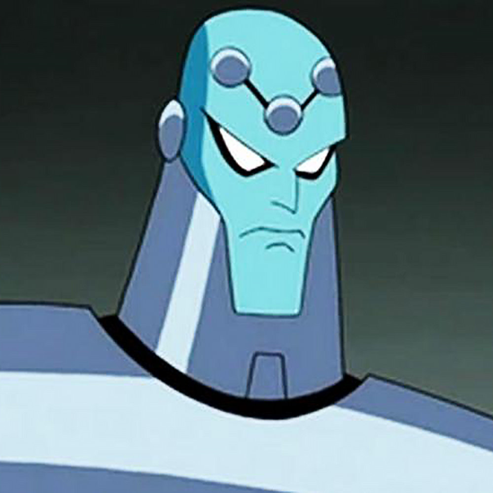

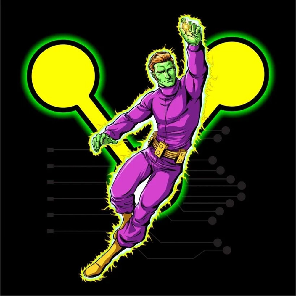
You'll notice a common element is his "logo," which is three connected circles.
But look at the logo for the movie... IT'S UP-SIDE DOWN!!!
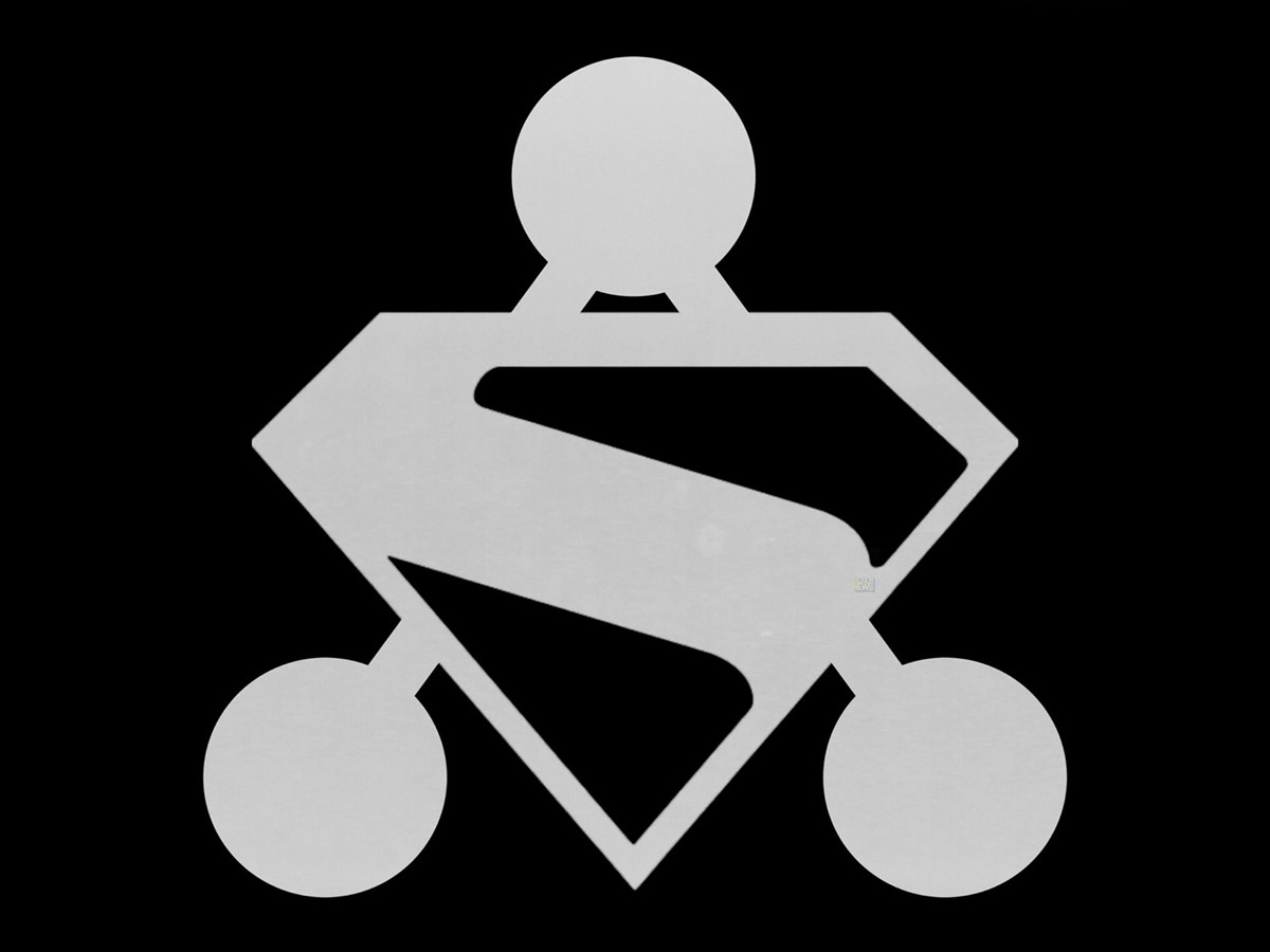
And just as I was telling my mind to calm down... that they likely did it up-side-down because it fit around Superman's logo better... I realized that the lines weren't lining up, which was when the designer in me nearly came unglued...
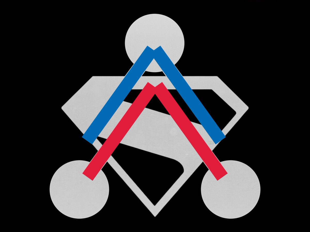
A good designer would have made the logos work without making one of them up-side-down. But a half-good designer would have known to have lined up the lines! I mean, holy shit, how hard was it to do something like this...
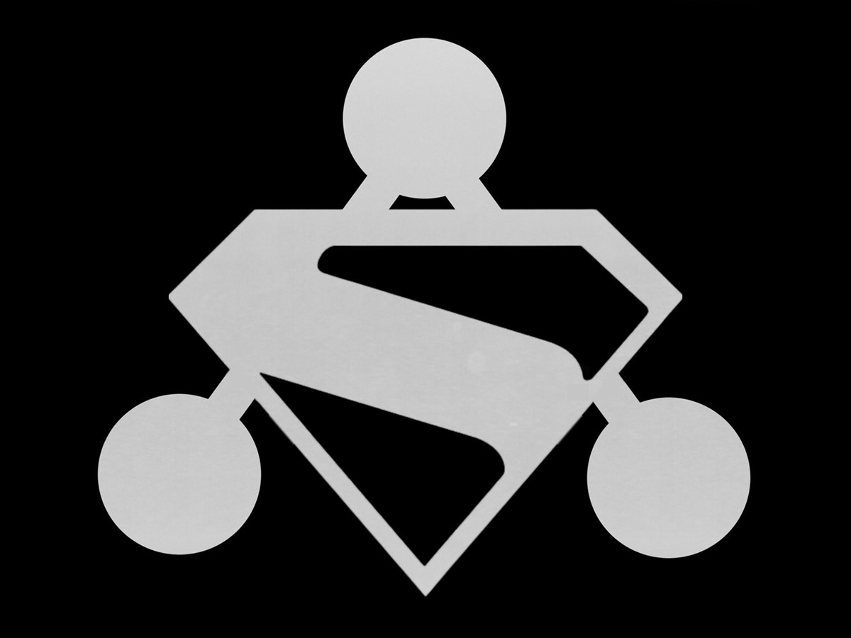
So, as you can clearly see, I hate this logo for two reasons (though there's a third I didn't mention: you should be able to see the Brainiac connecting lines through Superman's logo).
I sincerely hope this travesty isn't the final logo. And, if it is, I hope that the movie ends up being better than this would indicate.

I love comments! However, all comments are moderated, and won't appear until approved. Are you an abusive troll with nothing to contribute? Don't bother. Selling something? Don't bother. Spam linking? Don't bother.
PLEASE NOTE: My comment-spam protection requires JavaScript... if you have it turned off or are using a mobile device without JavaScript, commenting won't work. Sorry.
There's no comments here...