
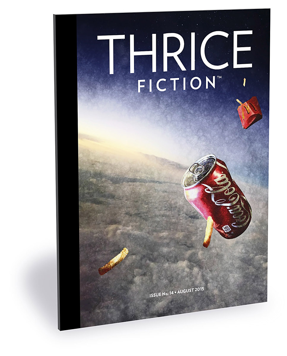
 Welcome to PART TWO of a discussion about the art that's running in the latest issue of THRICE Fiction Magazine!
If you haven't read PART ONE yet, you should do that first.
And if you haven't downloaded a FREE copy of our August 2015 issue... then you should definitely do that first because, WARNING... SPOILERS MAY ENSUE!
After our last issue was released, I received a comment from a friend who said "I like how you do such a good job of including so many women writers and artists." This kind of took me by surprise, because this is not something that ever entered my head. When it comes to the artwork, the women in our pages are not here because they're women, they're here because they are amazingly talented artists who are kind enough donate their time and wonderful works. There was no conscious effort on my part to make this happen, it just kind of worked out this way. If you bring your A-game, show me terrific stuff, and know how to compliment a story with your art... I couldn't care less what restroom you use, what ethnicity box you check, who you love, what you believe, or where you're from. I mean, sure I'd care if you were into kicking puppies or something equally heinous. I wouldn't want to support a puppy-kicker. But if you have a respect for puppies and make me want to have your work in our magazine, I'll be ringing your doorbell. Actually, I wouldn't do that... that's kind of creepy. But I would send you an email asking if I can send you some stories to look over.
And I can't imagine that things would be any different on the editorial side of Thrice. What makes RW so good at his job is that he literally doesn't care about anything except what he's reading. He made this quite clear in our submission guidelines when he says "Cover letters are a matter of complete indifference to us. So is your bio. We don’t care who you are or what you’ve done or where you have been published. We're happy to just let the work speak for itself." And those are not just empty words... that encapsulates everything Thrice Fiction is about.
And now that that's out of the way... if you think you've got what it takes to appear in our pages... we want to hear from you!
No matter who you are.
And now... back to Issue No. 14, already in progress...

PAGE 22. I have a huge respect and admiration for writers who can tell stories with an economy of words. Ray Nessly's Postcard is a shining example. What your imagination takes away from reading it is far larger than you'd ever expect from looking at the character count. Originally I had this piece paired with The Answer (which I talked about yesterday) because they both had a "Spanish conquest" kind of vibe going. But I wasn't 100% sold on that being the right take for The Answer, so I decided to let Postcard stand on its own... which ended up working great as a nice break between two larger works. When it came to the art, I was so taken with the opening of the piece that I just painted up Neptune and planted a flag on it to match. Going any further into the story seemed like cheating the reader out of a nice reveal.
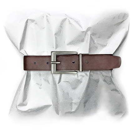
PAGE 23. I loved Daniel Presley's Notch Three and kept the art assignment for myself because I had a clear idea of where the visual should go. Or, to be more accurate, where the art should not go. As in, it should not focus on those lawn chairs, which I'm pretty sure would be the gut reaction for most people since they open the show. But that's not the point at which the story hinges (so to speak). The lawn chairs are merely a setup for the drastic turn of events that happens when the first line of dialogue enters the picture. It's at that point that Notch Three reveals itself. And its immediately after that, where Luke is uncinching his belt, and "the buckle is probably fastened at notch three" that I felt the visual accompaniment should focus. At first I had the belt buckle on a person, but felt that the buckle lost focus. So I decided to gather up the paper of the magazine itself to serve as a backdrop, leaving no mistake that the buckle and those five notches were where the reader's mind should be. That way, hopefully, when they reach that point in the story, it will slam it all home.
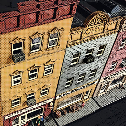
PAGE 25. Gentrification is a subject that's near and dear to my heart because the consequences of breaking apart established neighborhoods and displacing the people who call them home is such a heartbreaking subject. Laurence Klavan's Destabilized puts a very human spin on the subject, and finding the right art to accompany the story was something I struggled with. I knew right away that I wanted to use toy buildings to represent where Jerry and Hal lived. It only makes sense. The people affected by gentrification are mere pawns to be played with in a high stakes game, after all. But it had to be the right toy houses. Going all Fisher Price with the art would trivialize the story. So I spent a couple weeks hitting up antique malls, hobby stores, and toy shops trying to find just the right pieces. Toy-like... but not dismissively juvenile. Eventually I found a set of older train-scale buildings that were exactly what I needed. I took some photos, blocked the colors into zones to simplify things, then ran an old-time half-tone over everything which kept them as the toys they needed to be... but added a dash of gritty realism. I'm quite happy with the results.
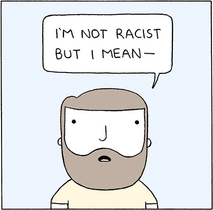
PAGE 29. Reza Farazmand's Poorly Draw Lines is such a perfect fit for Thrice Fiction that I compelled to run some more of his work in this issue. Just like last time, I was laughing the whole time I put the page together. So honored that Reza is allowing us to share his work!
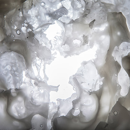
PAGE 30. Katelin Kinney took on Adam Webster's Lasso with an abstract piece that had a lot of thought behind it. As she explains... "For Lasso I decided to create this piece that at first glance looks similar to a flower or flower petals. Something soft and delicate and fragile, but when you look closer you see the cracks and faults and rough edges. I wanted to draw a parallel line between the imperfections in this shape and imperfections in the relationship in the story. The story is so soft and dainty, though, that I wanted to keep that aspect too."
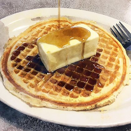
PAGE 31. And here it is... the new record-holder for "Thrice Fiction Artwork I Spent The Most Money On!" Though the fault is more mine than writer Sam Helmer. Her wonderful story, Right? The Dan Thoms Biography sent me down a spiral of trying to get the visuals in my head to match what I was creating on the page. The first piece was the waffle shot (above). I wanted a waffle with syrup and an entire stick of butter on it, thus tying together two story elements in one. No big deal, right? I bought some Bisquick and sticks of butter (I use margarine), grabbed some Mrs. Butterworth's from the cupboard, then borrowed a waffle-maker. Problem was... the waffle-maker I had didn't make the "Waffle House" cheap-style waffles I was looking for. So I ordered breakfast at a local restaurant only to discover their waffles were square and I wanted round. I ventured into the next city to have waffles at Denny's, but they ended up being these beautiful Belgian-style waffles which didn't match what I had in mind for the story. Finally I remembered yet another breakfast house in the neighboring city and called them up to ask questions about the waffles they served. They sounded about right, so I packed up my sticks of butter and went out for breakfast. Again. Lucky me... this time they were exactly what I wanted. The only problem was explaining to my server where all these sticks of butter came from. Oh well... I may have pissed away a lot of money on waffles, but they were all delicious.
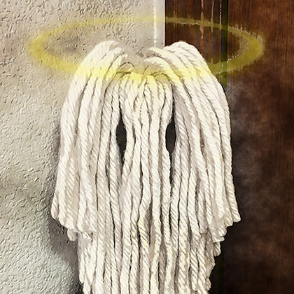
The Jesus Mop from later in the story was equally challenging. I bought a mop head and trimmed it to resemble Jesus. But it ended up looking a little too much like Jesus, and it was supposed to be more of a hint. So I bought another mop head and alternated trimming and taking photos until I went too far again... then looked back at all the photos to find the mop with just the right amount to Jesus to it. After Photoshopping a halo, I was good to go. Whew.
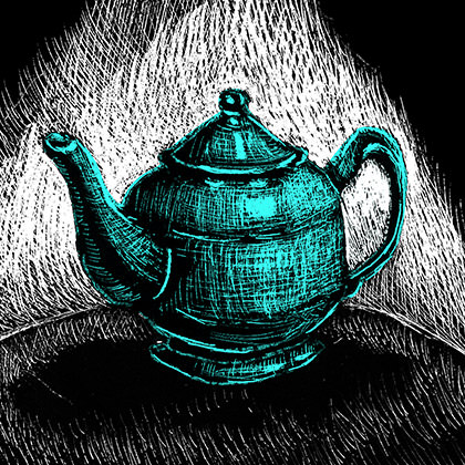
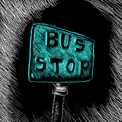
PAGES 36-37. As I mentioned in my previous post, my original plan was to have our "regulars" get a summer break while some new artists had a shot. But when the pieces for Mercedes Lawry's Estate Planning and Nicholas Olson's T(w)omb landed in my in-box they, unfortunately, had to be rejected. Which happens sometimes... and is usually entirely unrelated to the talent of the artist. It can be tough for some people to wrap their head around how to accent a story without overwhelming the writer's words, but this is an essential skill given that the focus for Thrice Fiction is that of a literary magazine. The art's not there just to be art... it's there to service the story and nothing more. So I ended up pleading with Chad at zero hour... hoping he could find some time to give me two pieces of art that would not only be restrained in selling the story... but also tie the spread together. He did his usual bang-up job... for which I was grateful, because both these stories had such terrific endings that they deserved a visual to match.
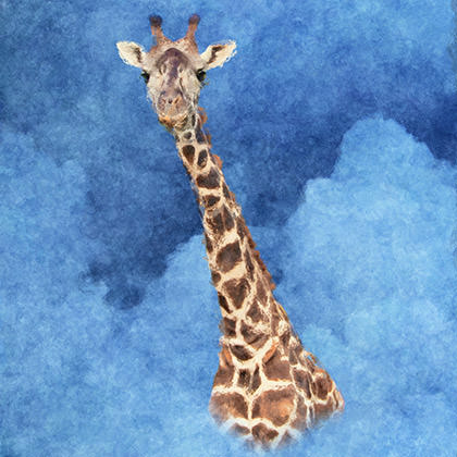
PAGE 38. I didn't even make it past the title of Jeff Weddle's When Giraffes Flew before I knew I'd be keeping this story for myself. Finally... a way to use some of the billion photos I shot while on safari in Africa last year! I'd find the perfect giraffe photo, crop and paint over it, drop him in some clouds, run everything through Photoshop for some painterly texture and, voila! Done! Super easy! Except not one of my shots from Africa had the giraffe I was picturing in my head. They didn't look... "cute"... enough. Resigning myself to the fact that I'd either have to draw the giraffe from scratch or pay for a stock photo, I set the story aside and went to work on the rest of the issue. And then... waking up like a shot had gone off at 2:00am one morning... I remembered that I had gone on a "Wild Africa Trek" at Disney's Animal Kingdom in Orlando. Wiping sleep out of my eyes and rumaging on my nightstand for my laptop, I poured through all my photos and found him. The perfect giraffe. Two hours later, my digital painting was complete. I think the story is a great way to close out our fourteenth issue, and was happy to have come up with artwork that kinda makes for a nice send-off too.
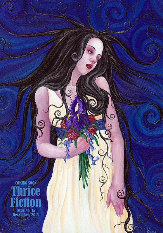
BACK COVER. When the art came in for the back cover, it had to be immediately rejected. It's not that the visuals weren't there... they were... it just the way the piece came together rendered it "not a good fit" for the magazine. Fortunately Kyra Wilson's back-catalog of works is ripe with beautiful, impactful pieces that work flawlessly for Thrice Fiction, so I begged and pleaded for one of them that would end everything on a high-note, while looking forward to the next issue. This gorgeous work is where we landed, and was everything I could hope for.
And... that's a wrap for Issue No. 14. See you back here in four months!

I love comments! However, all comments are moderated, and won't appear until approved. Are you an abusive troll with nothing to contribute? Don't bother. Selling something? Don't bother. Spam linking? Don't bother.
PLEASE NOTE: My comment-spam protection requires JavaScript... if you have it turned off or are using a mobile device without JavaScript, commenting won't work. Sorry.

There's no comments here...