


 I've had more that a couple people ask me if I've joined the Apple Mac OS X Yosemite Beta program. Of course I have, which always leads to the question "Well? What do you think?
The answer is not so easy to pin down... mostly because the beta is very much work in progress. And a lot of the more compelling features, such as all the nifty new iPhone integration, can't be tested because I don't have iOS 8 installed on any of my devices. So about all there is for me to comment on is A) How it runs with my existing stuff, and B) What it looks like. Those answers are as follows...
A) Seems to run fine, though I've noticed there is some lag when typing with a few apps.
B) I think it looks like shit. Garish, dated, and inexplicably messy on anything less than a Retina Display... which is a lot of people still have.
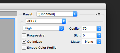
First of all, the new "flat" icon aesthetic isn't bad... it's the ugly day-glow color pallet that makes it appear that way. Even worse, the "flatness" is applied inconsistently. The icon for Mail, for example, isn't truly "flat" at all. It's got a lot of photo detail on it plus a watermark, which looks inconsistent next to all the other Apple icons that are so minimalistic...
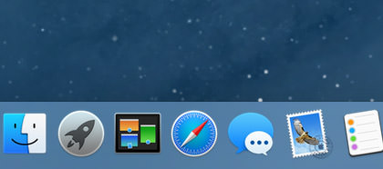
The Mail icon is new, so I'm guessing that's pretty much what it will look like when Yosemite is released. Unfortunate.
Even putting the garish app icons aside, there's an even bigger problem with folders. No longer a subtle element that recedes into the background so you can focus on what you need to, folders are now about as subtle as a slap in the face. They're like a plague of distraction...
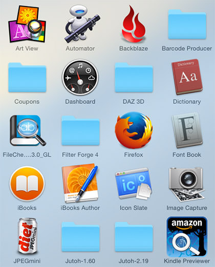
Get a grouping of them and it's almost worse...
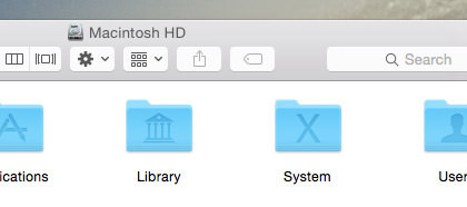
Compare and contrast to the much classier presentation of the older folders...
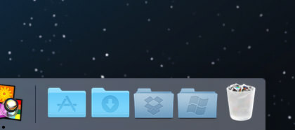
Also note the trash can, which no longer looks like an actual trash can... but instead like a frosted shot-glass filled with cigarette butts. Far more Windows-like than Mac-like in my opinion.
And it doesn't stop there... every single control element has been flooded in 80's day-glow colors which looks almost manic in it's distraction...
YES! WE FUCKING GET IT! WE CAN CLICK ON THOSE CONTROLS!! Praise be to Jobs that you can tone it down by switching the appearance controls to "Graphite"...
Unfortunately, there's no way to do that with the folders and icons. And, this being Apple, it's not like they're going to offer any skinning options so you can replace their shitty 1980's color scheme with something more sensible.
I haven't played much with the Apple apps that come with the system. Notepad and Contacts have been updated, but not noticeably so. The Calendar app looks a little different, but is still the same flaming pile of shit when it comes to usability. The only difference is that they've moved the laughably absurd and confusing month labels from the right to the left...

For the life of me, I don't understand Apple's new design mantra. It used to be that design was functional first... then that functionality was made beautiful. Now it's apparently design over function... which is made a hundred times worse because it's shitty design that's being painted over shitty functionality. Exactly the opposite of what Apple is supposed to be about. At least it's consistently shitty, which means they're still ahead of Microsoft. But for how long?
I was pleasantly surprised to find that the gimmicky transparency crap they've injected everywhere is much more subtle than I feared it would be. I still think it's entirely unnecessary, but at least it's not distracting me from getting things done. Even so...
John Hammond: I don't think you're giving us our due credit. Our scientists have done things which nobody's ever done before...
Dr. Ian Malcolm: Yeah, yeah, but your scientists were so preoccupied with whether or not they could that they didn't stop to think if they should.
That classic quote from Jurassic Park pretty much sums up my feelings about how Apple is operating now. Yes... yes... it's cool that the QuickDraw engine of Mac OS X allows effortless transparency to be added to any element... but just because you can do a thing doesn't mean you should do a thing.
One thing I rather like about Yosemite is iCloud Drive. It's basically DropBox integrated into the operating system. I am hoping... hoping with all my might... that this will make data sharing with iPhone have some semblance of sanity. If not, then DropBox it is. DropBox is not only dead-simple to configure and use... they just upped everybody who pays for their pro service to a whopping 1 terabyte at no extra charge. That's probably cheaper than what Apple will offer, which means the iPhone quackery you have to put up with is suddenly not the deal breaker it once was.
More random things to like...
And that's about all I have to say, really. Everything else is pretty much as it's being reported on every Mac website in existence.
While I think Yosemite has some interesting things going for it, ultimately it feels as if Mac OS X is taking a step backwards in functionality and design. Whether these things will be fine-tuned and improved before release is anybody's guess. I certainly hope so.

I love comments! However, all comments are moderated, and won't appear until approved. Are you an abusive troll with nothing to contribute? Don't bother. Selling something? Don't bother. Spam linking? Don't bother.
PLEASE NOTE: My comment-spam protection requires JavaScript... if you have it turned off or are using a mobile device without JavaScript, commenting won't work. Sorry.
I have the beta, but haven’t had the time to install it yet (I have an empty ext hard drive waiting to install it on). I’m hoping that these annoyances will find various fixes before this goes live in October.
I’m happy to read that I’m not the only one that is completely underwhelmed with the appearance makeover in Yosemite. I agree with many of your points. There’s a definite amateurish feel to the interface now that I’m not enjoying at all.
I think I was given the chance to play with this OS, too, since I too am an app developer, but I must have ignored that email. I’m always appreciative of your insights when it comes to Apple products, though!