
 And so Apple released the latest iteration of their Macintosh operating system, MacOS X 10.7 "Lion."
As a Certified Apple Whore, I am compelled to blog about it. But it's kind of a silly prospect, because other sites have done such a comprehensive job of going over the features. What I think I'll do is just go over some of the things I really like and really hate. Starting... NOW!
• Installer. In a move that harkens back to the day that Apple decided to abandon the floppy disk with the iMac... then abandon the CD drive with the MacBook Air... Apple has abandoned the media for distributing Lion at $29. No installation CDs or DVDs... you buy the upgrade directly from the Mac App Store (though apparently there's a USB thumb-drive version coming in August for $69). This gave me some pause, but I had TWO full backups, so I just rolled with it. Everything went flawlessly. There's even some wizardry in the background to give you a "magical" partition on your drive so you have an emergency backup available if something goes wrong since there's no DVD to boot from. Nice! Eventually I probably will burn a DVD and do a clean install just to clear out some junk I've accumulated over the years, but overall, things couldn't have gone better.
SIMPLICITY FACTOR? 9.9 (out of 10)
• Fuller. One idea that I've historically hated is the idea of an app taking over the entire screen. It just "feels" wrong to not be able to see and manipulate stuff in other windows while you're in the current window. But after playing with iPhone and iPad for a while, you just get used to it. And now I actually prefer it. Yes, it makes things like "drag-and-drop" impossible, but the tradeoff is that you get maximum screen real estate to work with. On a cramped laptop, that's gold! Lion provides developers the ability to make their apps go full-screen with the click of a button. As of now, only Apple seems to have the feature baked in, but hopefully other apps will be getting the ability to go full-boat soon. HOWEVER... there is one small, yet highly frustrating, problem. When you go full-screen, the menu bar disappears. To get it back, you put your cursor at the top of the screen... AND WAIT AND WAIT AND WAIT AND WAIT! Well, that's an exaggeration, kind-of, but if I need my fucking menu bar, I NEED IT NOW, dammit! I have no idea if this is because of some animation going on or what, but it completely sabotages the usefulness of going full-screen.
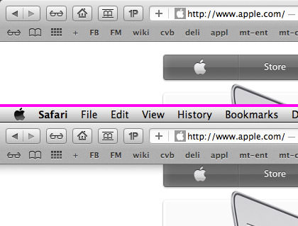
It is absolutely ridiculous that you don't have an option to "Always Show Menu Bar" for full-screen apps! There's some useful shit up there... like a clock... and your battery level... and all kinds of stuff I want to be able to look at. But you can't until you shove your mouse up there and wait. And wait. And wait.
IDIOCY FACTOR? 10 (out of 10)
• Gestures. The "new school" way of providing computer input is "gestures," which is done by swiping, pinching, rotating, and performing other motions on a touch-screen or touch-pad or track-pad or touch-mouse. The iPhone and iPad have used stuff like this since day one. Want to shrink a photo? Pinch it! Want to enlarge a photo? Stretch it! I find such input to be natural, intuitive, and efficient. Apple obviously agrees, because they've expanded the use of gestures in a very big way. There's lots of them...

And, let me tell you, once you get used to gestures, you will never want to go back. Just having the ability to swipe with two fingers to go backwards and forwards through browsing history without having to move the cursor up to a button you press... well, it's genius...
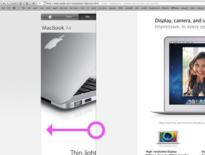
I am adapting to the gestures very, very quickly. I love them. A lot. So much, that I will be buying a "Magic Track-Pad" for my desktop Mac.
AWESOME FACTOR? 9.9 (out of 10)
• Mission Control. Apple has done a really cool thing in combining "Spaces" (virtual desktops), "Dashboard" (widgets), full-screen apps, and open windows into a single interface called "Mission Control"...
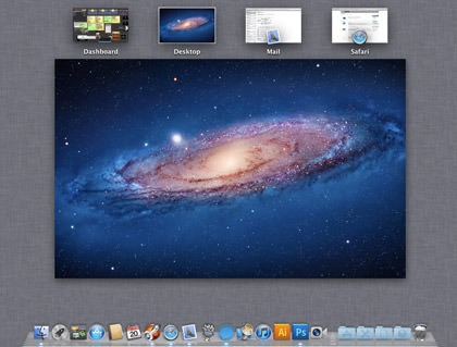
And, thanks to gestures, it's always available! Just swipe up with three fingers and BLAM! there it is! In theory, I like it a lot. In practice? Not so much. Partly because its kind of a mess to take in all at once... but mostly because YOU CANNOT FUCKING REARRANGE YOUR "SPACES" VIRTUAL DESKTOPS! They're just stuck there. This sabotages the usefulness of another gesture I love... swiping right and left with three fingers to switch between your full-screen apps and your virtual desktops. Have ten Spaces open and want to arrange them so that you can swipe between them with the most efficiency? TOUGH SHIT! You can't! You have to swipe through nine fucking screens to get back and forth between two that you'd really like to have next to each other. Your only choices when configuring the arrangement of Spaces in preferences is whether you want them auto-arranged or not. NO option to manually arrange them.
DUMBASSERY FACTOR? 8.8 (out of 10)
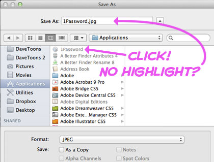
• Save Me. The "Save File" dialog box is now hopelessly fucked for productivity. It used to be that you option-clicked on an existing filename in the dialog, and you would get that filename automatically populated in your filename save field. This is handy for overwriting a current file... but more useful as a way of modifying an exiting filename into a new filename (e.g. clicking on "BigFile_001.jpg" so you can save a file as "BigFile002.jpg". ANYWAY... now you just click on the filename instead of option-clicking, which is no big deal. But in MacOS X 10.6 Snow Leopard, the system highlighted the filename automatically (sans extension) so you could very quickly overwrite the name OR hit the right-arrow to add/change characters at the end to create the new filename. Now? Not so much. No text is automatically selected for you, so hitting the right-arrow key inexplicably sends you into whatever folder you're on. But even worse than all that? It takes FOREVER for your files to show up in the browser. (UPDATE! See below)
TIME-WASTING FACTOR? 9.2 (out of 10)
• Lag. UPDATE: Apparently the horrible performance lag was due to two things... my Mac re-indexing the drive for Spotlight searches and the presence of MacFUSE on my system (which is supposedly not yet compatible with 64-bit Lion). In addition to the delays you find when waiting for the menu bar to appear in full-screen apps and the file browser to be populated in the save dialog box... there are several other areas. So many things just seem... slow. It used to be you'd press the space bar to preview with QuickLook and a window would appear instantly. Now? There's a huge delay. A delay so long that I'd argue it's probably faster to just double-click on the damn thing to open it in an app. It goes on and on (just try opening a Finder window so you can count the SECONDS it takes for the files to show up). Again, this may be due to the fancy animations going on, I don't know, but it is absolutely UNFORGIVABLE. Why the fuck would you make an operating system slower so people are waiting around all the time? It's a productivity killer on a massive scale because all those wasted seconds add up. This alone has me hesitating to recommend the Lion upgrade... if, like me, you YOU WANT TO GET SHIT DONE! This is so very, very frustrating.
STUPIDITY FACTOR? 38.6 (out of 10)
• Dock. Some freaky-ass stuff is going on with the way applications are run. Part of this has to do with the way Lion is taking control of your apps to better manage resources. If it's running low on memory, it can now tell an app you aren't using to quit itself. Then, when you need it again, Lion will reopen it exactly in the state it was in when it told the app to quit. I don't necessarily have a problem with this, but... it's not working right. You now have a choice whether the Dock displays a little light under running apps, but it's lighting up under apps which I've quit before a logout. Other times it refuses to light up apps I've just run. It's irritating. There's an option to turn off the indicator light, but I like to have it... when it works.
CONFUSION FACTOR? 5.7 (out of 10)
• Login. I have no fucking clue how Apple ended up with one of the ugliest login screens I have ever seen... and I'm including DOS-based logins from the 1980's. How the fuck can Apple, who is so sensitive to beauty in design, botch something so badly?
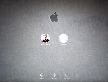
This is a crappy photograph of a crappy login, because I can't take a snapshot of it directly.
Everything about it is off. The circular pictures with the high-gloss reflections are tacky as hell. The "linen" background is boring as fuck. The Apple logo is wandering and distracting. The buttons are diminutive and lost. Everything about this piece of shit design screams amateur hour, and I cannot believe that His Holiness Steve Jobs okayed this. I've come to expect shit like this from Microsoft. But I am both disgusted and deeply saddened to see it coming from Apple. And so THIS is what I have to look at every morning when I start my day at work now? Why? WHY, LORD, WHY?!?
UGLINESS FACTOR? 18.2 (out of 10)
• Backwards. In an effort to make window scrolling act more like an iPad, Apple has introduced "natural" scrolling in Lion. The idea is that you click and pull window content in the direction you want it to move... just as if your mouse pointer was your finger. It seems like a smart idea, but it doesn't work... at least not for me. On an iPad, my finger is moving the actual content. On a Mac, my finger is moving a pointer which, in turn, moves scroll bars. From this perspective, using "natural" scrolling is backwards from how it should be and is, in fact, not "natural" at all. I turned it off after only an hour because I could not see myself getting used to it, nor training my brain to make sense of it. If I ever get a touch-screen on my Mac, then sure. But now? No thanks.
BIZARRE FACTOR? 8.0 (out of 10)
• Dash. Apple's widget repository, which they call Dashboard, is a nice feature that I use all the time. My "Dashboard" is filled with widgets which do everything from give me the weather forecast to track packages to taking notes to dozens of other things that widgets let you do. But not is all wine and roses in WidgetLand. The first time you open Dashboard, you have to WAIT AND WAIT AND WAIT AND WAIT for the widgets to activate. Subsequent access is still slow, but not horribly so. It's always been like this but, for some reason, I really thought they would address it in Lion. I'm sure it's a memory thing (why waste resources if somebody isn't going to even use Dashboard?) but I am ALWAYS using Dashboard, and the waiting drives me insane. If that wasn't enough, Apple changed some of the widgets so they're uglier. The font in calculator doesn't even frickin' fit in the display properly.
BOREDOM FACTOR? 5.1 (out of 10)

• Mail. If there's one program in OS X that I borderline hate, it's Apple Mail. It sucks on so many levels that I end up wanting to punch my computer at least once a day. It's slow. It's illogical. It's stupid (functionality-wise). It's unbearably frustrating for anybody who does more with email than just the basics. Well, Lion's new-and-improved Mail is, in fact, new-and-improved in many ways... but still kind of stupid in others. You get a new GMail-inspired "conversation view" but it ONLY displays your replies if they were written on the computer you're using! It doesn't matter if you have IMAP and store messages on a server for ALL your computers... Mail completely ignores anything you replied with when using other machines. This is almost laughable in just how fucking stupid it is. At first I thought it was my fault... I had stuff configured differently between them so Mail couldn't figure it out. But I use iSync, so that can't be the reason. So why? Did nobody TEST for this? Inexplicable bullshit like this drives me fucking crazy. Hopefully I'll eventually get it figured out, because right now "conversation view" is less than useless when it's incomplete. And yet... there are other things. Other cool things. I LOVE LOVE LOVE being able to flag mail with different colors. That's been a LONG time coming since I had this in every MacOS 9 mail app I ever used in the 80's and 90's! I still have a lot of exploring to do but, in the meanwhile, color me half-impressed.
INDECISIVE FACTOR? 5.0 (out of 10)
• Miscellany. I've only been using Lion for half-a-day, so this is going to be a really incomplete list. Some things I haven't experienced yet... like auto-file-versioning, AirDrop file sharing, and some of the security features. Other things I've run across have been cool, but not yet explored. Like the new three-finger-double-click to get a contextual dictionary...

And the hold-key character-picker...

And the three-finger-pinch Application Launcher "Launchpad" which is SO much nicer than digging through the Applications Folder...
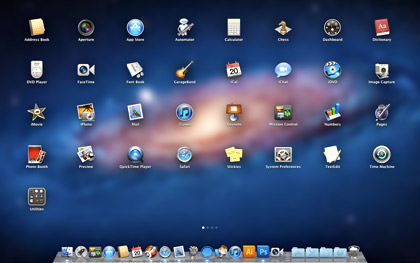
Still other things are just plain crazy... like the new-and-unimproved tiny-ass window control buttons...

Annnd... there's a lot more... I really like the new "All My Files" view available in the Finder windows. The whole-disk encryption is a godsend for somebody who travels all the time like me. There's additions to iCal and Address Book that help them not to suck so terribly. There's tiny little improvements everywhere that are nice. For the most part. I just wish Apple had taken a little more time to get rid of those frustrating changes and omissions that can make the OS less than what it could be.
AND FOR FUCKS SAKE, GET RID OF ALL THE LAG-TIME THAT MAKES ME WANT TO PULL MY HAIR OUT EVERY TIME I OPEN A FUCKING WINDOW!
FINAL SCORE? 7.5 (out of 10)

I love comments! However, all comments are moderated, and won't appear until approved. Are you an abusive troll with nothing to contribute? Don't bother. Selling something? Don't bother. Spam linking? Don't bother.
PLEASE NOTE: My comment-spam protection requires JavaScript... if you have it turned off or are using a mobile device without JavaScript, commenting won't work. Sorry.

I’ve been thinking about getting a Mac for a number of months now. Lion looks impressive but I may wait until they patch some of the more annoying bits. Do they normally release patches for stuff like that? At the moment, it’s looking like I’ll get a 13″ Macbook Air.
I downloaded it last night and haven’t really used it yet. Now I’m wondering if I made a mistake! We’ll see…
You lost me at Apple. Sorry.
And yet your stuck around and left a comment, so I guess I found you again.
Interesting review! I have to confess that I haven’t noticed any significant lag between my older Snow Leopard installation and Lion, and I’m using a late 2008 aluminum unibody Macbook. The difference, though, is that I’ve upgraded this Macbook with an SSD drive and 8 GB of RAM. Could that be the difference?
…James
Nice review of Lion features (and cool that you linked to the Ars Technica article, which was way comprehensive and exhaustive).
The “Save Me” part of your post mentions something I do a lot (and with JPGs) and I hope I can get used to the way Lion does it. Snow Leopard worked wonderful for renaming files easily.
So far for me, Apple Mail is less sucky. I do like the list on the left and the large reading panel on the right. And so does my wife (who loves her Mail). I’ve not explored the IMAP mail yet (haven’t done the Lion on my MacBook Pro yet and may not until I get back from vacation the week after next), but your saying that it doesn’t sort all of the mail together unless it was composed on that Mac? That may be ok for me on my main Mac, but i use 2 other Macs for mail, too. Maybe an update will fix that.
And I’m with you so far on the reverse scrolling. I had to add a 3rd party utility to the Mac mini (which has a Microsoft mouse) to put the scrolling back to where it was before. Maybe someday I’ll get used to the new way, but for now, it hurts my brain and adds too much frustration.
I use something called “Dashboard Kickstart” on Snow Leopard which makes my computer start up the dashboard on boot up so when I need it later, it clicks into action without waiting.
Slows down booting up a little but it’s worth it to me so I don’t have to wait when I want something now!
What widget do you use to track packages?
I always think Macs look really cool but I never have the first clue how they work.
When I left work I was still waiting for my download to start. I want to wait until I have it installed to read the details of your post.
I’m still being captain-sit-on-the-fence and taking note of how everyone else’s upgrades have gone before taking the plunge on my MBP. My twitter stream is a mixed bag of “just works” to “wish I hadn’t bothered”. I’ll probably give it another week before deciding.
I’m a fan of the natural scrolling; took me very little time to adapt though I sometimes get it wrong when I think about it.
I’m still confused on the ordering of screen. I can’t believe you can’t arrange them, but I’ve yet to find a way. Well, for the Desktops, I guess you can control where the apps are, so that’s enough, I suppose. And for full screen apps, I presume they order of going fullscreen is used? If so, that might be a poor substitute for direct reordering.
I really like that the calendar now supports gestures for forward and back: I was always trying to use them before.
My favorite feature is… well… shoot. I’ve forgotten. It was something minor that I knew about but was surprised by how much I liked it. Drat.
Dave, IF I understand the sent mail issue, there is some way to map your sent messages with the one on the server.
For what you want, you click on the gmail sent mail box (on the left side of the screen with all your mailboxes). Then go to the menubar choosing “mailbox”, scroll down to “use this mailbox for” and pick “sent”.
BUT before doing this drag your on computer sent messages to this gmail sent box so that they’re all there.
And once in a blue moon (maybe more often) it forgets this setting, I notice when I’m on the go and can’t access the mail from my iPhone.
That’s IF I understand…
It’s not defining the mailboxes that’s the problem… all my computers have the proper mailboxes defined on the server and are all pointing to the same place. The problem is that Mail doesn’t seem to want “thread” an email conversation UNLESS all the pieces were composed on your current computer. Any emails composed in reply on a DIFFERENT computer are left out of the threaded conversation. I have no idea how to solve this, because the emails ARE there… they’re just not threaded.