


 One of the things R.W. and I set out to do when we created THRICE Fiction was to make sure it was available in a variety of formats so people could read it however they wanted. Want to read a printed magazine? You can order a copy. Want to view it as a PDF? It's there. Want to read it on an eBook reader? We got that. Have a Kindle? We got that too. We've had all of it since Day One, and all the digital editions can be downloaded for FREE.
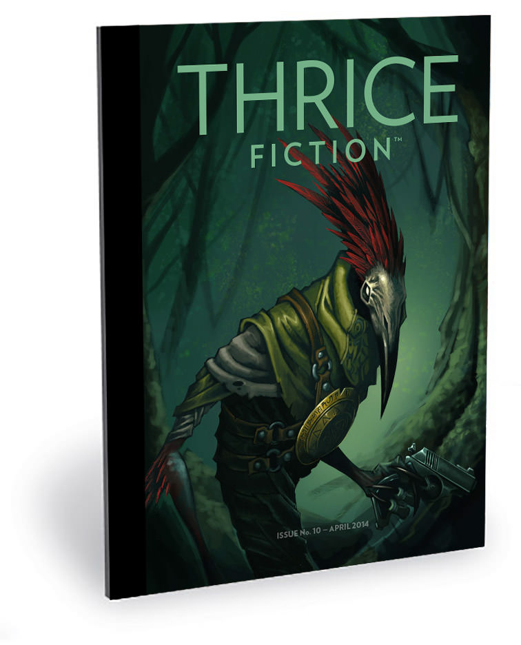
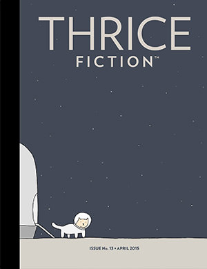
Like our brand new issue released today (featuring a stunning cover by Chris Walton)...
And we're not stopping there.
Our next outlet for THRICE will be an online edition. We want for people to be able to read every issue right on the THRICE Fiction website. There are many, many solutions for doing this, and I've looked at dozens of them. You can see a sample of one solution (from JooMag) here...
If you expand it to full-screen and have a decent-resolution display, it's pretty nice. I don't know if this is the route we'll take, but we'll get it figured out eventually.
Anyway...
Back to THRICE Fiction No. 10! For a look at the first half of the art included in this issue, click onward to an extended entry...
First, a warning. There be spoilers from here on out, so please go download a FREE copy of THRICE Fiction No. 10 before proceeding!
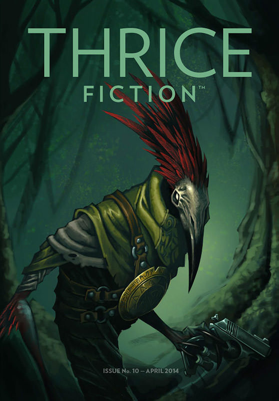
FRONT COVER. When one of my long-time blogging friends said she was marrying an artist, I did the only logical thing one can do in that situation... and it was not running a background check to make sure he's not a serial killer... it's checking out his portfolio. Once I saw she was marrying a incredibly talented artist, I made it my mission to get Chris Walton to draw us a cover, and here it is... exceeding my every expectation. I am secretly hoping that this will attract some terrific fantasy and sci-fi writers to contributing to THRICE, because we'd like to represent all the different genres "fiction" can encompass within our pages, and they've been woefully under-represented.
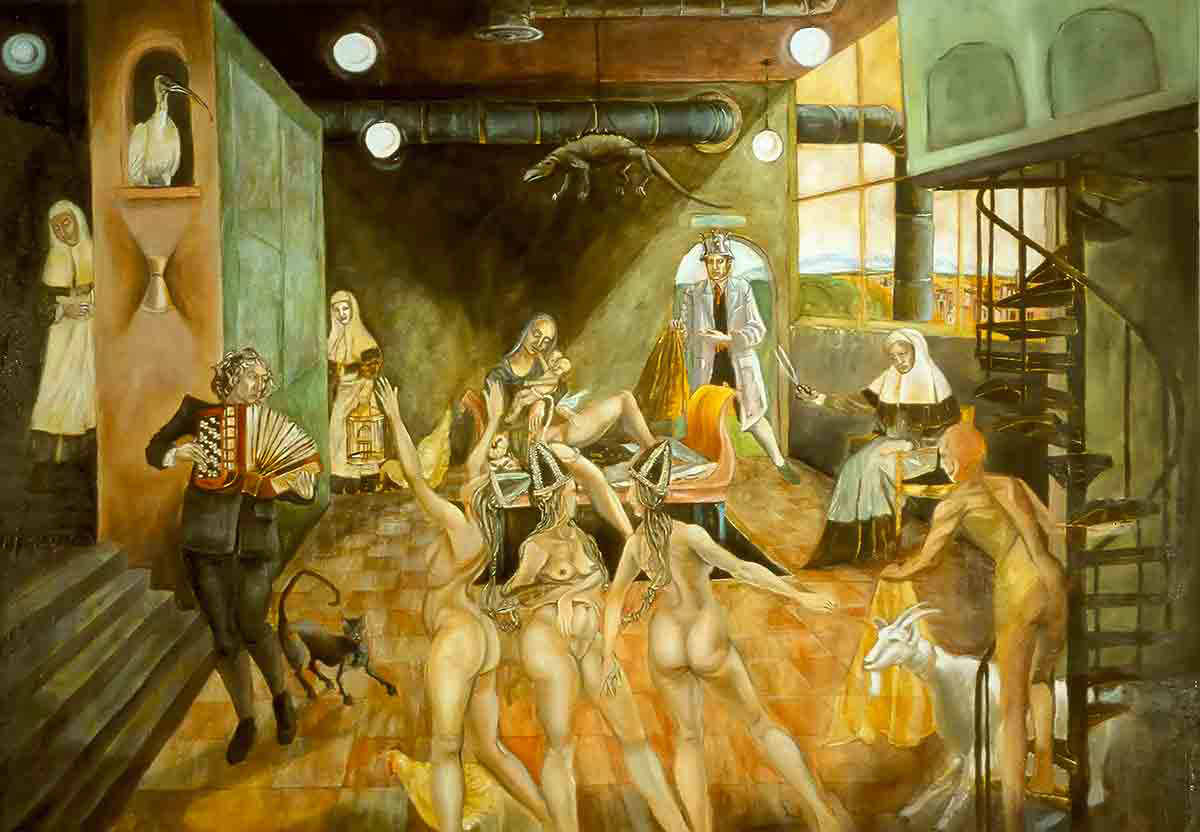
INSIDE FRONT COVER. THRICE readers know long-time contributor Chad Roseburg for his scratchboard illustrations, but he's an incredibly talented painter as well. The Yellow and Black Handkerchiefs was my only choice for the inside-front-cover the minute he showed it to me. Regarding the painting, Chad says: "An obvious reference to Ruben's Three Graces, this one depicts a marriage decision a woman must make between two suitors: One with a yellow handkerchief and one with a black handkerchief. She chooses black on the advice of a dream interpreter. Based on a true story."
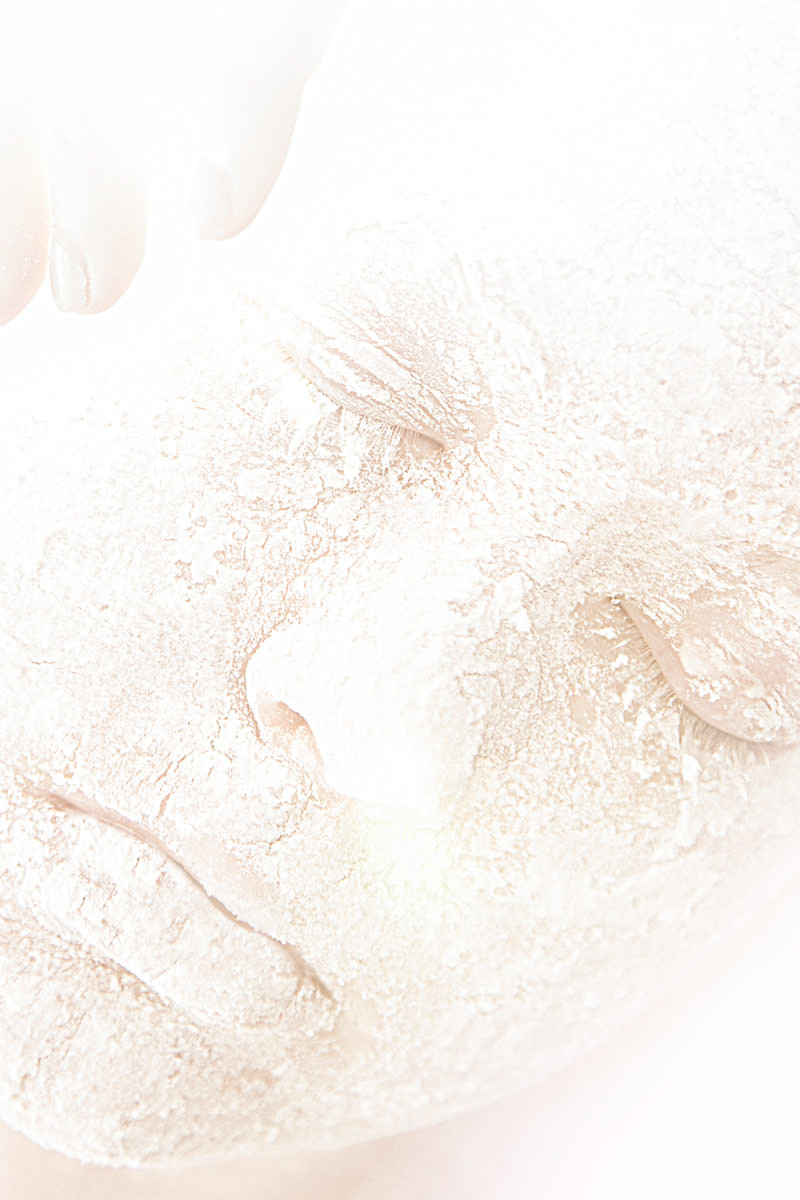
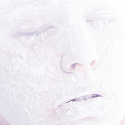
THRICE 10 NOTES. Katelin Kinney stepped up at the last minute with some portfolio pieces in our previous issue when some art I was expecting fell through. Needless to say, her amazing work was welcomed with open arms this time around... and she went the extra mile in creating custom pieces just for us! For R.W.'s opening notes, she sent a series of beautiful images which I absolutely loved. Here's what she had to say... "I'm very glad you like them! I just whipped those out real quick this morning. I'm actually still trying to get the pasty mixture of flour and water out of my hair ha!" — Yes, you read that right... she managed to create this kind of artistry as a self-portrait! And then...
PAGE 3. Howie Good can always be counted on for writing up a page of wonderful prose that's ripe for artistic interpretation... which is why I usually snap them up for myself. But once I knew we'd be opening the issue with his latest bit of brilliance, I wanted Katelin to play off her piece on the opposite page. Originally, she was going to create something entirely new, but once I saw how one of the outtakes had an eerie cool tone... almost "spirit-like"... for a piece called Things of the Spirit, I thought it was perfect. Katelin liked it too, so away we went.
Page 4. When I read the two pieces that Emily Grelle had written, I knew immediately that I wanted Kyra to create the visuals for them. But she is always flooded with work, so I hesitated before interrupting her schedule with new freebies for Thrice. Well, I hesitated for all of two minutes. Because I'm a horrible person like that, and the heart wants what the heart wants. As expected, Kyra completely delivered. This art for Reflection is beautifully-detailed, which makes me wish I had a larger layout to have presented it bigger.
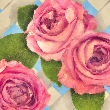
PAGE 5. What R.W. said in his introductory notes is absolutely true... we love finding new, talented, unpublished writers to unleash upon an unsuspecting world. But we also love it when our previous contributors think of us with their latest works. Susan Tepper is one of my favorites, and clever pieces like Wildebeest are why. Here she manages to change perspectives between husband and wife throughout the story. I liked how even when the point of view shifted to the husband, it was still all about Paula (the wife) so I grabbed a couple of elements that were literally from her "point of view"... like the old-fashioned pink roses on the arbor or her tea on the speckled formica tabletop. Each image is a collage of stock photos (the image above is sixteen separate layers) that I composited then ran through some Photoshop filters for a more "old-fashioned" look.
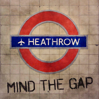
PAGE 7. I never overview any story R.W. sends me... I just dig right in without knowing how long it goes. So with Samantha Memi's Things to do on the way to the dentist, I was on the edge of my seat thinking IS SHE GOING TO SLEEP WITH THIS GUY OR NOT?!? before it ended. And once I got to the end, I knew I wanted to have a Heathrow Underground sign for the art. But not as it actually is. Having ridden the Heathrow Express several times, I knew that Heathrow's stations are all clean, modern, glass and steel, and wouldn't have the "slightly dirty" feel that I wanted. So I used a photo I took of Temple Station's signage... grunged it up a bit... erased the type, added my own, and took a lot artistic liberty with the actual location to fit the story. I liked it a lot, but I needed something "more"... so I added "Mind the Gap" as a fitting double-entendre for the piece.
PAGE 7. I loved... loved... the imagery André M. Zucker put into Astoria Saudade. Which usually means I would keep the story for myself.
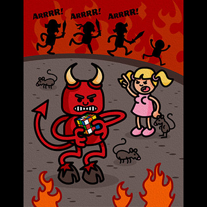
PAGE 12. I don't find stories that fit a "cartoon aesthetic" very often but, when I do, I completely take advantage of it. And when Zeke Jarvis sent The Pirates of Hell or Whatever, I had it all sketched out in my head before I reached the ending. I knew I wanted a little girl with inappropriate boobs complaining to the devil while pirates are wrecking havoc in the background. What I didn't know is how I wanted the devil to be distracted from caring about it all. After a few false starts, I landed on a Rubik's Cube and it worked great. It says that the devil has much bigger concerns than running Hell... but not really. After drawing it in Adobe Illustrator I ran it through Photoshop's "Oil Paint" filter to give it some texture.
Annnnd... we're at the half-way point. I'l run through the remaining pieces on Monday. But probably Tuesday since I won't get home until after midnight on Monday.

I love comments! However, all comments are moderated, and won't appear until approved. Are you an abusive troll with nothing to contribute? Don't bother. Selling something? Don't bother. Spam linking? Don't bother.
PLEASE NOTE: My comment-spam protection requires JavaScript... if you have it turned off or are using a mobile device without JavaScript, commenting won't work. Sorry.
Being a person who cannot draw or paint, I am nonetheless enthralled with artworks (and sculptures), and so I love to hear how an issue comes about at Thrice, how the story affected the artist and the resulting accompanying pictures. This is another gorgeous art-filled issue and I’m quite thrilled to be a part of it.