
 Yesterday I waxed poetic about Apple's "Special Event" where they unleashed a bunch of new iPods, revised Apple TV, and teased us with new features coming soon for iPhone and iPad. It was all very cool, and renewed my Mac Whore certification (along with my undying love for Steve Jobs).
But His Holiness Jobs did not stop there. He also introduced a new version 10 of iTunes... Apple's venerable media player. Many of the changes I approve, some I don't, and much of it has me feeling indifferent. Let's take a look, shall we?
The first thing you notice is that the icon has changed. The old icon had a CD on it, which doesn't make much sense considering that online downloads are eclipsing CD sales. Pretty soon, people won't even know what the heck a CD is (much like the 8-track tape and cassette). And, while I approve of iTunes getting a new icon, I have to say what they come up with sucks ass...
![]()
SERIOUSLY?
Seriously, Apple?
We finally get an opportunity to move past the gum-drop gloss of the original Apple "Aqua" interface, and you drop the ball by giving us a glowy blue blob that harkens back to design of of years past? What happened to the new "brushed aluminum" look you've been cultivating? That's pretty classy...
![]()
It also matches the visual elements of iTunes' interface, and is inline with the DVD Player, but whatever.
The interior of iTunes, oddly enough, is where they are getting rid of the glowy mess and going for a refined, more classy look. Where there's color, it's bright but not offensively so...

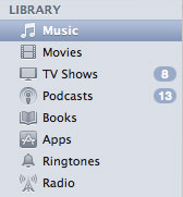
In still other places, the color has been eliminated completely. The small sidebar icons are now exclusively monotone. This is a little bit stupid, because color really helps to differentiate things when the images are so very small. Now they all kind of run together...
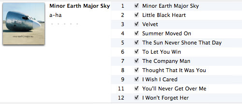
Usability is getting a modest boost in some areas. My favorite being the album artwork popping up in List View if you have more than five songs on that album. Like Steve says, there's room, so why not? Visual information helps you find what you're looking for faster...
And Apple is also helping add some nice vertical space by shifting the Window controls to a smaller, vertical format. A very good thing, even if it is inconsistent when every other window interface...

Enough about looks, what's new in features? Well... there's finally the ability to rent television shows for 99¢ each. In many cases, that's half the cost of buying the same shows in HD, but you can only watch them once.
And the BIG announcement? It's PING!

What's Ping? It's a "social networking feature" that allows you to follow artists and friends to see what they're playing so you can discover new music. Sound familiar? It should... that's what Last.fm does! I've been using Last.fm for years, sending my awesome musical tastes to the site via an iTunes plugin. I've made some great friends there, and discovered a lot of new music that I love. A part of me really, really wishes that Apple would have simply partnered with Last.fm... or even bought them out... rather than try to reinvent the wheel. Poorly, as it turns out.
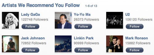
First of all, since the service is new, the number of artists participating in it is limited. The "recommended to follow" people they keep giving me is nobody I'm interested in (except perhaps Linkin Park, who I did enjoy back in the day)...
And it only goes downhill from there. When it comes to people, the important thing about music is (surprise) THE MUSIC THEY LIKE. Unfortunately, Apple has limited the music you get to like to the music they sell. This is sublimely stupid. Like the Beatles? Tough shit. They don't exist. Love some local indie band? Too bad. Unless they sell their music on iTunes, they don't exist. One of my favorite bands is a-ha... they only partly exists. Some of their albums can be Pinged... but a majority of them can't be. Scoundrel Days? Nope. Minor Earth, Major Sky? Nope. Analogue? Nope. Their final album, Foot of the Mountain? Nope. The new Deluxe Edition release of Hunting High and Low and Scoundrel Days? Nope. Nope. Much of their live stuff? Nope. Nope. Nope. Nope. Since Ping is supposed to be all about your music, you'd think you'd at least be able to talk about albums you like... even when they're not for sale at iTunes, right? Nope. If Apple doesn't sell it, it doesn't exist, because the like/post feature is tied to the iTunes Store, not your library...
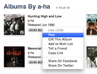
What the fuck?
Apple can brand this as "social networking" all they want, but it's total bullshit. It's a MARKETING TOOL! Apple is getting you to sell music from their store to your friends... AND NOTHING ELSE!! This is beyond FAIL! It's beyond EPIC FAIL! I don't even know a word that describes just how massive a FAIL! that Ping is.
I'll just come out and say it: I fucking HATE Ping. Apple does not get to decide which music exists and which music doesn't. The fact that they feel otherwise is a very, very scary prospect. And a bad business decision. People are going to notice what they're doing here. It's things like this that made Microsoft so roundly hated, and Apple has got to fix it fast. Because it's a short leap from hating Ping to hating Apple. Especially when it comes to something like music, which people get passionate about.
Apple says that they love music. If that's true, let people share ALL their music... not just the music that record labels allow Apple to sell. Otherwise, you aren't loving music at all... just the money it can generate. And while every company is out to make money, they shouldn't be out to become draconian evil bastards who dictate the music people are allowed to share and discuss.
UPDATE: Chris Carlozzi has created a few replacement icons for iTunes 10 which are much, much better than what Apple slapped on it...
![]()
You can get the icons for Mac here. And you'll need to download CandyBar to install them.

I love comments! However, all comments are moderated, and won't appear until approved. Are you an abusive troll with nothing to contribute? Don't bother. Selling something? Don't bother. Spam linking? Don't bother.
PLEASE NOTE: My comment-spam protection requires JavaScript... if you have it turned off or are using a mobile device without JavaScript, commenting won't work. Sorry.

You’ve captured basically what I was thinking about Ping. My brain didn’t make the marketing connection but you’re absolutely right.
I really dislike the icon and the vertical window control icons are really throwing me off.
I downloaded iTunes 10, but haven’t installed it yet. So far, from what you posted here and from other reviews, I don’t like to the new look. Especially the lack of color icons on the left sidebar. I like those colors. With them all gray, they look disabled.
Whoa, that icon designed by Chris is amazingly beautiful!
Wow. I have yet to read a good review of Ping. And from you’ve written here, I certainly won’t be giving it a try. I have too much invested in last.fm and love the music/people I’ve found as a result to switch to this total misfire. I’m a huge Apple fan and can’t believe they rolled out something this lame. And because of that I see no real compelling reason to upgrade to iTunes 10 at all.
Yes, Dave, you are absolutely right that PING is the same as Last.fm, but if you ask my opinion, I would only say, “The only difference is that Ping is PIG and Last.fm is Last.fm, which is miles away better!
Meh. I mean, I love music, but not enough to want to “socially” connect with artists I listen to.
No thanks, I’m good.
I already made up my mind not to activate Ping. You summed it up much as I imagined: that Ping is Apple’s lame version of Last.fm, which I’ve loved for years. Besides, I’ve got enough social networking stuff already…don’t need any more.
I really hate the new iTunes icon too. It’s not at all what I’d expect from Apple. It’s rather ugly.
hey, thanks for the review!
What “new “brushed aluminum” look”? The DVD Player, System Preferences and Calculator icons are virtually as old as OS X itself. Newer OS X icons are those like Pages, Numbers, and iMovie ’09, which have no brushed aluminium elements at all.
Indeed, Apple dropped all traces of brushed aluminium UI from the applications themselves in 10.5. The areas that used to be brushed aluminium are nowadays just uniform or gradient-shaded grey. So that ship sailed a long time ago (and I for one was glad to see the back of it).
The move to vertical window management buttons is horrid, and I’ve switched them back to the way they were. I know they’ve done it so the buttons don’t move around when you switch to the mini player, but I still don’t see why they can’t just use (smaller) horizontal buttons in the mini player. It would probably cost a few vertical pixels, but it’s not like pixels are as scarce as they used to be.
The OLD brushed aluminum texture was pitted with grainy texture. the NEW brushed aluminum is just a greytone gradient… that’s what I was talking about. It’s still brushed aluminum though, because it isn’t shiny (it’s meant to simulate the aluminum look of Apple’s MacBooks, Mac Pros, Mac minis, etc.). And if you look at Apple’s Human Interface Guidelines, you’ll see that the suggestions for applications like Pages, iMovie, etc. are very different from the utilitarian apps like DVD Player, which is what the iTunes icon should be emulating. In any event, the nuclear glow in the new iTunes app icon is a massive step backwards from the more elegant, flatter colors and subdued glows of modern Apple icons.
And, while I agree that the new window management buttons are not great and stupidly inconsistent, as I mentioned, I like the vertical space savings. I keep iTunes running all the time on all my Macs, so I’m never really using the buttons anyway.
Thanks for your recap of the event! I TOTALLY agree with you about Ping. WTF.