 After publishing a behind-the-scenes peek at how I created Avitable's Halloween Party shirt, I received a number of requests asking me to do something like that again. The problem is that the vast majority of the work I do outside Blogography simply can't be posted because of confidentiality agreements, copyright ownership, publishing royalties, and all kinds of other messy business. But every once in a while I get a fun assignment where the client doesn't mind me posting the details, so here we go again.
A while back, longtime Blogography reader Jon Whitby wrote asking if he could hire me to create a logo for the baseball team that his law-firm sponsors. Unfortunately, I was on my way to Dave York just then, but he was okay with waiting until I got back. There was a few days window before I had to get started on TequilaCon stuff, so the biggest hurdle... finding room in my schedule... had been cleared.
Corporate logo design is a long and complicated road that often involves numerous meetings and dozens of revisions. But fun logo design work like Jon was requesting is pretty straightforward. It was also fairly easy because he knew exactly what he wanted...
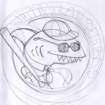
Two minutes of sketching, and this is what I had to start from...

A few tough spots became immediately apparent...
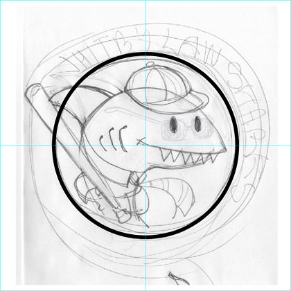
I ended up dropping the glasses and put some rounded eyes in there instead (I decided that I would create a second version with more menacing eyes, just in case I went a little too cartoony). My revisions set, I imported my sketch into Adobe Illustrator and drew a boundary circle to work around...

If you're interested in seeing what happens next, I've put the rest of the story (along with the finished design) in an extended entry...
Alrighty then. So far, I've spent about ten minutes sketching and getting it scanned and imported into Illustrator. Time to get to work! Since Jon is only familiar with the simple little cartoons I draw for this blog, I don't have to worry about what "style" I'm going to be drawing with... I'll just draw everything up Davetoon style!
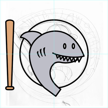
The first thing I do is rough in the shark with the pen tool. I draw up the baseball bat next, since everything else will be built around it. Since sharks have kind of icy-looking eyes, I decide to leave them white instead of coloring them in with black like I do with Lil' Dave and Bad Monkey...

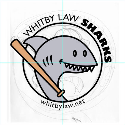
For a typeface, I choose Gill Sans, which is one of my long-time favorites. Designed by Eric Gill in the 1920's, it has a timeless look and maintains good readability, even when printed small. In addition, Gill Sans Black is one of the most beautiful heavy typefaces ever made, and has nice little cuts into the letters "K" and "R" that look like shark fins to me (making it especially appropriate here)...

From here on out, it's all pretty academic. Since navy blue was decided as the shirt color, I drop that in. I usually design to four colors for economics in screen-printing, but the dark T-shirt means I'll have to add a white underprint so everything will show up. Since I draw stuff in Illustrator all day long, adding the hat, tie, and fins takes only about 5 minutes. I work on dressing him in a business suit, but a pocket-sized print is really too small to handle it with everything else going on down there, so I abandon it...

Since we've got a shark in the logo, I create a second version in six colors with a little blood-red thrown in. It will cost more, but who knows? Jon might feel like springing for it. At this point I should also note that the design could be dropped to four colors by removing the baby blue in the circle. It could also be dropped to one color and be just a white outline if Jon needs it that way too...

And then I pop in a more menacing "eye" just in case the above version is too cartoony...

It's at this point I send my sketches to Jon to see what he thinks. From start to finish it's taken me about 15-20 minutes so far.
Ends up Jon and his baseball team like the sketch enough that they've decided to abandon the "breast pocket" print idea and instead have the design printed large in the middle of the shirt so people can see it better.
This presents a problem.
When you are drawing a shark that's to be printed 3-inches across, all you really need to do is draw a gray blob and stick some teeth in there. It's so small that you don't have to be accurate with the anatomy or anything. But now it's going to be printed much larger. People are going to notice that the "gray blob" could be a shark... but it could also be an eel or an earthworm or anything, really. So it's back to the drawing board, where I completely redraw the head so that it actually looks like a shark. I also add some weight to the lines so that the character has more dimension to it...

Since the design is being printed so much bigger, I reduce the size of the web address and turn it blue so it doesn't overwhelm the team name. The red was eliminated, which helps everything blend together better, and also makes the print less expensive.
And there you have it... one sharky logo in about 40 minutes. Best of luck to the Whitby Law Sharks this season!

I love comments! However, all comments are moderated, and won't appear until approved. Are you an abusive troll with nothing to contribute? Don't bother. Selling something? Don't bother. Spam linking? Don't bother.
PLEASE NOTE: My comment-spam protection requires JavaScript... if you have it turned off or are using a mobile device without JavaScript, commenting won't work. Sorry.

I wish getting a logo done up at work was that easy.
Love the behind scenes stuff too.
Not an artist here; but the logo with the red cap and menacing red eye appeals to me
Wow I found you through a commando friday search and think I’ll stay.
How was your day? Yesterday I mean.
its so cool seeing the steps to stuff like this! thanks again, dave, and thanks to jon for letting us see!
I love sharks!
thanks for sharing, Dave. I always enjoy these how-to sorts of posts. I really dig the shark’s tie.
Very cool. The one with the evil red eyes scared me a little, tho…
For someone who just dabbles in this stuff for fun, it’s always great to get a little lesson from a pro. This was a great read, and the finished logo is pitch perfect. I love the redrawing of the shark. A lot of other designers might have been too stubborn at that point in the process to do a complete re-draw. Maybe just bad ones, I guess. Great post.
I really enjoyed the process as well as the result here. It gave me a deeper appreciation for the work artists and graphic designers do.
On the recommendation of the printer, because the shirts were such a dark blue, we added a white outline around the edge of the circle (so the black line wouldn’t just disappear into the shirt). I was a bit nervous about changing your design in any way, but I think it turned out great. You can judge for yourself when you get your shirt.
Thanks again for working with me on this. The Sharks are off to a slow start this season, but we will pick it up down the stretch. And in the meantime, we look awesome.
ooo very cool. Can you post a photo of you (or Jon) in the finished Tshirt..? 🙂
I totally agree – it’s really fun to get to watch your process! And the subtle shift of his hands/fins on the bat in the final design really works – you can tell he’s gonna knock the ball out of the park. EXTREME GRAND SLAM!!
Man! Makes me wish I had employed you for a design for my business cards I won!
Thanks for a small window into your design process Dave, and go the sharks! 😀
Truly cool.
Amazing! Do you use a pen-tablet setup? I think it’s incredible that you could put something of this high standard together in less than an hour!
Thank you for giving us a backstage pass to your awesomeness.
Unfortunately, the Whitby Law Sharks seem to have their fins in concrete shoes as our record thus far is 0-4. But hell, we’re the best damn looking team in the league so thhbbt there.
Like the others, I thank you for the glimpse into this process – it was fun to follow along 🙂
Very enjoyable; I love these behind-the-scenes that you do.
The Sports Logo Pundit wholeheartedly loves it! I wish you were designing some of these new baseball team’s logos.
I love these types of “behind the scenes” posts.
It reminds me of the specials they have about behind the scenes at Disney,’cause its all magic.
It almost makes me want to become a lawyer so I can join the team.
Almost.
I can’t believe how FAST you are. That’s fantastic!
Amazing! Thanks for giving us a backstage pass!
You are made of MAGIC.
ooh.. so the pen tool in ps IS important.. hahahahahha
now i know how to edit my drawings… Cool
Thanks :p
Awesome!
I did like the glasses, though.
🙂
Amazing how much emotional is in the eye. That simple change drastically altered the feel of ‘Ol Sharky.
Super interesting for those of us who know nothing about this kind of thing. Thanks, Dave!
You’re very talented Mr Dave.
Love seeing your work if you get other projects you can share 🙂
RMB
I always love your behind the scenes. Thanks to Whitby Law for allowing you to post this.
I’m just barely scratching the surface in Illustrator, mostly getting used to text designs.
Wow. More of these kinds of posts. Seriously, that was way cool and very interesting.