 DUDE!
DUDE!
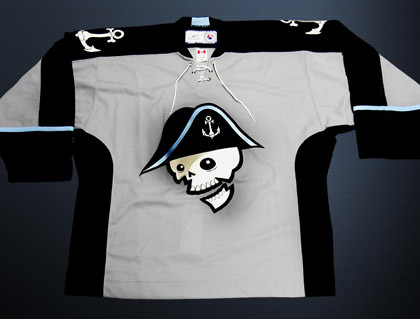
Thanks to Brandon over at The Sports Logo Pundit, I just ordered me what has to be the sweetest hockey jersey on the planet from the Milwaukee Admirals.
Seriously, check this out...

Coolest. Logo. Ever.
IT'S A PIRATE!! And note that the jersey has a lace-up front, buccaneer-style, which is even sweeter.
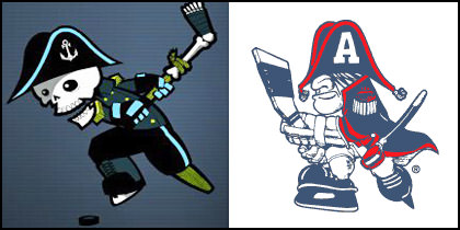
According to Brandon there's controversy because some people don't like the new logo, but these people are full of crap! Just look at the lame logo they used to have versus the sweet hotness of the logo they have now...

The only sucky part is that the jerseys are so popular there is a seven-week wait. But that's okay, I guess, because it will actually be cool enough to wear it then.
And speaking of totally frightening impulse shopping... tomorrow is one of the two scariest days of the year: the start of Apple's World Wide Developers Conference (the other day being MacWorld in January). And why is that? Because it's when Apple will unleash cool new products on an undeserving world. And what will it be? New big-screen video iPod? iPhone? Mac Pro? iTaco? Who knows?!?
Of course, being the Mac whore that I am, I will totally end up buying everything... even though I can't afford it.
I still remain hopeful for iToast...

I swear I would totally buy a box of rusty nails, so long as it had the Apple logo on it.
Somebody help me.

I love comments! However, all comments are moderated, and won't appear until approved. Are you an abusive troll with nothing to contribute? Don't bother. Selling something? Don't bother. Spam linking? Don't bother.
PLEASE NOTE: My comment-spam protection requires JavaScript... if you have it turned off or are using a mobile device without JavaScript, commenting won't work. Sorry.

Sweet mascot! Endless love for the amputated leg hockey stick and the wooden peg.
Those TShirts are cool !!! I prefer the new logo. Surely.
Hélas ! I am crazy too about products’ Apple.
There… I can’t help you. But I think it is important not to push it… You know… I mean that I can’t buy this kind of product… And you ? 🙂
You realize your pirate fixation stems from none other that the early days at Apple when they flew a pirate flag on campus…
It’s in your blood!
I’m quite sure that my household will also happily buy the new iRust when it comes out.
And that shirt is way cool. But, do you even like hockey and how did you even know there was a team in Milwaukee? (Wow, I really need to catch up, there was a time I could name every major sports team.)
I like the new logo MUCH better! He looks a lot more nimble….and clean shaven! 😉
PIRATES!!
That is a seriously cool shirt!! (My birth day is in January).
It would be great with a new Pwer Mac!
Isn’t it awesome?! I was surprised to see the incredible backlash toward it but it looks like people are starting to warm up to it.
Did you read the backstory at all? The new mascot is supposed to be the remains of the little guy that they used as a logo in the 70’s…
http://www.milwaukeeadmirals.com/home/news/new-logo0.html
How could anybody not like this logo?
Killer new pirate design. Are the cheerleaders going to dress up as pirate wenches? Cuz you know that’s my thang.
That is a seriously sweet pirate!
Am I the only one who hasn’t caught the Mac bug? I guess I’m too happy in my Linux world 🙂
The pirate is waaaaay better than the new logo the Buffalo Sabres are going to be stuck with. I don’t know *what* they were thinking when they picked the new logo – it doesn’t even have the right colors. There is a movement to get rid of it already – the petition already has over 25,000 signatures. If you haven’t seen the atrocity yet, you can see it here.
Undisciplined… Yeah, it’s pretty sweet. I can’t wait for my jersey to arrive!
Laurence… Uhhh… I don’t think I am in the bathroom long enough to listen to music on an iPod toilet paper dock! 🙂
Gerald… I’ve always loved pirates. Always. Steve flying the pirate flag over the Mac campus just made me love Apple more!
Eve… I blame Brandon’s “Sports Logo Pundit” for everything. He’s the one who made me blow $100 on a shirt!
Kyra… AND HE’S A PIRATE, BABY!! 🙂
Adena… PIRATES!!
Göran… If I’ve got $5000 burning a hole in my pocket come January, expect the MacPro and jersey in the mail! 😀
Brandon… I KNOW!! The logo is totally sweet, and I can’t believe that anybody would bitch about it! I did read the story… it’s kind of cool they tried to make it work, but not really necessary… BECAUSE IT’S A PIRATE!! w00t!!
Karl… I hear either wenches or French maids.
Sultana… What? You don’t own an iPod?!? I thought EVERYBODY had an iPod! 😉
Jill… I don’t get the new logo. Buffalo is the CITY… where’s the “sabre” in “Buffalo Sabres” for the new logo? I can barely tell it’s a buffalo anyway. Sad. I like the “alternate” logo of the two crossed sabres that they had a while back.
That is a cool logo for their jersey. The controversary will help sell the merchandise and hopefully the team will not fold and change it. The Calgary Hitman of the Western Hockey League had a really cool logo when they started and pressure forced them to change. Fortunately they came around when sales of merchandise fell through the floor.
Hitmen Current and First Logo
I’m not a macwhore so much as I am a “I have the latest and greatest and you don’t” whore. So even though I bought my black 30gig ipod the week after it came out, I’ll probably buy whatever it is they release this year, just because.
So that is what this thing needs to take over the world – an Apple logo…
Oh… I love pirates. Shiver me timbers.. Or like whatvever.
Although I’m not into the whole skeleton thing, I do think it’s better than the Gérard Depardieu they had previously.
Bah. I hate every logo that changed after 1929, and hockey should return to the Original Six.
Bah!
Just reading your blog for the first time.. good reading, I almost feel the burning need to bookmark 😉
you now have a convert to the cult of apple. My new Macbook should arrive by the end of the week. 🙂
(new computer + sales tax holiday = yay!)
Nice logo. Pity I’m not into sports though. Didn’t know about the Apple thingymajig. Can’t wait to hear what they’re doing now. My wallet is sweating.
Ewww, their old logo looks like something from the reject pile at ‘SchoolHouse Rock’.
Loving the new jersey.
I got lots of skull design items started from last year.
Long sleeve shirt, t shirt, ties, belt, socks and undies… but nothing like you ordered today. The design is coolest.
I’m hoping apple unleash new video ipod tomorrow.
I need a new toy.
Definately going with the new logo. Who wants Captain Crunch as a mascot?
I’m with you – that new mascot is quite fabulous!
That logo is sweet – but it’s the colour scheme that really does it for me.
Now the Toledo Storm just need to change their logo. Seriously, its the worst logo in hockey. It looks like someone made it on an etch-a-sketch.
I’m lucky I got out of S.F. when I did. Every day, on the way back to the 101 to our hotel, we drove by Moscone and saw the banners for WWDC 2006. It killed me to not go. Katie even said she’d have let me go if it was happening while we were still in town. Alas…
Can I have some of those nails when you order them?
I was going to tell you NOT to show that toaster to Kapgar. TOO LATE!!
LOL yes, I have a “thing” for pirates too. *sigh* Why can’t I live somewhere with a sports team that has a cool jersey? Or heck, that HAS a sports team at ALL?
Oh, and I don’t have anything Mac either… not even an ipod. 🙂 I haven’t been able to justify getting one yet… Any good excuses I can use?
delurking to say I like the new one better too! Much more hip and cool pirate dude!
Love your artwork! RW sent me today, but I usually lurk from his page anyway. 🙂
Thank you, thank you for saying something positive about this logo – I designed these new uniforms, and have been hearing nothing but crap locally from the 500 or so loudmouths who can’t stand any sort of change. Yet for some twisted reason I could not tear myself away from their personal blog attacks – it’s really riveting reading, but I was starting to get depressed. Anyway, glad you like it and I hope you ordered a jersey with numbers- they are expensive, but the numbers really make this jersey pop.
Hey, I’m a fan of anything that manages to combine pirates, skeletons, and hockey!
At first I didn’t understand you could get a customized jersey, but the guy from the Admiral’s office let me add my name and number to it for only $75 when I confirmed my order. I can’t wait to get mine! I end up in Milwaukee 2 or 3 times a year on business, and that jersey is absolutely going with me on my trips.
What’s strange is that people outside of Milwaukee don’t seem to mind the logo. In fact, every single person I’ve show it to thinks it’s great. On top of that, I don’t think I received a single negative comment on my blog. The local reaction, on the other hand, is completely baffling to me. It’s almost as if people are just dying to have something to bitch about, and this is all they could find. I understand that there’s going to be sentimental attachment to the old logo, but some of the things I’ve read are just insane! Hopefully, in time, the locals will calm down and grow to like it as much as everybody else seems to.
Anyway, thanks for the totally sweet logo, and I’m hoping to catch an Admirals game when I’m back in town in November!