
 Why does the USA have the ugliest, most boring money on the planet?
Seriously, I've been around the world more than a couple times and, everywhere I go, everybody else has sexier money than we do. Most foreign currencies look as though a gifted designer... a true artiste... sat down with a plan and crafted a cohesive statement that is both beautiful and representative of the currency's home nation. US currency looks like somebody sat their butt down in some random patriotic bits then wiped their ass with a piece of paper.
I can only guess that the "design" meeting for our currency went something like this...
"Hey, let's slap an engraving of a dead president on there, then sprinkle random shit everywhere to really junk things up. Then, just to be sure we don't accidentally make our bank notes look like a currency "family," let's intentionally make sure all bills have different typefaces and symbology. And, to be sure our money is the most boring it can be, let's use drab green as the only color, sprinkling other random colors around only when forced to for security measures."
Thus the "new" US currency was born.
Well, not actually "born" so much as crapped out of the ass of the US Mint. The latest atrocity being the $10 bill that's being released any day now...
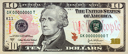
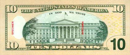
And then there's the $20 that was released a while back, showing entirely different design elements, typefaces, and illustration style. WTF? Did the person designing the $10 even LOOK at any other bills?!?
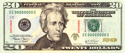
How totally embarrassing. I'd rather shop with Monopoly money than this dippy-looking cash.
Now take a look at this beautiful specimen from Costa Rica (as swiped from Randy Johnson's excellent world money pages)...
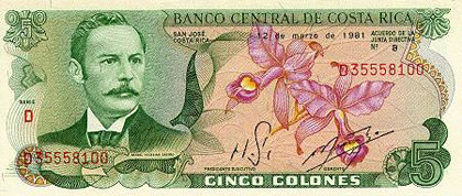
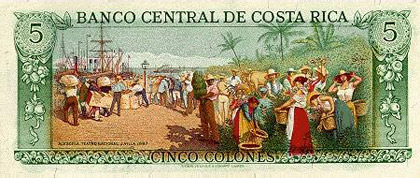
Yes, Costa Rica. An agricultural country that's smaller than the State of West Virginia (one-half of %1 the USA's land area), has 1% of the USA's population, and 1.4% of the Gross Domestic Product, takes more pride in their money than we United States. Why didn't we outsource our currency design to Costa Rica so we could have nice-looking bills? We don't seem to have a problem outsourcing every other f#@%ing job here.
I should run for president in 2008 based solely on the promise of affordable health-care, accountability of action, and better-looking money.
I would seriously kick-ass as president.

I love comments! However, all comments are moderated, and won't appear until approved. Are you an abusive troll with nothing to contribute? Don't bother. Selling something? Don't bother. Spam linking? Don't bother.
PLEASE NOTE: My comment-spam protection requires JavaScript... if you have it turned off or are using a mobile device without JavaScript, commenting won't work. Sorry.

I agree so much with you. I haven’t been around the world. But I have been to Switzerland and there bills are so cooler than ours. Plus, i like the idea of having coins up to the 5 dollars and no penny.
when i was 6, someone showed me the hologram inside the philippine pesos & convinced me that there were ghosts living inside the bills. had me freaked out for years.
anyway, that was more than 25 years ago and money in the philippines was already cool way back when.
What do you think of our english designs? A lot of people here seem to take great pride in them and get all teary eyed at the prospect of one day maybe having euros instead.
On another note (haha) I believe we print (or is that mint) notes for quite a lot of smaller countries.
That is an odd observation as far as the typefaces on our money. I had never thought of that but as a designer it is annoying. Costa Rican scratch is rather purdy. We should have only elements that were created in america on our bills like roller derby scenes and blues musicians. Or better yet why not state specific bills like we have quarters. Just more useless thoughts.
If I were an American, I would vote for you Dave!
Rob: And here’s a novel thought… using $1 and $5 coins would give us money that lasted longer in circulation, thus SAVING MONEY!! Of course, this IS the US government we’re talking about. It’s not like saving money for more important shit is ever a priority.
Rach: EVERYBODY has nicer money than we do. For some reason, the Thai Baht sticks in my mind as being the most beautiful I’ve seen. It even has little plastic windows in it, which is really cool.
MRK: British pound notes are quite lovely as I recall. The bills are all designed to look good together, with similar placement of elements and type styles. Variation in colors (colours!) between notes are also quite special. I can certainly understand why the Brits would be reluctant to change to the Euro… but, as a tourist in Europe, it sure would be nice for me if you did! 🙂
Luke: I have no idea why we don’t do currency variations… except perhaps it would make it easier for people to sneak in counterfeits or something.
Clever: Great! Thanks for your confidence! I promise not to invade your country (unless you have lots of oil, of course).
Money’s only as good as you spend it… so are you going to look at it, or spend it?
Hey… I just don’t want to be embarrassed AS I spend it!
I like the British notes because they are larger or smaller depending on value for the blind – of course when you are over there people complain about how things were better when a 5 pound note used to be the size of a small map.
Being out of country, what I don’t understand is why the US needs to change the $20 every couple of years? First there was the NEW $20, then the “No this really is the NEW” $20 and is there now another even Newer $20? And when did the $2 come back into common circulation?
Hm, while I surely appreciate good-looking money, I mostly don’t look at it in detail anyway. It’s just money, a mindless tool, if you wish. But even from that point of view, I found the usability of dollar notes to be quite bad because they’re all the same (or very similar) colour and the same size. And that just makes them hard to use.
Amusingly I’m having a money photo as well today.
Costa Rica not only has cooler money than us, with large coins with values that are actually useful (like 2 -6 dollar equiv.) but they also have free healthcare for every legal resident and citizen! I mean really, if they can afford to care for their people, don’t you think that as we are one of the richest nations in the world that we could afford to do this as well??!!?? Just a thought…
By the way… I have never commented before but I have been reading for quite some time now and I wanted to tell you how much I Love Your Blog! I check your posts before I check CNN! Wow, I feel kind of weird admitting that… Anyway, keep up the good work…
For those of you who do not want your ugly American money, please put all you have in an unmarked manila envelope and mail to:
S.U.M.
Stop Ugly Money
PO Box 4566
Rubshands, Pennsylvania 07788
Thank You!
I have to disagree. There´s no other currency that folded fits so perfect inside your 501s front pocket. There´s something kind of sexy about dollar bills, kind of thick and crisp at the same time.
I would vote for you for president…but only if you promised to endorse prettier money and more of it for people like me who need more shoes.
Because I’m political like that.
I don’t know, I’ve always had a fondness for the look of the US dollar. I thought it was terrible what they did to the back side of the 20 with all those gold twenties floating in mid air. That’s really my only gripe.
We’ve got that cool little plastic window in Australian money too!! I love the fact that there are no pennies here and the coins all have cool animals on one side.
I’ll vote for you, Dave, but only if you put the monkey on the money.
..while reading your “Money” Blog, the ABBA tune ,Money Money Money, started running through my mind and now I can’t stop singing it.
Dave, as far as you running for President, you’ll have to raise alot of our “ugly” money. As far as voting for you, I would have to first know your views on extending St. Patrick’s Day Holiday from one day to a full week!
I’d vote for you, Dave. At least you have a command of the English language.
I want my dollar bills to say “specimen” on it. Cool.
You have my vote Dave.
The look of money. Hmmmmm. I think that there are bigger fish to fry. I think our money is fine, I too have been around the world. I do find the Masonic Symbology a bit odd.
You said you would rather use Monopoly money than the current U.S. bills. The reason that U.S. bills are designed to look boring I think is that most Americans think that colorful bills like the Costa Rica example you showed ARE monopoly money. To many Americans, those designs do not look “serious” enough which is why our bills deliberately look drab.
And the irony is many foreign currencies are printed by the US mint.