
 Welcome to PART TWO of a discussion about the art that's running in the latest issue of THRICE Fiction Magazine!
If you haven't read PART ONE yet, you should do that first.
And if you haven't downloaded a FREE copy of our December 2014 issue... then you should definitely do that first because, WARNING... SPOILERS MAY ENSUE!
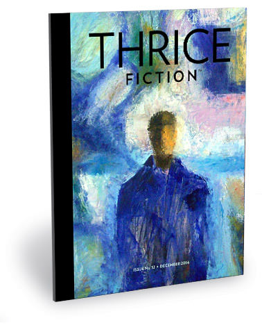
Last issue I talked about how assembling an issue of THRICE Fiction is like putting together a puzzle. And how I moved things around over and over and over again before I'm happy with how everything fits together. But I glossed over exactly how that happens, which is like this...
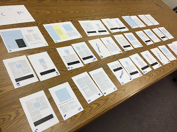
After inputting the stories into Adobe InDesign, I print out half-size pages that I can then move around a big table until I'm happy. Sometimes, if things get too difficult to keep track of, I'll print a second round of pages with color-coding to keep stories and spreads together.
The finalized layout has never come together without a struggle. I change my mind at least a dozen times as I read through the complete magazine over and over trying to make sure that I have created a rhythm from one story to the next, and that everything looks good together. I'll then change my mind a couple more times as I try to figure out which artist would be a good fit for each piece.
This issue came together easier than most, but still took days of working and re-working until I was happy.
And that's how it's done. Low-tech, but effective!
Anyway... to read about the art in the second-half of issue No. 12, click onward to an extended entry.

PAGES 19. Mike Koenig's Check Out was such a clever bit of fiction that I wanted to do something... I dunno... "charming"... is the word I guess I'm looking for. Somehow I became obsessed with the idea of having the two characters in the story being represented by Fisher Price Little People, and then piling up a bunch of other endlessly patient Little People behind them in a queue. And, in case you didn't grow up in the 70's, here's what I'm talking about...
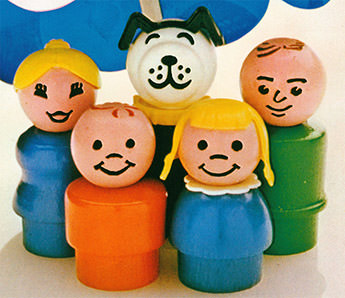
Photo from the Play Stuff Blog
So I managed to find a half-dozen of the toys at a local antique store, managed to rent them for a weekend, and get to work building a "set" for them to inhabit. And then... tragedy. Because Fisher Price Little People don't have arms, the scene was static and I wasn't able to communicate what was happening. Scrapping the idea, I tried again and again to think of another idea, but couldn't. So I decided to render my own 3D version of Fisher Price Little People, but flattened so I could build an "after you" arm on one of them. Not exactly what I had wanted at the beginning, but I do like how it turned out!
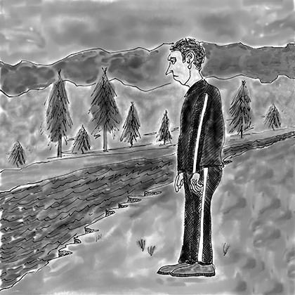
PAGES 21. Doug Scanlon's To Know One had a sweet sense of melancholy about it that I had no idea how to capture, so I sent the story off to our cover artist, Allen Forrest, to see what he would do. I think he pretty much nailed it. I like how the image is in black-and-white, because you never feel as if "the man's" world has any color in it until the very end of the story.
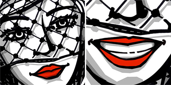
PAGES 23. If I had the time, I would have loved to have painted a noir scene straight off of a Raymond Chandler book cover for D.S. West's He Later Searched Her Body for Clues. The story has a fantastic kind of pulp feel woven amidst the strangeness of the narrative, and capturing that felt like the way to go. Alas, I didn't have the days that would require, so I decided to see if I could do something in pen and ink. I limited the color pallet to black, white, grey, and red, then roughed out The Betty thusly...
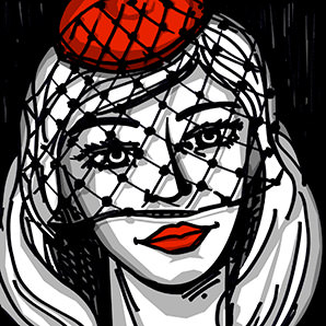
I cropped quite a bit off of the image because I didn't want my interpretation of her to trample over what was in the story. By zooming in on the eyes and lips, she was more generic. Also a bit stronger, I think. By the time I was finished with the story, I was definitely ready for more Lyle Eastman adventures... hopefully Mr. West isn't done with the character yet!
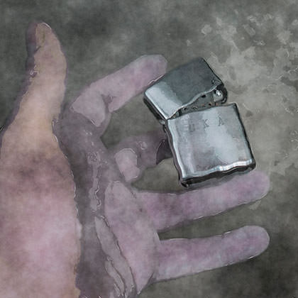
PAGES 25. When it came to G. Wise's The Argo and the Sirens of Lake Texoma, I had one idea for the artwork, and one only... that of the lighter being released into the water. To me it encapsulated the entire story and would make for a good visual. So I bought an old Zippo from an antique store, found a large concrete basin that I could fill with water, then built a stand for the lighter so it could be floating away from my hand when photographed. After shooting the scene from every angle possible, I found an image I liked and set to work on it in Photoshop. First I added a ripple to the water, then I painted over everything with color washes before running it through various filters to give it a watercolor look.

PAGES 29. I had no clue where to even start with the vivid imagery of L. Noelle McLaughlin's Lambda Lupi... so I handed it to Kyra, because she excels at that kind of thing. Her solution was genius, combining a voodoo doll with Christmas in the most disturbingly adorable way possible.
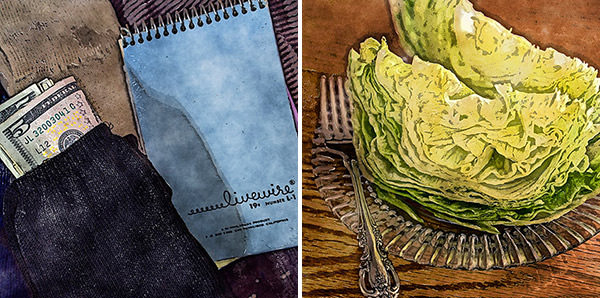
PAGES 30-31. Natalia Andrievskikh paints vivid mental pictures with her words. So vivid that any images I come up with would pale in comparison. So instead of trying to interpret Natalia's stories, I merely set the scene for them to exist by pulling a moment from each and recreating them for my camera. I then Photoshopped a series of filters on top to make them feel a bit surreal. But getting the photos was a bit of struggle. I found a table for the lettuce with wild wood grain that I was hoping to match with a pair of socks that had wild stripes... but the socks had to be buried by a 19¢ notebook, so I let the connection lapse and treated each image separately. Originally there was "blood" splattered across the lettuce, but I backpeddled that idea so that the image was from the beginning of the story rather than the ending. Originally the money in the black sock had a $50 bill on top, but it seemed a better "fit" with $5, so I Photoshopped that in.
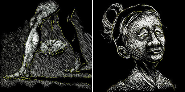
PAGES 33-34. Every issue it seems there's that one story I have no earthly idea how to conceptualize for a visual. Almost inevitably, these end up going to Chad, because he always manages to figure it out. Hun Ohm's The Last Promenade of Yoon Choro was that story this time around. And never have I sat with more anticipation of receiving artwork as I was with this story!

PAGES 33-34. Another bit of flash genius by Howie Good! I love his stuff, and Pretty Ugly was exactly what I needed to close out the issue. For the visual, I just pulled one of those cloud photos from the last line and brought it to life. Since "box of photos" implies that they would be old photos, I tracked down a battered old frame (courtesy of IROCKSOWHAT) and filled it with a cloud shot I took in Spain (which some grain added for effect).
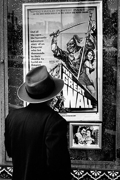
BACK COVER. I always try to find an image that sets anticipation for the next issue. This photo from Harry Wilson's portfolio fit the bill perfectly.
And... that's a wrap for THRICE Fiction No. 12! See you in four months!

I love comments! However, all comments are moderated, and won't appear until approved. Are you an abusive troll with nothing to contribute? Don't bother. Selling something? Don't bother. Spam linking? Don't bother.
PLEASE NOTE: My comment-spam protection requires JavaScript... if you have it turned off or are using a mobile device without JavaScript, commenting won't work. Sorry.

There's no comments here...